
Tags
@tlowdon, Actual Date of Death, COVID, COVID Testing, COVID-Like Illness, Don Wolt, Excess Deaths, False Positives, Hospitalizations, ILI, Influenza-Like Illness, PCR Tests, Reported Deaths
I hope readers share my compulsion to see updated COVID numbers. It’s become a regular feature on this blog and will probably remain one until infections subside, vaccine or otherwise. Or maybe when people get used to the idea of living normally again in the presence of an endemic pathogen, as they have with many other pathogens and myriad risks of greater proportions, and as they should. That might require more court challenges, political changes, and plain old civil disobedience.
So here, then, is an update on the U.S. COVID numbers released over the past few days. The charts below are attributable to Don Wolt (@tlowdon on Twitter).
First, reported deaths began to creep up again in the latter half of October and have escalated in November. They’ve now reached the highs of the mid-summer wave in the south, but this time the outbreak is concentrated in the midwest and especially the upper midwest.


Reported deaths are the basis of claims that we are seeing 1,500 people dying every day, which is an obvious exaggeration. There have been recent days when reported deaths exceeded that level, but the weekly average of reported deaths is now between 1,100 and 1,200 a day.
It’s important to understand that deaths reported in a given week actually occurred earlier, sometimes eight or more weeks before the week in which they are reported. Most occur within three weeks of reporting, but sometimes the numbers added from four-plus weeks earlier are significant.
The following chart reproduces weekly reported deaths from above using blue bars, ending with the week of November 14th. Deaths by actual date-of-death (DOD) are shown by the orange bars. The most recent three-plus weeks always show less than complete counts of deaths by DOD. But going back to mid-October, actual weekly deaths were running below reported deaths. If the pattern were to follow the upswings of the first two waves of infections, then actual weekly deaths would exceed reported deaths by perhaps the end of October. However, it’s doubtful that will occur, in part because we’ve made substantial progress since the spring and summer in treating the disease.

To reinforce the last point, it’s helpful to view deaths relative to COVID case counts. Deaths by DOD are plotted below by the orange line using the scale on the right-hand vertical axis. New positive tests are represented by the solid blue line, using the left-hand axis, along with COVID hospitalizations. There is no question that the relationship between cases, hospitalizations, and deaths has weakened over time. My suspicions were aroused somewhat by the noticeable compression of the right axis for deaths relative to the two charts above, but on reviewing the actual patterns (peak relative to troughs) in those charts, I’m satisfied that the relationships have indeed “decoupled”, as Wolt puts it.

Cases are going through the roof, but there is strong evidence that a large share of these cases are false positives. COVID hospitalizations are up as well, but their apparent co-movement with new cases appears to be dampening with successive waves of the virus. That’s at least partly a consequence of the low number of tests early in the pandemic.
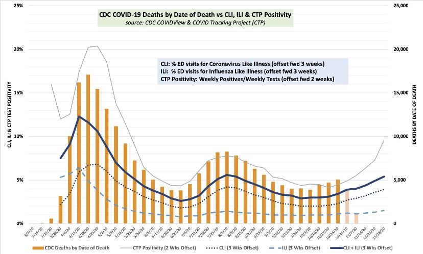
So where is this going? The next chart again shows COVID deaths by DOD using orange bars. Wolt has concluded, and I have reported here, that the single-best short-term predictor of COVID deaths by DOD is the percentage of emergency room visits at which patients presented symptoms of either COVID-like illness (CLI) or influenza-like illness (ILI). The sum of these percentages, CLI + ILI, is shown below by the dark blue line, but the values are shifted forward by three weeks to better align with deaths. This suggests that actual COVID deaths by DOD will be somewhere around 7,000 a week by the end of November, or about 1,000 a day. Beyond that time, the path will depend on a number of factors, including the weather, prevalence and immunity levels, and changes in mobility.
I am highly skeptical that lockdowns have any independent effect in knocking down the virus, though interventionists will try to take credit if the wave happens to subside soon for any other reason. They won’t take credit for the grim lockdown deaths reaped by their policies.
Despite the bleak prospect of 1,000 or more COVID-attributed deaths a day by the end of November, the way in which these deaths are counted is suspect. Early in the pandemic, the CDC significantly altered guidelines for the completion of death certificates for COVID such that deaths are often improperly attributed to the virus. Some COVID deaths stem from false-positive PCR tests, and again, almost since the beginning of the pandemic, hospitals were given a financial incentive to classify inpatients as COVID-infected.
It’s also important to remember that while any true COVID fatality is premature, they are generally not even close to the prematurity of lockdown deaths. That’s a simple consequence of the age profile of COVID deaths, which indicate relatively few life-years lost, and the preponderance of co-morbidities among COVID fatalities.
Again, COVId deaths are bad enough, but we are seeing an unacceptable and ongoing level of lockdown deaths. This is now to the point where they may account for almost all of the continuing excess deaths, even with the fall COVID wave. It’s probable that public health would be better served with reduced emphasis on COVID-mitigation for the general population and more intense focus on protecting the vulnerable, including the distribution of vaccines.
