
Tags
Cloroquine, Coronavirus Task Force, Covid-19, Dr. Anthony Fauci, Dr. Deborak Birx, Excess Mortality, Insights & Outliers, Johns Hopkins, Lesswrong, Mitigation, Remediation
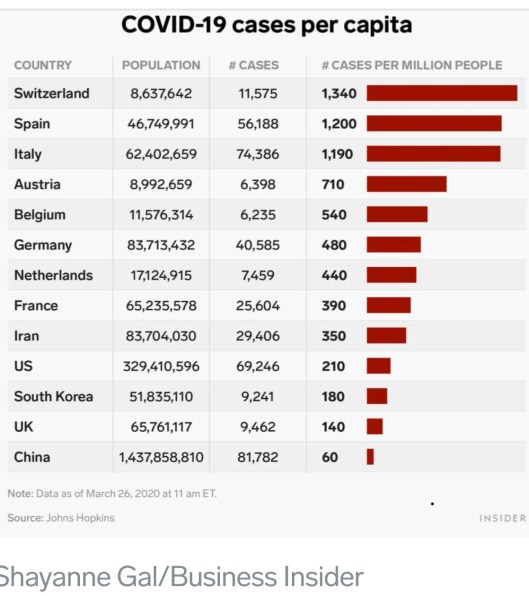
This is an update of my coronavirus “framing” post from early last Sunday morning, March 22. Before I say anything about the experience since then, there is great alarm in the media about the absolute number of diagnosed cases, and some parties are doing their best to exploit that alarm. So please, at least as a start, DIVIDE BY COUNTRY POPULATION if you want to make accurate cross-country comparisons, as in the illustration below from Business Insider, or put the absolute number of cases in a normalized context, as I did in my post last weekend. The numbers below are for confirmed cases, and it takes 10,000 per million to reach 1% of the population. So all major countries are well below that level. Things are much less certain if you want to think in terms of total infections, including the asymptomatic or as yet undiagnosed. Estimates range from 5 to nearly 20 times the number of confirmed cases, so you can multiply by 10 as a start.
I was getting case numbers from a “dashboard” at Insights & Outliers, but this week they had trouble because Johns Hopkins stopped reporting a certain data element, and they seem to have stopped updating the dashboard. I’ve reverted to taking the daily totals directly from Johns Hopkins. I try to take the number relatively late in the evening, usually no earlier than 11 p.m. EDT, but it’s possible that an audit would find that my numbers have a few cases shifted to the next day…. except for tonight, when I didn’t get the number until 12:45 a.m. EDT on Saturday. I was watching a good movie!! If you want to do a deep dive on Covid-19 data, there are now a number of very good sources and dashboards available.
The daily number of new confirmed cases of coronavirus in the U.S. has accelerated since last Saturday. That was expected given the slow start of testing in the U.S.; eliminating the backlog of qualified test requests might still be constrained by bottlenecks in processing results, but let’s hope not. On Wednesday evening, Dr. Deborah Birx of President Trump’s Coronavirus Task Force stated that the backlog might be eliminated very soon. I hope we’ll catch-up within just a few days, and that might be accompanied by a decrease in daily cases, which would also be a very good sign the spread won’t be as severe as in many other countries. Continued acceleration in the daily number of new cases for more than another week would be worrisome, leaving more uncertainty about the ultimate breadth of the spread.
Updated versions of the chart and data I posted last Sunday appear below. The actual number of confirmed cases (the red line) has climbed above what I called the “very good” scenario. This time, I “zoomed in” on the chart to get a better view of actual cases relative the two extreme scenarios.

Just to review: day zero in the chart was March 6th. The “very good” scenario (green line) would ultimately involve a maximum rate of confirmed diagnoses in the U.S. of 0.017% of the U.S. population, or 0.17% if 90% of infections are undiagnosed. That was 2.5x the South Korean experience as of last weekend. The “very bad” scenario (blue line) implies a maximum rate of diagnosis of 0.077% of the population, or 0.77% including undiagnosed cases, which was about 4x the Italian experience as of six days ago. I’ll update those extremes next time as well.

The daily growth rate of confirmed cases in the U.S. has declined from about 40% a week ago to about 22.5% on Friday, despite increasing numbers of new cases. (I will put the growth rate on the chart next time.) The red curve in the chart will start to bend to the right as the growth rate continues to decline, but we don’t know how soon that will happen. This uncertainty is exacerbated by the presence of any remaining backlog.
The following is a screen shot of an interactive chart showing an epidemiological model of coronavirus infection prevalence. It is shown here for the U.S. under “weak” global mitigation. At the site, you can select other countries and different levels of global mitigation. Curves are shown for different assumptions about the seasonal pattern of coronavirus as well as reductions in global air travel. Unfortunately, while extremely interesting, it leaves much to the imagination, such as what “moderate global mitigation” really means. Try the “moderate” setting if you’re curious to see how it changes.

I don’t want to overemphasize any of the numbers in this chart. My point in sharing it is that prevalence declines drastically in the late spring and early summer in all scenarios. Of course, I’m not sure whether the estimates of total prevalence, the seasonal effect, or the mitigation effect are at all accurate, but on the whole I found the range of scenarios available at the site reassuring.
We might have early indications of the efficacy of certain treatments under testing within the next week or so, some of which were already being legally administered off-label. (Dr. Anthony Fauci of the President’s Task Force, who I find generally likable, misrepresented the facts by implying that the FDA had acted this week to allow the use of Chloroquine. It was already allowed off-label.) Those treatments might help limit the virus’s spread in some cases (the prophylactic effect) and otherwise treat the infection.
The U.S. coronavirus mortality rate, which is now about 1.3% of confirmed cases, remains low in the U.S. relative to most other countries (see chart below, which is one day old). Of course, we don’t know the “real” mortality rate because so many undiagnosed cases are missing from the denominator. But one thing we know for certain is the real mortality rate is much lower than what we can measure by dividing deaths by confirmed cases.

Here’s more food for thought: most coronavirus deaths involve individuals with serious co-morbidities like diabetes, respiratory problems, and heart disease. Most fatalities are of advanced age. Mortality among these groups is high to begin with, so it’s worthwhile to ask about the marginal effect of coronavirus on mortality rates. This article does just that. There is certainly overlap between coronavirus deaths and the set of individuals who would have died anyway during any time period. That doesn’t mean coronavirus doesn’t cost lives, but it’s a pertinent question.

Pingback: Coronavirus: Framing the Next Few Weeks | Sacred Cow Chips
Pingback: Coronavirus: Framing the Next Few Weeks #3 | Sacred Cow Chips