• About

Sacred Cow Chips

Sacred Cow Chips

Tag Archives: Excess Mortality

The Vagaries of Excess Deaths

02 Saturday May 2020

Posted by pnoetx in Liberty, Pandemic, Tyranny

≈ 2 Comments

Tags

Cause of Death, CDC, Civid-Only Deaths, Co-Morbidities, Coronavirus, Covid-19, Denmark Covid, Eastern Europe Covid, Euromomo, Excess Mortality, Germany Covid, Jacob Sullum, John Burn-Murdoch, New York Covid, New York Times, Probable Covid Deaths

The New York Times ran a piece this week suggesting that excess mortality from Covid-19 in the U.S. is, or will be, quite high. The analysis was based on seven “hard hit” states, including three of the top four states in Covid death rate and five of the top ten. Two states in the analysis, New York and New Jersey, together account for over half of all U.S. active cases. This was thinly-veiled cherry picking by the Times, as Jacob Sullum notes in his discussion of what excess mortality does and doesn’t mean. Local and regional impacts of the virus have varied widely, depending on population density, international travel connections, cultural practices, the quality of medical care, and private and public reaction to news of the virus. To suggest that the experience in the rest of the country is likely to bear any similarity to these seven states is complete nonsense. Make no mistake: there have been excess deaths in the U.S. over the past few weeks of available data, but again, not of the magnitude the Times seems to intimate will be coming.

Beyond all that, the Times asserts that the CDC’s all-cause death count as of April 11 is a significant undercount, though the vast majority of deaths are counted within a three week time frame. In fact, CDC data at this link show that U.S. all-cause mortality was at a multi-year low during the first week of April. The author admits, however, that the most recent data is incomplete. The count will rise as reporting catches up, but even an allowance for the likely additions to come would leave the count for the U.S. well below the kinds of levels suggested by the Times‘s fear-mongering article, based as it was on the seven cherry-picked states.

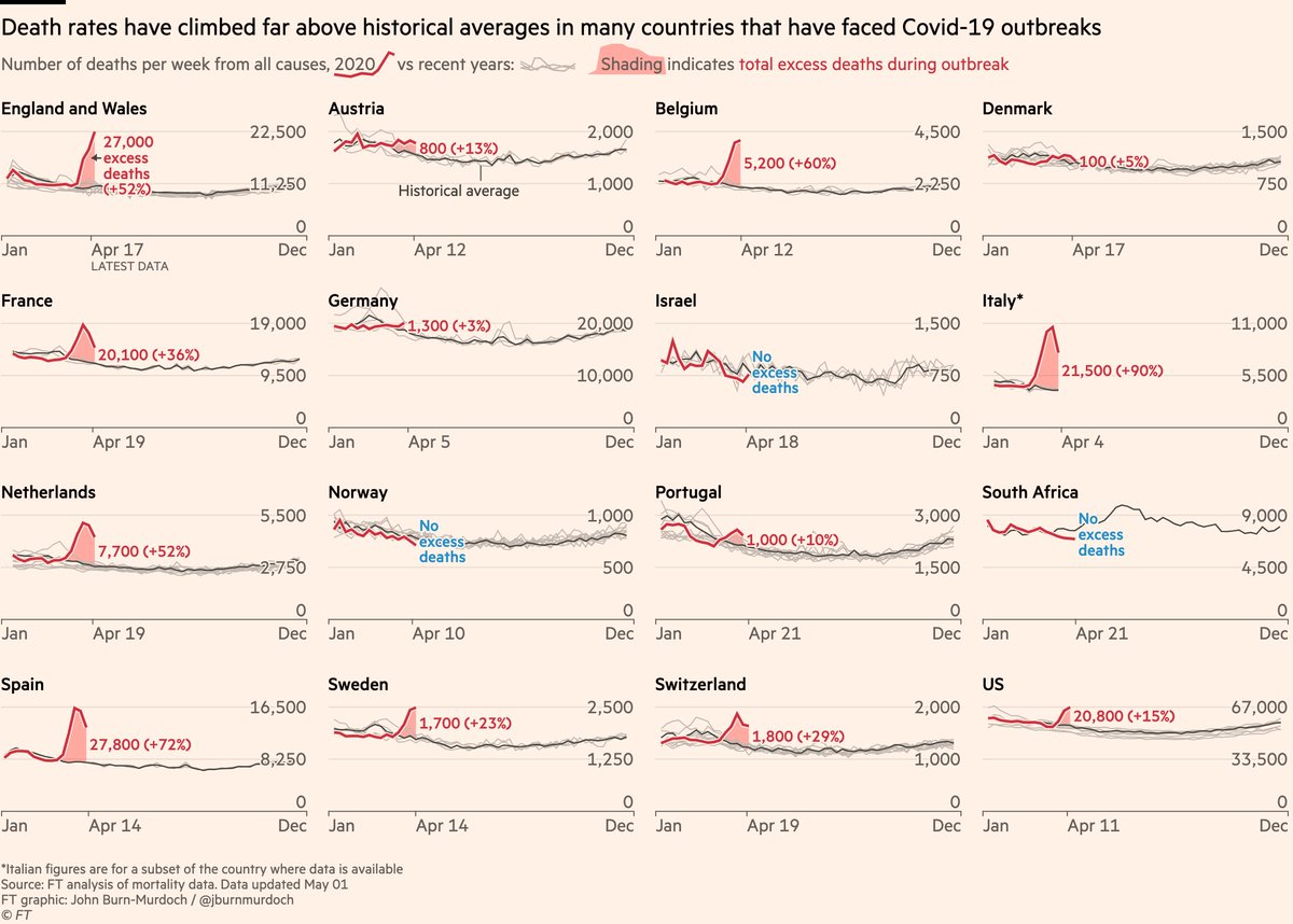
The author of this Twitter thread, John Burn-Murdoch, seems to engage in the same practice with respect to Europe. He shows charts with excess deaths in 12 countries, almost all of which show significant, recent bumps in excess deaths (the sole exception being Denmark). Inexplicably, he excludes Germany and a number of other countries with low excess deaths or even “valleys” of negative excess deaths. His most recent update is a bit more inclusive, however. (It was the source of the chart at the top of this post.) Euromomo is a site that tracks excess mortality in 24 European countries or major regions (non-overlapping), and by my count, 13 of have no or very little excess mortality. And by the way, even this fails to account for a number of other Eastern European nations having low Covid deaths.

Excess mortality is a tricky metric: it cannot be measured with certainty, and almost any measure has conceptual shortcomings. In the case of Covid-19, excess mortality seeks to measure the number of deaths attributable to the virus net of deaths that would have occurred anyway in the absence of the virus. For example, abstracting from some of the details, suppose there are 360 deaths per hundred-thousand of population during the average month of a pandemic. If the “normal” mortality rate is 60 per hundred-thousand, then excess mortality is 300 per month. It can also be expressed as a percentage of the population (0.3% in the example). But that’s just one way to measure it.

In the spirit of Sullum’s article, it’s important to ask what we’re trying to learn from statistics on excess mortality. It’s easy to draw general conclusions if the number of Covid-19 deaths is far in excess of the normal death rate, but that depends on the quality of the data, and any conclusion is subject to limits on its applicability. Covid deaths are not that high in many places. By the same token, if the number of Covid deaths (defined narrowly) is below the normal death rate (measured by an average of prior years), it really conveys little information about whether excess mortality is positive of negative: that depends on the nature of the question. For each of the following I offer admittedly preliminary answers:

  • Are people dying from Covid-19? Of course, virtually everywhere. There is no “normal” death rate here. And while this is the most direct question, it might not be the “best” question.
  • Is Covid-19 causing an increase in respiratory deaths? Yes, in many places, but perhaps not everywhere. Here and below, the answer might depend on the time frame as well.
  • Is Covid-19 increasing deaths from infectious diseases (biological and viral)? Yes, but perhaps not everywhere.
  • Is Covid-19 increasing total deaths from natural causes? Yes, but not everywhere.
  • Is all-cause mortality increasing due to Covid-19? In some places, not others. Accurate global and national numbers are still a long way off.

All-cause mortality is the most “rough and ready” comparison we have, but it includes deaths that have no direct relationship to the disease. For example, traffic fatalities might be down significantly due to social distancing or regulation during a pandemic. Thus, if our purpose is purely epidemiological, traffic fatalities might bias excess mortality downward. On the other hand, delayed medical treatments or personal malaise during a pandemic might lead to higher deaths, creating an upward bias in excess deaths via comparisons based on all-cause mortality.

Do narrow comparisons give a more accurate picture? If we focus only on respiratory deaths then we exclude deaths from other causes and co-morbidities that would have occurred in the absence of the virus. That may create a bias in excess mortality. So narrow comparisons have their drawbacks, depending on our purpose.

That also goes for the length of time over which excess mortality is measured. It can make a big difference. Again, much has been made of the fact that so many victims of Covid-19 have been elderly or already ailing severely before the pandemic. There is no question that some of these deaths would have occurred anyway, which goes to the very point of calculating excess mortality. If the pandemic accelerates death by a matter of weeks or months for a certain percentage of victims, it is reasonable to measure excess mortality over a lengthier period of time, despite the (perhaps) highly valuable time lost by those victims (that being dependent on the decedent’s likely quality of life during the interval).

Conversely, too narrow a window in time can lead to biases that might run in either direction. Yet a cottage industry is busy calculating excess mortality even as we speak with the pandemic still underway. There are many fatalities to come that are excluded by premature calculations of excess mortality. On the other hand, if the peak in deaths is behind us, a narrow window and premature calculation may sharply exaggerate excess mortality.

Narrow measures of excess mortality are affected by the accuracy of cause-of-death statistics. There are always inaccuracies in this data because so many deaths involve multiple co-morbidities, so there is often an arbitrary element in these decisions. For Covid-19, cause-of-death attribution has been extremely problematic. Some cases are easy: those testing positive for the virus, or even its presence immediately after death, and having no other respiratory infections, can fairly be counted as Covid-19 deaths. But apparently just over half of Covid-19 deaths counted by the CDC are “Covid-Only” deaths. A significant share of deaths involve both Covid and the flu, pneumonia, or all three. There are also “probable” Covid-19 deaths now counted without testing. In fact, hospitals and nursing homes are being encouraged to code deaths that way, and there are often strong financial incentives to do so. Many deaths at home, sans autopsy, are now routinely classified as Covid-19 deaths. While I have no doubt there are many Covid deaths of untested individuals both inside or outside of hospitals, there is no question this practice will overcount Covid deaths. Whether you believe that or not, doubts about cause-of-death accuracy is another reason why narrow comparisons can be problematic.

More trustworthy estimates of the coronavirus’ excess mortality will be possible with the passage of time. It’s natural, in the heat of the pandemic, to ask about excess mortality, but such early estimates are subject to tremendous uncertainty. Unfortunately, those calculations are being leveraged and often mis-applied for political purposes. Don’t trust anyone who would use these statistics as a cudgel to deny your Constitutional rights, or otherwise to shame or threaten you.

New York’s Covid experience is not applicable to the country as a whole. Urban mortality statistics are not applicable to areas with lower population densities. Excess mortality for the elderly cannot be used to make broad generalizations about excess mortality for other age groups. And excess mortality at the peak of a pandemic cannot be used to make generalizations about the full course of the pandemic. In the end, I expect Covid-19 excess mortality to be positive, whether calculated by all-cause mortality or more narrow measures. However, it will not be uniform in its impact. Nor will it be of the magnitude we were warned to expect by the early epidemiological models.

Spanish Flu: No Guide for Covid Lockdowns

25 Saturday Apr 2020

Posted by pnoetx in Pandemic

≈ Leave a comment

Tags

Cost of Lost Output, Covid-19, Cytokine Storm, Economic Costs, Excess Mortality, Herd Immunity, Life-Years, Lockdown, Non-Prescription Measures, Novel Coronavirus, Pandemic, Quarantines, Reason.com, Serological Testing, Skilled Care, Social Distancing, South Korea, Spanish Flu, World War I

The coronavirus pandemic differs in a few important ways from the much deadlier Spanish flu pandemic of 1918-19. Estimates are that as much as 1/3rd of the world’s population was infected during that contagion, and the case fatality rate is estimated to have been 10-20%. The current pandemic, while very serious, will not approach that level of lethality.

Another important difference: the Spanish Flu was very deadly among young adults, whereas the Coronavirus is taking its greatest toll on the elderly and those with significant co-morbidities. Of course, the Spanish Flu infected a large number of soldiers and sailors, many returning from World War I in confined conditions aboard transport vessels. A major reason for its deadliness among young adults, however, is thought to be the “cytokine storm“, or severe inflammatory response, it induced in those with strong immune systems.

It’s difficult to make a perfect comparison between the pandemics, but the charts below roughly illustrate the contrast between the age distribution of case mortality for the Spanish Flu in 1918, shown in the first chart, and Covid-19 in the second. The first shows a measure of “excess mortality” for each age cohort as the vertical gap between the solid line (Spanish flu) and the dashed line (the average of the seven previous seasons for respiratory diseases). Excess mortality was especially high among those between the ages of 15 and 44.

The second chart is for South Korea, where the Covid-19 pandemic has “matured” and was reasonably well controlled. We don’t yet have a good measure of excess case mortality for Covid-19, but it’s clear that it is most deadly among the elderly population. Not to say that infected individuals in younger cohorts never suffer: they are a higher proportion of diagnosed cases, severe cases are of extended duration, and some of the infected might have to deal with lasting consequences.

One implication of these contrasting age distributions is that Covid-19 will inflict a loss of fewer “life years” per fatality. If the Spanish flu’s median victim was 25 years old, then perhaps about 49 life years were lost per fatality, based on life expectancies at that time. At today’s life expectancies, it might be more like 54 years. if Covid-19’s median victim is 70 years old, then perhaps 15 life-years are lost per fatality, or about 73% less. And that assumes the the median Covid victim is of average health, so the loss of life years is probably less. But what a grisly comparison! Any loss is tragic, but it is worth noting that the current pandemic will be far less severe in terms of fatalities, excess mortality (because the elderly always die at much higher rates), and in life-years lost.

Is that relevant to the policy discussion? It doesn’t mean we should throw all caution to the wind. Ideally, policy would save lives and conserve life-years. We’d always put children on the lifeboats first, after all! But in this case, younger cohorts are the least vulnerable.

The flu pandemic of 1918-19 is often held to support the logic of non-prescription public health measures such as school closures, bans on public gatherings, and quarantines. Does the difference in vulnerabilities noted above have any bearing on the “optimal” level of those measures in the present crisis? Some argue that while a so-called lockdown confers health benefits for a Spanish flu-type pandemic in which younger cohorts are highly vulnerable, that is not true of the coronavirus. The young are already on lifeboats having few leaks, as it were.

My view is that society should expend resources on protecting the most vulnerable, in this case the aged and those with significant co-morbidities. Health care workers and “first responders” should be on the list as well. If well-targeted and executed, a Covid-19 lockdown targeted at those groups can save lives, but it means supporting the aged and afflicted in a state of relative isolation, at least until effective treatments or a vaccine prove out. A lockdown might not change living conditions greatly for those confined to skilled care facilities, but much can be done to reduce exposure among those individuals, including a prohibition on staff working at multiple facilities.

Conversely, the benefits of a lockdown for younger cohorts at low risk of death are much less compelling for Covid-19 than might be suggested by the Spanish flu experience. In fact, it can be argued that a complete lockdown denies society of the lowest-hanging fruit of earlier herd immunity to Covid-19. Younger individuals who have more social and economic contacts can be exposed with relative safety, and thus self-immunized, as their true mortality rate (including undiagnosed cases in the denominator) is almost zero to begin with.

Then we have the economic costs of a lockdown. Idle producers are inherently costly due to lost output, but idle non-producers don’t impose that cost. For Covid-19, prohibiting the labor of healthy, working age adults has scant health benefits, and it carries the high economic costs of lost output. That cost is magnified by the mounting difficulty of bringing moribund activities back to life, many of which will be unsalvageable due to insolvency.

The lockdown question is not binary. There are ways to maintain at least modest levels of production in many industries while observing guidelines on safety and social distancing. In fact, producers are finding inventive ways of maximizing both production and safety. They should be relied upon to create these solutions. The excess mortality rates associated with this pandemic will continue to come into focus at lower levels with more widespread serological testing. That will reinforce the need for individual autonomy in weighing risks and benefits. Hazards are always out there: reckless or drunk drivers, innumerable occupational hazards, and the flu and other communicable diseases. Protect yourself in any way you see fit, but if you are healthy, please do so without agitating for public support from the rest of us, and without imposing arbitrary judgments on which activities carry acceptable risk for others.


Coronavirus “Framing” Update

28 Saturday Mar 2020

Posted by pnoetx in Pandemic

≈ 2 Comments

Tags

Cloroquine, Coronavirus Task Force, Covid-19, Dr. Anthony Fauci, Dr. Deborak Birx, Excess Mortality, Insights & Outliers, Johns Hopkins, Lesswrong, Mitigation, Remediation

This is an update of my coronavirus “framing” post from early last Sunday morning, March 22. Before I say anything about the experience since then, there is great alarm in the media about the absolute number of diagnosed cases, and some parties are doing their best to exploit that alarm. So please, at least as a start, DIVIDE BY COUNTRY POPULATION if you want to make accurate cross-country comparisons, as in the illustration below from Business Insider, or put the absolute number of cases in a normalized context, as I did in my post last weekend. The numbers below are for confirmed cases, and it takes 10,000 per million to reach 1% of the population. So all major countries are well below that level. Things are much less certain if you want to think in terms of total infections, including the asymptomatic or as yet undiagnosed. Estimates range from 5 to nearly 20 times the number of confirmed cases, so you can multiply by 10 as a start.

I was getting case numbers from a “dashboard” at Insights & Outliers, but this week they had trouble because Johns Hopkins stopped reporting a certain data element, and they seem to have stopped updating the dashboard. I’ve reverted to taking the daily totals directly from Johns Hopkins. I try to take the number relatively late in the evening, usually no earlier than 11 p.m. EDT, but it’s possible that an audit would find that my numbers have a few cases shifted to the next day…. except for tonight, when I didn’t get the number until 12:45 a.m. EDT on Saturday. I was watching a good movie!! If you want to do a deep dive on Covid-19 data, there are now a number of very good sources and dashboards available.

The daily number of new confirmed cases of coronavirus in the U.S. has accelerated since last Saturday. That was expected given the slow start of testing in the U.S.; eliminating the backlog of qualified test requests might still be constrained by bottlenecks in processing results, but let’s hope not. On Wednesday evening, Dr. Deborah Birx of President Trump’s Coronavirus Task Force stated that the backlog might be eliminated very soon. I hope we’ll catch-up within just a few days, and that might be accompanied by a decrease in daily cases, which would also be a very good sign the spread won’t be as severe as in many other countries. Continued acceleration in the daily number of new cases for more than another week would be worrisome, leaving more uncertainty about the ultimate breadth of the spread.

 Updated versions of the chart and data I posted last Sunday appear below. The actual number of confirmed cases (the red line) has climbed above what I called the “very good” scenario. This time, I “zoomed in” on the chart to get a better view of actual cases relative the two extreme scenarios.

Just to review: day zero in the chart was March 6th. The “very good” scenario (green line) would ultimately involve a maximum rate of confirmed diagnoses in the U.S. of 0.017% of the U.S. population, or 0.17% if 90% of infections are undiagnosed. That was 2.5x the South Korean experience as of last weekend. The “very bad” scenario (blue line) implies a maximum rate of diagnosis of 0.077% of the population, or 0.77% including undiagnosed cases, which was about 4x the Italian experience as of six days ago. I’ll update those extremes next time as well.   

The daily growth rate of confirmed cases in the U.S. has declined from about 40% a week ago to about 22.5% on Friday, despite increasing numbers of new cases. (I will put the growth rate on the chart next time.) The red curve in the chart will start to bend to the right as the growth rate continues to decline, but we don’t know how soon that will happen. This uncertainty is exacerbated by the presence of any remaining backlog.

The following is a screen shot of an interactive chart showing an epidemiological model of coronavirus infection prevalence. It is shown here for the U.S. under “weak” global mitigation. At the site, you can select other countries and different levels of global mitigation. Curves are shown for different assumptions about the seasonal pattern of coronavirus as well as reductions in global air travel. Unfortunately, while extremely interesting, it leaves much to the imagination, such as what “moderate global mitigation” really means. Try the “moderate” setting if you’re curious to see how it changes.

I don’t want to overemphasize any of the numbers in this chart. My point in sharing it is that prevalence declines drastically in the late spring and early summer in all scenarios. Of course, I’m not sure whether the estimates of total prevalence, the seasonal effect, or the mitigation effect are at all accurate, but on the whole I found the range of scenarios available at the site reassuring. 

We might have early indications of the efficacy of certain treatments under testing within the next week or so, some of which were already being legally administered off-label. (Dr. Anthony Fauci of the President’s Task Force, who I find generally likable, misrepresented the facts by implying that the FDA had acted this week to allow the use of Chloroquine. It was already allowed off-label.) Those treatments might help limit the virus’s spread in some cases (the prophylactic effect) and otherwise treat the infection.

The U.S. coronavirus mortality rate, which is now about 1.3% of confirmed cases, remains low in the U.S. relative to most other countries (see chart below, which is one day old). Of course, we don’t know the “real” mortality rate because so many undiagnosed cases are missing from the denominator. But one thing we know for certain is the real mortality rate is much lower than what we can measure by dividing deaths by confirmed cases.

Here’s more food for thought: most coronavirus deaths involve individuals with serious co-morbidities like diabetes, respiratory problems, and heart disease. Most fatalities are of advanced age. Mortality among these groups is high to begin with, so it’s worthwhile to ask about the marginal effect of coronavirus on mortality rates. This article does just that. There is certainly overlap between coronavirus deaths and the set of individuals who would have died anyway during any time period. That doesn’t mean coronavirus doesn’t cost lives, but it’s a pertinent question. 


Follow Sacred Cow Chips on WordPress.com

Recent Posts

  • Observations on the Dobbs Decision
  • Medicare For All … and Tax Hikes, Long Waits, Inferior Care
  • A Fiscal Real-Bills Doctrine? No Such Thing As Painless Inflation Tax
  • Honeybees Are and Have Been Thriving
  • New Theory: Great Woke Filter Conceals Life In the Cosmos

Archives

  • June 2022
  • May 2022
  • April 2022
  • March 2022
  • February 2022
  • January 2022
  • December 2021
  • November 2021
  • October 2021
  • September 2021
  • August 2021
  • July 2021
  • June 2021
  • May 2021
  • April 2021
  • March 2021
  • February 2021
  • January 2021
  • December 2020
  • November 2020
  • October 2020
  • September 2020
  • August 2020
  • July 2020
  • June 2020
  • May 2020
  • April 2020
  • March 2020
  • February 2020
  • January 2020
  • December 2019
  • November 2019
  • October 2019
  • September 2019
  • August 2019
  • July 2019
  • June 2019
  • May 2019
  • April 2019
  • March 2019
  • February 2019
  • January 2019
  • December 2018
  • November 2018
  • October 2018
  • September 2018
  • August 2018
  • July 2018
  • June 2018
  • May 2018
  • April 2018
  • March 2018
  • February 2018
  • January 2018
  • December 2017
  • November 2017
  • October 2017
  • September 2017
  • August 2017
  • July 2017
  • June 2017
  • May 2017
  • April 2017
  • March 2017
  • February 2017
  • January 2017
  • December 2016
  • November 2016
  • October 2016
  • September 2016
  • August 2016
  • July 2016
  • June 2016
  • May 2016
  • April 2016
  • March 2016
  • February 2016
  • January 2016
  • December 2015
  • November 2015
  • October 2015
  • September 2015
  • August 2015
  • July 2015
  • June 2015
  • May 2015
  • April 2015
  • March 2015
  • February 2015
  • January 2015
  • December 2014
  • November 2014
  • October 2014
  • September 2014
  • August 2014
  • July 2014
  • June 2014
  • May 2014
  • April 2014
  • March 2014

Blogs I Follow

  • Passive Income Kickstart
  • OnlyFinance.net
  • TLC Cholesterol
  • Nintil
  • kendunning.net
  • DCWhispers.com
  • Hoong-Wai in the UK
  • Marginal REVOLUTION
  • CBS St. Louis
  • Watts Up With That?
  • Aussie Nationalist Blog
  • American Elephants
  • The View from Alexandria
  • The Gymnasium
  • A Force for Good
  • ARLIN REPORT...................walking this path together
  • Notes On Liberty
  • troymo
  • SUNDAY BLOG Stephanie Sievers
  • Miss Lou Acquiring Lore
  • Your Well Wisher Program
  • Objectivism In Depth
  • RobotEnomics
  • Orderstatistic
  • Paradigm Library

Blog at WordPress.com.

Passive Income Kickstart

OnlyFinance.net

Financial Matters!

TLC Cholesterol

Nintil

To estimate, compare, distinguish, discuss, and trace to its principal sources everything

kendunning.net

The future is ours to create.

DCWhispers.com

Hoong-Wai in the UK

A Commonwealth immigrant's perspective on the UK's public arena.

Marginal REVOLUTION

Small Steps Toward A Much Better World

CBS St. Louis

News, Sports, Weather, Traffic and St. Louis' Top Spots

Watts Up With That?

The world's most viewed site on global warming and climate change

Aussie Nationalist Blog

Commentary from a Paleoconservative and Nationalist perspective

American Elephants

Defending Life, Liberty and the Pursuit of Happiness

The View from Alexandria

In advanced civilizations the period loosely called Alexandrian is usually associated with flexible morals, perfunctory religion, populist standards and cosmopolitan tastes, feminism, exotic cults, and the rapid turnover of high and low fads---in short, a falling away (which is all that decadence means) from the strictness of traditional rules, embodied in character and inforced from within. -- Jacques Barzun

The Gymnasium

A place for reason, politics, economics, and faith steeped in the classical liberal tradition

A Force for Good

How economics, morality, and markets combine

ARLIN REPORT...................walking this path together

PERSPECTIVE FROM AN AGING SENIOR CITIZEN

Notes On Liberty

Spontaneous thoughts on a humble creed

troymo

SUNDAY BLOG Stephanie Sievers

Escaping the everyday life with photographs from my travels

Miss Lou Acquiring Lore

Gallery of Life...

Your Well Wisher Program

Attempt to solve commonly known problems…

Objectivism In Depth

Exploring Ayn Rand's revolutionary philosophy.

RobotEnomics

(A)n (I)ntelligent Future

Orderstatistic

Economics, chess and anything else on my mind.

Paradigm Library

OODA Looping

  • Follow Following
    • Sacred Cow Chips
    • Join 120 other followers
    • Already have a WordPress.com account? Log in now.
    • Sacred Cow Chips
    • Customize
    • Follow Following
    • Sign up
    • Log in
    • Report this content
    • View site in Reader
    • Manage subscriptions
    • Collapse this bar
 

Loading Comments...