• About

Sacred Cow Chips

Sacred Cow Chips

Tag Archives: Johns Hopkins

COVID Now: Turning Points, Vaccines, and Mutations

20 Wednesday Jan 2021

Posted by pnoetx in Coronavirus, Pandemic, Vaccinations

≈ Leave a comment

Tags

Alex Tabarrok, Case Fatality Rate, CDC, CLI, Convalescent Plasma, Covid-19, COVID-Like Illness, Date of Death, Herd Immunity, Herd Immunity Threshold, Infection Fatality Rate, Ivermectin, Johns Hopkins, Monoclonal Antibodies, Phil Kerpen, Provisional Deaths, South African Strain, UK Strain, Vaccinations, Youyang Gu

The pandemic outlook remains mixed, primarily due to the slow rollout of the vaccines and the appearance of new strains of the virus. Nationwide, cases and COVID deaths rose through December. Now, however, there are several good reasons for optimism.

The fall wave of the coronavirus receded in many states beginning in November, but the wave started a bit later in the eastern states, in the southern tier of states, and in California. It appears to have crested in many of those states in January, even after a post-holiday bump in new diagnoses. As of today, Johns Hopkins reports only two states with increasing trends of new cases over the past two weeks: NH and VA, while CT and WY were flat. States shaded darker green have had larger declines in new cases.

A more detailed look at WY shows something like a blip in January after the large decline that began in November. Trends in new cases have clearly improved across the nation, though somewhat later than hoped.

While the fall wave has taken many lives, we can take some solace in the continuing decline in the case fatality rate. (This is not the same as the infection mortality rate (IFR), which has also declined. The IFR is much lower, but more difficult to measure). The CFR fell by more than half from its level in the late summer. In other words, without that decline, deaths today would be running twice as high.

Some of the CFR’s decline was surely due to higher testing levels. However, better treatments are reducing the length of hospital stays for many patients, as well as ICU admittance and deaths relative to cases. Monoclonal antibodies and convalescent plasma have been effective for many patients, and now Ivermectin is showing great promise as a treatment, with a 75% reduction in mortality according to the meta-analysis at the link.

Reported or “announced” deaths remain high, but those reports are not an accurate guide to the level or trend in actual deaths as they occur. The CDC’s provisional death reports give the count of deaths by date of death (DOD), shown below. The most recent three to four weeks are very incomplete, but it appears that actual deaths by DOD may have peaked as early as mid-December, as I speculated they might last month. Another noteworthy point: by the totals we have thus far, actual deaths peaked at about 17,000 a week, or just over 2,400 a day. This is substantially less than the “announced” deaths of 4,000 or more a day we keep hearing. The key distinction is that those announced deaths were actually spread out over many prior weeks.

A useful leading indicator of actual deaths has been the percentage of ER patients presenting COVID-like illness (CLI). The purple dots in the next CDC chart show a pronounced decline in CLI over the past three weeks. This series has been subject to revisions, which makes it much less trustworthy. A less striking decline in late November subsequently disappeared. At the time, however, it seemed to foretell a decline in actual deaths by mid-December. That might actually have been the case. We shall see, but if so, it’s possible that better therapeutics are causing the apparent CLI-deaths linkage to break down.

A more recent concern is the appearance of several new virus strains around the world, particularly in the UK and South Africa. The UK strain has reached other countries and is now said to have made appearances in the U.S. The bad news is that these strains seem to be more highly transmissible. In fact, there are some predictions that they’ll account for 30% of new cases by the beginning of March. The South African strain is said to be fairly resistant to antibodies from prior infections. Thus, there is a strong possibility that these cases will be additive, and they might or might not speedily replace the established strains. The good news is that the new strains do not appear to be more lethal. The vaccines are expected to be effective against the UK strain. It’s not yet clear whether new versions of the vaccines will be required against the South African strain by next fall.

Vaccinations have been underway now for just over a month. I had hoped that by now they’d start to make a dent in the death counts, and maybe they have, but the truth is the rollout has been frustratingly slow. The first two weeks were awful, but as of today, the number of doses administered was over 14 million, or almost 46% of the doses that have been delivered. Believe it or not, that’s an huge improvement!

About 4.3% of the population had received at least one dose as of today, according to the CDC. I have no doubt that heavier reliance on the private sector will speed the “jab rate”, but rollouts in many states have been a study in ineptitude. Even worse, now a month after vaccinations began, the most vulnerable segment of the population, the elderly, has received far less than half of the doses in most states. The following table is from Phil Kerpen. Not all states are reporting vaccinations by age group, which might indicate a failure to prioritize those at the greatest risk.

It might not be fair to draw strong conclusions, but it appears WV, FL, IN, AK, and MS are performing well relative to other states in getting doses to those most at risk.

Even with the recent increase in volume, the U.S. is running far behind the usual pace of annual flu vaccinations. Each fall, those average about 50 million doses administered per month, according to Alex Tabarrok. He quotes Youyang Gu, an AI forecaster with a pretty good track record thus far, on the prospects for herd immunity and an end to the pandemic. However, he uses the term “herd immunity” as the ending share of post-infected plus vaccinated individuals in the population, which is different than the herd immunity threshold at which new cases begin to decline. Nevertheless, in Tabarrok’s words:

“… the United States will have reached herd immunity by July, with about half of the immunity coming from vaccinations and half from infections. Long before we reach herd immunity, however, the infection and death rates will fall. Gu is projecting that by March infections will be half what they are now and by May about one-tenth the current rate. The drop will catch people by surprise just like the increase. We are not good at exponentials. The economy will boom in Q2 as infections decline.”

That sounds good, but Tabarrok also quotes a CDC projection of another 100,000 deaths by February. That’s on top of the provisional death count of 340,000 thus far, which runs 3-4 weeks behind. If we have six weeks of provisionals to go before February, with actual deaths at their peak of about 17,000 per week, we’ll get to 100,000 more actual deaths by then. For what it’s worth, I think that’s pessimistic. The favorable turns already seen in cases and actual deaths, which I believe are likely to persist, should hold fatalities below that level, and the vaccinations we’ve seen thus far will help somewhat.

Coronavirus Framing #7: Second Wave Uncertainty

19 Friday Jun 2020

Posted by pnoetx in Pandemic

≈ 1 Comment

Tags

Air Conditioning, Asian Flu, Case Fatality Rate, CDC, Coronavirus, COVID Time Series, Covid Tracking Project, Effective Herd Immunity, George Floyd, HHS, High Cholesterol, Hong Kong Flu, Johns Hopkins, Operation Warp Speed, Pooled Testing, Reverse Seasonal Effect, Rich Lowry, Social Distancing, Testing, Vitamin D Deficiency

We’re now said to be on the cusp of a “second wave” of coronavirus infections. It’s become a new focus of media attention in the past week or so. Increased infections have been reported across a number of states, especially in the south, but I’m not especially alarmed at this point for reasons explained below. Either way, the public policy response will certainly be different this time, at least in most areas. We’ve learned that a more targeted approach to managing coronavirus risk is far less costly, which means eschewing general lockdowns in favor of focusing resources on protecting the most vulnerable. That approach is supported by research weighing the costs and benefits of the alternatives (also see here and here).

The targeted approach I’ve advocated does not call for any less caution on the part of individuals. That means avoiding prolonged, close contact with others, especially indoors. I don’t mind wearing a mask when inside stores or public buildings, but I believe it should be voluntary. I do my best to stay out of close proximity to most others in public places anyway, masked or otherwise. This is voluntary social distancing. I also believe public health authorities should be more active in disseminating information on known correlates of coronavirus severity, such as Vitamin D deficiency, high LDL cholesterol, and the “reverse seasonal effect” caused by low humidity in air-conditioned spaces. I would also strongly agree that the effort to identify and mass produce vaccine candidates, known as Operation Warp Speed, should be ramped up considerably, with heavier funding and more than five vaccine candidates.

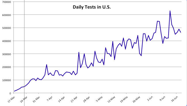
We’ve seen a continuing increase in coronavirus testing since my last “framing” post about a month ago. Testing has increased to a daily average of almost 500,000 over the past two weeks. At present we appear to have an excess supply of testing capacity in many areas, as Rich Lowry notes:

“The problem with testing nationally is becoming less a shortfall of availability of the tests and more a shortfall of people showing up to get tested. An insider in the diagnostics industry says that laboratories are reporting that they are ‘sample starved’ — i.e., they aren’t getting enough specimens. He notes, ‘We have all seen stories about sample-collection sites in some regions not seeing that many patients.’

An HHS official says that in May there was the capacity to do twice as many tests as were actually performed, calling it a function of ‘allocation and efficiency, but more just demand.’ Says Giroir, ‘We really see areas in the country now that there’s more tests available than people who want to get tested or the need for testing.'”

Before turning to some charts, a word about the data in the charts I’ve been using throughout the pandemic. Some of the nationwide information was directly from the CDC or the Johns Hopkins dashboard. In other cases, I’ve reported state level data and some nationwide data published by The COVID Tracking Project (CTP) and the COVID Time Series (CTS) dashboard, which uses state data from CTP. I first noticed a few discrepancies in the national totals in April, which have become larger with growth in the counts of cases and deaths. Here is a key part of CTP’s explanation:

“For many states, the CDC publishes higher testing numbers than the states themselves report, which raises questions about the structure and integrity of both state and federal data reporting. … Another point of contrast between the CDC’s new reporting and the official state data compiled by The COVID Tracking Project is that the CDC has not released historical, state-level testing data for the first three months of the outbreak.”

Thus, the CDC currently reports almost 120,000 U.S. deaths, while CTP reports about 112,000. Nevertheless, I will continue to report numbers from both sources for the sake of continuity, and I will try to remember to note the source in each case.

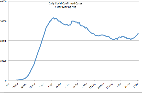
The first chart below shows the number of daily tests from CTP; the second chart shows the number of daily confirmed cases (CTP). Since mid-May, daily testing has increased by more than 50%, calculated on a moving average basis, and is now approaching half a million per day or more than 3 million per week. Pooled testing is coming, which will ultimately increase testing capacity several-fold. Daily confirmed cases have been hovered just above 20,000 since around Memorial Day, with a recent turn upward to around 24,000.

Early in the pandemic, I made the mistake of focusing too heavily on case numbers. Yes, I adjusted for population size and was aware that the initial shortage of tests was restraining diagnoses. Still, I did not foresee the great expansion in testing we’ve witnessed, the great transmissibility of the virus in some regions, nor the large number of asymptomatic cases that would ultimately be diagnosed.

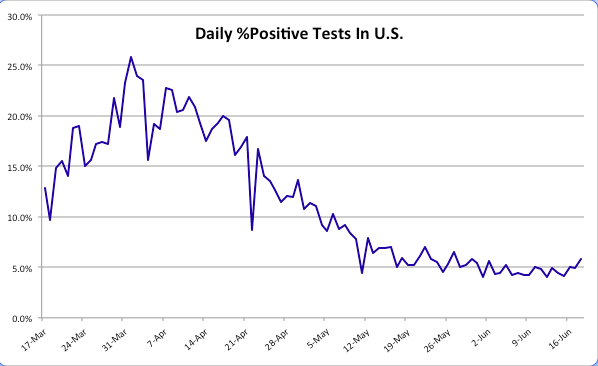
The daily percentage of positive tests (CTP), which is smoothed in the chart below using a seven-day moving average to eliminate within-week variability, has declined gradually since early April to about 4% before the uptick in the last few days. Still, that’s a drop of about 75% from the peak when tests were in very short supply. Those were days when even heavily symptomatic individuals were having trouble getting tested.

We’d hope to see a resumption in the decline of the positive percentage as testing continues to grow, but even with a relatively constant positivity rate, the number of daily confirmed cases must grow as testing expands. There may be several reasons the positivity rate has remained stubbornly near 5% over the past few weeks. One is the obvious reversal in social distancing as states have opened up. People became less fearful about the virus in general, and protesters jammed the streets after the George Floyd murder in Minneapolis. Another reason is that there are new areas of focus for testing that might be picking up cases. For example, hospitals in some states are now testing all admissions for COVID-19. This will tend to pick up more infections to the extent that individuals with co-morbidities are hospitalized at higher rates in general and are also more susceptible to the coronavirus. Finally, testing more broadly is likely to pick up a larger share of asymptomatic cases even as the “true rate” of infection declines.

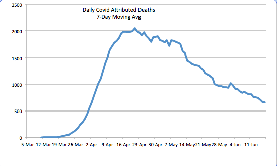
The daily death toll (CTP) attributed to coronavirus has continued to decline. See below. It is now running at about a third of the peak level it reached in mid-April. There are several reasons for the decline. One is the lower number of active cases, changes in which lead deaths by a few weeks. Awareness and testing capacity have undoubtedly led to earlier diagnosis of the most severe cases. There is also the strong possibility that the virus, having felled some of the most susceptible individuals, is now up against more hosts with effective immune responses. An ongoing degree of social distancing, more humid weather, and more direct sunlight have probably reduced initial viral loads from those experienced early-on, when the case load was escalating. Finally, treatment has improved in multiple ways, and there are now a few medications that have shown promise in shortening the duration and severity of infection.

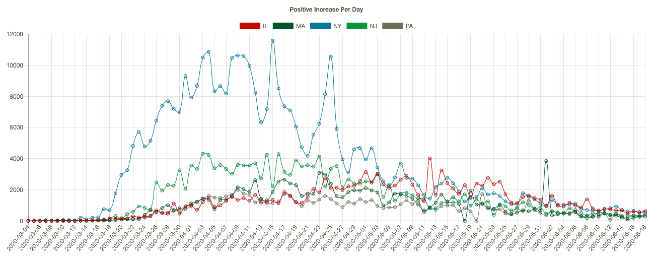
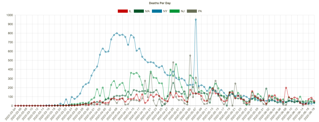
The course of the pandemic has varied greatly across countries and across regions of the U.S. The New York City area was especially hard hit along with several other large cities, as well as Louisiana. CTS shows that states with the highest cumulative number of coronavirus deaths (New York (blue line), New Jersey (green), Massachusetts, Illinois, and Pennsylvania in the charts below) have experienced downward trends in positive cases per day (the first chart below), leading daily deaths downward in May and early June (the second chart — NY’s downtrend began earlier). I apologize if the charts below are difficult to read, but they have resisted my efforts at resizing. Note: I’m mainly focused on trends here, and I have not shown these series on a per capita basis.

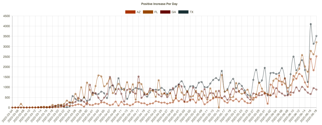
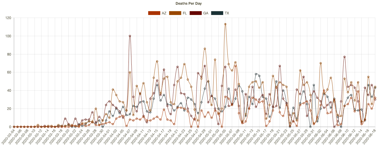
More recently, almost two dozen states have begun to see higher daily case diagnoses. Several of these had more favorable outcomes in the early months of the pandemic and were in more advanced stages of reopening. The charts below (CTS) show results for Arizona, Florida, Georgia, and Texas. The new “hot spots” in these states are mostly urban centers. It’s not clear that the reopenings are to blame, however. The protests after George Floyd’s murder may have contributed in cities like Houston, though no increase in New York is apparent as yet. The states in the chart are all in the south or southwest, so the increases have occurred despite sunny, warm conditions. It’s possible that hot weather has prompted more intensive use of air conditioning, which dries indoor environments and can promote the spread of the virus. These southern states have not yet experienced a corresponding increase in deaths, though that would occur with a lag. 

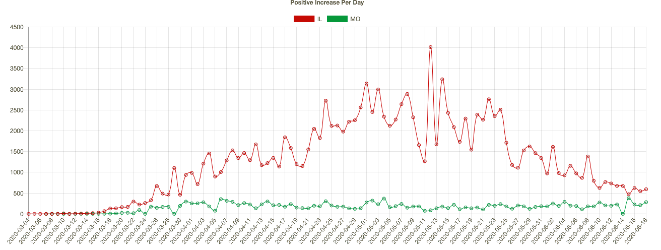
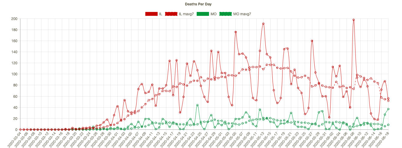
Missouri has seen an slow upward trend in its daily positive test count over the past four weeks, even though the state’s positive rate has trended down slowly since early May. I show MO’s confirmed cases per day below (in green) together with Illinois’ (because my hometown is on the border and the two states are a nice contrast). IL is much larger and has had a much higher case load, but the downward trend in new cases in IL is impressive. Coronavirus deaths per day are shown in the second chart below, with seven-day averages superimposed. Deaths have also trended down in both states, though MO has experienced a few bad days very recently, and MO’s case fatality rate is slightly higher than in IL.

We’ll know fairly soon whether we’re really headed for a second major wave. However, the case count, in and of itself, is not too informative. Testing has increased markedly, so we would expect to see more cases diagnosed. The percent of tests that are positive is a better indicator, and it has flattened at a still uncomfortable 5% for about a month, with a slight uptick in the past few days. Even more telling will be the future path of coronavirus deaths. My expectation is that more recent infections are likely to be less deadly, if only because of the lessons learned about protecting the care-bound elderly. I also believe we’re not too far from what I have called effective herd immunity. 

The pandemic has taken a heavy toll, especially among the aged. In fact, total deaths in the U.S. have now exceeded both the Hong Kong flu of the late 1960s and the Asian flu of the late 1950s. Unfortunately, risks will remain elevated for some time. However, any reasonable estimate of the life-years lost is considerably less than in those earlier pandemics due to the differing age profiles of the victims. In any case, the coronavirus pandemic has not been the kind of apocalyptic event that was originally feared and erroneously predicted by several prominent epidemiological models. It can be tackled effectively and at much lower cost by focusing resources on protecting vulnerable segments of the population. 

.

Coronavirus “Framing” Update

28 Saturday Mar 2020

Posted by pnoetx in Pandemic

≈ 2 Comments

Tags

Cloroquine, Coronavirus Task Force, Covid-19, Dr. Anthony Fauci, Dr. Deborak Birx, Excess Mortality, Insights & Outliers, Johns Hopkins, Lesswrong, Mitigation, Remediation

This is an update of my coronavirus “framing” post from early last Sunday morning, March 22. Before I say anything about the experience since then, there is great alarm in the media about the absolute number of diagnosed cases, and some parties are doing their best to exploit that alarm. So please, at least as a start, DIVIDE BY COUNTRY POPULATION if you want to make accurate cross-country comparisons, as in the illustration below from Business Insider, or put the absolute number of cases in a normalized context, as I did in my post last weekend. The numbers below are for confirmed cases, and it takes 10,000 per million to reach 1% of the population. So all major countries are well below that level. Things are much less certain if you want to think in terms of total infections, including the asymptomatic or as yet undiagnosed. Estimates range from 5 to nearly 20 times the number of confirmed cases, so you can multiply by 10 as a start.

I was getting case numbers from a “dashboard” at Insights & Outliers, but this week they had trouble because Johns Hopkins stopped reporting a certain data element, and they seem to have stopped updating the dashboard. I’ve reverted to taking the daily totals directly from Johns Hopkins. I try to take the number relatively late in the evening, usually no earlier than 11 p.m. EDT, but it’s possible that an audit would find that my numbers have a few cases shifted to the next day…. except for tonight, when I didn’t get the number until 12:45 a.m. EDT on Saturday. I was watching a good movie!! If you want to do a deep dive on Covid-19 data, there are now a number of very good sources and dashboards available.

The daily number of new confirmed cases of coronavirus in the U.S. has accelerated since last Saturday. That was expected given the slow start of testing in the U.S.; eliminating the backlog of qualified test requests might still be constrained by bottlenecks in processing results, but let’s hope not. On Wednesday evening, Dr. Deborah Birx of President Trump’s Coronavirus Task Force stated that the backlog might be eliminated very soon. I hope we’ll catch-up within just a few days, and that might be accompanied by a decrease in daily cases, which would also be a very good sign the spread won’t be as severe as in many other countries. Continued acceleration in the daily number of new cases for more than another week would be worrisome, leaving more uncertainty about the ultimate breadth of the spread.

 Updated versions of the chart and data I posted last Sunday appear below. The actual number of confirmed cases (the red line) has climbed above what I called the “very good” scenario. This time, I “zoomed in” on the chart to get a better view of actual cases relative the two extreme scenarios.

Just to review: day zero in the chart was March 6th. The “very good” scenario (green line) would ultimately involve a maximum rate of confirmed diagnoses in the U.S. of 0.017% of the U.S. population, or 0.17% if 90% of infections are undiagnosed. That was 2.5x the South Korean experience as of last weekend. The “very bad” scenario (blue line) implies a maximum rate of diagnosis of 0.077% of the population, or 0.77% including undiagnosed cases, which was about 4x the Italian experience as of six days ago. I’ll update those extremes next time as well.   

The daily growth rate of confirmed cases in the U.S. has declined from about 40% a week ago to about 22.5% on Friday, despite increasing numbers of new cases. (I will put the growth rate on the chart next time.) The red curve in the chart will start to bend to the right as the growth rate continues to decline, but we don’t know how soon that will happen. This uncertainty is exacerbated by the presence of any remaining backlog.

The following is a screen shot of an interactive chart showing an epidemiological model of coronavirus infection prevalence. It is shown here for the U.S. under “weak” global mitigation. At the site, you can select other countries and different levels of global mitigation. Curves are shown for different assumptions about the seasonal pattern of coronavirus as well as reductions in global air travel. Unfortunately, while extremely interesting, it leaves much to the imagination, such as what “moderate global mitigation” really means. Try the “moderate” setting if you’re curious to see how it changes.

I don’t want to overemphasize any of the numbers in this chart. My point in sharing it is that prevalence declines drastically in the late spring and early summer in all scenarios. Of course, I’m not sure whether the estimates of total prevalence, the seasonal effect, or the mitigation effect are at all accurate, but on the whole I found the range of scenarios available at the site reassuring. 

We might have early indications of the efficacy of certain treatments under testing within the next week or so, some of which were already being legally administered off-label. (Dr. Anthony Fauci of the President’s Task Force, who I find generally likable, misrepresented the facts by implying that the FDA had acted this week to allow the use of Chloroquine. It was already allowed off-label.) Those treatments might help limit the virus’s spread in some cases (the prophylactic effect) and otherwise treat the infection.

The U.S. coronavirus mortality rate, which is now about 1.3% of confirmed cases, remains low in the U.S. relative to most other countries (see chart below, which is one day old). Of course, we don’t know the “real” mortality rate because so many undiagnosed cases are missing from the denominator. But one thing we know for certain is the real mortality rate is much lower than what we can measure by dividing deaths by confirmed cases.

Here’s more food for thought: most coronavirus deaths involve individuals with serious co-morbidities like diabetes, respiratory problems, and heart disease. Most fatalities are of advanced age. Mortality among these groups is high to begin with, so it’s worthwhile to ask about the marginal effect of coronavirus on mortality rates. This article does just that. There is certainly overlap between coronavirus deaths and the set of individuals who would have died anyway during any time period. That doesn’t mean coronavirus doesn’t cost lives, but it’s a pertinent question. 


Follow Sacred Cow Chips on WordPress.com

Recent Posts

  • Rejecting Fossil Fuels at Our Great Peril
  • The Fed’s Balance Sheet: What’s the Big Deal?
  • Collectivism Is Not the “Natural” State
  • Social Insurance, Trust Fund Runoff, and Federal Debt
  • Critical Gender Theory and Trends in Gender Identity

Archives

  • May 2022
  • April 2022
  • March 2022
  • February 2022
  • January 2022
  • December 2021
  • November 2021
  • October 2021
  • September 2021
  • August 2021
  • July 2021
  • June 2021
  • May 2021
  • April 2021
  • March 2021
  • February 2021
  • January 2021
  • December 2020
  • November 2020
  • October 2020
  • September 2020
  • August 2020
  • July 2020
  • June 2020
  • May 2020
  • April 2020
  • March 2020
  • February 2020
  • January 2020
  • December 2019
  • November 2019
  • October 2019
  • September 2019
  • August 2019
  • July 2019
  • June 2019
  • May 2019
  • April 2019
  • March 2019
  • February 2019
  • January 2019
  • December 2018
  • November 2018
  • October 2018
  • September 2018
  • August 2018
  • July 2018
  • June 2018
  • May 2018
  • April 2018
  • March 2018
  • February 2018
  • January 2018
  • December 2017
  • November 2017
  • October 2017
  • September 2017
  • August 2017
  • July 2017
  • June 2017
  • May 2017
  • April 2017
  • March 2017
  • February 2017
  • January 2017
  • December 2016
  • November 2016
  • October 2016
  • September 2016
  • August 2016
  • July 2016
  • June 2016
  • May 2016
  • April 2016
  • March 2016
  • February 2016
  • January 2016
  • December 2015
  • November 2015
  • October 2015
  • September 2015
  • August 2015
  • July 2015
  • June 2015
  • May 2015
  • April 2015
  • March 2015
  • February 2015
  • January 2015
  • December 2014
  • November 2014
  • October 2014
  • September 2014
  • August 2014
  • July 2014
  • June 2014
  • May 2014
  • April 2014
  • March 2014

Blogs I Follow

  • Passive Income Kickstart
  • OnlyFinance.net
  • TLC Cholesterol
  • Nintil
  • kendunning.net
  • DCWhispers.com
  • Hoong-Wai in the UK
  • Marginal REVOLUTION
  • CBS St. Louis
  • Watts Up With That?
  • Aussie Nationalist Blog
  • American Elephants
  • The View from Alexandria
  • The Gymnasium
  • Public Secrets
  • A Force for Good
  • ARLIN REPORT...................walking this path together
  • Notes On Liberty
  • troymo
  • SUNDAY BLOG Stephanie Sievers
  • Miss Lou Acquiring Lore
  • Your Well Wisher Program
  • Objectivism In Depth
  • RobotEnomics
  • Orderstatistic

Blog at WordPress.com.

Passive Income Kickstart

OnlyFinance.net

Financial Matters!

TLC Cholesterol

Nintil

To estimate, compare, distinguish, discuss, and trace to its principal sources everything

kendunning.net

The future is ours to create.

DCWhispers.com

Hoong-Wai in the UK

A Commonwealth immigrant's perspective on the UK's public arena.

Marginal REVOLUTION

Small Steps Toward A Much Better World

CBS St. Louis

News, Sports, Weather, Traffic and St. Louis' Top Spots

Watts Up With That?

The world's most viewed site on global warming and climate change

Aussie Nationalist Blog

Commentary from a Paleoconservative and Nationalist perspective

American Elephants

Defending Life, Liberty and the Pursuit of Happiness

The View from Alexandria

In advanced civilizations the period loosely called Alexandrian is usually associated with flexible morals, perfunctory religion, populist standards and cosmopolitan tastes, feminism, exotic cults, and the rapid turnover of high and low fads---in short, a falling away (which is all that decadence means) from the strictness of traditional rules, embodied in character and inforced from within. -- Jacques Barzun

The Gymnasium

A place for reason, politics, economics, and faith steeped in the classical liberal tradition

Public Secrets

A 93% peaceful blog

A Force for Good

How economics, morality, and markets combine

ARLIN REPORT...................walking this path together

PERSPECTIVE FROM AN AGING SENIOR CITIZEN

Notes On Liberty

Spontaneous thoughts on a humble creed

troymo

SUNDAY BLOG Stephanie Sievers

Escaping the everyday life with photographs from my travels

Miss Lou Acquiring Lore

Gallery of Life...

Your Well Wisher Program

Attempt to solve commonly known problems…

Objectivism In Depth

Exploring Ayn Rand's revolutionary philosophy.

RobotEnomics

(A)n (I)ntelligent Future

Orderstatistic

Economics, chess and anything else on my mind.

  • Follow Following
    • Sacred Cow Chips
    • Join 120 other followers
    • Already have a WordPress.com account? Log in now.
    • Sacred Cow Chips
    • Customize
    • Follow Following
    • Sign up
    • Log in
    • Report this content
    • View site in Reader
    • Manage subscriptions
    • Collapse this bar
 

Loading Comments...