• About

Sacred Cow Chips

Sacred Cow Chips

Monthly Archives: April 2020

Covid “Framing” #5: Crested Wave

28 Tuesday Apr 2020

Posted by Nuetzel in Pandemic

≈ Leave a comment

Tags

Coronavirus, Covid Tracking Project, Covid-19, IHME Model, Institute for Health Metrics and Evaluation, Italy Covid, Johns Hopkins Dashboard, Missouri Covid, New York Covid, Private Testing, South Korea Covid, Testing and Tracing

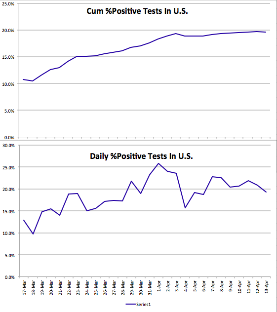
One big change in recent national Covid trends has to do with testing. In the past week, the number of daily tests has increased by an average of over 50%. That’s shown in the first chart below. Regardless of whether the individuals being tested meet the earlier testing criteria, there are still plenty of people who either want to get tested or are being tested for occupational reasons. Nonetheless, there are reports of unused testing capacity at private labs and universities. Further increases in testing are in the offing, especially if those desiring tests are made aware of their availability.

Increased testing has been accompanied by further declines in the percentage of positive tests. That’s certainly a good thing, but it’s not clear how much of the decline can be attributed to declining transmissions, as opposed to broadened testing criteria.

Coronavirus deaths in the U.S. have also begun to taper. The black line below plots cumulative Covid-attributed deaths the U.S. up through April 28. The red line is the IHME model projection from April 2nd, with upper and lower confidence bounds shown by the blue and green lines, respectively. Despite the notorious broadening of the definition of a Covid death a few weeks ago, the cumulative death toll has remained below the mean IMHE projection. 

More bad news is that the number of confirmed coronavirus cases continues to mount. Of course, that is a consequence of broader testing and possibly some arbitrary classifications as well. My previous coronavirus “framing” posts (#1 from March 18th is here, #4 is here ) usually featured a chart like the one below, which shows the number of cumulative confirmed cases of Covid-19 in the U.S. Day 1 in the chart was March 4th, so tonight, April 28th, we’re 55 days in. The blue and green lines are what I originally called “pretty bad” and “very good” outcomes, based on multiples of Italy and South Korea as of March 18th, as a share of their respective populations. Italy’s case count kept climbing after that, but its growth has now slowed considerably.

The U.S. case count has increased dramatically, now exceeding the original “very bad” case curve I plotted in mid-March. Has the U.S. fared as poorly as that seems to suggest? As of April 28, the U.S. has performed about three times as many tests as Italy, and it has identified about 10% fewer cases per capita. If we excluded the state of New York, which accounts for 5.7% of U.S. population but fully 30% of U.S. Covid cases through April 28th, U.S. Covid incidence would be well below Italy’s. However, Italy is still perhaps two weeks ahead of us.

The next chart examines New York’s experience relative to all other states. The blue line is the number of daily confirmed cases in the U.S., and the red line is the U.S. excluding New York state. The vertical gap between the two lines is the daily case count for New York. The fluctuating, slight downward trend in the U.S since about April 10th is largely attributable to improvement in New York. The rest of the country, while not as serious as New York in terms of incidence, is still on a plateau.

The next chart shows daily Covid-attributed deaths for the U.S. (blue), the U.S excluding New York state (red), and New York state (green). The source of this data is the Covid Tracking Project, which reports numbers as of 4 p.m. each day, so it differs from the daily numbers reported by the Johns Hopkins Dashboard. There are a few interesting things to note here. First, New York has accounted for a major share of daily deaths, though its share is diminishing. The decline in New York Covid deaths has been a major positive development over the past few weeks. The pattern of deaths for the U.S. is kind of fascinating: It shows a distinct weekly frequency, with declines over weekends and spikes early in each week. I suspect this is based on the data elements used by the Tracking Project, perhaps based on reporting dates rather than actual times of death. New York does not show that kind of pattern, but I’ve heard that the reporting system there is highly efficient. We might have seen a favorable turn in U.S. daily fatalities over the past week. After the peak early this week, the daily count is likely to decline again over the next few days. We can hope the weekly spikes and valleys reach lower levels as we get into May.

Finally, a couple of charts updating the status of the pandemic in Missouri, my home state. Despite some volatility, new cases continue to taper.

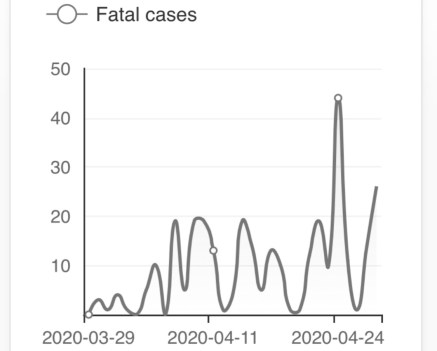
Missouri Covid fatalities are extremely volatile. It’s hard to see the kind of “weekend” phenomenon so apparent in the U.S. aggregate shown earlier. With a couple of recent spikes, it’s difficult to say anything conclusive about the course of daily fatalities based on the chart below. However, as fewer new cases are diagnosed in Missouri, the number of fatalities will follow.

So, what’s the new “framing”? I expect U.S. case counts to continue to climb with more extensive testing. If the most vulnerable individuals remain quarantined or at least carefully distanced, then individuals presenting symptoms will continue to fall, so the rate of new positive will decline. Additions to the case count will come increasingly from the asymptomatic who happen to be tested for occupational reasons, for travel abroad, and ultimately for testing and tracing efforts. Improved light and humidity is likely to cut into the rising case count as June approaches. With any luck it will become negligible along with fatalities. We’ll continue to learn as well. The hope is that a few treatments or even a vaccine will prove out. Test results for a few of the latter might be available as early as September.

Social Distancing Largely a Private Matter

26 Sunday Apr 2020

Posted by Nuetzel in Liberty, Pandemic, Uncategorized

≈ 1 Comment

Tags

Andrew Cuomo, Anthony Fauci, Bill De Blasio, Centre for Economic Policy Research, Donald Trump, Externalities, Heterogeneity, Laissez Faire, Lockdowns, Nancy Pelosi, Points of Interest, Private Governance, Safegraph, Social Distancing, Social Welfare, Stay-at-Home Orders, Wal Mart, WHO

How much did state and local governments accomplish when they decided to issue stay-at-home orders? Perhaps not much. That’s the implication of data presented by the authors of “Internal and external effects of social distancing in a pandemic” (starts on page 22 in the linked PDF). Social distancing began in the U.S. in a series of voluntary, private actions. Government orders merely followed and, at best, reinforced those actions, but often in ham-handed ways.

The paper has a broader purpose than the finding that social distancing is often a matter of private initiative. I’ll say a bit more about it, but you can probably skip the rest of this paragraph without loss of continuity. The paper explores theoretical relationships between key parameters (including a social distancing construct) and the dynamics of a pandemic over time in a social welfare context. The authors study several alternatives: a baseline in which behavior doesn’t change in any way; a “laissez faire” path in which actions are all voluntary; and a “socially optimal” path imposed by a benevolent and all-knowing central authority (say what???). I’d offer more details, but I’ll await the coming extension promised by the authors to a world in which susceptible populations are heterogenous (e.g., like Covid-19, where children are virtually unaffected, healthy working age adults are roughly as at-risk as they are to the flu, and a population of the elderly and health-compromised individuals for which the virus is much more dangerous than the flu). In general, the paper seems to support a more liberalized approach to dealing with the pandemic, but that’s a matter of interpretation. Tyler Cowen, who deserves a hat-tip, believes that reading is correct “at the margin”.

Let’s look at some of the charts the authors present early in the paper. The data on social distancing behavior comes from Safegraph, a vendor of mobility data taken from cell phone location information. This data can be used to construct various proxies for aggregate social activity. The first chart below shows traffic at “points of interest” (POI) in the U.S. from March 8 to April 12, 2020. That’s the blue line. The red line is the percentage of the U.S. population subject to lockdown orders on each date. The authors explain the details in the notes below the chart:

Clearly POI visits were declining sharply before any governments imposed their own orders. The next two charts show similar declines in the percent of mobile devices that leave “home” each day (“home” being the device’s dominant location during nighttime hours) and the duration over which devices were away from “home”, on average.

So all of these measures of social activity began declining well ahead of the government orders. The authors say private social distancing preceded government action in all 50 states. POI traffic was down almost 40% by the time 10% of the U.S. population was subject to government orders, and those early declines accounted for the bulk of the total decline through April 12. The early drops in the two away-from-home measures were 15-20%, again accounting for well over half of the total decline.

The additional declines beyond that time, to the extent they can be discerned, could be either trends that would have continued even in the absence of government orders or reinforcing effects the orders themselves. This does not imply that lockdown orders have no effects on specific activities. Rather, it means that those orders have minor incremental effects on measures of aggregate social activity than the voluntary actions already taken. In other words, the government lockdowns are largely a matter of rearranging the deck chairs, or, that is to say, their distribution.

Many private individuals and institutions acted early in response to information about the virus, motivated by concerns about their own safety and the safety of family and friends. The public sector in the U.S. was not especially effective in providing information, with such politicos as President Donald Trump, Nancy Pelosi, Andrew Cuomo, Bill De Blasio, and the mayor of New Orleans minimizing the dangers into the month of March, and some among them encouraging people to get out and celebrate at public events. Even Anthony Fauci minimized the danger in late February (not to mention the World Health Organization). In fact, “the scientists” were as negligent in their guidance as anyone in the early stages of the pandemic.

When lockdown orders were issued, they were often arbitrary and nonsensical. Grocery stores, liquor stores, and Wal Mart were allowed to remain open, but department stores and gun shops were not. Beaches and parks were ordered closed, though there is little if any chance of infection outdoors. Lawn care services, another outdoor activity, were classified as non-essential in some jurisdictions and therefore prohibited. And certain personal services seem to be available to public officials, but not to private citizens. The lists of things one can and can’t buy truly defies logic.

In March, John W. Whitehead wrote:

“We’re talking about lockdown powers (at both the federal and state level): the ability to suspend the Constitution, indefinitely detain American citizens, bypass the courts, quarantine whole communities or segments of the population, override the First Amendment by outlawing religious gatherings and assemblies of more than a few people, shut down entire industries and manipulate the economy, muzzle dissidents, ‘stop and seize any plane, train or automobile to stymie the spread of contagious disease,’…”

That is fearsome indeed, and individuals can accomplish distancing without it. If you are extremely risk averse, you can distance yourself or take other precautions to remain protected. You can either take action to isolate yourself or you can decide to be in proximity to others. The more risk averse among us will internalize most of the cost of voluntary social distancing. The less risk averse will avoid that cost but face greater exposure to the virus. Of course, this raises questions of public support for vulnerable segments of the population for whom risk aversion will be quite rational. That would certainly be a more enlightened form of intervention than lockdowns, though support should be offered only to those highly at-risk individuals who can’t support themselves.

Christopher Phelan writes of three rationales for the lockdowns: buying time for development of a vaccine or treatments; reducing the number of infected individuals; and to avoid overwhelming the health care system. Phelan thinks all three are of questionable validity at this point. A vaccine might never arrive, and Phelan is pessimistic about treatments (I have more hope in that regard). Ultimately a large share of the population will be infected, lockdowns or not. And of course the health care system is not overwhelmed at this point. Yes, those caring for Covid patients are under a great stress, but the health care system as a whole, and patients with other maladies, are currently suffering from massive under-utilization.

If you wish to be socially distant, you are free to do so on your very own. Individuals are quite capable of voluntary risk mitigation without authoritarian fiat, as the charts above show. While private actors might not internalize all of the external costs of their activities, government is seldom capable of making the appropriate corrections. Coercion to enforce the kinds of crazy rules that have been imposed during this pandemic is the kind of abuse of power the nation’s founders intended to prevent. Reversing those orders can be difficult, and the precedent itself becomes a threat to future liberty. Nevertheless, we see mounting efforts to resist by those who are harmed by these orders, and by those who recognize the short-sighted nature of the orders. Private incentives for risk reduction, and private evaluation of the benefits of social and economic activity, offer superior governance to the draconian realities of lockdowns.

Spanish Flu: No Guide for Covid Lockdowns

25 Saturday Apr 2020

Posted by Nuetzel in Pandemic

≈ Leave a comment

Tags

Cost of Lost Output, Covid-19, Cytokine Storm, Economic Costs, Excess Mortality, Herd Immunity, Life-Years, Lockdown, Non-Prescription Measures, Novel Coronavirus, Pandemic, Quarantines, Reason.com, Serological Testing, Skilled Care, Social Distancing, South Korea, Spanish Flu, World War I

The coronavirus pandemic differs in a few important ways from the much deadlier Spanish flu pandemic of 1918-19. Estimates are that as much as 1/3rd of the world’s population was infected during that contagion, and the case fatality rate is estimated to have been 10-20%. The current pandemic, while very serious, will not approach that level of lethality.

Another important difference: the Spanish Flu was very deadly among young adults, whereas the Coronavirus is taking its greatest toll on the elderly and those with significant co-morbidities. Of course, the Spanish Flu infected a large number of soldiers and sailors, many returning from World War I in confined conditions aboard transport vessels. A major reason for its deadliness among young adults, however, is thought to be the “cytokine storm“, or severe inflammatory response, it induced in those with strong immune systems.

It’s difficult to make a perfect comparison between the pandemics, but the charts below roughly illustrate the contrast between the age distribution of case mortality for the Spanish Flu in 1918, shown in the first chart, and Covid-19 in the second. The first shows a measure of “excess mortality” for each age cohort as the vertical gap between the solid line (Spanish flu) and the dashed line (the average of the seven previous seasons for respiratory diseases). Excess mortality was especially high among those between the ages of 15 and 44.

The second chart is for South Korea, where the Covid-19 pandemic has “matured” and was reasonably well controlled. We don’t yet have a good measure of excess case mortality for Covid-19, but it’s clear that it is most deadly among the elderly population. Not to say that infected individuals in younger cohorts never suffer: they are a higher proportion of diagnosed cases, severe cases are of extended duration, and some of the infected might have to deal with lasting consequences.

One implication of these contrasting age distributions is that Covid-19 will inflict a loss of fewer “life years” per fatality. If the Spanish flu’s median victim was 25 years old, then perhaps about 49 life years were lost per fatality, based on life expectancies at that time. At today’s life expectancies, it might be more like 54 years. if Covid-19’s median victim is 70 years old, then perhaps 15 life-years are lost per fatality, or about 73% less. And that assumes the the median Covid victim is of average health, so the loss of life years is probably less. But what a grisly comparison! Any loss is tragic, but it is worth noting that the current pandemic will be far less severe in terms of fatalities, excess mortality (because the elderly always die at much higher rates), and in life-years lost.

Is that relevant to the policy discussion? It doesn’t mean we should throw all caution to the wind. Ideally, policy would save lives and conserve life-years. We’d always put children on the lifeboats first, after all! But in this case, younger cohorts are the least vulnerable.

The flu pandemic of 1918-19 is often held to support the logic of non-prescription public health measures such as school closures, bans on public gatherings, and quarantines. Does the difference in vulnerabilities noted above have any bearing on the “optimal” level of those measures in the present crisis? Some argue that while a so-called lockdown confers health benefits for a Spanish flu-type pandemic in which younger cohorts are highly vulnerable, that is not true of the coronavirus. The young are already on lifeboats having few leaks, as it were.

My view is that society should expend resources on protecting the most vulnerable, in this case the aged and those with significant co-morbidities. Health care workers and “first responders” should be on the list as well. If well-targeted and executed, a Covid-19 lockdown targeted at those groups can save lives, but it means supporting the aged and afflicted in a state of relative isolation, at least until effective treatments or a vaccine prove out. A lockdown might not change living conditions greatly for those confined to skilled care facilities, but much can be done to reduce exposure among those individuals, including a prohibition on staff working at multiple facilities.

Conversely, the benefits of a lockdown for younger cohorts at low risk of death are much less compelling for Covid-19 than might be suggested by the Spanish flu experience. In fact, it can be argued that a complete lockdown denies society of the lowest-hanging fruit of earlier herd immunity to Covid-19. Younger individuals who have more social and economic contacts can be exposed with relative safety, and thus self-immunized, as their true mortality rate (including undiagnosed cases in the denominator) is almost zero to begin with.

Then we have the economic costs of a lockdown. Idle producers are inherently costly due to lost output, but idle non-producers don’t impose that cost. For Covid-19, prohibiting the labor of healthy, working age adults has scant health benefits, and it carries the high economic costs of lost output. That cost is magnified by the mounting difficulty of bringing moribund activities back to life, many of which will be unsalvageable due to insolvency.

The lockdown question is not binary. There are ways to maintain at least modest levels of production in many industries while observing guidelines on safety and social distancing. In fact, producers are finding inventive ways of maximizing both production and safety. They should be relied upon to create these solutions. The excess mortality rates associated with this pandemic will continue to come into focus at lower levels with more widespread serological testing. That will reinforce the need for individual autonomy in weighing risks and benefits. Hazards are always out there: reckless or drunk drivers, innumerable occupational hazards, and the flu and other communicable diseases. Protect yourself in any way you see fit, but if you are healthy, please do so without agitating for public support from the rest of us, and without imposing arbitrary judgments on which activities carry acceptable risk for others.


A Look at Covid-19 Cases in Missouri

21 Tuesday Apr 2020

Posted by Nuetzel in Pandemic

≈ 2 Comments

Tags

Bing, Confirmed Cases, Coronavirus, Covid Tracker, Covid-19, Fatalities, Log Scale, Microsoft, Missouri, Pandemic, St. Louis MO/IL Metro

This is a quick post for Missouri readers. It’s well known that the coronavirus pandemic has differed in its severity across the world and across the country. I’ve been focusing on nationwide statistics, but I thought it would be interesting to look at my home state’s progress in getting ahead of the virus. The charts below are taken from the Covid Tracker from Microsoft/Bing.

The peak of new cases in Missouri appears to be behind us. The state reached a rough plateau around the beginning of April. There was some volatility in the daily numbers of conformed cases, but the a downward trend seemed to begin around the 10th.

Cumulative confirmed cases in Missouri are shown in the next chart (Oops… spelling!), but in log scale. The slope of the line can be interpreted as the growth rate. It’s still positive and will be as long as there are new confirmed cases, but it is getting small.

Daily Covid-19 fatalities in Missouri are shown next. They are obviously quite volatile from day-to-day, as might be expected. They seemed to reach a high about a week after new cases reached their plateau, which demonstrates the lag between diagnosis and death in the most severe cases. The trend has become more favorable over the past week, though another jump in deaths was reported today.

The following chart shows cumulative Missouri fatalities in log scale. The curve is flattening (growth rate slowing), but it might take a few weeks for fatalities to stay in the very low single digits day after day.

The St. Louis metro area has had the largest concentration of cases and fatalities in Missouri. St. Louis County, St. Louis City, and St. Charles County are ranked #1 – #3 in the state, respectively. Here are the top ten counties in terms of this grim statistic (I’m sorry for the poor alignment).

County                 Cases       Deaths

St. Louis               2,333       91 (3.90%)
St. Louis City           877       21 (2.39%)
St. Charles              458       15 (3.28%)
Jackson                   438       13 (2.97%)
Jefferson.                230         3 (1.30%)
Franklin.                  102         5 (4.90%)
Boone                       96         1 (1.04%)
Greene.                    84          7 (8.33%)
Clay                          61         1 (1.64%)
Cass                         54          6  (11.1%)

I wanted to take a closer look at the pattern of cases in the metro area over time. Last night I found daily county-level case data on my phone. I thought I’d be able to download it tonight, but the site has been uncooperative. Maybe later.

Missouri looks like it’s on the back end of the curve, at least for this wave of the pandemic. We can hope there won’t be a second wave, or if there is, that it will be more manageable.


Lockdown-Righteous Morons Condemn Beachgoers

19 Sunday Apr 2020

Posted by Nuetzel in Liberty, Pandemic, Public Health

≈ Leave a comment

Tags

Aerosols, Close Talkers, Confined Space, Coronavirus, Covid-19, Dr. Christopher Gill, Droplets, Huggers, Humidity, HVAC, Indoor Transmission, Jacksonville, Outdoor Transmission, Public Health, SARS-CoV-2, Social Media, Time Magazine, Ultraviolet Light

I’m often inspired by social media because that’s where the sacred cows graze. Today I saw a juicy one… but actually, the linked article was not surprising: the headline claimed that Jacksonville, Florida residents were flocking to local beaches after they’d been reopened. What grabbed me were the half-witted condemnations made by the poster and his friends. One individual, a Jacksonville resident, claimed that the article was incorrect, that this was “not happening in Jax”. But many of the commenters were horrified by the accompanying photo, a view down the beach showing a number of walkers. If you’ve ever been to a beach, you probably know that such a visual perspective can exaggerate crowd conditions. They looked adequately distanced to me, and I’d bet most of the people or small groups in the photo were a good 20+ feet apart.

The comments on the post were a display of unbridled anger: those people on the beach would be sorry when they caused a second spike in coronavirus cases. How monstrous were these Jaxers to chance infecting others! A few expressed hope that the beachgoers would get sick, as if they’d learn their lesson. And in a delicious case of projection by the uninformed, the hashtag #FloridaMorons was trending on social media. These ugly, nitwitted nannies just can’t get over their need to control their fellow man, while lacking the knowledge to do so sensibly.

Not only did the people on the beach look adequately distanced to the rational eye, but unless you’re an unreformed hugger or “close talker”, the chance of contracting coronavirus outdoors is slim to none! That’s especially true on a beach, where there is typically a decent breeze.

A recent study conducted by Chinese researchers on the environments in which clusters of Covid infections were originally contracted showed that outdoor transmission is very unlikely:

“…among our 7,324 identified cases in China with sufficient descriptions, only one outdoor outbreak involving two cases occurred.”

The authors conclude that coronavirus transmission is an indoor phenomenon.

A Q&A from Time includes the question: Is there any difference between being indoors and outdoors when it comes to transmission? Here is part of the response:

“We all occupy an area in three dimensional space, and as we move away from one another, the volume of air space on which we have an impact expands enormously. ‘If you go from a 10-ft. sphere to a 20-ft. sphere you dilute the concentration [of contaminated air] eight-fold,’ says Dr. Christopher Gill, associate professor of global health at Boston University School of Public Health.”

“‘Within seconds [a virus] can be blown away,’ […] Sunlight may also act as a sterilizer, Gill says. Ultraviolet wavelengths can be murder—literally—on bacteria and viruses, though there hasn’t yet been enough research to establish what exactly the impact of sun exposure is on SARS-CoV-2, the virus responsible for COVID-19.”

There is evidence, however, that high temperatures and humidity reduce the spread of the virus (and see here). That sounds like the beach to me! Whether by droplets or aerosols, confined spaces are where transmission happens. It is almost exclusively an indoors phenomenon, aggravated by HVAC air flows that create dry conditions.

Social distancing is still important at the moment, but keeping people indoors is not conducive to public health. Most of the country (well, outside of downstate New York)  is on a path to stanching the contagion. Under these circumstances, you can expect people to push back against unreasonable demands to stay off the beach, stay off an outdoor job, or even stay off their indoor job where there is good ventilation with fresh air, and where distance can be maintained. These little social-media tyrants should pry off their jack-boots and get some sand between their toes!


Lockdown Illusions

16 Thursday Apr 2020

Posted by Nuetzel in Federalism, Liberty, Pandemic

≈ Leave a comment

Tags

CityLab, Coastal States, Coronavirus, Covid-19, Fixed Effects, International Travelers, Mood Affiliation, Pandemic, Population Density, Stay-at-Home Orders, Viral Transmission, Worldometers

Analytical sins have occurred with great regularity in popular discussions of the Covid-19 pandemic and even in more scholarly quarters. Among my pet peeves are cavalier statements about the number of cases or deaths in one country or state versus another without adjusting for population. Some of this week’s foibles also deal comparisons of the pandemic and public policy across jurisdictions, but they ignore important distinctions.

No matter how you weigh the benefits and costs of lockdowns or stay-at-home orders, there is no question that maximizing social distance can reduce the spread of the virus. But stories like this one from Kansas dispute even that straightforward conclusion. As evidence, the author presents the following table:

Now, I fully support the authority of states or local areas to make their own decisions, but this table does not constitute valid evidence that stay-at-home orders don’t reduce transmission. There are at least three reasons why the comparisons made in the table are invalid:

  1. The onset of coronavirus in these states lagged the coastal states, primarily because…
  2. These are all interior states with few direct arrivals of international travelers;
  3. These states are all more or less rural with relatively low population densities, ranking 40, 41, 42, 46, 48, 49, 52, 53, and 55 in density among all states and territories.

All of these factors lead to lower concentrations of confirmed cases and Covid deaths (though the first applies only on the front-end of the epidemic). The last two points provide strong rationale for less restrictive measures to control the spread of the virus. In fact, population density bears a close association with the incidence of Covid-19, as the table at the top of this post shows. Even within low-density states, residents of urban areas are at greater risk. That also weighs heavily against one-size-fits-all approaches to enforced distancing. But instead, the authors fall over themselves in a clumsy attempt to prove a falsehood.

Even highly-educated researchers can race to wholly unjustified conclusions, sometimes fooled by their own clever devices and personal mood affiliation. This recent study directly controls for the timing of stay-at-home orders at the county level. The researchers attempt to control for inherent differences in county transmission and other factors via “fixed effects” on case growth (which are not reported). This is an excuse for “assuming away” important marginal effects that local features and conditions might play in driving the contagion. The authors conclude that stay-at-home orders are effective in reducing the spread of coronavirus, which is fine as far as it goes. But they also leap to the conclusion that a uniform, mandatory, nationwide lockdown is the wisest course. Not only does this neglect to measure the differential impact of lockdowns by easily measured differences across counties, it also assumes that the benefits of lockdowns always exceed costs, regardless of density, demographics, and industrial composition; and that a central authority is always the best judge as to the timing and severity of a mandate.

The national crisis engendered by the coronavirus pandemic required action at all levels of government and by private institutions, not a uniform set of rules enforced by federal police power. State and local police power is dangerous enough, but better to have decisions made by local authorities who are more immediately accountable to citizens. Government certainly has a legitimate role to play in mitigating behaviors that might impose external costs on others. Providing good information about the risks of a virus might be a pivotal role for government, though governments have not acquitted themselves well in this regard during the Covid crisis.

It’s also important for federal, state and local authorities to remember that private governance is often more powerful in achieving social goals than public rule-making. People make innumerable decisions every day that weigh benefits against risks, but public authorities are prone to nudging or pushing private agents into over-precautionary states of being. It’s about time to start easing up.


CDC Sows Covid Case-Fatality Confusion

15 Wednesday Apr 2020

Posted by Nuetzel in Data Integrity, Pandemic

≈ Leave a comment

Tags

Case Fatality Rate, Centers for Disease Control, Co-Morbidities, Coronavirus, Covid "Hot Spots", Covid-119, Crisis Management, Data Integrity, Death Toll, Excess Deaths, Government Accounting, Influenza, New York Deaths, Probable Deaths, Respiratory Disease, Testing Guidelines

The Centers for Disease Control has formally decided to inflate statistics on coronavirus deaths by adding so-called “probable” cases to the toll. This news follows the announcement yesterday that New York decided to add, in one day, about 4,000 deaths from over the past month to its now “probable” Covid-19 death toll. So much for clean accounting! We have a confirmed death toll up to April 14th. We have a probable death toll after. The error in timing alone introduced by this abrupt adjustment impairs efforts to track patterns of change. Case fatality rates are rendered meaningless. Data integrity, which was already weak, has been thrown out the window by our public heath authorities.

It’s no longer necessary for a deceased patient to have tested positive for Covid-19:

“A probable case or death is defined as one that meets clinical criteria such as symptoms and evidence of the disease with no lab test confirming Covid-19. It can also be classified as a probable case if there are death or other vital records listing coronavirus as a cause. A third way to classify it is through presumptive laboratory evidence and either clinical criteria or evidence of the disease.”

Consider the following:

  • to date, more than 80% of patients presenting symptoms sufficient to meet testing guidelines have tested negative for Covid-19;
  • the most severe cases of Covid-19 and other respiratory diseases are coincident with significant co-morbidities;
  • “probable” cases appear to be concentrated among the elderly and infirm, whose regular mortality rate is high.

Deaths involving mere symptoms, or mere symptoms and co-morbidities, and even deaths of undetermined cause, are now more likely to be over-counted as Covid-19 deaths. This is certain to distort, and I believe overcount, Covid-19 deaths. Of course, this was already happening in some states, as I mentioned last week in “Coronavirus Controversies“.

One of the charts I’ve presented in my Continue%20reading Coronavirus “Framing” posts tracks Covid-19 deaths. The change in these cause-of-death guidelines will make continued tracking into something of a farce. I’d be tempted to deduct the one-day distortion caused by the New York decision, but then the count will still be distorted going forward by the broader definition of Covid-19 death.

The only possible rationale for these decisions by New York and the CDC is that testing is still subject to severe rationing. I have my doubts, as the number of daily tests has stabilized. On the other hand, I have heard anecdotes about hospitals with large numbers of respiratory patients who have not been tested! And they are intermingling all of these patients?? I’m not sure I can reconcile these reports. Surely the patients meet the guidelines for testing. Perhaps the CDC’s decision is associated with an effort to spread testing capacity by allowing only new patients to be tested, counting those already hospitalized as presumptively Covid-infected. And if they aren’t already, they will be! A decision to count deaths within that group as “probable” Covid deaths  would fit conveniently into that approach, but that would be wildly misguided and perverse.

I’m obviously cynical about the motives here. I don’t trust government accounting when it bears on the credit or blame for crisis management. Who stands to gain from a higher Covid death toll? The CDC? State health authorities? “Hot spots” vying for federal resources?

A consistent approach to attributing cause of death would have been more useful for gauging the direction of the pandemic, but as I’ve said, there will always be uncertainty about the true Covid-19 death toll. Ultimately, the best estimates will have to rely on calculations of “excess deaths” in 2020 compared to a “normal” level from a larger set of causes. In fact, even that comparison will be suspect because the flu season leading up to the Covid outbreak was harsh. Was it really the flu later in the season?

Coronavirus “Framing” Update #4

13 Monday Apr 2020

Posted by Nuetzel in economic growth, Pandemic

≈ 2 Comments

Tags

Centre for Translational Data Science, Confirmed Cases, Coronavirus, Covid-19, Death Toll, Epidemiological Models, Herd Immunity, IMHE, Murray Model, Pandemic, Pending Tests, Test Demand, The University of Sydney

It’s beginning to look like we’ve turned a corner in mitigating the spread of the coronavirus. I hope I’m not speaking too soon.

It’s time to update some of the charts and thoughts about where the epidemic is trending in the U.S. Here’s the first of these “framing” posts I published on March 18th. The last update from about a week ago is here. The demand for tests seems to be tapering a little, and the percentage of tests that are positive has leveled and even dropped a bit. The number of confirmed cases continues to mount, but the daily increases are slowing, as is the growth rate of the cumulative count. Finally, the daily increase in the number of deaths is also slowing, and total deaths have risen more slowly than one prominent model predicted on the date at which I chose to “freeze” it for my own expositional purposes: April 2. The charts appear further below.

The epidemiological modelers have taken a real beating from many observers as their estimated virus growth curves have shifted downward. Their initial projections were way too high, and they have continued to overshoot in subsequent model revisions. In fairness, however, they didn’t have a lot to go on during the early stages of the pandemic, and conservatism was probably seen as a must. The variety and extent of mitigation measures was also an unknown, of course.

I build “event” models for a living, though the events I study are economic and are obviously much different kinds of risks than coronavirus infection. I seldom face situations in which so little historical data is available, so I can appreciate the modeling challenge presented by Covid-19: it was pretty close to an unwinnable situation. Nevertheless, until recently the projections were outrageously high. There comes a time when accurate, rather than conservative, projections are demanded. The confidence intervals produced by the modelers are really not worthy of the name. Partly on that basis, a very recent paper gave the model produced by the Institute for Health Metrics and Evaluation very poor marks (IMHE, which I called the Murray Model last week):

“In excess of 70% of US states had actual death rates falling outside the 95% prediction interval for that state…”

That’s nothing short of pathetic.

That brings me to the “framing” exercise I’ve been performing for nearly four weeks. It is not a modeling exercise. The “very good” and “pretty bad” scenarios I charted for the confirmed Covid-19 case count in the U.S. were not intended as confidence intervals except perhaps in spirit. The intent was to provide perspective on developments as they unfolded. Where to place those bounds? They were based on multiples of the Italian experience (pretty bad) and the South Korean experience (very good) as of March 18, normalized for U.S. population. Here’s the latest version of that chart, where Day 1 was March 4th:

The curve may be just starting to bend to the right. Let’s hope so. The daily growth rate of new cases has dropped below 5%. Below, it’s clear that the daily count of new confirmed cases plateaued in early April, and the last few days show an encouraging reduction.

I also think it’s telling that after a few weeks of “excess demand” for tests, demand seems to be falling. The chart below showed the sharp reduction in the “pending test” count about a week ago. It corresponded with the spike in daily tests, which have stabilized since then and may be trending down (lower panel).

The next chart shows that the cumulative share of tests with a positive diagnosis has flattened. The lower panel hints at a taper in the daily share of positive tests, which would be welcome. However, I do not necessarily expect that percentage to decline too much if the number of tests continues to fall. In fact, more testing will almost certainly be required in order to “restart” the economy. Then, we should see a reduction in the percentage of positive tests if all goes well.

The last chart highlights the IMHE model discussed above. The chart extends from March through June, though the unlabeled date axis is not cooperating with me. The mean model prediction of U.S. cumulative deaths attributed to Covid-19 is shown in red. The upper and lower bounds of the confidence interval are the blue and green lines. Again, I “froze” this forecast as of April 2 to serve as another “framing” device. Actual deaths are traced by the black line, which goes through April 13th. It is trending below the mean forecast, and IMHE has reduced their mean forecast of the death toll by about a third since April 2nd (to 60,000). Actual deaths may well come in below that level.

I hope my optimism based on these nascent developments is not unwarranted. But they are consistent with state-by-state reports of more positive trends in the data. It is time to start planning for a return to more normal times, but with a new eye toward mitigating risk that will probably involve isolating vulnerable groups when appropriate, more work at home, widespread testing, and a few other significant changes in social and business practices. It remains to be seen how easily certain industries can return to previous levels, such as hospitality, or how soon crowds can return to sporting events, concerts, and theaters. That might have to await greater levels of “herd immunity”, an effective vaccine, and fast testing.

Coronavirus Controversies

11 Saturday Apr 2020

Posted by Nuetzel in Health Care, Leftism, Pandemic

≈ 1 Comment

Tags

American Society of  Thoracic Surgeons, Anecdotal Evidence, Co-Morbidities, Coronavirus, Covid-19, Donald Trump, Dr. Anthony Fauci, Dr. Jeffrey Singer, Excess Deaths, FDA, Hydroxychloraquin, Plasma Therapy, Randomized Control Trial, Reason Magazine, Remdeivir, Replication Problem, Right-To-Try Laws, Trump Derangement Syndrome, Victoria Taft, Z-Pac, Zinc

The coronavirus and the tragedy it has wrought has prompted so many provocative discussions that it’s hard to pick just one of those topics for scarce blogging time. So I’ll try to cover two here: first, the question of whether coronavirus deaths are being miscounted; second, the politically-motivated controversy over the use of hydroxychloraquin to treat severe cases of Covid-19.

Counting Deaths

I’ve been suspicious that Covid deaths are being over-counted, but I’m no longer as sure of that. Of course, there are reasons to doubt the accuracy of the death counts. For example, there is a strong possibility that some Covid deaths are simply not being counted due to lack of diagnoses. But there are widespread suspicions that too many deaths with positive diagnoses are being counted as Covid deaths when decedents have severe co-morbidities. Members of that cohort die on an ongoing basis, but now many or all of those deaths are being attributed to Covid-19. A more perverse counting problem might occur when public health authorities instruct physicians to attribute various respiratory deaths to Covid even without a positive diagnosis! That is happening in some parts of the country.

To avoid any bias in the count, I’ve advocated tracking mortality from all co-morbidities and comparing the total to historical or “normal” levels to calculate “excess deaths”. One could also look at all-cause mortality and do the same, though I don’t think that would be quite on point. For example, traffic deaths are certainly way down, which would distort the excess deaths calculation.

Despite the vagaries in counting, there is no question that the coronavirus has been especially deadly in its brief assault on humans. New York has experienced a sharp increase in deaths, as the chart below illustrates (the chart is a corrected version of what appeared in the Reason article at the prior link). The spike is way out of line with normal seasonal patterns, and it obviously corresponds closely with deaths attributable to Covid-19. It is expected to be short-lived, but it might taper over the course of several weeks or months, Once it does, I suspect that the cumulative deaths under all those other curves in the chart will exceed Covid deaths substantially. Also note that the yellow line for the flu just stops when Covid deaths begin, suggesting that the red line probably incorporates at least some “normal” flu deaths.

Once the virus abates, we’ll be able to tell with a bit more certainty just how deadly the pandemic has been. It will be revealed through analyses of excess deaths. For now, we have the statistics we have, and they should be interpreted cautiously.

Hydrochloraquin

A more boneheaded debate centers on the use of the anti-malarial drug hydroxychloraquin (HCQ) to treat coronavirus patients. There have been many successes, particularly in combination with a Z-Pak, or zinc. Guidelines issued by the American Society of  Thoracic Surgeons last week call for HCQ’s use in advanced cases of coronavirus infection. These and other therapies are being tested formally, but many are prescribed outside any formal testing framework. Remdesivir has been prominent among these. Plasma therapy has been as well, and several other possible treatments are under study.

With respect to HCQ, it’s almost as if the Left, much of the media, and a subset of overly “prescriptive” medical experts were goaded into an irrational position via pure Trump Derangement. Just Google or Bing “Hydroxychloraquine Coronavirus” for a bizarre list of alarmist articles about Trump’s mention of HCQ. To take just two of the claims, the idea that Trump stands to earn substantial personal profits from HCQ because he holds a few equity shares in a manufacturer of generic drugs is patently absurd. And claims that shortages for arthritis, lupus, and malaria patients are imminent are unconvincing, given the massive stockpiles now accumulated and the efforts to ramp-up production.

So much lefty hair is on fire over a potential therapy that is both promising and safe that the media message lacks credulity. But more ominously, the Democrat governors of Michigan and Nevada were so petulant that they banned HCQ’s use in their states, though at least Nevada’a governor rescinded his order. It’s almost as if they don’t want it to work, and don’t want to give it a chance to work. Or do I go too far? No, I don’t think so.

Victoria Taft has a good summary of the media backlash against President Trump’s hopeful statements about HCQ. Not only was the FDA’s authority over the use of HCQ misrepresented, there was also a good bit of smearing of various researchers who’d found preliminary evidence of HCQ’s effectiveness. Let’s be honest: the quality of medical research is often inflated by the research establishment. And the media eat up any study with findings that are noteworthy in any way. Over the years, a great deal of medical research has been based on small samples from which statistical hypothesis tests are shaky at best. That’s one reason for the legendary replication problem in medical research. In the case of HCQ, there has been widespread misuse of the term “anecdotal” in the media, prompted by experts like Dr. Anthony Fauci, who should know better. The term was used to describe clinical tests on moderately large groups of patients, at least one of which was a randomized control trial.

Every day we hear stories from individual patients that they were saved by HCQ. These are properly called anecdotal accounts. But we also hear from various physicians around the country and world who claim to be astonished at HCQ’s therapeutic efficacy on groups of patients. This link gives another strong indication of how physicians feel about HCQ at this point. These are not from RCTs, but they constitute clinical evidence, not mere “anecdotes”.

By virtue of state and federal right-to-try laws, terminally ill patients can choose to take medications that are unapproved by regulators. Beyond that, FDA approval of HCQ specifically for treating coronavirus was unnecessary because the drug was already legal to prescribe to cover patients as an “off-label” use. That’s true of all drugs approved by the FDA: they can be prescribed legally for off-label uses. When regulators like Dr. Fauci, and even practicing physicians like Dr. Jeffrey Singer (linked below) claim that the FDA hasn’t approved HCQ specifically for treating Covid, it is a technicality: the FDA can certainly “approve” it for that specific use, but it’s already legal to prescribe!

While it won’t end the silly argument, which is obviously grounded in other motives, Dr. Singer brings us to the only reasonable position: treatment of Covid with HCQ is between the patient and their doctor.


Coronavirus: Framing the Next Few Weeks #3

05 Sunday Apr 2020

Posted by Nuetzel in Pandemic, Risk Management

≈ 1 Comment

Tags

80000 Hours, Chris Murray Model, Christopher Monkton, Christopher Murray, Co-morbidity, Confidence Interval, Coronavirus, Covid Tracking Project, Covid-19, Economic Restart, Indur M. Goklany, Institute for Health Metrics and Evaluation, Lockdowns, Pending Tests, Positive Test Ratio, Social Distancing, Stay-at-Home Orders, White House Coronavirus Task Force

There were a few encouraging signs of change over the past few days in the course of the coronavirus pandemic in the U.S. This is the third of my quaint efforts to provide perspective on the coronavirus pandemic with “tracking” or “framing” posts. The first two were: Coronavirus: Framing the Next Few Weeks, on March 22, and Framing Update on March 28. In both of those posts, I charted confirmed cases of Covid-19 in the U.S. along with optimistic and pessimistic scenarios. I speculated that over the course of a few weeks, social distancing would lead to a reduction in the daily number of new confirmed cases. Unfortunately, it’s not clear whether that curve has started to “bend” rightward, but new confirmed cases on Sunday, April 5 — the number of those testing positive — was down almost 30% from Saturday.

An updated version of the earlier chart appears below, accompanied by a table. The number of confirmed cases (red line) has mounted over the past week, as has the daily increase in confirmed cases, though yesterday’s number was better. The table below the chart shows that the growth rate of confirmed cases (the far right-hand column) has decelerated, but it had leveled off at about 14% over the few days before Sunday. If Sunday’s drop persists it would be encouraging. Unfortunately, even moderate growth rates are destructive when the base of confirmed cases is large. The faster the growth rate declines, the faster the curve will bend.

I did not make any changes to the original “Very Good” and “Pretty Bad” scenarios, deciding that it was better to keep them as a consistent benchmark. As of Sunday, the top of the “Very Good” curve would still be about 2.3x the North Korean experience as of Sunday night, normalized for population. The top of the “Pretty Bad” scenario (which is not visible in this “zoomed-in” version) would be about 1.4x the Italian experience thus far. South Korea’s curve flattened substantially several weeks ago, and now even Italy’s curve is showing a rightward bend. Let’s hope that continues.

The case count obviously depends on the volume of daily testing, which has been increasing rapidly. As I’ve noted before, there has been a backlog of test requests. In addition, every day there is an overhang of “pending” test results. Interestingly, the number of tests stabilized on Saturday and the number of pending test results plunged (see the next chart, which uses data from the Covid Tracking Project). We’ll see if those developments persist. It would represent a milestone because daily case counts will advance as long as tests do, and the effort to work through the backlog has been inflating the speed of the advance in confirmed cases.

Another interesting development coincident with the drop in pending tests has to do with the cumulative percentage of positive test results: it has stabilized after growing for several weeks. This might mean we’ve reached a point at which the most severe incoming cases are fewer, but we’ll have to see if the flattening persists or even declines, which would be wonderful.

I’ve been grappling with potential weaknesses of the data on confirmed cases: first, the U.S. got a late start on testing, so there was the backlog of patients requiring tests just discussed above. That was presumed to have exaggerated the acceleration in the daily totals for new cases. Second, it’s possible that a continuing transition to more rapid test results would exaggerate the daily counts of new cases. Third, It’s possible that testing criteria are being relaxed, which, despite reducing the positive test rate, would increase growth in the “official” confirmed case count. Suspected cases should be tested, of course, but the change in standards is another factor that distorts the shape of the curve.

Any published statistic has its shortcomings. All test results are subject to false positives and negatives. Hospitalizations of patients with a positive coronavirus diagnosis are subject to the measurement issues as well, though they might be driven more by the severity of symptoms and co-morbidities than a positive Covid diagnosis per se. And hospitalizations of Covid patients might be subject to inconsistencies in reporting, and so might ICU admittances. Coronavirus deaths are subject to vagaries: reporting a cause of death is dictated by various criteria when co-morbidities are involved, and those criteria differ from country to country, or perhaps even hospital to hospital and doctor to doctor! In fact, some go so far as to say that all deaths should be tracked for coronavirus plus its co-morbidities and then compared to an average of the past five to ten years to obtain an estimate of “excess deaths”, which could conceivably be negative or positive. Finally, recoveries are even more impacted by inconsistent reporting, especially because many recoveries occur at home.

I’ll be highlighting coronavirus deaths going forward, and I’ll continue to focus mainly on the U.S. and only lightly on other countries. After all, death is obviously the most negative outcome. Again, however, the count of coronavirus deaths does not account for deaths that would have occurred over the same time frame due to co-morbidities or the effect of deaths that would not have occurred absent co-morbidities.

The predictions in the chart below are from the Chris Murray Model, upon which the White House Coronavirus Task Force has focused more recently. This model was developed by Dr. Christopher Murray at the Institute for Health Metrics and Evaluation at the University of Washington. I’ll be using the forecast starting from April 2 as the basis for my “framing” of actual deaths over the next few weeks, keeping it “frozen” at that level as a new benchmark. My apologies for the absence of dates on the horizontal axis, but the origin is at March 14 and there is only a single line up through April 1. That line represents actual cumulative Covid deaths recorded in the U.S. The red line is the mean model prediction. Deaths are expected to ramp up over the next week or so, much as we’ve seen in the confirmed case count, as deaths lag behind diagnoses by anywhere from a few days up to 17 days. This model predicts an ultimate death toll of about 94,000 at the top of the mean curve (not visible on the zoomed-in chart). Above and below that line are upper (blue) and lower (green) bounds, respectively, of a “confidence interval”. It’s unlikely we’ll see cumulative deaths breach either of those bounds. The lower bound would place the ultimate death toll at about 40,000; the upper bound would place it at just under 180,000. At this point, as of Sunday, April 5, actual deaths (black) are slightly below the mean or central tendency, but that’s difficult to see in the current chart.

The ongoing lockdowns in the U.S. and around the world are exceedingly controversial. There is a very real tradeoff between the benefits of extending the length of these lockdowns and the benefits of allowing economic activity to “restart”. But do lockdowns work? Christopher Monkton offers aggregate evidence that they truly do reduce the spread of the virus in “Are Lockdowns Working?” That they would work is intuitive, and decisions to scale them back should be made cautiously for certain “high exposure” activities, and in conjunction with isolating and trace-tracking contacts of all infected individuals, as they have done successfully in countries such as Taiwan and Singapore.

There may be signs that a bend in the U.S. case curve is in the offing, perhaps over the next week or two. That timing would roughly comport with the notion that over the past three weeks, efforts at social distancing and stay-at-home orders have allowed the U.S. to limit the spread of coronavirus through the first major “round” of infections and a much more limited second round. Perhaps these efforts will largely stanch a third and subsequent rounds of infection. Ultimately, if the number of coronavirus deaths is in the neighborhood of the mean value predicted by the Murray Model, about 94,000, that would place the severity of the toll at less than two times the severity of a bad flu season, though limiting the Covid death toll will have been achieved at much higher economic cost.

There are signs elsewhere around the globe that the pandemic may be turning a corner toward more favorable trends. See “Good News About COVID-19” at 80,000hours.org for a good review.

Follow Sacred Cow Chips on WordPress.com

Recent Posts

  • The Perils of Powell: Inflation, Illiquid Banks, Lonnng Lags
  • The Dreaded Social Security Salvage Job
  • Tariffs, Content Quotas, and What Passes for Patriotism
  • Carbon Credits and Green Bonds Are Largely Fake
  • The Wasteful Nature of Recycling Mandates

Archives

  • April 2023
  • March 2023
  • February 2023
  • January 2023
  • December 2022
  • November 2022
  • October 2022
  • September 2022
  • August 2022
  • July 2022
  • June 2022
  • May 2022
  • April 2022
  • March 2022
  • February 2022
  • January 2022
  • December 2021
  • November 2021
  • October 2021
  • September 2021
  • August 2021
  • July 2021
  • June 2021
  • May 2021
  • April 2021
  • March 2021
  • February 2021
  • January 2021
  • December 2020
  • November 2020
  • October 2020
  • September 2020
  • August 2020
  • July 2020
  • June 2020
  • May 2020
  • April 2020
  • March 2020
  • February 2020
  • January 2020
  • December 2019
  • November 2019
  • October 2019
  • September 2019
  • August 2019
  • July 2019
  • June 2019
  • May 2019
  • April 2019
  • March 2019
  • February 2019
  • January 2019
  • December 2018
  • November 2018
  • October 2018
  • September 2018
  • August 2018
  • July 2018
  • June 2018
  • May 2018
  • April 2018
  • March 2018
  • February 2018
  • January 2018
  • December 2017
  • November 2017
  • October 2017
  • September 2017
  • August 2017
  • July 2017
  • June 2017
  • May 2017
  • April 2017
  • March 2017
  • February 2017
  • January 2017
  • December 2016
  • November 2016
  • October 2016
  • September 2016
  • August 2016
  • July 2016
  • June 2016
  • May 2016
  • April 2016
  • March 2016
  • February 2016
  • January 2016
  • December 2015
  • November 2015
  • October 2015
  • September 2015
  • August 2015
  • July 2015
  • June 2015
  • May 2015
  • April 2015
  • March 2015
  • February 2015
  • January 2015
  • December 2014
  • November 2014
  • October 2014
  • September 2014
  • August 2014
  • July 2014
  • June 2014
  • May 2014
  • April 2014
  • March 2014

Blogs I Follow

  • Ominous The Spirit
  • Passive Income Kickstart
  • OnlyFinance.net
  • TLC Cholesterol
  • Nintil
  • kendunning.net
  • DCWhispers.com
  • Hoong-Wai in the UK
  • Marginal REVOLUTION
  • Stlouis
  • Watts Up With That?
  • Aussie Nationalist Blog
  • American Elephants
  • The View from Alexandria
  • The Gymnasium
  • A Force for Good
  • Notes On Liberty
  • troymo
  • SUNDAY BLOG Stephanie Sievers
  • Miss Lou Acquiring Lore
  • Your Well Wisher Program
  • Objectivism In Depth
  • RobotEnomics
  • Orderstatistic
  • Paradigm Library

Blog at WordPress.com.

Ominous The Spirit

Ominous The Spirit is an artist that makes music, paints, and creates photography. He donates 100% of profits to charity.

Passive Income Kickstart

OnlyFinance.net

TLC Cholesterol

Nintil

To estimate, compare, distinguish, discuss, and trace to its principal sources everything

kendunning.net

The future is ours to create.

DCWhispers.com

Hoong-Wai in the UK

A Commonwealth immigrant's perspective on the UK's public arena.

Marginal REVOLUTION

Small Steps Toward A Much Better World

Stlouis

Watts Up With That?

The world's most viewed site on global warming and climate change

Aussie Nationalist Blog

Commentary from a Paleoconservative and Nationalist perspective

American Elephants

Defending Life, Liberty and the Pursuit of Happiness

The View from Alexandria

In advanced civilizations the period loosely called Alexandrian is usually associated with flexible morals, perfunctory religion, populist standards and cosmopolitan tastes, feminism, exotic cults, and the rapid turnover of high and low fads---in short, a falling away (which is all that decadence means) from the strictness of traditional rules, embodied in character and inforced from within. -- Jacques Barzun

The Gymnasium

A place for reason, politics, economics, and faith steeped in the classical liberal tradition

A Force for Good

How economics, morality, and markets combine

Notes On Liberty

Spontaneous thoughts on a humble creed

troymo

SUNDAY BLOG Stephanie Sievers

Escaping the everyday life with photographs from my travels

Miss Lou Acquiring Lore

Gallery of Life...

Your Well Wisher Program

Attempt to solve commonly known problems…

Objectivism In Depth

Exploring Ayn Rand's revolutionary philosophy.

RobotEnomics

(A)n (I)ntelligent Future

Orderstatistic

Economics, chess and anything else on my mind.

Paradigm Library

OODA Looping

  • Follow Following
    • Sacred Cow Chips
    • Join 121 other followers
    • Already have a WordPress.com account? Log in now.
    • Sacred Cow Chips
    • Customize
    • Follow Following
    • Sign up
    • Log in
    • Report this content
    • View site in Reader
    • Manage subscriptions
    • Collapse this bar
 

Loading Comments...