• About

Sacred Cow Chips

Sacred Cow Chips

Monthly Archives: December 2020

Allocating Vaccine Supplies: Lives or “Justice”?

29 Tuesday Dec 2020

Posted by Nuetzel in Pandemic, Public Health, Uncategorized, Vaccinations

≈ 1 Comment

Tags

Alex Tabarrok, CDC, Chicago, Co-Morbidities, Covid-19, Emma Woodhouse, Essential Workers, Historical Inequities, Infection Fatality Rate, Long-Term Care, Megan McArdle, Super-Spreaders, Transmission, Vaccinations, Vaccine Allocation, Vaccine Passports

There are currently two vaccines in limited distribution across the U.S. from Pfizer and Moderna, but the number and variety of different vaccines will grow as we move through the winter. For now, the vaccine is in short supply, but that’s even more a matter of administering doses in a timely way as it is the quantity on hand. There are competing theories about how best to allocate the available doses, which is the subject of this post. I won’t debate the merits of refusing to take a vaccine except to say that I support anyone’s right to refuse it without coercion by public authorities. I also note that certain forms of discrimination on that basis are not necessarily unreasonable.

The vaccines in play all seem to be highly effective (> 90%, which is incredible by existing standards). There have been a few reports of side effects — certainly not in large numbers — but it remains to be seen whether the vaccines will have any long-term side effects. I’m optimistic, but I won’t dismiss the possibility.

Despite competing doctrines about how the available supplies of vaccine should be allocated, there is widespread acceptance that health care workers should go first. I have some reservations about this because, like Emma Woodhouse, I believe staff and residents at long-term care facilities should have at least equal priority. Yet they do not in the City of Chicago and probably in other areas. I have to wonder whether unionized health care workers there are the beneficiaries of political favoritism.

Beyond that question, we have the following competing priorities: 1) the vulnerable in care homes and other elderly individuals (75+, while younger individuals with co-morbidities come later); 2) “essential” workers of all ages (from police to grocery store clerks — decidedly arbitrary); and 3) basically the same as #2 with priority given to groups who have suffered historical inequities.

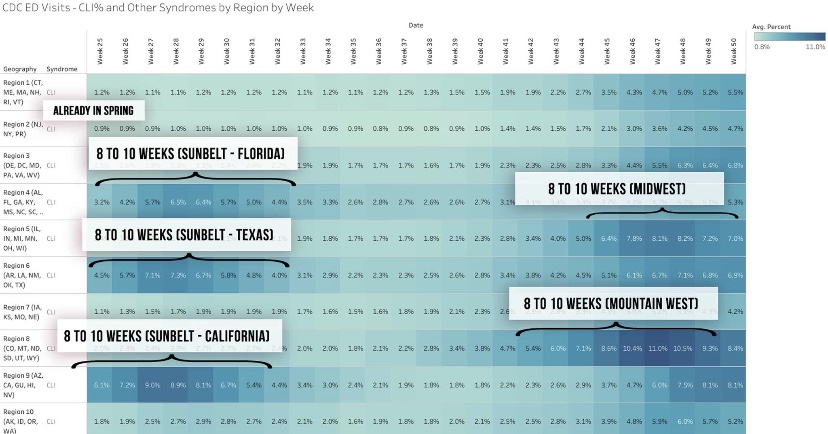
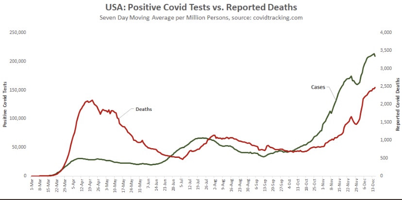
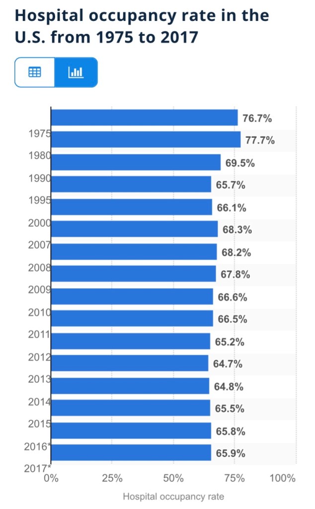
#1 is clearly the way to save the most lives, at least in the short-run. Over 40% of the deaths in the U.S. have been in elder-care settings, and COVID infection fatality rates mount exponentially with age:

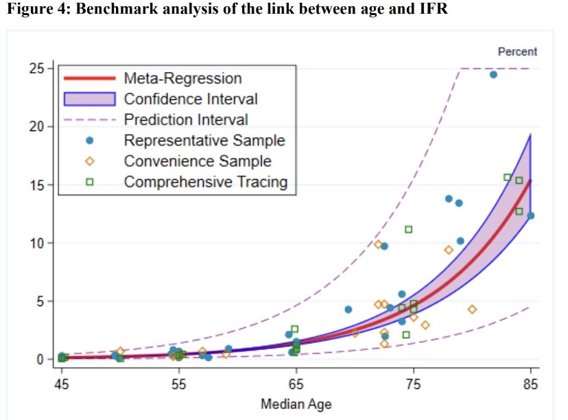
To derive the implications of #1 and #2, it’s more convenient to look at the share of deaths within each age cohort, since it incorporates the differences in infection rates and fatality rates across age groups (the number of “other” deaths is much larger than COVID deaths, of course, despite similar death shares):

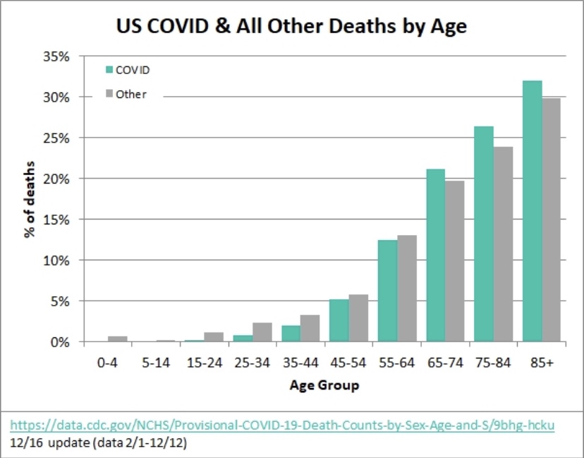
The 75+ age group has accounted for about 58% of all COVID deaths in the U.S., and ages 25 – 64 accounted for about 20% (an approximate age range for essential workers). This implies that nearly three times as many lives can be saved by prioritizing the elderly, at least if deaths among so-called essential workers mimic deaths in the 25 – 64 age cohorts. However, the gap would be smaller and perhaps reversed in terms of life-years saved.

Furthermore, this is a short-run calculation. Over a longer time frame, if essential workers are responsible for more transmission across all ages than the elderly, then it might throw the advantage to prioritizing essential workers over the elderly, but it would take a number of transmission cycles for the differential to play out. Yes, essential workers are more likely to be “super-spreaders” than work-at-home, corporate employees, or even the unemployed, but identifying true super-spreaders would require considerable luck. Moreover, care homes generally house a substantial number of elderly individuals and staff in a confined environment, where spread is likely to be rampant. So the transmission argument for #2 over #1 is questionable.

The over-riding problem is that of available supply. Suppose enough vaccine is available for all elderly individuals within a particular time frame. That’s about 6.6% of the total U.S. population. The same supply would cover only about 13% of the younger age group identified above. Essential workers are a subset of that group, but the same supply would fall far short of vaccinating all of them; lives saved under #2 would then fall far short of the lives saved under #1. Quantities of the vaccine are likely to increase over the course of a few months, but limited supplies at the outset force us to focus the allocation decision on the short-term, making #1 the clear winner.

Now let’s talk about #3, minority populations, historical inequities, and the logic of allocating vaccine on that basis. Minority populations have suffered disproportionately from COVID, so this is really a matter of objective risk, not historical inequities… unless the idea is to treat vaccine allocations as a form of reparation. Don’t laugh — that might not be far from the intent, and it won’t count as a credit toward the next demand for “justice”.

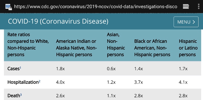
For the sake of argument, let’s assume that minorities have 3x the fatality rate of whites from COVID (a little high). Roughly 40% of the U.S. population is non-white or Hispanic. That’s more than six times the size of the full 75+ population. If all of the available doses were delivered to essential workers in that group, it would cover less than half of them and save perhaps 30% of minority COVID deaths over a few months. In contrast, minorities might account for up to two-thirds of the deaths among the elderly. Therefore, vaccinating all of the elderly would save 58% of elderly COVID deaths and about 39% of minority deaths overall!

The COVID mortality risk to the average white individual in the elderly population is far greater than that faced by the average minority individual in the working age population. Therefore, no part of #3 is sensible from a purely mathematical perspective. Race/ethnicity overlaps significantly with various co-morbidities and the number of co-morbidities with which individuals are afflicted. Further analysis might reveal whether there is more to be gained by prioritizing by co-morbidities rather than race/ethnicity.

Megan McArdle has an interesting column on the CDC’s vaccination guidelines issued in November, which emphasized equity, like #3 above. But the CDC walked back that decision in December. The initial November decision was merely the latest of the the agency’s fumbles on COVID policy. In her column, McArdle notes that the public has understood that the priority was to save lives since the very start of the pandemic. Ideally, if objective measures show that identifiable characteristics are associated with greater vulnerability, then those should be considered in prioritizing individuals who desire vaccinations. This includes age, co-morbidities, race/ethnicity, and elements of occupational risk. But lesser associations with risk should not take precedence over greater associations with risk unless an advantage can be demonstrated in terms of lives saved, historical inequities or otherwise.

The priorities for the early rounds of vaccinations may differ by state or jurisdiction, but they are all heavily influenced by the CDC’s guidelines. Some states pay lip service to equity considerations (if they simply said race/ethnicity, they’d be forced to operationalize it), while others might actually prioritize doses by race/ethnicity to some degree. Once the initial phase of vaccinations is complete, there are likely to be more granular prioritizations based on different co-morbidities, for example, as well as race/ethnicity. Thankfully, the most severe risk gradient, advanced age, will have been addressed by then.

One last point: the Pfizer and Moderna vaccines both require two doses. Alex Tabarrok points out that first doses appear to be highly effective on their own. In his opinion, while supplies are short, the second dose should be delayed until all groups at substantially elevated risk can be vaccinated…. doubling the supply of initial doses! The idea has merit, but it is unlikely to receive much consideration in the U.S. except to the extent that supply chain problems make it unavoidable, and they might.

Spate of Research Shows COVID Lockdowns Fail

27 Sunday Dec 2020

Posted by Nuetzel in Lockdowns, Public Health

≈ 4 Comments

Tags

@boriquagato, AIER, Covid-19, el gato malo, Hypothesis Testing, Ivor Cummins, Lockdowns, Model Calibration, Mortality, Non-Pharmaceutical interventions, Transmissability

For clarity, start with this charming interpretive one-act on public health policy in 2020. You might find it a little sardonic, but that’s the point. It was one of the more entertaining tweets of the day, from @boriquagato.

A growing body of research shows that stringent non-pharmaceutical interventions (NPIs) — “lockdowns” is an often-used shorthand — are not effective in stemming the transmission and spread of COVID-19. A compendium of articles and preprints on the topic was just published by the American Institute for Economic Research (AEIR): “Lockdowns Do Not Control the Coronavirus: The Evidence”. The list was compiled originally by Ivor Cummins, and he has added a few more articles and other relevant materials to the list. The links span research on lockdowns across the globe. It covers transmission, mortality, and other health outcomes, as well as the economic effects of lockdowns. AIER states the following:

“Perhaps this is a shocking revelation, given that universal social and economic controls are becoming the new orthodoxy. In a saner world, the burden of proof really should belong to the lockdowners, since it is they who overthrew 100 years of public-health wisdom and replaced it with an untested, top-down imposition on freedom and human rights. They never accepted that burden. They took it as axiomatic that a virus could be intimidated and frightened by credentials, edicts, speeches, and masked gendarmes.

The pro-lockdown evidence is shockingly thin, and based largely on comparing real-world outcomes against dire computer-generated forecasts derived from empirically untested models, and then merely positing that stringencies and “nonpharmaceutical interventions” account for the difference between the fictionalized vs. the real outcome. The anti-lockdown studies, on the other hand, are evidence-based, robust, and thorough, grappling with the data we have (with all its flaws) and looking at the results in light of controls on the population.”

We are constantly told that public intervention constitutes “leadership”, as if our well being depends upon behavioral control by the state. Unfortunately, it’s all too typical of research on phenomena deemed ripe for intervention that computer models are employed to “prove” the case. A common practice is to calibrate such models so that the outputs mimic certain historical outcomes. Unfortunately, a wide range of model specifications can be compatible with an historical record. This practice is also a far cry from empirically testing well-defined hypotheses against alternatives. And it is a practice that usually does poorly when the model is tested outside the period to which it is calibrated. Yet that is the kind of evidence that proponents of intervention are fond of using to support their policy prescriptions.

In this case, it’s even worse, with some of the alleged positive effects of NPI’s wholly made-up, with no empirical support whatsoever! So-called public health experts have misled themselves, and the public, with this kind of fake evidence, when they aren’t too busy talking out of both sides of their mouths.

Not My President, Not Your’s Either

24 Thursday Dec 2020

Posted by Nuetzel in Censorship, Election Fraud, Leftism

≈ Leave a comment

Tags

Alexandria Ocasio-Cortez, Angela Davis, Barack Obama, Bernie Sanders, Black Lives Matter, Donald Trump, Foreign Influence, Hing Kong, Hunter Biden, Joe Biden, Taiwan, Uhyger Muslims, Xi Jinping

Now why would I say such a thing? Well, 1) the presidential election was rife with fraud, as many of us feared would be the case (and see here); 2) the supposed winner, Joe “The Plagiarist” Biden, is a figurehead, and he will remain in the White House only as long as he toes the line set down by the Left; and 3) the figurehead is badly compromised by Chinese and other foreign influence: Chairman Xi Jinping of the Chinese Communist Party (CCP) is undoubtedly pleased that such a pliant American president will be taking office.

Those who deny the fraud that took place in the election keep insisting “there’s no evidence!” In fact, there is ample evidence to convince any fair-minded person that massive fraud took place across a number of states (see here, here, here and here). We knew that massive adoption of mail-in ballots was an invitation to fraud. There are many hundreds of affidavits (yes, they constitute evidence) stating that Republican election officials and poll watchers were obstructed in their attempts to observe the counting process on and after Election Day, and worse. There is video evidence of activities coincident with late-night lockouts of Republican poll watchers and outrageous, instant jumps in Biden’s vote totals. There is definitive evidence of process “shortcuts” in several states that led to a large number of unverified ballots. These shortcuts were often taken in contravention of state law. There were failed chains of custody for thousands of ballots across several states. There were dead and out-of-state voters. There were irregularities associated with vote tabulations by Dominion machines. There are hand recounts in a few counties that demonstrate miscounting of ballots. And of course, there was a willful effort to suppress this information by the news media, and outright censorship of this information by social media platforms.

No matter what has or will happen in the courts, state legislatures, or Congress, a large share of the voting public believes there was fraud in this election. In fact, a significant share of democrats believe the election was stolen from President Trump! The fraud goes beyond the electoral process as well. Polls show a substantial number of Biden voters would not have voted for him had they known about the escapades of Hunter Biden and Joe’s role as the family cash cow. The mainstream media and social media platforms also deliberately suppressed the information about Hunter Biden’s pay-for-play scandal prior to the election. And that came after months of avoiding any real scrutiny of Biden’s policy agenda and his fitness as a candidate. Instead, the media asked Joe tough questions about his favorite ice cream.

Not your president? The Hunter Biden saga creates doubt about who Joe Biden is likely to serve as President. To whom is Joe beholden for “taking care” of “the big guy’s” family? How about Hunter’s deals in the Ukraine and Russia? How heavily was the CCP involved in Hunter’s business ventures? How much is Joe compromised by these unfortunate ties? What kind of compromises might it be worth to Joe to avoid further exposure? Should the Biden Administration overlook the plight of the Uhygers? Turn the cheek on Hong Kong? Sacrifice Taiwan? Allow Chinese technology to be embedded in U.S. communications hardware? Cede international rights in the South China Sea? Perhaps Joe will be Chairman Xi’s President. And perhaps others hold cards, such as the hostile Iranian regime. Not our president.

Finally, if you *think* you voted for Joe as president, be aware that he is, even now, a doddering figurehead, a puppet of the Left whose strings might well be clipped when he demonstrates even a hint of incapacity. It might not be long. Perhaps the Left will adopt Hunter’s imbroglio as an excuse to take Joe down. It seems more than a little suspicious that the media, post-election, has finally begun to talk about Hunter’s miscues and Joe’s “possible” involvement.

But even if Joe remains in the Oval Office through a first term, just who will be in charge? Joe? No, he is captive to the interests that helped put him there. We might just as well call him “Any-Way-the-Wind-Blows Joe”. Angela Davis, former VP of the Communist Party USA, said during the primaries that she supported Biden because he:

“… can be most effectively pressured into allowing more space for the evolving anti-racist movement.”

Well, Joe better not compromise with anyone or accept any policy that Angela Davis deems “racist”.

Let’s consider a few influences expected to be paramount in pulling Joe’s strings: Barack Obama, Alexandria Ocasio-Cortez, Julian Castro, and Black Lives Matter. Bernie Sanders will also loom large, and of course Kamala Harris will be there to push the leftist agenda, and she’ll be waiting in the wings when Joe loses his tentative grip on the reins of the progressive machine. Joe better not resist these forces: he can be manipulated, and if he strays from the path, he and his presidency can be cancelled.

If you are a member of the Marxist wing of the coalition, you might have him just where you want him. If you are a member of the CCP, then he might be your president. But he is not the president of the disenfranchised voters whose majority was outstripped by the mailed ballot fraud. And if you are a centrist Democrat, you should awaken to the reality of the hard-left movement with which you’ve joined forces. Do not accept it as a legitimate governing force. No, Joe Biden will not be your president.

As I’ve noted in the past, apologists willing to look past Joe Biden’s domestic and foreign controllers and the fraudulent election are not to be trusted. Indeed, they have been willing to look past Biden’s personal status as a fraud, from his many lies about his family to his admitted plagiarism, to his denial of sexual aggression toward female staffers. In summary, I can’t put it any better than Newt Gingrich does here:

“… I have no interest in legitimizing the father of a son who Chinese Communist Party members boast about buying. Nor do I have any interest in pretending that the current result is legitimate or honorable. It is simply the final stroke of a four-year establishment-media power grab. It has been perpetrated by people who have broken the law, cheated the country of information, and smeared those of us who believe in America over China, history over revisionism, and the liberal ideal of free expression over cancel culture.”

COVID Testing: Cycle Thresholds and Coffee Grounds

19 Saturday Dec 2020

Posted by Nuetzel in Coronavirus, Public Health, Uncategorized

≈ 2 Comments

Tags

Andrew Bostom, Coffee Grounds Test, Covid-19, Ct, Cycle Threshold, False Positives, FDA, PCR Test, Rapid Tests, Rhode Island, Viral RNA

Here’s some incredible data on PCR tests demonstrating a radically excessive lab practice that generates false positives. I’m almost tempted to say we’d do just as well using a thermometer and the coffee ground test. Open a coffee tin and take a sniff. Can you smell the distinct aroma of the grounds? If not, and if you have other common symptoms, there’s a decent chance you have an active COVID infection. That test is actually in use in some parts of the globe!

The data shown below on PCR tests are from the Rhode Island Department of a Health and the Rhode Island State Health Lab. They summarize over 5,000 positive COVID PCR tests (collected via deep nasal swabs) taken from late March through early July. The vertical axis in the chart measures the cycle threshold (Ct) value of each positive test. Ct is the number of times the RNA in a sample must be replicated before any COVID-19 (or COVID-like) RNA is detected. It might be from a live virus or perhaps a fragment of a dead virus. A positive test with a low Ct value indicates that the subject is likely infected with billions of live COVID-19 viruses, while a high Ct value indicates perhaps a handful or no live virus at all.

The range of red dots in the chart (< 28 Ct) indicates relatively low Ct values and active infections. The yellow range of dots, for which 28 < Ct <= 32, indicates possible infections, and the upper range of green dots, where Ct > 32, indicates that active infections were highly unlikely. It’s important to note that all of these tests were recorded as new COVID cases, so the range of Ct values suggest that testing in Rhode Island was unreasonably sensitive. That’s broadly true across the U.S. as well, which means that COVID cases are over-counted by perhaps 30% or more. And yet it is extremely difficult for subjects testing positive to learn their Ct values. You can ask, but you probably won’t get an answer, which is absurd and counterproductive.

Notice that the concentration of red dots diminished over time, and we know that the spring wave of the virus in the Northeast was waning as the summer approached. The share of positives tests with high Ct values increased over that time frame, however. This is borne out by the next chart, which shows the daily mean Ct of these positive tests. The chart shows that active infections became increasingly rare over that time frame both because positive tests decreased and the average Ct value rose. What we don’t know is whether labs bumped up the number of cycles or replications to which samples were subjected. Still, the trend is rather disturbing because most of the positive cases in May and the first half of June were more likely to be virus remnants than live viruses.

It’s also worth noting that COVID deaths declined in concert with the upward trend in Ct values. This is shown in the chart below (where the Ct scale is inverted). This demonstrates the truly benign nature of positive tests having high Ct values.

This is also demonstrated by the following data from a New York City academic hospital, which was posted by Andrew Bostom. It shows that a more favorable “clinical status” of COVID patients is associated with higher Ct values.

It’s astounding that the U.S. has relied so heavily on a diagnostic tool that gets so many subjects wrong. And it’s nearly impossible for subjects testing positive to obtain their Ct values. Instead, they are subject to self-quarantine for up to two weeks. Even worse, until recently there were delays in reporting the results of these tests of up to a week or more. That made them extremely unhelpful. On the other hand, the coffee ground test is fast and cheap, and it might enhance the credibility of a subsequent positive PCR test, if one is necessary … and especially if the lab won’t report the Ct value.

The PCR test has identified far too many false infections, but it wouldn’t have been quite so damaging if 1) a reasonably low maximum cycle threshold had been established; 2) test results had not been subject to such long delays; and 3) rapid retests had been available for confirmation. The cycle threshold issue is starting to receive more attention, quite belatedly, and more rapid tests have become available. As I’ve emphasized in the past, cheap, rapid tests exist. But having dithered in February and March in approving even the PCR test, the FDA has remained extremely grudging in approving newer tests, and it persists in creating obstacles to their use. The FDA needs to wake up and smell the coffee!

Harbingers of COVID Fade, But Not the Pretense for Hysteria

17 Thursday Dec 2020

Posted by Nuetzel in Coronavirus, Pandemic, Vaccinations

≈ Leave a comment

Tags

@Humble_Analysis (PLC), CLI, COVID Vaccines, Covid-19, COVID-Like Illness, Date of Death, False Positives, Herd Immunity, ILI, Influenza-Like Illness, Justin Hart, PCR Tests, Reported Deaths

My pre-Thanksgiving optimism about a crest in the fall wave of the coronavirus has been borne out for the Midwest and Mountain states in the U.S. These regions were the epicenter of the fall wave through October and most of November, but new cases in those states have continued to decline. Cases in a number of other states began to climb in November, however, contributing to a continuing rise in total new cases nationally. Some of these states are still in the throes of this wave, with the virus impacting subsets of the population that were relatively unscathed up till now.

My disclaimer: COVID is obviously a nasty virus. I don’t want to get it. However, on the whole, it is not a cataclysm on the order of many pandemics of the past. In fact, excess deaths this year will add just over 10% to projections of total deaths based on a five-year average. That level puts us in line with average annual deaths of about twenty years ago. And many of those excess deaths have been caused by our overreaction to the pandemic, not by the virus itself. As my endocrinologist has said, this is the greatest overreaction in all medical history. Unfortunately, a fading pandemic does not mean we can expect an end to the undue panic, or pretense for panic, on the part of interventionists.

This post will focus largely on trends in newly diagnosed COVID cases. I have been highly critical of our testing regime and COVID case counts because the most prominent diagnostic test (PCR) falsely identifies a large number of uninfected individuals as COVID-positive. However, case numbers are widely tracked and it’s fairly easy to find information across geographies for comparison. Deflate all the numbers by 30% if you want, or by any other factor, but please indulge me because I think the trends are meaningful, even if the absolute level of cases is inflated.

I’ll start with the good news and work my way down to states in which cases are still climbing (all of the following charts are from @Humble_Analysis (PLC)). The first chart is for the Great Plains, where cases peaked a little before Thanksgiving and have continued to fall since then. That peak came about six weeks after it began in earnest and cases have faded over the last four weeks.

Next we have the Mountain states, where again, cases peaked around Thanksgiving, though Idaho saw a rebound after the holiday. You’ll see below that a number of states had a distinct drop in new cases during the week of Thanksgiving. There was somewhat of a pause in testing during that week, so the subsequent rebounds are largely due to a “catch-up” at testing sites, rather than some kind of Thanksgiving-induced spike in infections.

Back to the Mountain region, the peak came an average of about six or seven weeks into the wave, but the duration of the wave appears to have been longer in Montana and Wyoming.

Here are the Southern Plain states, where cases plateaued around Thanksgiving (though cases in Missouri have clearly declined from their peak). In this region, case counts accelerated in October after a slow climb over the summer.

The situation is somewhat similar in the Midwest. where cases have generally plateaued. There were some post-Thanksgiving rebounds in several states, especially Tennessee. The wave began a little later in this region, in mid- to late October, and it is now seven to eight weeks into the wave, on average.

Here are the Mid-Atlantic states, which may be showing signs of a peak, though North Carolina has had the greatest caseload and is still climbing. These states are about seven weeks into the wave, on average.

The Northeast also shows signs of a possible peak and is about seven weeks into the wave, except for Rhode Island, which saw an earlier onset and the most severe wave among these states.

And finally we have the South, which is defined quite broadly in PLC’s construction. It’s a mixed bag, with a few states showing signs of a peak after about seven weeks. However, cases are still climbing in several states, notably California and Florida, among a few others.

Oregon and Washington were skipped, but they appear as the Pacific NW in the following chart, along with aggregations for all the other regions. Maine is Part of the “Rural NE”, which was also skipped. The fall wave can be grouped roughly into two sets of regions: those in which waves began in late September or early October, and those where waves began in early to mid-November. The first group has moved beyond a peak or at least has plateaued. The latter group may be reaching peaks now or one hopes very soon. It seems to take about seven weeks to reach the peak of these regional waves, so a late December peak for the latter group would be consistent.

Justin Hart has a take on the duration of these waves, but he does so in terms of the share of emergency room (ER) visits in which symptoms of COVID-like illness (CLI) are presented. CLI tends to precede case counts slightly. Hart puts the duration of these waves at eight to ten weeks, but that’s a judgement call, and I might put it a bit longer using caseloads as a guide. Still, this color-coded chart from Hart is interesting.

If this sort of cyclical duration holds up, it’s consistent with the view that cases in many of the still “hot” states should be peaking this month.

Aggregate cases for the U.S. appear below. The growth rate of new cases has slowed, and the peak is likely to occur soon. However, because it combines all of the regional waves, the duration of the wave nationwide will appear to be greater than for the individual regions. COVID-attributed deaths are also plotted, but they are reported deaths, not by date of death (DOD) or actual deaths, as I sometimes call them. Deaths by DOD are available only with a lag. As always, some of the reported deaths shown below occurred weeks before their reported date. Actual deaths were still rising as of late November, and are likely still rising. However, another indicator suggests they should be close to a peak.

A leading indicator of actual deaths I’ve discussed in the past now shows a more definitive improvement than it did just after Thanksgiving, as the next chart shows. This is the CLI share discussed above. An even better predictor of COVID deaths by actual DOD is the sum of CLI and the share of ER patients presenting symptoms of influenza-like illness (ILI), but ILI has been fairly low and stable, so it isn’t contributing much to changes in trend at the moment. There has been about a three-week lead between movements in CLI+ILI and COVID deaths by DOD.

(The reason the sum, CLI+ILI, has been a better predictor than CLI alone is because for some individuals, there are similarities in the symptoms of COVID and the flu.)

The chart shows that CLI peaked right around the Thanksgiving holiday (and so did CLI+ILI), but it remained on something of a plateau through the first week of December before declining. Some of the last few days on this chart are subject to revision, but the recent trend is encouraging. Allowing for a three-week lead, this indicates that peak deaths by DOD should occur around mid-December, but we won’t know exactly until early to mid-January. To be conservative, we might say the latter half of December will mark the peak in actual deaths.

The regional COVID waves this summer and fall seem to have run their course within 10 – 12 weeks. Several former hot spots have seen cases drop since Thanksgiving after surges of six to seven weeks. However, there are several other regions with populous states where the fall wave is still close to “mid-cycle”, as it were, showing signs of possible peaks after roughly seven weeks of rising cases. The national CLI share peaked around Thanksgiving, but it did not give up much ground until early December. That suggests that actual deaths (as opposed to reported deaths), at least in some regions, will peak around the time of the winter solstice. Let’s hope it’s sooner.

Successive waves within a region seem to reach particular subsets of the population with relatively few reinfections. The 10 – 12 week cycle discussed above is sufficient to achieve an effective herd immunity within these subsets. But once again, a large share of the vulnerable, and a large share of COVID deaths, are still concentrated in the elderly, high-risk population and in care homes. The vaccine(s) currently being administered to residents of those homes are likely to hasten the decline in COVID deaths beginning sometime in January, perhaps as early as mid-month. By then, however, we should already see a decline underway as this wave of the virus finally burns itself out. As vaccines reach a larger share of the population through the winter and spring, the likelihood of additional severe waves of the virus will diminish.

Lest there be any misunderstanding, the reasons for the contagion’s fade to come have mostly to do with reaching the effective herd immunity threshold within afflicted subsets of the population (sub-herds). Social distancing certainly plays a role as well. Nearly all of that is voluntary, though it has been encouraged by panicked pronouncement by certain public officials and the media. Direct interventions or lockdown measures are in general counter-productive, however, and they create a death toll of their own. Unfortunately, the fading pandemic might not rein-in the curtailment of basic liberties we’ve witnessed this year.

Post-Script: Let’s hope the side effects of the vaccines are not particularly severe in the elderly. That’s a little uncertain, because that sub-population was not tested in very high numbers.

COVID Interventions: Costly, Deadly, and Ineffective

14 Monday Dec 2020

Posted by Nuetzel in Coronavirus, Liberty, Lockdowns, Public Health

≈ 1 Comment

Tags

AJ Kay, Andrew Cuomo, CDC, Contact Tracing, Covid-19, David Kay, Do-Somethingism, Eric Garcetti, Essential Businesses, Fairfax County Schools, Federalism, Friedrich Hayek, Human Rights Watch, J.D. Tucille, Justin Hart, Kelsey Munro, Knowledge Problem, Lemoine, Life Value, Nature, Non-Prescriptive Interventions, Philippe Lemoine, Public Health, Scott Sumner, Seth Flaxman, Stringency Index, University of Oxford, World Health Organization

What does it take to shake people out of their statist stupor? Evidently, the sweet “logic” of universal confinement is very appealing to the prescriptive mindset of busybodies everywhere, who anxiously wag their fingers at those whom they view as insufficiently frightened. As difficult as it is for these shrieking, authoritarian curs to fathom, measures like lockdowns, restrictions on business activity, school closures, and mandates on behavior have at best a limited impact on the spread of the coronavirus, and they are enormously costly in terms of economic well-being and many dimensions of public health. Yet the storm of propaganda to the contrary continues. Media outlets routinely run scare stories, dwelling on rising case numbers but ignoring them when they fall; they emphasize inflated measures of pandemic severity; certain researchers and so-called health experts can’t learn the lessons that are plain in the data; and too many public officials feel compelled to assert presumed but unconstitutional powers. At least the World Health Organization has managed to see things clearly, but many don’t want to listen.

I’ll be the first to say I thought the federalist approach to COVID policy was commendable: allow states and local governments to craft policies appropriate to local conditions and political preferences, rather than have the federal government dictate a one-size-fits-all policy. I haven’t wavered in that assessment, but let’s just say I expected more variety. What I failed to appreciate was the extent to which state and local leaders are captive to provincial busybodies, mavens of precautionary excess, and fraudulent claims to scientific wisdom.

Of course, it should be obvious that the “knowledge problem” articulated by Friedrich Hayek is just as dangerous at low-levels of government as it is in a central Leviathan. And it’s not just a knowledge problem, but a political problem: officials become panicked because they fear bad outcomes will spell doom for their careers. Politicians are particularly prone to the hazards of “do-somethingism”, especially if they have willing, status-seeking “experts” to back them up. But as Scott Sumner says:

“When issues strongly impact society, the science no longer ‘speaks for itself’.

Well, the science is not quite as clear as the “follow-the-science” crowd would have you believe. And unfortunately, public officials have little interest in sober assessments of the unintended effects of lockdown policy.

In my last post, I presented a simple framework for thinking about the benefits and costs of lockdown measures, or non-pharmaceutical interventions (NPIs). I also emphasized the knowledge problem: even if there is some point at which NPI stringencies are “optimized”, government does not possess the knowledge to find that point. It lacks detailed information on both the costs and benefits of NPIs, but individual actors know their own tolerance for risk, and they surely have some sense of the risks they pose to others in their normal course of affairs. While voluntary precautions might be imperfect, they accomplish much of what interventionists hope will be gained via coercion. But, in an effort to “sell” NPIs to constituents and assert their authority, officials vastly over-estimate benefits of NPIs and under-estimate the costs.

NPI Stringency and COVID Outcomes

Let’s take a look at a measure of the strength of NPIs by state — the University of Oxford Stringency Index — and compare those to CDC all-cause excess deaths in each state. If it’s hard to read, try clicking on the image or turn your phone sideways. This plot covers outcomes through mid-November:

The chart doesn’t suggest any benefit to the imposition of greater restrictions, or more stringent NPIs. In fact, the truth is that people will do most of the work on their own based on perceptions of risk. That’s partly because government restrictions add little risk mitigation to what can be accomplished by voluntary social distancing and other precautions.

Here’s a similar chart with cross-country comparisons, though the data here ended in early October (I apologize for the fuzzy image):

But what about reverse causality? Maybe the imposition of stringency was a response to more severe contagions. Now that the virus has swept most of the U.S and Europe in three distinct waves, and given the variety and timing of NPIs that have been tried, it’s harder to make that argument. States like South Dakota have done fairly well with low stringency, while states like New Jersey with high stringency have fared poorly. The charts above provide multiple pair-wise examples and counter-examples of states or countries having faced hard waves with different results.

But let’s look at a few specific situations.

The countries shown above have converged somewhat over the past month: Sweden’s daily deaths have risen while the others have declined to greater or lesser degrees, but the implications for mask usage are unaltered.

And of course we have this gem, predicated on the mental gymnastics lockdown enthusiasts are fond of performing:

But seriously, it’s been a typical pattern: cases rise to a point at which officials muster the political will to impose restrictions, often well after the “exponential” phase of the wave or even the peak has passed. For the sake of argument, if we were to stipulate that lockdowns save lives, it would take time for these measures to mitigate new infections, time for some of the infected individuals to become symptomatic, and more time for diagnosis. For the lockdown arguments to be persuasive, the implementation of NPIs would have to precede the point at which the growth of cases begins to decline by a few weeks. That’s something we’ve seldom observed, but officials always seem to take credit for the inevitable decline in cases.

More informed lockdown proponents have been hanging their hats on this paper in Nature by Seth Flaxman, et al, published in July. As Philippe LeMoine has shown, however, Flaxman and his coauthors essentially assumed their result. After a fairly exhaustive analysis, Lemoine, a man who understands sophisticated mathematics, offers these damning comments:

“Their paper is a prime example of propaganda masquerading as science that weaponizes complicated mathematics to promote questionable policies. Complicated mathematics always impresses people because they don’t understand it and it makes the analysis look scientific, but often it’s used to launder totally implausible assumptions, which anyone could recognize as such if they were stated in plain language. I think it’s exactly what happened with Flaxman et al.’s paper, which has been used as a cudgel to defend lockdowns, even though it has no practical relevance whatsoever.”

The Economic Costs of Stringency

So the benefits of stringent lockdowns in terms of averting sickness and death from COVID are speculative at best. What about the costs of lockdowns? We can start with their negative impact on economic activity:

That’s a pretty bad reflection on NPI stringency. In the U.S, a 10% decline in GDP in 2020 amounts to about $2.1 trillion in lost goods and services. That’s just for starters. The many destroyed businesses and livelihoods carry an ongoing cost that could take years to fade, as this graphic on permanent business closures shows:

If you’re wondering about the distributional effects of lockdowns, here’s more bad news:

It’s possible to do many high-paying jobs from home. Not so for blue-collar workers. And distributional effects by size of enterprise are also heavily-skewed in favor of big companies. Within the retail industry, big-box stores are often designated as “essential”, while small shops and restaurants are not. The restaurant industry has been destroyed in many areas, inflicting a huge blow to owners and workers. This despite evidence from contact tracing showing that restaurants and bars account for a very small share of transmission. To add insult to injury, many restaurants invested heavily in safety measures and equipment to facilitate new, safer ways of doing business, only to be double-crossed by officials like Andrew Cuomo and Eric Garcetti, who later shut them down.

Public Health Costs of Stringency

Lives are lost due to lockdowns, but here’s a little exercise for the sake of argument: The life value implied by individual willingness-to-pay for risk reduction comes in at less than $4 million. Even if the supposed 300,000 COVID deaths had all been saved by lockdowns, that would have amounted to a value of $1.2 trillion, about half of the GDP loss indicated above. Of course, it would be outrageously generous to concede that lives saved by NPI’s have approached 300,000, so lockdowns fall far short at the very outset of any cost-benefit comparison, even if we value individual lives at far more than $4 million.

As AJ Kay says, the social and human costs go far beyond economic losses:

I cited specific examples of losses in many of these categories in an earlier post. But for the moment, instead of focusing on causes of death, take a look at this table provided by Justin Hart showing a measure of non-COVID excess deaths by age group in the far right-hand column:

The numbers here are derived by averaging deaths by age group over the previous five years and subtracting COVID deaths in each group. I believe Hart’s numbers go through November. Of greatest interest here is the fact that younger age groups, having far less risk of death from COVID than older age groups, have suffered large numbers of excess deaths NOT attributed to COVID. As Hart notes later in his thread:

These deaths are a tragic consequence of lockdowns.

Educational Costs of Stringency

Many schools have been closed to in-person instruction during the pandemic, leading to severe disruptions to the education f children. This report from the Fairfax County, VA School District is indicative, and it is extremely disheartening. The report includes the following table:

Note the deterioration for disabled students, English learners, and the economically disadvantaged. The surfeit of failing grades is especially damaging to groups already struggling in school relative to their peers, such as blacks and Hispanics. Not only has the disruption to in-person instruction been disastrous to many students and their futures; it has also yielded little benefit in mitigating the contagion. A recent study in The Lancet confirms once again that transmission is low in educational settings. Also see here and here for more evidence on that point.

Conclusion

It’s clear that the “follow-the-science” mantra as a rationale for stringent NPIs was always a fraud, as was the knee-jerk response from those who conflated lockdowns with “leadership”. Such was the wrongheaded and ultimately deadly pressure to “do something”. We can be thankful that pressure was resisted at the federal level by President Trump. The extraordinary damage inflicted by ongoing NPIs was quite foreseeable, but there is one more very ominous implication. I’ll allow J.D. Tucille to sum that up with some of the pointed quotes he provides:

“‘The first global pandemic of the digital age has accelerated the international adoption of surveillance and public security technologies, normalising new forms of widespread, overt state surveillance,’ warned Kelsey Munro and Danielle Cave of the Australian Strategic Policy Institute’s Cyber Policy Centre last month.

‘Numerous governments have used the COVID-pandemic to repress expression in violation of their obligations under human rights law,’ United Nations Special Rapporteur on Freedom of Expression David Kaye noted in July.

‘For authoritarian-minded leaders, the coronavirus crisis is offering a convenient pretext to silence critics and consolidate power,’ Human Rights Watch warned back in April.

There’s widespread agreement, then, that government officials around the world are exploiting the pandemic to expand their power and to suppress opposition. That’s the case not only among the usual suspects where authorities don’t pretend to take elections and civil liberties seriously, but also in countries that are traditionally considered ‘free.’ … It’s wildly optimistic to expect that newly acquired surveillance tools and enforcement powers will simply evaporate once COVID-19 is sent on its way. The post-pandemic new normal is almost certain to be more authoritarian than what went before.”

COVID Externalities: the Costs and Benefits of Intervention

13 Sunday Dec 2020

Posted by Nuetzel in Coronavirus, Public Health, Social Costs

≈ 1 Comment

Tags

Cost-Benefit Analysis, Covid-19, Externalities, Friedrich Hayek, Intervention, Knowledge Problem, Mutual Risks, Non-Pharmaceutical interventions, Public Health, Stringency Index, University of Oxford

This post offers a simple representation of the argument against public non-pharmaceutical interventions (NPIs) to subdue the COVID-19 pandemic. The chart below features two lines, one representing the presumed life-saving benefits of lockdown measures or NPI stringency, and another representing the costs inflicted by those measures. The values on the axes here are not critical, though measures of stringency exist (e.g., the University of Oxford Stringency Index) and take values from zero to 100.

The benefits of lives saved due to NPI stringency are assigned a value on the vertical axis, as are the costs of lives lost due to deferred health care, isolation, and other stressors caused by stringency. In addition, there are the more straightforward losses caused by suspending economic activity, which should be included in costs.

One can think of the benefits curve as representing gains from forcing individuals, via lockdown measures, to internalize the external costs of risk inflicted on others. However, this curve captures only benefits incremental to those achieved through voluntary action. Thus, NPI benefits include only extra gains from coercing individuals to internalize risks, while losses from NPI stringency are captured by the cost curve.

My contention is that the benefits of stringency diminish and may in fact turn down at some point, and that costs always increase in the level of stringency. In the chart, for what it’s worth, the “optimal” level of stringency would be at a value of 2, where the difference between total benefits and total costs is maximized (and where the benefits of incremental stringency are equal to the marginal costs or losses). However, I am not convinced that the benefits of lockdown measures ever exceed costs, as they do in the chart above. That is, voluntary action may be sufficient. But if the benefits of NPIs do exceed costs, it’s likely to be only at low levels of stringency.

To the extent that people are aware of the pandemic and recognize risk, the external costs of possible infectiousness are already internalized to some degree. Moreover, there is mutual risk in most interactions, and all individuals face risks that are proportional to those to which they expose others: if your contacts are more varied and your interactions are more frequent and intimate, you face correspondingly higher risks yourself. After all, in a pandemic, an individual’s failure to exercise caution may lead to a very hard internalization of costs if an infection strikes them. This mutuality is an element absent from most situations involving externalities. And to the extent that you take voluntary precautions, you and your contacts both benefit. Nevertheless, I concede that there are individuals who face less risk themselves (the young or healthy) but who might behave recklessly, and they might not internalize all risk for which they are responsible. Yes, stringency may have benefits, but that does not mean it has net benefits.

Even if there is some meaningful point at which NPIs are “optimized”, government does not possess the knowledge required to find that point. It lacks detailed knowledge of both costs and benefits of NPIs. This is a manifestation of the “knowledge problem” articulated by Friedrich Hayek, which hampers all efforts at central planning. In contrast, individual actors know their own tolerance for risk, and they surely have some sense of the risks they create in their normal course of affairs. And again, there is a strong degree of proportionality and voluntary internalization of mutual risks.

While relying on voluntary action is economically inefficient relative to an ideal, full-information and perfectly altruistic solution, it is at least based on information that individuals possess: their own risk profile and risk preferences. In contrast, government does not possess information necessary to impose rules in an optimal way, and those rules are rife with unintended consequences and costs inflicted on individuals.

My next post will present empirical evidence of the weakness of lockdown measures in curbing the coronavirus as well as the high costs of those measures. The coronavirus is a serious infection, but it is not terribly deadly or damaging to the longer-term health of the vast majority of people. This, in and of itself, should be sufficient to demonstrate that the array of non-pharmaceutical interventions imposed in the U.S. and abroad were and are not worthwhile. People are capable of assessing risks for themselves. The externality argument, that NPIs are necessary because people do not adequately assess the risk they pose to others, relies on an authority’s ability to assess that risk, and they invariably go overboard on interventions for which they underestimate costs. COVID is not serious enough to justify a surrender of our constitutional rights, and like every concession to government authority, those rights will be difficult to recover.

A Good Historical Backdrop for the Pandemic

07 Monday Dec 2020

Posted by Nuetzel in Pandemic, Public Health

≈ 2 Comments

Tags

Age-Adjusted Deaths, All-Cause Mortality, Covid-19, Dry Tinder Effect, Flu Season, Lockdown Death, Pandemic, Patrick Moore

In this short post I’m trying to do my part to put our pandemic experience in perspective. Lord knows, I was on the low side in my U.S. case-load “guesstimate” last March, as well as the number of deaths induced by COVID. (A number of others, using highly sophisticated models, erred more severely in the opposite direction.) I also failed to anticipate the strength of the later seasonal waves we’ve experienced — I was excessively optimistic as the first wave ebbed. But now, as the fall wave is showing some signs of topping out, what can we say about the pandemic in historical perspective? I came across an interesting chart that sheds some light on the question.

In terms of all-cause mortality, we’ve clearly seen a bump upward this year. Take a look at the chart below. It shows deaths per million (DPM) of population (from all causes). Try clicking on it if it’s hard to read, or turn your phone sideways. See the little blip on the lower right? That’s our pandemic year through August. The blip made 2020, at least through August, look something like a normal year of the early 2000s.

The visible spike early in 2020 was the spring wave, which was concentrated on the east coast. Of course, the fall wave will yield another spike, probably a bit higher than the first. Nevertheless, against the historical backdrop, this chart shows that the magnitude of our current public health crisis is relatively minor.

If you scan to the left from 2020, you can see that DPM this year would have appeared normal around 2005. Remember how bad it was back in aught-five…. all the death? Yeah, me neither. That’s perspective.

The chart also reflects several mild flu seasons over the past few years. Because the flu, like COVID-19, tends to hit the elderly and infirm the hardest, the “soft” DPM numbers over the past few years support the theory that the population included a fair amount of so-called “dry tinder” for COVID as we entered the year.

One other note on the chart: the DPMs are “age-adjusted”, meaning that age groups are weighted for comparisons across countries with differing age distributions (not what we’re doing here). In this case, the DPM values are weighted based on the population in the year 2000.

It’s amazing how so many have bought into the narrative that the current pandemic is historically bad. Yes, our DPMs are high relative to the last decade, but a significant number of those deaths were caused not by COVID, but by our own overreaction to the virus. That’s something else I failed to anticipate in the spring. It’s something we can put behind us now, however, if only we’re willing to put our experience in perspective. Unfortunately, many public officials, along with their public health advisors, continue to promote the deluded view that the virus can only be stopped by stopping our lives, our educations, our earnings, our health, and our sanity.

Most Hospitals Have Ample Capacity

05 Saturday Dec 2020

Posted by Nuetzel in Coronavirus, Health Care

≈ 1 Comment

Tags

AJ Kay, CARES Act, CDC, CLI, COVID, COVID-Like Illness, Don Wolt, Emergency Use Authorization, FAIR Health, False Positives, FDA, HealthData.gov, Hospital Utiluzation, Houston Methodist Hospital, ICU Utilization, ILI, Influenza-Like Illness, Intensive Care, Length of Stay, Marc Boom, Observation Beds, PCR Tests, Phil Kerpen, Remdesivir, Staffed Beds, Statista

Let’s get one thing straight: when you read that “hospitalizations have hit record highs”, as the Wall Street Journal headline blared Friday morning, they aren’t talking about total hospitalizations. They reference a far more limited set of patients: those admitted either “for” or “with” COVID. And yes, COVID admissions have increased this fall nationwide, and especially in certain hot spots (though some of those are now coming down). Admissions for respiratory illness tend to be highest in the winter months. However, overall hospital capacity utilization has been stable this fall. The same contrast holds for ICU utilization: more COVID patients, but overall occupancy rates have been fairly stable. Several factors account for these differing trends.

Admissions and Utilization

First, take a look at total staffed beds, beds occupied, and beds occupied by COVID patients (admitted “for” or “with” COVID), courtesy of Don Wolt. Notice that COVID patients occupied about 14% of all staffed beds over the past week or so, and total beds occupied are at about 70% of all staffed beds.

Is this unusual? Utilization is a little high based on the following annual averages of staffed-bed occupancy from Statista (which end in 2017, unfortunately). I don’t have a comparable utilization average for the November 30 date in recent years. However, the medical director interviewed at this link believes there is a consensus that the “optimal” capacity utilization rate for hospitals is as high as 85%! On that basis, we’re fine in the aggregate!

The chart below shows that about 21% of staffed Intensive Care Unit (ICU) beds are occupied by patients having COVID infections, and 74% of all ICU beds are occupied.

Here’s some information on the regional variation in ICU occupancy rates by COVID patients, which pretty much mirror the intensity of total beds occupied by COVID patients. Fortunately, new cases have declined recently in most of the states with high ICU occupancies.

Resolving an Apparent Contradiction

There are several factors that account for the upward trend in COVID admissions with stable total occupancy. Several links below are courtesy of AJ Kay:

  • The flu season has been remarkably light, though outpatients with symptoms of influenza-like illness (ILI) have ticked-up a bit in the past couple of weeks. Still, thus far, the light flu season has freed up hospital resources for COVID patients. Take a look at the low CDC numbers through the first nine weeks of the current flu season (from Phil Kerpen):
  • There is always flexibility in the number of staffed beds both in ICUs and otherwise. Hospitals adjust staffing levels, and beds are sometimes reassigned to ICUs or from outpatient use to inpatient use. More extreme adjustments are possible as well, as when hallways or tents are deployed for temporary beds. This tends to stabilize total bed utilization.
  • The panic about the fall wave of the virus sowed by media and public officials has no doubt “spooked” individuals into deferring care and elective procedures that might require hospitalization. This has been an unfortunate hallmark of the pandemic with terrible medical implications, but it has almost surely freed-up capacity.
  • COVID beds occupied are inflated by a failure to distinguish between patients admitted “for” COVID-like illness (CLI) and patients admitted for other reasons but who happen to test positive for COVID — patients “with” COVID (and all admissions are tested).
  • Case inflation from other kinds of admissions is amplified by false positives, which are rife. This leads to a direct reallocation of patients from “beds occupied” to “COVID beds occupied”.
  • In early October, the CDC changed its guidelines for bed counts. Out-patients presenting CLI symptoms or a positive test, and who are assigned to a bed for observation for more than eight hours, were henceforth to be included in COVID-occupied beds.
  • Also in October, the FDA approve an Emergency Use Authorization for Remdesivir as a first line treatment for COVID. That requires hospitalization, so it probably inflated COVID admissions.
  • The CDC also announced severe penalties in October for facilities which fail to meet its rather inclusive COVID reporting requirements, creating another incentive to capture any suspected COVID case in its reports.

In addition to the above, let’s not forget: early on, hospitals were given an incentive to diagnose patients with COVID, whether tested or merely “suspected”. The CARES Act authorized $175 billion dollars for hospitals for the care of COVID patients. In the spring and even now, hospitals have lost revenue due to the cancellation of many elective procedures, so the law helped replace those losses (though the distribution was highly uneven). The point is that incentives were and still are in place to diagnose COVID to the extent possible under the law (with a major assist from false-positive PCR tests).

Improved Treatment and Treatment

While more COVID patients are using beds, they are surviving their infections at a much higher rate than in the spring, according to data from FAIR Health. Moreover, the average length of their hospital stay has fallen by more than half, from 10.5 to 4.6 days. That means beds turn over more quickly, so more patients can be admitted over a week or month while maintaining a given level of hospital occupancy.

The CDC just published a report on “under-reported” hospitalization, but as AJ Kay notes, it can only be described as terrible research. Okay, propaganda is probably a better word! Biased research would be okay as well. The basic idea is to say that all non-hospitalized, symptomatic COVID patients should be counted as “under-counted” hospitalizations. We’ve entered the theater of the absurd! It’s certainly true that maxed-out hospitals must prioritize admissions based on the severity of cases. Some patients might be diverted to other facilities or sent home. Those decisions depend on professional judgement and sometimes on the basis of patient preference. But let’s not confuse beds that are unoccupied with beds that “should be occupied” if only every symptomatic COVID patient were admitted.

Regional Differences

Finally, here’s a little more information on regional variation in bed utilization from the HealthData.gov web site. The table below lists the top 25 states by staffed bed utilization at the end of November. A few states are highlighted based on my loose awareness of their status as “COVID “hot spots” this fall (and I’m sure I have overlooked a couple. Only two states were above 80% occupancy, however.

The next table shows the 25 states with the largest increase in staffed bed utilization during November. Only a handful would appear to be at all alarming based on these increases, but Missouri, for example, at the top of the list, still had 27% of beds unoccupied on November 30. Also, 21 states had decreases in bed utilization during November. Importantly, it is not unusual for hospitals to operate with this much headroom or less, which many administrators would actually prefer.

Of course, certain local markets and individual hospitals face greater capacity pressures at this point. Often, the most crimped situations are in small hospitals in underserved communities. This is exacerbated by more limited availability of staff members with school-age children at home due to school closures. Nevertheless, overall needs for beds look quite manageable, especially in view of some of the factors inflating COVID occupancy.

Conclusion

Marc Boom, President and CEO of Houston Methodist Hospital, had some enlightening comments in this article:

“Hospital capacity is incredibly fluid, as Boom explained on the call, with shifting beds and staffing adjustments an ongoing affair. He also noted that as a rule, hospitals actually try to operate as near to capacity as possible in order to maximize resources and minimize cost burdens. Boom said numbers from one year ago, June 25, 2019, show that capacity was at 95%.”

So there are ample beds available at most hospitals. A few are pinched, but resources can and should be devoted to diverting serious COVID cases to other facilities. But on the whole, the panic over hospital capacity for COVID patients is unwarranted.

The Pernicious COVID PCR Test: Ditch It or Fix It

02 Wednesday Dec 2020

Posted by Nuetzel in Coronavirus, Public Health

≈ 2 Comments

Tags

Active Infections, Amplification Cycles, Andrew Bostom, Anthony Fauci, Antigen Tests, Asymptomatic. Minimally Infectious, Brown University, CDC, Coronavirus, Covid-19, Cycle Threshold, DNA, Elon Musk, Eurosurveillence, False Positives, Molecular Tests, New York Times, PCR Tests, Portugal, Replication Cycles, RNA, SARS-CoV-2

We have a false-positive problem and even the New York Times noticed! The number of active COVID cases has been vastly exaggerated and still is, but there is more than one fix.

COVID PCR tests, which are designed to detect coronavirus RNA from a nasal swab, have a “specificity” of about 97%, and perhaps much less in the field. That means at least 3% of tests on uninfected subjects are falsely positive. But the total number of false positive tests can be as large or larger than the total number of true positives identified. Let’s say 3% of the tested population is truly infected. Then out of every 100 individuals tested, three individuals are actively infected and 97 are not. Yet about 3 of those 97 will test positive anyway! So in this example, for every true infection identified, the test also falsely flags an uninfected individual. The number of active infections is exaggerated by 100%.

But again, it’s suspected to be much worse than that. The specificity of PCR tests depends on the number of DNA replications, or amplification cycles, to which a test sample is subjected. That process is illustrated through three cycles in the graphic above. It’s generally thought that 20 – 30 cycles is sufficient to pick-up DNA from a live virus infection. If a sample is subjected to more than 30 cycles, the likelihood that the test will detect insignificant dead fragments of the virus is increased. More than 35 cycles prompts real concern about the test’s reliability. But in the U.S., PCR tests are regularly subjected to upwards of 35 and even 40-plus cycles of amplification. This means the number of active cases is exaggerated, perhaps by several times. If you don’t believe me, just ask the great Dr. Anthony Fauci:

“It’s very frustrating for the patients as well as for the physicians … somebody comes in, and they repeat their PCR, and it’s like [a] 37 cycle threshold, but you almost never can culture virus from a 37 threshold cycle. So, I think if somebody does come in with 37, 38, even 36, you got to say, you know, it’s just dead nucleotides, period.“

Remember, the purpose of the test is to find active infections, but the window during which most COVID infections are active is fairly narrow, only for 10 – 15 days after the onset of symptoms, and often less; those individuals are infectious to others only up to about 10 days, and most tests lag behind the onset of symptoms. In fact, infected but asymptomatic individuals — a third or more of all those truly infected at any given time — are minimally infectious, if at all. So the window over which the test should be sensitive is fairly narrow, and many active infections are not infectious at all.

PCR tests are subject to a variety of other criticisms. Many of those are discussed in this external peer-review report on an early 2020 publication favorable to the tests. In addition to the many practical shortfalls of the test, the authors of the original paper are cited for conflicts of interest. And the original paper was accepted within 24 hours of submission to the journal Eurosurveillance (what a name!), which should raise eyebrows to anyone familiar with a typical journal review process.

The most obvious implication of all the false positives is that the COVID case numbers are exaggerated. The media and even public health officials have been very slow to catch onto this fact. As a result, their reaction has sown a panic among the public that active case numbers are spiraling out of control. In addition, false positives lead directly to mis-attribution of death: the CDC changed it’s guidelines in early April for attributing death to COVID (and only for COVID, not other causes of death). This, along with the vast increase in testing, means that false positives have led to an exaggeration of COVID as a cause of death. Even worse, false positives absorb scarce medical resources, as patients diagnosed with COVID require a high level of staffing and precaution, and the staff often requires isolation themselves.

Many have heard that Elon Musk tested positive twice in one day, and tested negative twice in the same day! The uncomfortable reality of a faulty test was recently recognized by an Appeals Court in Portugal, and we may see more litigation of this kind. The Court ruled in favor of four German tourists who were quarantined all summer after one of them tested positive. The Court said:

“In view of current scientific evidence, this test shows itself to be unable to determine beyond reasonable doubt that such positivity corresponds, in fact, to the infection of a person by the SARS-CoV-2 virus.” 

I don’t believe testing is a bad thing. The existence of diagnostic tests cannot be a bad thing. In fact, I have advocated for fast, cheap tests, even at the sacrifice of accuracy, so that individuals can test themselves at home repeatedly, if necessary. And fast, cheap tests exist, if only they would be approved by the FDA. Positive tests should always be followed-up immediately by additional testing, whether those are additional PCR tests, other molecular tests, or antigen tests. And as Brown University epidemiologist Andrew Bostom says, you should always ask for the cycle threshold used when you receive a positive result on a PCR test. If it’s above 30 and you feel okay, the test is probably not meaningful.

PCR tests are not ideal because repeat testing is time consuming and expensive, but PCR tests could be much better if the number of replication cycles was reduced to somewhere between 20 and 30. Like most flu and SARS viruses, COVID-19 is very dangerous to the aged and sick, so our resources should be focused on their safety. However, exaggerated case counts are a cause of unnecessary hysteria and cost, especially for a virus that is rather benign to most people.

Follow Sacred Cow Chips on WordPress.com

Recent Posts

  • Oh To Squeeze Fiscal Discipline From a Debt Limit Turnip
  • Conformity and Suppression: How Science Is Not “Done”
  • Grow Or Collapse: Stasis Is Not a Long-Term Option
  • Cassandras Feel An Urgent Need To Crush Your Lifestyle
  • Containing An Online Viper Pit of Antisemites

Archives

  • February 2023
  • January 2023
  • December 2022
  • November 2022
  • October 2022
  • September 2022
  • August 2022
  • July 2022
  • June 2022
  • May 2022
  • April 2022
  • March 2022
  • February 2022
  • January 2022
  • December 2021
  • November 2021
  • October 2021
  • September 2021
  • August 2021
  • July 2021
  • June 2021
  • May 2021
  • April 2021
  • March 2021
  • February 2021
  • January 2021
  • December 2020
  • November 2020
  • October 2020
  • September 2020
  • August 2020
  • July 2020
  • June 2020
  • May 2020
  • April 2020
  • March 2020
  • February 2020
  • January 2020
  • December 2019
  • November 2019
  • October 2019
  • September 2019
  • August 2019
  • July 2019
  • June 2019
  • May 2019
  • April 2019
  • March 2019
  • February 2019
  • January 2019
  • December 2018
  • November 2018
  • October 2018
  • September 2018
  • August 2018
  • July 2018
  • June 2018
  • May 2018
  • April 2018
  • March 2018
  • February 2018
  • January 2018
  • December 2017
  • November 2017
  • October 2017
  • September 2017
  • August 2017
  • July 2017
  • June 2017
  • May 2017
  • April 2017
  • March 2017
  • February 2017
  • January 2017
  • December 2016
  • November 2016
  • October 2016
  • September 2016
  • August 2016
  • July 2016
  • June 2016
  • May 2016
  • April 2016
  • March 2016
  • February 2016
  • January 2016
  • December 2015
  • November 2015
  • October 2015
  • September 2015
  • August 2015
  • July 2015
  • June 2015
  • May 2015
  • April 2015
  • March 2015
  • February 2015
  • January 2015
  • December 2014
  • November 2014
  • October 2014
  • September 2014
  • August 2014
  • July 2014
  • June 2014
  • May 2014
  • April 2014
  • March 2014

Blogs I Follow

  • Ominous The Spirit
  • Passive Income Kickstart
  • onlyfinance.net/
  • TLC Cholesterol
  • Nintil
  • kendunning.net
  • DCWhispers.com
  • Hoong-Wai in the UK
  • Marginal REVOLUTION
  • Stlouis
  • Watts Up With That?
  • Aussie Nationalist Blog
  • American Elephants
  • The View from Alexandria
  • The Gymnasium
  • A Force for Good
  • Notes On Liberty
  • troymo
  • SUNDAY BLOG Stephanie Sievers
  • Miss Lou Acquiring Lore
  • Your Well Wisher Program
  • Objectivism In Depth
  • RobotEnomics
  • Orderstatistic
  • Paradigm Library

Blog at WordPress.com.

Ominous The Spirit

Ominous The Spirit is an artist that makes music, paints, and creates photography. He donates 100% of profits to charity.

Passive Income Kickstart

onlyfinance.net/

TLC Cholesterol

Nintil

To estimate, compare, distinguish, discuss, and trace to its principal sources everything

kendunning.net

The future is ours to create.

DCWhispers.com

Hoong-Wai in the UK

A Commonwealth immigrant's perspective on the UK's public arena.

Marginal REVOLUTION

Small Steps Toward A Much Better World

Stlouis

Watts Up With That?

The world's most viewed site on global warming and climate change

Aussie Nationalist Blog

Commentary from a Paleoconservative and Nationalist perspective

American Elephants

Defending Life, Liberty and the Pursuit of Happiness

The View from Alexandria

In advanced civilizations the period loosely called Alexandrian is usually associated with flexible morals, perfunctory religion, populist standards and cosmopolitan tastes, feminism, exotic cults, and the rapid turnover of high and low fads---in short, a falling away (which is all that decadence means) from the strictness of traditional rules, embodied in character and inforced from within. -- Jacques Barzun

The Gymnasium

A place for reason, politics, economics, and faith steeped in the classical liberal tradition

A Force for Good

How economics, morality, and markets combine

Notes On Liberty

Spontaneous thoughts on a humble creed

troymo

SUNDAY BLOG Stephanie Sievers

Escaping the everyday life with photographs from my travels

Miss Lou Acquiring Lore

Gallery of Life...

Your Well Wisher Program

Attempt to solve commonly known problems…

Objectivism In Depth

Exploring Ayn Rand's revolutionary philosophy.

RobotEnomics

(A)n (I)ntelligent Future

Orderstatistic

Economics, chess and anything else on my mind.

Paradigm Library

OODA Looping

  • Follow Following
    • Sacred Cow Chips
    • Join 121 other followers
    • Already have a WordPress.com account? Log in now.
    • Sacred Cow Chips
    • Customize
    • Follow Following
    • Sign up
    • Log in
    • Report this content
    • View site in Reader
    • Manage subscriptions
    • Collapse this bar
 

Loading Comments...