If you’re not sure why schools should be reopened immediately, read this thread by Rory Cooper. He begins:
“Public health and pediatric health experts overwhelmingly are advocating for children to return to schools full-time. They recognize that the risks are far outweighed by the damage currently being done. Here are just some examples:”
Cooper links to 14 articles and op-eds by (or quoting) pediatricians, pediatric disease experts, psychologists, and others in favor of reopening schools. Literally thousands of experts in pediatric medicine are represented at these links, as well as professional associations. Also in the thread, Cooper provides direct quotes from eminent pediatric infectious disease experts on the wisdom of reopening schools, both because the risk is low and the harm from failing to do so is massive.
If you remain unconvinced and believe that in-person instruction represents a mortal threat to teachers, perhaps you’re under the sway of specious arguments made by politically powerful teachers unions. Most teachers (including my middle school teaching daughter) know know it’s safe to return to school, but union leaders are intent on holding public education hostage. As I wrote last month, the hoped-for ransom consists of massive commitments for increased public funding and prioritized vaccination ahead of those at substantially greater risk. The naked politics of this putsch is revealed by instances such as accusations of racism against proponents of reopening, when in fact minority students are suffering the most from school closures. This shameful episode must end now, but too many politicians are beholden to the teachers unions and dare not cross them.
The CDC choked on a new analysis estimating COVID-19’s impact on U.S. life expectancy as of year-end 2020: they reported a decline of a full year, which is ridiculous on its face! As explained by Peter B. Bach in STAT News, the agency assumed that excess deaths attributed to COVID in 2020 would continue as a permanentaddition to deaths going forward. Please forgive my skepticism, but isn’t this too basic to qualify as an analytical error by an agency that subjects its reports to thorough vetting? Or might this have been a deliberate manipulation intended to convince the public that COVID will be an ongoing public health crisis. Of course the media has picked it up; even Zero Hedgereported it uncritically!
Bach does a quick calculation based on 400,000 excess deaths attributed to COVID in 2020 and 12 life-years lost by the average victim. I believe the first assumption is on the high side, and I say “attributed to COVID” as a reminder that the CDC’s guidance for completing death certificates was altered in the spring of 2020 specifically for COVID and not other causes of death. Furthermore, if our objective is to assess the impact of the virus itself, under no circumstances should excess deaths induced by misguided lockdown policies enter the calculation (though Bach entertains the possibility). Bach arrives at a reduction in average life of 5.3 days! Of course, that’s not intended to be a projection, but it is a reasonable estimate of COVID’s impact on average lives in 2020.
The CDC’s projection essentially freezes death rates at each age at their 2020 values. We will certainly see more COVID deaths in 2021, and the virus is likely to become endemic. Even with higher levels of acquired immunity and widespread vaccinations, there will almost certainly be some ongoing deaths attributable to COVID, but they are likely to be at levels that will blend into a resumption of the long decline in mortality rates, especially if COVID continues to displace the flu in its “ecological niche”. I include the chart at the top to emphasize the long-term improvement in mortality (though the chart shows only a partial year for 2020, and there has been some flattening or slight backsliding over the past five years or so). As Bach says:
“Researchers have regularly demonstrated that life expectancy projections are overly sensitive to evanescent events like pandemics and wars, resulting in considerably overestimated declines. … And yet the CDC published a result that, if anything, would convey to the public an exaggerated toll that Covid-19 took on longevity in 2020. That’s a problem.”
There were excess deaths from other causes in 2020, which Bach acknowledges. Perhaps 100,000 or more could be attributed to lockdowns and their consequences like economically-induced stress, depression, suicide, overdoses, and medical care deferred or never sought. The Zero Hedge article mentioned above discusses findings that lockdowns and their consequences, such as unemployment spells and lost education, will have ongoing negative effects on health and mortality for many years. The net effect on life expectancy might be as large as 11 to 12 days. Again, however, I draw a distinction between deaths caused by the disease and deaths caused by policy mistakes.
The CDC’s estimate should not be taken seriously when, as Kyle Smith says, there is every indication that the battle against COVID is coming to a successful conclusion. Public health experts have not acquitted themselves well during the pandemic, and the CDC’s life expectancy number only reinforces that impression. Here is Smith:
“We have learned a lot about how the virus works, and how it doesn’t: Outdoor transmission, for the most part, hardly ever happens. Kids are at very low risk, especially younger children. Baseball games, barbecues, and summer camps should be fine. Some pre-COVID activities now carry a different risk profile — notably anything that packs crowds together indoors, so Broadway theater, rock concerts, and the like will be just about the last category of activity to return to normal.”
But return to normal we should, and yet the CDC seems determined to poop on the victory party!
It’s been said that many of the so-called “heroes” of the COVID pandemic who’ve been celebrated by the media are actually villains, and perhaps Governor Andrew Cuomo of New York should top the list. He saw to it that retirement homes were seeded with infected patients by ordering them returned their care homes rather than admitted to hospitals. Deaths in these facilities mounted, and they mounted faster than Cuomo’s administration was willing to admit. But the media and even Democrat state legislators have begun to take note, which is practically a miracle!
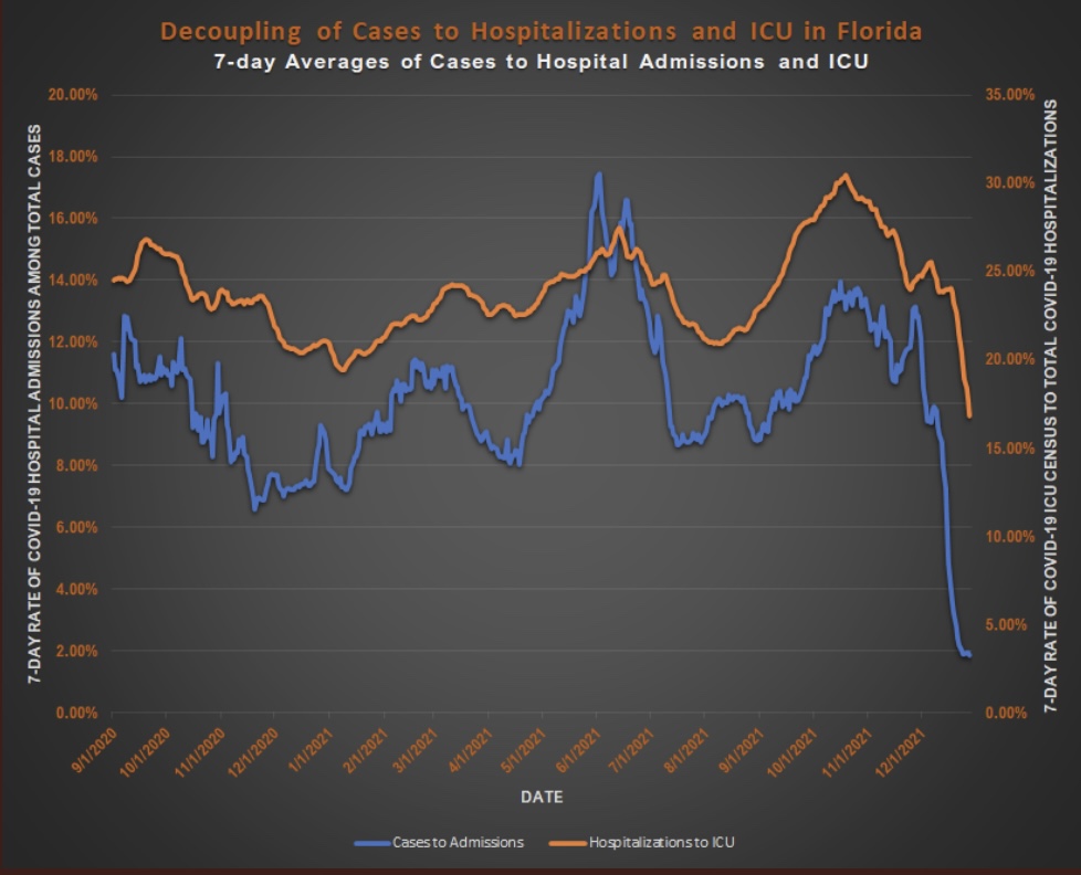
It seems equally true that some vilified by the media for their COVID response are actually heroes. Governor Ron DeSantis of Florida might deserve top honors here. Having spent the last month in Florida, I can attest that the business and social environment here is quite open compared to my home state (despite the presence of a few freaked out northerners who can’t quite fathom how stupid they look wearing masks on the beach). Florida’s infections, hospitalizations, and deaths have been lower than in California, New York, and many other states where lockdown measures have been stringent. (The first chart below is just a little busy…)
As I’ve written for much of the past year, COVID is far more dangerous to the elderly than anyone else, particularly those with co-morbidities. It’s also true that blacks (and some other minorities) are more vulnerable than whites, but if we want to save more black lives, we’re still better off prioritizing the elderly than racial groups. DeSantis understands this, and Florida is among the leaders in vaccinating the elderly population. (States don’t report this data on a uniform basis):
This approach to saving lives is obvious, yet critics at outlets like NBC News insist that DeSantis must be pandering to the senior population in Florida. Well, one wouldn’t want to be responsive to voters who happen to face high mortality risks, right? Others such as horror writer Stephen Kinghave jumped onboard to offer their bumbling public health expertise as well.
There were many experts and the usual collection of numbskulls on social media who were wrong about Florida. DeSantis handled the pandemic as it should have been handled elsewhere. But the propaganda to the contrary goes unabated. For example, this article is pathetic. Can these people be serious? Or are they really that stupid? This goes for the Biden Administration as well, which had entertained the notion of imposing federal travel restrictions on Florida!
The political attacks on Florida and its governor reveal the extent to which opponents wish to ignore the evidence in plain sight. The data on COVID outcomes put the lie to the narrative of a public health emergency requiring massive restrictions on personal liberty. We know those policies are powerless to control the course of the contagion. The pandemic, however, was the key to convincing the public to accept a more authoritarian role for government. It’s a blessing that not everyone bought in, and that there are places like Florida where you can still go about your business in approximate normalcy.
In early December I said that 2020 all-cause mortality in the U.S. would likely be comparable to figures from about 15 years ago. Now, Ben Martin confirms it with the chart below. Over time, declines in U.S. mortality have resulted from progress against disease and fewer violent deaths. COVID led to a jump in 2020, though some of last year’s deaths were attributable to policy responses, as opposed to COVID itself.
Here’s an even longer view of the trend from my post in December (for which 2020 is very incomplete):
As Martin notes sarcastically:
“Surprising, since the US is undergoing a ‘century pandemic‘ – In reality it is an event that’s unique in the last ‘15 years’”
The next chart shows 2020 mortality by month of year relative to the average of the past five years. Clearly, excess deaths have occurred compared to that baseline.
Using the range of deaths by month over the past 20 years (the blue-shaded band in the next chart), the 2020 figures don’t look quite as anomalous.
Finally, Martin shows total excess deaths in 2020 relative to several different baselines. The more recent (and shorter) the baseline time frame, the larger the excess deaths in 2020. Compared to the five-year average, 364,000 excess deaths occurred in 2020. Relative to the past 20 years, however, 150,000 excess deaths occurred last year. While those deaths are tragic, the pandemic looks more benign than when we confine our baseline to the immediate past.
Moreover, a large share of these excess deaths can be attributed to non-COVID causes of death that represent excesses relative to prior years, including drug overdoses, suicide, heart disease, dementia, and other causes. As many as 100,000 of these deaths are directly attributable lockdowns. That means true excess deaths caused by COVID infections were on the order of 50,000 relative to a 20-year baseline.
As infections subside from the fall wave, and as vaccinations continue to ramp up, some policy makers are awakening to the destructive impacts of non-pharmaceutical interventions (lockdown measures). The charts above show that this pandemic was never serious enough to justify those measures, and it’s not clear they can ever be justified in a free society. Yet some officials, including President Biden and Anthony Fauci, still labor under the misapprehension that masks mandates, stay-at-home orders, and restaurant closures can be effective or cost-efficient mitigation strategies.
The pandemic outlook remains mixed, primarily due to the slow rollout of the vaccines and the appearance of new strains of the virus. Nationwide, cases and COVID deaths rose through December. Now, however, there are several good reasons for optimism.
The fall wave of the coronavirus receded in many states beginning in November, but the wave started a bit later in the eastern states, in the southern tier of states, and in California. It appears to have crested in many of those states in January, even after a post-holiday bump in new diagnoses. As of today, Johns Hopkins reports only two states with increasing trends of new cases over the past two weeks: NH and VA, while CT and WY were flat. States shaded darker green have had larger declines in new cases.
A more detailed look at WY shows something like a blip in January after the large decline that began in November. Trends in new cases have clearly improved across the nation, though somewhat later than hoped.
While the fall wave has taken many lives, we can take some solace in the continuing decline in the case fatality rate. (This is not the same as the infection mortality rate (IFR), which has also declined. The IFR is much lower, but more difficult to measure). The CFR fell by more than half from its level in the late summer. In other words, without that decline, deaths today would be running twice as high.
Some of the CFR’s decline was surely due to higher testing levels. However, better treatments are reducing the length of hospital stays for many patients, as well as ICU admittance and deaths relative to cases. Monoclonal antibodies and convalescent plasma have been effective for many patients, and now Ivermectin is showing great promise as a treatment, with a 75% reduction in mortality according to the meta-analysis at the link.
Reported or “announced” deaths remain high, but those reports are not an accurate guide to the level or trend in actual deaths as they occur. The CDC’s provisional death reports give the count of deaths by date of death (DOD), shown below. The most recent three to four weeks are very incomplete, but it appears that actual deaths by DOD may have peaked as early as mid-December, as I speculated they might last month. Another noteworthy point: by the totals we have thus far, actual deaths peaked at about 17,000 a week, or just over 2,400 a day. This is substantially less than the “announced” deaths of 4,000 or more a day we keep hearing. The key distinction is that those announced deaths were actually spread out over many prior weeks.
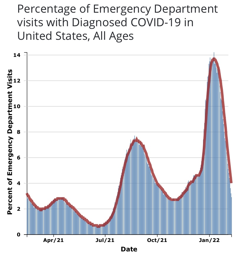
A useful leading indicator of actual deaths has been the percentage of ER patients presenting COVID-like illness (CLI). The purple dots in the next CDC chart show a pronounced decline in CLI over the past three weeks. This series has been subject to revisions, which makes it much less trustworthy. A less striking decline in late November subsequently disappeared. At the time, however, it seemed to foretell a decline in actual deaths by mid-December. That might actually have been the case. We shall see, but if so, it’s possible that better therapeutics are causing the apparent CLI-deaths linkage to break down.
A more recent concern is the appearance of several new virus strains around the world, particularly in the UK and South Africa. The UK strain has reached other countries and is now said to have made appearances in the U.S. The bad news is that these strains seem to be more highly transmissible. In fact, there are some predictions that they’ll account for 30% of new cases by the beginning of March. The South African strain is said to be fairly resistant to antibodies from prior infections. Thus, there is a strong possibility that these cases will be additive, and they might or might not speedily replace the established strains. The good news is that the new strains do not appear to be more lethal. The vaccines are expected to be effective against the UK strain. It’s not yet clear whether new versions of the vaccines will be required against the South African strain by next fall.
Vaccinations have been underway now for just over a month. I had hoped that by now they’d start to make a dent in the death counts, and maybe they have, but the truth is the rollout has been frustratingly slow. The first two weeks were awful, but as of today, the number of doses administered was over 14 million, or almost 46% of the doses that have been delivered. Believe it or not, that’s an huge improvement!
About 4.3% of the population had received at least one dose as of today, according to the CDC. I have no doubt that heavier reliance on the private sector will speed the “jab rate”, but rollouts in many states have been a study in ineptitude. Even worse, now a month after vaccinations began, the most vulnerable segment of the population, the elderly, has received far less than half of the doses in most states. The following table is from Phil Kerpen. Not all states are reporting vaccinations by age group, which might indicate a failure to prioritize those at the greatest risk.
It might not be fair to draw strong conclusions, but it appears WV, FL, IN, AK, and MS are performing well relative to other states in getting doses to those most at risk.
Even with the recent increase in volume, the U.S. is running far behind the usual pace of annual flu vaccinations. Each fall, those average about 50 million doses administered per month, according to Alex Tabarrok. He quotes Youyang Gu, an AI forecaster with a pretty good track record thus far, on the prospects for herd immunity and an end to the pandemic. However, he uses the term “herd immunity” as the ending share of post-infected plus vaccinated individuals in the population, which is different than the herd immunity threshold at which new cases begin to decline. Nevertheless, in Tabarrok’s words:
“… the United States will have reached herd immunity by July, with about half of the immunity coming from vaccinations and half from infections. Long before we reach herd immunity, however, the infection and death rates will fall. Gu is projecting that by March infections will be half what they are now and by May about one-tenth the current rate. The drop will catch people by surprise just like the increase. We are not good at exponentials. The economy will boom in Q2 as infections decline.”
That sounds good, but Tabarrok also quotes a CDC projection of another 100,000 deaths by February. That’s on top of the provisional death count of 340,000 thus far, which runs 3-4 weeks behind. If we have six weeks of provisionals to go before February, with actual deaths at their peak of about 17,000 per week, we’ll get to 100,000 more actual deaths by then. For what it’s worth, I think that’s pessimistic. The favorable turns already seen in cases and actual deaths, which I believe are likely to persist, should hold fatalities below that level, and the vaccinations we’ve seen thus far will help somewhat.
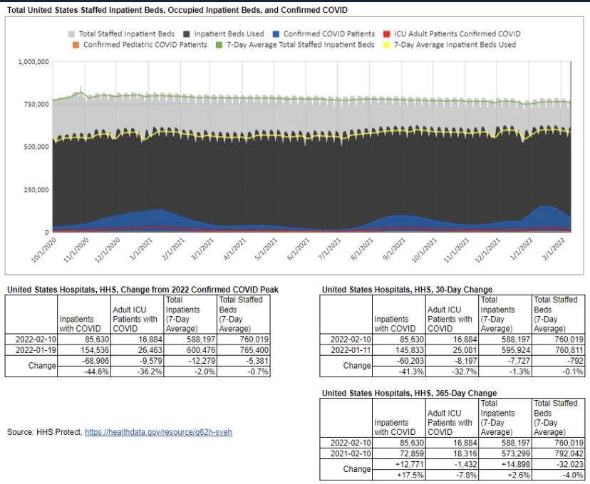
Here’s one of the many entertaining videos made by people who want to convince you that hospitals are overrun with COVID patients (and here is another, and here, here, and here). That assertion has been made repeatedly since early in the pandemic, but as I’ve made clear on at least two occasions, the overall system has plenty of capacity. There are certainly a few hospitals at or very near capacity, but diverting patients is a long-standing practice, and other hospitals have spare capacity to handle those patients in every state. Those with short memories would do well to remember 2018 before claiming that this winter is unique in terms of available hospital beds.
An old friend with long experience as a hospital administrator claimed that I didn’t account for staffing shortfalls in my earlier posts on this topic, but in fact the statistics I presented were all based on staffed inpatient or ICU beds. Apparently, he didn’t read those posts too carefully. Moreover, it’s curious that a hospital administrator would complain so bitterly of staffing shortfalls in the wake of widespread hospital layoffs in the spring. And it’s curious that so many layoffs would accompany huge bailouts of hospital systems by the federal government, courtesy of the CARES Act.
In fairness, hospitals suffered huge declines in revenue in the spring of 2020 as elective procedures were cancelled and non-COVID patients stayed away in droves. Then hospitals faced the expense of covering their shortfalls in PPE. We know staffing was undercut when health care workers were diagnosed with COVID, but in an effort to stem the red ink, hospitals began laying-off staff anyway just as the the COVID crisis peaked in the spring. About 160,000 staffers were laid off in April and May, though more than half of those losses had been recovered as of December.
Did these layoffs lead to a noticeable shortfall in hospital capacity? It’s hard to say because bed capacity is a squishy metric. When patients are discharged, staffed beds can ratchet down because beds might be taken “off-line”. When patients are admitted, beds can be brought back on-line. ICU capacity is flexible as well, as parts of other units can be quickly modified for patients requiring intensive care. And patient ratios can be adjusted to accommodate layoffs or an influx of admissions. Since early in the fall, occupancy has been overstated for several reasons, including a new requirement that beds in use for observation of outpatients with COVID symptoms for 8 hours or more must be reported as beds occupied. However, there are hospitals claiming that COVID is stressing capacity limits, but nary a mention of the earlier layoffs.
So where are we now in terms of staffed hospital occupancy. The screen shot below is from the HHS website and represents staffed bed utilization nationwide. 29% of capacity is open, hardly a seasonal anomaly, and there are very few influenza admissions thus far this winter, which is rather unique. 37% of ICU beds are available, and COVID patients, those admitted either “for” or “with” COVID, account for less than 18% of inpatients, though again, that includes observational beds.
Next are the 25 states with the highest inpatient bed utilization as of January 7th. Rhode Island tops the list at just over 90%, and eight other states are over 80%. In terms of ICU utilization, Georgia and Alabama are very tight. California and Arizona are outliers with respect to proportions of COVID inpatients, 41% and 38%, respectively. Finally, CA, GA, AL and AZ are all near or above 50% of ICU beds occupied by COVID patients.
So some of the states reaching the peak of their fall waves are pretty tight, and there are states with large numbers of very serious cases. Nevertheless, in all states there is variation across local hospitals to serve in relief, and it is not unusual for hospitals to suffer wintertime strains on capacity.
Los Angeles County is receiving much attention for recent COViD stress placed on hospital capacity. But it is hard to square that narrative with certain statistics. For example, Don Wolt notes that the state of California reports available ICU capacity in Southern CA of zero, but LA County has reported 10% ~ 11% for weeks. And the following chart shows that LA County occupancy remains well below it’s July peak, especially after a recent downward revision from the higher level shown by the blue dashed line.
Interestingly, the friend I mentioned said I should talk with some health system CEOs about recent occupancies. He overlooked the fact that I quoted or linked to comments from some system CEOs in my earlier posts (linked above). It’s noteworthy that one of those CEOs, and this report from the KPI Institute, propose that an occupancy rate of 85% is optimal. This medical director prefers a 75% – 85% rate, depending on day of week. These authors write that there is no one “optimal” occupancy rate, but they seem to lean toward rates below 85%. This paper reports a literature search indicating ICU occupancy of 70% -75% is optimal, while noting a variety of conditions may dictate otherwise. Seasonal effects on occupancy are of course very important. In general, we can conclude that hospital utilization in most states is well within acceptable if not “optimal” levels, especially in the context of normal seasonal conditions. However, there are a few states in which some hospitals are facing tight capacity, both in total staffed beds and in their ICUs.
None of this is to minimize the challenges faced by administrators in managing hospital resources. No real crisis in hospital capacity exists currently, though hospital finances are certainly under stress. Yes, hospitals collect greater reimbursements on COVID patients via the CARES Act, but COVID patients carry high costs of care. Also, hospitals have faced steep declines in revenue from the fall-off in other care, high costs in terms of PPE, specialized equipment and medications, and probably high temporary staffing costs in light of earlier layoffs and short-term losses of staff to COVID infections. The obvious salve for many of these difficulties is cash, and the most promising source is public funding. So it’s unsurprising that executives are inclined to cry wolf about a capacity crisis. It’s a simple story and more appealing than pleading for cash, and it’s a scare story that media are eager to push.
Both the Pfizer and the Moderna COVID vaccines require two doses, with an effectiveness of about 95%. But a single dose may have an efficacy of about 80% that is likely to last over a number of weeks without a second dose. There are varying estimates of short-term efficacy, and but see here, here, and here. The chart above is for the Pfizer vaccine (red line) relative to a control group over days since the first dose, and the efficacy grows over time relative to the control before a presumed decay ever sets in.
Unfortunately, doses are in short supply, and getting doses administered has proven to be much more difficult than expected. “First Doses First” (FDF) is a name for a vaccination strategy focusing on delivering only first doses until a sufficient number of the highly vulnerable receive one. After that, second doses can be administered, perhaps within some maximum time internal such as 8 – 12 weeks. FDF doubles the number of individuals who can be vaccinated in the short-term with a given supply of vaccine. Today, Phil Kerpen posted this update on doses delivered and administered thus far:
Dosing has caught up a little, but it’s still lagging way behind deliveries.
As Alex Tabbarok points out, FDF is superior strategy because every two doses create an average of 1.6 immune individuals (2 x 0.8) instead of just 0.95 immune individuals. His example involves a population of 300 million, a required herd immunity level of two-thirds (higher than a herd immunity threshold), and an ability to administer 100 million doses per month. Under a FDF regime, you’ve reached Tabarrok’s “herd immunity” level in two months. (This is not to imply that vaccination is the only contributor to herd immunity… far from it!) Under the two-dose regime, you only get halfway there in that time. So FDF means fewer cases, fewer deaths, shorter suspensions of individual liberty, and a faster economic recovery.
An alternative that doubles the number of doses available is Moderna’s half-dose plan. Apparently, their tests indicate that half doses are just as effective as full doses, and they are said to be in discussions with the FDA and Operation Warp Speed to implement the half-dose plan. But the disadvantage of the half-dose plan relative to FDF is that the former does not help to overcome the slow speed with which doses are being administered.
Vaccine supplies are bound to increase dramatically in coming months, and the process of dosing will no doubt accelerate as well. However, for the next month or two, FDF is too sensible to ignore. While I am not a fan of all British COVID policies, their vaccination authorities have recommended an FDF approach as well as allowing different vaccines for first and second doses.
Anthony Fauci has repeatedly increased his estimate of how much of the population must be vaccinated to achieve what he calls herd immunity, and he did it again in late December. This series of changes, and other mixed messages he’s delivered in the past, reveal Fauci to be a “public servant” who feels no obligation to level with the public. Instead, he crafts messages based on what he believes the public will accept, or on his sense of how the public must be manipulated. For example, by his own admission, his estimates of herd immunity have been sensitive to polling data! He reasoned that if more people reported a willingness to take a vaccine, he’d have flexibility to increase his “public” estimate of the percentage that must be vaccinated for herd immunity. Even worse, Fauci appears to lack a solid understanding of the very concept of herd immunity.
Manipulation
There is so much wrong with his reasoning on this point that it’s hard to know where to start. In the first place, why in the world would anyone think that if more people willingly vaccinate it would imply that even more must vaccinate? And if he felt that way all along it demonstrates an earlier willingness to be dishonest with the public. Of course, there was nothing scientific about it: the series of estimates was purely manipulative. It’s almost painful to consider the sort of public servant who’d engage in such mental machinations.
Immunity Is Multi-Faceted
Second, Fauci seemingly wants to convince us that herd immunity is solely dependent on vaccination. Far from it, and I’m sure he knows that, so perhaps this too was manipulative. Fauci intimates that COVID herd immunity must look something like herd immunity to the measles, which is laughable. Measles is a viral infection primarily in children, among whom there is little if any pre-immunity. The measles vaccine (MMR) is administered to young children along with occasional boosters for some individuals. Believe it or not, Fauci claims that he rationalized a requirement of 85% vaccination for COVID by discounting a 90% requirement for the measles! Really???
In fact, there is substantial acquired pre-immunity to COVID. A meaningful share of the population has long-memory, cross-reactive T-cells from earlier exposure to coronaviruses such as the common cold. Estimates range from 10% to as much as 50%. So if we stick with Fauci’s 85% herd immunity “guesstimate”, 25% pre-immunity implies that vaccinating only 60% of the population would get us to Fauci’s herd immunity goal. (Two qualifications: 1) the vaccines aren’t 100% effective, so it would take more than 60% vaccinated to offset the failure rate; 2) the pre-immune might not be identifiable at low cost, so there might be significant overlap between the pre-immune and those vaccinated.)
Conceptual Confusion
Vaccinations approaching 85% would be an extremely ambitious goal, especially if it is recommended annually or semi-annually. It would be virtually impossible without coercion. While more than 91% of children are vaccinated for measles in the U.S., it is not annual. Thus, measles does not offer an appropriate model for thinking about herd immunity to COVID. Less than half of adults get a flu shot each year, and somewhat more children.
Fauci’s reference to 85% – 90% total immunity is different from the concept of the herd immunity threshold (HIT) in standard epidemiological models. The HIT, often placed in the range of 60% – 70%, is the point at which new infections begin to decline. More infections occur above the HIT but at a diminishing rate. In the end, the total share of individuals who become immune due to exposure, pre-immunity or vaccination will be greater than the HIT. The point is, however, that reaching the HIT is a sufficient condition for cases to taper and an end to a contagion. If we use 65% as the HIT and pre-immunity of 25%, only 40% must be vaccinated to reach the HIT.
Heterogeneity
A recent innovation in epidemiological models is the recognition that there are tremendous differences between individuals in terms of transmissibility, pre-immunity, and other factors that influence the spread of a particular virus, including social and business arrangements. This kind of heterogeneity tends to reduce the effective HIT. We’ve already discussed the effect of pre-immunity. Suppose that certain individuals are much more likely to transmit the virus than others, like so-called super-spreaders. They spur the initial exponential growth of a contagion, but there are only so many of them. Once infected, no one else among the still-susceptible can spread the virus with the same force.
Researchers at the Max Planck Institute (and a number of others) have gauged the effect of introducing heterogeneity to standard epidemiological models. It is dramatic, as the following chart shows. The curves simulate a pandemic under different assumptions about the degree of heterogeneity. The peak of these curves correspond to the HIT under each assumption (R0 refers to the initial reproduction number from infected individuals to others).
Moderate heterogeneity implies a HIT of only 37%. Given pre-immunity of 25%, only an additional 12% of the population would have to be infected or vaccinated to prevent a contagion from gaining a foothold for the initial exponential stage of growth. Fauci’s herd immunity figure obviously fails to consider the effect of heterogeneity.
How Close To the HIT?
We’re not as far from HITs as Fauci might think, and a vaccination goal of 85% is absurd and unnecessary. The seasonal COVID waves we’ve experienced thus far have faded over a period of 10-12 weeks. Estimates of seroprevalence in many localities reached a range of 15% – 25% after those episodes, which probably includes some share of those with pre-immunity. To reach the likely range of a HIT, either some additional pre-immunity must have existed or the degree of heterogeneity must have been large in these populations.
But if that’s true, why did secondary waves occur in the fall? There are a few possibilities. Of course, some areas like the upper Midwest did not experience the springtime wave. But in areas that suffered a recurrance, perhaps the antibodies acquired from infections did not remain active for as long as six months. However, other immune cells have longer memories, and re-infections have been fairly rare. Another possibility is that those having some level of pre-immunity were still able to pass live virus along to new hosts. But this vector of transmission would probably have been quite limited. Pre-immunity almost surely varies from region to region, so some areas were not as firmly above their HITs as others. It’s also possible that infections from super-spreaders were concentrated within subsets of the population even within a given region, in certain neighborhoods or among some, but not all, social or business circles. Therefore, some subsets or “sub-herds” achieved a HIT in the first wave, but it was unnecessary for other groups. In other words, sub-herds spared in the first wave might have suffered a contagion in a subsequent wave. And again, reinfections seem to have been rare. Finally, there is the possibility of a reset in the HIT in the presence of a new, more transmissible variant of the virus, as has become prevalent in the UK, but that was not the case in the fall.
Fragility
Tyler Cowen has mentioned another possible explanation: so-called “fragile” herd immunity. The idea is that any particular HIT is dependent on the structure of social relations. When social distancing is widely practiced, for example, the HIT will be lower. But if, after a contagion recedes, social distancing is relaxed, it’s possible that the HIT will take a higher value at the onset of the next seasonal wave. Perhaps this played a role in the resurgence in infections in the fall, but the HIT can be reduced via voluntary distancing. Eventually, acquired immunity and vaccinations will achieve a HIT under which distancing should be unnecessary, and heterogeneity suggests that shouldn’t be far out of reach.
Conclusion
Anthony Fauci has too often changed his public pronouncements on critical issues related to management of the COVID pandemic. Last February he said cruises were fine for the healthy and that most people should live their lives normally. Oops! Then came his opinion on the limited effectiveness of masks, then a shift to their necessity. His first position on masks has been called a “noble lie” intended to preserve supplies for health care workers. However, Fauci was probably repeating the standing consensus at that point (and still the truth) that masks are of limited value in containing airborne pathogens.
This time, Fauci admitted to changing his estimate of “herd immunity” in response to public opinion, a pathetic approach to matters of public health. What he called herd immunity was really an opinion about adequate levels of vaccination. Furthermore, he neglected to consider other forms of immunity: pre-existing and already acquired. He did not distinguish between total immunity and the herd immunity threshold that should guide any discussion of pandemic management. He also neglected the significant advances in epidemiological modeling that recognize the reality of heterogeneity in reducing the herd immunity threshold. The upshot is that far fewer vaccinations are needed to contain future waves of the pandemic than Fauci suggests.
There are currently two vaccines in limited distribution across the U.S. from Pfizer and Moderna, but the number and variety of different vaccines will grow as we move through the winter. For now, the vaccine is in short supply, but that’s even more a matter of administering doses in a timely way as it is the quantity on hand. There are competing theories about how best to allocate the available doses, which is the subject of this post. I won’t debate the merits of refusing to take a vaccine except to say that I support anyone’s right to refuse it without coercion by public authorities. I also note that certain forms of discrimination on that basis are not necessarily unreasonable.
The vaccines in play all seem to be highly effective (> 90%, which is incredible by existing standards). There have been a few reports of side effects — certainly not in large numbers — but it remains to be seen whether the vaccines will have any long-term side effects. I’m optimistic, but I won’t dismiss the possibility.
Despite competing doctrines about how the available supplies of vaccine should be allocated, there is widespread acceptance that health care workers should go first. I have some reservations about this because, like Emma Woodhouse, I believe staff and residents at long-term care facilities should have at least equal priority. Yet they do not in the City of Chicago and probably in other areas. I have to wonder whether unionized health care workers there are the beneficiaries of political favoritism.
Beyond that question, we have the following competing priorities: 1) the vulnerable in care homes and other elderly individuals (75+, while younger individuals with co-morbidities come later); 2) “essential” workers of all ages (from police to grocery store clerks — decidedly arbitrary); and 3) basically the same as #2 with priority given to groups who have suffered historical inequities.
#1 is clearly the way to save the most lives, at least in the short-run. Over 40% of the deaths in the U.S. have been in elder-care settings, and COVID infection fatality ratesmount exponentially with age:
To derive the implications of #1 and #2, it’s more convenient to look at the share of deaths within each age cohort, since it incorporates the differences in infection rates and fatality rates across age groups (the number of “other” deaths is much larger than COVID deaths, of course, despite similar death shares):
The 75+ age group has accounted for about 58% of all COVID deaths in the U.S., and ages 25 – 64 accounted for about 20% (an approximate age range for essential workers). This implies that nearly three times as many lives can be saved by prioritizing the elderly, at least if deaths among so-called essential workers mimic deaths in the 25 – 64 age cohorts. However, the gap would be smaller and perhaps reversed in terms of life-years saved.
Furthermore, this is a short-run calculation. Over a longer time frame, if essential workers are responsible for more transmission across all ages than the elderly, then it might throw the advantage to prioritizing essential workers over the elderly, but it would take a number of transmission cycles for the differential to play out. Yes, essential workers are more likely to be “super-spreaders” than work-at-home, corporate employees, or even the unemployed, but identifying true super-spreaders would require considerable luck. Moreover, care homes generally house a substantial number of elderly individuals and staff in a confined environment, where spread is likely to be rampant. So the transmission argument for #2 over #1 is questionable.
The over-riding problem is that of available supply. Suppose enough vaccine is available for all elderly individuals within a particular time frame. That’s about 6.6% of the total U.S. population. The same supply would cover only about 13% of the younger age group identified above. Essential workers are a subset of that group, but the same supply would fall far short of vaccinating all of them; lives saved under #2 would then fall far short of the lives saved under #1. Quantities of the vaccine are likely to increase over the course of a few months, but limited supplies at the outset force us to focus the allocation decision on the short-term, making #1 the clear winner.
Now let’s talk about #3, minority populations, historical inequities, and the logic of allocating vaccine on that basis. Minority populations have suffered disproportionately from COVID, so this is really a matter of objective risk, not historical inequities… unless the idea is to treat vaccine allocations as a form of reparation. Don’t laugh — that might not be far from the intent, and it won’t count as a credit toward the next demand for “justice”.
For the sake of argument, let’s assume that minorities have 3x the fatality rate of whites from COVID (a little high). Roughly 40% of the U.S. population is non-white or Hispanic. That’s more than six times the size of the full 75+ population. If all of the available doses were delivered to essential workers in that group, it would cover less than half of them and save perhaps 30% of minority COVID deaths over a few months. In contrast, minorities might account for up to two-thirds of the deaths among the elderly. Therefore, vaccinating all of the elderly would save 58% of elderly COVID deaths and about 39% of minority deaths overall!
The COVID mortality risk to the average white individual in the elderly population is far greater than that faced by the average minority individual in the working age population. Therefore, no part of #3 is sensible from a purely mathematical perspective. Race/ethnicity overlaps significantly with various co-morbiditiesand the number of co-morbidities with which individuals are afflicted. Further analysis might reveal whether there is more to be gained by prioritizing by co-morbidities rather than race/ethnicity.
Megan McArdle has an interesting column on the CDC’s vaccination guidelines issued in November, which emphasized equity, like #3 above. But the CDC walked back that decision in December. The initial November decision was merely the latest of the the agency’s fumbles on COVID policy. In her column, McArdle notes that the public has understood that the priority was to save lives since the very start of the pandemic. Ideally, if objective measures show that identifiable characteristics are associated with greater vulnerability, then those should be considered in prioritizing individuals who desire vaccinations. This includes age, co-morbidities, race/ethnicity, and elements of occupational risk. But lesser associations with risk should not take precedence over greater associations with risk unless an advantage can be demonstrated in terms of lives saved, historical inequities or otherwise.
The priorities for the early rounds of vaccinationsmay differ by state or jurisdiction, but they are all heavily influenced by the CDC’s guidelines. Some states pay lip service to equity considerations (if they simply said race/ethnicity, they’d be forced to operationalize it), while others might actually prioritize doses by race/ethnicity to some degree. Once the initial phase of vaccinations is complete, there are likely to be more granular prioritizations based on different co-morbidities, for example, as well as race/ethnicity. Thankfully, the most severe risk gradient, advanced age, will have been addressed by then.
One last point: the Pfizer and Moderna vaccines both require two doses. Alex Tabarrok points out that first doses appear to be highly effective on their own. In his opinion, while supplies are short, the second dose should be delayed until all groups at substantially elevated risk can be vaccinated…. doubling the supply of initial doses! The idea has merit, but it is unlikely to receive much consideration in the U.S. except to the extent that supply chain problems make it unavoidable, and they might.
For clarity, start with this charming interpretive one-act on public health policy in 2020. You might find it a little sardonic, but that’s the point. It was one of the more entertaining tweets of the day, from @boriquagato.
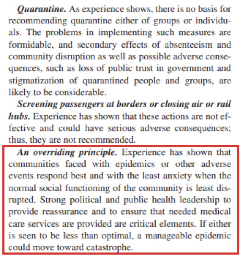
A growing body of research shows that stringent non-pharmaceutical interventions (NPIs) — “lockdowns” is an often-used shorthand — are not effective in stemming the transmission and spread of COVID-19. A compendium of articles and preprints on the topic was just published by the American Institute for Economic Research (AEIR): “Lockdowns Do Not Control the Coronavirus: The Evidence”. The list was compiled originally by Ivor Cummins, and he has added a few more articles and other relevant materials to the list. The links span research on lockdowns across the globe. It covers transmission, mortality, and other health outcomes, as well as the economic effects of lockdowns. AIER states the following:
“Perhaps this is a shocking revelation, given that universal social and economic controls are becoming the new orthodoxy. In a saner world, the burden of proof really should belong to the lockdowners, since it is they who overthrew 100 years of public-health wisdom and replaced it with an untested, top-down imposition on freedom and human rights. They never accepted that burden. They took it as axiomatic that a virus could be intimidated and frightened by credentials, edicts, speeches, and masked gendarmes.
The pro-lockdown evidence is shockingly thin, and based largely on comparing real-world outcomes against dire computer-generated forecasts derived from empirically untested models, and then merely positing that stringencies and “nonpharmaceutical interventions” account for the difference between the fictionalized vs. the real outcome. The anti-lockdown studies, on the other hand, are evidence-based, robust, and thorough, grappling with the data we have (with all its flaws) and looking at the results in light of controls on the population.”
We are constantly told that public intervention constitutes “leadership”, as if our well being depends upon behavioral control by the state. Unfortunately, it’s all too typical of research on phenomena deemed ripe for intervention that computer models are employed to “prove” the case. A common practice is to calibrate such models so that the outputs mimic certain historical outcomes. Unfortunately, a wide range of model specifications can be compatible with an historical record. This practice is also a far cry from empirically testing well-defined hypotheses against alternatives. And it is a practice that usually does poorly when the model is tested outside the period to which it is calibrated. Yet that is the kind of evidence that proponents of intervention are fond of using to support their policy prescriptions.
In this case, it’s even worse, with some of the alleged positive effects of NPI’s wholly made-up, with no empirical support whatsoever! So-called public health experts have misled themselves, and the public, with this kind of fake evidence, when they aren’t too busy talking out of both sides of their mouths.
In advanced civilizations the period loosely called Alexandrian is usually associated with flexible morals, perfunctory religion, populist standards and cosmopolitan tastes, feminism, exotic cults, and the rapid turnover of high and low fads---in short, a falling away (which is all that decadence means) from the strictness of traditional rules, embodied in character and inforced from within. -- Jacques Barzun