
Tags
Centre for Translational Data Science, Confirmed Cases, Coronavirus, Covid-19, Death Toll, Epidemiological Models, Herd Immunity, IMHE, Murray Model, Pandemic, Pending Tests, Test Demand, The University of Sydney
It’s beginning to look like we’ve turned a corner in mitigating the spread of the coronavirus. I hope I’m not speaking too soon.
It’s time to update some of the charts and thoughts about where the epidemic is trending in the U.S. Here’s the first of these “framing” posts I published on March 18th. The last update from about a week ago is here. The demand for tests seems to be tapering a little, and the percentage of tests that are positive has leveled and even dropped a bit. The number of confirmed cases continues to mount, but the daily increases are slowing, as is the growth rate of the cumulative count. Finally, the daily increase in the number of deaths is also slowing, and total deaths have risen more slowly than one prominent model predicted on the date at which I chose to “freeze” it for my own expositional purposes: April 2. The charts appear further below.
The epidemiological modelers have taken a real beating from many observers as their estimated virus growth curves have shifted downward. Their initial projections were way too high, and they have continued to overshoot in subsequent model revisions. In fairness, however, they didn’t have a lot to go on during the early stages of the pandemic, and conservatism was probably seen as a must. The variety and extent of mitigation measures was also an unknown, of course.
I build “event” models for a living, though the events I study are economic and are obviously much different kinds of risks than coronavirus infection. I seldom face situations in which so little historical data is available, so I can appreciate the modeling challenge presented by Covid-19: it was pretty close to an unwinnable situation. Nevertheless, until recently the projections were outrageously high. There comes a time when accurate, rather than conservative, projections are demanded. The confidence intervals produced by the modelers are really not worthy of the name. Partly on that basis, a very recent paper gave the model produced by the Institute for Health Metrics and Evaluation very poor marks (IMHE, which I called the Murray Model last week):
“In excess of 70% of US states had actual death rates falling outside the 95% prediction interval for that state…”
That’s nothing short of pathetic.
That brings me to the “framing” exercise I’ve been performing for nearly four weeks. It is not a modeling exercise. The “very good” and “pretty bad” scenarios I charted for the confirmed Covid-19 case count in the U.S. were not intended as confidence intervals except perhaps in spirit. The intent was to provide perspective on developments as they unfolded. Where to place those bounds? They were based on multiples of the Italian experience (pretty bad) and the South Korean experience (very good) as of March 18, normalized for U.S. population. Here’s the latest version of that chart, where Day 1 was March 4th:

The curve may be just starting to bend to the right. Let’s hope so. The daily growth rate of new cases has dropped below 5%. Below, it’s clear that the daily count of new confirmed cases plateaued in early April, and the last few days show an encouraging reduction.

I also think it’s telling that after a few weeks of “excess demand” for tests, demand seems to be falling. The chart below showed the sharp reduction in the “pending test” count about a week ago. It corresponded with the spike in daily tests, which have stabilized since then and may be trending down (lower panel).

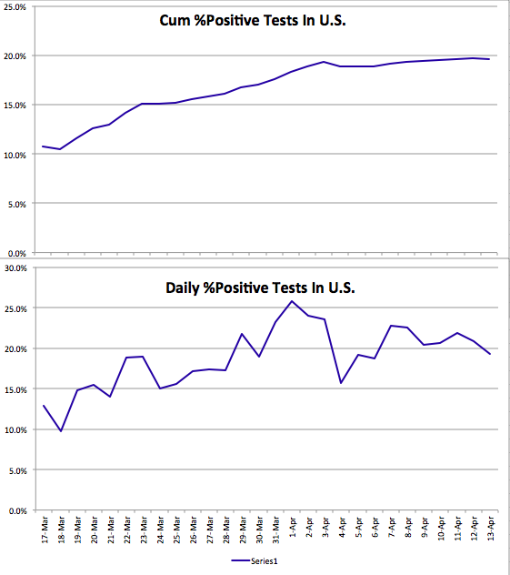
The next chart shows that the cumulative share of tests with a positive diagnosis has flattened. The lower panel hints at a taper in the daily share of positive tests, which would be welcome. However, I do not necessarily expect that percentage to decline too much if the number of tests continues to fall. In fact, more testing will almost certainly be required in order to “restart” the economy. Then, we should see a reduction in the percentage of positive tests if all goes well.
The last chart highlights the IMHE model discussed above. The chart extends from March through June, though the unlabeled date axis is not cooperating with me. The mean model prediction of U.S. cumulative deaths attributed to Covid-19 is shown in red. The upper and lower bounds of the confidence interval are the blue and green lines. Again, I “froze” this forecast as of April 2 to serve as another “framing” device. Actual deaths are traced by the black line, which goes through April 13th. It is trending below the mean forecast, and IMHE has reduced their mean forecast of the death toll by about a third since April 2nd (to 60,000). Actual deaths may well come in below that level.

I hope my optimism based on these nascent developments is not unwarranted. But they are consistent with state-by-state reports of more positive trends in the data. It is time to start planning for a return to more normal times, but with a new eye toward mitigating risk that will probably involve isolating vulnerable groups when appropriate, more work at home, widespread testing, and a few other significant changes in social and business practices. It remains to be seen how easily certain industries can return to previous levels, such as hospitality, or how soon crowds can return to sporting events, concerts, and theaters. That might have to await greater levels of “herd immunity”, an effective vaccine, and fast testing.

Pingback: CDC Sows Covid Case-Fatality Confusion | Sacred Cow Chips
Pingback: Covid “Framing” #5: Crested Wave | Sacred Cow Chips