• About

Sacred Cow Chips

Sacred Cow Chips

Tag Archives: Death Toll

Reported and “Actual” COVID Deaths

13 Monday Jul 2020

Posted by pnoetx in Pandemic, Political Bias

≈ 2 Comments

Tags

Cause of Death, CDC, Coronavirus, Covid Tracking Project, COVID-Phobic Deaths, Death Toll, Hospital Reimbursements, Kyle Lamb, Lockdown Deaths, Our World In Data, Reclassified Deaths

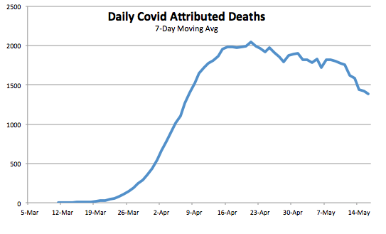
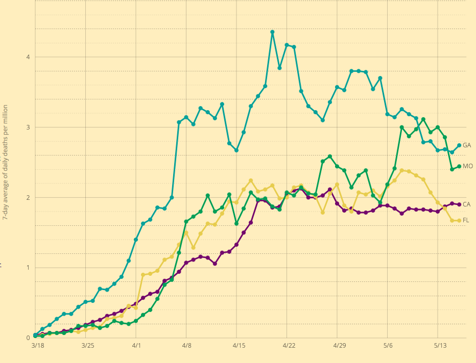
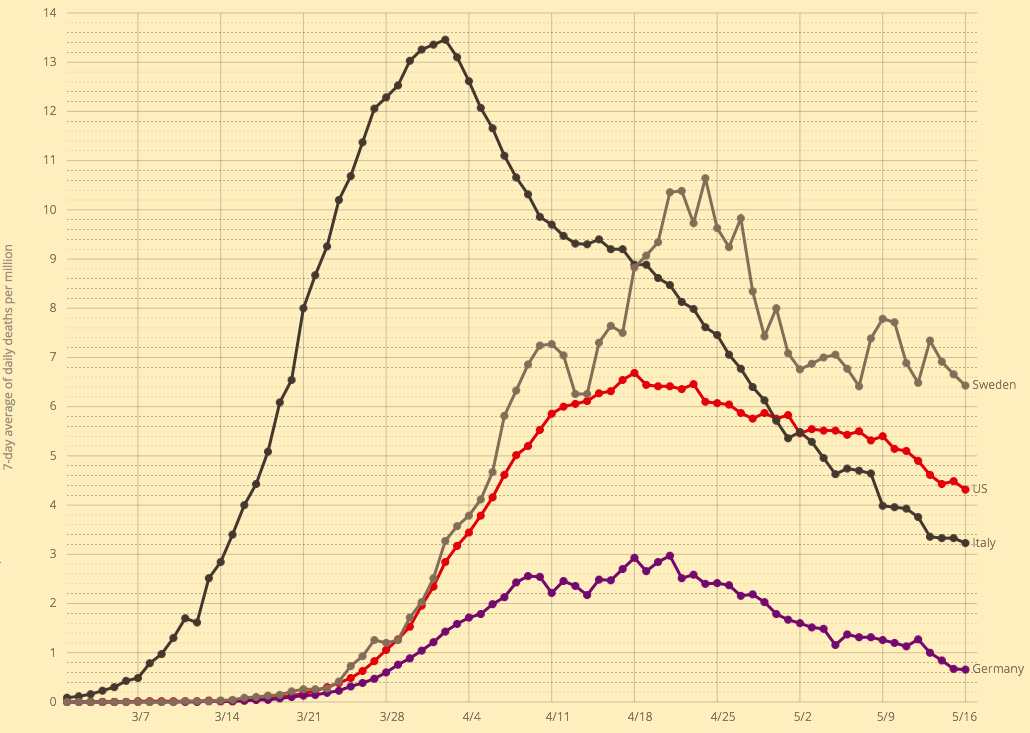
I was updating my post from twelve days ago on the upward trend in new coronavirus cases when I came across a great tabular summary of a phenomenon that’s been underway since early April: significant delays in reporting deaths from COVID-19 (C19). Before I get to that, a quick word on what’s happened over the past 12 days. New coronavirus cases keep climbing in a number of states, and it’s been a grisly waiting game to see whether the severity and lethality of infections will follow the case counts upward. The following chart provides a very preliminary answer. It’s taken from Our World In Data, and it shows the seven-day moving average of C19 deaths in the U.S.

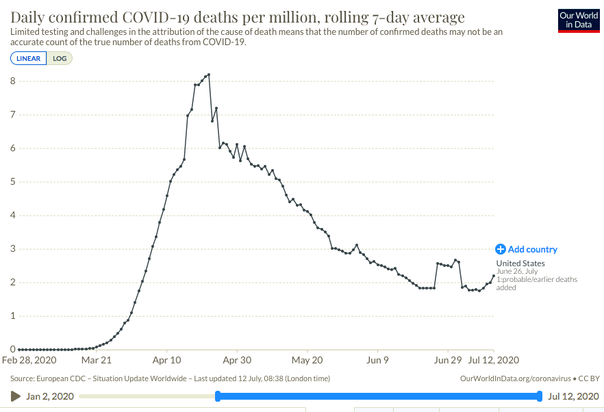
There has indeed been an upturn in reported deaths over the past week. Just prior to that, a temporary plateau in late June was caused by a set of “reclassifications” of earlier deaths in New Jersey (the “plateau effect is caused by seven-day averaging). These kinds of changes in reporting make it rather difficult to interpret trends accurately. Unfortunately, the reporting of deaths has been subject to continuing distortions that are even more difficult to discern than New Jersey’s spike.

Kyle Lamb provides the interesting table below, which might be difficult to read without either clicking on it or going to the link at Twitter. Here is another link to an annotated version of the table. The top row labeled “CTP Total” is the C19 death toll reported each week by the COVID Tracking Project. This is generally what the public sees. These reports show that deaths reached their highest levels during the weeks of April 11th through May 9th. However, the second column shows C19 deaths by their actual week of occurrence. This series shows a more distinct peak on April 18th with steady declines thereafter.

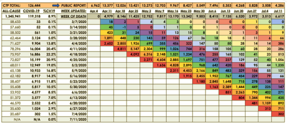
The weekly totals in the second column are not final, however. Take a look at the last reporting week in the far right column (July 11th). The CTP reported 4,286 deaths, an increase over the prior week consistent with the upturn in the first chart above. But the table shows that over half of that week’s reported deaths actually occurred in late April and early May! So the upturn in deaths is something of a mirage.

We won’t have a reasonable approximation of the death totals for the past several weeks (or how they compare) for at least several more weeks. In fact, one can argue that it might be a matter of months before we have a reasonable approximation of those deaths, but it’s worth noting that the vast bulk of “actual” C19 deaths tend to be reported within four weeks of the initial reporting week, and the additions or revisions to the two weeks in late April and early May in the last column were exceptionally large. Chances are we won’t see many more that big…. Or will we?

Aspects of this process hint at the ease with which the C19 death totals could be manipulated. The reported totals for all-cause mortality in the first column are incomplete; more recent weeks, especially, are not fully settled as to causes of death. Some of those fatalities are certain to be attributed to C19. Others might be reclassified as C19. And here is the scary part: the all-cause totals are certain to include a significant number of lockdown-related or COVID-phobic deaths: individuals who were unable or unwilling to seek medical care for urgent needs due to lockdowns or fears of rampant spread of C19 infections within hospital environments. To anyone with an interest in manipulating the C19 death toll, whether hospital officials seeking higher reimbursements, local or state officials seeking federal funds, or public officials at any level seeking to promote pandemic fears and/or political discord, these “extra” deaths might be tempting marks for reclassification.

I’m fairly confident that the uptrend of new cases will be far less severe than early in the pandemic. I believe much of the alarm I see on social and mainstream media is misplaced. More on that in a subsequent post, but for now I’ll simply note that those testing positive are concentrated in much lower ranges of the age distribution, and treatment has improved in a variety of ways. The table above shows that the downtrend in actual weekly C19 deaths is intact as of the admittedly incomplete July 11th reporting week. We won’t know the “actual” pattern of early-July C19 fatalities for another month or more. Even then, one might harbor suspicions that the totals are manipulated for economic or political reasons, but we can hope the reporting authorities are exercising the utmost objectivity in assigning cause of death.

Covid Framing #6: The Great Over-Reaction

16 Saturday May 2020

Posted by pnoetx in Pandemic

≈ 2 Comments

Tags

Asian Flu, California, Colorado, Confirmed Cases, Coronavirus, Covid-19, Death Toll, Florida, Georgia, Germany, Great Over-Reaction, Hong Kong Flu, Italy, Nate Silver, Neil Ferguson, New York, Pandemics, Spanish Flu, Sweden

I visited my doctor last Wednesday. He’s a specialist but also serves as my primary care physician, and we share the same condition. He’s affiliated with a prestigious medical school and practices on the campus of a large research hospital. First thing, I asked him, “So what do you think of all this?” Without hesitation, he said he believes we’re witnessing the single greatest over-reaction in all of medical history. He elaborated at length, which I very much appreciated, and I was gratified that much of what he said was familiar to me and my readers. The risks of the coronavirus are highly concentrated among the elderly and the already-sick, and the damage that the panic and lockdowns have done to the delivery of other medical care is probably a bigger tragedy, to say nothing of the economic damage. Furthermore, the Covid-19 pandemic is certainly not more threatening than others the world has experienced since WW II.

But did we know all that in March? No one with any sense believed the low numbers coming out of China; major flip-flops and mistakes by public health officials in the U.S. did much to confuse matters and delay evaluation of the outbreak. Nevertheless, there were reasons to proceed more deliberately. The explosion of cases in Italy and elsewhere consistently indicated that risk was concentrated among the elderly, so a targeted approach to protecting the vulnerable would have made sense. Still, individuals took voluntary action to social distance even before governments initiated broad lockdowns.

The lockdowns, of course, were sold as a short-term effort to “flatten the curve” so that medical resources would not be overwhelmed. There was, no doubt, great stress on front-line health care workers in March and April, and there were short-term shortages of personal protective equipment as well as ventilators for the most severe cases (but it’s possible ventilators actually harmed some patients). But whether you credit government action, private action, or the fact that so much of the population was not susceptible to begin with, mission accomplished! The strains were concentrated in certain geographic regions, especially the New York City metro area, but even there, the virus is on the wane. There is always the possibility of a major second wave, but perhaps it can be handled more intelligently by the public and especially public servants.

And now for some charts. Due to day-to-day volatility, and because the data on case numbers and deaths fluctuate on a weekly frequency, the charts below are on a 7-day moving average basis. It’s clear that the peak in U.S. daily confirmed cases was over five weeks ago, while the peak in Covid-attributed deaths was about three weeks ago.

Unfortunately, there is more doubt than ever about the legitimacy of the numbers. New York keeps “discovering” new deaths in nursing homes, a situation aggravated by a statewide order in March prohibiting homes from rejecting new or returning patients with active infections. There are reports from across the country of family deaths that were imminent, yet officially attributed to Covid. In one case, a death from severe alcohol poisoning was attributed to Covid. Colorado announced today that it was revising its death toll downward by about 24%.

The data on confirmed cases are elevated because testing keeps expanding. The first chart below shows that the number of daily tests has more than doubled over the past 3½ weeks. At the same time, the second chart below shows that the rate of “positives” has declined steadily for over six weeks. That is likely due to a combination of expanded testing for screening purposes, as opposed to testing mainly individuals presenting symptoms, and fewer individuals presenting symptoms each day.

As Nate Silver said on Saturday:

“There are still *way* too many stories about big spikes in cases when the cause of those spikes was a big increase in tests. And remember, it’s a good thing when states start doing more tests!”

One commenter on Silver’s thread pointed out that more testing is likely to lead to more confirmed cases even if the true number of infections is declining.

I’ll highlight just a few individual states. Missouri’s peak in cases appears to have occurred several weeks ago, though a spike at the end of April interrupted the trend. The spike was partly attributable to a flare-up at a single meat-packing plant (facilities that are particularly conducive to viral spread due to close conditions and aerosols).

Here is Georgia, which began to reopen its economy on April 24. The pro-lockdown crowd confidently predicted the reopening would lead to a spike in cases within two weeks. Georgia is conservative in its reporting, so they don’t extend the lines in the chart beyond 14 days of the most recent reports due to potential revisions. Nevertheless, it’s clear that the trend in cases is downward.

The pro-lockdown contingent predicted the same for Florida, but that has not been the case:

The next chart shows seven-day moving averages of deaths per million of population for four states: CA, FL, GA, and MO. The labels on the right might be hard to read, but MO is the green line. Deaths lag cases by a few weeks, and Missouri’s death rate was elevated more recently, again owing partly to the meat-packing plant. These death rates are all fairly low relative to the northeastern states around New York.

Finally, here are death rates per million of population for a few selected countries: Italy, Germany, Sweden, and the US. Italy had the large early spike, while Germany lagged and with a much lower fatality rate. The U.S. suffered more than twice the German death rate. Sweden, which has pursued a herd immunity strategy, has come in somewhat higher. The Italian and Swedish experiences both reflect high deaths in nursing homes, which might indicate a lack of preparedness at those institutions.

Here is a post from just a few days ago with a nice collection of charts for various countries.

Returning to the main gist of this “framing”, the Great Over-Reaction, the predictions setting off this panic were made by a forecaster, Neil Ferguson, who has had a rather poor track record of predicting the severity of earlier pandemics. The model he used is said to have been poorly coded and documented, and it is underdetermined such that many multiple forecast paths are possible. That means the choice of a “forecast” path is arbitrary.

Make no mistake: Covid-19 is a serious virus. Ultimately, however, the Covid-19 pandemic might not reach the scale of a typical global flu: the current global death toll is only about two-thirds of the average flu season (global deaths from Covid-19 are now about 312,000—the chart below is a few days old). In the U.S., the death toll is modestly higher than the average flu season, but that is largely attributable to the New York City metro area. Worldwide, Covid19 deaths are now about 30% of the toll of the Hong Kong flu in 1969-70, 28% of the Asian flu in 1957-58, and far less than 1% of the Spanish flu at the end of WW I. Neither the Hong Kong flu nor the Asian flu were dealt with via widespread non-prescription health interventions like the draconian lockdowns instituted this time. The damage to the economy has been massive and unjustifiable, and the effective moratorium on medical care for other serious conditions is inflicting a large toll of its own.

Again, we can identify distinct groups that are highly vulnerable to Covid-19: the aged and individuals with co-morbidities most common among the aged. A large share of the population is not susceptible, including children and the vast bulk of the work force. The sensible approach is to target vulnerable groups for protection while minimizing interference with the liberties of those capable of taking care of themselves, especially their freedom to weigh risks. Nevertheless, those facing low risks should continue to practice extra-good manners…. er, social distancing, to avoid subjecting others to undue risk. Don’t be a close talker, don’t go out if you feel at all out of sorts, and cover your sneezes!

CDC Sows Covid Case-Fatality Confusion

15 Wednesday Apr 2020

Posted by pnoetx in Data Integrity, Pandemic

≈ Leave a comment

Tags

Case Fatality Rate, Centers for Disease Control, Co-Morbidities, Coronavirus, Covid "Hot Spots", Covid-119, Crisis Management, Data Integrity, Death Toll, Excess Deaths, Government Accounting, Influenza, New York Deaths, Probable Deaths, Respiratory Disease, Testing Guidelines

The Centers for Disease Control has formally decided to inflate statistics on coronavirus deaths by adding so-called “probable” cases to the toll. This news follows the announcement yesterday that New York decided to add, in one day, about 4,000 deaths from over the past month to its now “probable” Covid-19 death toll. So much for clean accounting! We have a confirmed death toll up to April 14th. We have a probable death toll after. The error in timing alone introduced by this abrupt adjustment impairs efforts to track patterns of change. Case fatality rates are rendered meaningless. Data integrity, which was already weak, has been thrown out the window by our public heath authorities.

It’s no longer necessary for a deceased patient to have tested positive for Covid-19:

“A probable case or death is defined as one that meets clinical criteria such as symptoms and evidence of the disease with no lab test confirming Covid-19. It can also be classified as a probable case if there are death or other vital records listing coronavirus as a cause. A third way to classify it is through presumptive laboratory evidence and either clinical criteria or evidence of the disease.”

Consider the following:

  • to date, more than 80% of patients presenting symptoms sufficient to meet testing guidelines have tested negative for Covid-19;
  • the most severe cases of Covid-19 and other respiratory diseases are coincident with significant co-morbidities;
  • “probable” cases appear to be concentrated among the elderly and infirm, whose regular mortality rate is high.

Deaths involving mere symptoms, or mere symptoms and co-morbidities, and even deaths of undetermined cause, are now more likely to be over-counted as Covid-19 deaths. This is certain to distort, and I believe overcount, Covid-19 deaths. Of course, this was already happening in some states, as I mentioned last week in “Coronavirus Controversies“.

One of the charts I’ve presented in my Continue%20reading Coronavirus “Framing” posts tracks Covid-19 deaths. The change in these cause-of-death guidelines will make continued tracking into something of a farce. I’d be tempted to deduct the one-day distortion caused by the New York decision, but then the count will still be distorted going forward by the broader definition of Covid-19 death.

The only possible rationale for these decisions by New York and the CDC is that testing is still subject to severe rationing. I have my doubts, as the number of daily tests has stabilized. On the other hand, I have heard anecdotes about hospitals with large numbers of respiratory patients who have not been tested! And they are intermingling all of these patients?? I’m not sure I can reconcile these reports. Surely the patients meet the guidelines for testing. Perhaps the CDC’s decision is associated with an effort to spread testing capacity by allowing only new patients to be tested, counting those already hospitalized as presumptively Covid-infected. And if they aren’t already, they will be! A decision to count deaths within that group as “probable” Covid deaths  would fit conveniently into that approach, but that would be wildly misguided and perverse.

I’m obviously cynical about the motives here. I don’t trust government accounting when it bears on the credit or blame for crisis management. Who stands to gain from a higher Covid death toll? The CDC? State health authorities? “Hot spots” vying for federal resources?

A consistent approach to attributing cause of death would have been more useful for gauging the direction of the pandemic, but as I’ve said, there will always be uncertainty about the true Covid-19 death toll. Ultimately, the best estimates will have to rely on calculations of “excess deaths” in 2020 compared to a “normal” level from a larger set of causes. In fact, even that comparison will be suspect because the flu season leading up to the Covid outbreak was harsh. Was it really the flu later in the season?

Coronavirus “Framing” Update #4

13 Monday Apr 2020

Posted by pnoetx in economic growth, Pandemic

≈ 2 Comments

Tags

Centre for Translational Data Science, Confirmed Cases, Coronavirus, Covid-19, Death Toll, Epidemiological Models, Herd Immunity, IMHE, Murray Model, Pandemic, Pending Tests, Test Demand, The University of Sydney

It’s beginning to look like we’ve turned a corner in mitigating the spread of the coronavirus. I hope I’m not speaking too soon.

It’s time to update some of the charts and thoughts about where the epidemic is trending in the U.S. Here’s the first of these “framing” posts I published on March 18th. The last update from about a week ago is here. The demand for tests seems to be tapering a little, and the percentage of tests that are positive has leveled and even dropped a bit. The number of confirmed cases continues to mount, but the daily increases are slowing, as is the growth rate of the cumulative count. Finally, the daily increase in the number of deaths is also slowing, and total deaths have risen more slowly than one prominent model predicted on the date at which I chose to “freeze” it for my own expositional purposes: April 2. The charts appear further below.

The epidemiological modelers have taken a real beating from many observers as their estimated virus growth curves have shifted downward. Their initial projections were way too high, and they have continued to overshoot in subsequent model revisions. In fairness, however, they didn’t have a lot to go on during the early stages of the pandemic, and conservatism was probably seen as a must. The variety and extent of mitigation measures was also an unknown, of course.

I build “event” models for a living, though the events I study are economic and are obviously much different kinds of risks than coronavirus infection. I seldom face situations in which so little historical data is available, so I can appreciate the modeling challenge presented by Covid-19: it was pretty close to an unwinnable situation. Nevertheless, until recently the projections were outrageously high. There comes a time when accurate, rather than conservative, projections are demanded. The confidence intervals produced by the modelers are really not worthy of the name. Partly on that basis, a very recent paper gave the model produced by the Institute for Health Metrics and Evaluation very poor marks (IMHE, which I called the Murray Model last week):

“In excess of 70% of US states had actual death rates falling outside the 95% prediction interval for that state…”

That’s nothing short of pathetic.

That brings me to the “framing” exercise I’ve been performing for nearly four weeks. It is not a modeling exercise. The “very good” and “pretty bad” scenarios I charted for the confirmed Covid-19 case count in the U.S. were not intended as confidence intervals except perhaps in spirit. The intent was to provide perspective on developments as they unfolded. Where to place those bounds? They were based on multiples of the Italian experience (pretty bad) and the South Korean experience (very good) as of March 18, normalized for U.S. population. Here’s the latest version of that chart, where Day 1 was March 4th:

The curve may be just starting to bend to the right. Let’s hope so. The daily growth rate of new cases has dropped below 5%. Below, it’s clear that the daily count of new confirmed cases plateaued in early April, and the last few days show an encouraging reduction.

I also think it’s telling that after a few weeks of “excess demand” for tests, demand seems to be falling. The chart below showed the sharp reduction in the “pending test” count about a week ago. It corresponded with the spike in daily tests, which have stabilized since then and may be trending down (lower panel).

The next chart shows that the cumulative share of tests with a positive diagnosis has flattened. The lower panel hints at a taper in the daily share of positive tests, which would be welcome. However, I do not necessarily expect that percentage to decline too much if the number of tests continues to fall. In fact, more testing will almost certainly be required in order to “restart” the economy. Then, we should see a reduction in the percentage of positive tests if all goes well.

The last chart highlights the IMHE model discussed above. The chart extends from March through June, though the unlabeled date axis is not cooperating with me. The mean model prediction of U.S. cumulative deaths attributed to Covid-19 is shown in red. The upper and lower bounds of the confidence interval are the blue and green lines. Again, I “froze” this forecast as of April 2 to serve as another “framing” device. Actual deaths are traced by the black line, which goes through April 13th. It is trending below the mean forecast, and IMHE has reduced their mean forecast of the death toll by about a third since April 2nd (to 60,000). Actual deaths may well come in below that level.

I hope my optimism based on these nascent developments is not unwarranted. But they are consistent with state-by-state reports of more positive trends in the data. It is time to start planning for a return to more normal times, but with a new eye toward mitigating risk that will probably involve isolating vulnerable groups when appropriate, more work at home, widespread testing, and a few other significant changes in social and business practices. It remains to be seen how easily certain industries can return to previous levels, such as hospitality, or how soon crowds can return to sporting events, concerts, and theaters. That might have to await greater levels of “herd immunity”, an effective vaccine, and fast testing.

Follow Sacred Cow Chips on WordPress.com

Recent Posts

  • On Quitting Facebook
  • COVID Now: Turning Points, Vaccines, and Mutations
  • Long COVID: a Name For Post-Viral Syndrome
  • Cash Flows and Hospital Woes
  • Let’s Do “First Doses First”

Archives

  • January 2021
  • December 2020
  • November 2020
  • October 2020
  • September 2020
  • August 2020
  • July 2020
  • June 2020
  • May 2020
  • April 2020
  • March 2020
  • February 2020
  • January 2020
  • December 2019
  • November 2019
  • October 2019
  • September 2019
  • August 2019
  • July 2019
  • June 2019
  • May 2019
  • April 2019
  • March 2019
  • February 2019
  • January 2019
  • December 2018
  • November 2018
  • October 2018
  • September 2018
  • August 2018
  • July 2018
  • June 2018
  • May 2018
  • April 2018
  • March 2018
  • February 2018
  • January 2018
  • December 2017
  • November 2017
  • October 2017
  • September 2017
  • August 2017
  • July 2017
  • June 2017
  • May 2017
  • April 2017
  • March 2017
  • February 2017
  • January 2017
  • December 2016
  • November 2016
  • October 2016
  • September 2016
  • August 2016
  • July 2016
  • June 2016
  • May 2016
  • April 2016
  • March 2016
  • February 2016
  • January 2016
  • December 2015
  • November 2015
  • October 2015
  • September 2015
  • August 2015
  • July 2015
  • June 2015
  • May 2015
  • April 2015
  • March 2015
  • February 2015
  • January 2015
  • December 2014
  • November 2014
  • October 2014
  • September 2014
  • August 2014
  • July 2014
  • June 2014
  • May 2014
  • April 2014
  • March 2014

Blogs I Follow

  • TLCCholesterol
  • Nintil
  • kendunning.net
  • DCWhispers.com
  • Hoong-Wai in the UK
  • Marginal REVOLUTION
  • CBS St. Louis
  • Watts Up With That?
  • Aussie Nationalist Blog
  • American Elephants
  • The View from Alexandria
  • The Gymnasium
  • Public Secrets
  • A Force for Good
  • ARLIN REPORT...................walking this path together
  • Notes On Liberty
  • troymo
  • SUNDAY BLOG Stephanie Sievers
  • Miss Lou Acquiring Lore
  • Your Well Wisher Program
  • Objectivism In Depth
  • RobotEnomics
  • Orderstatistic
  • Paradigm Library
  • Scattered Showers and Quicksand

Blog at WordPress.com.

TLCCholesterol

The Cholesterol Blog

Nintil

To estimate, compare, distinguish, discuss, and trace to its principal sources everything

kendunning.net

The future is ours to create.

DCWhispers.com

Hoong-Wai in the UK

A Commonwealth immigrant's perspective on the UK's public arena.

Marginal REVOLUTION

Small Steps Toward A Much Better World

CBS St. Louis

News, Sports, Weather, Traffic and St. Louis' Top Spots

Watts Up With That?

The world's most viewed site on global warming and climate change

Aussie Nationalist Blog

Commentary from a Paleoconservative and Nationalist perspective

American Elephants

Defending Life, Liberty and the Pursuit of Happiness

The View from Alexandria

In advanced civilizations the period loosely called Alexandrian is usually associated with flexible morals, perfunctory religion, populist standards and cosmopolitan tastes, feminism, exotic cults, and the rapid turnover of high and low fads---in short, a falling away (which is all that decadence means) from the strictness of traditional rules, embodied in character and inforced from within. -- Jacques Barzun

The Gymnasium

A place for reason, politics, economics, and faith steeped in the classical liberal tradition

Public Secrets

A 93% peaceful blog

A Force for Good

How economics, morality, and markets combine

ARLIN REPORT...................walking this path together

PERSPECTIVE FROM AN AGING SENIOR CITIZEN

Notes On Liberty

Spontaneous thoughts on a humble creed

troymo

SUNDAY BLOG Stephanie Sievers

Escaping the everyday life with photographs from my travels

Miss Lou Acquiring Lore

Gallery of Life...

Your Well Wisher Program

Attempt to solve commonly known problems…

Objectivism In Depth

Exploring Ayn Rand's revolutionary philosophy.

RobotEnomics

(A)n (I)ntelligent Future

Orderstatistic

Economics, chess and anything else on my mind.

Paradigm Library

OODA Looping

Scattered Showers and Quicksand

Musings on science, investing, finance, economics, politics, and probably fly fishing.

Cancel