
Tags
Age-Adjusted Deaths, All-Cause Mortality, Covid-19, Dry Tinder Effect, Flu Season, Lockdown Death, Pandemic, Patrick Moore
In this short post I’m trying to do my part to put our pandemic experience in perspective. Lord knows, I was on the low side in my U.S. case-load “guesstimate” last March, as well as the number of deaths induced by COVID. (A number of others, using highly sophisticated models, erred more severely in the opposite direction.) I also failed to anticipate the strength of the later seasonal waves we’ve experienced — I was excessively optimistic as the first wave ebbed. But now, as the fall wave is showing some signs of topping out, what can we say about the pandemic in historical perspective? I came across an interesting chart that sheds some light on the question.
In terms of all-cause mortality, we’ve clearly seen a bump upward this year. Take a look at the chart below. It shows deaths per million (DPM) of population (from all causes). Try clicking on it if it’s hard to read, or turn your phone sideways. See the little blip on the lower right? That’s our pandemic year through August. The blip made 2020, at least through August, look something like a normal year of the early 2000s.
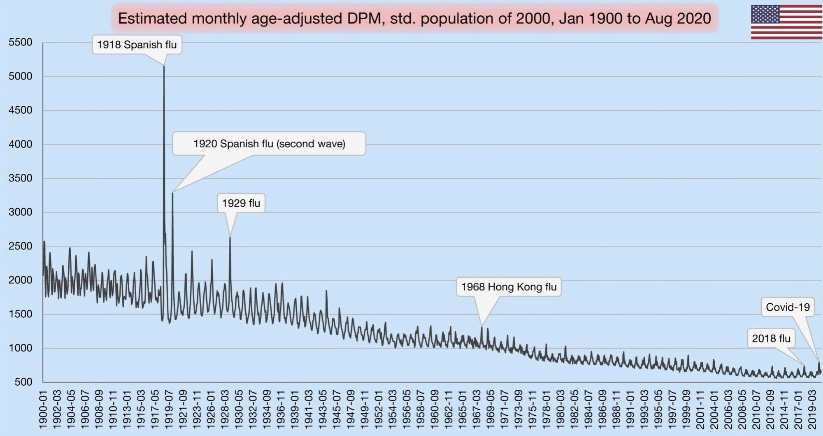
The visible spike early in 2020 was the spring wave, which was concentrated on the east coast. Of course, the fall wave will yield another spike, probably a bit higher than the first. Nevertheless, against the historical backdrop, this chart shows that the magnitude of our current public health crisis is relatively minor.
If you scan to the left from 2020, you can see that DPM this year would have appeared normal around 2005. Remember how bad it was back in aught-five…. all the death? Yeah, me neither. That’s perspective.
The chart also reflects several mild flu seasons over the past few years. Because the flu, like COVID-19, tends to hit the elderly and infirm the hardest, the “soft” DPM numbers over the past few years support the theory that the population included a fair amount of so-called “dry tinder” for COVID as we entered the year.
One other note on the chart: the DPMs are “age-adjusted”, meaning that age groups are weighted for comparisons across countries with differing age distributions (not what we’re doing here). In this case, the DPM values are weighted based on the population in the year 2000.
It’s amazing how so many have bought into the narrative that the current pandemic is historically bad. Yes, our DPMs are high relative to the last decade, but a significant number of those deaths were caused not by COVID, but by our own overreaction to the virus. That’s something else I failed to anticipate in the spring. It’s something we can put behind us now, however, if only we’re willing to put our experience in perspective. Unfortunately, many public officials, along with their public health advisors, continue to promote the deluded view that the virus can only be stopped by stopping our lives, our educations, our earnings, our health, and our sanity.

Pingback: COVID Externalities: the Costs and Benefits of Intervention | Sacred Cow Chips
Pingback: Revisiting Excess Mortality | Sacred Cow Chips