In this short post I’m trying to do my part to put our pandemic experience in perspective. Lord knows, I was on the low side in my U.S. case-load “guesstimate” last March, as well as the number of deaths induced by COVID. (A number of others, using highly sophisticated models, erred more severely in the opposite direction.) I also failed to anticipate the strength of the later seasonal waves we’ve experienced — I was excessively optimistic as the first wave ebbed. But now, as the fall wave is showing some signs of topping out, what can we say about the pandemic in historical perspective? I came across an interesting chart that sheds some light on the question.
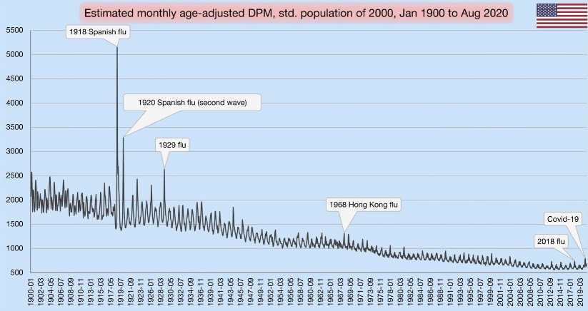
In terms of all-cause mortality, we’ve clearly seen a bump upward this year. Take a look at the chart below. It shows deaths per million (DPM) of population (from all causes). Try clicking on it if it’s hard to read, or turn your phone sideways. See the little blip on the lower right? That’s our pandemic year through August. The blip made 2020, at least through August, look something like a normal year of the early 2000s.
The visible spike early in 2020 was the spring wave, which was concentrated on the east coast. Of course, the fall wave will yield another spike, probably a bit higher than the first. Nevertheless, against the historical backdrop, this chart shows that the magnitude of our current public health crisis is relatively minor.
If you scan to the left from 2020, you can see that DPM this year would have appeared normal around 2005. Remember how bad it was back in aught-five…. all the death? Yeah, me neither. That’s perspective.
The chart also reflects several mild flu seasons over the past few years. Because the flu, like COVID-19, tends to hit the elderly and infirm the hardest, the “soft” DPM numbers over the past few years support the theory that the population included a fair amount of so-called “dry tinder” for COVID as we entered the year.
One other note on the chart: the DPMs are “age-adjusted”, meaning that age groups are weighted for comparisons across countries with differing age distributions (not what we’re doing here). In this case, the DPM values are weighted based on the population in the year 2000.
It’s amazing how so many have bought into the narrative that the current pandemic is historically bad. Yes, our DPMs are high relative to the last decade, but a significant number of those deaths were caused not by COVID, but by our own overreaction to the virus. That’s something else I failed to anticipate in the spring. It’s something we can put behind us now, however, if only we’re willing to put our experience in perspective. Unfortunately, many public officials, along with their public health advisors, continue to promote the deluded view that the virus can only be stopped by stopping our lives, our educations, our earnings, our health, and our sanity.
There are some hints of good news on the spread of the coronavirus in a few of the “hot spots“ that developed this fall. This could be very good news, but it’s a bit too early to draw definitive conclusions.
The number of new cases plateaued in Europe a few weeks ago. Of course, Europe’s average latitude is higher than in most of the U.S., and the seasonal spread began there a little earlier. It makes sense that it might ebb there a bit sooner than in the U.S. as well.
In the U.S., cases shot up in the upper Midwest four to six weeks ago, depending on the state. Now, however, new cases have turned down in Iowa, Nebraska, North Dakota, South Dakota, and Wisconsin (first chart below), and they appear to have plateaued in Illinois, Kansas, Minnesota, and Missouri (second chart below, but ending a few days earlier). These are the hottest of the recent hot states.
These plateaus and declines were preceded by a decline in the growth rates of new cases around 10 days ago, shown below.
The timing of these patterns roughly correspond to the timing of the spread in other regions earlier in the year. It’s been suggested that after seroprevalence reaches levels of around 15% – 25% that individuals with new antibodies, together with individuals having an existing pre-immunity from other coronaviruses, is enough to bring the virus reproduction rate (R) to a value of one or less. That means a breach of the effective herd immunity threshold. It’s possible that many of these states are reaching those levels. Of course, this is very uncertain, but the patterns are certainly encouraging.
Deaths lag behind new infections, and it generally takes several weeks before actual deaths by date-of-death are known with any precision. However, we might expect deaths to turn down within two to three weeks.
Deaths by date-of-death are strongly associated with emergency room patients from three weeks prior who presented symptoms of COVID-like illness (CLI) or influenza-like illness ((ILI). The following chart shows CLI and ILI separately for the entire U.S. (ILI is the lowest dashed line), but the last few observations of both series, after a peak on November 15th, suggest a downturn in CLI + ILI. If the relationship holds up, actual U.S. deaths by date-of-death should peak around December 7th, though we won’t know precisely until early in the new year.
As a side note, it continues to look like the flu season will be exceptionally mild this year. See the next chart. That’s tremendous because it should take some of the normal seasonable pressure off health care resources.
So Happy Thanksgiving!
-————————————————
Note: I saved all those charts over the last few days but lost track of the individual sources on Twitter. I’m too lazy and busy to go back and search through Twitter posts, so instead I’ll just list a few of my frequent sources here with links to recent posts, which are not necessarily apropos of the above: Don Wolt, Justin Hart, AlexL, The Ethical Skeptic, Aaron Ginn, and HOLD2.
Reported COVID deaths do not reflect deaths that actually occurred in the reporting day or week, as I’ve noted several times. Here is a nice chart from @tlowdon on Twitter showing the difference between reported deaths and actual deaths for corresponding weeks. The blue bars are weekly deaths reported by the COVID Tracking Project. The solid orange bars are the CDC’s “provisional” deaths by actual week of death, which is less than complete for recent weeks because of lags in reporting. Still, it’s easy to see that reported deaths have overstated actual deaths each week since late August.
I should note that the orange bars represent deaths that involved COVID-19, though a COVID infection might not have actually killed them. This CDC report, updated on November 4th, shows the importance of co-morbidities, which in many cases are the actual cause of death according to pre-COVID, CDC guidance on death certificates.
Leading Indicators
Researchers have studied several measures in an effort to find leading indicators of COVID deaths. The list includes new cases diagnosed (PCR positivity) and the percentage of emergency room visits presenting symptoms of COVID-like illness (%CLI). These indicators are usually evaluated after shifting them in time by a few weeks in order to observe correlations with COVID deaths a few weeks later. Interestingly, @tlowdon reports that the best single predictor of actual COVID deaths over the course of a few weeks is the sum of the %CLI and the percentage of ER patients presenting symptoms of influenza-like illness (%ILI). Perhaps adding %ILI to %CLI strengthens the correlation because the symptoms of the flu and COVID are often mistaken for one another.
The chart below reproduces the orange bars from above representing deaths at actual dates of death. Also plotted are the %Positivity from COVID tests (shifted forward 2 weeks), %CLI (3 weeks), the %ILI (3 weeks), and the sum of %CLI and %ILI (3 weeks, the solid blue line). My guess is that %ILI contributes to the correlation with deaths mainly because %ILI’s early peak (which occurred in March) led the peak in deaths in April. Otherwise, there is very little variation in %ILI. That might change with the current onset of the flu season, but as I noted in my last post, the flu has been very subdued since last winter.
What About November?
So where does that leave us? The chart above ends with our leading indicator, CLI + ILI, brought forward from the first half of October. What’s happened to CLI + ILI since then? And what does that tell us to expect in November? The chart below is from the CDC’s web site. The red line is %CLI and the yellow line is %ILI. The sum of the two isn’t shown. However, there is no denying the upward trend in CLI, though the slope of CLI + ILI would be more moderate.
As of 10/31, CLI + ILI has increased by almost 40% since it’s low in early October. If the previous relationship holds up, that implies an increase of almost 40% in actual weekly COVID deaths from about 4,000 per week to about 5,500 per week by November 21 (a little less than 800 per day).
FiveThirtyEight has a compilation of 13 different forecast models with projections of deaths by the end of November. The estimate of 5,500 per week by November 21, or perhaps slightly less per week over the full month of November, would put total COVID deaths at the top of the range of the MIT, UCLA, Iowa State, and University of Texas models, but below or near the low end of ranges for eight other models. However, those models are based on reported deaths, so the comparison is not strictly valid. Reported deaths are still likely to exceed actual deaths by the end of November, and the actual death prediction would be squarely in the range of multiple reported death predictions. That reinforces the expectation an upward trend in actual deaths.
Third Wave States
States in the upper Midwest and upper Mountain regions have had the largest increases in cases per capita over the past few weeks. Using state abbreviations, the top ten are ND, SD, WI, IA, MT, NE, WY, UT, IL, and MN, with ID at #11 (according to the CDC’s COVID Data Tracker). One factor that might mediate the increase in cases, and ultimately deaths, is the possibility of early herd immunity: in the earlier COVID waves, the increase in infections abated once seroprevalence (the share of the population with antibodies from exposure) reached a level of 15% to 25%.
Unfortunately, estimates of seroprevalence by state are very imprecise. Thus far, reliable samples have been limited to states and metro areas that had heavy infections in the first and second waves. One rule of thumb, however, is that seroprevalence is probably less than 10x the cumulative share of a population having tested positive. To be very conservative, let’s assume a seroprevalence of four times cumulative cases. On that basis, half the states in the “top ten” listed above would already have seroprevalence above 15%. Those states are ND, SD, WI, IA, and NE. The others are mostly in a range of 12% to 15%, with MI coming in the lowest at about 9%.
This gives some cause for optimism that the wave in these states and others will abate fairly soon, but there are a number of uncertainties: first, the estimates of seroprevalence above, while conservative, are very imprecise, as noted above; second, the point at which herd immunity might cause the increase in new cases to begin declining is real guesswork (though we might have confirmation in a few states before long); third, we are now well into the fall season, with lower temperatures, lower humidity, less direct sunlight, and diminishing vitamin D levels. We do not have experience with COVID at this time of year, so we don’t know whether the patterns observed earlier in the year will be repeated. If so, new cases might begin to abate in some areas in November, but that probably wouldn’t be reflected in deaths until sometime in December. And if the flu comes back with a corresponding increase in CLI + ILI, then we’d expect further increases in actual deaths attributed to COVID. That is only a possibility given the weakness in flu numbers in 2020, however.
Closing Thoughts
I was excessively optimistic about the course of the pandemic in the U.S. in the spring. While this post has been moderately pessimistic, I believe there are reasons to expect fewer deaths than previous relationships would predict. We are far better at treating COVID now, and the vulnerable are taking precautions that have reduced their incidence of infections relative to younger and healthier cohorts. So if anything, I think the forecasts above will err on the high side.
Writing about COVID as a respite from election madness is very cold comfort, but here goes….
COVID deaths in the U.S. still haven’t shown the kind of upward trend this fall that many had feared. It could happen, but it hasn’t yet. In the chart above, new cases are shown in brown (along with the rolling seven-day average), while deaths (on the right axis) are shown in blue. It’s been over six weeks since new case counts began to rise, but deaths have risen for about two weeks, and it’s been gradual relative to the first two waves. Either the average lag between diagnosis and death is much longer than earlier in the year, or the current “casedemic” is much less deadly, or perhaps both. It could change. And granted, this is national data; states in the midwest have had the strongest trends in cases, especially the upper midwest, as well as stronger trends in hospitalizations and deaths. Most of those areas had milder experiences with the virus in the spring and summer.
Lagged Reporting
What’s tricky about this is that both case reports and death reports in the chart above are significantly lagged. A COVID test might not take place until several days after infection (if at all), and sometimes not until hospitalization or death. Then the test result might not be known for several days. However, the greater availability of tests and faster turnaround time have almost certainly shortened that lag.
Deaths are reported with an even a greater delay, though you wouldn’t know it from listening to the media or some of the organizations that track these statistics, such as Johns Hopkins University and the COVID Tracking Project. Thus far, they only tell you what’s reported on a given day. This article from Rational Ground does a good job of explaining the issue and the distortion it causes in discerning trends.
Deaths by actual date-of-death
I’ve reported on the issue of lagged COVID deaths myself. The following graph from Justin Hart is a clear presentation of the reporting delays.
Reported deaths for the most recent week (10/24) are shown in dark blue, and those deaths were spread over a number of prior weeks. Actual deaths in a given week are represented by a “stack” of deaths reported later, in subsequent weeks. One word of caution: actual deaths in the most recent weeks are “provisional”, and more will be added in subsequent reporting weeks. Hence the steep drop off for the 10/17 and 10/24 reporting weeks.
Going back three or four weeks, it’s clear that actual deaths continued to decline into October. Unfortunately, that doesn’t tell us much about the recent trend or whether actual deaths have started to rise given the increase in new cases. I have seen a new weekly update with the deaths by actual date of death, but it is not “stacked” by reporting week. However, it does show a slight increase in the week of 10/10, the first weekly increase since the end of June. So perhaps we’ll see an uptick more in-line with the earlier lags between diagnosis and death, but that’s far from certain.
Another important point is that the number of deaths each week, and each day, are not as high as reported by the media and the popular tracking sites. How often have you heard “more than 1,000 people a day are dying”. That’s high even for weekly averages of reported deaths. As of three weeks ago, actual daily deaths were running at about 560. That’s still very high, but based on seroprevalence estimates (the actual number of infections from the presence of antibodies), the infection fatality keeps dropping toward levels that are comparable to the flu at ages less than 65.
Where is the flu?
Speaking of the flu, this chart from the World Health Organization is revealing: the flu appears to have virtually disappeared in 2020:
It’s still very early in the northern flu season, but the case count was very light this summer in the Southern Hemisphere. There are several possible explanations. One favored by the “lockdown crowd” is that mitigation efforts, including masks and social distancing, have curtailed the flu bug. Not just curtailed … quashed! If that’s true, it’s more than a little odd because the same measures have been so unsuccessful in curtailing COVID, which is transmitted the same way! Also, these measures vary widely around the globe, which weakens the explanation.
There are other, more likely explanations: perhaps the flu is being undercounted because COVID is being overcounted. False positive COVID tests might override the reporting of a few flu cases, but not all diagnoses are made via testing. Other respiratory diseases can be mistaken for the flu and vice versus, and they are now more likely to be diagnosed as COVID absent a test — and as the joke goes, the flu is now illegal! And another partial explanation: it is rare to be infected with two viruses at once. Thus, COVID is said to be “crowding out” the flu.
Waiting for data
There is other good news about transmission, treatment, and immunity, but I’ll devote another post to that, and I’ll wait for more data. For now, the “third wave” appears to be geographically distinct from the first two, as was the second wave from the first. This suggests a sort of herd immunity in areas that were hit more severely in earlier waves. But the best news is that COVID deaths, thus far this fall, are not showing much if any upward movement, and estimates of infection fatality rates continue to fall.
In advanced civilizations the period loosely called Alexandrian is usually associated with flexible morals, perfunctory religion, populist standards and cosmopolitan tastes, feminism, exotic cults, and the rapid turnover of high and low fads---in short, a falling away (which is all that decadence means) from the strictness of traditional rules, embodied in character and inforced from within. -- Jacques Barzun