• About

Sacred Cow Chips

Sacred Cow Chips

Tag Archives: Co-morbidity

Coronavirus: Framing the Next Few Weeks #3

05 Sunday Apr 2020

Posted by Nuetzel in Pandemic, Risk Management

≈ 1 Comment

Tags

80000 Hours, Chris Murray Model, Christopher Monkton, Christopher Murray, Co-morbidity, Confidence Interval, Coronavirus, Covid Tracking Project, Covid-19, Economic Restart, Indur M. Goklany, Institute for Health Metrics and Evaluation, Lockdowns, Pending Tests, Positive Test Ratio, Social Distancing, Stay-at-Home Orders, White House Coronavirus Task Force

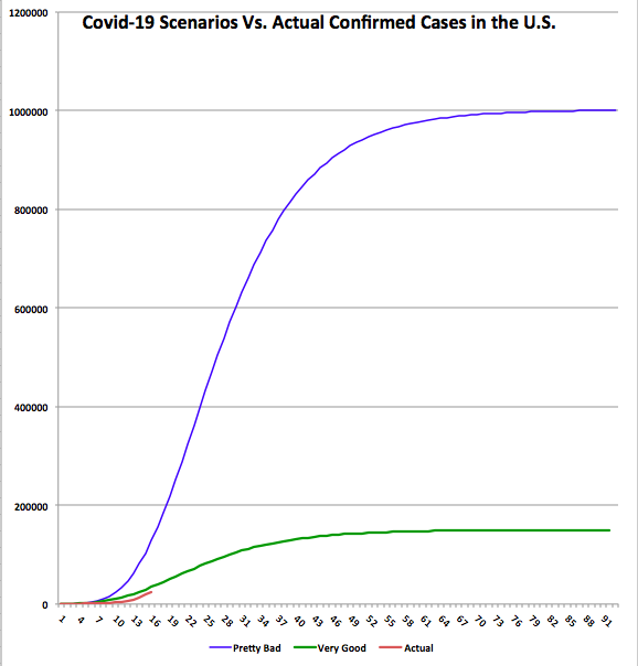
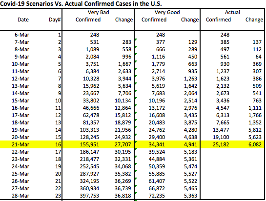
There were a few encouraging signs of change over the past few days in the course of the coronavirus pandemic in the U.S. This is the third of my quaint efforts to provide perspective on the coronavirus pandemic with “tracking” or “framing” posts. The first two were: Coronavirus: Framing the Next Few Weeks, on March 22, and Framing Update on March 28. In both of those posts, I charted confirmed cases of Covid-19 in the U.S. along with optimistic and pessimistic scenarios. I speculated that over the course of a few weeks, social distancing would lead to a reduction in the daily number of new confirmed cases. Unfortunately, it’s not clear whether that curve has started to “bend” rightward, but new confirmed cases on Sunday, April 5 — the number of those testing positive — was down almost 30% from Saturday.

An updated version of the earlier chart appears below, accompanied by a table. The number of confirmed cases (red line) has mounted over the past week, as has the daily increase in confirmed cases, though yesterday’s number was better. The table below the chart shows that the growth rate of confirmed cases (the far right-hand column) has decelerated, but it had leveled off at about 14% over the few days before Sunday. If Sunday’s drop persists it would be encouraging. Unfortunately, even moderate growth rates are destructive when the base of confirmed cases is large. The faster the growth rate declines, the faster the curve will bend.

I did not make any changes to the original “Very Good” and “Pretty Bad” scenarios, deciding that it was better to keep them as a consistent benchmark. As of Sunday, the top of the “Very Good” curve would still be about 2.3x the North Korean experience as of Sunday night, normalized for population. The top of the “Pretty Bad” scenario (which is not visible in this “zoomed-in” version) would be about 1.4x the Italian experience thus far. South Korea’s curve flattened substantially several weeks ago, and now even Italy’s curve is showing a rightward bend. Let’s hope that continues.

The case count obviously depends on the volume of daily testing, which has been increasing rapidly. As I’ve noted before, there has been a backlog of test requests. In addition, every day there is an overhang of “pending” test results. Interestingly, the number of tests stabilized on Saturday and the number of pending test results plunged (see the next chart, which uses data from the Covid Tracking Project). We’ll see if those developments persist. It would represent a milestone because daily case counts will advance as long as tests do, and the effort to work through the backlog has been inflating the speed of the advance in confirmed cases.

Another interesting development coincident with the drop in pending tests has to do with the cumulative percentage of positive test results: it has stabilized after growing for several weeks. This might mean we’ve reached a point at which the most severe incoming cases are fewer, but we’ll have to see if the flattening persists or even declines, which would be wonderful.

I’ve been grappling with potential weaknesses of the data on confirmed cases: first, the U.S. got a late start on testing, so there was the backlog of patients requiring tests just discussed above. That was presumed to have exaggerated the acceleration in the daily totals for new cases. Second, it’s possible that a continuing transition to more rapid test results would exaggerate the daily counts of new cases. Third, It’s possible that testing criteria are being relaxed, which, despite reducing the positive test rate, would increase growth in the “official” confirmed case count. Suspected cases should be tested, of course, but the change in standards is another factor that distorts the shape of the curve.

Any published statistic has its shortcomings. All test results are subject to false positives and negatives. Hospitalizations of patients with a positive coronavirus diagnosis are subject to the measurement issues as well, though they might be driven more by the severity of symptoms and co-morbidities than a positive Covid diagnosis per se. And hospitalizations of Covid patients might be subject to inconsistencies in reporting, and so might ICU admittances. Coronavirus deaths are subject to vagaries: reporting a cause of death is dictated by various criteria when co-morbidities are involved, and those criteria differ from country to country, or perhaps even hospital to hospital and doctor to doctor! In fact, some go so far as to say that all deaths should be tracked for coronavirus plus its co-morbidities and then compared to an average of the past five to ten years to obtain an estimate of “excess deaths”, which could conceivably be negative or positive. Finally, recoveries are even more impacted by inconsistent reporting, especially because many recoveries occur at home.

I’ll be highlighting coronavirus deaths going forward, and I’ll continue to focus mainly on the U.S. and only lightly on other countries. After all, death is obviously the most negative outcome. Again, however, the count of coronavirus deaths does not account for deaths that would have occurred over the same time frame due to co-morbidities or the effect of deaths that would not have occurred absent co-morbidities.

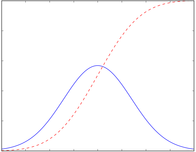
The predictions in the chart below are from the Chris Murray Model, upon which the White House Coronavirus Task Force has focused more recently. This model was developed by Dr. Christopher Murray at the Institute for Health Metrics and Evaluation at the University of Washington. I’ll be using the forecast starting from April 2 as the basis for my “framing” of actual deaths over the next few weeks, keeping it “frozen” at that level as a new benchmark. My apologies for the absence of dates on the horizontal axis, but the origin is at March 14 and there is only a single line up through April 1. That line represents actual cumulative Covid deaths recorded in the U.S. The red line is the mean model prediction. Deaths are expected to ramp up over the next week or so, much as we’ve seen in the confirmed case count, as deaths lag behind diagnoses by anywhere from a few days up to 17 days. This model predicts an ultimate death toll of about 94,000 at the top of the mean curve (not visible on the zoomed-in chart). Above and below that line are upper (blue) and lower (green) bounds, respectively, of a “confidence interval”. It’s unlikely we’ll see cumulative deaths breach either of those bounds. The lower bound would place the ultimate death toll at about 40,000; the upper bound would place it at just under 180,000. At this point, as of Sunday, April 5, actual deaths (black) are slightly below the mean or central tendency, but that’s difficult to see in the current chart.

The ongoing lockdowns in the U.S. and around the world are exceedingly controversial. There is a very real tradeoff between the benefits of extending the length of these lockdowns and the benefits of allowing economic activity to “restart”. But do lockdowns work? Christopher Monkton offers aggregate evidence that they truly do reduce the spread of the virus in “Are Lockdowns Working?” That they would work is intuitive, and decisions to scale them back should be made cautiously for certain “high exposure” activities, and in conjunction with isolating and trace-tracking contacts of all infected individuals, as they have done successfully in countries such as Taiwan and Singapore.

There may be signs that a bend in the U.S. case curve is in the offing, perhaps over the next week or two. That timing would roughly comport with the notion that over the past three weeks, efforts at social distancing and stay-at-home orders have allowed the U.S. to limit the spread of coronavirus through the first major “round” of infections and a much more limited second round. Perhaps these efforts will largely stanch a third and subsequent rounds of infection. Ultimately, if the number of coronavirus deaths is in the neighborhood of the mean value predicted by the Murray Model, about 94,000, that would place the severity of the toll at less than two times the severity of a bad flu season, though limiting the Covid death toll will have been achieved at much higher economic cost.

There are signs elsewhere around the globe that the pandemic may be turning a corner toward more favorable trends. See “Good News About COVID-19” at 80,000hours.org for a good review.

Coronavirus: Framing the Next Few Weeks

19 Thursday Mar 2020

Posted by Nuetzel in Pandemic

≈ 4 Comments

Tags

Aaron Ginn, Co-morbidity, Coronavirus, Covid-19, Diamond Process, Endless Metrics, Envelope Membrane, Gompertz curves, Insights and Outliers, Medium.com, Mortality, Pandemic, S-Curve, Scott Alexander, Seasonal Flu, Sigmoid Function, SlateStarCodex, Transmissibility, Willis Eschenbach

See my March 28 update here.

What follows is an exercise intended to put the coronavirus in perspective as we move through a crucial phase in the U.S. I believe it’s more informative than speculative. However, I’m relying on several pieces of information in establishing bounds on how the caseload and mortality rate will play out over the next few months: the experience abroad; domestic developments thus far; risk mitigation; prospective treatments; and some mathematics.

Pandemic Progressions

Despite all the warnings we’ve heard about exponential growth in the number of infections, that is something characterizing only the earliest stages of epidemics. These episodes invariably follow a growth curve that accelerates for a time before tapering. The total number of individuals infected eventually flattens, like the top of the dashed red line in the chart below. Think of the blue line’s height as showing the number of new positive diagnoses each day. New cases (blue) peak as the slope of the red line, total positive diagnoses, begins to decrease. The blue line is the one we’d like to flatten. That’s because once the number of new cases exceeds a certain threshold, medical resources can no longer handle the load. Nevertheless, I’ll focus on the red line and how it’s growth accelerates and then decelerates. Where are various countries on that curve? 

I’ve been using the interactive tool at the Insights and Outliers web site to view curves like the red line above, by country. China and South Korea are at the top, where the line is flat, though I discount the Chinese numbers as quite likely manipulated. Italy is somewhere in the middle of the red curve — one hopes it will enter the deceleration phase soon, but it’s not clear from the numbers.

Setting Context

The U.S. caseload is accelerating; it will continue to accelerate until the availability of tests catches up with demand from individuals meeting the qualifications for testing. The delay in the availability of tests, which I mentioned in an earlier post, will exaggerate the acceleration in the number of diagnosed cases for another week, or perhaps a bit more. Some of those cases already existed, and we should have known about them before now. However, after starting high, the U.S. death rate from the virus is already well below the global death rate, suggesting that either 1) our testing is actually well ahead of the rest of the world; 2) our Covid-19 mortality is, and will be, lower than the rest of the world; or 3) deaths in the U.S. will increase much faster than new diagnoses over the next few weeks. I seriously doubt the latter given the high quality of U.S. health care, the time of year, and the promising treatments that have recently been approved for use.

I expect the daily number of new cases in the U.S. to fall after the “catch-up” in testing. That’s based on a combination of things: first, the time from infection to first symptoms can be up to about 14 days, but the mean is just five days. Second, in the U.S., we began to practice “social distancing” and “self-quarantine” in earnest just this past week. Among those infected before this week, those who develop symptoms serious enough to notice will know before the end of March. But people are still out trying to take care of business. Some of those people will catch the virus, and there will be secondary infections of family members or others in close proximity to individuals diagnosed earlier. It will take an additional week, accounting for overlap, for infections among that cohort to mature. Nevertheless, over the next three weeks, the number of infections transmitted to new “hosts” will fall drastically with social distancing, as each of us comes into contact with fewer people. 

Third, the transmissibility of the virus will decrease with rising temperatures, more direct sunlight, and higher absolute humidity. See my post on the topic here. I know, I know, skeptics wag their fingers and say, “Covid-19 is not the same as the flu virus”, and they’re right! It has some similarities, however: a so-called “envelope” lipid membrane, transmissability via fine aerosols or larger droplets expelled into the air by infected individuals, and symptoms that are similar, except for shortness of breath with Covid-19. And like the flu, the new virus seems to be more virulent in cold, dry environments. If you cannot avoid contact with other individuals during your workday, if you have a large family at home, or if you live in quarters with a number of other individuals, it might be a good idea to keep your humidifier on or don’t air-condition aggressively. That’s an implication of this study and this study:

“The current spread suggests a degree of climate determination with Coronavirus displaying preference for cool and dry conditions. The predecessor SARS-CoV was linked to similar climate conditions.”

Bounding Expectations

How high will the numbers go? I’ll start by establishing some “very good” and “very bad” scenarios for total confirmed cases. South Korea (where masks were used widely) has had an excellent experience thus far. The county’s cumulative confirmed cases flattened out at less than 0.017% (0.00017) of the total population. Assuming that 90% of cases are asymptomatic and undiagnosed, that would mean 0.17% (0.0017) of the South Korean population has been infected. If the U.S. experience is the same, we’d have a total of about 60,000 confirmed infections when our curve flattens. But I won’t be that optimistic — we’re at about 25,000 cases already and I think we’ll be at 60,000 cases within a week. Instead, I’ll define the “very good” scenario as 2.5x the South Korean outcome, or 150,000 confirmed cases. 

For a “very bad” scenario one might look to Italy. Unfortunately, it’s impossible to say how much higher Italy’s case load will go before flattening. If it had flattened today (it didn’t), the rate of confirmed cases for the country would be 0.077% (0.00077). That yields 0.77% of the population including the undiagnosed at 90% of cases. Applying the same percentage to the U.S. would mean just over 250,000 confirmed cases. But again, for a really bad scenario, and because we don’t yet know how Italy’s experience will play out, let’s suppose Italy’s confirmed cases quadruple: For the U.S., using the same percentage of the population would imply just over 1 million confirmed cases, or about 1.6% of the population. That yields a total infected population of 10 million.  

I’ve illustrated these “very good” and “very bad” scenarios in the chart below as Gompertz curves, a form of sigmoid function or s-curve. First, a couple of caveats: Please note that this represents a “first wave” of the virus, as it were. I do not dismiss the possibility of a second wave should we relax our nonprescription safeguards prematurely, and obviously the chart does not speak to a return of the virus in the fall. Also, these are just two examples that allow us to examine the implications of extreme outcomes. I could have varied the timing, growth, and end-outcome in other ways, but I think the following is instructive.

The chart shows cumulative confirmed cases for each scenario. It also shows the actual confirmed case total through March 21st, which is the shorter red line at the bottom. The data plotted begins on March 6, when there were 248 cases confirmed. The horizontal axis shows days elapsed since then. The accompanying table shows the same information through March 28th, a week from today. 

There are a few things to note about the chart and table:

  1. The actual curve is still below the “very good” curve. If our experience proves to be marginally worse than the “very good” scenario, then we’ve already “caught-up” in terms of testing for Covid-19: the actual increase today is larger than the highest daily increases under that scenario. If our experience approaches the “very bad” scenario, then we are eight days behind in our testing. That is, today’s actual increase is about what that scenario would have predicted eight days ago.
  2. Under the “very good” scenario, the daily increase in cases would peak by Friday, March 27. We’ve already exceeded that level of daily increase, but it will be encouraging if the daily increase doesn’t accelerate much more over the next few days. Under the “very bad” scenario, and given a full “catch-up”, the daily increase would peak about a week from now at approximately 37,000. That would be delayed if the catch-up process is more protracted.
  3. New cases flatten out within a couple of months under both scenarios. Under the “very good” scenario, new cases fall below 1,000 per day by April 21. Under the “very bad’ scenario, they don’t reach that level until Mid-May.
  4. In the next week (by March 28th), we will know a lot more about where we’re trending relative to these scenarios. I plan to provide an update later in the week or next weekend. 

While it can’t be seen from the chart or the table, once the “catch-up” ends, if there really is a catch-up involved, the daily increase in cases might fall abruptly. That would be encouraging.

Other Thoughts

It’s also important to note that the experience within the U.S. might be as varied as what we see around the globe. For example, New York and Washington state seem to be hot spots. Cities with large international ports and flights are more likely to suffer relatively high infection rates. In contrast, St. Louis probably won’t have a comparable incidence of infection, as there are so few international flights terminating there. 

The global death rate from Covid-19 has been widely quoted as somewhere around 4%, but that came into question with the revelation of low mortality aboard the Diamond Princess, despite the many seniors aboard. And it appears that the death rate from coronavirus is declining in the U.S. This was noted here at Endless Metrics several days ago. It’s also discussed in some detail by Aaron Ginn in this excellent this Medium article. Again, the death rate will decline as our testing “catches-up”, if indeed it must, and it will decline with spring weather as well as treatments if they are effective. Ultimately, I’ll be surprised if it comes in at more than 1% of confirmed cases in the U.S., and I won’t be surprised if it’s much less. At 1% under the “very bad” scenario, the U.S. would have about 10,000 deaths associated with coronavirus, the large majority of which would be individuals older than 70 years of age with significant co-morbidities.  

Conclusion

I hope this exercise proves useful to others in establishing a framing for what will ensue over the next few weeks. However, even the “very bad” scenario discussed above involves an infected share of the population of much less than we’ve heard we’re in for. Yet that scenario is far worse than Italy’s experience thus far, which most people consider pretty bad. For this reason, I am increasingly convinced that this pandemic will not prove to be the widespread calamity we’re still being told to expect. Those warning us might be alarmists, or perhaps they simply lack a sufficient level of numeracy.

This post was partly inspired by The Math of Epidemics by Willis Eschenbach, as well as Scott Alexander’s March 2nd post at Slate Star Codex. Also, see the Medium article by Aaron Ginn. It is a thorough examination of many aspects of the pandemic and very much aligned with my views. (Something is wrong with the link … I’ll try to fix it later.)


at WUWT 

Follow Sacred Cow Chips on WordPress.com

Recent Posts

  • The Case Against Interest On Reserves
  • Immigration and Merit As Fiscal Propositions
  • Tariff “Dividend” From An Indigent State
  • Almost Looks Like the Fed Has a 3% Inflation Target
  • Government Malpractice Breeds Health Care Havoc

Archives

  • January 2026
  • December 2025
  • November 2025
  • October 2025
  • September 2025
  • August 2025
  • July 2025
  • June 2025
  • May 2025
  • April 2025
  • March 2025
  • February 2025
  • January 2025
  • December 2024
  • November 2024
  • October 2024
  • September 2024
  • August 2024
  • July 2024
  • June 2024
  • May 2024
  • April 2024
  • March 2024
  • February 2024
  • January 2024
  • December 2023
  • November 2023
  • August 2023
  • July 2023
  • June 2023
  • May 2023
  • April 2023
  • March 2023
  • February 2023
  • January 2023
  • December 2022
  • November 2022
  • October 2022
  • September 2022
  • August 2022
  • July 2022
  • June 2022
  • May 2022
  • April 2022
  • March 2022
  • February 2022
  • January 2022
  • December 2021
  • November 2021
  • October 2021
  • September 2021
  • August 2021
  • July 2021
  • June 2021
  • May 2021
  • April 2021
  • March 2021
  • February 2021
  • January 2021
  • December 2020
  • November 2020
  • October 2020
  • September 2020
  • August 2020
  • July 2020
  • June 2020
  • May 2020
  • April 2020
  • March 2020
  • February 2020
  • January 2020
  • December 2019
  • November 2019
  • October 2019
  • September 2019
  • August 2019
  • July 2019
  • June 2019
  • May 2019
  • April 2019
  • March 2019
  • February 2019
  • January 2019
  • December 2018
  • November 2018
  • October 2018
  • September 2018
  • August 2018
  • July 2018
  • June 2018
  • May 2018
  • April 2018
  • March 2018
  • February 2018
  • January 2018
  • December 2017
  • November 2017
  • October 2017
  • September 2017
  • August 2017
  • July 2017
  • June 2017
  • May 2017
  • April 2017
  • March 2017
  • February 2017
  • January 2017
  • December 2016
  • November 2016
  • October 2016
  • September 2016
  • August 2016
  • July 2016
  • June 2016
  • May 2016
  • April 2016
  • March 2016
  • February 2016
  • January 2016
  • December 2015
  • November 2015
  • October 2015
  • September 2015
  • August 2015
  • July 2015
  • June 2015
  • May 2015
  • April 2015
  • March 2015
  • February 2015
  • January 2015
  • December 2014
  • November 2014
  • October 2014
  • September 2014
  • August 2014
  • July 2014
  • June 2014
  • May 2014
  • April 2014
  • March 2014

Blogs I Follow

  • Passive Income Kickstart
  • OnlyFinance.net
  • TLC Cholesterol
  • Nintil
  • kendunning.net
  • DCWhispers.com
  • Hoong-Wai in the UK
  • Marginal REVOLUTION
  • Stlouis
  • Watts Up With That?
  • Aussie Nationalist Blog
  • American Elephants
  • The View from Alexandria
  • The Gymnasium
  • A Force for Good
  • Notes On Liberty
  • troymo
  • SUNDAY BLOG Stephanie Sievers
  • Miss Lou Acquiring Lore
  • Your Well Wisher Program
  • Objectivism In Depth
  • RobotEnomics
  • Orderstatistic
  • Paradigm Library
  • Scattered Showers and Quicksand

Blog at WordPress.com.

Passive Income Kickstart

OnlyFinance.net

TLC Cholesterol

Nintil

To estimate, compare, distinguish, discuss, and trace to its principal sources everything

kendunning.net

The Future is Ours to Create

DCWhispers.com

Hoong-Wai in the UK

A Commonwealth immigrant's perspective on the UK's public arena.

Marginal REVOLUTION

Small Steps Toward A Much Better World

Stlouis

Watts Up With That?

The world's most viewed site on global warming and climate change

Aussie Nationalist Blog

Commentary from a Paleoconservative and Nationalist perspective

American Elephants

Defending Life, Liberty and the Pursuit of Happiness

The View from Alexandria

In advanced civilizations the period loosely called Alexandrian is usually associated with flexible morals, perfunctory religion, populist standards and cosmopolitan tastes, feminism, exotic cults, and the rapid turnover of high and low fads---in short, a falling away (which is all that decadence means) from the strictness of traditional rules, embodied in character and inforced from within. -- Jacques Barzun

The Gymnasium

A place for reason, politics, economics, and faith steeped in the classical liberal tradition

A Force for Good

How economics, morality, and markets combine

Notes On Liberty

Spontaneous thoughts on a humble creed

troymo

SUNDAY BLOG Stephanie Sievers

Escaping the everyday life with photographs from my travels

Miss Lou Acquiring Lore

Gallery of Life...

Your Well Wisher Program

Attempt to solve commonly known problems…

Objectivism In Depth

Exploring Ayn Rand's revolutionary philosophy.

RobotEnomics

(A)n (I)ntelligent Future

Orderstatistic

Economics, chess and anything else on my mind.

Paradigm Library

OODA Looping

Scattered Showers and Quicksand

Musings on science, investing, finance, economics, politics, and probably fly fishing.

  • Subscribe Subscribed
    • Sacred Cow Chips
    • Join 128 other subscribers
    • Already have a WordPress.com account? Log in now.
    • Sacred Cow Chips
    • Subscribe Subscribed
    • Sign up
    • Log in
    • Report this content
    • View site in Reader
    • Manage subscriptions
    • Collapse this bar
 

Loading Comments...