• About

Sacred Cow Chips

Sacred Cow Chips

Tag Archives: Willis Eschenbach

The Oceans and Global Temperatures

18 Saturday Feb 2023

Posted by Nuetzel in Climate science, Ocean Temperatures

≈ Leave a comment

Tags

Acidification, Alkaline, Anthony WAtts, ARGO Floats, Buffering, Carbon Dioxide, Carbon Sink, Cloud Formation, Cosmic Ray Flux, El Nino, Energy Budget, Evaporation, Geothermal Heat, Greenhouse Gases, Gulf Stream, Heat Storage, Henrik Svensmark, Indian Ocean, Isoprene, Jim Steele, Ocean Circulation, Ocean Temperatures, Paul Homewood, pH Levels, Rud István, Sea Life, Solar Irradiation, Water Vapor, Willis Eschenbach

Despite evidence to the contrary, there’s one thing climate change alarmists seem to consider a clincher. Well… their stylized account has the seas absorbing heat from our warming atmosphere as human activity forces carbon emissions into the air. That notion seems to be reinforced, at least in the popular imagination, by the fact that the sea is a “carbon sink”, but that is a matter of carbon sequestration and not a mechanism of ocean warming. While ocean temperatures have warmed slightly over the past few decades, it is almost entirely coincidental, rather than a result of slightly warmer air temperatures.

Heat and the Hydrosphere

There is no doubt that the oceans store heat very efficiently, but that heat comes primarily from solar radiation and geothermal sources underseas. In fact, water stores heat far more efficiently than the atmosphere. According to Paul Homewood, a given cross section of sea water to a depth of just 2.6 meters is capable of holding as much heat as a column of air of the same width extending from the ocean surface to the outermost layers of the atmosphere! (See here for an earlier reference.) However, that does not imply that the oceans are very effective at drawing heat from warmer air or particularly carbon back-radiation. Both the air and water draw heat from solar radiation, and how much in any given location depends on the Sun’s angle in the sky.

A solid guide is that air temperatures are heavily influenced by water temperatures, but not as much vice versa. When temperatures in the upper layers of the ocean rise from natural forces, including reduced upward circulation from greater depths, evaporation causes this heat to radiate into the atmosphere along with evaporation of water vapor. Homewood notes that El Niño patterns make the influence of the Pacific Ocean waters on climate pretty obvious. The impact of the Gulf Stream on European climates is also instructive.

The Indian Ocean accounted for about half of the sea warming that occurred within the globe’s top 700 meters of waters over the years 2000 – 2019, though the Indian Ocean represents only about 20% of the world’s sea surface. The authors of that research found that the warming was not caused by trends in surface forcing of any kind, including warmer air temperatures. They said the ocean warming:

“… has been driven by significant changes in oceanic fluxes and not by surface forcing. … the ocean has been driving a rapid increase in Indian Ocean heat content.”

This was consistent with an earlier study of global sea temperatures covering the period 1984 – 2006 that found:

“… diminished ocean cooling due to vertical ocean processes … A conclusion is that natural variability, rather than long-term climate change, dominates the SST [sea surface temperature] and heat flux changes over this 23-yr period.”

It’s a Water World

Heat released by the oceans tends to dominate variations in global temperatures. A 2018 study found that evaporative heat transfer to the atmosphere from the oceans was closely associated with variations in air temperatures:

“When the atmosphere gets extra warm it receives more heat from the ocean, when it is extra cool it receives less heat from the ocean, making it clear that the ocean is the driving force behind these variations. …

The changes in solar radiation received at the Earth’s surface are clearly a trigger for these variations in global mean temperature, but the mechanisms by which these changes occur are a bit more complex and depend on the time-scale of the changes.”

Measurement

Willis Eschenbach reviewed a prominent study of ocean temperature changes and noted that the authors’ estimate of total warming of the oceans was quite small:

“… over the last sixty years, the ocean has warmed a little over a tenth of one measly degree … now you can understand why they put it in zettajoules—it’s far more alarming that way.”

Eschenbach goes on to discuss the massive uncertainty underlying measurements of ocean temperatures, particularly below a depth of 2,000 meters, but even well above that depth given the extremely wide spacing of so-called ARGO floats. However, the relative stability of the point estimates over 60 years is noteworthy, not to mention the “cold water” doused on alarmist claims about ocean overheating.

Sun Engine

Ocean warmth begins with energy from the Sun and from the deep interior of the Earth. The force of solar energy is greatest in the tropics, where sunlight is perpendicular to the surface of the Earth and is least dispersed by the thickness of the atmosphere. The sun’s radiative force is smallest in the polar regions, where the angle of its light is acute. As Anthony Watts says:

“All elements of Earth’s weather, storm fronts, hurricanes, the jet stream, and even ocean currents, are driven to redistribute energy from the tropics to the poles.”

Both land and sea absorb heat from the Sun and from volcanic activity, though the heat is moderated by the sea. That moderation is especially impactful in the Southern Hemisphere, which has far less land area, greater exposure of sea surface to the Sun, and about half of the average ocean temperature variation experienced in the North.

Ultimately, the importance of natural sunlight on air and sea temperatures can’t be overemphasized. Henrik Svensmark and some co-authors have estimated that a cosmic ray flux of 15% from a coronal mass ejection leads to a reduction in cloud cover within roughly 9 – 12 days. The ultimate increase in the Earth’s “energy budget” over about a week’s time is about the same size as a doubling of CO2, which certainly puts things in perspective. However, the oceans, and hence cloud cover, moderate the impact of the Sun, with or without the presence of additional greenhouse gases forced by human activity.

Vapors

The importance of evaporation from bodies of water also deserves great emphasis. No one doubts the massive influence of greenhouse gases (GHGs) on the climate. Water vapor accounts for about 90% of GHGs, and it originates predominantly from oceans. Meanwhile, carbon dioxide accounts for less than 4% of GHGs, and it appears that only a small part is from anthropogenic sources (and see here and below).

The impact of changing levels of water vapor dominates GHG levels. They are also a critical input to cloud formation, a phenomenon that climate models are generally ill-equipped to explain. Clouds reflect solar radiation back into space, reducing the Sun’s net contribution to the Earth’s energy budget. On the other hand, clouds can trap heat in the lower layers of the atmosphere. The globe has an average of 60 – 70% cloud cover, and most of that is over the oceans. Increased cloud cover generally leads to declines in temperature.

A 2015 study identified a process through which the sea surface has an unexpectedly large impact on climate. This was from the formation of isoprene, a film on the ocean surface, which leads to more cloud formation. In addition to biological sources, isoprene was found to originate, surprisingly, from the effect of sunlight.

The Big Sink

Man-made emissions of CO2 constitute only about 5% of naturally discharged CO2, which is roughly matched by natural removal. CO2 is absorbed, dissolved, or transformed in a variety of ways on both land and sea, but the oceans collectively represent the world’s largest carbon sink. They hold about 50 times more CO2 than the atmosphere. Carbon is stored in sea water at great depths, and it enhances undersea vegetation just as it does on land. It is sequestered in a variety of sea organisms as calcium carbonate and is locked in sediments as well. A longstanding question is whether there is some limit on the capacity of the oceans and other sinks to store carbon, but apparently the uptake over time has remained roughly constant at just under 50% of all natural and man-made CO2 emissions (also see here). So far, we don’t appear to be approaching any sort of “saturation point”.

One claim about the rising carbon stored undersea is that it will drive down the oceans’ pH levels. In other words, it will lead to “ocean acidification” and harm a variety of marine life. Rud István has ridiculed that term (quite rightly) because slightly less alkaline sea water does not make it “acidic”. More substantively, he notes the huge natural variations in ocean pH levels across different marine environments, the exaggeration inherent in some estimates of pH changes that do not account for physical buffering, and the fact that the impact on many organisms is inconsistent with the presumed harms of reduced pH. In fact, errors in some of the research pointing to those harms has been acknowledged. In addition, the much feared “coral crisis” seems to have been a myth.

Conclusion

The upper layers of the oceans have warmed somewhat over the past 60 years, but the warming had natural causes. Heat transfer from the atmosphere to the hydrosphere is relatively minor compared to the absorption of heat by oceans via solar forcings. It is also minor compared to the transfer of temperature from oceans to surface air. As Jim Steele has explained it:

“Greenhouse longwave energy penetrates only a few microns into the ocean surface and even less into most soils, but the sun’s shortwave energy passes much more deeply into the ocean.”

It’s reasonable to concede that warmer air temperatures via man-made GHGs might be a minor reinforcement to natural sources of ocean warming, or it might slightly moderate ocean cooling. However, measuring that contribution would be difficult against the massive background of natural forcings on ocean temperatures.

Oceans are dominant in terms of heat storage from natural forcings and in terms of carbon sequestration. In fact, the oceans have thoroughly outperformed alarmist projections as a carbon sink. Dire prognostications of the effect of carbon dioxide on marine life have been drastically over-emphasized as well.

Renewable Power Gains, Costs, and Fantasies

01 Thursday Jul 2021

Posted by Nuetzel in Electric Power, Renewable Energy

≈ 2 Comments

Tags

Baseload, Blackouts, California, Combined-Cycle Gas, Dispatchable Power, Disposal Costs, Dung Burning, Energy Information Administration, External Costs, Fossil fuels, Francis Menton, Germany, Green Propaganda, Interrmittency, Levelized Costs, Modern Renewables, Peak Demand, Plant Utilization, Renewable energy, Solar Power, Texas, The Manhattan Contrarian, Willis Eschenbach, Wind Power

“Modern” renewable energy sources made large gains in providing for global energy consumption over the ten years from 2009-19, according to a recent report, but that “headline” is highly misleading. So is a separate report on the costs of solar and wind power, which claims those sources are now cheaper than any fossil fuel. The underlying facts will receive little critical examination by a hopelessly naive press, nor among analysts with more technical wherewithal. Of course, “green” activists will go on using misinformation like this to have their way with policy makers.

Extinguishing Dung Fires

The “Renewables Global Status Report” was published in mid-June by an organization called REN21: Renewables Now. Francis Menton has a good discussion of the report on his blog, The Manhattan Contrarian. The big finding is a large increase in the global use of “modern” renewable energy sources, from 8.7% of total consumption in 2009 to 11.2% in 2019. The “modern” qualifier is critical: it distinguishes renewables that made gains from those that might be considered antiquated, like dung chips, the burning of which is an energy staple in many underdeveloped parts of the world. In fact, the share of those “non-modern renewables” declined from 11.0% to 8.7%, almost fully accounting for the displacement caused by “modern renewables”. The share of fossil fuels was almost unchanged, down from 80.3% in 2009 to 80.2% in 2019. Whatever the benefits of wind, solar, and other modern green power sources, they did not make much headway in displacing reliable fossil fuel energy.

I certainly can’t argue that replacing dung power with wind, solar, or hydro is a bad thing (but there are more sophisticated ways of converting dung to energy than open flame). However, I contend that replacing open dung fires with fossil-fuel or nuclear capacity would be better than renewables from both a cost and an environmental perspective. Be that as it may, the adoption of “modern renewables” over the ten-year period was not at the expense of fossil fuels, as might be expected if the latter was at a cost disadvantage, and remember that renewables were already given an edge via intense government efforts to subsidize and even require the use of wind and solar power.

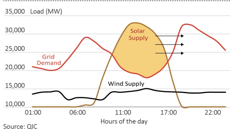
The near-term limits on our ability to substitute renewables for fossil fuels should be fairly obvious. For one thing, renewable power is intermittent, so it cannot be relied upon for baseload generation. The chart at the top of this post demonstrates this reality, though the chart is “optimistic” in the sense that planners have to consider worst-case intermittency, not merely average production by time-of-day. Reliable power sources must be maintained in order to prevent the kinds of disasters like we saw in Texas last winter when demand spiked and output from renewables plunged. This is an area of considerable denialism: a search on “intermittent renewables” gets you an unending list of rosy assessments of energy storage technologies, and very little realistic commentary on today’s needs for meeting base-load or weather-induced demands.

While renewables account for about 29% of global electricity generation, there is another limit on adoption: certain jobs just can’t be done with renewables short of major advances in battery technology. As Menton says:

“Steel mills and tractor trailer trucks and airplanes powered by solar panels? Not happening. … I think these people really believe that if governments will just do the right thing and require airplanes to run on solar panels, then it will promptly happen.”

Cost and Intermittency

Again, we’d expect to see more rapid conversion to renewable energy, at least in compatible applications, as the cost of renewables drops relative to fossil fuels. And major components of their costs have indeed dropped, so much so that the U.S. Energy Information Administration (EIA) now says they are cheaper than fossil fuels in terms of the “levelized cost” of new electric generating capacity. That’s the average cost per megawatt-hour produced over the life of a new installation. The EIA’s calculations are distorted on at least two counts, however, as Willis Eschenbach ably explains here.

The EIA’s cost figures reflect a “capacity factor” that adjusts the megawatts produced to presumed “real world” conditions. It’s more like a utilization adjustment made necessary by a variety of realities (intermittency as well as other technical imperfections) that cause output to run lower than the maximum under ideal conditions. Eschenbach reports that the factors applied by the EIA for solar and wind, at 30% and 41%, respectively, are overstated drastically, which reduces their cost estimates by overstating output. For solar, he cites a more realistic value of 14%, which would more than double the levelized cost of solar. For wind, he quotes a figure of 30%, which would increase the cost of wind power by more than a third. That puts the cost of those renewables well above that of a “combined-cycle gas” plant, which uses exhaust from gas turbines to generate additional power via steam.

The true costs of renewables are likely much higher than nuclear power as well, based on earlier comparisons of nuclear to combined-cycle gas. The EIA does not report a cost for nuclear power, however, because the report is for new capacity, and no additions of nuclear capacity are expected.

The Cost of Back-Up Capacity

Eschenbach notes a second major problem with the EIA cost comparisons. As discussed above, the intermittency of solar and wind power means that their deployment cannot provide for base loads. Other “dispatchable” power technologies, on which production can be ramped up or down at discretion, must be available to meet power needs when renewables are off-line, as is frequently the case. The more we attempt to rely on renewables, the more significant the intermittency problem becomes, as Germany, Texas, and California are discovering.

How to account for the extra cost of dispatchable power required to smooth production or meet peak demand? Renewables are simply incapable of doing so reliably, and back-up capacity ain’t free! Meeting demand at all times requires equivalent dispatchable capacity in the power mix. It requires not just dispatchable baseload capacity, but surge capacity! Meeting long-term growth in demand with renewables implies that new back-up capacity is required as well, and the levelized cost should reflect it. After all, those costs won’t be saved by virtue of adding renewable capacity, unless you plan on blackouts. Thus, the EIA’s levelized cost comparisons of wind, solar and fossil fuel electricity generation are completely phony.

Conclusion

Growth in wind and solar power increased their contribution to global energy needs to more than 11% in 2019, but their gains over the previous ten years came largely at the expense of more “primitive” renewable energy sources, not fossil fuels. And despite impressive declines in the installation costs of wind and solar power, and despite low variable costs, the economics of power generation still favors fossil fuels rather substantially. In popular discussions, this point is often obscured by the heavy subsidies granted to renewables. 

In truth, the “name-plate” capacities of wind and solar installations far exceed typical output, so installation costs are spread over less output than is widely believed. Furthermore, the intermittency of production from these renewable sources means that back-up capacity is still required, almost always from plants fired by fossil fuels. Properly considered, this represents a significant incremental cost of renewable power sources, but it is one that is routinely ignored by environmentalists and even in official reports. It’s also worth noting that “modern” renewables carry significant external costs to the environment both during the useful life of plant and at disposal (and see here). It’s tempting to say all these distortions and omissions are deliberate contributions to the propaganda in favor of government mandates for renewables.

Coronavirus: Framing the Next Few Weeks

19 Thursday Mar 2020

Posted by Nuetzel in Pandemic

≈ 4 Comments

Tags

Aaron Ginn, Co-morbidity, Coronavirus, Covid-19, Diamond Process, Endless Metrics, Envelope Membrane, Gompertz curves, Insights and Outliers, Medium.com, Mortality, Pandemic, S-Curve, Scott Alexander, Seasonal Flu, Sigmoid Function, SlateStarCodex, Transmissibility, Willis Eschenbach

See my March 28 update here.

What follows is an exercise intended to put the coronavirus in perspective as we move through a crucial phase in the U.S. I believe it’s more informative than speculative. However, I’m relying on several pieces of information in establishing bounds on how the caseload and mortality rate will play out over the next few months: the experience abroad; domestic developments thus far; risk mitigation; prospective treatments; and some mathematics.

Pandemic Progressions

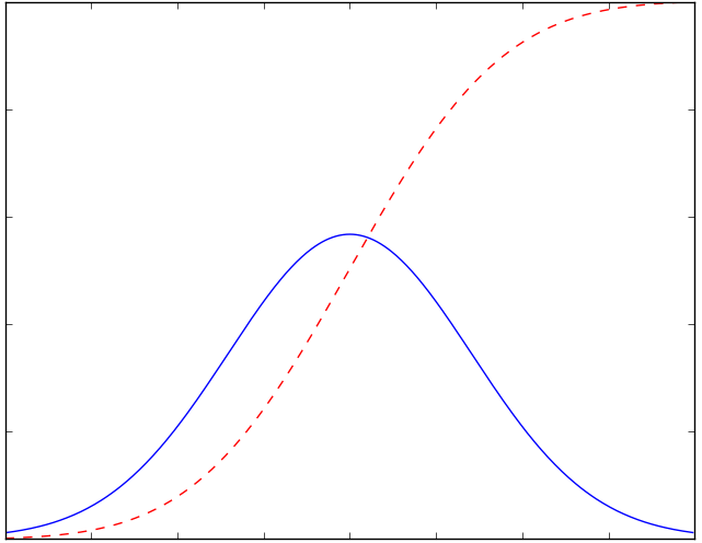
Despite all the warnings we’ve heard about exponential growth in the number of infections, that is something characterizing only the earliest stages of epidemics. These episodes invariably follow a growth curve that accelerates for a time before tapering. The total number of individuals infected eventually flattens, like the top of the dashed red line in the chart below. Think of the blue line’s height as showing the number of new positive diagnoses each day. New cases (blue) peak as the slope of the red line, total positive diagnoses, begins to decrease. The blue line is the one we’d like to flatten. That’s because once the number of new cases exceeds a certain threshold, medical resources can no longer handle the load. Nevertheless, I’ll focus on the red line and how it’s growth accelerates and then decelerates. Where are various countries on that curve? 

I’ve been using the interactive tool at the Insights and Outliers web site to view curves like the red line above, by country. China and South Korea are at the top, where the line is flat, though I discount the Chinese numbers as quite likely manipulated. Italy is somewhere in the middle of the red curve — one hopes it will enter the deceleration phase soon, but it’s not clear from the numbers.

Setting Context

The U.S. caseload is accelerating; it will continue to accelerate until the availability of tests catches up with demand from individuals meeting the qualifications for testing. The delay in the availability of tests, which I mentioned in an earlier post, will exaggerate the acceleration in the number of diagnosed cases for another week, or perhaps a bit more. Some of those cases already existed, and we should have known about them before now. However, after starting high, the U.S. death rate from the virus is already well below the global death rate, suggesting that either 1) our testing is actually well ahead of the rest of the world; 2) our Covid-19 mortality is, and will be, lower than the rest of the world; or 3) deaths in the U.S. will increase much faster than new diagnoses over the next few weeks. I seriously doubt the latter given the high quality of U.S. health care, the time of year, and the promising treatments that have recently been approved for use.

I expect the daily number of new cases in the U.S. to fall after the “catch-up” in testing. That’s based on a combination of things: first, the time from infection to first symptoms can be up to about 14 days, but the mean is just five days. Second, in the U.S., we began to practice “social distancing” and “self-quarantine” in earnest just this past week. Among those infected before this week, those who develop symptoms serious enough to notice will know before the end of March. But people are still out trying to take care of business. Some of those people will catch the virus, and there will be secondary infections of family members or others in close proximity to individuals diagnosed earlier. It will take an additional week, accounting for overlap, for infections among that cohort to mature. Nevertheless, over the next three weeks, the number of infections transmitted to new “hosts” will fall drastically with social distancing, as each of us comes into contact with fewer people. 

Third, the transmissibility of the virus will decrease with rising temperatures, more direct sunlight, and higher absolute humidity. See my post on the topic here. I know, I know, skeptics wag their fingers and say, “Covid-19 is not the same as the flu virus”, and they’re right! It has some similarities, however: a so-called “envelope” lipid membrane, transmissability via fine aerosols or larger droplets expelled into the air by infected individuals, and symptoms that are similar, except for shortness of breath with Covid-19. And like the flu, the new virus seems to be more virulent in cold, dry environments. If you cannot avoid contact with other individuals during your workday, if you have a large family at home, or if you live in quarters with a number of other individuals, it might be a good idea to keep your humidifier on or don’t air-condition aggressively. That’s an implication of this study and this study:

“The current spread suggests a degree of climate determination with Coronavirus displaying preference for cool and dry conditions. The predecessor SARS-CoV was linked to similar climate conditions.”

Bounding Expectations

How high will the numbers go? I’ll start by establishing some “very good” and “very bad” scenarios for total confirmed cases. South Korea (where masks were used widely) has had an excellent experience thus far. The county’s cumulative confirmed cases flattened out at less than 0.017% (0.00017) of the total population. Assuming that 90% of cases are asymptomatic and undiagnosed, that would mean 0.17% (0.0017) of the South Korean population has been infected. If the U.S. experience is the same, we’d have a total of about 60,000 confirmed infections when our curve flattens. But I won’t be that optimistic — we’re at about 25,000 cases already and I think we’ll be at 60,000 cases within a week. Instead, I’ll define the “very good” scenario as 2.5x the South Korean outcome, or 150,000 confirmed cases. 

For a “very bad” scenario one might look to Italy. Unfortunately, it’s impossible to say how much higher Italy’s case load will go before flattening. If it had flattened today (it didn’t), the rate of confirmed cases for the country would be 0.077% (0.00077). That yields 0.77% of the population including the undiagnosed at 90% of cases. Applying the same percentage to the U.S. would mean just over 250,000 confirmed cases. But again, for a really bad scenario, and because we don’t yet know how Italy’s experience will play out, let’s suppose Italy’s confirmed cases quadruple: For the U.S., using the same percentage of the population would imply just over 1 million confirmed cases, or about 1.6% of the population. That yields a total infected population of 10 million.  

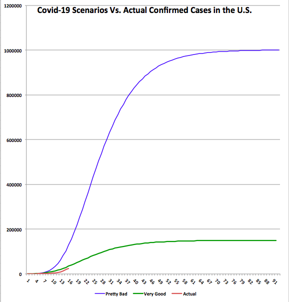
I’ve illustrated these “very good” and “very bad” scenarios in the chart below as Gompertz curves, a form of sigmoid function or s-curve. First, a couple of caveats: Please note that this represents a “first wave” of the virus, as it were. I do not dismiss the possibility of a second wave should we relax our nonprescription safeguards prematurely, and obviously the chart does not speak to a return of the virus in the fall. Also, these are just two examples that allow us to examine the implications of extreme outcomes. I could have varied the timing, growth, and end-outcome in other ways, but I think the following is instructive.

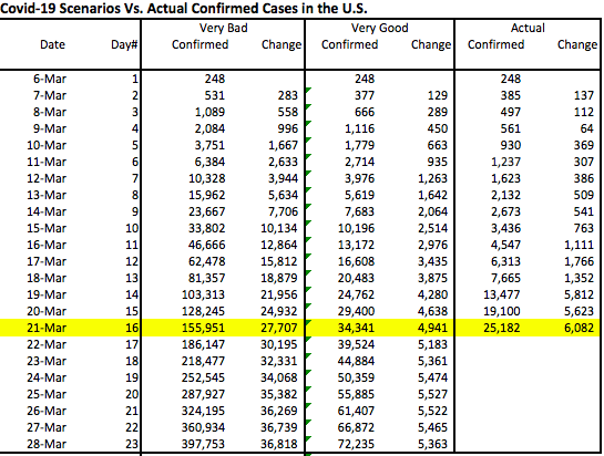
The chart shows cumulative confirmed cases for each scenario. It also shows the actual confirmed case total through March 21st, which is the shorter red line at the bottom. The data plotted begins on March 6, when there were 248 cases confirmed. The horizontal axis shows days elapsed since then. The accompanying table shows the same information through March 28th, a week from today. 

There are a few things to note about the chart and table:

  1. The actual curve is still below the “very good” curve. If our experience proves to be marginally worse than the “very good” scenario, then we’ve already “caught-up” in terms of testing for Covid-19: the actual increase today is larger than the highest daily increases under that scenario. If our experience approaches the “very bad” scenario, then we are eight days behind in our testing. That is, today’s actual increase is about what that scenario would have predicted eight days ago.
  2. Under the “very good” scenario, the daily increase in cases would peak by Friday, March 27. We’ve already exceeded that level of daily increase, but it will be encouraging if the daily increase doesn’t accelerate much more over the next few days. Under the “very bad” scenario, and given a full “catch-up”, the daily increase would peak about a week from now at approximately 37,000. That would be delayed if the catch-up process is more protracted.
  3. New cases flatten out within a couple of months under both scenarios. Under the “very good” scenario, new cases fall below 1,000 per day by April 21. Under the “very bad’ scenario, they don’t reach that level until Mid-May.
  4. In the next week (by March 28th), we will know a lot more about where we’re trending relative to these scenarios. I plan to provide an update later in the week or next weekend. 

While it can’t be seen from the chart or the table, once the “catch-up” ends, if there really is a catch-up involved, the daily increase in cases might fall abruptly. That would be encouraging.

Other Thoughts

It’s also important to note that the experience within the U.S. might be as varied as what we see around the globe. For example, New York and Washington state seem to be hot spots. Cities with large international ports and flights are more likely to suffer relatively high infection rates. In contrast, St. Louis probably won’t have a comparable incidence of infection, as there are so few international flights terminating there. 

The global death rate from Covid-19 has been widely quoted as somewhere around 4%, but that came into question with the revelation of low mortality aboard the Diamond Princess, despite the many seniors aboard. And it appears that the death rate from coronavirus is declining in the U.S. This was noted here at Endless Metrics several days ago. It’s also discussed in some detail by Aaron Ginn in this excellent this Medium article. Again, the death rate will decline as our testing “catches-up”, if indeed it must, and it will decline with spring weather as well as treatments if they are effective. Ultimately, I’ll be surprised if it comes in at more than 1% of confirmed cases in the U.S., and I won’t be surprised if it’s much less. At 1% under the “very bad” scenario, the U.S. would have about 10,000 deaths associated with coronavirus, the large majority of which would be individuals older than 70 years of age with significant co-morbidities.  

Conclusion

I hope this exercise proves useful to others in establishing a framing for what will ensue over the next few weeks. However, even the “very bad” scenario discussed above involves an infected share of the population of much less than we’ve heard we’re in for. Yet that scenario is far worse than Italy’s experience thus far, which most people consider pretty bad. For this reason, I am increasingly convinced that this pandemic will not prove to be the widespread calamity we’re still being told to expect. Those warning us might be alarmists, or perhaps they simply lack a sufficient level of numeracy.

This post was partly inspired by The Math of Epidemics by Willis Eschenbach, as well as Scott Alexander’s March 2nd post at Slate Star Codex. Also, see the Medium article by Aaron Ginn. It is a thorough examination of many aspects of the pandemic and very much aligned with my views. (Something is wrong with the link … I’ll try to fix it later.)


at WUWT 

Feckless Greens Burn Aussie Bush

09 Thursday Jan 2020

Posted by Nuetzel in Forest Fires, Global Warming, Wildfires

≈ 1 Comment

Tags

Arson, Arson Raptors, Australia, Black Kite, CO2 Forcings, David Packham, David Ward, Dead Vegetation, Eucalyptus, Gasoline Trees, Human Ignitions, Invasive Grasses, James Morrow, Jennifer Marohasy, Leslie Eastman, Marc Lallanilla, Massachusetts, Mike Shedlock, Mishtalk, Myron Ebell, New South Wales, Patrick Michaels, Prescribed Burns, Queensland, Roy Spencer, Victoria, Whistling Kite, Willis Eschenbach

The raging Australian bush fires have been expansive and deadly. Country-wide, over 12 million acres have burned over the past few months, an area approaching twice the size of Massachusetts. The burnt areas in some regions rival or exceed individual fires of the past, such as the Black Friday fire of 1939, which burned about 5 million acres. As bad as the recent fires have been, note that various outlets in the U.S. have felt it necessary to exaggerate the size of the burnt area (also see here). And the season’s burnt area has not even approached the total for 1974-1975, when over 250 million acres burned.

So what causes these bush fires? Dry weather and plenty of fuel from dead vegetation create the hazard, of course. A spark is needed, as from lightning, an accident, an arsonist, or perhaps even a blistering sun, but warm temperatures are unnecessary. Nevertheless, the narrative we hear year-in and year-out is that global warming is to blame for wildfires. My commentary on the climate-change hubbub over the 2018 California fires is here. As for Australia’s fires, there is similarly ample evidence that climate change or warming has nothing to do with it. Rather, as in California, there is a pattern of mismanagement of forests and brush combined with population growth, accidents, and arson, and of course a dry spell. This dry spell has been severe, but the trend in Australia over the past 120 years has been toward more precipitation, not less, and the past 25 years have been relatively rainy. The rain comes with a downside, however: it encourages growth in vegetation, much of which dies every dry season, leaving plenty of fuel for fires. And the fuel has been accumulating.

Mike Shedlock at Mishtalk offers some pertinent observations. First, he quotes James Morrow in the Wall Street Journal:

“Byzantine environmental restrictions prevent landholders from clearing scrub, brush and trees. State governments don’t do their part to reduce the fuel load in parks. Last November a former fire chief in Victoria slammed that state’s ‘minimalist approach’ to hazard-reduction burning in the off-season. That complaint is heard across the country.“

Prescribed burns have been in decline and focused on areas adjacent to suburbs, leaving vast areas of accumulating fuel. This is a product of wrongheaded conservation efforts and resistance to CO2 emissions. These policymakers haven’t done favors for Australia or the world on either count. Shedlock reinforces this point with the following statement from Patrick Michaels and Myron Ebell:

“Australia has been ready to explode for years. David Packham, former head of Australia’s National Rural Fire Research Centre, warned in a 2015 article in the Age that fire fuel levels had climbed to their most dangerous levels in thousands of years. He noted this was the result of ‘misguided green ideology.'”

Eucalyptus trees grow thickly in many fire-prone areas of Australia, and Shedlock says these trees act as a multiplier on the fire hazard. Yet these trees remain a favorite landscape feature for suburbians even in fire-prone areas. He quotes Marc Lallanilla in LiveScience:

“Fallen eucalyptus leaves create dense carpets of flammable material, and the trees’ bark peels off in long streamers that drop to the ground, providing additional fuel that draws ground fires up into the leaves, creating massive, fast-spreading ‘crown fires’ in the upper story of eucalyptus forests. … Additionally, the eucalyptus oil that gives the trees their characteristic spicy fragrance is a flammable oil: This oil, combined with leaf litter and peeling bark during periods of dry, windy weather, can turn a small ground fire into a terrifying, explosive firestorm in a matter of minutes. That’s why eucalyptus trees — especially the blue gums (Eucalyptus globulus) that are common throughout New South Wales — are sometimes referred to wryly as ‘gasoline trees.’“

The introduction of non-native invasive grasses has also been blamed for increasing the fuel load in the bush. And as incredible as it may seem, certain birds native to Australia are spreading bushfires by carrying and dropping burning sticks in grasslands to flush out prey. Birds are indeed tool users! The Whistling Kite and the Black Kite are sometimes called “arson raptors”, according to Leslie Eastman at this link.

The hypothesis that climate warming from CO2 emissions is the cause of the bushfires is undermined by all of the above. Then, of course, there are the arsonists and accidental fires. Over 180 people have been arrested for setting recent brushfires intentionally in New South Wales alone, and 103 others in Queensland. (Also see here.) Jim Steele reports that human ignitions account for 66% of bush fires, while just 11% are caused by lightning. Population growth has brought more people into close proximity with the bush, which increases the exposure of humans to fire danger and might well add to the number of accidents and potential arsonists. Obviously, human and avian arson, and accidents, are not within the line of causation that climate alarmists have in mind.

Roy Spencer addresses some of the inconsistencies in the claimed link between climate warming and the Australian bushfires. First, of course, is the trend in rainfall. Climate models based on CO2 forcings predict no long-term trend in Australia’s rainfall, but again, rainfall has increased in Australia during the era of accelerated forcings. Interestingly, the fires of 1974-75 occurred during a period that was quite rainy, but that rain might have added so much to the annual vegetation cycle that it exacerbated the effect of dry season. Temperatures in Australia were quite warm in 2019, but the climate models cannot account for that variation, especially as Australian temperatures are subject to high variability from year-to-year. It’s been hotter before, though the temperature records in Australia have been subject to some controversial “editing”. Finally, Spencer notes that global wildfire activity has been in decline for many years, despite the mild warming we’ve experienced over the past 50 years (also see here).

Australia has bush fires every year, and this year has been particularly bad, but it might not reach the proportions of the fires in 1974-75. The causes are: poor burn management practices, or sometimes neglect and no burn management at all, allowing dead vegetation to accumulate to dangerous levels; arson, which has been implicated in a large number of fires this year; and 2019 was a very dry year. The contention that global warming or climate change is responsible for these bush fires is a dangerous distraction from reforms that can minimize fire hazards in the future.

For additional reading of interest, see “Australia Fires … and Misfires” by Willis Eschenbach and “The Mathematics of Connectivity and Bush Fires: A Note From David Ward” a post from Jennifer Marohasy’s blog.

HyperBoondoggle

06 Wednesday Nov 2019

Posted by Nuetzel in infrastructure

≈ Leave a comment

Tags

Delmar Loop, Dubai, Elon Musk, G-Force, Hyperloop, I-70 Rights-of-Way, Innovation Origins, Last-Mile Problem, Loop Trolley, Magnetic Levitation, Missouri Hyperloop, Passenger Throughput, Richard Branson, Vacuum Tube, Virgin One, Virginia Postrel, Willis Eschenbach

The hyperloop: if you think the Delmar Loop Trolley in St. Louis, MO was a boondoggle, just wait till the state starts hemorrhaging cash for the proposed hyperloop test track, and later a possible route connecting St. Louis, Columbia, and Kansas City. The hyperloop would rely on magnetic levitation (maglev) technology that has been used for trains in some parts of the world, though always on relatively short routes. For a hyperloop, however, the maglev system keeps carrier “pods” suspended in a near-vacuum tube extending the length of the route, eliminating friction and air resistance. Proponents say the pods will move at top speeds of 700 miles an hour, traversing the state in about 30 minutes. And they say it will be a very green machine.

Richard Branson’s Virgin Hyperloop One wants to build the 15-mile test track, which is projected to cost $300 – $500 million. That range is centered just a bit higher than the cost of the Loop Trolley on a per-mile basis, and for a project with major technological uncertainties, that leaves me just a bit wary. The 250-mile cross-state route is now pegged at between $7.3 and $10.4 billion, according to the recent report issued by the state’s “Blue-Ribbon Panel on Hyperloop”. It’s likely to cost much more by the time they get around to building it, if they do at all, and if it actually works.

Hyperbole?

My skepticism about hyperloops is based in part on the hucksterism that often characterizes appeals for public funding of large projects, and hyperloop hucksterism has already taken place. For example, in 2013 Elon Musk estimated that a Hyperloop system would cost about $11.5 million per mile. By 2016, the mid-point estimate for a route in the San Francisco Bay Area was over $100 million per mile. A friendlier route in Dubai is expected to cost $52 million per mile. So to be conservative, we saw 5x to 10x higher costs in a matter of three years. But now, Virgin One says it can construct a route in Missouri for less than the per-mile cost of the Dubai line. Well, the state Department of Transportation already owns the rights of way over significant stretches of the route (but not everywhere because the tube must be straighter than the highway).

The hyperbolic claims for hyperloop technology include speed, projected passenger fares, and ridership. According to Innovation Origins, the so-called feasibility study for the Missouri hyperloop did not assess the technology or even address the fact that no working hyperloop has ever been built or proven at full scale over any distance longer than a kilometer or so. The consultants who prepared the “study” merely assumed it would work. No test pod within a vacuum tube has achieved more than a fraction of the promised speed. The tubes were not long enough to achieve top speeds, they say, but that raises another issue: creating near-vacuum conditions in a sizable tube over very long distances. At the Innovation Origin link above, they estimate that the Missouri tube would occupy over 1 million cubic meters of space, which is at least 30 times larger than the most expansive man-made vacuum space now in existence.

The Ride

As for the passenger experience, 30 minutes to traverse the state of Missouri would be impressive, but what about comfort? First, expanding the tube’s circumference and the girth of the pods would have a disproportionate impact on cost, so conditions might either be more cramped than the promotional photos would have you believe, or the number of passenger seats per pod might be reduced. Second, rapid acceleration from zero to 700 mph would subject humans to fairly large G-forces over several minutes. Deceleration at the end of the trip might be even worse. Negotiating even mild curves would also require reduced speed and subsequent re-acceleration to avoid uncomfortably high radial G-forces. All that means the ride could be a bit uncomfortable. That also means the average speed between Kansas City and St. Louis would be significantly less than 700 mph, especially with a stop in Columbia. G-forces might not be much of a concern for freight traffic, unless it’s fresh produce.

Safety

Then there’s the vulnerability of the system. Willis Eschenbach goes into detail on some technical problems that make the hyperloop risky, such as the pressure on the tubes themselves. It would be about 20,000 pounds per square meter of tube surface, all subject to significant thermal expansion and contraction over the course of a day, with large pods racing through joints and rounding curves. Any fault or crack at any point in the tube surface would cause catastrophic deceleration of pods along the entire length of the tube. The integrity of the pressurized pods themselves is also a safety issue. And what about an earthquake? Or a loss of control and fiery pile-up of vehicles traveling on I-70 near the tubes. Or any number of other foolish or intentional sources of damage to the tube along its route?

Throughput

One of Eschenbach’s most interesting critiques has to do with passenger throughput. Musk’s original plan called for 28-passenger pods departing every 30 seconds: 3,300 passengers per hour. That would represent a substantial addition to total cross-state transportation capacity. At full utilization (which of course is unlikely), that would exceed current estimated totals for daily travel between St. Louis, Columbia, and Kansas City. And while that capacity might reduce pressure to expand other modes, such as adding an extra lane to I-70, it would not offer an excuse to eliminate highway, rail, or airport infrastructure, nor would it eliminate the need to maintain it.

Musks’s assumption might be too optimistic, however: for safety, the time between pod departures might have to be longer. than 30 seconds. Eschenbach asserts 80 that seconds would be more reasonable, which would slash capacity by about 60% relative to Musk’s estimate. And that doesn’t account for potential bottlenecks at stops where pods must be depressurized and repressurized. And if substantially heavier freight pods are intermingled with passenger pods, as anticipated, the required intervals between departures might have to be longer.

Economics

Few large transportation projects are self-funding. Typically, user fees fail to cover operating costs, let alone capital costs. The projected fares quoted by proponents of the Missouri hyperloop are low: “cheaper than the price of gas to drive” cross-state. Perhaps we could say about $25, based on that statement. That won’t make much of a dent in the cost of construction.

The hyperloop’s economic viability for freight traffic is questionable as well, though freight traffic seems to be a fallback position among boosters when confronted with the uncertainties of passenger travel via hyperloop. The Blue-Ribbon report says the expected cost of freight via hyperloop might range from $1.40 per mile to $2.80 on the high end, putting the mid-point well above the $1.69 per mile average cost of shipping by truck. Will speed make the hyperloop a competitive alternative for shippers? In fact, freight via hyperloop might be much worse than rail or truck in solving the “last mile” problem. That’s because the speeds that are its presumed advantage also mean fewer terminals are possible. The system would have to rely as heavily on integration with other modes of transportation as any other form of long-distance carriage, and perhaps more.

The last-mile problem eats into hyperloop’s presumed environmental advantages, which are not as clear cut as its enthusiasts would have you believe. Maintaining a vacuum in a gargantuan tube will not be a low-energy proposition, nor will powering the magnetic levitation/propulsion system, with or without a vacuum. Pressurized, climate-controlled pods will require still more power, and that’s to say nothing of the energy required to fabricate one-inch thick steel cylinders, huge magnets, and the rest of the support infrastructure. Reassurances that hyperloop will be powered exclusively by “green” technologies should be taken with a grain of salt. 

Virginia Postrel believes that regulation might be the biggest threat to the success of hyperloop, though she seems a bit optimistic about the actual economics of the technology. Safety will be a major concern for regulators. The technology will be subject to common carrier rules, and there will be other hurdles at the federal, state and local levels. And what of the health effects of prolonged exposure to those powerful magnetic forces? They may be insignificant, but the question will come up and possibly litigated.

Conclusion

A hyperloop cannot be built and operated without a significant and ongoing investment of public funds. The hoped-for public-private partnership needed to build the system would require major investors, and brave investors. Promoters say the project is not unlike efforts to build the railroads in the 19th century, which must have seemed like a daunting task at the time, and one involving huge financial risk. Fair enough, but the railroads stood to benefit in that age from a huge pent-up desire to exploit distant resources. The Missouri hyperloop is not quite comparable in that respect. It might be attractive mainly as a novelty, much like the Loop Trolley. Moreover, it didn’t take long for the railroads to become desperate rent-seekers, unable to profit from their heavily-subsidized investments without further public intervention on their behalf.

The hyperloop is a truly seductive idea. It’s the sort of thing that even small government types find irresistible, but there is little doubt that taxpayers will pay dearly. It’s not clear to me that the project will create meaningful social benefits or address compelling social risks. Therefore, let’s be cautious about making huge public commitments until this technology is farther along in development and the benefits can be estimated with greater certainty.

Follow Sacred Cow Chips on WordPress.com

Recent Posts

  • Tariffs, Content Quotas, and What Passes for Patriotism
  • Carbon Credits and Green Bonds Are Largely Fake
  • The Wasteful Nature of Recycling Mandates
  • Broken Windows: Destroying Wealth To Create Green Jobs
  • The Oceans and Global Temperatures

Archives

  • March 2023
  • February 2023
  • January 2023
  • December 2022
  • November 2022
  • October 2022
  • September 2022
  • August 2022
  • July 2022
  • June 2022
  • May 2022
  • April 2022
  • March 2022
  • February 2022
  • January 2022
  • December 2021
  • November 2021
  • October 2021
  • September 2021
  • August 2021
  • July 2021
  • June 2021
  • May 2021
  • April 2021
  • March 2021
  • February 2021
  • January 2021
  • December 2020
  • November 2020
  • October 2020
  • September 2020
  • August 2020
  • July 2020
  • June 2020
  • May 2020
  • April 2020
  • March 2020
  • February 2020
  • January 2020
  • December 2019
  • November 2019
  • October 2019
  • September 2019
  • August 2019
  • July 2019
  • June 2019
  • May 2019
  • April 2019
  • March 2019
  • February 2019
  • January 2019
  • December 2018
  • November 2018
  • October 2018
  • September 2018
  • August 2018
  • July 2018
  • June 2018
  • May 2018
  • April 2018
  • March 2018
  • February 2018
  • January 2018
  • December 2017
  • November 2017
  • October 2017
  • September 2017
  • August 2017
  • July 2017
  • June 2017
  • May 2017
  • April 2017
  • March 2017
  • February 2017
  • January 2017
  • December 2016
  • November 2016
  • October 2016
  • September 2016
  • August 2016
  • July 2016
  • June 2016
  • May 2016
  • April 2016
  • March 2016
  • February 2016
  • January 2016
  • December 2015
  • November 2015
  • October 2015
  • September 2015
  • August 2015
  • July 2015
  • June 2015
  • May 2015
  • April 2015
  • March 2015
  • February 2015
  • January 2015
  • December 2014
  • November 2014
  • October 2014
  • September 2014
  • August 2014
  • July 2014
  • June 2014
  • May 2014
  • April 2014
  • March 2014

Blogs I Follow

  • Ominous The Spirit
  • Passive Income Kickstart
  • OnlyFinance.net
  • TLC Cholesterol
  • Nintil
  • kendunning.net
  • DCWhispers.com
  • Hoong-Wai in the UK
  • Marginal REVOLUTION
  • Stlouis
  • Watts Up With That?
  • Aussie Nationalist Blog
  • American Elephants
  • The View from Alexandria
  • The Gymnasium
  • A Force for Good
  • Notes On Liberty
  • troymo
  • SUNDAY BLOG Stephanie Sievers
  • Miss Lou Acquiring Lore
  • Your Well Wisher Program
  • Objectivism In Depth
  • RobotEnomics
  • Orderstatistic
  • Paradigm Library

Blog at WordPress.com.

Ominous The Spirit

Ominous The Spirit is an artist that makes music, paints, and creates photography. He donates 100% of profits to charity.

Passive Income Kickstart

OnlyFinance.net

TLC Cholesterol

Nintil

To estimate, compare, distinguish, discuss, and trace to its principal sources everything

kendunning.net

The future is ours to create.

DCWhispers.com

Hoong-Wai in the UK

A Commonwealth immigrant's perspective on the UK's public arena.

Marginal REVOLUTION

Small Steps Toward A Much Better World

Stlouis

Watts Up With That?

The world's most viewed site on global warming and climate change

Aussie Nationalist Blog

Commentary from a Paleoconservative and Nationalist perspective

American Elephants

Defending Life, Liberty and the Pursuit of Happiness

The View from Alexandria

In advanced civilizations the period loosely called Alexandrian is usually associated with flexible morals, perfunctory religion, populist standards and cosmopolitan tastes, feminism, exotic cults, and the rapid turnover of high and low fads---in short, a falling away (which is all that decadence means) from the strictness of traditional rules, embodied in character and inforced from within. -- Jacques Barzun

The Gymnasium

A place for reason, politics, economics, and faith steeped in the classical liberal tradition

A Force for Good

How economics, morality, and markets combine

Notes On Liberty

Spontaneous thoughts on a humble creed

troymo

SUNDAY BLOG Stephanie Sievers

Escaping the everyday life with photographs from my travels

Miss Lou Acquiring Lore

Gallery of Life...

Your Well Wisher Program

Attempt to solve commonly known problems…

Objectivism In Depth

Exploring Ayn Rand's revolutionary philosophy.

RobotEnomics

(A)n (I)ntelligent Future

Orderstatistic

Economics, chess and anything else on my mind.

Paradigm Library

OODA Looping

  • Follow Following
    • Sacred Cow Chips
    • Join 121 other followers
    • Already have a WordPress.com account? Log in now.
    • Sacred Cow Chips
    • Customize
    • Follow Following
    • Sign up
    • Log in
    • Report this content
    • View site in Reader
    • Manage subscriptions
    • Collapse this bar
 

Loading Comments...