Tags
Anthony Fauci, Asymptomatic Spread, CIVID-19, Edibles, Grateful Dead, Hand Washing, Hookahs, Jake’s Leg, Masks, Social Distancing, Spinning, St. Louis, St. Louis County Department of Health, Vaccination, Vaccine Passports
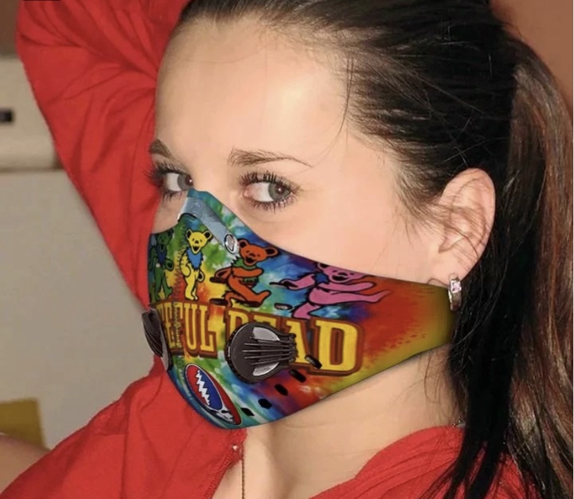
She looks good in a mask, and I grant you: masquerades often convey exciting undertones of sexual adventurism. But masquerades and masks should be novelties, not a constant way of life dictated by over-precautious public health authorities.
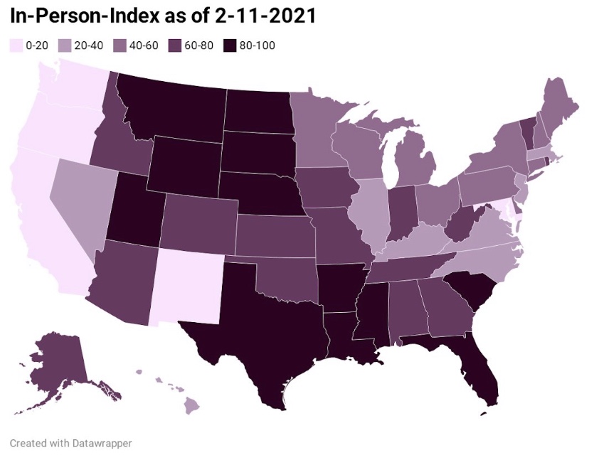
That brings me to the subject of an outdoor concert I’m attending with some friends on May 8th. It’s to be held at a grassy amphitheater along the Mississippi River in south St. Louis County. Unfortunately, the county health department imposes idiotic rules at this and other outdoor facilities. In the document at the link, it’s clear the rules were given some spin by the band who will perform that night, Jake’s Leg, a very good Grateful Dead cover band. And I get it: these guys just want to play music and perform for their fans, who will be happy to soak in the sounds, party, and dance the night away. Still, some of the rules are absurd and fly in the face of “the science”.
There is a certain libertarian streak among Grateful Deadheads, though in terms of realpolitik, probably the majority is of a more collectivist persuasion (not me). Some in the crowd will welcome the rules and might even go so far as to rat-out anyone whose behavior they find “unsafe”. Others will just go along with the rules as they interpret them. Some like me might push the envelope. But as the evening wears on… what a nice expression, … “as the evening wore on…”, it will be interesting to see whether forces tear loose from the prescriptive axis.
I’ve excerpted some of the rules below and added brief commentary. They appear in the order listed in the document, though it might seem a bit jumbled. I’m sorry to have left out most of the friendly color added by the band:
“Bring a cloth or paper face covering. You will not be allowed entry if you do not have one. Gaiters, bandanas and full-face shields are not acceptable as primary or only face covering. Face coverings must completely cover the nose and mouth. Children under 2 years old are not required to wear a face covering.”
The chances of contracting COVID outdoors are virtually nil, and don’t tell me we’re just learning these details … we’ve known that since almost the beginning of the pandemic. Second, in any case, cloth and paper masks are ineffective at stopping the aerosols responsible for most viral transmission. That’s been known for many years. Our public health experts are only now starting to admit these facts. Allowing toddlers to go maskless is the only concession, and it’s true that transmission by children is unlikely and COVID severity in children is very low. But that goes for older children as well, not just toddlers. Asymptomatic spread is similarly rare, so if you feel good enough to go (and they’ll check your temperature at the gate), you are unlikely to present a risk to anyone.
“Please bring small personal coolers only (no coolers w/ wheels) for your favorite beverages (cans and non- breakables please), along with snacks and food, chairs, blankets and personal use items for you and your small group.”
So, maybe not so bad… it’s about like the usual charade at restaurants: we must enter wearing masks, but then we can rip them off as soon as we find a spot to enjoy the music, our snacks, beverages and those all-important personal use items. Hmm, I guess the unsanitary passing of spleefs ist verboten. A hookah with several hoses could accommodate a small group, but that never goes over with an event staff! Edibles are fine!
“Have your ticket ready to be scanned … and always maintain at least 6 feet social distancing while you’re in line. Markers will be placed as a reminder for you.”
Even indoors, three feet of distancing has been acknowledged as adequate by the undeservedly celebrated Dr. Anthony Fauci.
“Please spread out and maintain at least six feet social distancing from other attendees outside of your small group. There is plenty of room to move and dance.”
More of the same hogwash. Note that the requirements offer no definition of “small group”. To appreciate the absurdity and unnecessary ass-covering inherent in all this, let me point out that my “small group” will consist of six or seven friends who haven’t met as a group in more than a year, We are almost sure to mix with other friends whom we’ll see at the show. So group members will migrate between groups, or small groups might merge into somewhat larger “small groups”. This will be happening all over, and it’s a pretty sure bet there will be lapses in mask compliance. If you happen to be spinning or dancing, the last thing you should do is wear a mask. You need oxygen, and you should avoid trapping hot breath and spittle right up against your face (see the latter part of this article).
“Once you’ve found a place to watch the show, please stay with your group at your area. If you must leave your space, you must wear a face covering at all times whenever you are not able to maintain at least 6 foot social distancing.”
Uh-huh… “Distancing” is not always clear-cut behavior. You pass people coming and going and dancing around. Are you “distancing” on average? Will you be ejected if you briefly come within a few feet of another concert-goer, sans mask? These are matters of uncertain degree, and it’s generally why police don’t enforce mask mandates in pedestrian areas, aside from a few draconian “mask traps” outside stores. Outdoors, it’s absurd.
“Please wash/sanitize your hands before and after using all restroom facilities. Always be kind, think of others and practice social distancing when waiting.”
Post-toilet hand washing is always a good practice, of course, but these guys are nuts! When I arrive at the restroom, I’m generally not worried about the remote chance that my hands will pass the virus to my genitals or vice-versa, and we know that the virus isn’t transmitted from surfaces. It’s also regrettable that masks and distancing will limit those sometimes entertaining conversations in bathroom lines.
“All attendees must adhere to these guidelines regardless of vaccination status.”
This also is sheer stupidity, and I’m complaining only because it reflects the “Zero COVID” mentality of the public health authorities holding us hostage. I guess I’d rather not bring my vaccination card along in any case, and at least they aren’t requiring “vaccine passports” for entry to the venue. But just in case I’m misunderstood, the chance that a fully vaccinated individual will catch or transmit the virus is very low and not even worthy of concern in any rational balancing of risk and benefit.
“Disclaimer: All venue initiatives to prevent the spread of COVID-19 are strictly followed and enforced. Those on premises are subject to compliance with all venue safety procedures and protocols. Non-compliance will result in refused entry or ejection from venue without refund. Upon purchasing tickets for the event, you acknowledge and agree to adhere to all venue policies.”
Again, as a practical matter, some of the rules listed above are virtually unenforceable, but we’ll see how the evening unfolds with a crowd of free-wheeling Deadheads. It could be all strangers stopping strangers, just to bump their elbows. Either way, if past is prelude, the amphitheater will be something of a heart-of-gold land.