• About

Sacred Cow Chips

Sacred Cow Chips

Tag Archives: Covid Tracking Project

Predicted November COVID Deaths

08 Sunday Nov 2020

Posted by Nuetzel in Pandemic, Public Health

≈ 2 Comments

Tags

@tlowdon, Antibodies, CDC, COVID Deaths, Covid Tracking Project, COVID-Like Illness, ER Patient Symptoms, FiveThirtyEight, Flu Season, Herd Immunity, Humidity, Influenza-Type Illness, Iowa State, MIT, Predictive Models, Provisional Deaths, Seroprevalence, UCLA, University of Texas, Vitamin D

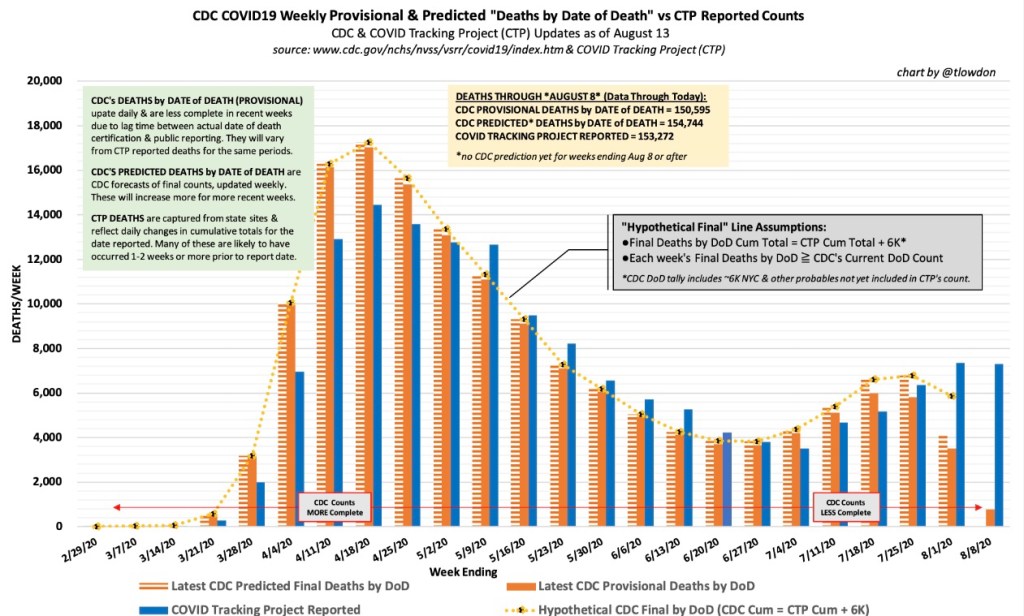
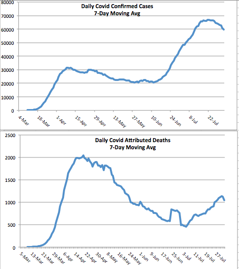
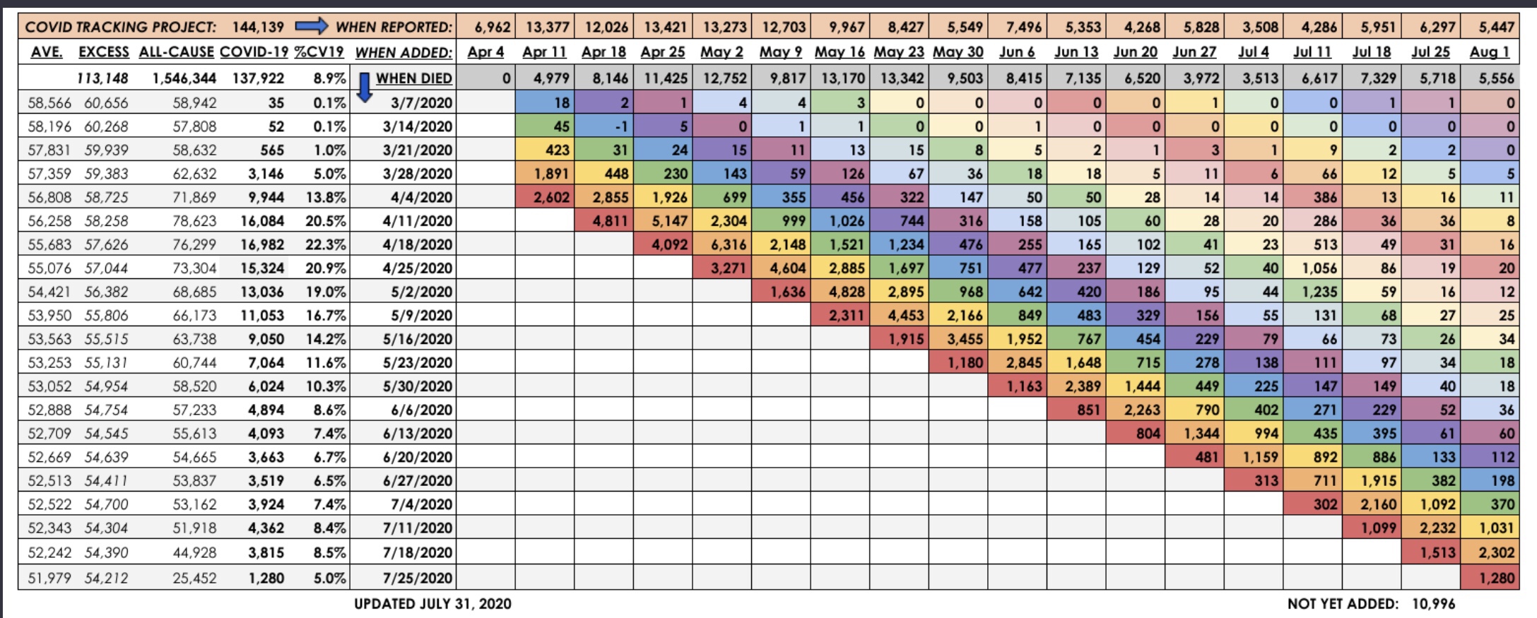
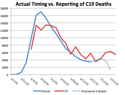
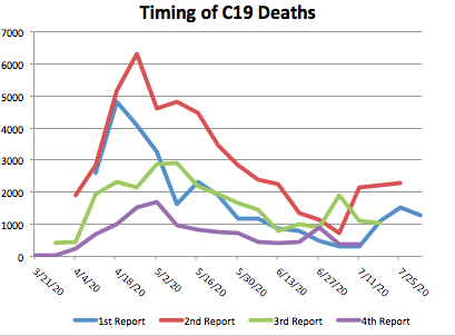
Reported COVID deaths do not reflect deaths that actually occurred in the reporting day or week, as I’ve noted several times. Here is a nice chart from @tlowdon on Twitter showing the difference between reported deaths and actual deaths for corresponding weeks. The blue bars are weekly deaths reported by the COVID Tracking Project. The solid orange bars are the CDC’s “provisional” deaths by actual week of death, which is less than complete for recent weeks because of lags in reporting. Still, it’s easy to see that reported deaths have overstated actual deaths each week since late August.

I should note that the orange bars represent deaths that involved COVID-19, though a COVID infection might not have actually killed them. This CDC report, updated on November 4th, shows the importance of co-morbidities, which in many cases are the actual cause of death according to pre-COVID, CDC guidance on death certificates.

Leading Indicators

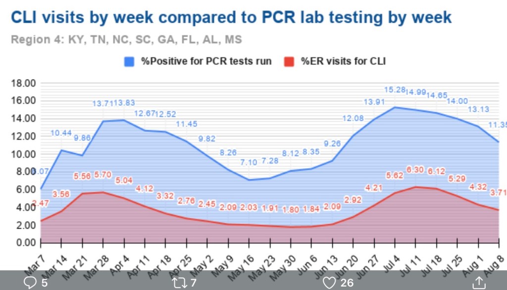
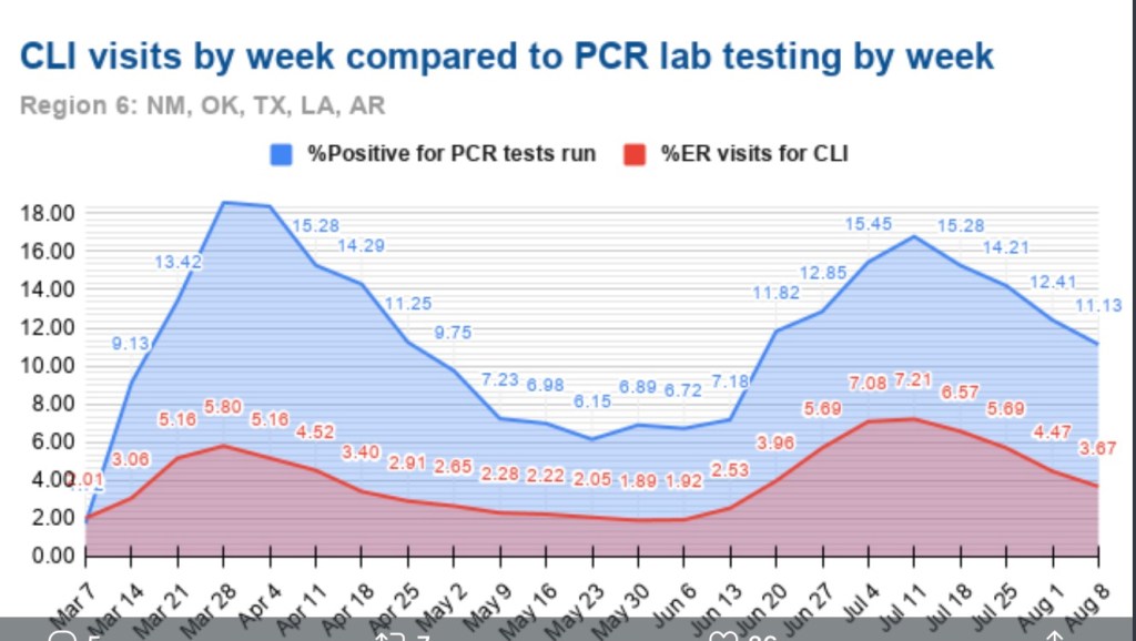
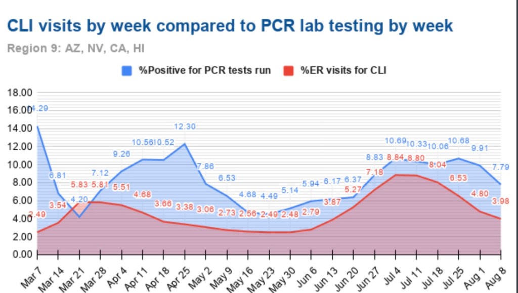
Researchers have studied several measures in an effort to find leading indicators of COVID deaths. The list includes new cases diagnosed (PCR positivity) and the percentage of emergency room visits presenting symptoms of COVID-like illness (%CLI). These indicators are usually evaluated after shifting them in time by a few weeks in order to observe correlations with COVID deaths a few weeks later. Interestingly, @tlowdon reports that the best single predictor of actual COVID deaths over the course of a few weeks is the sum of the %CLI and the percentage of ER patients presenting symptoms of influenza-like illness (%ILI). Perhaps adding %ILI to %CLI strengthens the correlation because the symptoms of the flu and COVID are often mistaken for one another.

The chart below reproduces the orange bars from above representing deaths at actual dates of death. Also plotted are the %Positivity from COVID tests (shifted forward 2 weeks), %CLI (3 weeks), the %ILI (3 weeks), and the sum of %CLI and %ILI (3 weeks, the solid blue line). My guess is that %ILI contributes to the correlation with deaths mainly because %ILI’s early peak (which occurred in March) led the peak in deaths in April. Otherwise, there is very little variation in %ILI. That might change with the current onset of the flu season, but as I noted in my last post, the flu has been very subdued since last winter.

What About November?

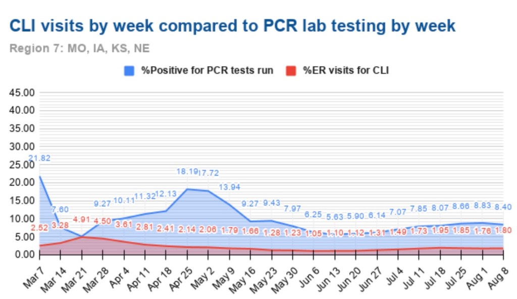
So where does that leave us? The chart above ends with our leading indicator, CLI + ILI, brought forward from the first half of October. What’s happened to CLI + ILI since then? And what does that tell us to expect in November? The chart below is from the CDC’s web site. The red line is %CLI and the yellow line is %ILI. The sum of the two isn’t shown. However, there is no denying the upward trend in CLI, though the slope of CLI + ILI would be more moderate.

As of 10/31, CLI + ILI has increased by almost 40% since it’s low in early October. If the previous relationship holds up, that implies an increase of almost 40% in actual weekly COVID deaths from about 4,000 per week to about 5,500 per week by November 21 (a little less than 800 per day).

FiveThirtyEight has a compilation of 13 different forecast models with projections of deaths by the end of November. The estimate of 5,500 per week by November 21, or perhaps slightly less per week over the full month of November, would put total COVID deaths at the top of the range of the MIT, UCLA, Iowa State, and University of Texas models, but below or near the low end of ranges for eight other models. However, those models are based on reported deaths, so the comparison is not strictly valid. Reported deaths are still likely to exceed actual deaths by the end of November, and the actual death prediction would be squarely in the range of multiple reported death predictions. That reinforces the expectation an upward trend in actual deaths.

Third Wave States

States in the upper Midwest and upper Mountain regions have had the largest increases in cases per capita over the past few weeks. Using state abbreviations, the top ten are ND, SD, WI, IA, MT, NE, WY, UT, IL, and MN, with ID at #11 (according to the CDC’s COVID Data Tracker). One factor that might mediate the increase in cases, and ultimately deaths, is the possibility of early herd immunity: in the earlier COVID waves, the increase in infections abated once seroprevalence (the share of the population with antibodies from exposure) reached a level of 15% to 25%.

Unfortunately, estimates of seroprevalence by state are very imprecise. Thus far, reliable samples have been limited to states and metro areas that had heavy infections in the first and second waves. One rule of thumb, however, is that seroprevalence is probably less than 10x the cumulative share of a population having tested positive. To be very conservative, let’s assume a seroprevalence of four times cumulative cases. On that basis, half the states in the “top ten” listed above would already have seroprevalence above 15%. Those states are ND, SD, WI, IA, and NE. The others are mostly in a range of 12% to 15%, with MI coming in the lowest at about 9%.

This gives some cause for optimism that the wave in these states and others will abate fairly soon, but there are a number of uncertainties: first, the estimates of seroprevalence above, while conservative, are very imprecise, as noted above; second, the point at which herd immunity might cause the increase in new cases to begin declining is real guesswork (though we might have confirmation in a few states before long); third, we are now well into the fall season, with lower temperatures, lower humidity, less direct sunlight, and diminishing vitamin D levels. We do not have experience with COVID at this time of year, so we don’t know whether the patterns observed earlier in the year will be repeated. If so, new cases might begin to abate in some areas in November, but that probably wouldn’t be reflected in deaths until sometime in December. And if the flu comes back with a corresponding increase in CLI + ILI, then we’d expect further increases in actual deaths attributed to COVID. That is only a possibility given the weakness in flu numbers in 2020, however.

Closing Thoughts

I was excessively optimistic about the course of the pandemic in the U.S. in the spring. While this post has been moderately pessimistic, I believe there are reasons to expect fewer deaths than previous relationships would predict. We are far better at treating COVID now, and the vulnerable are taking precautions that have reduced their incidence of infections relative to younger and healthier cohorts. So if anything, I think the forecasts above will err on the high side.

COVID Trends and Flu Cases

05 Thursday Nov 2020

Posted by Nuetzel in Pandemic

≈ 1 Comment

Tags

Casedemic, Coronavirus, Covid Tracking Project, Covid-19, Flu Season, Herd Immunity, Infection Fatality Rate, Influenza, Johns Hopkins University, Justin Hart, Lockdowns, Provisional Deaths, Rational Ground

Writing about COVID as a respite from election madness is very cold comfort, but here goes….

COVID deaths in the U.S. still haven’t shown the kind of upward trend this fall that many had feared. It could happen, but it hasn’t yet. In the chart above, new cases are shown in brown (along with the rolling seven-day average), while deaths (on the right axis) are shown in blue. It’s been over six weeks since new case counts began to rise, but deaths have risen for about two weeks, and it’s been gradual relative to the first two waves. Either the average lag between diagnosis and death is much longer than earlier in the year, or the current “casedemic” is much less deadly, or perhaps both. It could change. And granted, this is national data; states in the midwest have had the strongest trends in cases, especially the upper midwest, as well as stronger trends in hospitalizations and deaths. Most of those areas had milder experiences with the virus in the spring and summer.

Lagged Reporting

What’s tricky about this is that both case reports and death reports in the chart above are significantly lagged. A COVID test might not take place until several days after infection (if at all), and sometimes not until hospitalization or death. Then the test result might not be known for several days. However, the greater availability of tests and faster turnaround time have almost certainly shortened that lag.

Deaths are reported with an even a greater delay, though you wouldn’t know it from listening to the media or some of the organizations that track these statistics, such as Johns Hopkins University and the COVID Tracking Project. Thus far, they only tell you what’s reported on a given day. This article from Rational Ground does a good job of explaining the issue and the distortion it causes in discerning trends.

Deaths by actual date-of-death

I’ve reported on the issue of lagged COVID deaths myself. The following graph from Justin Hart is a clear presentation of the reporting delays.

Reported deaths for the most recent week (10/24) are shown in dark blue, and those deaths were spread over a number of prior weeks. Actual deaths in a given week are represented by a “stack” of deaths reported later, in subsequent weeks. One word of caution: actual deaths in the most recent weeks are “provisional”, and more will be added in subsequent reporting weeks. Hence the steep drop off for the 10/17 and 10/24 reporting weeks.

Going back three or four weeks, it’s clear that actual deaths continued to decline into October. Unfortunately, that doesn’t tell us much about the recent trend or whether actual deaths have started to rise given the increase in new cases. I have seen a new weekly update with the deaths by actual date of death, but it is not “stacked” by reporting week. However, it does show a slight increase in the week of 10/10, the first weekly increase since the end of June. So perhaps we’ll see an uptick more in-line with the earlier lags between diagnosis and death, but that’s far from certain.

Another important point is that the number of deaths each week, and each day, are not as high as reported by the media and the popular tracking sites. How often have you heard “more than 1,000 people a day are dying”. That’s high even for weekly averages of reported deaths. As of three weeks ago, actual daily deaths were running at about 560. That’s still very high, but based on seroprevalence estimates (the actual number of infections from the presence of antibodies), the infection fatality keeps dropping toward levels that are comparable to the flu at ages less than 65.

Where is the flu?

Speaking of the flu, this chart from the World Health Organization is revealing: the flu appears to have virtually disappeared in 2020:

It’s still very early in the northern flu season, but the case count was very light this summer in the Southern Hemisphere. There are several possible explanations. One favored by the “lockdown crowd” is that mitigation efforts, including masks and social distancing, have curtailed the flu bug. Not just curtailed … quashed! If that’s true, it’s more than a little odd because the same measures have been so unsuccessful in curtailing COVID, which is transmitted the same way! Also, these measures vary widely around the globe, which weakens the explanation.

There are other, more likely explanations: perhaps the flu is being undercounted because COVID is being overcounted. False positive COVID tests might override the reporting of a few flu cases, but not all diagnoses are made via testing. Other respiratory diseases can be mistaken for the flu and vice versus, and they are now more likely to be diagnosed as COVID absent a test — and as the joke goes, the flu is now illegal! And another partial explanation: it is rare to be infected with two viruses at once. Thus, COVID is said to be “crowding out” the flu.

Waiting for data

There is other good news about transmission, treatment, and immunity, but I’ll devote another post to that, and I’ll wait for more data. For now, the “third wave” appears to be geographically distinct from the first two, as was the second wave from the first. This suggests a sort of herd immunity in areas that were hit more severely in earlier waves. But the best news is that COVID deaths, thus far this fall, are not showing much if any upward movement, and estimates of infection fatality rates continue to fall.

Evidence of Fading COVID Summer Surge

16 Sunday Aug 2020

Posted by Nuetzel in Pandemic

≈ Leave a comment

Tags

CDC, CLI, Covid Tracking Project, Covid-19, COVID-Like Illness, Date of Death, FEMA, FEMA Regions, Herd Immunity Threshold, Hospitalizations, Kyle Lamb, PCR Test, Percent Positive, Provisional Deaths

Lately I’ve talked a lot about reported deaths each week versus deaths by actual date of death (DOD). Much of that information came from Kyle Lamb’s Twitter account, and he’s the source of the charts below as well. The first one provides a convenient summary of the data reported through last week. The blue bars are reported deaths each week from the COVID Tracking Project (CTP), which are an aggregation of deaths that actually occurred over previous weeks. Again, the blue bars do NOT represent deaths that occurred in the reporting week. The solid orange bars are “provisional” actual deaths by DOD. “Provisional” means that recent weeks are not complete, though most deaths by DOD are captured within three to four weeks. The CDC also produces a “forecast” of final death counts by DOD, shown by the hatched orange bars.   

Note that the recent surge in deaths has been much smaller than the one in the spring, which was driven by deaths in the northeast. The CDC “expects” actual deaths by DOD to have declined starting after the week of July 23rd. However, CTP was still reporting deaths of over 1,000 per day last week. The actual timing of those deaths in prior weeks, and the ultimate extent of the summer surge in COVID deaths, remains to be seen.

Certain leading indicators of deaths are signaling declines in actual deaths in August. Two of those indicators are 1) the positivity rate on standard PCR tests for infections; and 2) the share of emergency room visits made for symptoms of “COVID Like Illness” (CLI). The charts below show those indicators for FEMA regions that had the largest uptrends in cases in June and July. Florida is part of Region 4, shown in the next chart:

Here is the Region 6, which includes Texas:

Finally, Region 8 includes Arizona and California:

Out of personal interest, I’m also throwing in Region 7 with a few midwestern states, where cases have risen but not to the levels reached in Regions 4, 6, and 8:

With the exception of the last chart, the clear pattern is a peak or plateau in the positivity rate in late June through late July, followed by declines in subsequent weeks. The share or ER visits for CLI was not quite coincident with the positivity rate, but close. The decline in the CLI share is evident in Regions 4, 6 and 8. Again, these three regions include states that drove the nationwide increase in cases this summer (AZ, CA, FL, and TX), and the surge appears to have maxed out.     

Here is a chart showing the share of CLI visits to ERs for all ten FEMA region from mid-June through last week. Clearly, this measure is improving across the U.S.

Nationwide, the CLI percentage at ERs has decreased by about 47% over the past four weeks, and the positivity rate has decreased by about 28% in that time. In addition to these favorable trends, COVID hospitalizations have decreased by about 40% over the past three weeks. All of these trends bode well for a downturn in COVID-attributed deaths.

The summertime surge in the virus was not nearly as ravaging as in the spring, and it appears to be fading. We’ll await developments in the fall, but we’ve come a long way in terms of protecting the vulnerable, treating the infected, approaching herd immunity thresholds (which means reduced rates of transmission to susceptible individuals), and the real possibility that we can put the pandemic behind us. 

COVID at Midsummer

04 Tuesday Aug 2020

Posted by Nuetzel in Pandemic, Public Health

≈ 2 Comments

Tags

Arizona, California, CDC, Coronavirus, COVID Time Series, Covid Tracking Project, Covid-19, Fatality Rate, Florida, Hospitalizations, Illinois, Kyle Lamb, Missouri, New Cases, New York, Provisional Deaths, Regional Variation, South Carolina, Tennessee, Texas

It’s been several weeks since I last posted on the state of the coronavirus pandemic (also see here). The charts below show seven-day moving averages of new confirmed cases and reported C19 deaths from the COVID Tracking Project as of August 3. Daily new cases began to flatten about three weeks ago and then turned down (it can take a few days for such changes to show up in a moving average). Daily C19-attributed deaths began climbing again in early July, lagging new cases by a few weeks, and they slowed just a bit over the past several days. Obviously, both are good news if those changes are maintained. The other thing to note is that deaths have remained far below their levels of April and early May.

The daily death count is that reported on each date, not when the deaths actually occurred. Each day’s report consists of deaths that were spread across several previous weeks or even a month or more. That makes the slight downturn in deaths more tenuous from a data perspective. There are sometimes large numbers of deaths from preceding weeks reported together on a single day, so reporting can be ragged and the final pattern of actual deaths is not known for some time. More on that below.

States

The increase in cases and deaths during late June and July was concentrated in four states: Arizona, California, Florida, and Texas. Here’s how those states look now in terms of cases and deaths, from the interactive COVID Time Series site:


New cases began to flatten or drop in these states two to three weeks ago, driving the change in the national data. Daily deaths have not turned convincingly, but again, these are reported deaths, which actually occurred over previous weeks. One more chart that is suggestive: current hospitalizations in these four states. The recent declines should bode well for the trend in reported deaths, but it remains to be seen. 

Meanwhile, other parts of the country have seen an uptrend in cases and deaths, such as Illinois, Missouri, South Carolina, and Tennessee. Here are new cases in those states:

It’s worth emphasizing that the elevated level of new cases this summer has not been associated with the rates of fatality experienced in the Northeast during the spring. There are many reasons: better patient care, new treatments, more direct summer sunlight, higher humidity, and tighter controls in nursing homes.

More On the Timing of Deaths

Back to the discrepancies in the timing of reported deaths and actual deaths. This is important because the reported totals each day and each week can be highly misleading, even to the point of frightening the public and policy makers, with consequent psychological and economic impacts.

The latest summary of provisional vs. reported deaths is shown below, courtesy of Kyle Lamb, who posts updates on his Twitter feed. This report ends with the last complete week ending August 1. It’s a little hard to read, but you might get a better look if you click on it or turn your phone sideways. Some of the key series are also graphed below. 

The table shows the actual timing of deaths in the fourth column, with dates alongside. The pattern differs from the statistics reported by the Covid Tracking Project (CTP) in the top row (shaded orange), and from the totals of actual deaths by reporting day in the third row (shaded gray). The reporting dates are always later than the dates of death. This can be seen in the chart below. The most obvious illustration is how many of the deaths from around the peak in mid-April were reported in May. In March and April, the daily reports were short of the ultimate actual death counts because so few deaths with associated dates were known by then.


The right-hand end of the red line shows that many deaths reported by CTP have not yet been placed at an actual date of death by the CDC.  At this point, the actual date of death has not been placed for over 10,000 deaths! Again, those will be spread over earlier weeks.

The blue line is dashed over the last four weeks because those counts are most “highly” provisional. Small changes in the actual counts are likely for dates even before that, but the last four weeks are subject to fairly substantial upward revisions. Eventually, the right end of the blue line will more closely approximate the totals shown in red.

To get an indication of trends in the actual timing of deaths, I plotted the weekly actual deaths reported for the last four reporting weeks going back in time. In the table, those are the four lowest, color-coded diagonals. In the graph below, which should include the qualifier “by recency of report week”, actual deaths in the most recent report week are represented by the blue line, the prior weekly report is red, followed by green (three weeks prior), and purple (four weeks prior… sorry, the colors are not consistent with those in the table). The lines extend farther to the right for more recent report weeks.

The increase in actual deaths occurring in July has declined or flattened in each of the four most recent report weeks. Only the second-to-last week increased as of the August 1st report. On the whole, those changes seem favorable, but we shall see.

Closing

It’s getting trite to say, but the next few weeks will be interesting. The increase in deaths in July was a sad development, but at least the extent of it appears to have been limited. Even with a somewhat higher death count, the fatality rate continued to decline. Let’s hope any further waves of infections are even less deadly.

Reported and “Actual” COVID Deaths

13 Monday Jul 2020

Posted by Nuetzel in Pandemic, Political Bias

≈ 2 Comments

Tags

Cause of Death, CDC, Coronavirus, Covid Tracking Project, COVID-Phobic Deaths, Death Toll, Hospital Reimbursements, Kyle Lamb, Lockdown Deaths, Our World In Data, Reclassified Deaths

I was updating my post from twelve days ago on the upward trend in new coronavirus cases when I came across a great tabular summary of a phenomenon that’s been underway since early April: significant delays in reporting deaths from COVID-19 (C19). Before I get to that, a quick word on what’s happened over the past 12 days. New coronavirus cases keep climbing in a number of states, and it’s been a grisly waiting game to see whether the severity and lethality of infections will follow the case counts upward. The following chart provides a very preliminary answer. It’s taken from Our World In Data, and it shows the seven-day moving average of C19 deaths in the U.S.

There has indeed been an upturn in reported deaths over the past week. Just prior to that, a temporary plateau in late June was caused by a set of “reclassifications” of earlier deaths in New Jersey (the “plateau effect is caused by seven-day averaging). These kinds of changes in reporting make it rather difficult to interpret trends accurately. Unfortunately, the reporting of deaths has been subject to continuing distortions that are even more difficult to discern than New Jersey’s spike.

Kyle Lamb provides the interesting table below, which might be difficult to read without either clicking on it or going to the link at Twitter. Here is another link to an annotated version of the table. The top row labeled “CTP Total” is the C19 death toll reported each week by the COVID Tracking Project. This is generally what the public sees. These reports show that deaths reached their highest levels during the weeks of April 11th through May 9th. However, the second column shows C19 deaths by their actual week of occurrence. This series shows a more distinct peak on April 18th with steady declines thereafter.

The weekly totals in the second column are not final, however. Take a look at the last reporting week in the far right column (July 11th). The CTP reported 4,286 deaths, an increase over the prior week consistent with the upturn in the first chart above. But the table shows that over half of that week’s reported deaths actually occurred in late April and early May! So the upturn in deaths is something of a mirage.

We won’t have a reasonable approximation of the death totals for the past several weeks (or how they compare) for at least several more weeks. In fact, one can argue that it might be a matter of months before we have a reasonable approximation of those deaths, but it’s worth noting that the vast bulk of “actual” C19 deaths tend to be reported within four weeks of the initial reporting week, and the additions or revisions to the two weeks in late April and early May in the last column were exceptionally large. Chances are we won’t see many more that big…. Or will we?

Aspects of this process hint at the ease with which the C19 death totals could be manipulated. The reported totals for all-cause mortality in the first column are incomplete; more recent weeks, especially, are not fully settled as to causes of death. Some of those fatalities are certain to be attributed to C19. Others might be reclassified as C19. And here is the scary part: the all-cause totals are certain to include a significant number of lockdown-related or COVID-phobic deaths: individuals who were unable or unwilling to seek medical care for urgent needs due to lockdowns or fears of rampant spread of C19 infections within hospital environments. To anyone with an interest in manipulating the C19 death toll, whether hospital officials seeking higher reimbursements, local or state officials seeking federal funds, or public officials at any level seeking to promote pandemic fears and/or political discord, these “extra” deaths might be tempting marks for reclassification.

I’m fairly confident that the uptrend of new cases will be far less severe than early in the pandemic. I believe much of the alarm I see on social and mainstream media is misplaced. More on that in a subsequent post, but for now I’ll simply note that those testing positive are concentrated in much lower ranges of the age distribution, and treatment has improved in a variety of ways. The table above shows that the downtrend in actual weekly C19 deaths is intact as of the admittedly incomplete July 11th reporting week. We won’t know the “actual” pattern of early-July C19 fatalities for another month or more. Even then, one might harbor suspicions that the totals are manipulated for economic or political reasons, but we can hope the reporting authorities are exercising the utmost objectivity in assigning cause of death.

Coronavirus Framing #7: Second Wave Uncertainty

19 Friday Jun 2020

Posted by Nuetzel in Pandemic

≈ 1 Comment

Tags

Air Conditioning, Asian Flu, Case Fatality Rate, CDC, Coronavirus, COVID Time Series, Covid Tracking Project, Effective Herd Immunity, George Floyd, HHS, High Cholesterol, Hong Kong Flu, Johns Hopkins, Operation Warp Speed, Pooled Testing, Reverse Seasonal Effect, Rich Lowry, Social Distancing, Testing, Vitamin D Deficiency

We’re now said to be on the cusp of a “second wave” of coronavirus infections. It’s become a new focus of media attention in the past week or so. Increased infections have been reported across a number of states, especially in the south, but I’m not especially alarmed at this point for reasons explained below. Either way, the public policy response will certainly be different this time, at least in most areas. We’ve learned that a more targeted approach to managing coronavirus risk is far less costly, which means eschewing general lockdowns in favor of focusing resources on protecting the most vulnerable. That approach is supported by research weighing the costs and benefits of the alternatives (also see here and here).

The targeted approach I’ve advocated does not call for any less caution on the part of individuals. That means avoiding prolonged, close contact with others, especially indoors. I don’t mind wearing a mask when inside stores or public buildings, but I believe it should be voluntary. I do my best to stay out of close proximity to most others in public places anyway, masked or otherwise. This is voluntary social distancing. I also believe public health authorities should be more active in disseminating information on known correlates of coronavirus severity, such as Vitamin D deficiency, high LDL cholesterol, and the “reverse seasonal effect” caused by low humidity in air-conditioned spaces. I would also strongly agree that the effort to identify and mass produce vaccine candidates, known as Operation Warp Speed, should be ramped up considerably, with heavier funding and more than five vaccine candidates.

We’ve seen a continuing increase in coronavirus testing since my last “framing” post about a month ago. Testing has increased to a daily average of almost 500,000 over the past two weeks. At present we appear to have an excess supply of testing capacity in many areas, as Rich Lowry notes:

“The problem with testing nationally is becoming less a shortfall of availability of the tests and more a shortfall of people showing up to get tested. An insider in the diagnostics industry says that laboratories are reporting that they are ‘sample starved’ — i.e., they aren’t getting enough specimens. He notes, ‘We have all seen stories about sample-collection sites in some regions not seeing that many patients.’

An HHS official says that in May there was the capacity to do twice as many tests as were actually performed, calling it a function of ‘allocation and efficiency, but more just demand.’ Says Giroir, ‘We really see areas in the country now that there’s more tests available than people who want to get tested or the need for testing.'”

Before turning to some charts, a word about the data in the charts I’ve been using throughout the pandemic. Some of the nationwide information was directly from the CDC or the Johns Hopkins dashboard. In other cases, I’ve reported state level data and some nationwide data published by The COVID Tracking Project (CTP) and the COVID Time Series (CTS) dashboard, which uses state data from CTP. I first noticed a few discrepancies in the national totals in April, which have become larger with growth in the counts of cases and deaths. Here is a key part of CTP’s explanation:

“For many states, the CDC publishes higher testing numbers than the states themselves report, which raises questions about the structure and integrity of both state and federal data reporting. … Another point of contrast between the CDC’s new reporting and the official state data compiled by The COVID Tracking Project is that the CDC has not released historical, state-level testing data for the first three months of the outbreak.”

Thus, the CDC currently reports almost 120,000 U.S. deaths, while CTP reports about 112,000. Nevertheless, I will continue to report numbers from both sources for the sake of continuity, and I will try to remember to note the source in each case.

The first chart below shows the number of daily tests from CTP; the second chart shows the number of daily confirmed cases (CTP). Since mid-May, daily testing has increased by more than 50%, calculated on a moving average basis, and is now approaching half a million per day or more than 3 million per week. Pooled testing is coming, which will ultimately increase testing capacity several-fold. Daily confirmed cases have been hovered just above 20,000 since around Memorial Day, with a recent turn upward to around 24,000.

Early in the pandemic, I made the mistake of focusing too heavily on case numbers. Yes, I adjusted for population size and was aware that the initial shortage of tests was restraining diagnoses. Still, I did not foresee the great expansion in testing we’ve witnessed, the great transmissibility of the virus in some regions, nor the large number of asymptomatic cases that would ultimately be diagnosed.

The daily percentage of positive tests (CTP), which is smoothed in the chart below using a seven-day moving average to eliminate within-week variability, has declined gradually since early April to about 4% before the uptick in the last few days. Still, that’s a drop of about 75% from the peak when tests were in very short supply. Those were days when even heavily symptomatic individuals were having trouble getting tested.

We’d hope to see a resumption in the decline of the positive percentage as testing continues to grow, but even with a relatively constant positivity rate, the number of daily confirmed cases must grow as testing expands. There may be several reasons the positivity rate has remained stubbornly near 5% over the past few weeks. One is the obvious reversal in social distancing as states have opened up. People became less fearful about the virus in general, and protesters jammed the streets after the George Floyd murder in Minneapolis. Another reason is that there are new areas of focus for testing that might be picking up cases. For example, hospitals in some states are now testing all admissions for COVID-19. This will tend to pick up more infections to the extent that individuals with co-morbidities are hospitalized at higher rates in general and are also more susceptible to the coronavirus. Finally, testing more broadly is likely to pick up a larger share of asymptomatic cases even as the “true rate” of infection declines.

The daily death toll (CTP) attributed to coronavirus has continued to decline. See below. It is now running at about a third of the peak level it reached in mid-April. There are several reasons for the decline. One is the lower number of active cases, changes in which lead deaths by a few weeks. Awareness and testing capacity have undoubtedly led to earlier diagnosis of the most severe cases. There is also the strong possibility that the virus, having felled some of the most susceptible individuals, is now up against more hosts with effective immune responses. An ongoing degree of social distancing, more humid weather, and more direct sunlight have probably reduced initial viral loads from those experienced early-on, when the case load was escalating. Finally, treatment has improved in multiple ways, and there are now a few medications that have shown promise in shortening the duration and severity of infection.

The course of the pandemic has varied greatly across countries and across regions of the U.S. The New York City area was especially hard hit along with several other large cities, as well as Louisiana. CTS shows that states with the highest cumulative number of coronavirus deaths (New York (blue line), New Jersey (green), Massachusetts, Illinois, and Pennsylvania in the charts below) have experienced downward trends in positive cases per day (the first chart below), leading daily deaths downward in May and early June (the second chart — NY’s downtrend began earlier). I apologize if the charts below are difficult to read, but they have resisted my efforts at resizing. Note: I’m mainly focused on trends here, and I have not shown these series on a per capita basis.

More recently, almost two dozen states have begun to see higher daily case diagnoses. Several of these had more favorable outcomes in the early months of the pandemic and were in more advanced stages of reopening. The charts below (CTS) show results for Arizona, Florida, Georgia, and Texas. The new “hot spots” in these states are mostly urban centers. It’s not clear that the reopenings are to blame, however. The protests after George Floyd’s murder may have contributed in cities like Houston, though no increase in New York is apparent as yet. The states in the chart are all in the south or southwest, so the increases have occurred despite sunny, warm conditions. It’s possible that hot weather has prompted more intensive use of air conditioning, which dries indoor environments and can promote the spread of the virus. These southern states have not yet experienced a corresponding increase in deaths, though that would occur with a lag. 

Missouri has seen an slow upward trend in its daily positive test count over the past four weeks, even though the state’s positive rate has trended down slowly since early May. I show MO’s confirmed cases per day below (in green) together with Illinois’ (because my hometown is on the border and the two states are a nice contrast). IL is much larger and has had a much higher case load, but the downward trend in new cases in IL is impressive. Coronavirus deaths per day are shown in the second chart below, with seven-day averages superimposed. Deaths have also trended down in both states, though MO has experienced a few bad days very recently, and MO’s case fatality rate is slightly higher than in IL.

We’ll know fairly soon whether we’re really headed for a second major wave. However, the case count, in and of itself, is not too informative. Testing has increased markedly, so we would expect to see more cases diagnosed. The percent of tests that are positive is a better indicator, and it has flattened at a still uncomfortable 5% for about a month, with a slight uptick in the past few days. Even more telling will be the future path of coronavirus deaths. My expectation is that more recent infections are likely to be less deadly, if only because of the lessons learned about protecting the care-bound elderly. I also believe we’re not too far from what I have called effective herd immunity. 

The pandemic has taken a heavy toll, especially among the aged. In fact, total deaths in the U.S. have now exceeded both the Hong Kong flu of the late 1960s and the Asian flu of the late 1950s. Unfortunately, risks will remain elevated for some time. However, any reasonable estimate of the life-years lost is considerably less than in those earlier pandemics due to the differing age profiles of the victims. In any case, the coronavirus pandemic has not been the kind of apocalyptic event that was originally feared and erroneously predicted by several prominent epidemiological models. It can be tackled effectively and at much lower cost by focusing resources on protecting vulnerable segments of the population. 

.

Covid “Framing” #5: Crested Wave

28 Tuesday Apr 2020

Posted by Nuetzel in Pandemic

≈ Leave a comment

Tags

Coronavirus, Covid Tracking Project, Covid-19, IHME Model, Institute for Health Metrics and Evaluation, Italy Covid, Johns Hopkins Dashboard, Missouri Covid, New York Covid, Private Testing, South Korea Covid, Testing and Tracing

One big change in recent national Covid trends has to do with testing. In the past week, the number of daily tests has increased by an average of over 50%. That’s shown in the first chart below. Regardless of whether the individuals being tested meet the earlier testing criteria, there are still plenty of people who either want to get tested or are being tested for occupational reasons. Nonetheless, there are reports of unused testing capacity at private labs and universities. Further increases in testing are in the offing, especially if those desiring tests are made aware of their availability.

Increased testing has been accompanied by further declines in the percentage of positive tests. That’s certainly a good thing, but it’s not clear how much of the decline can be attributed to declining transmissions, as opposed to broadened testing criteria.

Coronavirus deaths in the U.S. have also begun to taper. The black line below plots cumulative Covid-attributed deaths the U.S. up through April 28. The red line is the IHME model projection from April 2nd, with upper and lower confidence bounds shown by the blue and green lines, respectively. Despite the notorious broadening of the definition of a Covid death a few weeks ago, the cumulative death toll has remained below the mean IMHE projection. 

More bad news is that the number of confirmed coronavirus cases continues to mount. Of course, that is a consequence of broader testing and possibly some arbitrary classifications as well. My previous coronavirus “framing” posts (#1 from March 18th is here, #4 is here ) usually featured a chart like the one below, which shows the number of cumulative confirmed cases of Covid-19 in the U.S. Day 1 in the chart was March 4th, so tonight, April 28th, we’re 55 days in. The blue and green lines are what I originally called “pretty bad” and “very good” outcomes, based on multiples of Italy and South Korea as of March 18th, as a share of their respective populations. Italy’s case count kept climbing after that, but its growth has now slowed considerably.

The U.S. case count has increased dramatically, now exceeding the original “very bad” case curve I plotted in mid-March. Has the U.S. fared as poorly as that seems to suggest? As of April 28, the U.S. has performed about three times as many tests as Italy, and it has identified about 10% fewer cases per capita. If we excluded the state of New York, which accounts for 5.7% of U.S. population but fully 30% of U.S. Covid cases through April 28th, U.S. Covid incidence would be well below Italy’s. However, Italy is still perhaps two weeks ahead of us.

The next chart examines New York’s experience relative to all other states. The blue line is the number of daily confirmed cases in the U.S., and the red line is the U.S. excluding New York state. The vertical gap between the two lines is the daily case count for New York. The fluctuating, slight downward trend in the U.S since about April 10th is largely attributable to improvement in New York. The rest of the country, while not as serious as New York in terms of incidence, is still on a plateau.

The next chart shows daily Covid-attributed deaths for the U.S. (blue), the U.S excluding New York state (red), and New York state (green). The source of this data is the Covid Tracking Project, which reports numbers as of 4 p.m. each day, so it differs from the daily numbers reported by the Johns Hopkins Dashboard. There are a few interesting things to note here. First, New York has accounted for a major share of daily deaths, though its share is diminishing. The decline in New York Covid deaths has been a major positive development over the past few weeks. The pattern of deaths for the U.S. is kind of fascinating: It shows a distinct weekly frequency, with declines over weekends and spikes early in each week. I suspect this is based on the data elements used by the Tracking Project, perhaps based on reporting dates rather than actual times of death. New York does not show that kind of pattern, but I’ve heard that the reporting system there is highly efficient. We might have seen a favorable turn in U.S. daily fatalities over the past week. After the peak early this week, the daily count is likely to decline again over the next few days. We can hope the weekly spikes and valleys reach lower levels as we get into May.

Finally, a couple of charts updating the status of the pandemic in Missouri, my home state. Despite some volatility, new cases continue to taper.

Missouri Covid fatalities are extremely volatile. It’s hard to see the kind of “weekend” phenomenon so apparent in the U.S. aggregate shown earlier. With a couple of recent spikes, it’s difficult to say anything conclusive about the course of daily fatalities based on the chart below. However, as fewer new cases are diagnosed in Missouri, the number of fatalities will follow.

So, what’s the new “framing”? I expect U.S. case counts to continue to climb with more extensive testing. If the most vulnerable individuals remain quarantined or at least carefully distanced, then individuals presenting symptoms will continue to fall, so the rate of new positive will decline. Additions to the case count will come increasingly from the asymptomatic who happen to be tested for occupational reasons, for travel abroad, and ultimately for testing and tracing efforts. Improved light and humidity is likely to cut into the rising case count as June approaches. With any luck it will become negligible along with fatalities. We’ll continue to learn as well. The hope is that a few treatments or even a vaccine will prove out. Test results for a few of the latter might be available as early as September.

Coronavirus: Framing the Next Few Weeks #3

05 Sunday Apr 2020

Posted by Nuetzel in Pandemic, Risk Management

≈ 1 Comment

Tags

80000 Hours, Chris Murray Model, Christopher Monkton, Christopher Murray, Co-morbidity, Confidence Interval, Coronavirus, Covid Tracking Project, Covid-19, Economic Restart, Indur M. Goklany, Institute for Health Metrics and Evaluation, Lockdowns, Pending Tests, Positive Test Ratio, Social Distancing, Stay-at-Home Orders, White House Coronavirus Task Force

There were a few encouraging signs of change over the past few days in the course of the coronavirus pandemic in the U.S. This is the third of my quaint efforts to provide perspective on the coronavirus pandemic with “tracking” or “framing” posts. The first two were: Coronavirus: Framing the Next Few Weeks, on March 22, and Framing Update on March 28. In both of those posts, I charted confirmed cases of Covid-19 in the U.S. along with optimistic and pessimistic scenarios. I speculated that over the course of a few weeks, social distancing would lead to a reduction in the daily number of new confirmed cases. Unfortunately, it’s not clear whether that curve has started to “bend” rightward, but new confirmed cases on Sunday, April 5 — the number of those testing positive — was down almost 30% from Saturday.

An updated version of the earlier chart appears below, accompanied by a table. The number of confirmed cases (red line) has mounted over the past week, as has the daily increase in confirmed cases, though yesterday’s number was better. The table below the chart shows that the growth rate of confirmed cases (the far right-hand column) has decelerated, but it had leveled off at about 14% over the few days before Sunday. If Sunday’s drop persists it would be encouraging. Unfortunately, even moderate growth rates are destructive when the base of confirmed cases is large. The faster the growth rate declines, the faster the curve will bend.

I did not make any changes to the original “Very Good” and “Pretty Bad” scenarios, deciding that it was better to keep them as a consistent benchmark. As of Sunday, the top of the “Very Good” curve would still be about 2.3x the North Korean experience as of Sunday night, normalized for population. The top of the “Pretty Bad” scenario (which is not visible in this “zoomed-in” version) would be about 1.4x the Italian experience thus far. South Korea’s curve flattened substantially several weeks ago, and now even Italy’s curve is showing a rightward bend. Let’s hope that continues.

The case count obviously depends on the volume of daily testing, which has been increasing rapidly. As I’ve noted before, there has been a backlog of test requests. In addition, every day there is an overhang of “pending” test results. Interestingly, the number of tests stabilized on Saturday and the number of pending test results plunged (see the next chart, which uses data from the Covid Tracking Project). We’ll see if those developments persist. It would represent a milestone because daily case counts will advance as long as tests do, and the effort to work through the backlog has been inflating the speed of the advance in confirmed cases.

Another interesting development coincident with the drop in pending tests has to do with the cumulative percentage of positive test results: it has stabilized after growing for several weeks. This might mean we’ve reached a point at which the most severe incoming cases are fewer, but we’ll have to see if the flattening persists or even declines, which would be wonderful.

I’ve been grappling with potential weaknesses of the data on confirmed cases: first, the U.S. got a late start on testing, so there was the backlog of patients requiring tests just discussed above. That was presumed to have exaggerated the acceleration in the daily totals for new cases. Second, it’s possible that a continuing transition to more rapid test results would exaggerate the daily counts of new cases. Third, It’s possible that testing criteria are being relaxed, which, despite reducing the positive test rate, would increase growth in the “official” confirmed case count. Suspected cases should be tested, of course, but the change in standards is another factor that distorts the shape of the curve.

Any published statistic has its shortcomings. All test results are subject to false positives and negatives. Hospitalizations of patients with a positive coronavirus diagnosis are subject to the measurement issues as well, though they might be driven more by the severity of symptoms and co-morbidities than a positive Covid diagnosis per se. And hospitalizations of Covid patients might be subject to inconsistencies in reporting, and so might ICU admittances. Coronavirus deaths are subject to vagaries: reporting a cause of death is dictated by various criteria when co-morbidities are involved, and those criteria differ from country to country, or perhaps even hospital to hospital and doctor to doctor! In fact, some go so far as to say that all deaths should be tracked for coronavirus plus its co-morbidities and then compared to an average of the past five to ten years to obtain an estimate of “excess deaths”, which could conceivably be negative or positive. Finally, recoveries are even more impacted by inconsistent reporting, especially because many recoveries occur at home.

I’ll be highlighting coronavirus deaths going forward, and I’ll continue to focus mainly on the U.S. and only lightly on other countries. After all, death is obviously the most negative outcome. Again, however, the count of coronavirus deaths does not account for deaths that would have occurred over the same time frame due to co-morbidities or the effect of deaths that would not have occurred absent co-morbidities.

The predictions in the chart below are from the Chris Murray Model, upon which the White House Coronavirus Task Force has focused more recently. This model was developed by Dr. Christopher Murray at the Institute for Health Metrics and Evaluation at the University of Washington. I’ll be using the forecast starting from April 2 as the basis for my “framing” of actual deaths over the next few weeks, keeping it “frozen” at that level as a new benchmark. My apologies for the absence of dates on the horizontal axis, but the origin is at March 14 and there is only a single line up through April 1. That line represents actual cumulative Covid deaths recorded in the U.S. The red line is the mean model prediction. Deaths are expected to ramp up over the next week or so, much as we’ve seen in the confirmed case count, as deaths lag behind diagnoses by anywhere from a few days up to 17 days. This model predicts an ultimate death toll of about 94,000 at the top of the mean curve (not visible on the zoomed-in chart). Above and below that line are upper (blue) and lower (green) bounds, respectively, of a “confidence interval”. It’s unlikely we’ll see cumulative deaths breach either of those bounds. The lower bound would place the ultimate death toll at about 40,000; the upper bound would place it at just under 180,000. At this point, as of Sunday, April 5, actual deaths (black) are slightly below the mean or central tendency, but that’s difficult to see in the current chart.

The ongoing lockdowns in the U.S. and around the world are exceedingly controversial. There is a very real tradeoff between the benefits of extending the length of these lockdowns and the benefits of allowing economic activity to “restart”. But do lockdowns work? Christopher Monkton offers aggregate evidence that they truly do reduce the spread of the virus in “Are Lockdowns Working?” That they would work is intuitive, and decisions to scale them back should be made cautiously for certain “high exposure” activities, and in conjunction with isolating and trace-tracking contacts of all infected individuals, as they have done successfully in countries such as Taiwan and Singapore.

There may be signs that a bend in the U.S. case curve is in the offing, perhaps over the next week or two. That timing would roughly comport with the notion that over the past three weeks, efforts at social distancing and stay-at-home orders have allowed the U.S. to limit the spread of coronavirus through the first major “round” of infections and a much more limited second round. Perhaps these efforts will largely stanch a third and subsequent rounds of infection. Ultimately, if the number of coronavirus deaths is in the neighborhood of the mean value predicted by the Murray Model, about 94,000, that would place the severity of the toll at less than two times the severity of a bad flu season, though limiting the Covid death toll will have been achieved at much higher economic cost.

There are signs elsewhere around the globe that the pandemic may be turning a corner toward more favorable trends. See “Good News About COVID-19” at 80,000hours.org for a good review.

Follow Sacred Cow Chips on WordPress.com

Recent Posts

  • Oh To Squeeze Fiscal Discipline From a Debt Limit Turnip
  • Conformity and Suppression: How Science Is Not “Done”
  • Grow Or Collapse: Stasis Is Not a Long-Term Option
  • Cassandras Feel An Urgent Need To Crush Your Lifestyle
  • Containing An Online Viper Pit of Antisemites

Archives

  • February 2023
  • January 2023
  • December 2022
  • November 2022
  • October 2022
  • September 2022
  • August 2022
  • July 2022
  • June 2022
  • May 2022
  • April 2022
  • March 2022
  • February 2022
  • January 2022
  • December 2021
  • November 2021
  • October 2021
  • September 2021
  • August 2021
  • July 2021
  • June 2021
  • May 2021
  • April 2021
  • March 2021
  • February 2021
  • January 2021
  • December 2020
  • November 2020
  • October 2020
  • September 2020
  • August 2020
  • July 2020
  • June 2020
  • May 2020
  • April 2020
  • March 2020
  • February 2020
  • January 2020
  • December 2019
  • November 2019
  • October 2019
  • September 2019
  • August 2019
  • July 2019
  • June 2019
  • May 2019
  • April 2019
  • March 2019
  • February 2019
  • January 2019
  • December 2018
  • November 2018
  • October 2018
  • September 2018
  • August 2018
  • July 2018
  • June 2018
  • May 2018
  • April 2018
  • March 2018
  • February 2018
  • January 2018
  • December 2017
  • November 2017
  • October 2017
  • September 2017
  • August 2017
  • July 2017
  • June 2017
  • May 2017
  • April 2017
  • March 2017
  • February 2017
  • January 2017
  • December 2016
  • November 2016
  • October 2016
  • September 2016
  • August 2016
  • July 2016
  • June 2016
  • May 2016
  • April 2016
  • March 2016
  • February 2016
  • January 2016
  • December 2015
  • November 2015
  • October 2015
  • September 2015
  • August 2015
  • July 2015
  • June 2015
  • May 2015
  • April 2015
  • March 2015
  • February 2015
  • January 2015
  • December 2014
  • November 2014
  • October 2014
  • September 2014
  • August 2014
  • July 2014
  • June 2014
  • May 2014
  • April 2014
  • March 2014

Blogs I Follow

  • Ominous The Spirit
  • Passive Income Kickstart
  • onlyfinance.net/
  • TLC Cholesterol
  • Nintil
  • kendunning.net
  • DCWhispers.com
  • Hoong-Wai in the UK
  • Marginal REVOLUTION
  • Stlouis
  • Watts Up With That?
  • Aussie Nationalist Blog
  • American Elephants
  • The View from Alexandria
  • The Gymnasium
  • A Force for Good
  • Notes On Liberty
  • troymo
  • SUNDAY BLOG Stephanie Sievers
  • Miss Lou Acquiring Lore
  • Your Well Wisher Program
  • Objectivism In Depth
  • RobotEnomics
  • Orderstatistic
  • Paradigm Library

Blog at WordPress.com.

Ominous The Spirit

Ominous The Spirit is an artist that makes music, paints, and creates photography. He donates 100% of profits to charity.

Passive Income Kickstart

onlyfinance.net/

TLC Cholesterol

Nintil

To estimate, compare, distinguish, discuss, and trace to its principal sources everything

kendunning.net

The future is ours to create.

DCWhispers.com

Hoong-Wai in the UK

A Commonwealth immigrant's perspective on the UK's public arena.

Marginal REVOLUTION

Small Steps Toward A Much Better World

Stlouis

Watts Up With That?

The world's most viewed site on global warming and climate change

Aussie Nationalist Blog

Commentary from a Paleoconservative and Nationalist perspective

American Elephants

Defending Life, Liberty and the Pursuit of Happiness

The View from Alexandria

In advanced civilizations the period loosely called Alexandrian is usually associated with flexible morals, perfunctory religion, populist standards and cosmopolitan tastes, feminism, exotic cults, and the rapid turnover of high and low fads---in short, a falling away (which is all that decadence means) from the strictness of traditional rules, embodied in character and inforced from within. -- Jacques Barzun

The Gymnasium

A place for reason, politics, economics, and faith steeped in the classical liberal tradition

A Force for Good

How economics, morality, and markets combine

Notes On Liberty

Spontaneous thoughts on a humble creed

troymo

SUNDAY BLOG Stephanie Sievers

Escaping the everyday life with photographs from my travels

Miss Lou Acquiring Lore

Gallery of Life...

Your Well Wisher Program

Attempt to solve commonly known problems…

Objectivism In Depth

Exploring Ayn Rand's revolutionary philosophy.

RobotEnomics

(A)n (I)ntelligent Future

Orderstatistic

Economics, chess and anything else on my mind.

Paradigm Library

OODA Looping

  • Follow Following
    • Sacred Cow Chips
    • Join 121 other followers
    • Already have a WordPress.com account? Log in now.
    • Sacred Cow Chips
    • Customize
    • Follow Following
    • Sign up
    • Log in
    • Report this content
    • View site in Reader
    • Manage subscriptions
    • Collapse this bar
 

Loading Comments...