• About

Sacred Cow Chips

Sacred Cow Chips

Tag Archives: California

Renewable Power Gains, Costs, and Fantasies

01 Thursday Jul 2021

Posted by pnoetx in Electric Power, Renewable Energy

≈ 2 Comments

Tags

Baseload, Blackouts, California, Combined-Cycle Gas, Dispatchable Power, Disposal Costs, Dung Burning, Energy Information Administration, External Costs, Fossil fuels, Francis Menton, Germany, Green Propaganda, Interrmittency, Levelized Costs, Modern Renewables, Peak Demand, Plant Utilization, Renewable energy, Solar Power, Texas, The Manhattan Contrarian, Willis Eschenbach, Wind Power

“Modern” renewable energy sources made large gains in providing for global energy consumption over the ten years from 2009-19, according to a recent report, but that “headline” is highly misleading. So is a separate report on the costs of solar and wind power, which claims those sources are now cheaper than any fossil fuel. The underlying facts will receive little critical examination by a hopelessly naive press, nor among analysts with more technical wherewithal. Of course, “green” activists will go on using misinformation like this to have their way with policy makers.

Extinguishing Dung Fires

The “Renewables Global Status Report” was published in mid-June by an organization called REN21: Renewables Now. Francis Menton has a good discussion of the report on his blog, The Manhattan Contrarian. The big finding is a large increase in the global use of “modern” renewable energy sources, from 8.7% of total consumption in 2009 to 11.2% in 2019. The “modern” qualifier is critical: it distinguishes renewables that made gains from those that might be considered antiquated, like dung chips, the burning of which is an energy staple in many underdeveloped parts of the world. In fact, the share of those “non-modern renewables” declined from 11.0% to 8.7%, almost fully accounting for the displacement caused by “modern renewables”. The share of fossil fuels was almost unchanged, down from 80.3% in 2009 to 80.2% in 2019. Whatever the benefits of wind, solar, and other modern green power sources, they did not make much headway in displacing reliable fossil fuel energy.

I certainly can’t argue that replacing dung power with wind, solar, or hydro is a bad thing (but there are more sophisticated ways of converting dung to energy than open flame). However, I contend that replacing open dung fires with fossil-fuel or nuclear capacity would be better than renewables from both a cost and an environmental perspective. Be that as it may, the adoption of “modern renewables” over the ten-year period was not at the expense of fossil fuels, as might be expected if the latter was at a cost disadvantage, and remember that renewables were already given an edge via intense government efforts to subsidize and even require the use of wind and solar power.

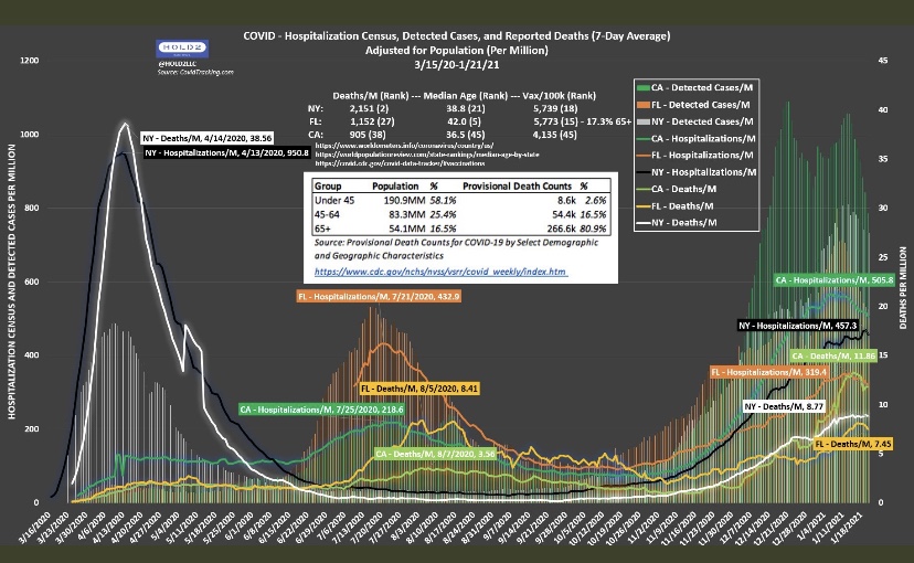
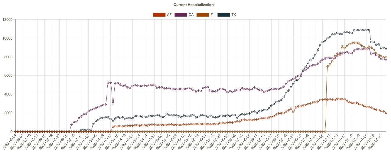
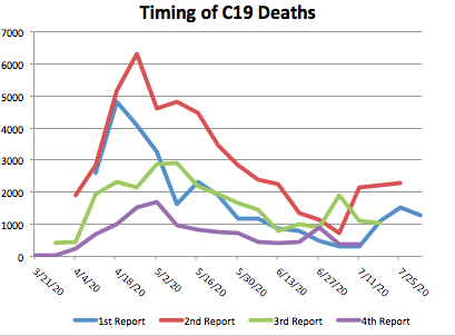
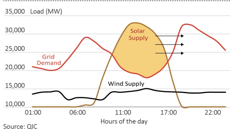
The near-term limits on our ability to substitute renewables for fossil fuels should be fairly obvious. For one thing, renewable power is intermittent, so it cannot be relied upon for baseload generation. The chart at the top of this post demonstrates this reality, though the chart is “optimistic” in the sense that planners have to consider worst-case intermittency, not merely average production by time-of-day. Reliable power sources must be maintained in order to prevent the kinds of disasters like we saw in Texas last winter when demand spiked and output from renewables plunged. This is an area of considerable denialism: a search on “intermittent renewables” gets you an unending list of rosy assessments of energy storage technologies, and very little realistic commentary on today’s needs for meeting base-load or weather-induced demands.

While renewables account for about 29% of global electricity generation, there is another limit on adoption: certain jobs just can’t be done with renewables short of major advances in battery technology. As Menton says:

“Steel mills and tractor trailer trucks and airplanes powered by solar panels? Not happening. … I think these people really believe that if governments will just do the right thing and require airplanes to run on solar panels, then it will promptly happen.”

Cost and Intermittency

Again, we’d expect to see more rapid conversion to renewable energy, at least in compatible applications, as the cost of renewables drops relative to fossil fuels. And major components of their costs have indeed dropped, so much so that the U.S. Energy Information Administration (EIA) now says they are cheaper than fossil fuels in terms of the “levelized cost” of new electric generating capacity. That’s the average cost per megawatt-hour produced over the life of a new installation. The EIA’s calculations are distorted on at least two counts, however, as Willis Eschenbach ably explains here.

The EIA’s cost figures reflect a “capacity factor” that adjusts the megawatts produced to presumed “real world” conditions. It’s more like a utilization adjustment made necessary by a variety of realities (intermittency as well as other technical imperfections) that cause output to run lower than the maximum under ideal conditions. Eschenbach reports that the factors applied by the EIA for solar and wind, at 30% and 41%, respectively, are overstated drastically, which reduces their cost estimates by overstating output. For solar, he cites a more realistic value of 14%, which would more than double the levelized cost of solar. For wind, he quotes a figure of 30%, which would increase the cost of wind power by more than a third. That puts the cost of those renewables well above that of a “combined-cycle gas” plant, which uses exhaust from gas turbines to generate additional power via steam.

The true costs of renewables are likely much higher than nuclear power as well, based on earlier comparisons of nuclear to combined-cycle gas. The EIA does not report a cost for nuclear power, however, because the report is for new capacity, and no additions of nuclear capacity are expected.

The Cost of Back-Up Capacity

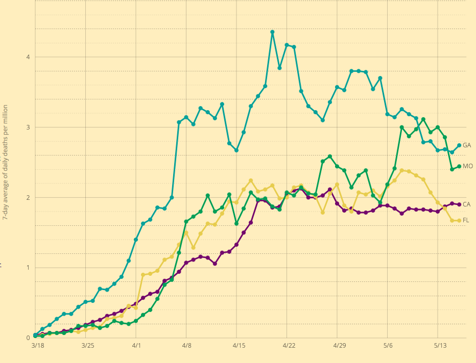
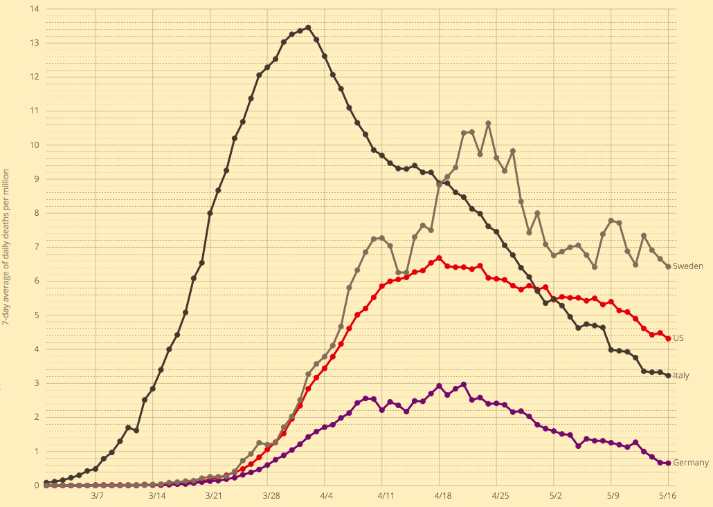
Eschenbach notes a second major problem with the EIA cost comparisons. As discussed above, the intermittency of solar and wind power means that their deployment cannot provide for base loads. Other “dispatchable” power technologies, on which production can be ramped up or down at discretion, must be available to meet power needs when renewables are off-line, as is frequently the case. The more we attempt to rely on renewables, the more significant the intermittency problem becomes, as Germany, Texas, and California are discovering.

How to account for the extra cost of dispatchable power required to smooth production or meet peak demand? Renewables are simply incapable of doing so reliably, and back-up capacity ain’t free! Meeting demand at all times requires equivalent dispatchable capacity in the power mix. It requires not just dispatchable baseload capacity, but surge capacity! Meeting long-term growth in demand with renewables implies that new back-up capacity is required as well, and the levelized cost should reflect it. After all, those costs won’t be saved by virtue of adding renewable capacity, unless you plan on blackouts. Thus, the EIA’s levelized cost comparisons of wind, solar and fossil fuel electricity generation are completely phony.

Conclusion

Growth in wind and solar power increased their contribution to global energy needs to more than 11% in 2019, but their gains over the previous ten years came largely at the expense of more “primitive” renewable energy sources, not fossil fuels. And despite impressive declines in the installation costs of wind and solar power, and despite low variable costs, the economics of power generation still favors fossil fuels rather substantially. In popular discussions, this point is often obscured by the heavy subsidies granted to renewables. 

In truth, the “name-plate” capacities of wind and solar installations far exceed typical output, so installation costs are spread over less output than is widely believed. Furthermore, the intermittency of production from these renewable sources means that back-up capacity is still required, almost always from plants fired by fossil fuels. Properly considered, this represents a significant incremental cost of renewable power sources, but it is one that is routinely ignored by environmentalists and even in official reports. It’s also worth noting that “modern” renewables carry significant external costs to the environment both during the useful life of plant and at disposal (and see here). It’s tempting to say all these distortions and omissions are deliberate contributions to the propaganda in favor of government mandates for renewables.

Hooray For Florida!

22 Monday Feb 2021

Posted by pnoetx in Coronavirus, Public Health

≈ 1 Comment

Tags

Andrew Cuomo, Biden Administration, California, Coronavirus, Covid-19, Deaths, Florida, Hospitalizations, Infections, Lockdowns, NBC News, New York, Ron DeSantis, Stephen King, Vaccinations

It’s been said that many of the so-called “heroes” of the COVID pandemic who’ve been celebrated by the media are actually villains, and perhaps Governor Andrew Cuomo of New York should top the list. He saw to it that retirement homes were seeded with infected patients by ordering them returned their care homes rather than admitted to hospitals. Deaths in these facilities mounted, and they mounted faster than Cuomo’s administration was willing to admit. But the media and even Democrat state legislators have begun to take note, which is practically a miracle!

It seems equally true that some vilified by the media for their COVID response are actually heroes. Governor Ron DeSantis of Florida might deserve top honors here. Having spent the last month in Florida, I can attest that the business and social environment here is quite open compared to my home state (despite the presence of a few freaked out northerners who can’t quite fathom how stupid they look wearing masks on the beach). Florida’s infections, hospitalizations, and deaths have been lower than in California, New York, and many other states where lockdown measures have been stringent. (The first chart below is just a little busy…)

As I’ve written for much of the past year, COVID is far more dangerous to the elderly than anyone else, particularly those with co-morbidities. It’s also true that blacks (and some other minorities) are more vulnerable than whites, but if we want to save more black lives, we’re still better off prioritizing the elderly than racial groups. DeSantis understands this, and Florida is among the leaders in vaccinating the elderly population. (States don’t report this data on a uniform basis):

This approach to saving lives is obvious, yet critics at outlets like NBC News insist that DeSantis must be pandering to the senior population in Florida. Well, one wouldn’t want to be responsive to voters who happen to face high mortality risks, right? Others such as horror writer Stephen King have jumped onboard to offer their bumbling public health expertise as well.

There were many experts and the usual collection of numbskulls on social media who were wrong about Florida. DeSantis handled the pandemic as it should have been handled elsewhere. But the propaganda to the contrary goes unabated. For example, this article is pathetic. Can these people be serious? Or are they really that stupid? This goes for the Biden Administration as well, which had entertained the notion of imposing federal travel restrictions on Florida!

The political attacks on Florida and its governor reveal the extent to which opponents wish to ignore the evidence in plain sight. The data on COVID outcomes put the lie to the narrative of a public health emergency requiring massive restrictions on personal liberty. We know those policies are powerless to control the course of the contagion. The pandemic, however, was the key to convincing the public to accept a more authoritarian role for government. It’s a blessing that not everyone bought in, and that there are places like Florida where you can still go about your business in approximate normalcy.

COVID at Midsummer

04 Tuesday Aug 2020

Posted by pnoetx in Pandemic, Public Health

≈ 2 Comments

Tags

Arizona, California, CDC, Coronavirus, COVID Time Series, Covid Tracking Project, Covid-19, Fatality Rate, Florida, Hospitalizations, Illinois, Kyle Lamb, Missouri, New Cases, New York, Provisional Deaths, Regional Variation, South Carolina, Tennessee, Texas

It’s been several weeks since I last posted on the state of the coronavirus pandemic (also see here). The charts below show seven-day moving averages of new confirmed cases and reported C19 deaths from the COVID Tracking Project as of August 3. Daily new cases began to flatten about three weeks ago and then turned down (it can take a few days for such changes to show up in a moving average). Daily C19-attributed deaths began climbing again in early July, lagging new cases by a few weeks, and they slowed just a bit over the past several days. Obviously, both are good news if those changes are maintained. The other thing to note is that deaths have remained far below their levels of April and early May.

The daily death count is that reported on each date, not when the deaths actually occurred. Each day’s report consists of deaths that were spread across several previous weeks or even a month or more. That makes the slight downturn in deaths more tenuous from a data perspective. There are sometimes large numbers of deaths from preceding weeks reported together on a single day, so reporting can be ragged and the final pattern of actual deaths is not known for some time. More on that below.

States

The increase in cases and deaths during late June and July was concentrated in four states: Arizona, California, Florida, and Texas. Here’s how those states look now in terms of cases and deaths, from the interactive COVID Time Series site:


New cases began to flatten or drop in these states two to three weeks ago, driving the change in the national data. Daily deaths have not turned convincingly, but again, these are reported deaths, which actually occurred over previous weeks. One more chart that is suggestive: current hospitalizations in these four states. The recent declines should bode well for the trend in reported deaths, but it remains to be seen. 

Meanwhile, other parts of the country have seen an uptrend in cases and deaths, such as Illinois, Missouri, South Carolina, and Tennessee. Here are new cases in those states:

It’s worth emphasizing that the elevated level of new cases this summer has not been associated with the rates of fatality experienced in the Northeast during the spring. There are many reasons: better patient care, new treatments, more direct summer sunlight, higher humidity, and tighter controls in nursing homes.

More On the Timing of Deaths

Back to the discrepancies in the timing of reported deaths and actual deaths. This is important because the reported totals each day and each week can be highly misleading, even to the point of frightening the public and policy makers, with consequent psychological and economic impacts.

The latest summary of provisional vs. reported deaths is shown below, courtesy of Kyle Lamb, who posts updates on his Twitter feed. This report ends with the last complete week ending August 1. It’s a little hard to read, but you might get a better look if you click on it or turn your phone sideways. Some of the key series are also graphed below. 

The table shows the actual timing of deaths in the fourth column, with dates alongside. The pattern differs from the statistics reported by the Covid Tracking Project (CTP) in the top row (shaded orange), and from the totals of actual deaths by reporting day in the third row (shaded gray). The reporting dates are always later than the dates of death. This can be seen in the chart below. The most obvious illustration is how many of the deaths from around the peak in mid-April were reported in May. In March and April, the daily reports were short of the ultimate actual death counts because so few deaths with associated dates were known by then.


The right-hand end of the red line shows that many deaths reported by CTP have not yet been placed at an actual date of death by the CDC.  At this point, the actual date of death has not been placed for over 10,000 deaths! Again, those will be spread over earlier weeks.

The blue line is dashed over the last four weeks because those counts are most “highly” provisional. Small changes in the actual counts are likely for dates even before that, but the last four weeks are subject to fairly substantial upward revisions. Eventually, the right end of the blue line will more closely approximate the totals shown in red.

To get an indication of trends in the actual timing of deaths, I plotted the weekly actual deaths reported for the last four reporting weeks going back in time. In the table, those are the four lowest, color-coded diagonals. In the graph below, which should include the qualifier “by recency of report week”, actual deaths in the most recent report week are represented by the blue line, the prior weekly report is red, followed by green (three weeks prior), and purple (four weeks prior… sorry, the colors are not consistent with those in the table). The lines extend farther to the right for more recent report weeks.

The increase in actual deaths occurring in July has declined or flattened in each of the four most recent report weeks. Only the second-to-last week increased as of the August 1st report. On the whole, those changes seem favorable, but we shall see.

Closing

It’s getting trite to say, but the next few weeks will be interesting. The increase in deaths in July was a sad development, but at least the extent of it appears to have been limited. Even with a somewhat higher death count, the fatality rate continued to decline. Let’s hope any further waves of infections are even less deadly.

Covid Framing #6: The Great Over-Reaction

16 Saturday May 2020

Posted by pnoetx in Pandemic

≈ 2 Comments

Tags

Asian Flu, California, Colorado, Confirmed Cases, Coronavirus, Covid-19, Death Toll, Florida, Georgia, Germany, Great Over-Reaction, Hong Kong Flu, Italy, Nate Silver, Neil Ferguson, New York, Pandemics, Spanish Flu, Sweden

I visited my doctor last Wednesday. He’s a specialist but also serves as my primary care physician, and we share the same condition. He’s affiliated with a prestigious medical school and practices on the campus of a large research hospital. First thing, I asked him, “So what do you think of all this?” Without hesitation, he said he believes we’re witnessing the single greatest over-reaction in all of medical history. He elaborated at length, which I very much appreciated, and I was gratified that much of what he said was familiar to me and my readers. The risks of the coronavirus are highly concentrated among the elderly and the already-sick, and the damage that the panic and lockdowns have done to the delivery of other medical care is probably a bigger tragedy, to say nothing of the economic damage. Furthermore, the Covid-19 pandemic is certainly not more threatening than others the world has experienced since WW II.

But did we know all that in March? No one with any sense believed the low numbers coming out of China; major flip-flops and mistakes by public health officials in the U.S. did much to confuse matters and delay evaluation of the outbreak. Nevertheless, there were reasons to proceed more deliberately. The explosion of cases in Italy and elsewhere consistently indicated that risk was concentrated among the elderly, so a targeted approach to protecting the vulnerable would have made sense. Still, individuals took voluntary action to social distance even before governments initiated broad lockdowns.

The lockdowns, of course, were sold as a short-term effort to “flatten the curve” so that medical resources would not be overwhelmed. There was, no doubt, great stress on front-line health care workers in March and April, and there were short-term shortages of personal protective equipment as well as ventilators for the most severe cases (but it’s possible ventilators actually harmed some patients). But whether you credit government action, private action, or the fact that so much of the population was not susceptible to begin with, mission accomplished! The strains were concentrated in certain geographic regions, especially the New York City metro area, but even there, the virus is on the wane. There is always the possibility of a major second wave, but perhaps it can be handled more intelligently by the public and especially public servants.

And now for some charts. Due to day-to-day volatility, and because the data on case numbers and deaths fluctuate on a weekly frequency, the charts below are on a 7-day moving average basis. It’s clear that the peak in U.S. daily confirmed cases was over five weeks ago, while the peak in Covid-attributed deaths was about three weeks ago.

Unfortunately, there is more doubt than ever about the legitimacy of the numbers. New York keeps “discovering” new deaths in nursing homes, a situation aggravated by a statewide order in March prohibiting homes from rejecting new or returning patients with active infections. There are reports from across the country of family deaths that were imminent, yet officially attributed to Covid. In one case, a death from severe alcohol poisoning was attributed to Covid. Colorado announced today that it was revising its death toll downward by about 24%.

The data on confirmed cases are elevated because testing keeps expanding. The first chart below shows that the number of daily tests has more than doubled over the past 3½ weeks. At the same time, the second chart below shows that the rate of “positives” has declined steadily for over six weeks. That is likely due to a combination of expanded testing for screening purposes, as opposed to testing mainly individuals presenting symptoms, and fewer individuals presenting symptoms each day.

As Nate Silver said on Saturday:

“There are still *way* too many stories about big spikes in cases when the cause of those spikes was a big increase in tests. And remember, it’s a good thing when states start doing more tests!”

One commenter on Silver’s thread pointed out that more testing is likely to lead to more confirmed cases even if the true number of infections is declining.

I’ll highlight just a few individual states. Missouri’s peak in cases appears to have occurred several weeks ago, though a spike at the end of April interrupted the trend. The spike was partly attributable to a flare-up at a single meat-packing plant (facilities that are particularly conducive to viral spread due to close conditions and aerosols).

Here is Georgia, which began to reopen its economy on April 24. The pro-lockdown crowd confidently predicted the reopening would lead to a spike in cases within two weeks. Georgia is conservative in its reporting, so they don’t extend the lines in the chart beyond 14 days of the most recent reports due to potential revisions. Nevertheless, it’s clear that the trend in cases is downward.

The pro-lockdown contingent predicted the same for Florida, but that has not been the case:

The next chart shows seven-day moving averages of deaths per million of population for four states: CA, FL, GA, and MO. The labels on the right might be hard to read, but MO is the green line. Deaths lag cases by a few weeks, and Missouri’s death rate was elevated more recently, again owing partly to the meat-packing plant. These death rates are all fairly low relative to the northeastern states around New York.

Finally, here are death rates per million of population for a few selected countries: Italy, Germany, Sweden, and the US. Italy had the large early spike, while Germany lagged and with a much lower fatality rate. The U.S. suffered more than twice the German death rate. Sweden, which has pursued a herd immunity strategy, has come in somewhat higher. The Italian and Swedish experiences both reflect high deaths in nursing homes, which might indicate a lack of preparedness at those institutions.

Here is a post from just a few days ago with a nice collection of charts for various countries.

Returning to the main gist of this “framing”, the Great Over-Reaction, the predictions setting off this panic were made by a forecaster, Neil Ferguson, who has had a rather poor track record of predicting the severity of earlier pandemics. The model he used is said to have been poorly coded and documented, and it is underdetermined such that many multiple forecast paths are possible. That means the choice of a “forecast” path is arbitrary.

Make no mistake: Covid-19 is a serious virus. Ultimately, however, the Covid-19 pandemic might not reach the scale of a typical global flu: the current global death toll is only about two-thirds of the average flu season (global deaths from Covid-19 are now about 312,000—the chart below is a few days old). In the U.S., the death toll is modestly higher than the average flu season, but that is largely attributable to the New York City metro area. Worldwide, Covid19 deaths are now about 30% of the toll of the Hong Kong flu in 1969-70, 28% of the Asian flu in 1957-58, and far less than 1% of the Spanish flu at the end of WW I. Neither the Hong Kong flu nor the Asian flu were dealt with via widespread non-prescription health interventions like the draconian lockdowns instituted this time. The damage to the economy has been massive and unjustifiable, and the effective moratorium on medical care for other serious conditions is inflicting a large toll of its own.

Again, we can identify distinct groups that are highly vulnerable to Covid-19: the aged and individuals with co-morbidities most common among the aged. A large share of the population is not susceptible, including children and the vast bulk of the work force. The sensible approach is to target vulnerable groups for protection while minimizing interference with the liberties of those capable of taking care of themselves, especially their freedom to weigh risks. Nevertheless, those facing low risks should continue to practice extra-good manners…. er, social distancing, to avoid subjecting others to undue risk. Don’t be a close talker, don’t go out if you feel at all out of sorts, and cover your sneezes!

High-Speed Third Rail For Taxpayers

15 Friday May 2015

Posted by pnoetx in Big Government, infrastructure, Taxes

≈ 3 Comments

Tags

Amtrak, Bullet trains, California, capital costs, Carbon Emissions, fare revenue, Frederic Bastiat, High speed rail, infrastructure, Malinvestment, Megabus, operating costs, Privatization, profitability, Public benefits, Public boondoggles, Randall O'Toole, Sean Davis, The Federalist, Transit subsidies

bullet train

Public boondoggles come in many forms, including sports stadiums and entertainment venues, convention centers, local trolly lines, light rail, superhighways, “gold-plated” public offices, and even subsidies for politically-favored (as opposed to market-favored) industries. Anything involving “infrastructure” has an almost perverse  political appeal. The many varieties of boondoggles have much in common from a public finance perspective: ultimately, they are almost always funded by taxpayers; when they confer benefits to private parties (and they usually do), they are underpriced to those users. Taxpayers are often lucky if these projects cover their operating costs, let alone capital costs, via direct revenue generation. Taxpayers are usually on the hook for the bonds. Pure public benefits might offer some justication for this burden, but those cited by project proponents are often unconvincing on that basis. Let’s face it: projects are seldom evaluated against something approximating the true opportunity costs faced by the public or taxpayers.

A prominent example of such a project that seems to capture the political imagination is high-speed rail (HSR). My friend John Crawford emailed the following link: “Doing the math on California’s bullet train fares“. John provided this summary:

“Not surprisingly, today’s fare estimate has risen 72% over the estimate that was cited during planning. That’s telling but probably not surprising to anyone, even those that tried to change opinions by citing the $50 fare. What I think is most interesting follows.

CA-HSR price of 86 is about 20c/mile. Comparable prices are 22c for a Chinese train that everybody agrees to be subsidized, 54c for a French train that is profitable and 50c for the Amtrak corridor on the East coast, which is probably profitable; 46c in Germany. Somehow, they think they can do what nobody else in the world can do…profit at 20c/mile.“

The California authority is either spectacularly arrogant or stupid. Probably the former, because they are doing what self-interested bureaucrats and politicians always do. They want the project to get done, thus creating an empire, kicking a can-full of fare increases and taxpayer liabilities down the road, beyond the time when anyone will hold them accountable for the malinvestment. But the true extent of the malinvestment will never be obvious, because the counter-factual will remain in the unseen world of lost opportunity.

Something I find exasperating about articles like this are references to “profitability”, as in “… state officials say the system will quickly become profitable“, when the meaning is not actual profitability. My friend John did it too, but I forgive him because he knew the score, and because he’ll forgive me for being a pedant (I hope). But this is important! What the California officials mean by “profitability” (and it is a misuse of the term) is fare revenue in excess of operating costs. The latter do not include initial capital costs, so these officials are not making claims about actual profitability. Profitability means that revenue exceeds ALL costs, including capital costs. Many observers consider the California authority’s estimates of operating costs to be suspect, so it’s not even clear that revenue will cover the future costs of capital replacement, let alone the initial installation costs. Construction and planning costs are expected to be $68 billion for Phase 1 only, and you can safely bet on significant additional overruns by the projected completion of Phase 1 in 2029.

Fares calibrated to cover operating costs are not defensible in terms of long-run marginal cost pricing. While an incremental rider does not cause the capital cost of the system to increase in the short run, incremental riders absolutely do have an impact on long-run capital costs. In any case, there are many incremental riders at start-up. The long run is now. Yet, like many public projects, the burden of uncovered costs is justified in terms of other benefits of a supposedly public nature. Here is a vague description of such benefits from the CA HSR Authority:

“California high-speed rail will connect the mega-regions of the state, contribute to economic development and a cleaner environment, create jobs and preserve agricultural and protected lands.“

Let’s take these one at a time:

  • connecting “mega-regions”, if that is a real benefit of HSR relative to alternative modes of transportation, will largely accrue to riders, not the general public.
  • Economic development benefits are possible along the route or near stations, but that is hardly a pure public benefit, and it is likely to come at the expense of development elsewhere.
  • The trains will be powered, at least in part, by energy from fossil fuels. If HSR produces less carbon than equivalent airplanes, autos and other alternatives, that might represent a pure public benefit (according to the carbonphobic), but this is a costly way to achieve a minor reduction in carbon emissions. It is of value only to the extent that HSR brings real substitution away from other, higher carbon modes.
  • Construction jobs are part of the cost of the project, but this is a common ploy and very handy way to sell the project. Gains for the workers are certainly not a pure public benefit. To paraphrase Bastiat, calling construction jobs from malinvested capital a “public benefit” is like calling a broken window beneficial because it provides work for the glazier.
  • As for preserving agricultural and public lands, I do not believe that HSR will make much of a dent in future, land-gobbling highway construction (and if it did, it would offset those vaunted HSR job gains).

The public should always view large public projects like HSR with skepticism and insist that private benefits should be paid privately. There are always alternative uses of taxpayer funds, including the possibility that taxpayers should keep them. Too many public projects become funding disasters. In many cases, private parties would not be willing to buy the facilities for more than 10 cents on the dollar.of original cost.  Without access to tax revenue, only a low purchase price would allow them to operate at a profit.

At the national level, this week’s tragic Amtrak crash near Philadelphia was the context for misguided calls to provide additional funding to the rail service. Sean Davis in The Federalist has a more logical proposal, even if it is a bit radical: not only should Amtrak be privatized, its assets should be given away! And how could anyone reach such a conclusion?

“Amtrak lost nearly $1.3 billion in 2013. Since its creation, Amtrak has racked up over $31 billion in accumulated losses. And every penny of those losses has been covered by federal taxpayers.

… Hand over the entire enterprise to whichever rail company wants it. ‘But that’s crazy!’ you might say. ‘Giving it away for free makes no cents [sic]!’

Well, neither does keeping it on the taxpayers’ books. The status quo costs taxpayers at least a billion dollars each year.“

Davis makes a fair point, though a give-away might attract multiple takers. Ultimately, bidding just might be necessary! Or, perhaps it would be necessary to PAY a private rail operator to take Amtrak off the federal government’s hands. A fairly high payment would still be worthwhile to taxpayers.

Randall O’Toole provides this excellent discussion of privatizing transit in a video  of approximately 17 minutes. He discusses trends in ridership, the inefficiencies inherent in public transportation systems, and compares various market structures and types of private transportation systems, including private intercity buses (Megabus). He also addresses concerns that private transportation systems will not meet the needs of the poor by proposing the substitution of “transit stamps” for the huge subsidies currently paid into transportation bureaucracies.

Follow Sacred Cow Chips on WordPress.com

Recent Posts

  • Observations on the Dobbs Decision
  • Medicare For All … and Tax Hikes, Long Waits, Inferior Care
  • A Fiscal Real-Bills Doctrine? No Such Thing As Painless Inflation Tax
  • Honeybees Are and Have Been Thriving
  • New Theory: Great Woke Filter Conceals Life In the Cosmos

Archives

  • June 2022
  • May 2022
  • April 2022
  • March 2022
  • February 2022
  • January 2022
  • December 2021
  • November 2021
  • October 2021
  • September 2021
  • August 2021
  • July 2021
  • June 2021
  • May 2021
  • April 2021
  • March 2021
  • February 2021
  • January 2021
  • December 2020
  • November 2020
  • October 2020
  • September 2020
  • August 2020
  • July 2020
  • June 2020
  • May 2020
  • April 2020
  • March 2020
  • February 2020
  • January 2020
  • December 2019
  • November 2019
  • October 2019
  • September 2019
  • August 2019
  • July 2019
  • June 2019
  • May 2019
  • April 2019
  • March 2019
  • February 2019
  • January 2019
  • December 2018
  • November 2018
  • October 2018
  • September 2018
  • August 2018
  • July 2018
  • June 2018
  • May 2018
  • April 2018
  • March 2018
  • February 2018
  • January 2018
  • December 2017
  • November 2017
  • October 2017
  • September 2017
  • August 2017
  • July 2017
  • June 2017
  • May 2017
  • April 2017
  • March 2017
  • February 2017
  • January 2017
  • December 2016
  • November 2016
  • October 2016
  • September 2016
  • August 2016
  • July 2016
  • June 2016
  • May 2016
  • April 2016
  • March 2016
  • February 2016
  • January 2016
  • December 2015
  • November 2015
  • October 2015
  • September 2015
  • August 2015
  • July 2015
  • June 2015
  • May 2015
  • April 2015
  • March 2015
  • February 2015
  • January 2015
  • December 2014
  • November 2014
  • October 2014
  • September 2014
  • August 2014
  • July 2014
  • June 2014
  • May 2014
  • April 2014
  • March 2014

Blogs I Follow

  • Passive Income Kickstart
  • OnlyFinance.net
  • TLC Cholesterol
  • Nintil
  • kendunning.net
  • DCWhispers.com
  • Hoong-Wai in the UK
  • Marginal REVOLUTION
  • CBS St. Louis
  • Watts Up With That?
  • Aussie Nationalist Blog
  • American Elephants
  • The View from Alexandria
  • The Gymnasium
  • A Force for Good
  • ARLIN REPORT...................walking this path together
  • Notes On Liberty
  • troymo
  • SUNDAY BLOG Stephanie Sievers
  • Miss Lou Acquiring Lore
  • Your Well Wisher Program
  • Objectivism In Depth
  • RobotEnomics
  • Orderstatistic
  • Paradigm Library

Blog at WordPress.com.

Passive Income Kickstart

OnlyFinance.net

Financial Matters!

TLC Cholesterol

Nintil

To estimate, compare, distinguish, discuss, and trace to its principal sources everything

kendunning.net

The future is ours to create.

DCWhispers.com

Hoong-Wai in the UK

A Commonwealth immigrant's perspective on the UK's public arena.

Marginal REVOLUTION

Small Steps Toward A Much Better World

CBS St. Louis

News, Sports, Weather, Traffic and St. Louis' Top Spots

Watts Up With That?

The world's most viewed site on global warming and climate change

Aussie Nationalist Blog

Commentary from a Paleoconservative and Nationalist perspective

American Elephants

Defending Life, Liberty and the Pursuit of Happiness

The View from Alexandria

In advanced civilizations the period loosely called Alexandrian is usually associated with flexible morals, perfunctory religion, populist standards and cosmopolitan tastes, feminism, exotic cults, and the rapid turnover of high and low fads---in short, a falling away (which is all that decadence means) from the strictness of traditional rules, embodied in character and inforced from within. -- Jacques Barzun

The Gymnasium

A place for reason, politics, economics, and faith steeped in the classical liberal tradition

A Force for Good

How economics, morality, and markets combine

ARLIN REPORT...................walking this path together

PERSPECTIVE FROM AN AGING SENIOR CITIZEN

Notes On Liberty

Spontaneous thoughts on a humble creed

troymo

SUNDAY BLOG Stephanie Sievers

Escaping the everyday life with photographs from my travels

Miss Lou Acquiring Lore

Gallery of Life...

Your Well Wisher Program

Attempt to solve commonly known problems…

Objectivism In Depth

Exploring Ayn Rand's revolutionary philosophy.

RobotEnomics

(A)n (I)ntelligent Future

Orderstatistic

Economics, chess and anything else on my mind.

Paradigm Library

OODA Looping

  • Follow Following
    • Sacred Cow Chips
    • Join 120 other followers
    • Already have a WordPress.com account? Log in now.
    • Sacred Cow Chips
    • Customize
    • Follow Following
    • Sign up
    • Log in
    • Report this content
    • View site in Reader
    • Manage subscriptions
    • Collapse this bar
 

Loading Comments...