• About

Sacred Cow Chips

Sacred Cow Chips

Tag Archives: Institute for Health Metrics and Evaluation

Trump Hates/Loves Lockdowns, Dumps on Swedes

07 Sunday Jun 2020

Posted by Nuetzel in Health Care, Pandemic

≈ Leave a comment

Tags

Cholesterol, Coronavirus, Donald Trump, Herd Immunity, Institute for Health Metrics and Evaluation, Lockdowns, Nordic, Rose Garden Briefing, Somali Immigration, Sweden, Vitamin D

President Trump was in a festive mood last Friday, pleased with the May employment report, as he should be. But in his Rose Garden word jam, he made some questionable and unnecessary claims about coronavirus policies in the U.S. and the Swedish experience. I credit Trump for pushing to end the lockdowns as it became clear that they were both unhealthy and unsustainable. However, he’s now way too eager to cover his earlier tracks. That is, he is now defensive about the precautions he advocated on the advice of his medical experts in March and early April.

In the Rose Garden, Trump said that lockdowns were necessary to stop the spread of the virus. But to assert that lockdowns “stopped” or even slowed the spread of the virus is speculation at best, and they had deadly effects of their own. Most of the social distancing was achieved through voluntary action, as I have argued previously. Lockdown advocacy lacked any semblance of geographic nuance, as if uniform application makes sense regardless of population density.

Trump went on to say that Sweden was in “bad shape” because it did not impose a lockdown during the pandemic. This is not a new position for the president, but the facts are anything but clear-cut. Again, there is mixed evidence on whether mandatory lockdowns have a real impact on the spread or mortality of the coronavirus (also see here). That’s not to say that social distancing doesn’t work, but much of the benefit comes from private decisions to mitigate risk via distancing. Of course, that also depends on whether people have good information to act on. And to be fair, Sweden did take certain measures such as banning gatherings of more than 50 people, closing schools, and limiting incoming travel.

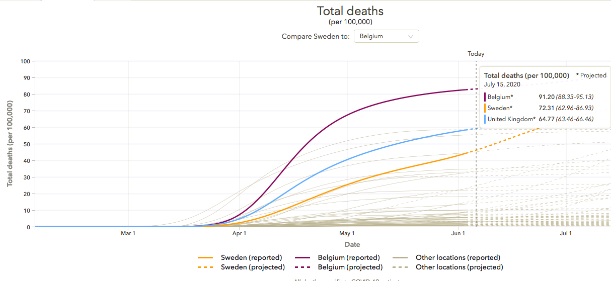
While the full tale has not been told, and Sweden’s death rate is high on a per capita basis, several other Western European countries that imposed lockdowns have had even higher death rates. The following chart is from the Institute for Health Metrics and Evaluation (IMHE). It is expressed in terms of coronavirus deaths per 100,000 of population. The orange line is Sweden, the purple line is Belgium, and the light blue line is the UK. Actuals are reported through June 4th. While Sweden’s death toll has a somewhat steeper gradient, the level remains well below both Belgium and the UK. It is also lower than the death rates for Italy and Spain, and it is about the same as France’s death rate. Yes, a number of other countries have lower death rates, including the U.S., but the evidence is hardly consistent with Trump’s characterization.

Sweden’s big mistake was not it’s decision to rely on voluntary social distancing, but in failing to adequately protect highly vulnerable populations. The country’s elderly skew older than most countries by several years. Residents of nursing homes have accounted for about half of Sweden’s coronavirus deaths, an international outlier. Inadequate preparedness in elder care has been a particular problem, including a lack of personal protective equipment for workers. There was also a poorly implemented volunteer program, intended to fill-out staffing needs, that appears to have aggravated transmission of the virus.

Sweden has also experienced a concentration of cases and deaths among its large immigrant population. It has the largest immigrant population among the Nordic countries, with large numbers of low income migrants from Syria, Iraq, Iran, Somalia and parts of Eastern Europe. Earlier in the pandemic, according to one estimate, 40% of coronavirus fatalities in Stockholm were in the Somali population. These immigrants tend to live in dense conditions, often in multigenerational households. Many residents with health problems tend to go untreated. Conditions like Vitamin D deficiency and high cholesterol, apparent risk factors for coronavirus severity, likely go untreated in these communities. In addition, language barriers and traditional trust relationships may diminish the effectiveness of communications from public health authorities. In fact, some say the style of Swedish public health messaging was too culturally idiosyncratic to be of much use to immigrants. And one more thing: immigrants are a disproportionately high 28% of nursing home staff in Sweden, implying an intimacy between two vulnerable populations that almost surely acts as a risk multiplier in both.

It might be too harsh to suggest that that Sweden could have prevented the outsized impact of the virus on immigrants. However, Sweden’s coronavirus testing has not been as intensive as other Nordic countries. More testing might have helped alleviate the spread of the virus in nursing homes and in immigrant communities. But the vulnerabilities of the immigrant population might be more a matter of inadequate health care than anything else, both on the demand and supply sides.

Contrary to Trump’s characterization, Sweden’s herd immunity strategy is not the reason for it’s relatively high death rate from the virus. Several countries that imposed lockdowns have had higher death rates. And Sweden’s death rate has been heavily concentrated among the aged in nursing homes and its large immigrant population. It’s possible that Sweden’s approach led to a cavalier attitude with respect identifying vulnerable groups and taking measures that could have protected them, including more intensive testing. Nevertheless, it’s inaccurate and unfair to scapegoat Sweden for not imposing a mandatory lockdown. The choice is not merely whether to impose lockdowns, but how to protect vulnerable populations at least cost. In that sense, general lockdowns are a poor choice.


Covid “Framing” #5: Crested Wave

28 Tuesday Apr 2020

Posted by Nuetzel in Pandemic

≈ Leave a comment

Tags

Coronavirus, Covid Tracking Project, Covid-19, IHME Model, Institute for Health Metrics and Evaluation, Italy Covid, Johns Hopkins Dashboard, Missouri Covid, New York Covid, Private Testing, South Korea Covid, Testing and Tracing

One big change in recent national Covid trends has to do with testing. In the past week, the number of daily tests has increased by an average of over 50%. That’s shown in the first chart below. Regardless of whether the individuals being tested meet the earlier testing criteria, there are still plenty of people who either want to get tested or are being tested for occupational reasons. Nonetheless, there are reports of unused testing capacity at private labs and universities. Further increases in testing are in the offing, especially if those desiring tests are made aware of their availability.

Increased testing has been accompanied by further declines in the percentage of positive tests. That’s certainly a good thing, but it’s not clear how much of the decline can be attributed to declining transmissions, as opposed to broadened testing criteria.

Coronavirus deaths in the U.S. have also begun to taper. The black line below plots cumulative Covid-attributed deaths the U.S. up through April 28. The red line is the IHME model projection from April 2nd, with upper and lower confidence bounds shown by the blue and green lines, respectively. Despite the notorious broadening of the definition of a Covid death a few weeks ago, the cumulative death toll has remained below the mean IMHE projection. 

More bad news is that the number of confirmed coronavirus cases continues to mount. Of course, that is a consequence of broader testing and possibly some arbitrary classifications as well. My previous coronavirus “framing” posts (#1 from March 18th is here, #4 is here ) usually featured a chart like the one below, which shows the number of cumulative confirmed cases of Covid-19 in the U.S. Day 1 in the chart was March 4th, so tonight, April 28th, we’re 55 days in. The blue and green lines are what I originally called “pretty bad” and “very good” outcomes, based on multiples of Italy and South Korea as of March 18th, as a share of their respective populations. Italy’s case count kept climbing after that, but its growth has now slowed considerably.

The U.S. case count has increased dramatically, now exceeding the original “very bad” case curve I plotted in mid-March. Has the U.S. fared as poorly as that seems to suggest? As of April 28, the U.S. has performed about three times as many tests as Italy, and it has identified about 10% fewer cases per capita. If we excluded the state of New York, which accounts for 5.7% of U.S. population but fully 30% of U.S. Covid cases through April 28th, U.S. Covid incidence would be well below Italy’s. However, Italy is still perhaps two weeks ahead of us.

The next chart examines New York’s experience relative to all other states. The blue line is the number of daily confirmed cases in the U.S., and the red line is the U.S. excluding New York state. The vertical gap between the two lines is the daily case count for New York. The fluctuating, slight downward trend in the U.S since about April 10th is largely attributable to improvement in New York. The rest of the country, while not as serious as New York in terms of incidence, is still on a plateau.

The next chart shows daily Covid-attributed deaths for the U.S. (blue), the U.S excluding New York state (red), and New York state (green). The source of this data is the Covid Tracking Project, which reports numbers as of 4 p.m. each day, so it differs from the daily numbers reported by the Johns Hopkins Dashboard. There are a few interesting things to note here. First, New York has accounted for a major share of daily deaths, though its share is diminishing. The decline in New York Covid deaths has been a major positive development over the past few weeks. The pattern of deaths for the U.S. is kind of fascinating: It shows a distinct weekly frequency, with declines over weekends and spikes early in each week. I suspect this is based on the data elements used by the Tracking Project, perhaps based on reporting dates rather than actual times of death. New York does not show that kind of pattern, but I’ve heard that the reporting system there is highly efficient. We might have seen a favorable turn in U.S. daily fatalities over the past week. After the peak early this week, the daily count is likely to decline again over the next few days. We can hope the weekly spikes and valleys reach lower levels as we get into May.

Finally, a couple of charts updating the status of the pandemic in Missouri, my home state. Despite some volatility, new cases continue to taper.

Missouri Covid fatalities are extremely volatile. It’s hard to see the kind of “weekend” phenomenon so apparent in the U.S. aggregate shown earlier. With a couple of recent spikes, it’s difficult to say anything conclusive about the course of daily fatalities based on the chart below. However, as fewer new cases are diagnosed in Missouri, the number of fatalities will follow.

So, what’s the new “framing”? I expect U.S. case counts to continue to climb with more extensive testing. If the most vulnerable individuals remain quarantined or at least carefully distanced, then individuals presenting symptoms will continue to fall, so the rate of new positive will decline. Additions to the case count will come increasingly from the asymptomatic who happen to be tested for occupational reasons, for travel abroad, and ultimately for testing and tracing efforts. Improved light and humidity is likely to cut into the rising case count as June approaches. With any luck it will become negligible along with fatalities. We’ll continue to learn as well. The hope is that a few treatments or even a vaccine will prove out. Test results for a few of the latter might be available as early as September.

Coronavirus: Framing the Next Few Weeks #3

05 Sunday Apr 2020

Posted by Nuetzel in Pandemic, Risk Management

≈ 1 Comment

Tags

80000 Hours, Chris Murray Model, Christopher Monkton, Christopher Murray, Co-morbidity, Confidence Interval, Coronavirus, Covid Tracking Project, Covid-19, Economic Restart, Indur M. Goklany, Institute for Health Metrics and Evaluation, Lockdowns, Pending Tests, Positive Test Ratio, Social Distancing, Stay-at-Home Orders, White House Coronavirus Task Force

There were a few encouraging signs of change over the past few days in the course of the coronavirus pandemic in the U.S. This is the third of my quaint efforts to provide perspective on the coronavirus pandemic with “tracking” or “framing” posts. The first two were: Coronavirus: Framing the Next Few Weeks, on March 22, and Framing Update on March 28. In both of those posts, I charted confirmed cases of Covid-19 in the U.S. along with optimistic and pessimistic scenarios. I speculated that over the course of a few weeks, social distancing would lead to a reduction in the daily number of new confirmed cases. Unfortunately, it’s not clear whether that curve has started to “bend” rightward, but new confirmed cases on Sunday, April 5 — the number of those testing positive — was down almost 30% from Saturday.

An updated version of the earlier chart appears below, accompanied by a table. The number of confirmed cases (red line) has mounted over the past week, as has the daily increase in confirmed cases, though yesterday’s number was better. The table below the chart shows that the growth rate of confirmed cases (the far right-hand column) has decelerated, but it had leveled off at about 14% over the few days before Sunday. If Sunday’s drop persists it would be encouraging. Unfortunately, even moderate growth rates are destructive when the base of confirmed cases is large. The faster the growth rate declines, the faster the curve will bend.

I did not make any changes to the original “Very Good” and “Pretty Bad” scenarios, deciding that it was better to keep them as a consistent benchmark. As of Sunday, the top of the “Very Good” curve would still be about 2.3x the North Korean experience as of Sunday night, normalized for population. The top of the “Pretty Bad” scenario (which is not visible in this “zoomed-in” version) would be about 1.4x the Italian experience thus far. South Korea’s curve flattened substantially several weeks ago, and now even Italy’s curve is showing a rightward bend. Let’s hope that continues.

The case count obviously depends on the volume of daily testing, which has been increasing rapidly. As I’ve noted before, there has been a backlog of test requests. In addition, every day there is an overhang of “pending” test results. Interestingly, the number of tests stabilized on Saturday and the number of pending test results plunged (see the next chart, which uses data from the Covid Tracking Project). We’ll see if those developments persist. It would represent a milestone because daily case counts will advance as long as tests do, and the effort to work through the backlog has been inflating the speed of the advance in confirmed cases.

Another interesting development coincident with the drop in pending tests has to do with the cumulative percentage of positive test results: it has stabilized after growing for several weeks. This might mean we’ve reached a point at which the most severe incoming cases are fewer, but we’ll have to see if the flattening persists or even declines, which would be wonderful.

I’ve been grappling with potential weaknesses of the data on confirmed cases: first, the U.S. got a late start on testing, so there was the backlog of patients requiring tests just discussed above. That was presumed to have exaggerated the acceleration in the daily totals for new cases. Second, it’s possible that a continuing transition to more rapid test results would exaggerate the daily counts of new cases. Third, It’s possible that testing criteria are being relaxed, which, despite reducing the positive test rate, would increase growth in the “official” confirmed case count. Suspected cases should be tested, of course, but the change in standards is another factor that distorts the shape of the curve.

Any published statistic has its shortcomings. All test results are subject to false positives and negatives. Hospitalizations of patients with a positive coronavirus diagnosis are subject to the measurement issues as well, though they might be driven more by the severity of symptoms and co-morbidities than a positive Covid diagnosis per se. And hospitalizations of Covid patients might be subject to inconsistencies in reporting, and so might ICU admittances. Coronavirus deaths are subject to vagaries: reporting a cause of death is dictated by various criteria when co-morbidities are involved, and those criteria differ from country to country, or perhaps even hospital to hospital and doctor to doctor! In fact, some go so far as to say that all deaths should be tracked for coronavirus plus its co-morbidities and then compared to an average of the past five to ten years to obtain an estimate of “excess deaths”, which could conceivably be negative or positive. Finally, recoveries are even more impacted by inconsistent reporting, especially because many recoveries occur at home.

I’ll be highlighting coronavirus deaths going forward, and I’ll continue to focus mainly on the U.S. and only lightly on other countries. After all, death is obviously the most negative outcome. Again, however, the count of coronavirus deaths does not account for deaths that would have occurred over the same time frame due to co-morbidities or the effect of deaths that would not have occurred absent co-morbidities.

The predictions in the chart below are from the Chris Murray Model, upon which the White House Coronavirus Task Force has focused more recently. This model was developed by Dr. Christopher Murray at the Institute for Health Metrics and Evaluation at the University of Washington. I’ll be using the forecast starting from April 2 as the basis for my “framing” of actual deaths over the next few weeks, keeping it “frozen” at that level as a new benchmark. My apologies for the absence of dates on the horizontal axis, but the origin is at March 14 and there is only a single line up through April 1. That line represents actual cumulative Covid deaths recorded in the U.S. The red line is the mean model prediction. Deaths are expected to ramp up over the next week or so, much as we’ve seen in the confirmed case count, as deaths lag behind diagnoses by anywhere from a few days up to 17 days. This model predicts an ultimate death toll of about 94,000 at the top of the mean curve (not visible on the zoomed-in chart). Above and below that line are upper (blue) and lower (green) bounds, respectively, of a “confidence interval”. It’s unlikely we’ll see cumulative deaths breach either of those bounds. The lower bound would place the ultimate death toll at about 40,000; the upper bound would place it at just under 180,000. At this point, as of Sunday, April 5, actual deaths (black) are slightly below the mean or central tendency, but that’s difficult to see in the current chart.

The ongoing lockdowns in the U.S. and around the world are exceedingly controversial. There is a very real tradeoff between the benefits of extending the length of these lockdowns and the benefits of allowing economic activity to “restart”. But do lockdowns work? Christopher Monkton offers aggregate evidence that they truly do reduce the spread of the virus in “Are Lockdowns Working?” That they would work is intuitive, and decisions to scale them back should be made cautiously for certain “high exposure” activities, and in conjunction with isolating and trace-tracking contacts of all infected individuals, as they have done successfully in countries such as Taiwan and Singapore.

There may be signs that a bend in the U.S. case curve is in the offing, perhaps over the next week or two. That timing would roughly comport with the notion that over the past three weeks, efforts at social distancing and stay-at-home orders have allowed the U.S. to limit the spread of coronavirus through the first major “round” of infections and a much more limited second round. Perhaps these efforts will largely stanch a third and subsequent rounds of infection. Ultimately, if the number of coronavirus deaths is in the neighborhood of the mean value predicted by the Murray Model, about 94,000, that would place the severity of the toll at less than two times the severity of a bad flu season, though limiting the Covid death toll will have been achieved at much higher economic cost.

There are signs elsewhere around the globe that the pandemic may be turning a corner toward more favorable trends. See “Good News About COVID-19” at 80,000hours.org for a good review.

Follow Sacred Cow Chips on WordPress.com

Recent Posts

  • The Case Against Interest On Reserves
  • Immigration and Merit As Fiscal Propositions
  • Tariff “Dividend” From An Indigent State
  • Almost Looks Like the Fed Has a 3% Inflation Target
  • Government Malpractice Breeds Health Care Havoc

Archives

  • January 2026
  • December 2025
  • November 2025
  • October 2025
  • September 2025
  • August 2025
  • July 2025
  • June 2025
  • May 2025
  • April 2025
  • March 2025
  • February 2025
  • January 2025
  • December 2024
  • November 2024
  • October 2024
  • September 2024
  • August 2024
  • July 2024
  • June 2024
  • May 2024
  • April 2024
  • March 2024
  • February 2024
  • January 2024
  • December 2023
  • November 2023
  • August 2023
  • July 2023
  • June 2023
  • May 2023
  • April 2023
  • March 2023
  • February 2023
  • January 2023
  • December 2022
  • November 2022
  • October 2022
  • September 2022
  • August 2022
  • July 2022
  • June 2022
  • May 2022
  • April 2022
  • March 2022
  • February 2022
  • January 2022
  • December 2021
  • November 2021
  • October 2021
  • September 2021
  • August 2021
  • July 2021
  • June 2021
  • May 2021
  • April 2021
  • March 2021
  • February 2021
  • January 2021
  • December 2020
  • November 2020
  • October 2020
  • September 2020
  • August 2020
  • July 2020
  • June 2020
  • May 2020
  • April 2020
  • March 2020
  • February 2020
  • January 2020
  • December 2019
  • November 2019
  • October 2019
  • September 2019
  • August 2019
  • July 2019
  • June 2019
  • May 2019
  • April 2019
  • March 2019
  • February 2019
  • January 2019
  • December 2018
  • November 2018
  • October 2018
  • September 2018
  • August 2018
  • July 2018
  • June 2018
  • May 2018
  • April 2018
  • March 2018
  • February 2018
  • January 2018
  • December 2017
  • November 2017
  • October 2017
  • September 2017
  • August 2017
  • July 2017
  • June 2017
  • May 2017
  • April 2017
  • March 2017
  • February 2017
  • January 2017
  • December 2016
  • November 2016
  • October 2016
  • September 2016
  • August 2016
  • July 2016
  • June 2016
  • May 2016
  • April 2016
  • March 2016
  • February 2016
  • January 2016
  • December 2015
  • November 2015
  • October 2015
  • September 2015
  • August 2015
  • July 2015
  • June 2015
  • May 2015
  • April 2015
  • March 2015
  • February 2015
  • January 2015
  • December 2014
  • November 2014
  • October 2014
  • September 2014
  • August 2014
  • July 2014
  • June 2014
  • May 2014
  • April 2014
  • March 2014

Blogs I Follow

  • Passive Income Kickstart
  • OnlyFinance.net
  • TLC Cholesterol
  • Nintil
  • kendunning.net
  • DCWhispers.com
  • Hoong-Wai in the UK
  • Marginal REVOLUTION
  • Stlouis
  • Watts Up With That?
  • Aussie Nationalist Blog
  • American Elephants
  • The View from Alexandria
  • The Gymnasium
  • A Force for Good
  • Notes On Liberty
  • troymo
  • SUNDAY BLOG Stephanie Sievers
  • Miss Lou Acquiring Lore
  • Your Well Wisher Program
  • Objectivism In Depth
  • RobotEnomics
  • Orderstatistic
  • Paradigm Library
  • Scattered Showers and Quicksand

Blog at WordPress.com.

Passive Income Kickstart

OnlyFinance.net

TLC Cholesterol

Nintil

To estimate, compare, distinguish, discuss, and trace to its principal sources everything

kendunning.net

The Future is Ours to Create

DCWhispers.com

Hoong-Wai in the UK

A Commonwealth immigrant's perspective on the UK's public arena.

Marginal REVOLUTION

Small Steps Toward A Much Better World

Stlouis

Watts Up With That?

The world's most viewed site on global warming and climate change

Aussie Nationalist Blog

Commentary from a Paleoconservative and Nationalist perspective

American Elephants

Defending Life, Liberty and the Pursuit of Happiness

The View from Alexandria

In advanced civilizations the period loosely called Alexandrian is usually associated with flexible morals, perfunctory religion, populist standards and cosmopolitan tastes, feminism, exotic cults, and the rapid turnover of high and low fads---in short, a falling away (which is all that decadence means) from the strictness of traditional rules, embodied in character and inforced from within. -- Jacques Barzun

The Gymnasium

A place for reason, politics, economics, and faith steeped in the classical liberal tradition

A Force for Good

How economics, morality, and markets combine

Notes On Liberty

Spontaneous thoughts on a humble creed

troymo

SUNDAY BLOG Stephanie Sievers

Escaping the everyday life with photographs from my travels

Miss Lou Acquiring Lore

Gallery of Life...

Your Well Wisher Program

Attempt to solve commonly known problems…

Objectivism In Depth

Exploring Ayn Rand's revolutionary philosophy.

RobotEnomics

(A)n (I)ntelligent Future

Orderstatistic

Economics, chess and anything else on my mind.

Paradigm Library

OODA Looping

Scattered Showers and Quicksand

Musings on science, investing, finance, economics, politics, and probably fly fishing.

  • Subscribe Subscribed
    • Sacred Cow Chips
    • Join 128 other subscribers
    • Already have a WordPress.com account? Log in now.
    • Sacred Cow Chips
    • Subscribe Subscribed
    • Sign up
    • Log in
    • Report this content
    • View site in Reader
    • Manage subscriptions
    • Collapse this bar
 

Loading Comments...