
Tags
Air Conditioning, Asian Flu, Case Fatality Rate, CDC, Coronavirus, COVID Time Series, Covid Tracking Project, Effective Herd Immunity, George Floyd, HHS, High Cholesterol, Hong Kong Flu, Johns Hopkins, Operation Warp Speed, Pooled Testing, Reverse Seasonal Effect, Rich Lowry, Social Distancing, Testing, Vitamin D Deficiency
We’re now said to be on the cusp of a “second wave” of coronavirus infections. It’s become a new focus of media attention in the past week or so. Increased infections have been reported across a number of states, especially in the south, but I’m not especially alarmed at this point for reasons explained below. Either way, the public policy response will certainly be different this time, at least in most areas. We’ve learned that a more targeted approach to managing coronavirus risk is far less costly, which means eschewing general lockdowns in favor of focusing resources on protecting the most vulnerable. That approach is supported by research weighing the costs and benefits of the alternatives (also see here and here).
The targeted approach I’ve advocated does not call for any less caution on the part of individuals. That means avoiding prolonged, close contact with others, especially indoors. I don’t mind wearing a mask when inside stores or public buildings, but I believe it should be voluntary. I do my best to stay out of close proximity to most others in public places anyway, masked or otherwise. This is voluntary social distancing. I also believe public health authorities should be more active in disseminating information on known correlates of coronavirus severity, such as Vitamin D deficiency, high LDL cholesterol, and the “reverse seasonal effect” caused by low humidity in air-conditioned spaces. I would also strongly agree that the effort to identify and mass produce vaccine candidates, known as Operation Warp Speed, should be ramped up considerably, with heavier funding and more than five vaccine candidates.
We’ve seen a continuing increase in coronavirus testing since my last “framing” post about a month ago. Testing has increased to a daily average of almost 500,000 over the past two weeks. At present we appear to have an excess supply of testing capacity in many areas, as Rich Lowry notes:
“The problem with testing nationally is becoming less a shortfall of availability of the tests and more a shortfall of people showing up to get tested. An insider in the diagnostics industry says that laboratories are reporting that they are ‘sample starved’ — i.e., they aren’t getting enough specimens. He notes, ‘We have all seen stories about sample-collection sites in some regions not seeing that many patients.’
An HHS official says that in May there was the capacity to do twice as many tests as were actually performed, calling it a function of ‘allocation and efficiency, but more just demand.’ Says Giroir, ‘We really see areas in the country now that there’s more tests available than people who want to get tested or the need for testing.'”
Before turning to some charts, a word about the data in the charts I’ve been using throughout the pandemic. Some of the nationwide information was directly from the CDC or the Johns Hopkins dashboard. In other cases, I’ve reported state level data and some nationwide data published by The COVID Tracking Project (CTP) and the COVID Time Series (CTS) dashboard, which uses state data from CTP. I first noticed a few discrepancies in the national totals in April, which have become larger with growth in the counts of cases and deaths. Here is a key part of CTP’s explanation:
“For many states, the CDC publishes higher testing numbers than the states themselves report, which raises questions about the structure and integrity of both state and federal data reporting. … Another point of contrast between the CDC’s new reporting and the official state data compiled by The COVID Tracking Project is that the CDC has not released historical, state-level testing data for the first three months of the outbreak.”
Thus, the CDC currently reports almost 120,000 U.S. deaths, while CTP reports about 112,000. Nevertheless, I will continue to report numbers from both sources for the sake of continuity, and I will try to remember to note the source in each case.
The first chart below shows the number of daily tests from CTP; the second chart shows the number of daily confirmed cases (CTP). Since mid-May, daily testing has increased by more than 50%, calculated on a moving average basis, and is now approaching half a million per day or more than 3 million per week. Pooled testing is coming, which will ultimately increase testing capacity several-fold. Daily confirmed cases have been hovered just above 20,000 since around Memorial Day, with a recent turn upward to around 24,000.

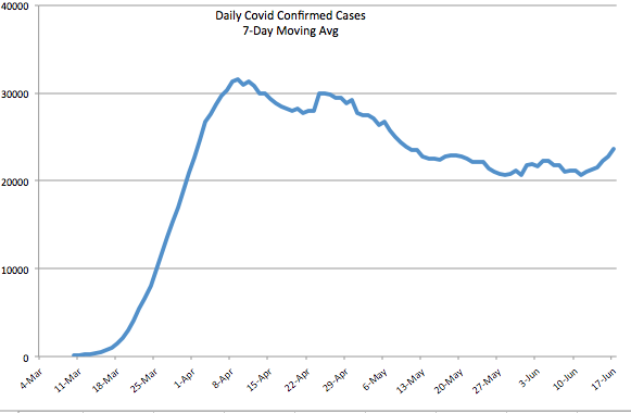
Early in the pandemic, I made the mistake of focusing too heavily on case numbers. Yes, I adjusted for population size and was aware that the initial shortage of tests was restraining diagnoses. Still, I did not foresee the great expansion in testing we’ve witnessed, the great transmissibility of the virus in some regions, nor the large number of asymptomatic cases that would ultimately be diagnosed.
The daily percentage of positive tests (CTP), which is smoothed in the chart below using a seven-day moving average to eliminate within-week variability, has declined gradually since early April to about 4% before the uptick in the last few days. Still, that’s a drop of about 75% from the peak when tests were in very short supply. Those were days when even heavily symptomatic individuals were having trouble getting tested.

We’d hope to see a resumption in the decline of the positive percentage as testing continues to grow, but even with a relatively constant positivity rate, the number of daily confirmed cases must grow as testing expands. There may be several reasons the positivity rate has remained stubbornly near 5% over the past few weeks. One is the obvious reversal in social distancing as states have opened up. People became less fearful about the virus in general, and protesters jammed the streets after the George Floyd murder in Minneapolis. Another reason is that there are new areas of focus for testing that might be picking up cases. For example, hospitals in some states are now testing all admissions for COVID-19. This will tend to pick up more infections to the extent that individuals with co-morbidities are hospitalized at higher rates in general and are also more susceptible to the coronavirus. Finally, testing more broadly is likely to pick up a larger share of asymptomatic cases even as the “true rate” of infection declines.
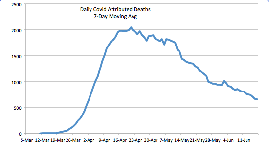
The daily death toll (CTP) attributed to coronavirus has continued to decline. See below. It is now running at about a third of the peak level it reached in mid-April. There are several reasons for the decline. One is the lower number of active cases, changes in which lead deaths by a few weeks. Awareness and testing capacity have undoubtedly led to earlier diagnosis of the most severe cases. There is also the strong possibility that the virus, having felled some of the most susceptible individuals, is now up against more hosts with effective immune responses. An ongoing degree of social distancing, more humid weather, and more direct sunlight have probably reduced initial viral loads from those experienced early-on, when the case load was escalating. Finally, treatment has improved in multiple ways, and there are now a few medications that have shown promise in shortening the duration and severity of infection.
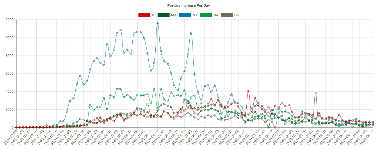
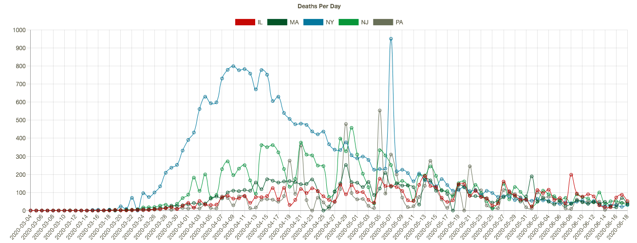
The course of the pandemic has varied greatly across countries and across regions of the U.S. The New York City area was especially hard hit along with several other large cities, as well as Louisiana. CTS shows that states with the highest cumulative number of coronavirus deaths (New York (blue line), New Jersey (green), Massachusetts, Illinois, and Pennsylvania in the charts below) have experienced downward trends in positive cases per day (the first chart below), leading daily deaths downward in May and early June (the second chart — NY’s downtrend began earlier). I apologize if the charts below are difficult to read, but they have resisted my efforts at resizing. Note: I’m mainly focused on trends here, and I have not shown these series on a per capita basis.
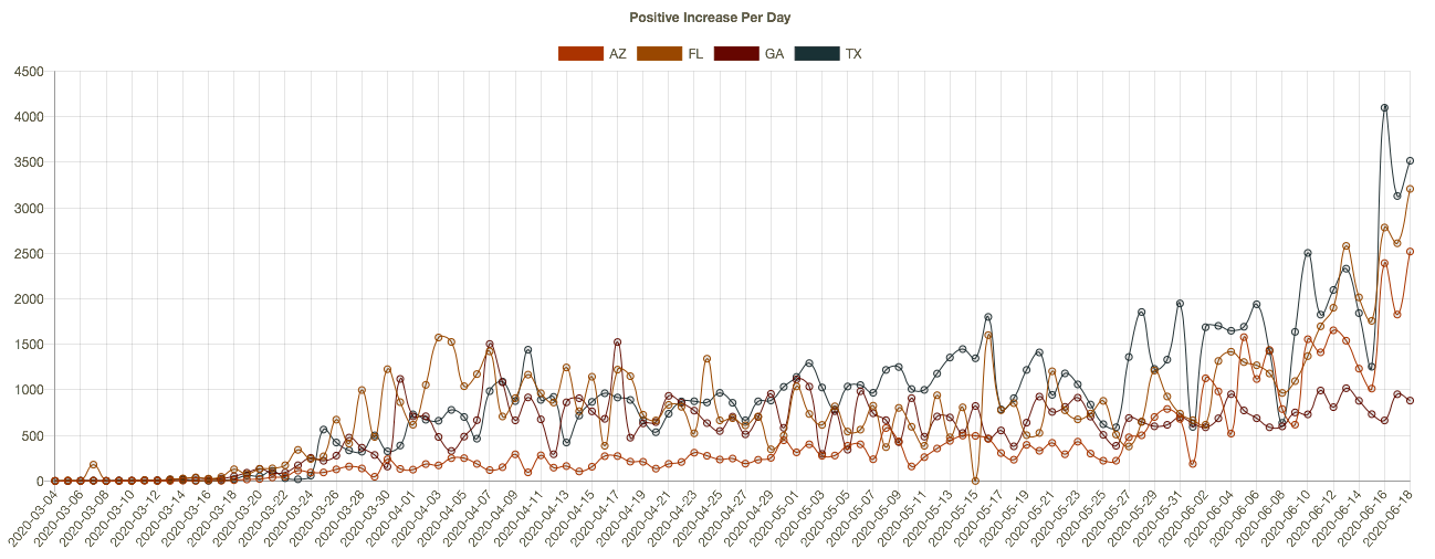
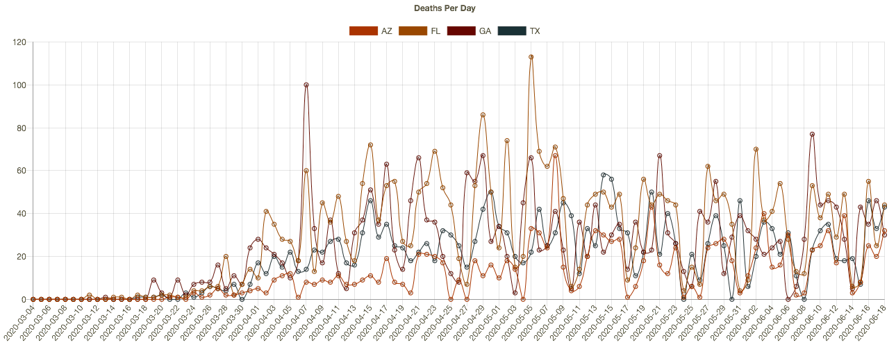
More recently, almost two dozen states have begun to see higher daily case diagnoses. Several of these had more favorable outcomes in the early months of the pandemic and were in more advanced stages of reopening. The charts below (CTS) show results for Arizona, Florida, Georgia, and Texas. The new “hot spots” in these states are mostly urban centers. It’s not clear that the reopenings are to blame, however. The protests after George Floyd’s murder may have contributed in cities like Houston, though no increase in New York is apparent as yet. The states in the chart are all in the south or southwest, so the increases have occurred despite sunny, warm conditions. It’s possible that hot weather has prompted more intensive use of air conditioning, which dries indoor environments and can promote the spread of the virus. These southern states have not yet experienced a corresponding increase in deaths, though that would occur with a lag.
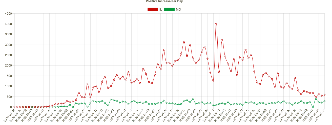
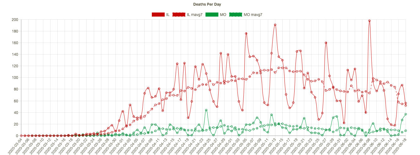
Missouri has seen an slow upward trend in its daily positive test count over the past four weeks, even though the state’s positive rate has trended down slowly since early May. I show MO’s confirmed cases per day below (in green) together with Illinois’ (because my hometown is on the border and the two states are a nice contrast). IL is much larger and has had a much higher case load, but the downward trend in new cases in IL is impressive. Coronavirus deaths per day are shown in the second chart below, with seven-day averages superimposed. Deaths have also trended down in both states, though MO has experienced a few bad days very recently, and MO’s case fatality rate is slightly higher than in IL.
We’ll know fairly soon whether we’re really headed for a second major wave. However, the case count, in and of itself, is not too informative. Testing has increased markedly, so we would expect to see more cases diagnosed. The percent of tests that are positive is a better indicator, and it has flattened at a still uncomfortable 5% for about a month, with a slight uptick in the past few days. Even more telling will be the future path of coronavirus deaths. My expectation is that more recent infections are likely to be less deadly, if only because of the lessons learned about protecting the care-bound elderly. I also believe we’re not too far from what I have called effective herd immunity.
The pandemic has taken a heavy toll, especially among the aged. In fact, total deaths in the U.S. have now exceeded both the Hong Kong flu of the late 1960s and the Asian flu of the late 1950s. Unfortunately, risks will remain elevated for some time. However, any reasonable estimate of the life-years lost is considerably less than in those earlier pandemics due to the differing age profiles of the victims. In any case, the coronavirus pandemic has not been the kind of apocalyptic event that was originally feared and erroneously predicted by several prominent epidemiological models. It can be tackled effectively and at much lower cost by focusing resources on protecting vulnerable segments of the population.
.

Pingback: Cases Climb, Most Patients Faring Better | Sacred Cow Chips