• About

Sacred Cow Chips

Sacred Cow Chips

Tag Archives: Vitamin D Deficiency

COVID Seasonality and Latitudes

23 Sunday Aug 2020

Posted by pnoetx in Pandemic

≈ 2 Comments

Tags

Air Conditioning, Antibodies, Antigenic Drift, Bimodal, Coronavirus, Covid-19, Ethical Skeptic, Heidi J Zapata, Herd Immunity, Herd Immunity Threshold, Humidity, Immune Response, Justin Hart, Latitude and Seasonality, Proofreading enzymes, Robert Edgar Hope-Simpson, SARS, SARS-CoV-2, Seasonality, Sunlight, T-Cell Immunity, Temperature, Tropical Latitudes, Viral Load, Viral Mutation, Vitamin D Deficiency

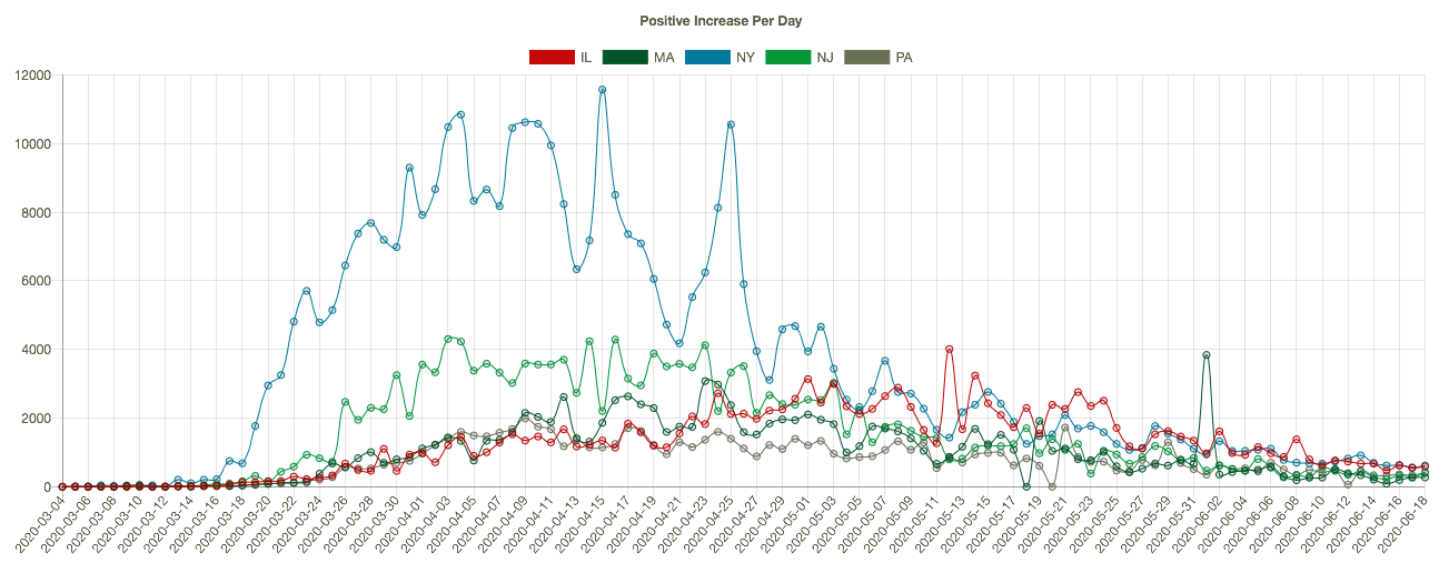
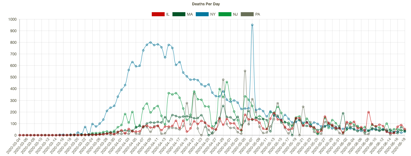
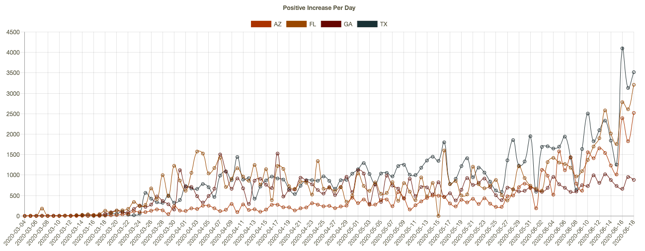
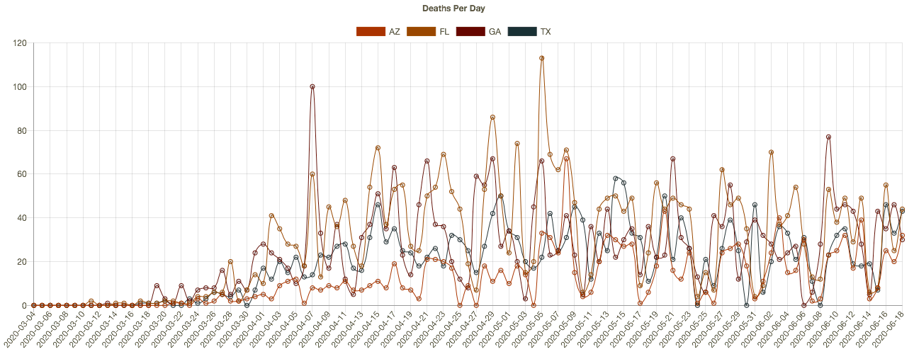
The coronavirus (C19), or SARS-CoV-2, has a strong seasonal component that appears to closely match that of earlier SARS viruses as well as seasonal influenza. This includes the two distinct caseloads we’ve experienced in the U.S. 1) in the late winter/early spring; and 2) the smaller bump we witnessed this summer in some southern states and tropics. 

COVID Seasonal Patterns and Latitude

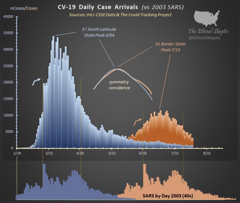
The Ethical Skeptic on Twitter recently featured the chart below. It shows the new case count of C19 in the U.S. in the upper panel, and the 2003 SARS virus in the lower panel. Both viruses had an initial phase at higher latitudes and a summer rebound at lower latitudes.


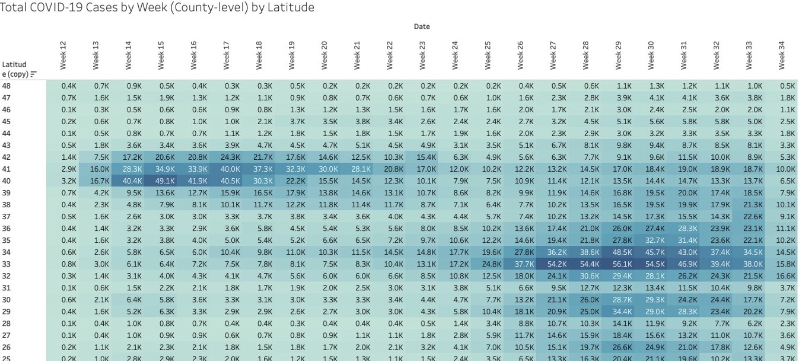
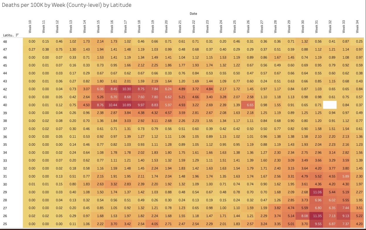
I particularly like the following visualizations from Justin Hart demonstrating the pandemic’s pattern at different latitudes (shown in the leftmost column). The first table shows total cases by week of 2020. The second shows deaths per 100,000 of population by week. Again, notice that lower latitudes have had a crest in the contagion this summer, while higher latitudes suffered the worst of their contagion in the spring. Based on deaths in the second table, the infections at lower latitudes have been less severe.

Viral Patterns in the South

Many expected the pandemic to abate this summer, including me, as it is well known that viruses don’t thrive in higher temperatures and humidity levels, and in more direct sunlight. So it is a puzzle that southern latitudes experienced a surge in the virus during the warmest months of the year. True, the cases were less severe on average, and sunlight and humidity likely played a role in that, along with the marked reduction in the age distribution of cases. However, the SARS pandemic of 2003 followed the same pattern, and the summer surge of C19 at southern latitudes was quite typical of viruses historically.

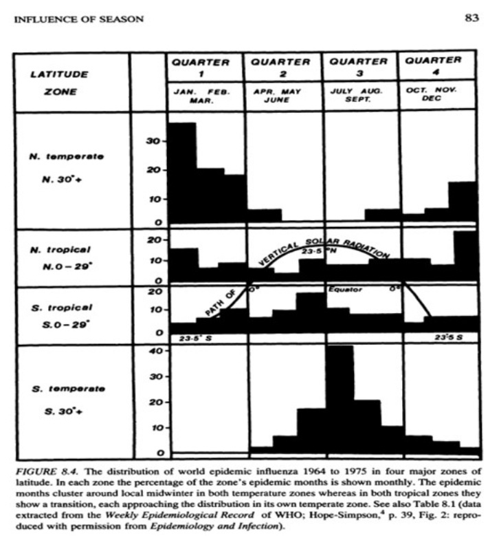
A classic study of the seasonality of viruses was published in 1981 by Robert Edgar Hope-Simpson. The next chart summarized his findings on influenza, seasonality, and latitude based on four groups of latitudes. Northern and southern latitudes above 30° are shown in the top and bottom panels, respectively. Both show wintertime contagions with few infections during the summer months. Tropical regions are different, however. The second and third panels of the chart show flu infections at latitudes less than 30°. Influenza seems to lurk at relatively low levels through most of the year in the tropics, but the respective patterns above and below the equator look almost like very muted versions of activity further to the north and south. However, some researchers describe the tropical pattern as bimodal, meaning that there are two peaks over the course of a year.   

So the “puzzle” of the summer surge at low latitudes appears to be more of an empirical regularity. But what gives rise to this pattern in the tropics, given that direct sunlight, temperature, and humidity subdue viral activity?

There are several possible explanations. One is that the summer rainy season in the tropics leads to less sunlight as well as changes in behavior: more time spent indoors and even less exposure to sunlight. In fact, today, in tropical areas where air conditioning is more widespread, it doesn’t have to be rainy to bring people indoors, just hot. Unfortunately, air conditioning dries the air and creates a more hospitable environment for viruses. Moreover, low latitudes are populated by a larger share of dark-skinned peoples, who generally are more deficient in vitamin D. That might magnify the virulence associated with the flight indoors brought on by hot and or rainy weather.   

Mutations and Seasonal Patterns

What makes the seasonal patterns noted above so reliable in the face of successful immune responses by recovered individuals? And shouldn’t herd immunity end these seasonal repetitions? The problem is the flu is highly prone to viral mutation, having segments of genes that are highly interchangeable (prompting so-called “antigenic drift“). That’s why flu vaccines are usually different each year: they are customized to prompt an immune response to the latest strains of the virus. Still, the power of these new viral strains are sufficient to propagate the kinds of annual flu cycles documented by Hope-Simpson.

With C19, we know there have been up to 100 mutations, mostly quite minor. Two major strains have been dominant. The first was more common in Southeast Asia near the beginning of the pandemic. It was less virulent and deadly than the strain that hit much of Europe and the U.S. Of course, in July the media misrepresented this strain as “new”, when in fact it had become the most dominant strain back in March and April.

What Lies Ahead

By now, it’s possible that the herd immunity threshold has been surpassed in many areas, which means that a surge this coming fall or winter would be limited to a smaller subset of still-susceptible individuals. The key question is whether C19 will be prone to mutations that pose new danger. If so, it’s possible that the fall and winter will bring an upsurge in cases in northern latitudes both among those still susceptible to existing strains, and to the larger population without immune defenses against new strains.

Fortunately, less dangerous variants are more more likely to be in the interest of the virus’ survival. And thus far, despite the number of minor mutations, it appears that C19 is relatively stable as viruses go. This article quotes Dr. Heidi J. Zapata, an infectious disease specialist and immunologist at Yale, who says that C19:

“… has shown to be a bit slow when it comes to accumulating mutations … Coronaviruses are interesting in that they carry a protein that ‘proofreads’ [their] genetic code, thus making mutations less likely compared to viruses that do not carry these proofreading proteins.”

The flu, however, does not have such a proofreading enzyme, so there is little to check its prodigious tendency to mutate. Ironically, C19’s greater reliability in producing faithful copies of itself should help ensure more durable immunity among those already having acquired defenses against C19.

This means that C19 might not have a strong seasonal resurgence in the fall and winter. Exceptions could include: 1) the remaining susceptible population, should they be exposed to a sufficient viral load; 2) regions that have not yet reached the herd immunity threshold; and 3) the advent of a dangerous new mutation, though existing T-cell immunity may effectively cross-react to defend against such a mutation in many individuals.


Unfortunate COVID Follies

08 Wednesday Jul 2020

Posted by pnoetx in Government Failure, Pandemic

≈ Leave a comment

Tags

Arsenic and Old Lace, BAME, Black Asian and Minority Ethnics, BLM, CDC, Coronavirus, Covid-19, Dr. Einstein, Flattening the Curve, Hydroxychloraquine, Jonathan Brewster, Lockdowns, Masks, Operation Warp Speed, Vitamin D Deficiency, World Health Organization

This post is devoted to a few coronavirus policies and positions that trouble me. 

Counting Deaths: People have the general impression that counting COVID-19 cases and deaths is straightforward. The facts are more reminiscent of the following exchange in the film Arsenic and Old Lace, when Jonathan Brewster angrily insists he has offed more souls than his sweet little aunties have poisoned with elderberry wine:

Dr. Einstein: You cannot count the one in South Bend. He died of pneumonia!
Jonathan Brewster: He wouldn’t have died of pneumonia if I hadn’t shot him! 

Here, Dr. Einstein wears the shoes of public health authorities who claim that C19 deaths are undercounted. But lives counted as lost from C19, in many cases, are individuals who also had the flu, pneumonia, stroke, kidney failure, and a variety of other co-morbidities. Yes, other causes of death might be induced by the coronavirus, but like Johnny’s victim in South Bend, many would not have died from C19 if they hadn’t had a prior health event. In addition, otherwise unexplained deaths are often attributed to C19 with little justification.

In fact, the C19 death toll has been distorted by a perverse federal hospital reimbursement policy that rewards hospitals for COVID patients. Death certificates seem to list C19 as the cause for almost anyone who dies in or out of a hospital during the pandemic, whether they’ve been tested or not. In fact, deaths have been attributed to C19 despite negative test results when officials decided, for one reason or another, that the test must have been unreliable!

Lockdowns: almost all of the “curve flattening” in late March and April was accomplished by voluntary action, which I’ve covered before here. The lockdowns imposed by state and local governments were highly arbitrary and tragic for many workers and business owners who could have continued to operate as safely as many so-called “essential” businesses. Lockdowns in certain areas were also blatant violations of religious rights. There is little to no evidence that lockdowns themselves led to any actual abatement of the virus. And of course, people are fed up! 

The Beach: Right now I’m at a wonderful beach condo in Florida for a week. There are other people on the beach, mostly families and a few groups of friends, but there is plenty of open space. You will not catch the coronavirus on a beach like this. And there is almost zero chance you’ll catch it on any beach. In fact, the chance you’ll catch it anywhere outside is minuscule unless you’re jammed so tightly among hundreds of protesters that you can’t even turn around. Yet government officials have closed beaches in many parts of the country while allowing the protests to go on. Oh sure, they think people will CROWD onto beaches as if they’re at a BLM protest… except they’re not. Ah, then it must be banned! That takes a special kind of dumbass.     

Waiting for Results: How could we have spent trillions of dollars as a nation on economic stimulus, much of it skimmed off by grifters, but we can’t seem to get sufficient resources to make calls to those awaiting test results? This is a case of misplaced priorities. Even now, people are waiting more than a week for their results, and many are wandering around in the community without knowing their status. Wouldn’t you think we’d get that done? We can conduct well over a half million tests a day, but can’t we find a few bucks to deliver results via phone, email, or text within 24 hours of processing results. This is truly absurd. 

Vaccine Candidates: A similar point can be made about vaccine development: We are spending $5 billion on Operation Warp Speed to build capacity in advance for five promising vaccine candidates. These will be identified over the next few months, and it looks as if all five will come from established pharmaceutical majors. There are many more vaccine candidates, however, some being developed by smaller players using inventive new techniques. The OWS expenditure looks pretty meager when you compare it to the trillions in funds the federal government is spending on economic stimulus, especially when finding an effective vaccine would obviate much of the stimulus. 

Treatment: Hydroxycloroquine has been found to lower the death rate from COVID-19 in a large controlled trial. Congratulations, morons, for trashing HCQ as a potential treatment, solely because Trump mentioned it. Way to go, dumbasses, for banning the use of a potential treatment that could have saved many thousands of lives. 

Air Conditioning: I’m shocked that public health experts haven’t been more vocal about the potentially dangerous effects of running air conditioners at high levels in public buildings. The virus is known to thrive in cool, dry environments, which is exactly what AC creates, yet this seems to have been almost completely ignored.   

Vitamin D: Likewise, I think public health experts have been far too reticent about the connection between Vitamin D deficiencies and the severity of C19 (also see here and here). The accumulating evidence about this association offers an explanation for the disturbingly high severity of cases among Black, Asian and Minority Ethnics (BAME), not to mention a possible role in C19 deaths among the generally D-deficient nursing home population. For the love of God, get the word out to the community that Vitamin D supplements might help, and they won’t hurt, and otherwise, tell people to get some sun!

Masks: I’m not in favor of strict mask mandates, but I have trouble understanding the aversion to masks among certain friends. Of course, there’s been way too much mixed messaging on the benefits of masks, and it didn’t all come from politicians! Scientists, the CDC, and the World Health Organization seemingly did everything possible to squander their credibility on this and other issues. However, a consensus now seems to have developed that masks protect others from the wearer and seem to protect the wearer from others as well. It should be obvious that masks offer a middle ground on which the economy can be restarted while mitigating the risks of further contagion. But even if you don’t believe masks protect the wearer, but only protect others from an infected wearer, donning a mask inside buildings, and when social distancing is impossible, still qualifies as a mannerly thing to do.  


Cases Climb, Most Patients Faring Better

30 Tuesday Jun 2020

Posted by pnoetx in Pandemic, Public Health

≈ 1 Comment

Tags

Air Conditioning, Bloomberg, Cases vs. Deaths, Confirmed Cases, COVID Time Series, Covid-19, George Floyd, Immunity, Increased Testing, Nate Silver, Pandemic, Protest Effect, Social Distancing, Viral Transmission, Vitamin D Deficiency

There’s been much speculation about whether recent increases in confirmed cases of COVID-19 (first chart above) will lead to a dramatic increase in fatalities (second chart). More generally, there is curiosity or perhaps hope as to whether the virus is not as dangerous to these new patients as it was early in the pandemic. I have discussed this point in several posts, most recently here. Based on the national data (above), we’re at the point at which an upturn in deaths might be expected. Based on the experience of many individual states, however, deaths should have trended upward by now, but they haven’t done so. Cases are generally less severe and are resolving more quickly.

Of course, more testing produces more cases (though there has been a mild uptick in test positivity over the past two weeks), but that doesn’t really explain the entire increase in cases over the past few weeks. In particular, why are so many new cases in the south? After all, there is evidence that the virus doesn’t survive well in warm, humid climates with more direct sunlight.

As I have mentioned several times, heavy use of air-conditioning in the south may have contributed to the increase. Nate Silver speculates that this is the case. The weather warmed up in late May and especially June, and many southerners retreated indoors where the air is cool, dry, and the virus thrives. Managers of public buildings should avoid blasting the AC, and you might do well to heed the same advice if you live with others in a busy household. In fact, nearly all transmission is likely occurring indoors, as has been the case throughout the pandemic. At the same time, however, with the early reopening of many southern states, younger people flocked to gyms, bars and other venues, largely abandoning any pretense of social distancing. So it’s possible that these effects have combined to produce the spike in new cases.

Some contend that the protests following George Floyd’s murder precipitated the jump in confirmed cases. Perhaps they played a role, but I’m somewhat skeptical. Yes, these could have become so-called super-spreader events; there are certain cities in which the jump in cases lagged the protests by a few weeks, such as Austin, Houston, and Miami, and where some cases were confirmed to be among those who protested. But if the protests contributed much to the jump, why hasn’t New York City seen a corresponding increase? Not only that, but the protests were outside, and the protests dissuaded many others from going out at all!

The trend in coronavirus fatalities remains more favorable, despite the increase in daily confirmed cases. One exception is New Jersey, which decided to reclassify 1,800 deaths as “probable” COVID deaths about six days ago. You can see the spike caused by that decision in the second chart above. Reclassifications like that arouse my suspicion, especially when federal hospital reimbursements are tied to COVID cases, and in view of this description from Bloomberg (my emphasis):

“… those whose negative test results were considered unreliable; who were linked to known outbreaks and showed symptoms; or whose death certificates strongly suggested a coronavirus link.”

Deaths necessarily lag new cases by anywhere from a few days to several weeks, depending on the stage at the time of diagnosis and delays in test results. The lag between diagnosis and death seems to center on about 12 – 14 days. Thus far, there doesn’t appear to be an upward shift in the trend of fatal cases, but the big updraft in cases nationally only started about two weeks ago. More on that below.

Importantly, a larger share of new cases is now among a younger age cohort, for whom the virus is much less threatening. The most vulnerable people are probably taking more precautions than early in the pandemic, and shocking as might seem, there is probably some buildup in immunity in the surviving nursing home population at this point. We are also better at treatment, and there is generally plenty of hospital capacity. And to the extent that the surge in new cases is concentrated in the south, fewer patients are likely to have Vitamin D deficiencies, which is increasingly mentioned as a contributor to the severity of coronavirus infections.

I decided to make some casual comparisons of new cases versus COVID deaths on a state-by-state basis, but I got a little carried away. Using the COVID Time Series web site, I started by checking some of the southern states with recent large increases in case counts. I ended up looking at 15 states in the south and west, and I added Missouri and Minnesota as well. I passed over a few others because their trends were basically flat. The 17 states all had upward trends in new cases over the past one to two months, or they had an increase in new cases more recently. However, only four of those states experienced any discernible increase in daily deaths over the corresponding time frames. These are Arizona, Arkansas, Tennessee, and Texas, and their increases are so modest they might be statistical noise.

Again, deaths tend to lag new cases by a couple of weeks, so the timing of the increase in case counts matters. Five of the states were trending upward beginning in May or even earlier, and 13 of the states saw an acceleration or a shift to an upward trend in new cases after Memorial Day, in late May or June. Of those 13, the changes in trend occurred between one and five weeks ago. Six states, including Texas, had a shift within the past two weeks. It’s probably too early to draw conclusions for those six states, but in general there is little to suggest that fatal cases will soar like they did early in the pandemic. Case fatality rates are likely to remain at much lower levels.

We’ll know much more within a week or two. It’s very encouraging that the upward trend in new cases hasn’t resulted in more deaths thus far, especially at the state level, as many states have had case counts drift upward for over a month. If it’s going to occur, it should be well underway within a week or so. Much also depends on whether new cases continue to climb in July, in which case we’ll be waiting in trepidation for whether more deaths transpire.

Coronavirus Framing #7: Second Wave Uncertainty

19 Friday Jun 2020

Posted by pnoetx in Pandemic

≈ 1 Comment

Tags

Air Conditioning, Asian Flu, Case Fatality Rate, CDC, Coronavirus, COVID Time Series, Covid Tracking Project, Effective Herd Immunity, George Floyd, HHS, High Cholesterol, Hong Kong Flu, Johns Hopkins, Operation Warp Speed, Pooled Testing, Reverse Seasonal Effect, Rich Lowry, Social Distancing, Testing, Vitamin D Deficiency

We’re now said to be on the cusp of a “second wave” of coronavirus infections. It’s become a new focus of media attention in the past week or so. Increased infections have been reported across a number of states, especially in the south, but I’m not especially alarmed at this point for reasons explained below. Either way, the public policy response will certainly be different this time, at least in most areas. We’ve learned that a more targeted approach to managing coronavirus risk is far less costly, which means eschewing general lockdowns in favor of focusing resources on protecting the most vulnerable. That approach is supported by research weighing the costs and benefits of the alternatives (also see here and here).

The targeted approach I’ve advocated does not call for any less caution on the part of individuals. That means avoiding prolonged, close contact with others, especially indoors. I don’t mind wearing a mask when inside stores or public buildings, but I believe it should be voluntary. I do my best to stay out of close proximity to most others in public places anyway, masked or otherwise. This is voluntary social distancing. I also believe public health authorities should be more active in disseminating information on known correlates of coronavirus severity, such as Vitamin D deficiency, high LDL cholesterol, and the “reverse seasonal effect” caused by low humidity in air-conditioned spaces. I would also strongly agree that the effort to identify and mass produce vaccine candidates, known as Operation Warp Speed, should be ramped up considerably, with heavier funding and more than five vaccine candidates.

We’ve seen a continuing increase in coronavirus testing since my last “framing” post about a month ago. Testing has increased to a daily average of almost 500,000 over the past two weeks. At present we appear to have an excess supply of testing capacity in many areas, as Rich Lowry notes:

“The problem with testing nationally is becoming less a shortfall of availability of the tests and more a shortfall of people showing up to get tested. An insider in the diagnostics industry says that laboratories are reporting that they are ‘sample starved’ — i.e., they aren’t getting enough specimens. He notes, ‘We have all seen stories about sample-collection sites in some regions not seeing that many patients.’

An HHS official says that in May there was the capacity to do twice as many tests as were actually performed, calling it a function of ‘allocation and efficiency, but more just demand.’ Says Giroir, ‘We really see areas in the country now that there’s more tests available than people who want to get tested or the need for testing.'”

Before turning to some charts, a word about the data in the charts I’ve been using throughout the pandemic. Some of the nationwide information was directly from the CDC or the Johns Hopkins dashboard. In other cases, I’ve reported state level data and some nationwide data published by The COVID Tracking Project (CTP) and the COVID Time Series (CTS) dashboard, which uses state data from CTP. I first noticed a few discrepancies in the national totals in April, which have become larger with growth in the counts of cases and deaths. Here is a key part of CTP’s explanation:

“For many states, the CDC publishes higher testing numbers than the states themselves report, which raises questions about the structure and integrity of both state and federal data reporting. … Another point of contrast between the CDC’s new reporting and the official state data compiled by The COVID Tracking Project is that the CDC has not released historical, state-level testing data for the first three months of the outbreak.”

Thus, the CDC currently reports almost 120,000 U.S. deaths, while CTP reports about 112,000. Nevertheless, I will continue to report numbers from both sources for the sake of continuity, and I will try to remember to note the source in each case.

The first chart below shows the number of daily tests from CTP; the second chart shows the number of daily confirmed cases (CTP). Since mid-May, daily testing has increased by more than 50%, calculated on a moving average basis, and is now approaching half a million per day or more than 3 million per week. Pooled testing is coming, which will ultimately increase testing capacity several-fold. Daily confirmed cases have been hovered just above 20,000 since around Memorial Day, with a recent turn upward to around 24,000.

Early in the pandemic, I made the mistake of focusing too heavily on case numbers. Yes, I adjusted for population size and was aware that the initial shortage of tests was restraining diagnoses. Still, I did not foresee the great expansion in testing we’ve witnessed, the great transmissibility of the virus in some regions, nor the large number of asymptomatic cases that would ultimately be diagnosed.

The daily percentage of positive tests (CTP), which is smoothed in the chart below using a seven-day moving average to eliminate within-week variability, has declined gradually since early April to about 4% before the uptick in the last few days. Still, that’s a drop of about 75% from the peak when tests were in very short supply. Those were days when even heavily symptomatic individuals were having trouble getting tested.

We’d hope to see a resumption in the decline of the positive percentage as testing continues to grow, but even with a relatively constant positivity rate, the number of daily confirmed cases must grow as testing expands. There may be several reasons the positivity rate has remained stubbornly near 5% over the past few weeks. One is the obvious reversal in social distancing as states have opened up. People became less fearful about the virus in general, and protesters jammed the streets after the George Floyd murder in Minneapolis. Another reason is that there are new areas of focus for testing that might be picking up cases. For example, hospitals in some states are now testing all admissions for COVID-19. This will tend to pick up more infections to the extent that individuals with co-morbidities are hospitalized at higher rates in general and are also more susceptible to the coronavirus. Finally, testing more broadly is likely to pick up a larger share of asymptomatic cases even as the “true rate” of infection declines.

The daily death toll (CTP) attributed to coronavirus has continued to decline. See below. It is now running at about a third of the peak level it reached in mid-April. There are several reasons for the decline. One is the lower number of active cases, changes in which lead deaths by a few weeks. Awareness and testing capacity have undoubtedly led to earlier diagnosis of the most severe cases. There is also the strong possibility that the virus, having felled some of the most susceptible individuals, is now up against more hosts with effective immune responses. An ongoing degree of social distancing, more humid weather, and more direct sunlight have probably reduced initial viral loads from those experienced early-on, when the case load was escalating. Finally, treatment has improved in multiple ways, and there are now a few medications that have shown promise in shortening the duration and severity of infection.

The course of the pandemic has varied greatly across countries and across regions of the U.S. The New York City area was especially hard hit along with several other large cities, as well as Louisiana. CTS shows that states with the highest cumulative number of coronavirus deaths (New York (blue line), New Jersey (green), Massachusetts, Illinois, and Pennsylvania in the charts below) have experienced downward trends in positive cases per day (the first chart below), leading daily deaths downward in May and early June (the second chart — NY’s downtrend began earlier). I apologize if the charts below are difficult to read, but they have resisted my efforts at resizing. Note: I’m mainly focused on trends here, and I have not shown these series on a per capita basis.

More recently, almost two dozen states have begun to see higher daily case diagnoses. Several of these had more favorable outcomes in the early months of the pandemic and were in more advanced stages of reopening. The charts below (CTS) show results for Arizona, Florida, Georgia, and Texas. The new “hot spots” in these states are mostly urban centers. It’s not clear that the reopenings are to blame, however. The protests after George Floyd’s murder may have contributed in cities like Houston, though no increase in New York is apparent as yet. The states in the chart are all in the south or southwest, so the increases have occurred despite sunny, warm conditions. It’s possible that hot weather has prompted more intensive use of air conditioning, which dries indoor environments and can promote the spread of the virus. These southern states have not yet experienced a corresponding increase in deaths, though that would occur with a lag. 

Missouri has seen an slow upward trend in its daily positive test count over the past four weeks, even though the state’s positive rate has trended down slowly since early May. I show MO’s confirmed cases per day below (in green) together with Illinois’ (because my hometown is on the border and the two states are a nice contrast). IL is much larger and has had a much higher case load, but the downward trend in new cases in IL is impressive. Coronavirus deaths per day are shown in the second chart below, with seven-day averages superimposed. Deaths have also trended down in both states, though MO has experienced a few bad days very recently, and MO’s case fatality rate is slightly higher than in IL.

We’ll know fairly soon whether we’re really headed for a second major wave. However, the case count, in and of itself, is not too informative. Testing has increased markedly, so we would expect to see more cases diagnosed. The percent of tests that are positive is a better indicator, and it has flattened at a still uncomfortable 5% for about a month, with a slight uptick in the past few days. Even more telling will be the future path of coronavirus deaths. My expectation is that more recent infections are likely to be less deadly, if only because of the lessons learned about protecting the care-bound elderly. I also believe we’re not too far from what I have called effective herd immunity. 

The pandemic has taken a heavy toll, especially among the aged. In fact, total deaths in the U.S. have now exceeded both the Hong Kong flu of the late 1960s and the Asian flu of the late 1950s. Unfortunately, risks will remain elevated for some time. However, any reasonable estimate of the life-years lost is considerably less than in those earlier pandemics due to the differing age profiles of the victims. In any case, the coronavirus pandemic has not been the kind of apocalyptic event that was originally feared and erroneously predicted by several prominent epidemiological models. It can be tackled effectively and at much lower cost by focusing resources on protecting vulnerable segments of the population. 

.

Suspending Medical Care In the Name of Public Health

23 Saturday May 2020

Posted by pnoetx in Health Care, Pandemic

≈ 3 Comments

Tags

Asian Flu, Comorbidities, Coronavirus, Covid-19, Get Outside, Hong Kong Flu, Imperial College Model, Italy, Lockdowns, Mortality by Age, Mortality Rates, Neil Ferguson, New York, Organ Failure, Pandemic, Public Health, Slow the Spread, South Korea, Spanish Flu, Suicide Hotlines, Vitamin D Deficiency

Step back in time six months and ask any health care professional about the consequences of suspending delivery of most medical care for a period of months. Forget about the coronavirus for a moment and just think about that “hypothetical”. These experts would have answered, uniformly, that it would be cataclysmic: months of undiagnosed cardiac and stroke symptoms; no cancer screenings, putting patients months behind on the survival curve; deferred procedures of all kinds; run-of-the-mill infections gone untreated; palsy and other neurological symptoms anxiously discounted by victims at home; a hold on treatments for all sorts of other progressive diseases; and patients ordinarily requiring hospitalization sent home. And to start back up, new health problems must compete with all that deferred care. Do you dare tally the death and other worsened outcomes? Both are no doubt significant.

What you just read has been a reality for more than two months due to federal and state orders to halt non-emergency medical procedures in the U.S. The intent was to conserve hospital capacity for a potential rush of coronavirus patients and to prevent others from exposure to the virus. That might have made sense in hot spots like New York, but even there the provision of temporary capacity went almost completely unused. Otherwise, clearing hospitals of non-Covid patients, who could have been segregated, was largely unnecessary. The fears prompted by these orders impacted delivery of care in emergency facilities: people have assiduously avoided emergency room visits. Even most regular office visits were placed on hold. And as for the reboot, there are health care facilities that will not survive the financial blow, leaving communities without local sources of care.

A lack of access to health care is one source of human misery, but let’s ask our health care professional about another “hypothetical”: the public health consequences of an economic depression. She would no doubt predict that the stresses of joblessness and business ruin would be acute. It’s reasonable to think of mental health issues first. Indeed, in the past two months, suicide hotlines have seen calls spike by multiples of normal levels (also see here and here). But the stresses of economic disaster often manifest in failing physical health as well. Common associations include hypertension, heart disease, migraines, inflammatory responses, immune deficiency, and other kinds of organ failure.

The loss of economic output during a shutdown can never be recovered. Goods don’t magically reappear on the shelves by government mandate. Running the printing press in order to make government benefit payments cannot make us whole. The output loss will permanently reduce the standard of living, and it will reduce our future ability to deal with pandemics and other crises by eroding the resources available to invest in public health, safety, and disaster relief.

What would our representative health care professional say about the health effects of a mass quarantine, stretching over months? What are the odds that it might compound the effects of the suspension in care? Confinement and isolation add to stress. In an idle state of boredom and dejection, many are unmotivated and have difficulty getting enough exercise. There may be a tendency to eat and drink excessively. And misguided exhortations to “stay inside” certainly would never help anyone with a Vitamin D deficiency, which bears a striking association with the severity of coronavirus infections.

But to be fair, was all this worthwhile in the presence of the coronavirus pandemic? What did health care professionals and public health officials know at the outset, in early to mid-March? There was lots of alarming talk of exponential growth and virus doubling times. There were anecdotal stories of younger people felled by the virus. Health care professionals were no doubt influenced by the dire conditions under which colleagues who cared for virus victims were working.

Nevertheless, a great deal was known in early March about the truly vulnerable segments of the population, even if you discount Chinese reporting. Mortality rates in South Korea and Italy were heavily skewed toward the aged and those with other risk factors. One can reasonably argue that health care professionals and policy experts should have known even then how best to mitigate the risks of the virus. That would have involved targeting high-risk segments of the population for quarantine, and treatment for the larger population in-line with the lower risks it actually faced. Vulnerable groups require protection, but death rates from coronavirus across the full age distribution closely mimic mortality from other causes, as the chart at the top of this chart shows.

The current global death toll is still quite small relative to major pandemics of the past (Spanish Flu, 1918-19: ~45 million; Asian Flu, 1957-58: 1.1 million; Hong Kong flu, 1969: 1 million; Covid-19 as of May 22: 333,000). But by mid-March, people were distressed by one particular epidemiological model (Neil Ferguson’s Imperial College Model, subsequently exposed as slipshod), predicting 2.2 million deaths in the U.S. (We are not yet at 100,000 deaths). Most people were willing to accept temporary non-prescription measures to “slow the spread“. But unreasonable fear and alarm, eagerly promoted by the media, drove the extension of lockdowns across the U.S. by up to two extra months in some states, and perhaps beyond.

The public health and policy establishment did not properly weigh the health care and economic costs of extended lockdowns against the real risks of the coronavirus. I believe many health care workers were goaded into supporting ongoing lockdowns in the same way as the public. They had to know that the suspension of medical care was a dire cost to pay, but they fell in line when the “experts” insisted that extensions of the lockdowns were worthwhile. Some knew better, and much of the public has learned better.

Follow Sacred Cow Chips on WordPress.com

Recent Posts

  • Observations on the Dobbs Decision
  • Medicare For All … and Tax Hikes, Long Waits, Inferior Care
  • A Fiscal Real-Bills Doctrine? No Such Thing As Painless Inflation Tax
  • Honeybees Are and Have Been Thriving
  • New Theory: Great Woke Filter Conceals Life In the Cosmos

Archives

  • June 2022
  • May 2022
  • April 2022
  • March 2022
  • February 2022
  • January 2022
  • December 2021
  • November 2021
  • October 2021
  • September 2021
  • August 2021
  • July 2021
  • June 2021
  • May 2021
  • April 2021
  • March 2021
  • February 2021
  • January 2021
  • December 2020
  • November 2020
  • October 2020
  • September 2020
  • August 2020
  • July 2020
  • June 2020
  • May 2020
  • April 2020
  • March 2020
  • February 2020
  • January 2020
  • December 2019
  • November 2019
  • October 2019
  • September 2019
  • August 2019
  • July 2019
  • June 2019
  • May 2019
  • April 2019
  • March 2019
  • February 2019
  • January 2019
  • December 2018
  • November 2018
  • October 2018
  • September 2018
  • August 2018
  • July 2018
  • June 2018
  • May 2018
  • April 2018
  • March 2018
  • February 2018
  • January 2018
  • December 2017
  • November 2017
  • October 2017
  • September 2017
  • August 2017
  • July 2017
  • June 2017
  • May 2017
  • April 2017
  • March 2017
  • February 2017
  • January 2017
  • December 2016
  • November 2016
  • October 2016
  • September 2016
  • August 2016
  • July 2016
  • June 2016
  • May 2016
  • April 2016
  • March 2016
  • February 2016
  • January 2016
  • December 2015
  • November 2015
  • October 2015
  • September 2015
  • August 2015
  • July 2015
  • June 2015
  • May 2015
  • April 2015
  • March 2015
  • February 2015
  • January 2015
  • December 2014
  • November 2014
  • October 2014
  • September 2014
  • August 2014
  • July 2014
  • June 2014
  • May 2014
  • April 2014
  • March 2014

Blogs I Follow

  • Passive Income Kickstart
  • OnlyFinance.net
  • TLC Cholesterol
  • Nintil
  • kendunning.net
  • DCWhispers.com
  • Hoong-Wai in the UK
  • Marginal REVOLUTION
  • CBS St. Louis
  • Watts Up With That?
  • Aussie Nationalist Blog
  • American Elephants
  • The View from Alexandria
  • The Gymnasium
  • A Force for Good
  • ARLIN REPORT...................walking this path together
  • Notes On Liberty
  • troymo
  • SUNDAY BLOG Stephanie Sievers
  • Miss Lou Acquiring Lore
  • Your Well Wisher Program
  • Objectivism In Depth
  • RobotEnomics
  • Orderstatistic
  • Paradigm Library

Blog at WordPress.com.

Passive Income Kickstart

OnlyFinance.net

Financial Matters!

TLC Cholesterol

Nintil

To estimate, compare, distinguish, discuss, and trace to its principal sources everything

kendunning.net

The future is ours to create.

DCWhispers.com

Hoong-Wai in the UK

A Commonwealth immigrant's perspective on the UK's public arena.

Marginal REVOLUTION

Small Steps Toward A Much Better World

CBS St. Louis

News, Sports, Weather, Traffic and St. Louis' Top Spots

Watts Up With That?

The world's most viewed site on global warming and climate change

Aussie Nationalist Blog

Commentary from a Paleoconservative and Nationalist perspective

American Elephants

Defending Life, Liberty and the Pursuit of Happiness

The View from Alexandria

In advanced civilizations the period loosely called Alexandrian is usually associated with flexible morals, perfunctory religion, populist standards and cosmopolitan tastes, feminism, exotic cults, and the rapid turnover of high and low fads---in short, a falling away (which is all that decadence means) from the strictness of traditional rules, embodied in character and inforced from within. -- Jacques Barzun

The Gymnasium

A place for reason, politics, economics, and faith steeped in the classical liberal tradition

A Force for Good

How economics, morality, and markets combine

ARLIN REPORT...................walking this path together

PERSPECTIVE FROM AN AGING SENIOR CITIZEN

Notes On Liberty

Spontaneous thoughts on a humble creed

troymo

SUNDAY BLOG Stephanie Sievers

Escaping the everyday life with photographs from my travels

Miss Lou Acquiring Lore

Gallery of Life...

Your Well Wisher Program

Attempt to solve commonly known problems…

Objectivism In Depth

Exploring Ayn Rand's revolutionary philosophy.

RobotEnomics

(A)n (I)ntelligent Future

Orderstatistic

Economics, chess and anything else on my mind.

Paradigm Library

OODA Looping

  • Follow Following
    • Sacred Cow Chips
    • Join 120 other followers
    • Already have a WordPress.com account? Log in now.
    • Sacred Cow Chips
    • Customize
    • Follow Following
    • Sign up
    • Log in
    • Report this content
    • View site in Reader
    • Manage subscriptions
    • Collapse this bar
 

Loading Comments...