
Tags
CDC, CLI, Covid Tracking Project, Covid-19, COVID-Like Illness, Date of Death, FEMA, FEMA Regions, Herd Immunity Threshold, Hospitalizations, Kyle Lamb, PCR Test, Percent Positive, Provisional Deaths
Lately I’ve talked a lot about reported deaths each week versus deaths by actual date of death (DOD). Much of that information came from Kyle Lamb’s Twitter account, and he’s the source of the charts below as well. The first one provides a convenient summary of the data reported through last week. The blue bars are reported deaths each week from the COVID Tracking Project (CTP), which are an aggregation of deaths that actually occurred over previous weeks. Again, the blue bars do NOT represent deaths that occurred in the reporting week. The solid orange bars are “provisional” actual deaths by DOD. “Provisional” means that recent weeks are not complete, though most deaths by DOD are captured within three to four weeks. The CDC also produces a “forecast” of final death counts by DOD, shown by the hatched orange bars.
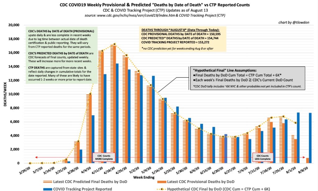
Note that the recent surge in deaths has been much smaller than the one in the spring, which was driven by deaths in the northeast. The CDC “expects” actual deaths by DOD to have declined starting after the week of July 23rd. However, CTP was still reporting deaths of over 1,000 per day last week. The actual timing of those deaths in prior weeks, and the ultimate extent of the summer surge in COVID deaths, remains to be seen.
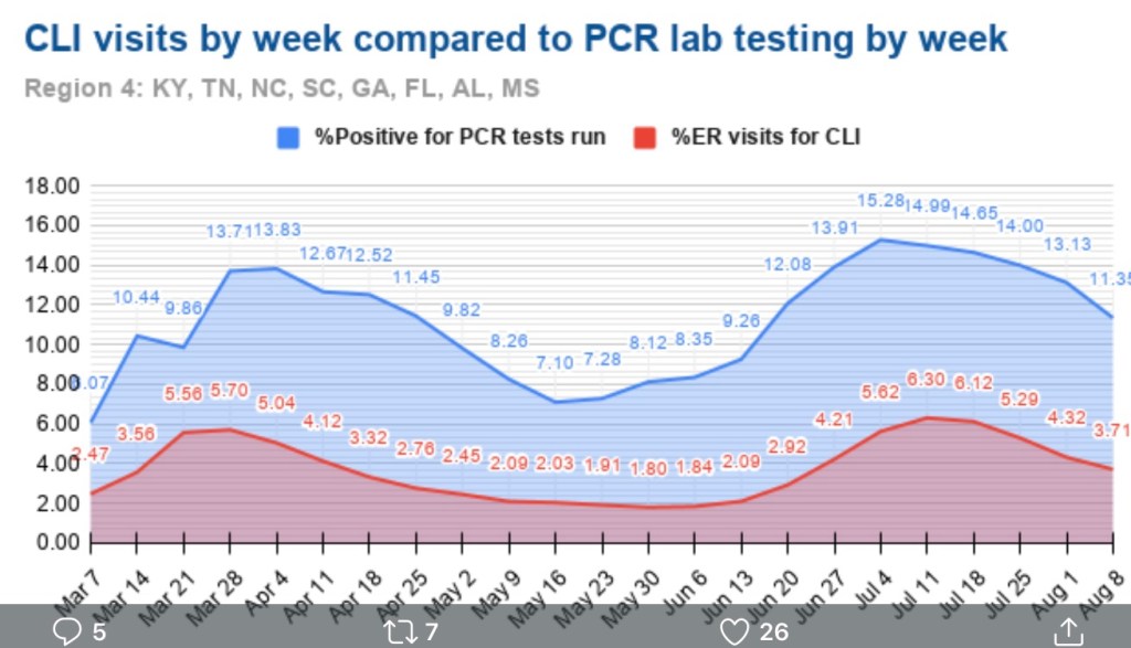
Certain leading indicators of deaths are signaling declines in actual deaths in August. Two of those indicators are 1) the positivity rate on standard PCR tests for infections; and 2) the share of emergency room visits made for symptoms of “COVID Like Illness” (CLI). The charts below show those indicators for FEMA regions that had the largest uptrends in cases in June and July. Florida is part of Region 4, shown in the next chart:
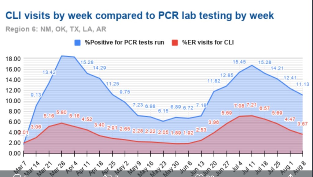
Here is the Region 6, which includes Texas:
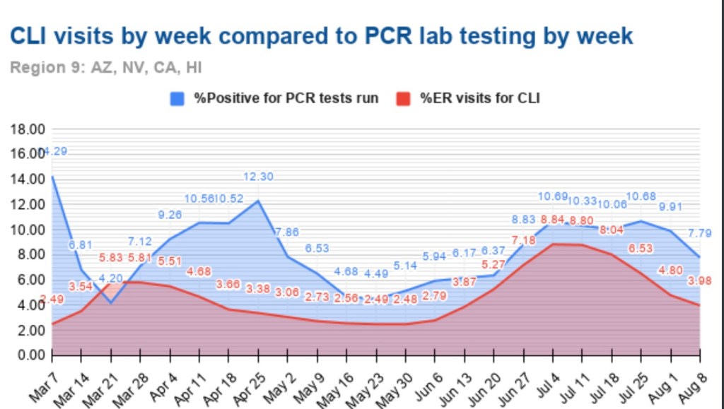
Finally, Region 8 includes Arizona and California:
Out of personal interest, I’m also throwing in Region 7 with a few midwestern states, where cases have risen but not to the levels reached in Regions 4, 6, and 8:
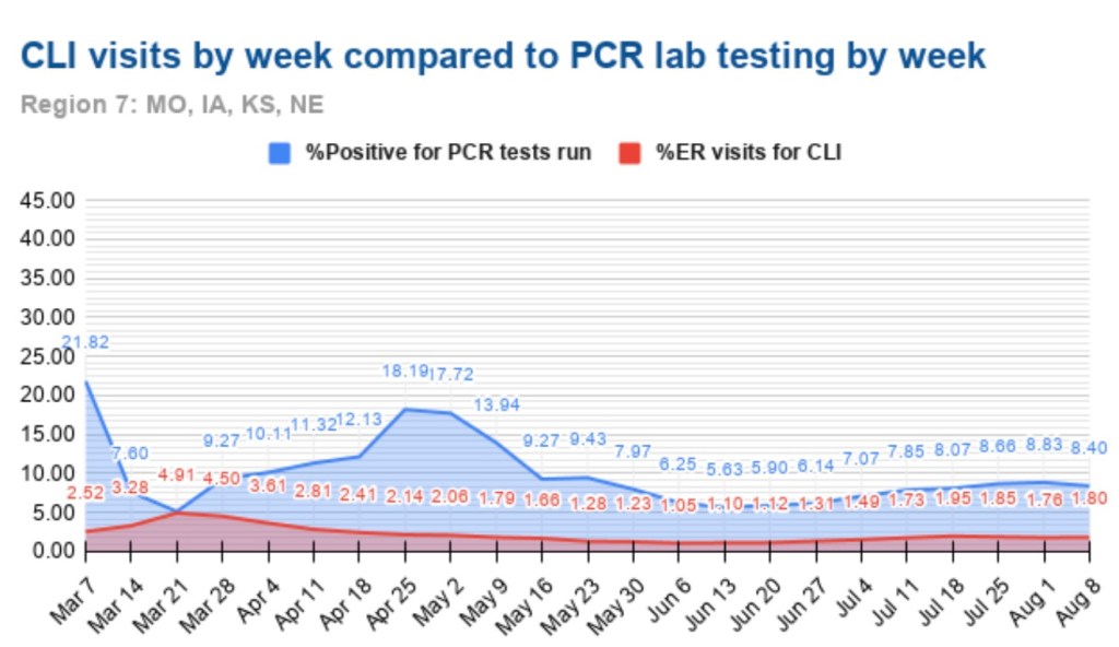
With the exception of the last chart, the clear pattern is a peak or plateau in the positivity rate in late June through late July, followed by declines in subsequent weeks. The share or ER visits for CLI was not quite coincident with the positivity rate, but close. The decline in the CLI share is evident in Regions 4, 6 and 8. Again, these three regions include states that drove the nationwide increase in cases this summer (AZ, CA, FL, and TX), and the surge appears to have maxed out.
Here is a chart showing the share of CLI visits to ERs for all ten FEMA region from mid-June through last week. Clearly, this measure is improving across the U.S.
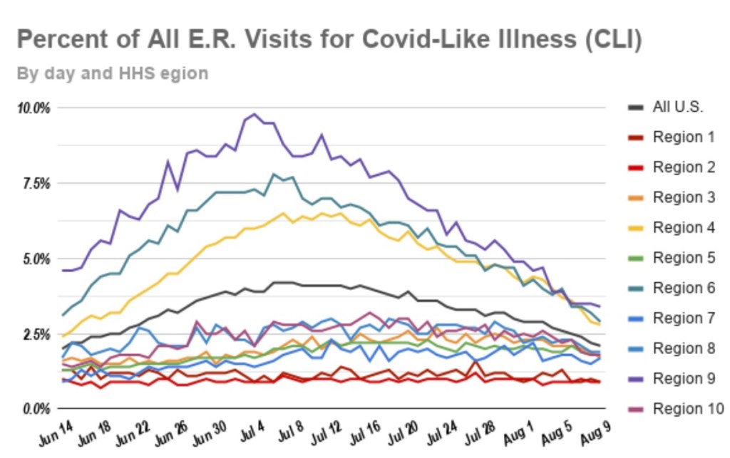
Nationwide, the CLI percentage at ERs has decreased by about 47% over the past four weeks, and the positivity rate has decreased by about 28% in that time. In addition to these favorable trends, COVID hospitalizations have decreased by about 40% over the past three weeks. All of these trends bode well for a downturn in COVID-attributed deaths.
The summertime surge in the virus was not nearly as ravaging as in the spring, and it appears to be fading. We’ll await developments in the fall, but we’ve come a long way in terms of protecting the vulnerable, treating the infected, approaching herd immunity thresholds (which means reduced rates of transmission to susceptible individuals), and the real possibility that we can put the pandemic behind us.
