• About

Sacred Cow Chips

Sacred Cow Chips

Tag Archives: Hospitalizations

Chill-Out Advisory: Pandemic to Endemic Means Live Again

13 Sunday Feb 2022

Posted by Nuetzel in Pandemic, Public Health, Uncategorized

≈ Leave a comment

Tags

Acquired Immunity, Biden Administration, CDC, Child Risks, Covid-19, Covid-Like Symptoms, Covidestim.org, Delta Variant, EU Visits, HOLD2, Hope-Simpson Seasonal Pattern, Hospital Utilization, Hospitalizations, Incidental Infections, John Tierney, Lockdowns, Mask Efficacy, Natural Immunity, Omicron BA.1, Omicron BA.2, Omicron Variant, Our World In Data, Phil Kerpen, Staffed Beds, Teachers Unions, Tradeoffs, Transmissability, Vaccine Efficacy, Vaccine Risks, Virulence

We might be just be done with the coronavirus pandemic. That is, it appears to be transitioning to a more permanent endemic phase. What follows are a few details about the Omicron wave and its current status, an attempt to put the risks of Covid in perspective, and a few public policy lessons that are now gaining broad currency but should have been obvious long ago.

What’s The Status?

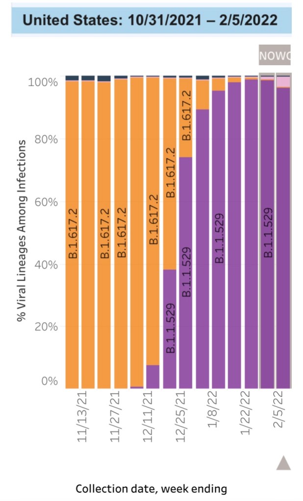
The Omicron variant became the dominant U.S. strain of the coronavirus in December. Omicron outcompeted Delta, which was very good news because Omicron is far less severe. The chart below (from the CDC Data Tracker site) shows Omicron’s rapid ascendance and displacement of the Delta variant. The orange bar segments represent the proportion of cases of the Delta strain, while the purple and pink segments are Omicron sub-variants known as BA.1 and BA.2, respectively. BA.2 is even more transmissible than BA.1 and is likely to become dominant over the next month or so. However, the BA.2 sub-variant appears to be far less virulent than Delta, like BA.1.

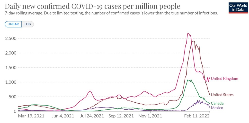
Despite a record number of infections over a period of a month or so, the Omicron wave is tapering just as rapidly as it ramped up, as the next chart demonstrates. In fact, covidestim.org shows that cases are now receding in all states, DC, and Puerto Rico. Here are new cases per million people from Our World in Data:

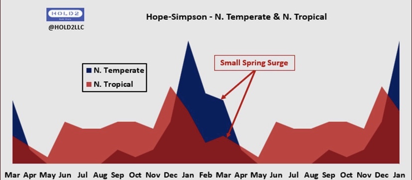
Whether BA.2 causes cases to plateau for a while, or even a secondary Omicron “wavelet”, is yet to be seen. That would be consistent with the normal Hope-Simpson seasonal pattern of viral prevalence in the northern hemisphere (hat tip: HOLD2):

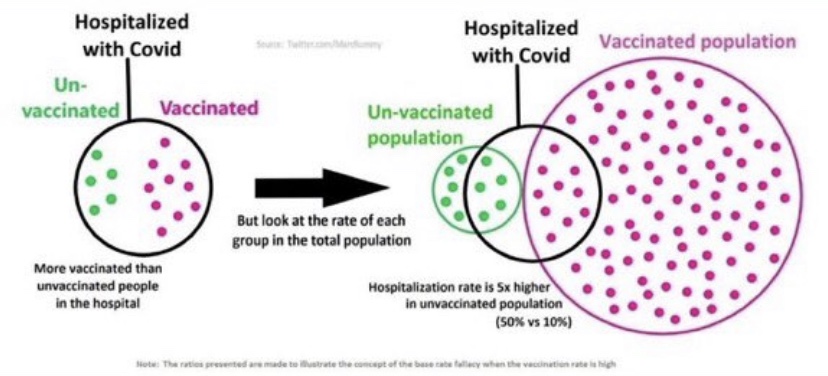
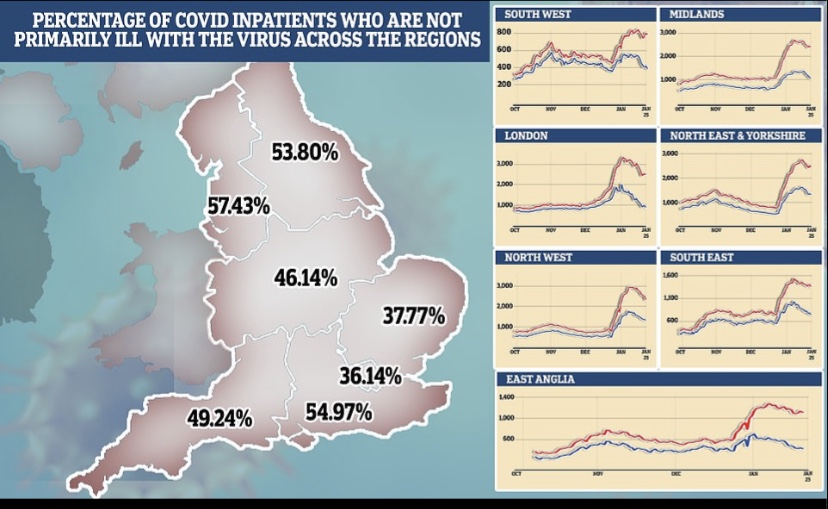
Data problems make the Omicron wave difficult to assess, however. We don’t know the share of incidental infections for the U.S. as a whole, but more than half of hospitalized Covid patients in Massachusetts and Rhode Island are classified with incidental infections. The proportion in the UK is estimated to be rising and approaching 30% of total cases, with much higher percentages in many regions of England, as shown below.

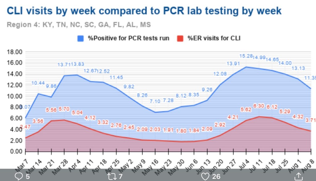
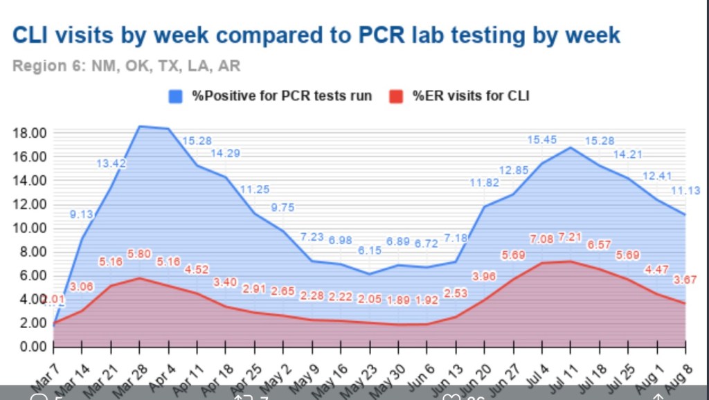
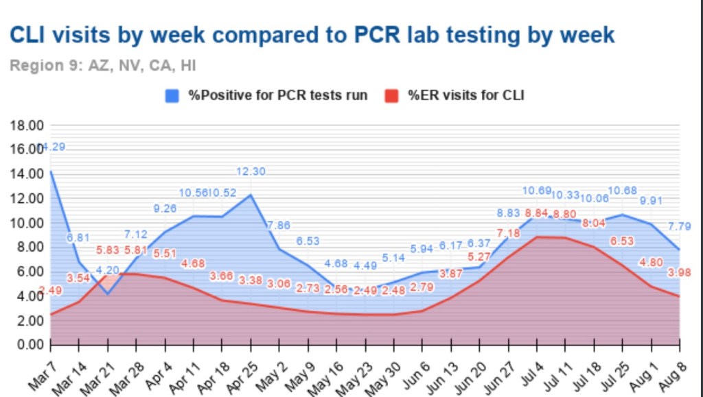
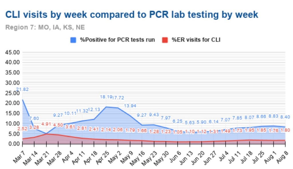
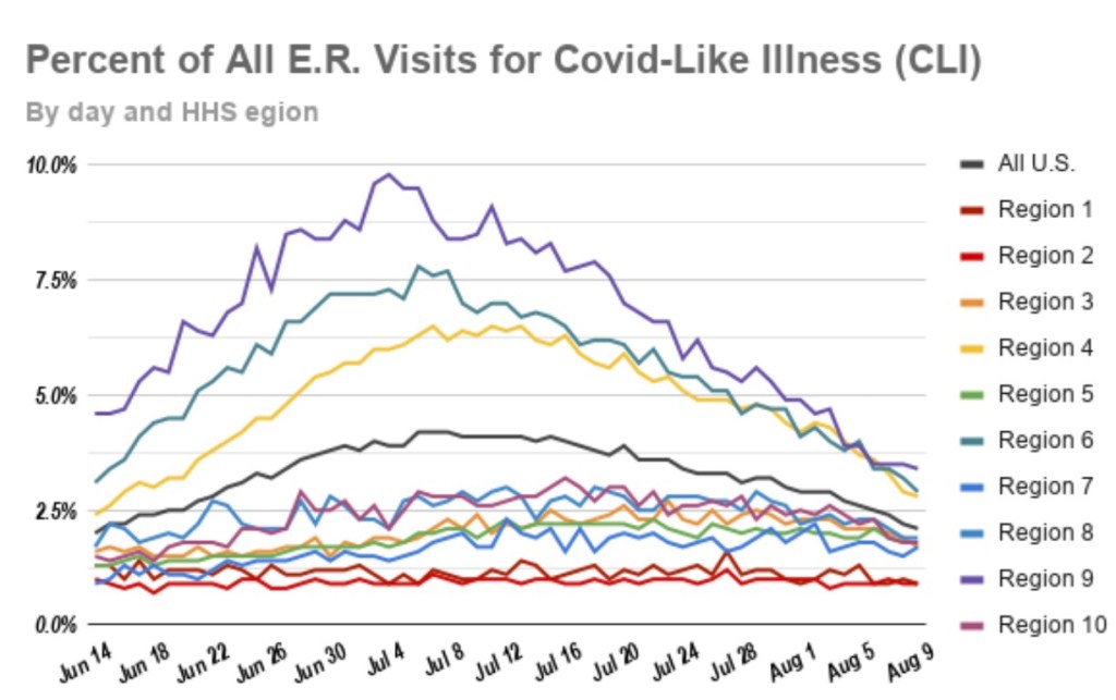
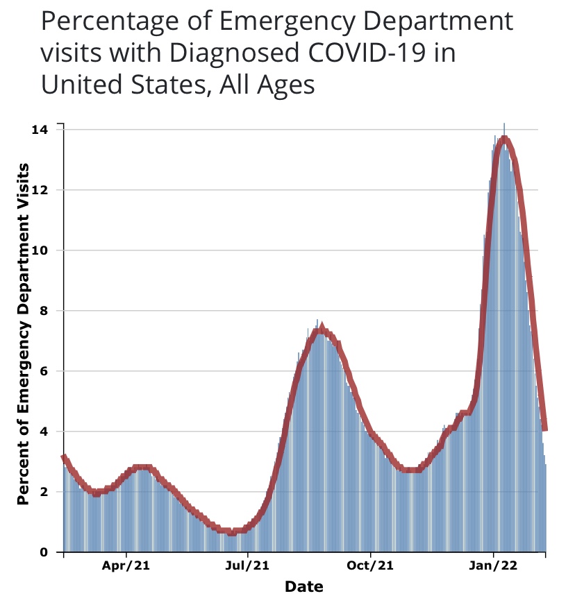
As I’ve emphasized in the past, case numbers should not be the primary gauge of the state of the pandemic, especially with a more highly contagious but relatively mild variant like Omicron. Hospitalizations are a better measure, but only if “incidental” infections are removed from the counts. That’s been acknowledged only recently by the public health establishment, and even the Biden Administration is emphasizing it as a matter of sheer political expediency. Another measure that might be more reliable for assessing the pandemic in the community as a whole is the number of emergency room patients presenting Covid-like symptoms. From the CDC Data Tracker:

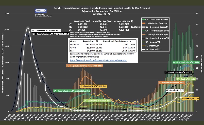
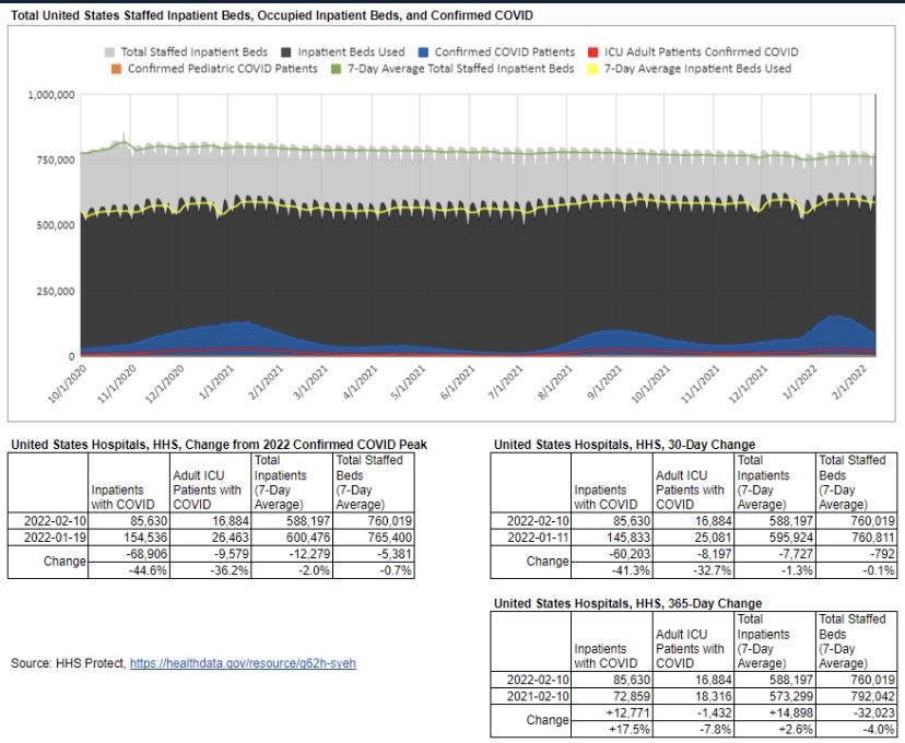
There is no doubt that incidental infections create complications in caring for patients with other ailments. That has a bearing on the utilization of hospital capacity. Generally, however, strains on hospital capacity during the pandemic have been greatly exaggerated. This is not to diminish the hard work and risks faced by health care workers, and there have been spot shortages of capacity in certain localities. However, in general, staffed beds have been more than adequate to meet needs. This chart, like a few others below, is courtesy of Phil Kerpen:

With the more highly transmissible variants we have now, it’s not at all surprising to see a high proportion of incidental cases among inpatients. Incidental infections are likely to inflate counts of Covid deaths as well, given the exceptional and odd way in which Covid deaths are being recorded. It will be some time until we see full U.S. data on cases and deaths net of incidental infections. Moreover, many of the Covid deaths in December and January were from lingering Delta infections, which might still be a factor in the February counts.

How Are Your Odds?

The mild or asymptomatic nature of most Omicron cases, the large proportion of incidental hospitalizations, and the knowledge that Omicron is not a deep respiratory threat should offer strong reassurance to healthy individuals that the variant does not pose a great risk. According to a recent CDC report, in a sample of almost 700,000 vaccinated individuals aged 65 or less without co-morbidities, there were no Covid fatalities or ICU admissions during the 10 months from December 2020 through October 2021. There was only one fatality in the sample of healthy individuals older than 65. There were just 36 fatalities across the full sample of over 1.2 million vaccinated individuals, so COVID’s fatality risk was only about 0.3%. Of those deaths, 28 were among those with four or more risk factors (including co-morbidities and > 65 years). And this was before the advent of Omicron!

I have a few doubts about the CDC’s sample selection and vagaries around certain definitions used. Nevertheless, the results are striking. However, the study did not address risks to unvaccinated adults. Another more limited CDC study found that vaccinated patients were still less likely than the unvaccinated to require critical care during the Omicron wave.

A separate CDC study found a 91% reduction in the likelihood of death for Omicron relative to Delta. A study from the UK (see summary here) found that Omicron cases were 59% less likely than Delta cases to require hospitalization and 69% less likely to result in death within 28 days of a positive test. Omicron was far less deadly among both the vaccinated and the unvaccinated, and the latter had a larger reduction in the likelihood of death. The study was stratified by age as well, with less severe outcomes for Omicron among older cohorts except in the case of death, for which there was no apparent age gradient.

Another unnecessarily contentious issue has been the risk to children during the pandemic. Based on the data, there should never have been much doubt that these risks are quite low. Apparently, however, it was advantageous for teachers’ unions to insist otherwise. Phil Kerpen soundly debunks that claim with the following chart:

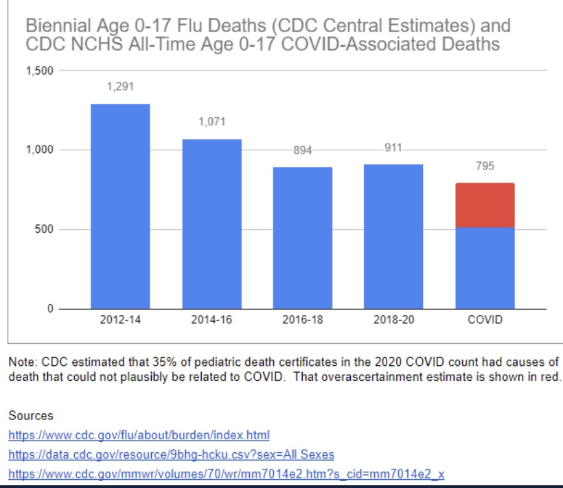
Covid has been less deadly to children from infancy through 17 years than the pre-pandemic flu going back to 2012! Oh yes, but teachers FEAR transmission from the children! That claim is just as silly, since children are known to be inefficient transmitters of the virus (and see here).

Now that Omicron has relegated the Delta variant to the history books, the risks going forward seem much more manageable. Omicron is less severe, especially for the vaccinated. Levels of acquired (natural) immunity from earlier infections are now much higher against older strains, and Omicron infections seem to be protective against Delta.

In commentary about the first CDC study discussed above, John Tierney lends perspective to the odds of death from pre-Omicron Covid:

“Those are roughly the same odds that in the course of a year you will die in a fire, or that you’ll perish by falling down stairs. Going anywhere near automobiles is a bigger risk: you’re three times more likely during a given year to be killed while riding in a car, and also three times more likely to be a pedestrian casualty. The 150,000-to-1 odds of a Covid death are even longer than the odds over your lifetime of dying in an earthquake or being killed by lightning.”

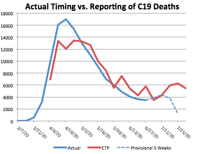
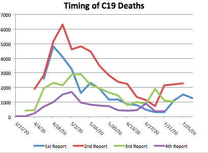
Yet with all this research confirming the low odds of death induced by Omicron, why have we seen recent deaths at levels approaching previous waves? First, many of those deaths are carried over from Delta infections. That means deaths should begin to taper rapidly as February reports roll in. And remember that daily reports do not show deaths by date of death. Deaths usually occur weeks or even months before they are reported. That also means some of the deaths reported might be “harvested” from much earlier fatalities. Second, given the high levels of incidental Omicron infections, some of those deaths are misattributed to Covid, an issue that is not new by any means. Finally, while Omicron is relatively mild for most people, the high rate of transmission means that a high number of especially vulnerable individuals may be infected with severe outcomes. We have seen much more severe consequences for the unvaccinated, of course, and for those with co-morbidities.

Things We Should Have Known

I’ll try to keep this last section brief, but as an introduction I’ll just say that it’s almost as if we’ve been allowing the lunatics to run the asylum. To paraphrase one comment I saw recently, if you wonder why there is so much dissent, you ought to consider the fact the much of what our governments have done (along with many private organizations) was to prohibit things that were demonstrably safe (e.g., going outside, using swing sets, or attending schools) and to encourage things that were demonstrably harmful (e.g., deferring medical care, or masking small children).

The following facts are only now coming into focus among those who’ve been “following the politics” rather than “the science”, despite pretensions to the latter.

  • Specific public health initiatives often face steep economic, emotional, social, and countervailing health tradeoffs.
  • Lockdowns do NOT work.
  • Masks do NOT work (despite the CDC’s past and recent confusion on the matter).
  • Children are at very low-risk from Covid.
  • Children do NOT present high risks to teachers.
  • Natural immunity is more protective than vaccines.
  • Vaccines do NOT “stop the spread”.
  • Vaccine risks might outweigh benefits for certain groups and individuals.
  • Vaccines should NOT be relied upon at the expense of treatments.
  • Don’t reject treatments based on politics.
  • Vaccine mandates are unethical.

Grow Up and Chill Out!

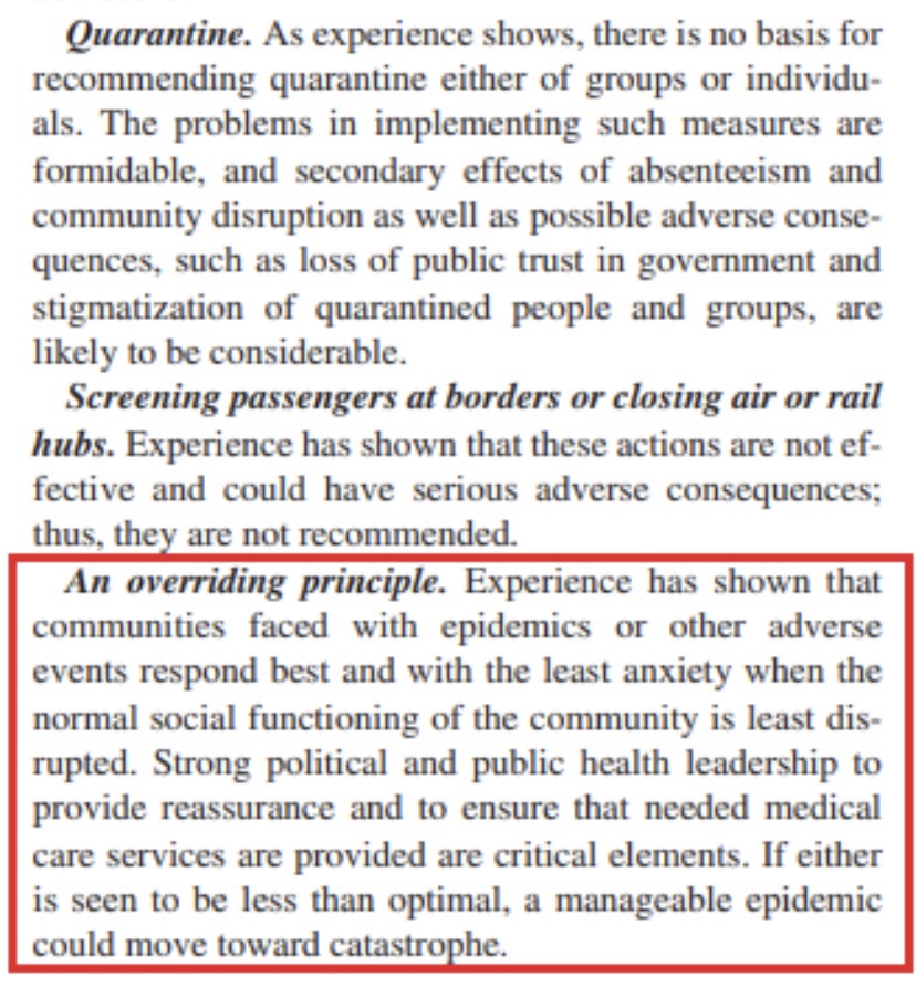
Life is full of risks, and nothing has changed to alter wisdom gained in earlier pandemics. For example, this pearl from a 2006 publication on disease mitigation measures should be heeded (hat tip: Phil Kerpen):

If there is one simple message everyone needs to hear, it is to stop allowing the virus bogeyman to rule your life. It will never go away completely, and it is likely to present risks that is are comparable to the flu going forward. In fact, it might well compete with the flu, which means we won’t be dealing with endemic Covid plus historical flu averages, but some smaller union of the two case loads.

So get out, go back to work, or go have some fun! Get back truckin’ on!

Vagaries of Vaccine Efficacy

23 Sunday Jan 2022

Posted by Nuetzel in Coronavirus, Vaccinations

≈ 1 Comment

Tags

Antibodies, aparachick, B-Cells, Breakthrough Infections, Conditional Probability, Covid-19, Great Barrington Declaration, Hospitalizations, Immune Escape, Immune Response, Infections, Jay Bhattacharya, Mutations, Natural Immunity, Omicron Variant, Public Health, Seroprevalence, T-Cells, Transmissability, Vaccine Efficacy, Vaccine Mandate, Virulence, Wuhan

There should never have been any doubt that vaccines would not stop you from “catching” the coronavirus. Vaccines cannot stop virus particles from lodging in your nose or your eyeballs. The vaccines act to prime the immune system against the virus, but no immune response is instantaneous. In other words, if you aren’t first “infected”, antibodies don’t do anything! A virus may replicate for at least a brief time, and it is therefore possible for a vaccinated individual to carry the virus and even pass it along to others. The Omicron variant has proven that beyond a shadow of a doubt, though the wave appears to be peaking in most of the U.S. and has peaked already in a few states, mostly in the northeast.

I grant that the confusion over “catching” the virus stems from an imprecision in our way of speaking about contracting “bugs”. Usually we don’t say we “caught” one unless it actually makes us feel a bit off. We come into intimate contact with many more bugs than that. The effects are often so mild that we either don’t notice or brush it off without mention. But when it comes to pathogens like Covid and discussions of vaccine efficacy (VE), it’s obviously useful to remember the distinction between infections, on the one hand, and symptomatic infections on the other.

Cases Are the Wrong Focus

Unless calibrated by seroprevalence data, these studies are not based on proper estimates of infections in the population. Asymptomatic people are much less likely to get tested, and vaccinated individuals who are infected are either much more likely to be asymptomatic or the test might not detect the weak presence of a virus at all. VE based on detected infections is essentially meaningless unless testing is universal.

We are bombarded by studies (and analyses like the one here) alleging that VE should be judged on the reduction in infections among the vaccinated. The likelihood of a detected infection by vaccination status is simply the wrong way to measure of VE. It’s not so much the direction of bias in measured VE, however. The mere presence of cases among the vaccinated has been sufficient to inflame anti-vax sentiment, especially cases detected in mandatory tests at hospitals, where the infections are often incidental to the primary cause of admission.

The typical evolution of a novel virus is further reason to dismiss case numbers as a basis for measuring VE. Mutations create new variants in ways that usually promote the continuing survival of the lineage. Subsequent variants tend to be more transmissible and less deadly to their hosts. Thus, given a certain “true” degree of VE, so-called breakthrough infections among the vaccinated are even more likely to be asymptomatic and less likely to be tested and/or detected.

There is the matter of immune escape or evasion, however, which means that sometimes a virus mutates in ways that get around natural or vaccine-induced immune responses. While such a variant is likely to be less dangerous to unvaccinated hosts, more cases among the vaccinated will turn up. That should not be interpreted as a deterioration in VE, however, because detected infections are still the wrong measure. Instead, the fundamental meaning of VE is a lower virulence or severity of a variant in vaccinated individuals than in unvaccinated individuals.

Interestingly, to digress briefly, while immune escape has been discussed in connection with Omicron, that variant’s viral ancestors may have predated even the original Covid strain released from the Wuhan lab! It is a fascinating mystery.

Virulence

In fact, vaccines have reduced the virulence of Covid infections, and the evidence is overwhelming. See here for a CDC report. The chart below is Swiss data, followed by a “handy” report from Wisconsin:

From the standpoint of virulence, there are other kinds of misguided comparisons to watch out for: these involve vaxed and unvaxed patients with specific outcomes, like the left side of the graphic at the top of this post (credit to Twitter poster aparachick). This thread has an excellent discussion of the misconception inherent in the claim that vaccines haven’t reduced severity: the focus is on the wrong conditional probability (again, like the left side of the graphic). Getting that wrong can lead to highly inaccurate conclusions when the sizes of the two key groups, hospitalizations and vaccinated individuals in this case, are greatly different.

Bumbled Messaging

The misunderstandings about VE are just one of many terrible failures of public health authorities over the course of the pandemic. There seems to have been fundamental miscommunication by the vaccine manufacturers and many others in the epidemiological community about what vaccines can and cannot do.

Another example is the apparent effort to downplay the importance of natural immunity, which is far more protective than vaccines. This looks suspiciously like a willful effort to push the narrative that universal vaccination as the only valid course for ending the pandemic. Even worse, the omission was helpful to those attempting to justify the tyranny of vaccine mandates.

Waning Efficacy

It should be noted that the efficacy of vaccines will wane over time. This phenomenon has been measured by the presence of antibodies, which is a valid measure of one aspect of VE over time. However, immune responses are more deeply embedded in the human body: so-called T-cells carry messages alerting so-called B-cells to the presence of viral “invaders”. The B-cells then produce new antibodies specific to characteristics of the interloping pathogen. Thus, these cells can function as a kind of “memory” allowing the immune system to mount a fresh antibody defense to a repeat or similar infection. The reports on waning antibodies primarily in vaccinated but uninfected individuals do not and cannot account for this deeper process.

Conclusion

Vaccines don’t necessarily reduce the likelihood of infection or even the spread of the virus, but they absolutely limit virulence. That’s why Jay Bhattacharya, one of the authors of The Great Barrington Declaration, says the vaccines provide a private benefit, but only a limited public benefit. Yet too often we see VE measured by the number of infections detected, and vaccine mandates are still motivated in part by the idea that vaccines offer protection to others. They might do that only to the extent that infections are less severe and clear-up more quickly.

Three Justices Reveal Astonishing Covid Ignorance

10 Monday Jan 2022

Posted by Nuetzel in Coronavirus, Supreme Court, Vaccinations

≈ Leave a comment

Tags

Commerce Clause, Covid-19, Delta Variant, Ed Morrissey, Elena Kagan, Hospitalizations, Major Question Doctrine, Neil Gorsuch, Omicron Variant, OSHA, Phil Kerpen, Police Powers, Sonia Satamayor, Stephen Breyer, Tenth Amendment, Transmission, Twitter, Vaccine Mandate, Ventilators

Good God! What a remarkable display of ignorance we witnessed on Friday from three different Supreme Court justices. This trio dumped buckets-full of erroneous information about the current state of the COVID pandemic, all points that are easily falsifiable. The three are Sonia Satamayor, Stephen Breyer, and Elena Kagan. The flub-fest occurred during a proceeding on challenges to OSHA’s attempt to impose a nationwide vaccine mandate on private employers having more than 100 employees. I’m sorely tempted to say these jurists must know better, but perhaps they were simply parroting what they’ve heard from “reliable” media sources.

Here’s a list of the false assertions made by the three justices at the hearing, as compiled by Michael P. Sanger, along with my own brief comments:

  • 100,000 children in critical care and on ventilators (Sotomayor) — Not even close!
  • Vaccine mandate would prevent 100% of US cases (Breyer) — Lol!
  • 750 million people tested positive last Thursday (Breyer) — That’s more than twice the U.S. population… in one day! Haha! See here.
  • COVID deaths are at an all-time high (Sotomayor) — No, they are well under half of the all-time high, and many of those “announced” deaths are Delta deaths and deaths that occurred weeks to months ago.
  • It’s “beyond settled” that vaccines and masks are the best way to stop the spread (Kagan) — Say what?
  • COVID vaccines stop transmission (Kagan) — Is that why two fully vaccinated attorneys arguing the government’s case just tested positive?
  • Federal agencies can mandate vaccines using the police powers of the federal government (Sotomayor) — Incorrect, not at their fancy. Police powers with respect to health, safety and morals are generally reserved to the states by the Tenth Amendment. The Commerce Clause allows Congress to regulate these powers through federal agencies on “major questions”. Congress, however, has never acted on the question of vaccine mandates.
  • Hospitals are nearing capacity (Sotomayor) — Again, no! And see here.
  • Omicron is deadlier than Delta (Sotomayor) — Omicron may be more severe than the common cold in some cases, but all indications are that it has much lower severity than the Delta variant.
  • Hospitals are full of unvaccinated people (Breyer) — No, on two counts: 1) hospitals are not full, and 2) there are COVID hospitalizations among the vaccinated as well. Also see here.

I’ve covered most of these points on this blog at various times in the past, a few links to which are provided in the bullets above. As one wag said, it’s almost as if these justices read nothing but the New York Times, the paper that once assured the world that Joseph Stalin was actually a pretty decent fellow. With tongue firmly in cheek, Ed Morrissey asked whether Twitter would suspend Justice Sotomayor for spreading COVID misinformation.

There also followed a desperate attempt by left-wing journalists to convince themselves and their followers that Justice Neil Gorsuch had incorrectly claimed hundreds of thousands of people die from the flu every year. The actual Gorsuch quote in the transcript reads:

“Flu kills—I believe—hundreds, thousands of people every year.”

And that indeed is what can be heard clearly on the audio (short clip here). But in the fertile imaginations of the lefty commentariat, Gorsuch uttered an extra “of”. Gorsuch was clearly correcting himself mid-sentence. As noted by Phil Kerpen, the line of questioning had to do with the establishment of a limiting principle under which OSHA could conceivably have authority to impose a vaccine mandate. Naturally, Gorsuch intended to quote a number smaller than the count of COVID deaths.

Most of the justices appeared to lean against the OSHA mandate. We’ll probably get a ruling this week. However, the episode vividly illustrates the power of the leftist mainstream media and social media to manipulate beliefs, even beliefs held by individuals of formidable intellect. It also shows how fiercely people cling to falsehoods supporting their ideological mood affiliations.

Vax Results, Biden Boosters, Delta, and the Mask Charade

19 Thursday Aug 2021

Posted by Nuetzel in Coronavirus, Public Health, Uncategorized, Vaccinations

≈ Leave a comment

Tags

Aerosols, Antibody Response, Biden Administration, Case Counts, City Journal, Covid-19, Delta Variant, Follow the Science, Hope-Simpson, Hospitalizations, Israeli Vaccinations, Jeffrey H. Anderson, Jeffrey Morris, Mask Mandates, Moderna, mRNA Vaccines, Pfizer, Randomized Control Trials, Reproduction Rates, The American Reveille, Transmissability, Vaccinations, Vaccine Efficacy

If this post has an overarching theme, it might be “just relax”! That goes especially for those inclined to prescribe behavioral rules for others. People can assess risks for themselves, though it helps when empirical information is presented without bias. With that brief diatribe, here are a few follow-ups on COVID vaccines, the Delta wave, and the ongoing “mask charade”.

Israeli Vax Protection

Here is Jeffrey Morris’ very good exposition as to why the Israeli reports of COVID vaccine inefficacy are false. First, he shows the kind of raw data we’ve been hearing about for weeks: almost 60% of the country’s severe cases are in vaccinated individuals. This is the origin of the claim that the vaccines don’t work. 

Next, Morris notes that 80% of the Israeli population 12 years and older are vaccinated (predominantly if not exclusively with the Pfizer vaccine). This causes a distortion that can be controlled by normalizing the case counts relative to the total populations of the vaccinated and unvaccinated subgroups. Doing so shows that the unvaccinated are 3.1 times more likely to have contracted a severe case than the vaccinated. Said a different way, this shows that the vaccines are 67.5% effective in preventing severe disease. But that’s not the full story!

Morris goes on to show case rates in different age strata. For those older than 50 (over 90% of whom are vaccinated and who have more co-morbidities), there are 23.6 times more severe cases among the unvaccinated than the vaccinated. That yields an efficacy rate of 85.2%. Vaccine efficacy is even better in the younger age group: 91.8%. 

These statistics pertain to the Delta variant. However, it’s true they are lower than the 95% efficacy rate achieved in the Pfizer trials. Is Pfizer’s efficacy beginning to fade? That’s possible, but this is just one set of results and declining efficacy has not been proven. Israel’s vaccination program got off to a fast start, so the vaccinated population has had more time for efficacy to decay than in most countries. And as I discussed in an earlier post, there are reasons to think that the vaccines are still highly protective after a minimum of seven months.

Biden Boosters

IIn the meantime, the Biden Administration has recommended that booster shots be delivered eight months after original vaccinations. There is empirical evidence that boosters of similar mRNA vaccine (Pfizer and Moderna) might not be a sound approach, both due to side effects and because additional doses might reduce the “breadth” of the antibody response. We’ll soon know whether the first two jabs are effective after eight months, and my bet is that will be the case.

Is Delta Cresting?

Meanwhile, the course of this summer’s Delta wave appears to be turning a corner. The surge in cases has a seasonal component, mimicking the summer 2020 wave as well as the typical Hope-Simpson pattern, in which large viral waves peak in mid-winter but more muted waves occur in low- to mid-latitudes during the summer months.

Therefore, we might expect to see a late-summer decline in new cases. There are now 21 states with COVID estimated reproduction rates less than one (this might change by the time you see the charts at the link). In other words, each new infected person transmits to an average of less than one other person, which shows that case growth may be near or beyond a peak. Another 16 states have reproduction rates approaching or very close to one. This is promising.

Maskholes

Finally, I’m frustrated as a resident of a county where certain government officials are bound and determined to impose a mask mandate, though they have been slowed by a court challenge. The “science” does NOT support such a measure: masks have not been shown to mitigate the spread of the virus, and they cannot stop penetration of aerosols in either direction. This recent article in City Journal by Jeffrey H. Anderson is perhaps the most thorough treatment I’ve seen on the effectiveness of masks. Anderson makes this remark about the scientific case made by mask proponents:

“Mask supporters often claim that we have no choice but to rely on observational studies instead of RCTs [randomized control trials], because RCTs cannot tell us whether masks work or not. But what they really mean is that they don’t like what the RCTs show.”

Oh, how well I remember the “follow-the-science” crowd insisting last year that only RCTs could be trusted when it came to evaluating certain COVID treatments. In any case, the observational studies on masks are quite mixed and by no means offer unequivocal support for masking. 

A further consideration is that masks can act to convert droplets to aerosols, which are highly efficient vehicles of transmission. The mask debate is even more absurd when it comes to school children, who are at almost zero risk of severe COVID infection (also see here), and for whom masks are highly prone to cause developmental complications.

Closing Thoughts

The vaccines are still effective. Data purporting to show otherwise fails to account for the most obvious of confounding influences: vaccination rates and age effects. In fact, the Biden Administration has made a rather arbitrary decision about the durability of vaccine effects by recommending booster shots after eight months. The highly transmissible Delta variant has struck quickly but the wave now shows signs of cresting, though that is no guarantee for the fall and winter season. However, Delta cases have been much less severe on average than earlier variants. Masks did nothing to protect us from those waves, and they won’t protect us now. I, for one, won’t wear one if I can avoid it.

Herd Immunity To Public Health Bullshitters and To COVID

16 Monday Aug 2021

Posted by Nuetzel in Coronavirus, Herd Immunity, Uncategorized

≈ Leave a comment

Tags

Acquired Immunity, Aerosols, AstraZeneca, Border Control, Breakthrough Infections, Case Counts, Covid-19, Delta Variant, Endemicity, Herd Immunity, Hospitalizations, Immunity, Lockdowns, Mask Mandates, Oxford University, Paul Hunter, PCR Tests, School Closings, ScienceAlert, Sir Andrew Pollard, T-Cell Immunity, Transmissability, University of East Anglia, Vaccinations, Vaccine Hesitancy

My last post had a simple message about the meaning of immunity: you won’t get very sick or die from an infection to which you are immune, including COVID-19. Like any other airborne virus, that does NOT mean you won’t get it lodged in your eyeballs, sinuses, throat, or lungs. If you do, you are likely to test positive, though your immunity means the “case” is likely to be inconsequential.

As noted in that last post, we’ve seen increasing COVID case counts with the so-called Delta variant, which is more highly transmissible than earlier variants. (This has been abetted by an uncontrolled southern border as well.) However, as we’d expect with a higher level of immunity in the population, the average severity of these cases is low relative to last year’s COVID waves. But then I saw this article in ScienceAlert quoting Sir Andrew Pollard, a scientist affiliated AstraZeneca and the University of Oxford. He says with Delta, herd immunity “is not a possibility” — everyone will get it.

Maybe everyone will, but that doesn’t mean everyone will get sick. His statement raises an obvious question about the meaning of herd immunity. If our working definition of the term is that the virus simply disappears, then Pollard is correct: we know that COVID is endemic. But the only virus that we’ve ever completely eradicated is polio. Would Pollard say we’ve failed to achieve herd immunity against all other viruses? I doubt it. Endemicity and herd immunity are not mutually exclusive. The key to herd immunity is whether a virus does or does not remain a threat to the health of the population generally.

Active COVID infections will be relatively short-lived in individuals with “immunity”. Moreover, viral loads tend to be lower in immune individuals who happen to get infected. Therefore, the “infected immune” have less time and less virus with which to infect others. That creates resistance to further contagion and contributes to what we know as herd immunity. While immune individuals can “catch” the virus, they won’t get sick. Likewise, a large proportion of the herd can be immune and still catch the virus without getting sick. That is herd immunity.

One open and controversial question is whether uninfected individuals will require frequent revaccination to maintain their immunity. A further qualification has to do with asymptomatic breakthrough infections. Those individuals won’t see any reason to quarantine, and they may unwittingly transmit the virus.

I also acknowledge that the concept of herd immunity is often discussed strictly in terms of transmission, or rather its failure. The more contagious a new virus, like the Delta variant, the more difficult it is to achieve herd immunity. Models predicting low herd immunity thresholds due to heterogeneity in the population are predicated on a given level of transmissibility. Those thresholds would be correspondingly higher given greater transmissibility.

A prominent scientist quoted in this article is Paul Hunter of the University of East Anglia. After backing-up Pollard’s dubious take on herd immunity, Hunter drops this bit of real wisdom:

“We need to move away from reporting infections to actually reporting the number of people who are ill. Otherwise we are going to be frightening ourselves with very high numbers that don’t translate into disease burden.”

Here, here! Ultimately, immunity has to do with the ability of our immune systems to fight infections. Vaccinations, acquired immunity from infections, and pre-existing immunity all reduce the severity of later infections. They are associated with reductions in transmission, but those immune responses are more basic to herd immunity than transmissability alone. Herd immunity does not mean that severe cases will never occur. In fact, more muted seasonal waves will come and go, inflicting illness on a limited number of vulnerables, but most people can live their lives normally while viral reproduction is contained. Herd immunity!

Sadly, we’re getting accustomed to hearing misstatements and bad information from public health officials on everything from mask mandates, lockdowns, and school closings to hospital capacity and vaccine hesitancy. Dr. Pollard’s latest musing is not unique in that respect. It’s almost as if these “experts” have become victims of their own flawed risk assessments insofar as their waning appeal to “the herd” is concerned. Professor Hunter’s follow-up is refreshing, however. Public health agencies should quit reporting case counts and instead report only patients who present serious symptoms, COVID ER visits, or hospitalizations.

Hooray For Florida!

22 Monday Feb 2021

Posted by Nuetzel in Coronavirus, Public Health

≈ 2 Comments

Tags

Andrew Cuomo, Biden Administration, California, Coronavirus, Covid-19, Deaths, Florida, Hospitalizations, Infections, Lockdowns, NBC News, New York, Ron DeSantis, Stephen King, Vaccinations

It’s been said that many of the so-called “heroes” of the COVID pandemic who’ve been celebrated by the media are actually villains, and perhaps Governor Andrew Cuomo of New York should top the list. He saw to it that retirement homes were seeded with infected patients by ordering them returned their care homes rather than admitted to hospitals. Deaths in these facilities mounted, and they mounted faster than Cuomo’s administration was willing to admit. But the media and even Democrat state legislators have begun to take note, which is practically a miracle!

It seems equally true that some vilified by the media for their COVID response are actually heroes. Governor Ron DeSantis of Florida might deserve top honors here. Having spent the last month in Florida, I can attest that the business and social environment here is quite open compared to my home state (despite the presence of a few freaked out northerners who can’t quite fathom how stupid they look wearing masks on the beach). Florida’s infections, hospitalizations, and deaths have been lower than in California, New York, and many other states where lockdown measures have been stringent. (The first chart below is just a little busy…)

As I’ve written for much of the past year, COVID is far more dangerous to the elderly than anyone else, particularly those with co-morbidities. It’s also true that blacks (and some other minorities) are more vulnerable than whites, but if we want to save more black lives, we’re still better off prioritizing the elderly than racial groups. DeSantis understands this, and Florida is among the leaders in vaccinating the elderly population. (States don’t report this data on a uniform basis):

This approach to saving lives is obvious, yet critics at outlets like NBC News insist that DeSantis must be pandering to the senior population in Florida. Well, one wouldn’t want to be responsive to voters who happen to face high mortality risks, right? Others such as horror writer Stephen King have jumped onboard to offer their bumbling public health expertise as well.

There were many experts and the usual collection of numbskulls on social media who were wrong about Florida. DeSantis handled the pandemic as it should have been handled elsewhere. But the propaganda to the contrary goes unabated. For example, this article is pathetic. Can these people be serious? Or are they really that stupid? This goes for the Biden Administration as well, which had entertained the notion of imposing federal travel restrictions on Florida!

The political attacks on Florida and its governor reveal the extent to which opponents wish to ignore the evidence in plain sight. The data on COVID outcomes put the lie to the narrative of a public health emergency requiring massive restrictions on personal liberty. We know those policies are powerless to control the course of the contagion. The pandemic, however, was the key to convincing the public to accept a more authoritarian role for government. It’s a blessing that not everyone bought in, and that there are places like Florida where you can still go about your business in approximate normalcy.

November Pandemic Perspective

18 Wednesday Nov 2020

Posted by Nuetzel in Coronavirus, Pandemic, Uncategorized

≈ Leave a comment

Tags

@tlowdon, Actual Date of Death, COVID, COVID Testing, COVID-Like Illness, Don Wolt, Excess Deaths, False Positives, Hospitalizations, ILI, Influenza-Like Illness, PCR Tests, Reported Deaths

I hope readers share my compulsion to see updated COVID numbers. It’s become a regular feature on this blog and will probably remain one until infections subside, vaccine or otherwise. Or maybe when people get used to the idea of living normally again in the presence of an endemic pathogen, as they have with many other pathogens and myriad risks of greater proportions, and as they should. That might require more court challenges, political changes, and plain old civil disobedience.

So here, then, is an update on the U.S. COVID numbers released over the past few days. The charts below are attributable to Don Wolt (@tlowdon on Twitter).

First, reported deaths began to creep up again in the latter half of October and have escalated in November. They’ve now reached the highs of the mid-summer wave in the south, but this time the outbreak is concentrated in the midwest and especially the upper midwest.

Reported deaths are the basis of claims that we are seeing 1,500 people dying every day, which is an obvious exaggeration. There have been recent days when reported deaths exceeded that level, but the weekly average of reported deaths is now between 1,100 and 1,200 a day.

It’s important to understand that deaths reported in a given week actually occurred earlier, sometimes eight or more weeks before the week in which they are reported. Most occur within three weeks of reporting, but sometimes the numbers added from four-plus weeks earlier are significant.

The following chart reproduces weekly reported deaths from above using blue bars, ending with the week of November 14th. Deaths by actual date-of-death (DOD) are shown by the orange bars. The most recent three-plus weeks always show less than complete counts of deaths by DOD. But going back to mid-October, actual weekly deaths were running below reported deaths. If the pattern were to follow the upswings of the first two waves of infections, then actual weekly deaths would exceed reported deaths by perhaps the end of October. However, it’s doubtful that will occur, in part because we’ve made substantial progress since the spring and summer in treating the disease.

To reinforce the last point, it’s helpful to view deaths relative to COVID case counts. Deaths by DOD are plotted below by the orange line using the scale on the right-hand vertical axis. New positive tests are represented by the solid blue line, using the left-hand axis, along with COVID hospitalizations. There is no question that the relationship between cases, hospitalizations, and deaths has weakened over time. My suspicions were aroused somewhat by the noticeable compression of the right axis for deaths relative to the two charts above, but on reviewing the actual patterns (peak relative to troughs) in those charts, I’m satisfied that the relationships have indeed “decoupled”, as Wolt puts it.

Cases are going through the roof, but there is strong evidence that a large share of these cases are false positives. COVID hospitalizations are up as well, but their apparent co-movement with new cases appears to be dampening with successive waves of the virus. That’s at least partly a consequence of the low number of tests early in the pandemic.

So where is this going? The next chart again shows COVID deaths by DOD using orange bars. Wolt has concluded, and I have reported here, that the single-best short-term predictor of COVID deaths by DOD is the percentage of emergency room visits at which patients presented symptoms of either COVID-like illness (CLI) or influenza-like illness (ILI). The sum of these percentages, CLI + ILI, is shown below by the dark blue line, but the values are shifted forward by three weeks to better align with deaths. This suggests that actual COVID deaths by DOD will be somewhere around 7,000 a week by the end of November, or about 1,000 a day. Beyond that time, the path will depend on a number of factors, including the weather, prevalence and immunity levels, and changes in mobility.

I am highly skeptical that lockdowns have any independent effect in knocking down the virus, though interventionists will try to take credit if the wave happens to subside soon for any other reason. They won’t take credit for the grim lockdown deaths reaped by their policies.

Despite the bleak prospect of 1,000 or more COVID-attributed deaths a day by the end of November, the way in which these deaths are counted is suspect. Early in the pandemic, the CDC significantly altered guidelines for the completion of death certificates for COVID such that deaths are often improperly attributed to the virus. Some COVID deaths stem from false-positive PCR tests, and again, almost since the beginning of the pandemic, hospitals were given a financial incentive to classify inpatients as COVID-infected.

It’s also important to remember that while any true COVID fatality is premature, they are generally not even close to the prematurity of lockdown deaths. That’s a simple consequence of the age profile of COVID deaths, which indicate relatively few life-years lost, and the preponderance of co-morbidities among COVID fatalities.

Again, COVId deaths are bad enough, but we are seeing an unacceptable and ongoing level of lockdown deaths. This is now to the point where they may account for almost all of the continuing excess deaths, even with the fall COVID wave. It’s probable that public health would be better served with reduced emphasis on COVID-mitigation for the general population and more intense focus on protecting the vulnerable, including the distribution of vaccines.

Evidence of Fading COVID Summer Surge

16 Sunday Aug 2020

Posted by Nuetzel in Pandemic

≈ Leave a comment

Tags

CDC, CLI, Covid Tracking Project, Covid-19, COVID-Like Illness, Date of Death, FEMA, FEMA Regions, Herd Immunity Threshold, Hospitalizations, Kyle Lamb, PCR Test, Percent Positive, Provisional Deaths

Lately I’ve talked a lot about reported deaths each week versus deaths by actual date of death (DOD). Much of that information came from Kyle Lamb’s Twitter account, and he’s the source of the charts below as well. The first one provides a convenient summary of the data reported through last week. The blue bars are reported deaths each week from the COVID Tracking Project (CTP), which are an aggregation of deaths that actually occurred over previous weeks. Again, the blue bars do NOT represent deaths that occurred in the reporting week. The solid orange bars are “provisional” actual deaths by DOD. “Provisional” means that recent weeks are not complete, though most deaths by DOD are captured within three to four weeks. The CDC also produces a “forecast” of final death counts by DOD, shown by the hatched orange bars.   

Note that the recent surge in deaths has been much smaller than the one in the spring, which was driven by deaths in the northeast. The CDC “expects” actual deaths by DOD to have declined starting after the week of July 23rd. However, CTP was still reporting deaths of over 1,000 per day last week. The actual timing of those deaths in prior weeks, and the ultimate extent of the summer surge in COVID deaths, remains to be seen.

Certain leading indicators of deaths are signaling declines in actual deaths in August. Two of those indicators are 1) the positivity rate on standard PCR tests for infections; and 2) the share of emergency room visits made for symptoms of “COVID Like Illness” (CLI). The charts below show those indicators for FEMA regions that had the largest uptrends in cases in June and July. Florida is part of Region 4, shown in the next chart:

Here is the Region 6, which includes Texas:

Finally, Region 8 includes Arizona and California:

Out of personal interest, I’m also throwing in Region 7 with a few midwestern states, where cases have risen but not to the levels reached in Regions 4, 6, and 8:

With the exception of the last chart, the clear pattern is a peak or plateau in the positivity rate in late June through late July, followed by declines in subsequent weeks. The share or ER visits for CLI was not quite coincident with the positivity rate, but close. The decline in the CLI share is evident in Regions 4, 6 and 8. Again, these three regions include states that drove the nationwide increase in cases this summer (AZ, CA, FL, and TX), and the surge appears to have maxed out.     

Here is a chart showing the share of CLI visits to ERs for all ten FEMA region from mid-June through last week. Clearly, this measure is improving across the U.S.

Nationwide, the CLI percentage at ERs has decreased by about 47% over the past four weeks, and the positivity rate has decreased by about 28% in that time. In addition to these favorable trends, COVID hospitalizations have decreased by about 40% over the past three weeks. All of these trends bode well for a downturn in COVID-attributed deaths.

The summertime surge in the virus was not nearly as ravaging as in the spring, and it appears to be fading. We’ll await developments in the fall, but we’ve come a long way in terms of protecting the vulnerable, treating the infected, approaching herd immunity thresholds (which means reduced rates of transmission to susceptible individuals), and the real possibility that we can put the pandemic behind us. 

COVID at Midsummer

04 Tuesday Aug 2020

Posted by Nuetzel in Pandemic, Public Health

≈ 2 Comments

Tags

Arizona, California, CDC, Coronavirus, COVID Time Series, Covid Tracking Project, Covid-19, Fatality Rate, Florida, Hospitalizations, Illinois, Kyle Lamb, Missouri, New Cases, New York, Provisional Deaths, Regional Variation, South Carolina, Tennessee, Texas

It’s been several weeks since I last posted on the state of the coronavirus pandemic (also see here). The charts below show seven-day moving averages of new confirmed cases and reported C19 deaths from the COVID Tracking Project as of August 3. Daily new cases began to flatten about three weeks ago and then turned down (it can take a few days for such changes to show up in a moving average). Daily C19-attributed deaths began climbing again in early July, lagging new cases by a few weeks, and they slowed just a bit over the past several days. Obviously, both are good news if those changes are maintained. The other thing to note is that deaths have remained far below their levels of April and early May.

The daily death count is that reported on each date, not when the deaths actually occurred. Each day’s report consists of deaths that were spread across several previous weeks or even a month or more. That makes the slight downturn in deaths more tenuous from a data perspective. There are sometimes large numbers of deaths from preceding weeks reported together on a single day, so reporting can be ragged and the final pattern of actual deaths is not known for some time. More on that below.

States

The increase in cases and deaths during late June and July was concentrated in four states: Arizona, California, Florida, and Texas. Here’s how those states look now in terms of cases and deaths, from the interactive COVID Time Series site:


New cases began to flatten or drop in these states two to three weeks ago, driving the change in the national data. Daily deaths have not turned convincingly, but again, these are reported deaths, which actually occurred over previous weeks. One more chart that is suggestive: current hospitalizations in these four states. The recent declines should bode well for the trend in reported deaths, but it remains to be seen. 

Meanwhile, other parts of the country have seen an uptrend in cases and deaths, such as Illinois, Missouri, South Carolina, and Tennessee. Here are new cases in those states:

It’s worth emphasizing that the elevated level of new cases this summer has not been associated with the rates of fatality experienced in the Northeast during the spring. There are many reasons: better patient care, new treatments, more direct summer sunlight, higher humidity, and tighter controls in nursing homes.

More On the Timing of Deaths

Back to the discrepancies in the timing of reported deaths and actual deaths. This is important because the reported totals each day and each week can be highly misleading, even to the point of frightening the public and policy makers, with consequent psychological and economic impacts.

The latest summary of provisional vs. reported deaths is shown below, courtesy of Kyle Lamb, who posts updates on his Twitter feed. This report ends with the last complete week ending August 1. It’s a little hard to read, but you might get a better look if you click on it or turn your phone sideways. Some of the key series are also graphed below. 

The table shows the actual timing of deaths in the fourth column, with dates alongside. The pattern differs from the statistics reported by the Covid Tracking Project (CTP) in the top row (shaded orange), and from the totals of actual deaths by reporting day in the third row (shaded gray). The reporting dates are always later than the dates of death. This can be seen in the chart below. The most obvious illustration is how many of the deaths from around the peak in mid-April were reported in May. In March and April, the daily reports were short of the ultimate actual death counts because so few deaths with associated dates were known by then.


The right-hand end of the red line shows that many deaths reported by CTP have not yet been placed at an actual date of death by the CDC.  At this point, the actual date of death has not been placed for over 10,000 deaths! Again, those will be spread over earlier weeks.

The blue line is dashed over the last four weeks because those counts are most “highly” provisional. Small changes in the actual counts are likely for dates even before that, but the last four weeks are subject to fairly substantial upward revisions. Eventually, the right end of the blue line will more closely approximate the totals shown in red.

To get an indication of trends in the actual timing of deaths, I plotted the weekly actual deaths reported for the last four reporting weeks going back in time. In the table, those are the four lowest, color-coded diagonals. In the graph below, which should include the qualifier “by recency of report week”, actual deaths in the most recent report week are represented by the blue line, the prior weekly report is red, followed by green (three weeks prior), and purple (four weeks prior… sorry, the colors are not consistent with those in the table). The lines extend farther to the right for more recent report weeks.

The increase in actual deaths occurring in July has declined or flattened in each of the four most recent report weeks. Only the second-to-last week increased as of the August 1st report. On the whole, those changes seem favorable, but we shall see.

Closing

It’s getting trite to say, but the next few weeks will be interesting. The increase in deaths in July was a sad development, but at least the extent of it appears to have been limited. Even with a somewhat higher death count, the fatality rate continued to decline. Let’s hope any further waves of infections are even less deadly.

Case Fatality, Stale Ratios and Exaggerated Loss

14 Tuesday Jul 2020

Posted by Nuetzel in Analytics, Pandemic

≈ Leave a comment

Tags

Antibodies, Case Fatality Rates, CDC, Coronavirus, COVID Time Series, Hospitalizations, Mortality Rate, Pandemic, Predictive Value, Serological tests

I hope someday I won’t feel compelled to write or worry about the coronavirus. However, as the pandemic wears on, it seems to take only a few days for issues to pile up, and I just can’t resist comment. Today I have a couple of beefs with uses of data and concomitant statements I’ve seen posted of late.

People are still quoting case fatality rates (CFRs) as if those cumulative numbers are relevant to the number of deaths we can expect going forward. They are not. Just as hair-brained are applications of cumulative hospitalization and ICU admittance rates to produce “rough and ready” estimates of what to expect going forward. Or, I’ve seen people express hospitalizations as ratios to CFR, as if those ratios will be the same going forward. Again, they are not. Let me try to explain.

The chart below shows the course of the U.S. CFR since the start of the pandemic. It’s taken from the interactive Covid Time Series site. My apologies if you have to click on the chart for decent viewing (or you can visit the site). The CFR at any date is the cumulative number of deaths to-date divided by the cumulative number of confirmed cases. It is a summary of past history, but it is not well-suited to making predictions about death rates in the future. The CFR began to taper a little before Memorial Day, and it is now at about 4% (as of July 13).

Out of curiosity, I also generated CFRs for AZ, CA, FL, GA, and TX, which now average about half of the national CFR. There’s an obvious lesson: if you must use CFRs, understand that they vary from place to place.

Again, CFRs are cumulative. Their changes over time can tell us something about recent trends, but even then they are flawed. For example, case counts have risen dramatically with more widespread testing. Those testing positive more recently are concentrated in younger age cohorts, for whom infections are much less severe. Treatment has improved dramatically as well, so there is little reason to expect the CFR’s of recently diagnosed cases to be as high as the latest CFRs shown above.

There is no easy way to calculate an unflawed “marginal” CFR for a recent period, though an effort to do so might improve the predictive value. Deaths lag behind case counts because the progression from early symptoms to death can take several weeks. Even more vexing for constructing a valid, recent fatality rate is that reporting of deaths is itself delayed, as I explained in my last post. Each day’s report of deaths captures deaths that may have occurred over a period of several weeks in the past, and sometimes many more.

Finally no CFR can capture the true mortality rate of the virus without ongoing, ubiquitous testing. As the state of testing stands, the true mortality rate must reflect undiagnosed cases in the denominator. The CDC’s latest “best” estimate of the true mortality rate is just 0.3%, and 0.05% for those aged 50 years or less. Those figures are based on serological tests for the presence of antibodies to C19 in more random samples of the population. Those findings reflect the extent of undiagnosed and/or asymptomatic cases.

The point is one shouldn’t be too blithe about throwing numbers around like 4% mortality based on the CFR, or even 1% mortality as a “nice, round number”, without heavy qualification. Those numbers are gross exaggerations of what we are likely to see going forward.

The same criticisms can be leveled at claims that hospitalizations will proceed at some fixed ratio relative to diagnosed cases, or some fixed ratio relative to deaths. Again, new cases tend to be less severe, so hospitalizations are likely to be a much lower ratio to cases than what is reflected in cumulative totals. Because of improved treatment, the ratio of deaths to hospitalizations will be much lower in the future as well.

CFRs are not a useful guide to future COVID deaths. The true mortality rate is a much better baseline, particularly for subsets of the population matching the current case load. Finally, and this is the only disclaimer I’ll bother to provide today, we all know that suffering is not confined to terminal cases, and it is not confined to the hospitalized subset. But don’t exaggerate the extent of your preferred interpretation of suffering by applying inappropriate cumulative calculations.


Follow Sacred Cow Chips on WordPress.com

Recent Posts

  • Oh To Squeeze Fiscal Discipline From a Debt Limit Turnip
  • Conformity and Suppression: How Science Is Not “Done”
  • Grow Or Collapse: Stasis Is Not a Long-Term Option
  • Cassandras Feel An Urgent Need To Crush Your Lifestyle
  • Containing An Online Viper Pit of Antisemites

Archives

  • February 2023
  • January 2023
  • December 2022
  • November 2022
  • October 2022
  • September 2022
  • August 2022
  • July 2022
  • June 2022
  • May 2022
  • April 2022
  • March 2022
  • February 2022
  • January 2022
  • December 2021
  • November 2021
  • October 2021
  • September 2021
  • August 2021
  • July 2021
  • June 2021
  • May 2021
  • April 2021
  • March 2021
  • February 2021
  • January 2021
  • December 2020
  • November 2020
  • October 2020
  • September 2020
  • August 2020
  • July 2020
  • June 2020
  • May 2020
  • April 2020
  • March 2020
  • February 2020
  • January 2020
  • December 2019
  • November 2019
  • October 2019
  • September 2019
  • August 2019
  • July 2019
  • June 2019
  • May 2019
  • April 2019
  • March 2019
  • February 2019
  • January 2019
  • December 2018
  • November 2018
  • October 2018
  • September 2018
  • August 2018
  • July 2018
  • June 2018
  • May 2018
  • April 2018
  • March 2018
  • February 2018
  • January 2018
  • December 2017
  • November 2017
  • October 2017
  • September 2017
  • August 2017
  • July 2017
  • June 2017
  • May 2017
  • April 2017
  • March 2017
  • February 2017
  • January 2017
  • December 2016
  • November 2016
  • October 2016
  • September 2016
  • August 2016
  • July 2016
  • June 2016
  • May 2016
  • April 2016
  • March 2016
  • February 2016
  • January 2016
  • December 2015
  • November 2015
  • October 2015
  • September 2015
  • August 2015
  • July 2015
  • June 2015
  • May 2015
  • April 2015
  • March 2015
  • February 2015
  • January 2015
  • December 2014
  • November 2014
  • October 2014
  • September 2014
  • August 2014
  • July 2014
  • June 2014
  • May 2014
  • April 2014
  • March 2014

Blogs I Follow

  • Ominous The Spirit
  • Passive Income Kickstart
  • onlyfinance.net/
  • TLC Cholesterol
  • Nintil
  • kendunning.net
  • DCWhispers.com
  • Hoong-Wai in the UK
  • Marginal REVOLUTION
  • Stlouis
  • Watts Up With That?
  • Aussie Nationalist Blog
  • American Elephants
  • The View from Alexandria
  • The Gymnasium
  • A Force for Good
  • Notes On Liberty
  • troymo
  • SUNDAY BLOG Stephanie Sievers
  • Miss Lou Acquiring Lore
  • Your Well Wisher Program
  • Objectivism In Depth
  • RobotEnomics
  • Orderstatistic
  • Paradigm Library

Blog at WordPress.com.

Ominous The Spirit

Ominous The Spirit is an artist that makes music, paints, and creates photography. He donates 100% of profits to charity.

Passive Income Kickstart

onlyfinance.net/

TLC Cholesterol

Nintil

To estimate, compare, distinguish, discuss, and trace to its principal sources everything

kendunning.net

The future is ours to create.

DCWhispers.com

Hoong-Wai in the UK

A Commonwealth immigrant's perspective on the UK's public arena.

Marginal REVOLUTION

Small Steps Toward A Much Better World

Stlouis

Watts Up With That?

The world's most viewed site on global warming and climate change

Aussie Nationalist Blog

Commentary from a Paleoconservative and Nationalist perspective

American Elephants

Defending Life, Liberty and the Pursuit of Happiness

The View from Alexandria

In advanced civilizations the period loosely called Alexandrian is usually associated with flexible morals, perfunctory religion, populist standards and cosmopolitan tastes, feminism, exotic cults, and the rapid turnover of high and low fads---in short, a falling away (which is all that decadence means) from the strictness of traditional rules, embodied in character and inforced from within. -- Jacques Barzun

The Gymnasium

A place for reason, politics, economics, and faith steeped in the classical liberal tradition

A Force for Good

How economics, morality, and markets combine

Notes On Liberty

Spontaneous thoughts on a humble creed

troymo

SUNDAY BLOG Stephanie Sievers

Escaping the everyday life with photographs from my travels

Miss Lou Acquiring Lore

Gallery of Life...

Your Well Wisher Program

Attempt to solve commonly known problems…

Objectivism In Depth

Exploring Ayn Rand's revolutionary philosophy.

RobotEnomics

(A)n (I)ntelligent Future

Orderstatistic

Economics, chess and anything else on my mind.

Paradigm Library

OODA Looping

  • Follow Following
    • Sacred Cow Chips
    • Join 121 other followers
    • Already have a WordPress.com account? Log in now.
    • Sacred Cow Chips
    • Customize
    • Follow Following
    • Sign up
    • Log in
    • Report this content
    • View site in Reader
    • Manage subscriptions
    • Collapse this bar
 

Loading Comments...