• About

Sacred Cow Chips

Sacred Cow Chips

Tag Archives: Kyle Lamb

COVID Cases Decline Despite New Variants

19 Friday Feb 2021

Posted by Nuetzel in Coronavirus, Pandemic

≈ Leave a comment

Tags

Antibodies, Brazilian Strain, Coronavirus, Kyle Lamb, Pfizer Vaccine, South African Strain, T-Cells, Transmissability, UK Strain, Youyang Gu

For weeks, even months, we’ve been hearing about dangerous new mutations of the coronavirus, and they’ve been identified in cases in the U.S. There’s a UK strain, a South African strain, a Brazilian strain, and still others, which differ in seemingly minor ways. Nevertheless, these variants are said to be more infectious. It’s also been reported that the South African and Brazilian strains might resist antibodies from prior infections from earlier strains.

Kyle Lamb has provided the following charts to put things in perspective:

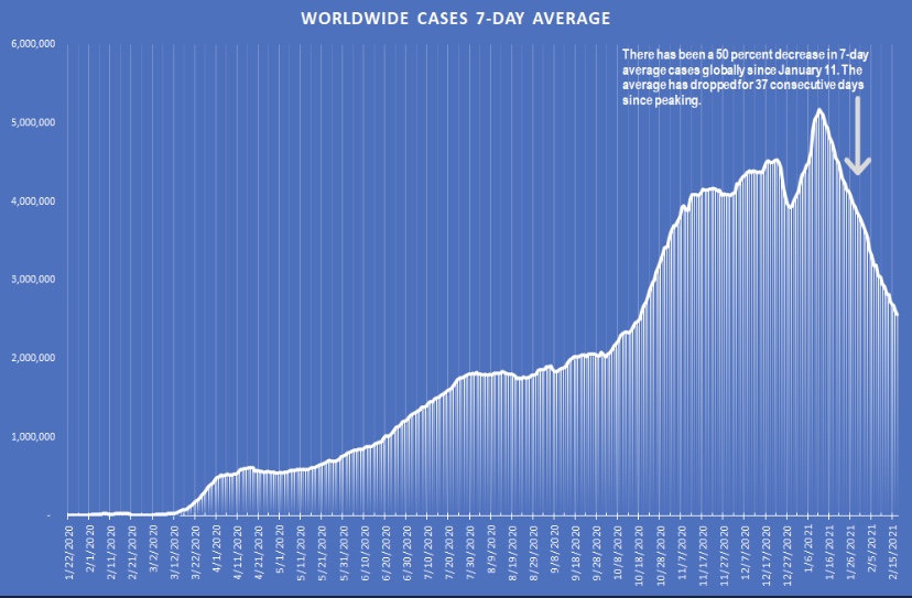
Just to round things out, here is the trend in cases worldwide:

There is a great deal of concern about the new variants. A search for “COVID-19 variants” turns up plenty of scary articles. However, there is some evidence that the new variants are not as dangerous as alarmists contend. The resistance to specific antibodies does not necessarily imply resistance to protection by T-cells. As Youyang Gu points out, even if a new strain becomes “dominant”, that does not imply that cases will reverse their decline. This study indicates that the Pfizer vaccine is protective against both the UK and South African strains, and there is evidence that other vaccines offer adequate protection as well (and see here).

The charts demonstrate that the new strains haven’t arrested or reversed the declines in infections witnessed worldwide since early January. That doesn’t mean the mutations haven’t made a difference: perhaps the declines would have been faster in their absence. And we don’t know what the future will hold as the virus in various forms becomes endemic. Still, it’s reassuring to see that the increased transmissibility of the new strains hasn’t overcome factors that have contributed to the recent declines, which in all likelihood are related to increasing immunity in the population with a minor assist from vaccinations (thus far). As Lamb wryly notes about the recent declines in transmission: “Just saying”.

Fall Coronavirus Season

16 Friday Oct 2020

Posted by Nuetzel in Coronavirus, Pandemic, Uncategorized

≈ Leave a comment

Tags

Antigenic Drift, CARES Act, Coronavirus, Covid-19, Death Laundering, Europe, False Positives, Hospital Reimbursement, IFR, Immunity, Infection Fatality Rate, Kyle Lamb, Medicare, Seasonality, Second Wave, Twitter, Vitamin D, WHO

We’ve known for some times that COVID-19 (C19) follows seasonal patterns typical of the flu, though without the flu’s frequent antigenic drift. Now that we’re moving well into autumn, we’ve seen a surge in new C19 case counts in Europe and in a number of U.S. states, especially along the northern tier of the country.

The new case surge began in early to mid-September, depending on the state, and it’s been coincident with another surge in tests. From late July through early October, we had a near doubling in the number of tests per positive in the U.S. An increase in tests also accompanied the previous surge during the summer, which claimed far fewer lives than the initial wave in the early spring. In the summer, infections were much more prevalent among younger people than in the spring. Vitamin D levels were almost certainly higher during the summer months, our ability to treat the virus had also improved, and immunities imparted by prior infections left fewer susceptible individuals in the population. We have many of those advantages now, but D levels will fade as the fall progresses.

As for the new surge in cases, another qualification is that false positives are still a major testing problem; they inflate both case counts and C19-attributed deaths. In the absence of any improvement in test specificity, of which there is no evidence, the exaggeration caused by false positives grows larger as testing increases and positivity rates fall. So take all the numbers with that as a caveat.

How deadly will the virus be this fall? So far in Europe, the trends look very promising. Kyle Lamb provided the following charts from WHO on Twitter yesterday. (We should all be grateful that Twitter hasn’t censored Kyle yet, because he’s been a force in exposing alarmism in the mainstream media and among the public health establishment.) Take a look at these charts, and note particularly the lag between the first wave of infections and deaths, as well as the low counts of deaths now:

If the lag between diagnosis and death is similar now to the spring, Europe should have seen a strong upward trend in deaths by now, yet it’s hardly discernible in most of those countries. The fatality rates are low as well:

As Lamb notes, the IFRs in the last column look about like the flu, though again, the reporting of deaths and their causes are often subject to lags.

What about the U.S.? Nationwide, C19 cases and attributed death reports declined after July. See the chart below. More recently, reported deaths have stabilized at under 700 per day. Note again the relatively short lags between turns in cases and deaths in both the spring and summer waves.

Clearly, there has been no acceleration in C19 deaths corresponding to the recent trend in new cases. Northeastern states that had elevated death rates in the spring saw no resurgence in the summer; southern states that experienced a surge in the summer have now enjoyed taperings of both cases and deaths. But with each season, the virus seems to roll to regions that have been relatively unscathed to that point. Now, cases are surging in the upper Midwest and upper mountain states, though some of these states are lightly populated and their data are thin.

A few state charts are shown below, but trends in deaths are very difficult to tease out in some cases. First, here are new cases and reported deaths in Michigan, Wisconsin, and Minnesota. There is a clear uptrend in cases in these states along with a very slight rise in deaths, but reported deaths are very low.

Next are Idaho, Montana, North Dakota, and South Dakota. A slight uptrend in cases began as early as August. Idaho and Montana have had few deaths, so they are not plotted in the second chart. The Dakotas have had days with higher reported deaths, and while the data are thin and volatile, the visual impression is definitely of an uptrend in deaths.

The following states are somewhat more central in latitude: Colorado, Illinois, and Ohio. There is a slight upward trend in new cases, but not deaths. Illinois is experiencing its own second wave in cases.

Out of curiosity, I also plotted Massachusetts, Pennsylvania, and New Jersey, all of which suffered in the first wave during the spring. They are now experiencing uptrends in cases, especially Massachusetts, but deaths have been restrained thus far.

The upshot is that states having little previous exposure to the virus are seeing an uptrend in deaths this fall. The same does not seem to be happening in states with significant prior exposure, at least not yet.

There are major questions about the reasons for the lingering death counts in the U.S.. But consider the following: first, the infection fatality rate (IFR) keeps falling, despite the stubborn level of daily reported deaths. Second, deaths reported have increasingly been pulled forward from deaths that actually occurred in the more distant past. This sort of “laundering” lends the appearance of greater persistence in deaths than is real. Third, again, false positives exaggerate not just cases, but also C19 deaths. Hospitals test everyone admitted, and patients who test positive for C19 are reimbursed at higher rates under the CARES Act; Medicare reimburses at a higher rates for C19 patients as well.

We’re definitely seeing a seasonal upswing in C19 infections in the US., now going on five weeks. In Europe, the surge in cases began slightly earlier. However, in both Europe and the U.S., these new cases have not yet been associated with a meaningful surge in deaths. The exceptions in the U.S. are the low-density upper mountain states, which have had little prior exposure to the virus. The lag between cases and deaths in the spring and summer was just two to three weeks, and while it’s too early to draw conclusions, the absence of a surge in deaths thus far bodes well for the IFR going forward. If we’re so fortunate, we can thank a combination of factors: a younger set of infecteds, earlier detection, better treatment and therapeutics, lower viral loads, and a subset of individuals who have already gained immunity.

Virus Visuals and Non-Pharmaceutical Interventions

19 Saturday Sep 2020

Posted by Nuetzel in Government Failure, Pandemic

≈ Leave a comment

Tags

Bill Blain. Donald Luskin, Coronavirus, Covid-19, Death Laundering, False Positives, Federalism, Flatten the Curve, Jacob Sullum, Kyle Lamb, National Bureau of Economic Research, Non-Pharmaceutical interventions, NPIs, Oxford Stringency Index, The Ethical Skeptic

There are a bunch of nice graphs below summarizing the course of the coronavirus (C19) pandemic in different countries, as well as their policy responses. The charts are courtesy of Kyle Lamb, who has been an unlikely (in my mind…) but forceful voice regarding the pandemic over the past few months. I’m sorry if the resolution in some of the charts is poor, but I hope you can click on them for a better view.

The data reported in the charts goes through September 12. The first few charts below are “mirror charts”: they show newly diagnosed C19 cases by day on top, right-side up; on the bottom of each chart are C19-attributed deaths, but the vertical axis is inverted to create the “mirror effect”. The scales on the bottom are heavily stretched compared to the top (deaths are much smaller than cases), and the scales for different countries aren’t comparable. The patterns are informative nevertheless, and I’ll provide per capita deaths separately.

Let’s start with the U.S., where the early part of the pandemic in the spring was quite deadly, while the second, geographically distinct “wave” of the pandemic was less deadly. It looks bad, but the high number of deaths in the spring was partly a consequence of mismanagement by a few prominent government officials in the Northeast, most glaringly Governor Andrew Cuomo of New York. The full pattern for the U.S. combines different waves in different regions. The overall outcome to-date is 622 deaths per million of population.

Then we have charts for (deaths/mil in parens): the UK (628), Italy (591), Spain (653), France (467), Germany (114), the Netherlands (364), and Switzerland (240), which all have had second waves in cases, of but hardly any noticeable second wave in deaths, at least not yet:

And finally, we have Sweden (576), which had many deaths during the first wave, but very few now. Overall, to-date, Sweden has faired better than the U.S., Spain, the UK, and Italy — not to mention Belgium (870), for which I don’t have mirror charts.

There are several points to make about the charts:

First, the so-called second wave this summer has not been as deadly as the virus was in the spring. The U.S. is not an exception in that regard, though it did have more C19 deaths than the other countries. The count of U.S. deaths in the summer was partly due to C19 false positives under a much heavier testing regime, as well as “death laundering” by public health authorities that looks suspiciously like a politicization of the attribution process: C19 deaths over the summer have been well in excess of what would be expected from C19 hospitalizations and ICU admissions. It’s also evident that deaths are being reallocated to C19 from other natural causes, as this chart from The Ethical Skeptic shows (compare the bright line for 2020 to the (very) dim but tightly clustered baselines from prior years):

Second, most of the charts for Europe (not Sweden) show a late summer escalation in cases, though cases in Spain and Germany appear to have crested already. If an uptrend in deaths is to follow, it should become noticeable soon. Thus far, the wave certainly looks less threatening. 

Finally, it’s noteworthy that Sweden’s early experience, which was plagued by mismanagement of the virus’ threat to the nursing home population, later transitioned to a dramatic fading of cases and deaths. There has been no late summer wave in Sweden as we’ve seen elsewhere. This despite Sweden’s far less stringent non-pharmaceutical interventions (NPIs). Sweden’s deaths per million of population are now less than in the US, the UK, Italy, Spain, and Belgium, and most of those differences are growing.

All of the other countries discussed above have had far more stringent lockdown policies than Sweden, and at far greater economic cost. The following charts show some cross-country comparisons of an Oxford University index of NPI stringency over time. It combines a number of different dimensions of NPIs, such as mask mandates, restrictions on public gatherings, and school closures. The first chart below shows the U.S. and the UK contrasted with Sweden. The other countries discussed above are shown in separate charts that follow. 

In the U.S., there has been tremendous variation across states in terms of stringency due to the federalist approach required by the U.S. Constitution, but overall, the Oxford measure for the U.S. has been broadly similar to the UK over time, with the largest departures from one another at the start of the pandemic.   


The stringency of NPIs over the full pandemic depends on their day-by-day strength as well as their duration at various levels. One could measure stringency indices and deaths at various points in time and produce all kinds of conflicting results as to the efficacy of NPIs. On the whole, however, these charts suggest that stringent NPIs hold no particular advantage except perhaps as a way to temporarily avoid overwhelming the health care system. Even the original “flatten the curve” argument acknowledged that the virus could not be avoided indefinitely at a reasonable cost via NPIs, especially in an otherwise free society.

Note that most of these countries eased their NPIs after the initial wave in the spring, but several remained far more stringent than Sweden’s policies. That did not prevent the second wave of cases, though again, those were far less deadly.

As Jacob Sullum writes, and what is increasingly clear to honest observers: lockdowns tend to be ineffective and even destructive over lengthy periods.

A working paper from the National Bureau of Economic Research finds that four different “stylized facts” about the growth in C19 deaths are consistent across countries and states having different policy responses to the virus. The authors say:

“… failing to account for these four stylized facts may result in overstating the importance of policy mandated [non-pharmaceutical interventions] for shaping the progression of this deadly pandemic.“

Here’s Bill Blain’s discussion of the inefficacy of lockdowns. And here is Donald Luskin’s summary of his firm’s research that appeared in the WSJ, which likewise casts extreme doubt on the wisdom of stringent NPIs.

The virus is far from gone, but this summer’s wave has been much more docile in both Europe and the U.S. There are reasons to think that subsequent waves will be dampened in many areas via the cumulative immunity gained from exposure thus far, not to mention improvements in treatment and knowledge regarding prophylaxis such as Vitamin D supplements. Government authorities and their public health advisors should dispense with the pretense that stringent NPIs can mitigate the impact of the virus at a reasonable cost. These measures are constitutionally flawed, impinge on basic freedoms, and look increasingly like government failure. Risk mitigation should be practiced by those who are either vulnerable or fearful, but for most people, particularly children and people of working age, those risks no longer appear to be much worse than a bad year for influenza.  

COVID Immunity, Herd By Herd

01 Tuesday Sep 2020

Posted by Nuetzel in Coronavirus, Herd Immunity

≈ Leave a comment

Tags

Antibodies, Coronavirus, Herd Immunity, Herd Immunity Threshold, Heterogeneity, Immunological Dark Matter, Infectives, Kyle Lamb, Miami, Seroprevalence, SIR Models, Stockholm New York City, Susceptibility, T-Cell Immunity, Transmissability, Yinon Weiss

Too many public health authorities remain in denial, but epidemiologists are increasingly convinced that heterogeneity implies a coronavirus herd immunity threshold (HIT) that is greatly reduced from traditional models and estimates. HIT is the share of the population that must be infected before the contagion begins to recede (and the transmission ratio R falls below one). Traditional models, based on three classes of individuals (Susceptibles, Infectives, and Recovered – SIR), predict a HIT of 60% or more. However, models that incorporate variation in susceptibility, transmissibility, and occupational or social behavior reduce the HIT substantially. Many of these more nuanced models show that the HIT could be in a range of just 15% to 25%. If that is the case, many regions are already there!

For background, I refer you to the first post I wrote about heterogeneity in late March, more detailed thoughts from early May, examples and more information on the literature later in May. I’ve referenced it repeatedly in other posts since then. And now, more than five months later, even the slow kids at the New York Times have noticed. The gist of it: if not everyone is equally susceptible, for example, a smaller share of the population needs to be “immunized via infection” to taper the spread of the virus.

Some supporting evidence appears in the charts below, courtesy of Kyle Lamb on Twitter. The first chart shows a seven-day average of C19 cases per million of population for ten states that reached an estimated 10% antibodies. These antibodies confer at least short-term immunity against C19. Most of these states saw cases/m climb at least through the day when the 10% level was reached, though Rhode Island appears to have been an exception.

The second chart shows the seven-day average of cases/m in the same states starting seven days after the 10% immunity level was reached. I’d prefer to see the days in the interim as well, but the changes in trend are still noteworthy. All of these states except Louisiana had a downturn in the seven-day average of new cases within a few weeks of breaching the 10% infection level (Louisiana had distinct and non-coincident outbreaks in different parts of the state). These striking similarities suggest that things turned as the infection level reached 15% or more, consistent with many of the epidemiological models incorporating heterogeneity.

Next, take a look at the states in which C19 surged most severely this summer. The new cases are not moving averages, so the charts are not quite comparable to those above. However, the peaks seem to occur prior to the breach of the 15% infection level.

Speculation about early herd immunity has been going on for several months with respect to various countries and even more “micro” settings such as cruise ships and military vessels, where populations are completely isolated. Early on, this “early” herd immunity was discussed under the aegis of “immunological dark matter”, but we know now that T-cell immunity has played an important role. In any case, anti-body expression (or seroprevalence) at around 20% has been linked to reversals in C19 cases and deaths in several countries. As Yinon Weiss notes, New York City and Stockholm were both C19 hotspots in the spring, both have seen deaths decline to low levels, and they have little in common in terms of public health policy. London as well. The one thing they share are similar levels of seroprevalence.

An important qualification is that herd immunity is not relevant at high levels of aggregation. That is, herd immunity won’t be achieved simultaneously in all regions. The New York City metro area might have reached its HIT in April, but Florida (or perhaps only Miami) might have reached a HIT in July. Many areas of the Midwest probably still aren’t there.

In the absence of a new mutation of C19, the final proof of herd immunity in many of the former hotspots will be in the fall and winter. We should expect at least a few cases in those areas, but if there are more intense contagions, they should be confined to areas that have not yet seen a level of seroprevalence near 15%.

Evidence of Fading COVID Summer Surge

16 Sunday Aug 2020

Posted by Nuetzel in Pandemic

≈ Leave a comment

Tags

CDC, CLI, Covid Tracking Project, Covid-19, COVID-Like Illness, Date of Death, FEMA, FEMA Regions, Herd Immunity Threshold, Hospitalizations, Kyle Lamb, PCR Test, Percent Positive, Provisional Deaths

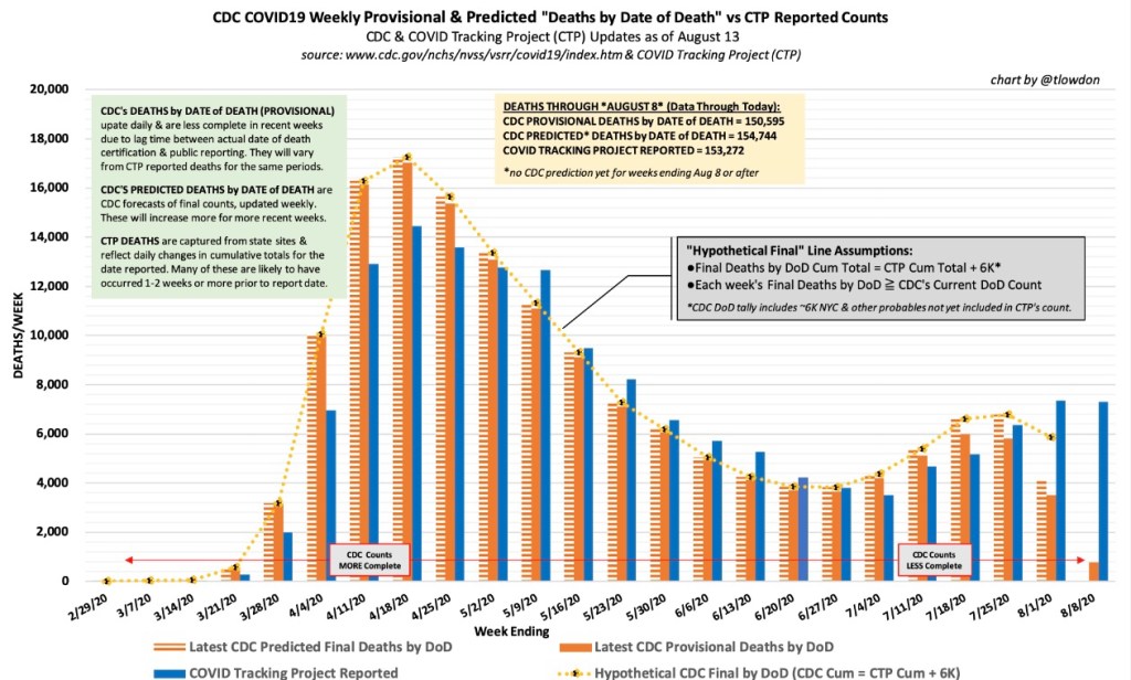
Lately I’ve talked a lot about reported deaths each week versus deaths by actual date of death (DOD). Much of that information came from Kyle Lamb’s Twitter account, and he’s the source of the charts below as well. The first one provides a convenient summary of the data reported through last week. The blue bars are reported deaths each week from the COVID Tracking Project (CTP), which are an aggregation of deaths that actually occurred over previous weeks. Again, the blue bars do NOT represent deaths that occurred in the reporting week. The solid orange bars are “provisional” actual deaths by DOD. “Provisional” means that recent weeks are not complete, though most deaths by DOD are captured within three to four weeks. The CDC also produces a “forecast” of final death counts by DOD, shown by the hatched orange bars.   

Note that the recent surge in deaths has been much smaller than the one in the spring, which was driven by deaths in the northeast. The CDC “expects” actual deaths by DOD to have declined starting after the week of July 23rd. However, CTP was still reporting deaths of over 1,000 per day last week. The actual timing of those deaths in prior weeks, and the ultimate extent of the summer surge in COVID deaths, remains to be seen.

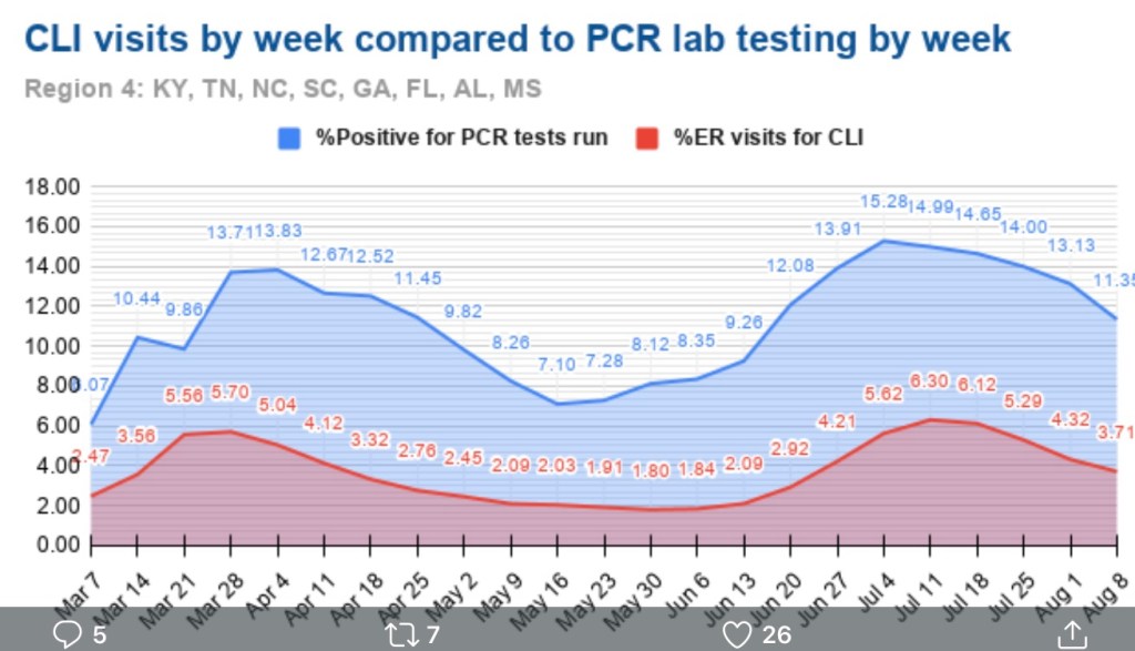
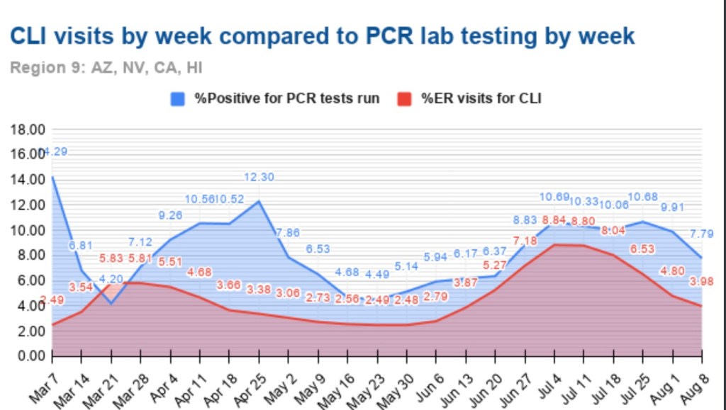
Certain leading indicators of deaths are signaling declines in actual deaths in August. Two of those indicators are 1) the positivity rate on standard PCR tests for infections; and 2) the share of emergency room visits made for symptoms of “COVID Like Illness” (CLI). The charts below show those indicators for FEMA regions that had the largest uptrends in cases in June and July. Florida is part of Region 4, shown in the next chart:

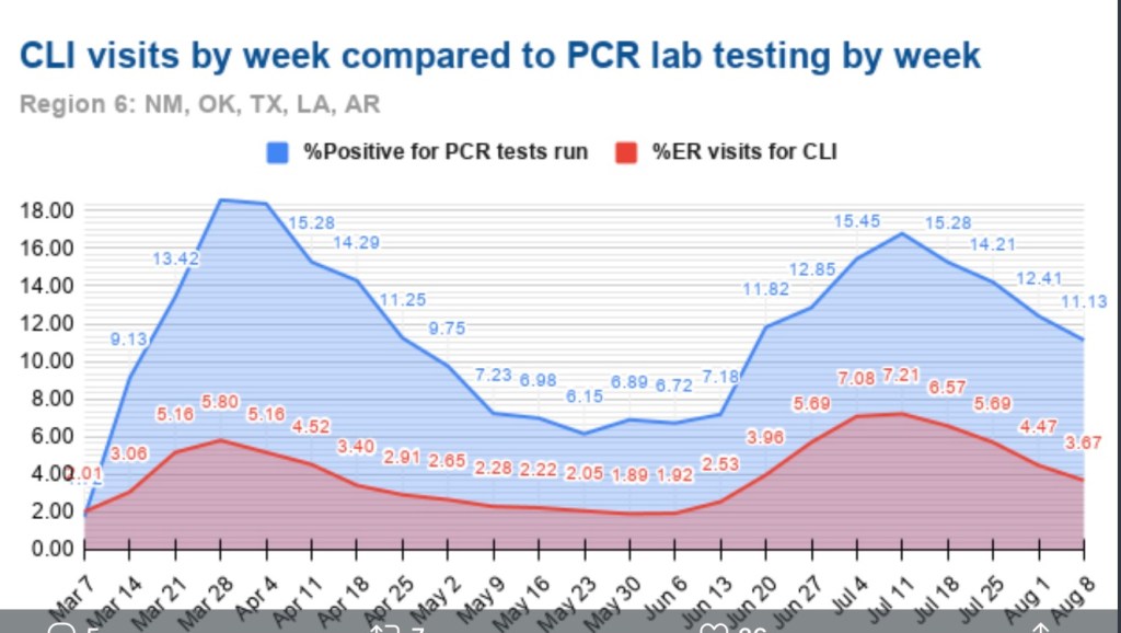
Here is the Region 6, which includes Texas:

Finally, Region 8 includes Arizona and California:

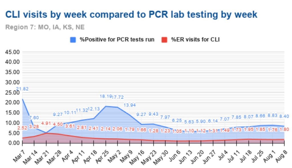
Out of personal interest, I’m also throwing in Region 7 with a few midwestern states, where cases have risen but not to the levels reached in Regions 4, 6, and 8:

With the exception of the last chart, the clear pattern is a peak or plateau in the positivity rate in late June through late July, followed by declines in subsequent weeks. The share or ER visits for CLI was not quite coincident with the positivity rate, but close. The decline in the CLI share is evident in Regions 4, 6 and 8. Again, these three regions include states that drove the nationwide increase in cases this summer (AZ, CA, FL, and TX), and the surge appears to have maxed out.     

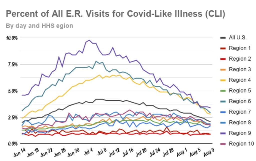
Here is a chart showing the share of CLI visits to ERs for all ten FEMA region from mid-June through last week. Clearly, this measure is improving across the U.S.

Nationwide, the CLI percentage at ERs has decreased by about 47% over the past four weeks, and the positivity rate has decreased by about 28% in that time. In addition to these favorable trends, COVID hospitalizations have decreased by about 40% over the past three weeks. All of these trends bode well for a downturn in COVID-attributed deaths.

The summertime surge in the virus was not nearly as ravaging as in the spring, and it appears to be fading. We’ll await developments in the fall, but we’ve come a long way in terms of protecting the vulnerable, treating the infected, approaching herd immunity thresholds (which means reduced rates of transmission to susceptible individuals), and the real possibility that we can put the pandemic behind us. 

COVID at Midsummer

04 Tuesday Aug 2020

Posted by Nuetzel in Pandemic, Public Health

≈ 2 Comments

Tags

Arizona, California, CDC, Coronavirus, COVID Time Series, Covid Tracking Project, Covid-19, Fatality Rate, Florida, Hospitalizations, Illinois, Kyle Lamb, Missouri, New Cases, New York, Provisional Deaths, Regional Variation, South Carolina, Tennessee, Texas

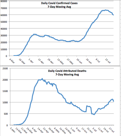
It’s been several weeks since I last posted on the state of the coronavirus pandemic (also see here). The charts below show seven-day moving averages of new confirmed cases and reported C19 deaths from the COVID Tracking Project as of August 3. Daily new cases began to flatten about three weeks ago and then turned down (it can take a few days for such changes to show up in a moving average). Daily C19-attributed deaths began climbing again in early July, lagging new cases by a few weeks, and they slowed just a bit over the past several days. Obviously, both are good news if those changes are maintained. The other thing to note is that deaths have remained far below their levels of April and early May.

The daily death count is that reported on each date, not when the deaths actually occurred. Each day’s report consists of deaths that were spread across several previous weeks or even a month or more. That makes the slight downturn in deaths more tenuous from a data perspective. There are sometimes large numbers of deaths from preceding weeks reported together on a single day, so reporting can be ragged and the final pattern of actual deaths is not known for some time. More on that below.

States

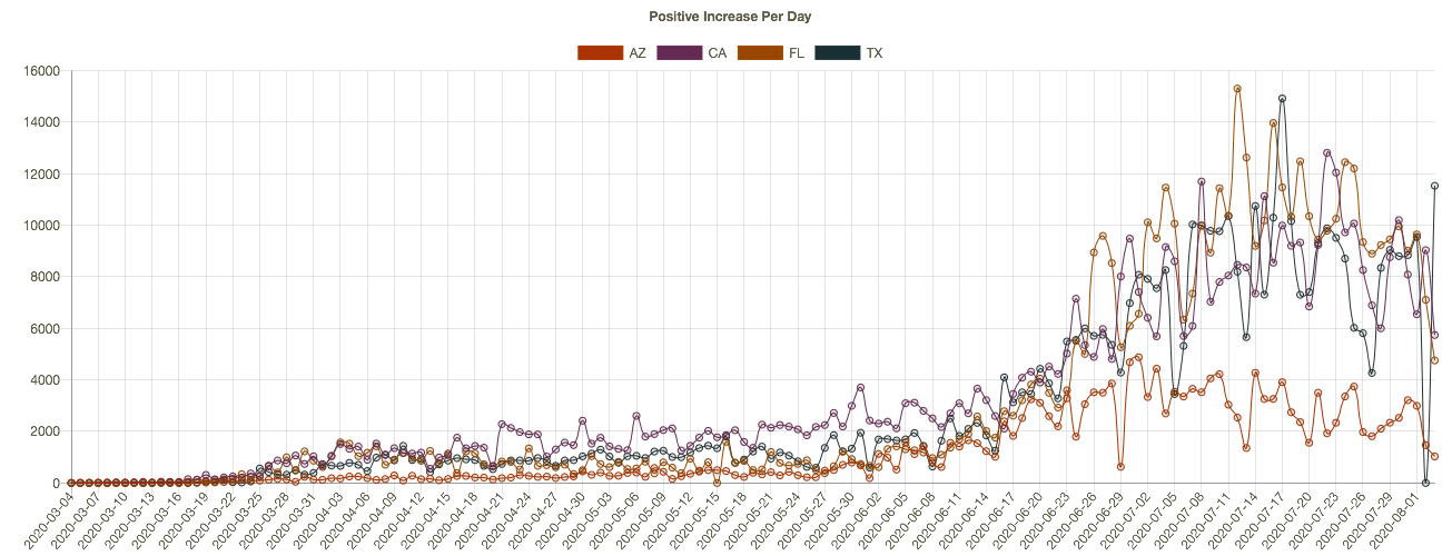
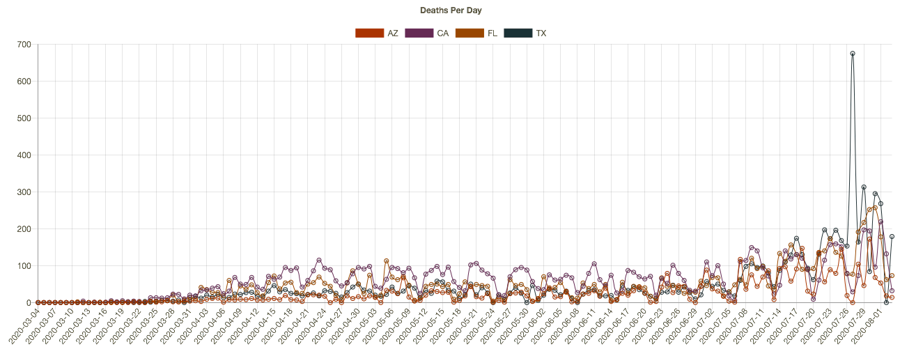
The increase in cases and deaths during late June and July was concentrated in four states: Arizona, California, Florida, and Texas. Here’s how those states look now in terms of cases and deaths, from the interactive COVID Time Series site:


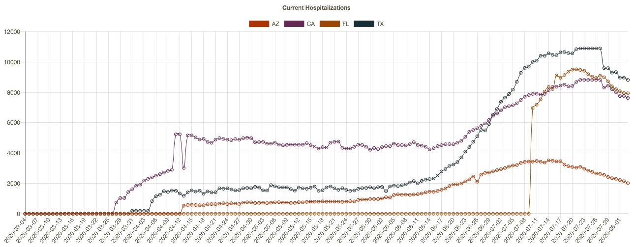
New cases began to flatten or drop in these states two to three weeks ago, driving the change in the national data. Daily deaths have not turned convincingly, but again, these are reported deaths, which actually occurred over previous weeks. One more chart that is suggestive: current hospitalizations in these four states. The recent declines should bode well for the trend in reported deaths, but it remains to be seen. 

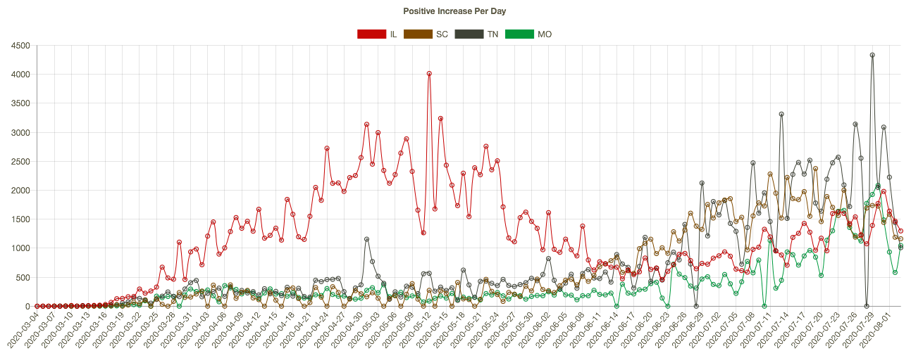
Meanwhile, other parts of the country have seen an uptrend in cases and deaths, such as Illinois, Missouri, South Carolina, and Tennessee. Here are new cases in those states:

It’s worth emphasizing that the elevated level of new cases this summer has not been associated with the rates of fatality experienced in the Northeast during the spring. There are many reasons: better patient care, new treatments, more direct summer sunlight, higher humidity, and tighter controls in nursing homes.

More On the Timing of Deaths

Back to the discrepancies in the timing of reported deaths and actual deaths. This is important because the reported totals each day and each week can be highly misleading, even to the point of frightening the public and policy makers, with consequent psychological and economic impacts.

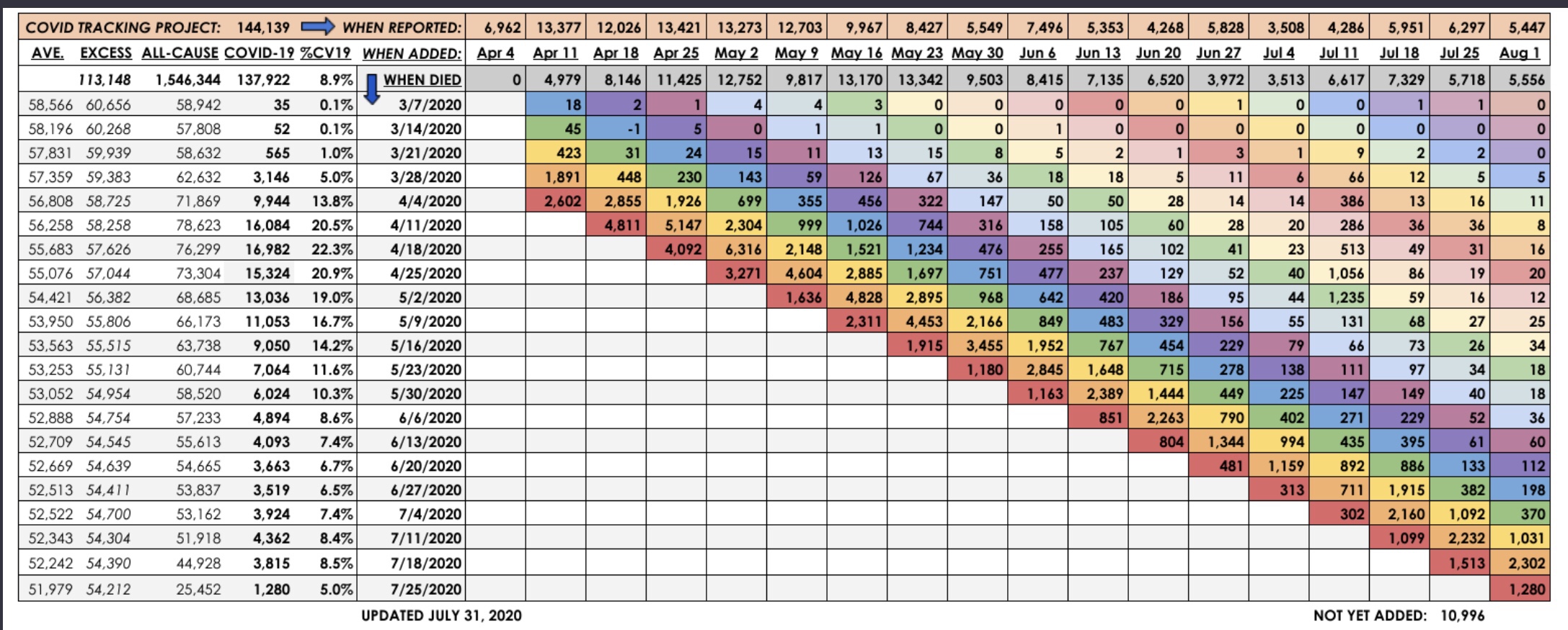
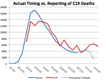
The latest summary of provisional vs. reported deaths is shown below, courtesy of Kyle Lamb, who posts updates on his Twitter feed. This report ends with the last complete week ending August 1. It’s a little hard to read, but you might get a better look if you click on it or turn your phone sideways. Some of the key series are also graphed below. 

The table shows the actual timing of deaths in the fourth column, with dates alongside. The pattern differs from the statistics reported by the Covid Tracking Project (CTP) in the top row (shaded orange), and from the totals of actual deaths by reporting day in the third row (shaded gray). The reporting dates are always later than the dates of death. This can be seen in the chart below. The most obvious illustration is how many of the deaths from around the peak in mid-April were reported in May. In March and April, the daily reports were short of the ultimate actual death counts because so few deaths with associated dates were known by then.


The right-hand end of the red line shows that many deaths reported by CTP have not yet been placed at an actual date of death by the CDC.  At this point, the actual date of death has not been placed for over 10,000 deaths! Again, those will be spread over earlier weeks.

The blue line is dashed over the last four weeks because those counts are most “highly” provisional. Small changes in the actual counts are likely for dates even before that, but the last four weeks are subject to fairly substantial upward revisions. Eventually, the right end of the blue line will more closely approximate the totals shown in red.

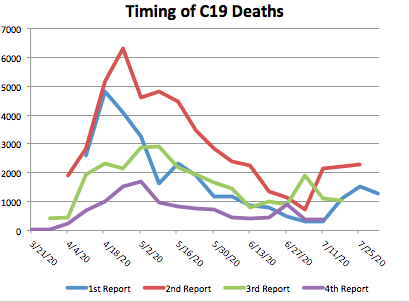
To get an indication of trends in the actual timing of deaths, I plotted the weekly actual deaths reported for the last four reporting weeks going back in time. In the table, those are the four lowest, color-coded diagonals. In the graph below, which should include the qualifier “by recency of report week”, actual deaths in the most recent report week are represented by the blue line, the prior weekly report is red, followed by green (three weeks prior), and purple (four weeks prior… sorry, the colors are not consistent with those in the table). The lines extend farther to the right for more recent report weeks.

The increase in actual deaths occurring in July has declined or flattened in each of the four most recent report weeks. Only the second-to-last week increased as of the August 1st report. On the whole, those changes seem favorable, but we shall see.

Closing

It’s getting trite to say, but the next few weeks will be interesting. The increase in deaths in July was a sad development, but at least the extent of it appears to have been limited. Even with a somewhat higher death count, the fatality rate continued to decline. Let’s hope any further waves of infections are even less deadly.

Reported and “Actual” COVID Deaths

13 Monday Jul 2020

Posted by Nuetzel in Pandemic, Political Bias

≈ 2 Comments

Tags

Cause of Death, CDC, Coronavirus, Covid Tracking Project, COVID-Phobic Deaths, Death Toll, Hospital Reimbursements, Kyle Lamb, Lockdown Deaths, Our World In Data, Reclassified Deaths

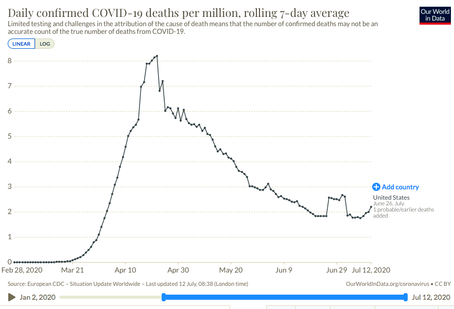
I was updating my post from twelve days ago on the upward trend in new coronavirus cases when I came across a great tabular summary of a phenomenon that’s been underway since early April: significant delays in reporting deaths from COVID-19 (C19). Before I get to that, a quick word on what’s happened over the past 12 days. New coronavirus cases keep climbing in a number of states, and it’s been a grisly waiting game to see whether the severity and lethality of infections will follow the case counts upward. The following chart provides a very preliminary answer. It’s taken from Our World In Data, and it shows the seven-day moving average of C19 deaths in the U.S.

There has indeed been an upturn in reported deaths over the past week. Just prior to that, a temporary plateau in late June was caused by a set of “reclassifications” of earlier deaths in New Jersey (the “plateau effect is caused by seven-day averaging). These kinds of changes in reporting make it rather difficult to interpret trends accurately. Unfortunately, the reporting of deaths has been subject to continuing distortions that are even more difficult to discern than New Jersey’s spike.

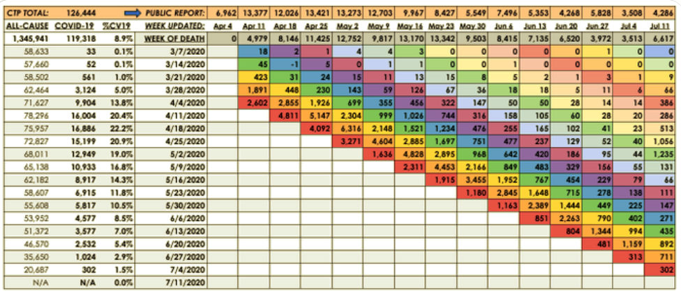
Kyle Lamb provides the interesting table below, which might be difficult to read without either clicking on it or going to the link at Twitter. Here is another link to an annotated version of the table. The top row labeled “CTP Total” is the C19 death toll reported each week by the COVID Tracking Project. This is generally what the public sees. These reports show that deaths reached their highest levels during the weeks of April 11th through May 9th. However, the second column shows C19 deaths by their actual week of occurrence. This series shows a more distinct peak on April 18th with steady declines thereafter.

The weekly totals in the second column are not final, however. Take a look at the last reporting week in the far right column (July 11th). The CTP reported 4,286 deaths, an increase over the prior week consistent with the upturn in the first chart above. But the table shows that over half of that week’s reported deaths actually occurred in late April and early May! So the upturn in deaths is something of a mirage.

We won’t have a reasonable approximation of the death totals for the past several weeks (or how they compare) for at least several more weeks. In fact, one can argue that it might be a matter of months before we have a reasonable approximation of those deaths, but it’s worth noting that the vast bulk of “actual” C19 deaths tend to be reported within four weeks of the initial reporting week, and the additions or revisions to the two weeks in late April and early May in the last column were exceptionally large. Chances are we won’t see many more that big…. Or will we?

Aspects of this process hint at the ease with which the C19 death totals could be manipulated. The reported totals for all-cause mortality in the first column are incomplete; more recent weeks, especially, are not fully settled as to causes of death. Some of those fatalities are certain to be attributed to C19. Others might be reclassified as C19. And here is the scary part: the all-cause totals are certain to include a significant number of lockdown-related or COVID-phobic deaths: individuals who were unable or unwilling to seek medical care for urgent needs due to lockdowns or fears of rampant spread of C19 infections within hospital environments. To anyone with an interest in manipulating the C19 death toll, whether hospital officials seeking higher reimbursements, local or state officials seeking federal funds, or public officials at any level seeking to promote pandemic fears and/or political discord, these “extra” deaths might be tempting marks for reclassification.

I’m fairly confident that the uptrend of new cases will be far less severe than early in the pandemic. I believe much of the alarm I see on social and mainstream media is misplaced. More on that in a subsequent post, but for now I’ll simply note that those testing positive are concentrated in much lower ranges of the age distribution, and treatment has improved in a variety of ways. The table above shows that the downtrend in actual weekly C19 deaths is intact as of the admittedly incomplete July 11th reporting week. We won’t know the “actual” pattern of early-July C19 fatalities for another month or more. Even then, one might harbor suspicions that the totals are manipulated for economic or political reasons, but we can hope the reporting authorities are exercising the utmost objectivity in assigning cause of death.

Follow Sacred Cow Chips on WordPress.com

Recent Posts

  • Oh To Squeeze Fiscal Discipline From a Debt Limit Turnip
  • Conformity and Suppression: How Science Is Not “Done”
  • Grow Or Collapse: Stasis Is Not a Long-Term Option
  • Cassandras Feel An Urgent Need To Crush Your Lifestyle
  • Containing An Online Viper Pit of Antisemites

Archives

  • February 2023
  • January 2023
  • December 2022
  • November 2022
  • October 2022
  • September 2022
  • August 2022
  • July 2022
  • June 2022
  • May 2022
  • April 2022
  • March 2022
  • February 2022
  • January 2022
  • December 2021
  • November 2021
  • October 2021
  • September 2021
  • August 2021
  • July 2021
  • June 2021
  • May 2021
  • April 2021
  • March 2021
  • February 2021
  • January 2021
  • December 2020
  • November 2020
  • October 2020
  • September 2020
  • August 2020
  • July 2020
  • June 2020
  • May 2020
  • April 2020
  • March 2020
  • February 2020
  • January 2020
  • December 2019
  • November 2019
  • October 2019
  • September 2019
  • August 2019
  • July 2019
  • June 2019
  • May 2019
  • April 2019
  • March 2019
  • February 2019
  • January 2019
  • December 2018
  • November 2018
  • October 2018
  • September 2018
  • August 2018
  • July 2018
  • June 2018
  • May 2018
  • April 2018
  • March 2018
  • February 2018
  • January 2018
  • December 2017
  • November 2017
  • October 2017
  • September 2017
  • August 2017
  • July 2017
  • June 2017
  • May 2017
  • April 2017
  • March 2017
  • February 2017
  • January 2017
  • December 2016
  • November 2016
  • October 2016
  • September 2016
  • August 2016
  • July 2016
  • June 2016
  • May 2016
  • April 2016
  • March 2016
  • February 2016
  • January 2016
  • December 2015
  • November 2015
  • October 2015
  • September 2015
  • August 2015
  • July 2015
  • June 2015
  • May 2015
  • April 2015
  • March 2015
  • February 2015
  • January 2015
  • December 2014
  • November 2014
  • October 2014
  • September 2014
  • August 2014
  • July 2014
  • June 2014
  • May 2014
  • April 2014
  • March 2014

Blogs I Follow

  • Ominous The Spirit
  • Passive Income Kickstart
  • onlyfinance.net/
  • TLC Cholesterol
  • Nintil
  • kendunning.net
  • DCWhispers.com
  • Hoong-Wai in the UK
  • Marginal REVOLUTION
  • Stlouis
  • Watts Up With That?
  • Aussie Nationalist Blog
  • American Elephants
  • The View from Alexandria
  • The Gymnasium
  • A Force for Good
  • Notes On Liberty
  • troymo
  • SUNDAY BLOG Stephanie Sievers
  • Miss Lou Acquiring Lore
  • Your Well Wisher Program
  • Objectivism In Depth
  • RobotEnomics
  • Orderstatistic
  • Paradigm Library

Blog at WordPress.com.

Ominous The Spirit

Ominous The Spirit is an artist that makes music, paints, and creates photography. He donates 100% of profits to charity.

Passive Income Kickstart

onlyfinance.net/

TLC Cholesterol

Nintil

To estimate, compare, distinguish, discuss, and trace to its principal sources everything

kendunning.net

The future is ours to create.

DCWhispers.com

Hoong-Wai in the UK

A Commonwealth immigrant's perspective on the UK's public arena.

Marginal REVOLUTION

Small Steps Toward A Much Better World

Stlouis

Watts Up With That?

The world's most viewed site on global warming and climate change

Aussie Nationalist Blog

Commentary from a Paleoconservative and Nationalist perspective

American Elephants

Defending Life, Liberty and the Pursuit of Happiness

The View from Alexandria

In advanced civilizations the period loosely called Alexandrian is usually associated with flexible morals, perfunctory religion, populist standards and cosmopolitan tastes, feminism, exotic cults, and the rapid turnover of high and low fads---in short, a falling away (which is all that decadence means) from the strictness of traditional rules, embodied in character and inforced from within. -- Jacques Barzun

The Gymnasium

A place for reason, politics, economics, and faith steeped in the classical liberal tradition

A Force for Good

How economics, morality, and markets combine

Notes On Liberty

Spontaneous thoughts on a humble creed

troymo

SUNDAY BLOG Stephanie Sievers

Escaping the everyday life with photographs from my travels

Miss Lou Acquiring Lore

Gallery of Life...

Your Well Wisher Program

Attempt to solve commonly known problems…

Objectivism In Depth

Exploring Ayn Rand's revolutionary philosophy.

RobotEnomics

(A)n (I)ntelligent Future

Orderstatistic

Economics, chess and anything else on my mind.

Paradigm Library

OODA Looping

  • Follow Following
    • Sacred Cow Chips
    • Join 121 other followers
    • Already have a WordPress.com account? Log in now.
    • Sacred Cow Chips
    • Customize
    • Follow Following
    • Sign up
    • Log in
    • Report this content
    • View site in Reader
    • Manage subscriptions
    • Collapse this bar
 

Loading Comments...