• About

Sacred Cow Chips

Sacred Cow Chips

Tag Archives: COVID-Like Illness

COVID Now: Turning Points, Vaccines, and Mutations

20 Wednesday Jan 2021

Posted by Nuetzel in Coronavirus, Pandemic, Vaccinations

≈ Leave a comment

Tags

Alex Tabarrok, Case Fatality Rate, CDC, CLI, Convalescent Plasma, Covid-19, COVID-Like Illness, Date of Death, Herd Immunity, Herd Immunity Threshold, Infection Fatality Rate, Ivermectin, Johns Hopkins, Monoclonal Antibodies, Phil Kerpen, Provisional Deaths, South African Strain, UK Strain, Vaccinations, Youyang Gu

The pandemic outlook remains mixed, primarily due to the slow rollout of the vaccines and the appearance of new strains of the virus. Nationwide, cases and COVID deaths rose through December. Now, however, there are several good reasons for optimism.

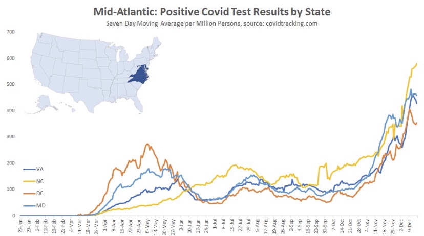
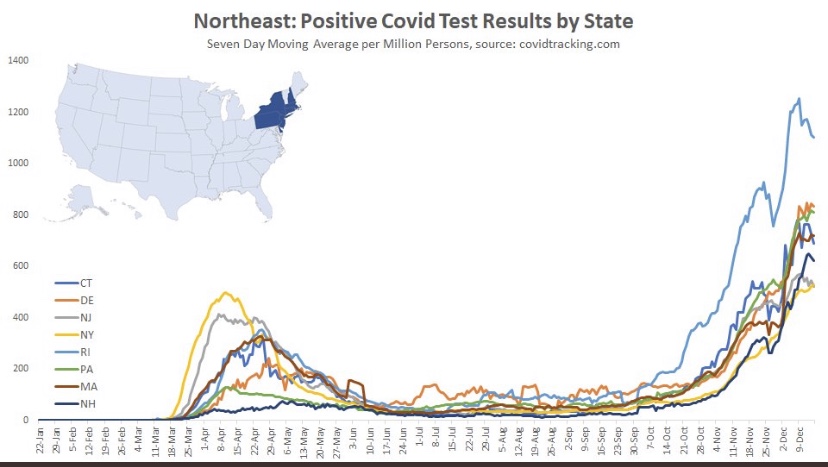
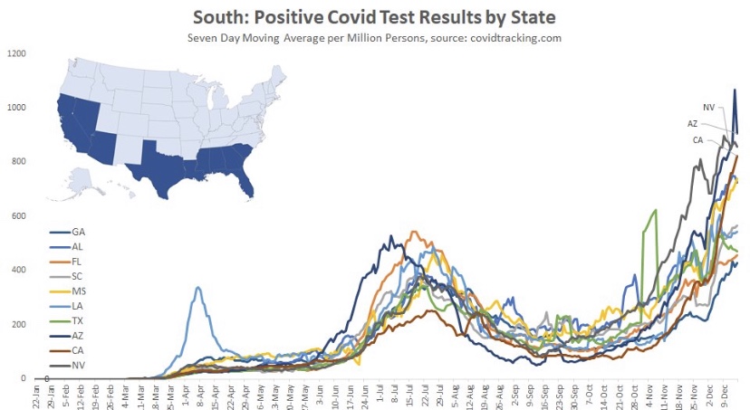
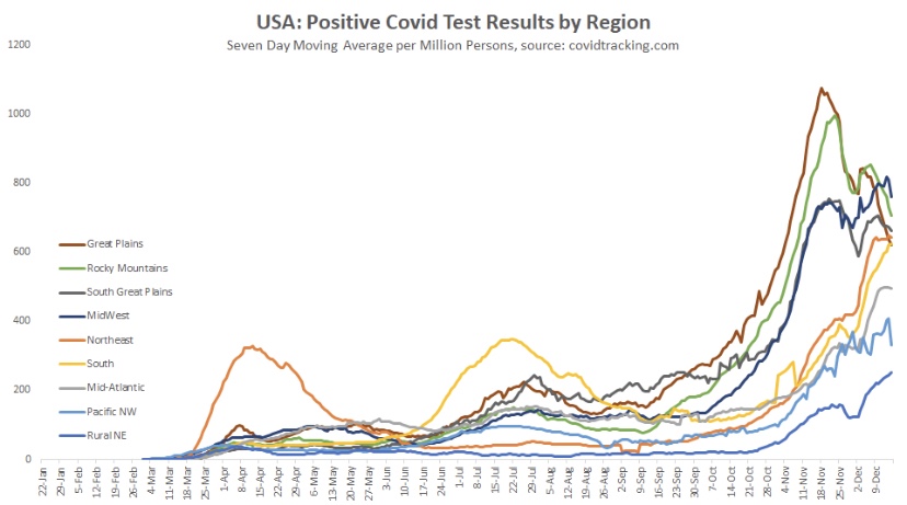
The fall wave of the coronavirus receded in many states beginning in November, but the wave started a bit later in the eastern states, in the southern tier of states, and in California. It appears to have crested in many of those states in January, even after a post-holiday bump in new diagnoses. As of today, Johns Hopkins reports only two states with increasing trends of new cases over the past two weeks: NH and VA, while CT and WY were flat. States shaded darker green have had larger declines in new cases.

A more detailed look at WY shows something like a blip in January after the large decline that began in November. Trends in new cases have clearly improved across the nation, though somewhat later than hoped.

While the fall wave has taken many lives, we can take some solace in the continuing decline in the case fatality rate. (This is not the same as the infection mortality rate (IFR), which has also declined. The IFR is much lower, but more difficult to measure). The CFR fell by more than half from its level in the late summer. In other words, without that decline, deaths today would be running twice as high.

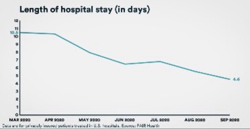
Some of the CFR’s decline was surely due to higher testing levels. However, better treatments are reducing the length of hospital stays for many patients, as well as ICU admittance and deaths relative to cases. Monoclonal antibodies and convalescent plasma have been effective for many patients, and now Ivermectin is showing great promise as a treatment, with a 75% reduction in mortality according to the meta-analysis at the link.

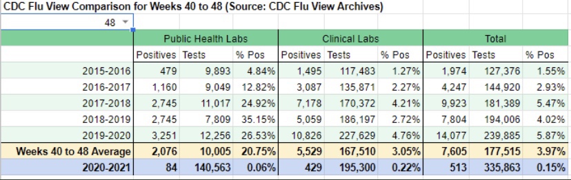
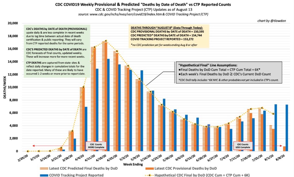
Reported or “announced” deaths remain high, but those reports are not an accurate guide to the level or trend in actual deaths as they occur. The CDC’s provisional death reports give the count of deaths by date of death (DOD), shown below. The most recent three to four weeks are very incomplete, but it appears that actual deaths by DOD may have peaked as early as mid-December, as I speculated they might last month. Another noteworthy point: by the totals we have thus far, actual deaths peaked at about 17,000 a week, or just over 2,400 a day. This is substantially less than the “announced” deaths of 4,000 or more a day we keep hearing. The key distinction is that those announced deaths were actually spread out over many prior weeks.

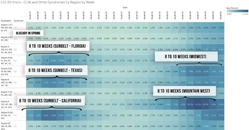
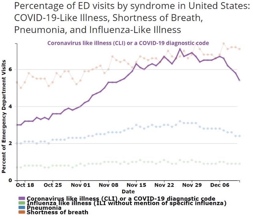
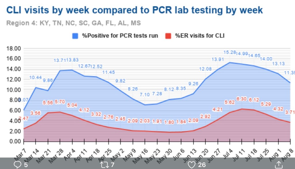
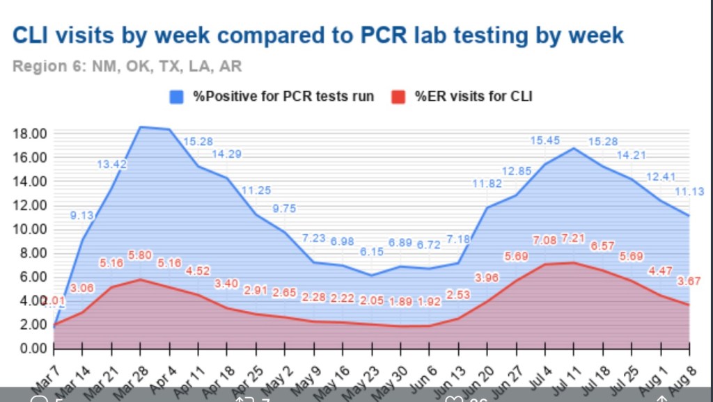
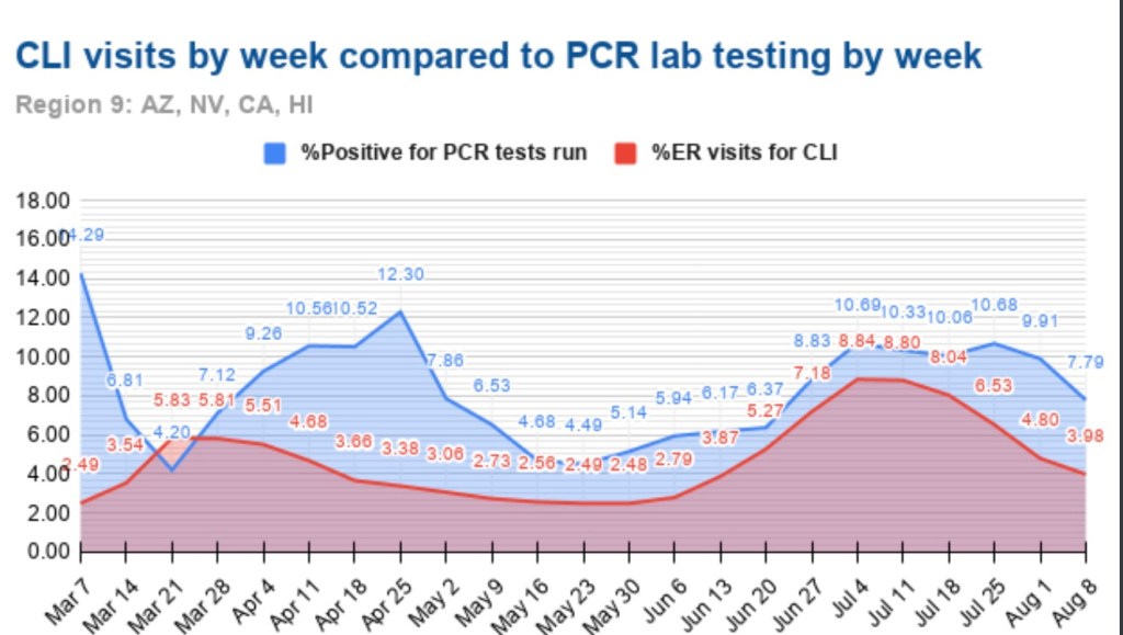
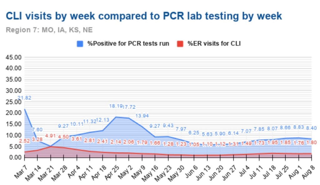
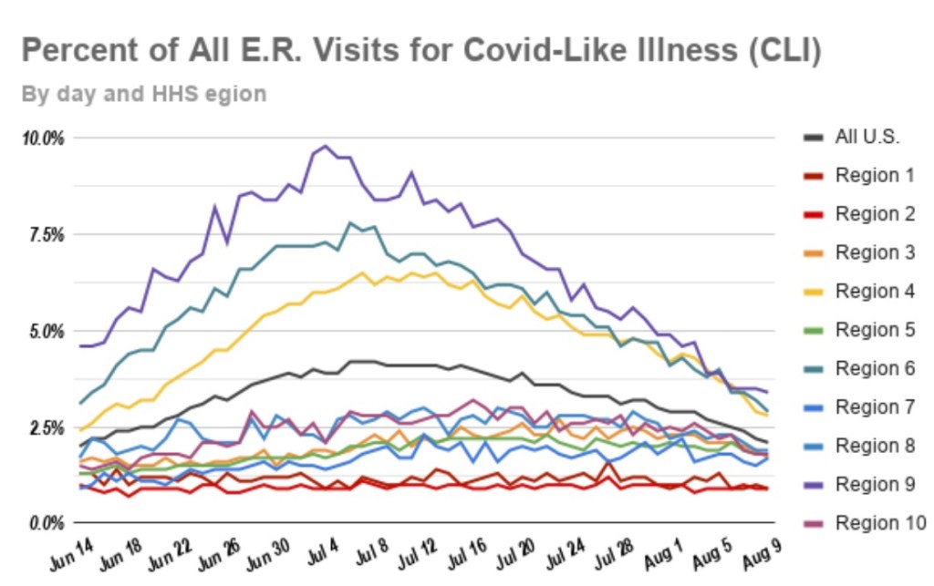
A useful leading indicator of actual deaths has been the percentage of ER patients presenting COVID-like illness (CLI). The purple dots in the next CDC chart show a pronounced decline in CLI over the past three weeks. This series has been subject to revisions, which makes it much less trustworthy. A less striking decline in late November subsequently disappeared. At the time, however, it seemed to foretell a decline in actual deaths by mid-December. That might actually have been the case. We shall see, but if so, it’s possible that better therapeutics are causing the apparent CLI-deaths linkage to break down.

A more recent concern is the appearance of several new virus strains around the world, particularly in the UK and South Africa. The UK strain has reached other countries and is now said to have made appearances in the U.S. The bad news is that these strains seem to be more highly transmissible. In fact, there are some predictions that they’ll account for 30% of new cases by the beginning of March. The South African strain is said to be fairly resistant to antibodies from prior infections. Thus, there is a strong possibility that these cases will be additive, and they might or might not speedily replace the established strains. The good news is that the new strains do not appear to be more lethal. The vaccines are expected to be effective against the UK strain. It’s not yet clear whether new versions of the vaccines will be required against the South African strain by next fall.

Vaccinations have been underway now for just over a month. I had hoped that by now they’d start to make a dent in the death counts, and maybe they have, but the truth is the rollout has been frustratingly slow. The first two weeks were awful, but as of today, the number of doses administered was over 14 million, or almost 46% of the doses that have been delivered. Believe it or not, that’s an huge improvement!

About 4.3% of the population had received at least one dose as of today, according to the CDC. I have no doubt that heavier reliance on the private sector will speed the “jab rate”, but rollouts in many states have been a study in ineptitude. Even worse, now a month after vaccinations began, the most vulnerable segment of the population, the elderly, has received far less than half of the doses in most states. The following table is from Phil Kerpen. Not all states are reporting vaccinations by age group, which might indicate a failure to prioritize those at the greatest risk.

It might not be fair to draw strong conclusions, but it appears WV, FL, IN, AK, and MS are performing well relative to other states in getting doses to those most at risk.

Even with the recent increase in volume, the U.S. is running far behind the usual pace of annual flu vaccinations. Each fall, those average about 50 million doses administered per month, according to Alex Tabarrok. He quotes Youyang Gu, an AI forecaster with a pretty good track record thus far, on the prospects for herd immunity and an end to the pandemic. However, he uses the term “herd immunity” as the ending share of post-infected plus vaccinated individuals in the population, which is different than the herd immunity threshold at which new cases begin to decline. Nevertheless, in Tabarrok’s words:

“… the United States will have reached herd immunity by July, with about half of the immunity coming from vaccinations and half from infections. Long before we reach herd immunity, however, the infection and death rates will fall. Gu is projecting that by March infections will be half what they are now and by May about one-tenth the current rate. The drop will catch people by surprise just like the increase. We are not good at exponentials. The economy will boom in Q2 as infections decline.”

That sounds good, but Tabarrok also quotes a CDC projection of another 100,000 deaths by February. That’s on top of the provisional death count of 340,000 thus far, which runs 3-4 weeks behind. If we have six weeks of provisionals to go before February, with actual deaths at their peak of about 17,000 per week, we’ll get to 100,000 more actual deaths by then. For what it’s worth, I think that’s pessimistic. The favorable turns already seen in cases and actual deaths, which I believe are likely to persist, should hold fatalities below that level, and the vaccinations we’ve seen thus far will help somewhat.

Harbingers of COVID Fade, But Not the Pretense for Hysteria

17 Thursday Dec 2020

Posted by Nuetzel in Coronavirus, Pandemic, Vaccinations

≈ Leave a comment

Tags

@Humble_Analysis (PLC), CLI, COVID Vaccines, Covid-19, COVID-Like Illness, Date of Death, False Positives, Herd Immunity, ILI, Influenza-Like Illness, Justin Hart, PCR Tests, Reported Deaths

My pre-Thanksgiving optimism about a crest in the fall wave of the coronavirus has been borne out for the Midwest and Mountain states in the U.S. These regions were the epicenter of the fall wave through October and most of November, but new cases in those states have continued to decline. Cases in a number of other states began to climb in November, however, contributing to a continuing rise in total new cases nationally. Some of these states are still in the throes of this wave, with the virus impacting subsets of the population that were relatively unscathed up till now.

My disclaimer: COVID is obviously a nasty virus. I don’t want to get it. However, on the whole, it is not a cataclysm on the order of many pandemics of the past. In fact, excess deaths this year will add just over 10% to projections of total deaths based on a five-year average. That level puts us in line with average annual deaths of about twenty years ago. And many of those excess deaths have been caused by our overreaction to the pandemic, not by the virus itself. As my endocrinologist has said, this is the greatest overreaction in all medical history. Unfortunately, a fading pandemic does not mean we can expect an end to the undue panic, or pretense for panic, on the part of interventionists.

This post will focus largely on trends in newly diagnosed COVID cases. I have been highly critical of our testing regime and COVID case counts because the most prominent diagnostic test (PCR) falsely identifies a large number of uninfected individuals as COVID-positive. However, case numbers are widely tracked and it’s fairly easy to find information across geographies for comparison. Deflate all the numbers by 30% if you want, or by any other factor, but please indulge me because I think the trends are meaningful, even if the absolute level of cases is inflated.

I’ll start with the good news and work my way down to states in which cases are still climbing (all of the following charts are from @Humble_Analysis (PLC)). The first chart is for the Great Plains, where cases peaked a little before Thanksgiving and have continued to fall since then. That peak came about six weeks after it began in earnest and cases have faded over the last four weeks.

Next we have the Mountain states, where again, cases peaked around Thanksgiving, though Idaho saw a rebound after the holiday. You’ll see below that a number of states had a distinct drop in new cases during the week of Thanksgiving. There was somewhat of a pause in testing during that week, so the subsequent rebounds are largely due to a “catch-up” at testing sites, rather than some kind of Thanksgiving-induced spike in infections.

Back to the Mountain region, the peak came an average of about six or seven weeks into the wave, but the duration of the wave appears to have been longer in Montana and Wyoming.

Here are the Southern Plain states, where cases plateaued around Thanksgiving (though cases in Missouri have clearly declined from their peak). In this region, case counts accelerated in October after a slow climb over the summer.

The situation is somewhat similar in the Midwest. where cases have generally plateaued. There were some post-Thanksgiving rebounds in several states, especially Tennessee. The wave began a little later in this region, in mid- to late October, and it is now seven to eight weeks into the wave, on average.

Here are the Mid-Atlantic states, which may be showing signs of a peak, though North Carolina has had the greatest caseload and is still climbing. These states are about seven weeks into the wave, on average.

The Northeast also shows signs of a possible peak and is about seven weeks into the wave, except for Rhode Island, which saw an earlier onset and the most severe wave among these states.

And finally we have the South, which is defined quite broadly in PLC’s construction. It’s a mixed bag, with a few states showing signs of a peak after about seven weeks. However, cases are still climbing in several states, notably California and Florida, among a few others.

Oregon and Washington were skipped, but they appear as the Pacific NW in the following chart, along with aggregations for all the other regions. Maine is Part of the “Rural NE”, which was also skipped. The fall wave can be grouped roughly into two sets of regions: those in which waves began in late September or early October, and those where waves began in early to mid-November. The first group has moved beyond a peak or at least has plateaued. The latter group may be reaching peaks now or one hopes very soon. It seems to take about seven weeks to reach the peak of these regional waves, so a late December peak for the latter group would be consistent.

Justin Hart has a take on the duration of these waves, but he does so in terms of the share of emergency room (ER) visits in which symptoms of COVID-like illness (CLI) are presented. CLI tends to precede case counts slightly. Hart puts the duration of these waves at eight to ten weeks, but that’s a judgement call, and I might put it a bit longer using caseloads as a guide. Still, this color-coded chart from Hart is interesting.

If this sort of cyclical duration holds up, it’s consistent with the view that cases in many of the still “hot” states should be peaking this month.

Aggregate cases for the U.S. appear below. The growth rate of new cases has slowed, and the peak is likely to occur soon. However, because it combines all of the regional waves, the duration of the wave nationwide will appear to be greater than for the individual regions. COVID-attributed deaths are also plotted, but they are reported deaths, not by date of death (DOD) or actual deaths, as I sometimes call them. Deaths by DOD are available only with a lag. As always, some of the reported deaths shown below occurred weeks before their reported date. Actual deaths were still rising as of late November, and are likely still rising. However, another indicator suggests they should be close to a peak.

A leading indicator of actual deaths I’ve discussed in the past now shows a more definitive improvement than it did just after Thanksgiving, as the next chart shows. This is the CLI share discussed above. An even better predictor of COVID deaths by actual DOD is the sum of CLI and the share of ER patients presenting symptoms of influenza-like illness (ILI), but ILI has been fairly low and stable, so it isn’t contributing much to changes in trend at the moment. There has been about a three-week lead between movements in CLI+ILI and COVID deaths by DOD.

(The reason the sum, CLI+ILI, has been a better predictor than CLI alone is because for some individuals, there are similarities in the symptoms of COVID and the flu.)

The chart shows that CLI peaked right around the Thanksgiving holiday (and so did CLI+ILI), but it remained on something of a plateau through the first week of December before declining. Some of the last few days on this chart are subject to revision, but the recent trend is encouraging. Allowing for a three-week lead, this indicates that peak deaths by DOD should occur around mid-December, but we won’t know exactly until early to mid-January. To be conservative, we might say the latter half of December will mark the peak in actual deaths.

The regional COVID waves this summer and fall seem to have run their course within 10 – 12 weeks. Several former hot spots have seen cases drop since Thanksgiving after surges of six to seven weeks. However, there are several other regions with populous states where the fall wave is still close to “mid-cycle”, as it were, showing signs of possible peaks after roughly seven weeks of rising cases. The national CLI share peaked around Thanksgiving, but it did not give up much ground until early December. That suggests that actual deaths (as opposed to reported deaths), at least in some regions, will peak around the time of the winter solstice. Let’s hope it’s sooner.

Successive waves within a region seem to reach particular subsets of the population with relatively few reinfections. The 10 – 12 week cycle discussed above is sufficient to achieve an effective herd immunity within these subsets. But once again, a large share of the vulnerable, and a large share of COVID deaths, are still concentrated in the elderly, high-risk population and in care homes. The vaccine(s) currently being administered to residents of those homes are likely to hasten the decline in COVID deaths beginning sometime in January, perhaps as early as mid-month. By then, however, we should already see a decline underway as this wave of the virus finally burns itself out. As vaccines reach a larger share of the population through the winter and spring, the likelihood of additional severe waves of the virus will diminish.

Lest there be any misunderstanding, the reasons for the contagion’s fade to come have mostly to do with reaching the effective herd immunity threshold within afflicted subsets of the population (sub-herds). Social distancing certainly plays a role as well. Nearly all of that is voluntary, though it has been encouraged by panicked pronouncement by certain public officials and the media. Direct interventions or lockdown measures are in general counter-productive, however, and they create a death toll of their own. Unfortunately, the fading pandemic might not rein-in the curtailment of basic liberties we’ve witnessed this year.

Post-Script: Let’s hope the side effects of the vaccines are not particularly severe in the elderly. That’s a little uncertain, because that sub-population was not tested in very high numbers.

Most Hospitals Have Ample Capacity

05 Saturday Dec 2020

Posted by Nuetzel in Coronavirus, Health Care

≈ 1 Comment

Tags

AJ Kay, CARES Act, CDC, CLI, COVID, COVID-Like Illness, Don Wolt, Emergency Use Authorization, FAIR Health, False Positives, FDA, HealthData.gov, Hospital Utiluzation, Houston Methodist Hospital, ICU Utilization, ILI, Influenza-Like Illness, Intensive Care, Length of Stay, Marc Boom, Observation Beds, PCR Tests, Phil Kerpen, Remdesivir, Staffed Beds, Statista

Let’s get one thing straight: when you read that “hospitalizations have hit record highs”, as the Wall Street Journal headline blared Friday morning, they aren’t talking about total hospitalizations. They reference a far more limited set of patients: those admitted either “for” or “with” COVID. And yes, COVID admissions have increased this fall nationwide, and especially in certain hot spots (though some of those are now coming down). Admissions for respiratory illness tend to be highest in the winter months. However, overall hospital capacity utilization has been stable this fall. The same contrast holds for ICU utilization: more COVID patients, but overall occupancy rates have been fairly stable. Several factors account for these differing trends.

Admissions and Utilization

First, take a look at total staffed beds, beds occupied, and beds occupied by COVID patients (admitted “for” or “with” COVID), courtesy of Don Wolt. Notice that COVID patients occupied about 14% of all staffed beds over the past week or so, and total beds occupied are at about 70% of all staffed beds.

Is this unusual? Utilization is a little high based on the following annual averages of staffed-bed occupancy from Statista (which end in 2017, unfortunately). I don’t have a comparable utilization average for the November 30 date in recent years. However, the medical director interviewed at this link believes there is a consensus that the “optimal” capacity utilization rate for hospitals is as high as 85%! On that basis, we’re fine in the aggregate!

The chart below shows that about 21% of staffed Intensive Care Unit (ICU) beds are occupied by patients having COVID infections, and 74% of all ICU beds are occupied.

Here’s some information on the regional variation in ICU occupancy rates by COVID patients, which pretty much mirror the intensity of total beds occupied by COVID patients. Fortunately, new cases have declined recently in most of the states with high ICU occupancies.

Resolving an Apparent Contradiction

There are several factors that account for the upward trend in COVID admissions with stable total occupancy. Several links below are courtesy of AJ Kay:

  • The flu season has been remarkably light, though outpatients with symptoms of influenza-like illness (ILI) have ticked-up a bit in the past couple of weeks. Still, thus far, the light flu season has freed up hospital resources for COVID patients. Take a look at the low CDC numbers through the first nine weeks of the current flu season (from Phil Kerpen):
  • There is always flexibility in the number of staffed beds both in ICUs and otherwise. Hospitals adjust staffing levels, and beds are sometimes reassigned to ICUs or from outpatient use to inpatient use. More extreme adjustments are possible as well, as when hallways or tents are deployed for temporary beds. This tends to stabilize total bed utilization.
  • The panic about the fall wave of the virus sowed by media and public officials has no doubt “spooked” individuals into deferring care and elective procedures that might require hospitalization. This has been an unfortunate hallmark of the pandemic with terrible medical implications, but it has almost surely freed-up capacity.
  • COVID beds occupied are inflated by a failure to distinguish between patients admitted “for” COVID-like illness (CLI) and patients admitted for other reasons but who happen to test positive for COVID — patients “with” COVID (and all admissions are tested).
  • Case inflation from other kinds of admissions is amplified by false positives, which are rife. This leads to a direct reallocation of patients from “beds occupied” to “COVID beds occupied”.
  • In early October, the CDC changed its guidelines for bed counts. Out-patients presenting CLI symptoms or a positive test, and who are assigned to a bed for observation for more than eight hours, were henceforth to be included in COVID-occupied beds.
  • Also in October, the FDA approve an Emergency Use Authorization for Remdesivir as a first line treatment for COVID. That requires hospitalization, so it probably inflated COVID admissions.
  • The CDC also announced severe penalties in October for facilities which fail to meet its rather inclusive COVID reporting requirements, creating another incentive to capture any suspected COVID case in its reports.

In addition to the above, let’s not forget: early on, hospitals were given an incentive to diagnose patients with COVID, whether tested or merely “suspected”. The CARES Act authorized $175 billion dollars for hospitals for the care of COVID patients. In the spring and even now, hospitals have lost revenue due to the cancellation of many elective procedures, so the law helped replace those losses (though the distribution was highly uneven). The point is that incentives were and still are in place to diagnose COVID to the extent possible under the law (with a major assist from false-positive PCR tests).

Improved Treatment and Treatment

While more COVID patients are using beds, they are surviving their infections at a much higher rate than in the spring, according to data from FAIR Health. Moreover, the average length of their hospital stay has fallen by more than half, from 10.5 to 4.6 days. That means beds turn over more quickly, so more patients can be admitted over a week or month while maintaining a given level of hospital occupancy.

The CDC just published a report on “under-reported” hospitalization, but as AJ Kay notes, it can only be described as terrible research. Okay, propaganda is probably a better word! Biased research would be okay as well. The basic idea is to say that all non-hospitalized, symptomatic COVID patients should be counted as “under-counted” hospitalizations. We’ve entered the theater of the absurd! It’s certainly true that maxed-out hospitals must prioritize admissions based on the severity of cases. Some patients might be diverted to other facilities or sent home. Those decisions depend on professional judgement and sometimes on the basis of patient preference. But let’s not confuse beds that are unoccupied with beds that “should be occupied” if only every symptomatic COVID patient were admitted.

Regional Differences

Finally, here’s a little more information on regional variation in bed utilization from the HealthData.gov web site. The table below lists the top 25 states by staffed bed utilization at the end of November. A few states are highlighted based on my loose awareness of their status as “COVID “hot spots” this fall (and I’m sure I have overlooked a couple. Only two states were above 80% occupancy, however.

The next table shows the 25 states with the largest increase in staffed bed utilization during November. Only a handful would appear to be at all alarming based on these increases, but Missouri, for example, at the top of the list, still had 27% of beds unoccupied on November 30. Also, 21 states had decreases in bed utilization during November. Importantly, it is not unusual for hospitals to operate with this much headroom or less, which many administrators would actually prefer.

Of course, certain local markets and individual hospitals face greater capacity pressures at this point. Often, the most crimped situations are in small hospitals in underserved communities. This is exacerbated by more limited availability of staff members with school-age children at home due to school closures. Nevertheless, overall needs for beds look quite manageable, especially in view of some of the factors inflating COVID occupancy.

Conclusion

Marc Boom, President and CEO of Houston Methodist Hospital, had some enlightening comments in this article:

“Hospital capacity is incredibly fluid, as Boom explained on the call, with shifting beds and staffing adjustments an ongoing affair. He also noted that as a rule, hospitals actually try to operate as near to capacity as possible in order to maximize resources and minimize cost burdens. Boom said numbers from one year ago, June 25, 2019, show that capacity was at 95%.”

So there are ample beds available at most hospitals. A few are pinched, but resources can and should be devoted to diverting serious COVID cases to other facilities. But on the whole, the panic over hospital capacity for COVID patients is unwarranted.

November Pandemic Perspective

18 Wednesday Nov 2020

Posted by Nuetzel in Coronavirus, Pandemic, Uncategorized

≈ Leave a comment

Tags

@tlowdon, Actual Date of Death, COVID, COVID Testing, COVID-Like Illness, Don Wolt, Excess Deaths, False Positives, Hospitalizations, ILI, Influenza-Like Illness, PCR Tests, Reported Deaths

I hope readers share my compulsion to see updated COVID numbers. It’s become a regular feature on this blog and will probably remain one until infections subside, vaccine or otherwise. Or maybe when people get used to the idea of living normally again in the presence of an endemic pathogen, as they have with many other pathogens and myriad risks of greater proportions, and as they should. That might require more court challenges, political changes, and plain old civil disobedience.

So here, then, is an update on the U.S. COVID numbers released over the past few days. The charts below are attributable to Don Wolt (@tlowdon on Twitter).

First, reported deaths began to creep up again in the latter half of October and have escalated in November. They’ve now reached the highs of the mid-summer wave in the south, but this time the outbreak is concentrated in the midwest and especially the upper midwest.

Reported deaths are the basis of claims that we are seeing 1,500 people dying every day, which is an obvious exaggeration. There have been recent days when reported deaths exceeded that level, but the weekly average of reported deaths is now between 1,100 and 1,200 a day.

It’s important to understand that deaths reported in a given week actually occurred earlier, sometimes eight or more weeks before the week in which they are reported. Most occur within three weeks of reporting, but sometimes the numbers added from four-plus weeks earlier are significant.

The following chart reproduces weekly reported deaths from above using blue bars, ending with the week of November 14th. Deaths by actual date-of-death (DOD) are shown by the orange bars. The most recent three-plus weeks always show less than complete counts of deaths by DOD. But going back to mid-October, actual weekly deaths were running below reported deaths. If the pattern were to follow the upswings of the first two waves of infections, then actual weekly deaths would exceed reported deaths by perhaps the end of October. However, it’s doubtful that will occur, in part because we’ve made substantial progress since the spring and summer in treating the disease.

To reinforce the last point, it’s helpful to view deaths relative to COVID case counts. Deaths by DOD are plotted below by the orange line using the scale on the right-hand vertical axis. New positive tests are represented by the solid blue line, using the left-hand axis, along with COVID hospitalizations. There is no question that the relationship between cases, hospitalizations, and deaths has weakened over time. My suspicions were aroused somewhat by the noticeable compression of the right axis for deaths relative to the two charts above, but on reviewing the actual patterns (peak relative to troughs) in those charts, I’m satisfied that the relationships have indeed “decoupled”, as Wolt puts it.

Cases are going through the roof, but there is strong evidence that a large share of these cases are false positives. COVID hospitalizations are up as well, but their apparent co-movement with new cases appears to be dampening with successive waves of the virus. That’s at least partly a consequence of the low number of tests early in the pandemic.

So where is this going? The next chart again shows COVID deaths by DOD using orange bars. Wolt has concluded, and I have reported here, that the single-best short-term predictor of COVID deaths by DOD is the percentage of emergency room visits at which patients presented symptoms of either COVID-like illness (CLI) or influenza-like illness (ILI). The sum of these percentages, CLI + ILI, is shown below by the dark blue line, but the values are shifted forward by three weeks to better align with deaths. This suggests that actual COVID deaths by DOD will be somewhere around 7,000 a week by the end of November, or about 1,000 a day. Beyond that time, the path will depend on a number of factors, including the weather, prevalence and immunity levels, and changes in mobility.

I am highly skeptical that lockdowns have any independent effect in knocking down the virus, though interventionists will try to take credit if the wave happens to subside soon for any other reason. They won’t take credit for the grim lockdown deaths reaped by their policies.

Despite the bleak prospect of 1,000 or more COVID-attributed deaths a day by the end of November, the way in which these deaths are counted is suspect. Early in the pandemic, the CDC significantly altered guidelines for the completion of death certificates for COVID such that deaths are often improperly attributed to the virus. Some COVID deaths stem from false-positive PCR tests, and again, almost since the beginning of the pandemic, hospitals were given a financial incentive to classify inpatients as COVID-infected.

It’s also important to remember that while any true COVID fatality is premature, they are generally not even close to the prematurity of lockdown deaths. That’s a simple consequence of the age profile of COVID deaths, which indicate relatively few life-years lost, and the preponderance of co-morbidities among COVID fatalities.

Again, COVId deaths are bad enough, but we are seeing an unacceptable and ongoing level of lockdown deaths. This is now to the point where they may account for almost all of the continuing excess deaths, even with the fall COVID wave. It’s probable that public health would be better served with reduced emphasis on COVID-mitigation for the general population and more intense focus on protecting the vulnerable, including the distribution of vaccines.

Predicted November COVID Deaths

08 Sunday Nov 2020

Posted by Nuetzel in Pandemic, Public Health

≈ 2 Comments

Tags

@tlowdon, Antibodies, CDC, COVID Deaths, Covid Tracking Project, COVID-Like Illness, ER Patient Symptoms, FiveThirtyEight, Flu Season, Herd Immunity, Humidity, Influenza-Type Illness, Iowa State, MIT, Predictive Models, Provisional Deaths, Seroprevalence, UCLA, University of Texas, Vitamin D

Reported COVID deaths do not reflect deaths that actually occurred in the reporting day or week, as I’ve noted several times. Here is a nice chart from @tlowdon on Twitter showing the difference between reported deaths and actual deaths for corresponding weeks. The blue bars are weekly deaths reported by the COVID Tracking Project. The solid orange bars are the CDC’s “provisional” deaths by actual week of death, which is less than complete for recent weeks because of lags in reporting. Still, it’s easy to see that reported deaths have overstated actual deaths each week since late August.

I should note that the orange bars represent deaths that involved COVID-19, though a COVID infection might not have actually killed them. This CDC report, updated on November 4th, shows the importance of co-morbidities, which in many cases are the actual cause of death according to pre-COVID, CDC guidance on death certificates.

Leading Indicators

Researchers have studied several measures in an effort to find leading indicators of COVID deaths. The list includes new cases diagnosed (PCR positivity) and the percentage of emergency room visits presenting symptoms of COVID-like illness (%CLI). These indicators are usually evaluated after shifting them in time by a few weeks in order to observe correlations with COVID deaths a few weeks later. Interestingly, @tlowdon reports that the best single predictor of actual COVID deaths over the course of a few weeks is the sum of the %CLI and the percentage of ER patients presenting symptoms of influenza-like illness (%ILI). Perhaps adding %ILI to %CLI strengthens the correlation because the symptoms of the flu and COVID are often mistaken for one another.

The chart below reproduces the orange bars from above representing deaths at actual dates of death. Also plotted are the %Positivity from COVID tests (shifted forward 2 weeks), %CLI (3 weeks), the %ILI (3 weeks), and the sum of %CLI and %ILI (3 weeks, the solid blue line). My guess is that %ILI contributes to the correlation with deaths mainly because %ILI’s early peak (which occurred in March) led the peak in deaths in April. Otherwise, there is very little variation in %ILI. That might change with the current onset of the flu season, but as I noted in my last post, the flu has been very subdued since last winter.

What About November?

So where does that leave us? The chart above ends with our leading indicator, CLI + ILI, brought forward from the first half of October. What’s happened to CLI + ILI since then? And what does that tell us to expect in November? The chart below is from the CDC’s web site. The red line is %CLI and the yellow line is %ILI. The sum of the two isn’t shown. However, there is no denying the upward trend in CLI, though the slope of CLI + ILI would be more moderate.

As of 10/31, CLI + ILI has increased by almost 40% since it’s low in early October. If the previous relationship holds up, that implies an increase of almost 40% in actual weekly COVID deaths from about 4,000 per week to about 5,500 per week by November 21 (a little less than 800 per day).

FiveThirtyEight has a compilation of 13 different forecast models with projections of deaths by the end of November. The estimate of 5,500 per week by November 21, or perhaps slightly less per week over the full month of November, would put total COVID deaths at the top of the range of the MIT, UCLA, Iowa State, and University of Texas models, but below or near the low end of ranges for eight other models. However, those models are based on reported deaths, so the comparison is not strictly valid. Reported deaths are still likely to exceed actual deaths by the end of November, and the actual death prediction would be squarely in the range of multiple reported death predictions. That reinforces the expectation an upward trend in actual deaths.

Third Wave States

States in the upper Midwest and upper Mountain regions have had the largest increases in cases per capita over the past few weeks. Using state abbreviations, the top ten are ND, SD, WI, IA, MT, NE, WY, UT, IL, and MN, with ID at #11 (according to the CDC’s COVID Data Tracker). One factor that might mediate the increase in cases, and ultimately deaths, is the possibility of early herd immunity: in the earlier COVID waves, the increase in infections abated once seroprevalence (the share of the population with antibodies from exposure) reached a level of 15% to 25%.

Unfortunately, estimates of seroprevalence by state are very imprecise. Thus far, reliable samples have been limited to states and metro areas that had heavy infections in the first and second waves. One rule of thumb, however, is that seroprevalence is probably less than 10x the cumulative share of a population having tested positive. To be very conservative, let’s assume a seroprevalence of four times cumulative cases. On that basis, half the states in the “top ten” listed above would already have seroprevalence above 15%. Those states are ND, SD, WI, IA, and NE. The others are mostly in a range of 12% to 15%, with MI coming in the lowest at about 9%.

This gives some cause for optimism that the wave in these states and others will abate fairly soon, but there are a number of uncertainties: first, the estimates of seroprevalence above, while conservative, are very imprecise, as noted above; second, the point at which herd immunity might cause the increase in new cases to begin declining is real guesswork (though we might have confirmation in a few states before long); third, we are now well into the fall season, with lower temperatures, lower humidity, less direct sunlight, and diminishing vitamin D levels. We do not have experience with COVID at this time of year, so we don’t know whether the patterns observed earlier in the year will be repeated. If so, new cases might begin to abate in some areas in November, but that probably wouldn’t be reflected in deaths until sometime in December. And if the flu comes back with a corresponding increase in CLI + ILI, then we’d expect further increases in actual deaths attributed to COVID. That is only a possibility given the weakness in flu numbers in 2020, however.

Closing Thoughts

I was excessively optimistic about the course of the pandemic in the U.S. in the spring. While this post has been moderately pessimistic, I believe there are reasons to expect fewer deaths than previous relationships would predict. We are far better at treating COVID now, and the vulnerable are taking precautions that have reduced their incidence of infections relative to younger and healthier cohorts. So if anything, I think the forecasts above will err on the high side.

Evidence of Fading COVID Summer Surge

16 Sunday Aug 2020

Posted by Nuetzel in Pandemic

≈ Leave a comment

Tags

CDC, CLI, Covid Tracking Project, Covid-19, COVID-Like Illness, Date of Death, FEMA, FEMA Regions, Herd Immunity Threshold, Hospitalizations, Kyle Lamb, PCR Test, Percent Positive, Provisional Deaths

Lately I’ve talked a lot about reported deaths each week versus deaths by actual date of death (DOD). Much of that information came from Kyle Lamb’s Twitter account, and he’s the source of the charts below as well. The first one provides a convenient summary of the data reported through last week. The blue bars are reported deaths each week from the COVID Tracking Project (CTP), which are an aggregation of deaths that actually occurred over previous weeks. Again, the blue bars do NOT represent deaths that occurred in the reporting week. The solid orange bars are “provisional” actual deaths by DOD. “Provisional” means that recent weeks are not complete, though most deaths by DOD are captured within three to four weeks. The CDC also produces a “forecast” of final death counts by DOD, shown by the hatched orange bars.   

Note that the recent surge in deaths has been much smaller than the one in the spring, which was driven by deaths in the northeast. The CDC “expects” actual deaths by DOD to have declined starting after the week of July 23rd. However, CTP was still reporting deaths of over 1,000 per day last week. The actual timing of those deaths in prior weeks, and the ultimate extent of the summer surge in COVID deaths, remains to be seen.

Certain leading indicators of deaths are signaling declines in actual deaths in August. Two of those indicators are 1) the positivity rate on standard PCR tests for infections; and 2) the share of emergency room visits made for symptoms of “COVID Like Illness” (CLI). The charts below show those indicators for FEMA regions that had the largest uptrends in cases in June and July. Florida is part of Region 4, shown in the next chart:

Here is the Region 6, which includes Texas:

Finally, Region 8 includes Arizona and California:

Out of personal interest, I’m also throwing in Region 7 with a few midwestern states, where cases have risen but not to the levels reached in Regions 4, 6, and 8:

With the exception of the last chart, the clear pattern is a peak or plateau in the positivity rate in late June through late July, followed by declines in subsequent weeks. The share or ER visits for CLI was not quite coincident with the positivity rate, but close. The decline in the CLI share is evident in Regions 4, 6 and 8. Again, these three regions include states that drove the nationwide increase in cases this summer (AZ, CA, FL, and TX), and the surge appears to have maxed out.     

Here is a chart showing the share of CLI visits to ERs for all ten FEMA region from mid-June through last week. Clearly, this measure is improving across the U.S.

Nationwide, the CLI percentage at ERs has decreased by about 47% over the past four weeks, and the positivity rate has decreased by about 28% in that time. In addition to these favorable trends, COVID hospitalizations have decreased by about 40% over the past three weeks. All of these trends bode well for a downturn in COVID-attributed deaths.

The summertime surge in the virus was not nearly as ravaging as in the spring, and it appears to be fading. We’ll await developments in the fall, but we’ve come a long way in terms of protecting the vulnerable, treating the infected, approaching herd immunity thresholds (which means reduced rates of transmission to susceptible individuals), and the real possibility that we can put the pandemic behind us. 

Follow Sacred Cow Chips on WordPress.com

Recent Posts

  • Oh To Squeeze Fiscal Discipline From a Debt Limit Turnip
  • Conformity and Suppression: How Science Is Not “Done”
  • Grow Or Collapse: Stasis Is Not a Long-Term Option
  • Cassandras Feel An Urgent Need To Crush Your Lifestyle
  • Containing An Online Viper Pit of Antisemites

Archives

  • February 2023
  • January 2023
  • December 2022
  • November 2022
  • October 2022
  • September 2022
  • August 2022
  • July 2022
  • June 2022
  • May 2022
  • April 2022
  • March 2022
  • February 2022
  • January 2022
  • December 2021
  • November 2021
  • October 2021
  • September 2021
  • August 2021
  • July 2021
  • June 2021
  • May 2021
  • April 2021
  • March 2021
  • February 2021
  • January 2021
  • December 2020
  • November 2020
  • October 2020
  • September 2020
  • August 2020
  • July 2020
  • June 2020
  • May 2020
  • April 2020
  • March 2020
  • February 2020
  • January 2020
  • December 2019
  • November 2019
  • October 2019
  • September 2019
  • August 2019
  • July 2019
  • June 2019
  • May 2019
  • April 2019
  • March 2019
  • February 2019
  • January 2019
  • December 2018
  • November 2018
  • October 2018
  • September 2018
  • August 2018
  • July 2018
  • June 2018
  • May 2018
  • April 2018
  • March 2018
  • February 2018
  • January 2018
  • December 2017
  • November 2017
  • October 2017
  • September 2017
  • August 2017
  • July 2017
  • June 2017
  • May 2017
  • April 2017
  • March 2017
  • February 2017
  • January 2017
  • December 2016
  • November 2016
  • October 2016
  • September 2016
  • August 2016
  • July 2016
  • June 2016
  • May 2016
  • April 2016
  • March 2016
  • February 2016
  • January 2016
  • December 2015
  • November 2015
  • October 2015
  • September 2015
  • August 2015
  • July 2015
  • June 2015
  • May 2015
  • April 2015
  • March 2015
  • February 2015
  • January 2015
  • December 2014
  • November 2014
  • October 2014
  • September 2014
  • August 2014
  • July 2014
  • June 2014
  • May 2014
  • April 2014
  • March 2014

Blogs I Follow

  • Ominous The Spirit
  • Passive Income Kickstart
  • onlyfinance.net/
  • TLC Cholesterol
  • Nintil
  • kendunning.net
  • DCWhispers.com
  • Hoong-Wai in the UK
  • Marginal REVOLUTION
  • Stlouis
  • Watts Up With That?
  • Aussie Nationalist Blog
  • American Elephants
  • The View from Alexandria
  • The Gymnasium
  • A Force for Good
  • Notes On Liberty
  • troymo
  • SUNDAY BLOG Stephanie Sievers
  • Miss Lou Acquiring Lore
  • Your Well Wisher Program
  • Objectivism In Depth
  • RobotEnomics
  • Orderstatistic
  • Paradigm Library

Blog at WordPress.com.

Ominous The Spirit

Ominous The Spirit is an artist that makes music, paints, and creates photography. He donates 100% of profits to charity.

Passive Income Kickstart

onlyfinance.net/

TLC Cholesterol

Nintil

To estimate, compare, distinguish, discuss, and trace to its principal sources everything

kendunning.net

The future is ours to create.

DCWhispers.com

Hoong-Wai in the UK

A Commonwealth immigrant's perspective on the UK's public arena.

Marginal REVOLUTION

Small Steps Toward A Much Better World

Stlouis

Watts Up With That?

The world's most viewed site on global warming and climate change

Aussie Nationalist Blog

Commentary from a Paleoconservative and Nationalist perspective

American Elephants

Defending Life, Liberty and the Pursuit of Happiness

The View from Alexandria

In advanced civilizations the period loosely called Alexandrian is usually associated with flexible morals, perfunctory religion, populist standards and cosmopolitan tastes, feminism, exotic cults, and the rapid turnover of high and low fads---in short, a falling away (which is all that decadence means) from the strictness of traditional rules, embodied in character and inforced from within. -- Jacques Barzun

The Gymnasium

A place for reason, politics, economics, and faith steeped in the classical liberal tradition

A Force for Good

How economics, morality, and markets combine

Notes On Liberty

Spontaneous thoughts on a humble creed

troymo

SUNDAY BLOG Stephanie Sievers

Escaping the everyday life with photographs from my travels

Miss Lou Acquiring Lore

Gallery of Life...

Your Well Wisher Program

Attempt to solve commonly known problems…

Objectivism In Depth

Exploring Ayn Rand's revolutionary philosophy.

RobotEnomics

(A)n (I)ntelligent Future

Orderstatistic

Economics, chess and anything else on my mind.

Paradigm Library

OODA Looping

  • Follow Following
    • Sacred Cow Chips
    • Join 121 other followers
    • Already have a WordPress.com account? Log in now.
    • Sacred Cow Chips
    • Customize
    • Follow Following
    • Sign up
    • Log in
    • Report this content
    • View site in Reader
    • Manage subscriptions
    • Collapse this bar
 

Loading Comments...