• About

Sacred Cow Chips

Sacred Cow Chips

Tag Archives: Missouri

COVID and Hospital Capacity

15 Sunday Nov 2020

Posted by Nuetzel in Health Care, Pandemic

≈ 1 Comment

Tags

Bed Capacity, Capacity Management, CDC, Covid-19, HealthData.gov, Herd Immunity, Hospital Utilization, ICU Capacity, ICU Utilization, Influenza, Justin Hart, Lockdown Illnesses, Missouri, PCR Tests, Prevalence, Seasonality, St. Louis MO, Staffed Beds, Staffed Utilization, Statista

The fall wave of the coronavirus has brought with it an increase in COVID hospitalizations. It’s a serious situation for the infected and for those who care for them. But while hospital utilization is rising and is reaching tight conditions in some areas, claims that it is already a widespread national problem are without merit.

National and State Hospital Utilization

The table below shows national and state statistics comparing beds used during November 1-9 to the three-year average from 2017 – 19, from Justin Hart. There are some real flaws in the comparison: one is that full-year averages are not readily comparable to particular times of the year, with or without COVID. Nevertheless, the comparison does serve to show that current overall bed usage is not “crazy high” in most states, as it were. The increase in utilization shown in the table is highest in IA, MT, NV, PA, VT, and WI, and there are a few other states with sizable increases.

Another limitation is that the utilization rates in the far right column do not appear to be calculated on the basis of “staffed” beds, but total beds. The U.S. bed utilization rate would be 74% in terms of staffed beds.

Average historical hospital occupancy rates from Statista look like this:

Again, these don’t seem to be calculated on the basis of staffed beds, but current occupancies are probably higher now based on either staffed beds or total beds.

As of November 11th, a table available at HealthData.gov indicates that staffed bed utilization in the U.S. is at nearly 74%, with ICU utilization also at 74%. As the table above shows, states vary tremendously in their hospital bed utilization, a point to which I’ll return below.

COVID patients were using just over 9% of of all staffed beds and just over 19% of ICU beds as of November 11th. One caveat on the reported COVID shares you’ll see for dates going forward: the CDC changed its guidelines on counting COVID hospitalizations as of November 12th. It is now a COVID patient’s entire hospital stay, rather than only when a patient is in isolation with COVID. That might be a better metric if we can trust the accuracy of COVID tests (and I don’t), but either way, the change will cause a jump in the COVID share of occupied beds.

Interpreting Hospital Utilization

Many issues impinge on the interpretation of hospital utilization rates:

First, cases and utilization rates are increasing, which is worrisome, but the question is whether they have already reached crisis levels or will very soon. The data doesn’t suggest that is the case in the aggregate, but there certainly there are hospitals bumping up against capacity constraints in some parts of the country.

Second, occupancies are increasing due to COVID patients as well as patients suffering from lockdown-related problems such as self-harm, psychiatric problems, drug abuse, and conditions worsened by earlier deferrals of care. We can expect more of that in coming weeks.

Third, lockdowns create other hospital capacity issues related to staffing. Health care workers with school-aged children face the daunting task of caring for their kids and maintaining hours on jobs for which they are critically needed.

Fourth, there are capacity issues related to PPE and medical equipment that are not addressed by the statistics above. Different uses must compete for these resources within any hospital, so the share of COVID admissions has a strong bearing on how the care of other kinds of patients must be managed.

Fifth, some of the alarm is purely case-driven: all admissions are tested for COVID, and non-COVID admissions often become COVID admissions after false-positive PCR tests, or simply due to the presence of mild COVID with a more serious condition or injury. However, severe COVID cases have an outsized impact on utilization of staff because their care is relatively labor-intensive.

Sixth, there are reports that the average length of COVID patient stays has decreased markedly since the spring (it is hard to find nationwide figures), but it is also increasingly difficult to find facilities for post-acute care required for some patients on discharge. Nevertheless, if improved treatment reduces average length of stay, it helps hospitals deal with the surge.

Finally, thus far, the influenza season has been remarkably light, as the following chart from the CDC shows. It is still early in the season, but the near-complete absence of flu patients is helping hospitals manage their resources.

St. Louis Hotspot

The St. Louis metro area has been proclaimed a COVID “hotspot” by the local media and government officials, which certainly doesn’t make St. Louis unique in terms of conditions or alarmism. I’m curious about the data there, however, since it’s my hometown. Here is hospital occupancy on the Missouri side of the St. Louis region:

It seems this chart is based on total beds, not staffed beds, However, one of the interesting aspects of this chart is the variation in capacity over time, with several significant jumps in the series. This has to do with data coverage and some variation in daily reporting. Almost all of these data dashboards are relatively new, so their coverage has been increasing, but generally in fits and starts. Reporting is spotty on a day-to-day basis, so there are jagged patterns. And of course, capacity can vary from day-to-day and week-to-week — there is some flexibility in the number of beds that can be made available.

The share of St. Louis area beds in use was 61% as of November 11th (preliminary). COVID patients accounted for 12% of hospital beds. ICU utilization in the St. Louis region was a preliminary 67% as of Nov. 11, with COVID patients using 29% of ICU capacity (which is quite high). Again, these figures probably aren’t calculated on the basis of “staffed” beds, so actual hospital-bed and ICU-bed utilization rates could be several percentage points higher. More importantly, it does not appear that utilization in the St. Louis area has trended up over the past month.

At the moment, the St. Louis region appears to have more spare hospital capacity than the nation, but COVID patients are using a larger share of all beds and ICU beds in St. Louis than nationwide. So this is a mixed bag. And again, capacity is not spread evenly across hospitals, and it’s clear that hospitals are under pressure to manage capacity more actively. In fact, hospitals only have so many options as the share of COVID admissions increases: divert or discharge COVID and non-COVID patients, defer elective procedures, discharge COVID and non-COVID patients earlier, allow beds to be more thinly staffed and/or add temporary beds wherever possible.

Closing Thoughts

Anyone with severe symptoms of COVID-19 probably should be hospitalized. The beds must be available, or else at-home care will become more commonplace, as it was for non-COVID maladies earlier in the pandemic. A continued escalation in severe COVID cases would require more drastic steps to make hospital resources available. That said, we do not yet have a widespread capacity crisis, although that’s small consolation to areas now under stress. And a few of the states with the highest utilization rates now have been rather stable in terms of hospitalizations — they already had high average utilization rates, which is potentially dangerous.

COVID is a seasonal disease, and it’s no surprise that it’s raging now in areas that did not experience large outbreaks in the spring and summer. And those areas that had earlier outbreaks have not had a serious surge this fall, at least not yet. My expectation and hope is that the midwestern and northern states now seeing high case counts will soon reach a level of prevalence at which new infections will begin to subside. And we’re likely to see a far lower infection fatality rate than experienced in the Northeast last spring.

COVID at Midsummer

04 Tuesday Aug 2020

Posted by Nuetzel in Pandemic, Public Health

≈ 2 Comments

Tags

Arizona, California, CDC, Coronavirus, COVID Time Series, Covid Tracking Project, Covid-19, Fatality Rate, Florida, Hospitalizations, Illinois, Kyle Lamb, Missouri, New Cases, New York, Provisional Deaths, Regional Variation, South Carolina, Tennessee, Texas

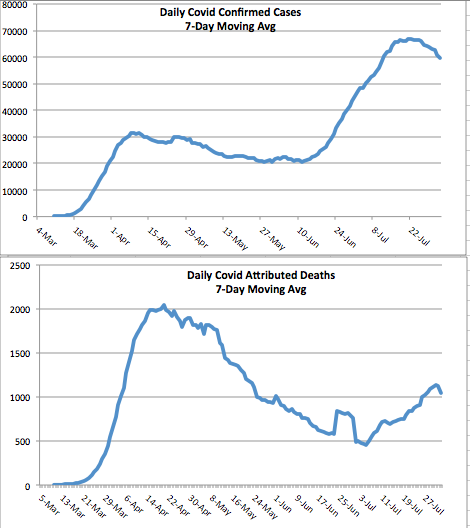
It’s been several weeks since I last posted on the state of the coronavirus pandemic (also see here). The charts below show seven-day moving averages of new confirmed cases and reported C19 deaths from the COVID Tracking Project as of August 3. Daily new cases began to flatten about three weeks ago and then turned down (it can take a few days for such changes to show up in a moving average). Daily C19-attributed deaths began climbing again in early July, lagging new cases by a few weeks, and they slowed just a bit over the past several days. Obviously, both are good news if those changes are maintained. The other thing to note is that deaths have remained far below their levels of April and early May.

The daily death count is that reported on each date, not when the deaths actually occurred. Each day’s report consists of deaths that were spread across several previous weeks or even a month or more. That makes the slight downturn in deaths more tenuous from a data perspective. There are sometimes large numbers of deaths from preceding weeks reported together on a single day, so reporting can be ragged and the final pattern of actual deaths is not known for some time. More on that below.

States

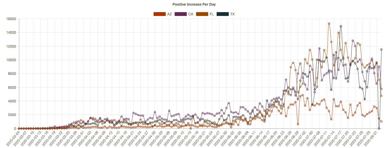
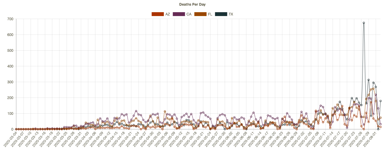
The increase in cases and deaths during late June and July was concentrated in four states: Arizona, California, Florida, and Texas. Here’s how those states look now in terms of cases and deaths, from the interactive COVID Time Series site:


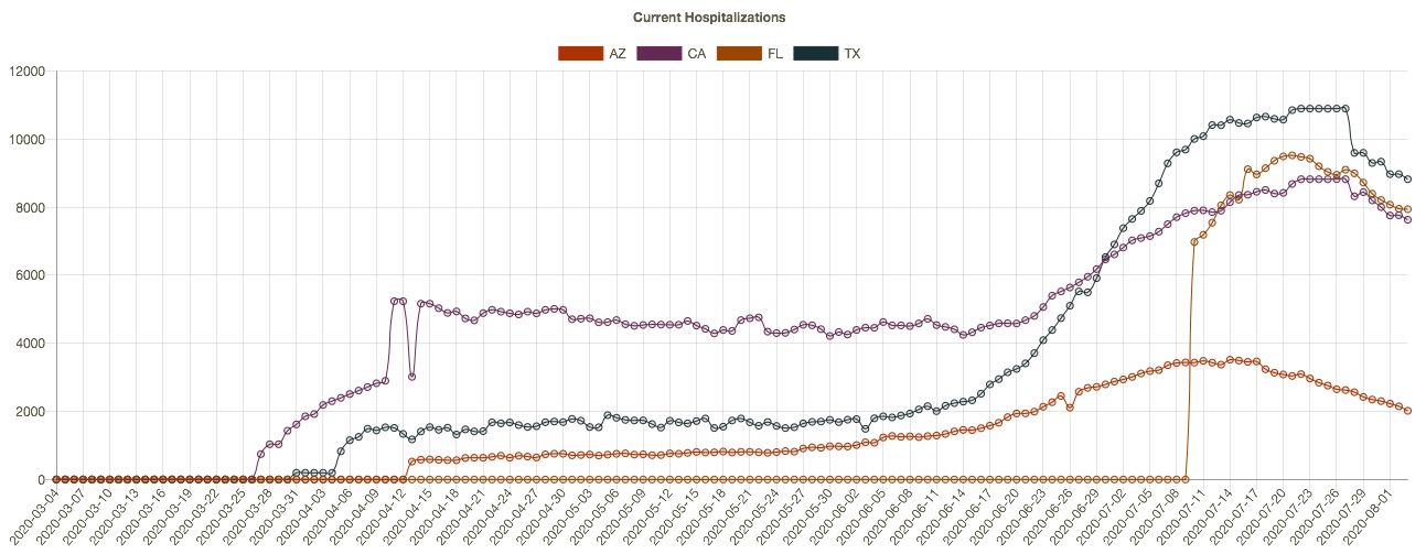
New cases began to flatten or drop in these states two to three weeks ago, driving the change in the national data. Daily deaths have not turned convincingly, but again, these are reported deaths, which actually occurred over previous weeks. One more chart that is suggestive: current hospitalizations in these four states. The recent declines should bode well for the trend in reported deaths, but it remains to be seen. 

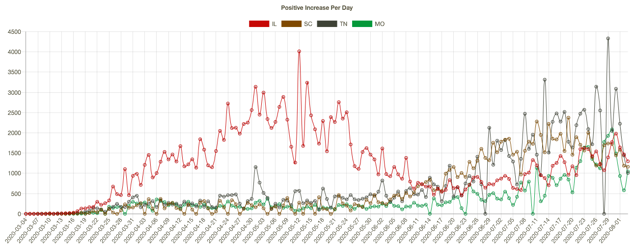
Meanwhile, other parts of the country have seen an uptrend in cases and deaths, such as Illinois, Missouri, South Carolina, and Tennessee. Here are new cases in those states:

It’s worth emphasizing that the elevated level of new cases this summer has not been associated with the rates of fatality experienced in the Northeast during the spring. There are many reasons: better patient care, new treatments, more direct summer sunlight, higher humidity, and tighter controls in nursing homes.

More On the Timing of Deaths

Back to the discrepancies in the timing of reported deaths and actual deaths. This is important because the reported totals each day and each week can be highly misleading, even to the point of frightening the public and policy makers, with consequent psychological and economic impacts.

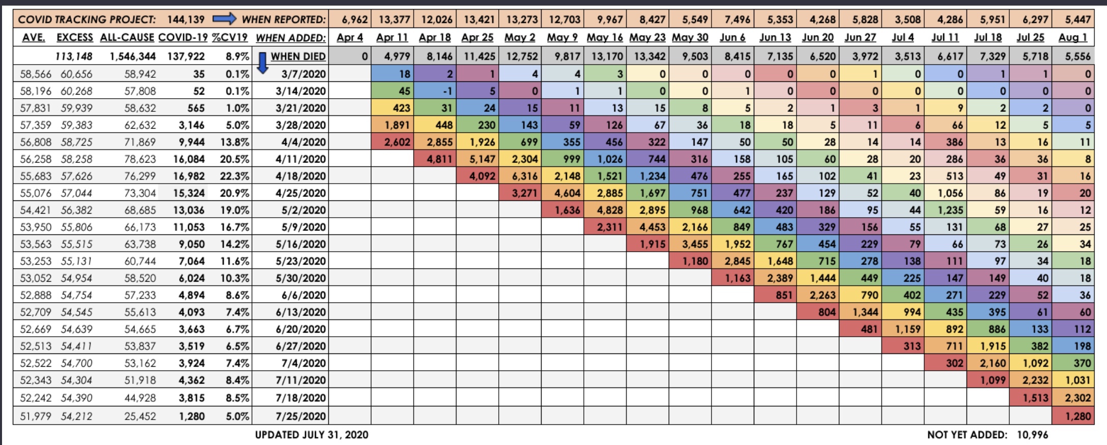
The latest summary of provisional vs. reported deaths is shown below, courtesy of Kyle Lamb, who posts updates on his Twitter feed. This report ends with the last complete week ending August 1. It’s a little hard to read, but you might get a better look if you click on it or turn your phone sideways. Some of the key series are also graphed below. 

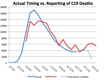
The table shows the actual timing of deaths in the fourth column, with dates alongside. The pattern differs from the statistics reported by the Covid Tracking Project (CTP) in the top row (shaded orange), and from the totals of actual deaths by reporting day in the third row (shaded gray). The reporting dates are always later than the dates of death. This can be seen in the chart below. The most obvious illustration is how many of the deaths from around the peak in mid-April were reported in May. In March and April, the daily reports were short of the ultimate actual death counts because so few deaths with associated dates were known by then.


The right-hand end of the red line shows that many deaths reported by CTP have not yet been placed at an actual date of death by the CDC.  At this point, the actual date of death has not been placed for over 10,000 deaths! Again, those will be spread over earlier weeks.

The blue line is dashed over the last four weeks because those counts are most “highly” provisional. Small changes in the actual counts are likely for dates even before that, but the last four weeks are subject to fairly substantial upward revisions. Eventually, the right end of the blue line will more closely approximate the totals shown in red.

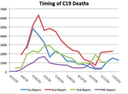
To get an indication of trends in the actual timing of deaths, I plotted the weekly actual deaths reported for the last four reporting weeks going back in time. In the table, those are the four lowest, color-coded diagonals. In the graph below, which should include the qualifier “by recency of report week”, actual deaths in the most recent report week are represented by the blue line, the prior weekly report is red, followed by green (three weeks prior), and purple (four weeks prior… sorry, the colors are not consistent with those in the table). The lines extend farther to the right for more recent report weeks.

The increase in actual deaths occurring in July has declined or flattened in each of the four most recent report weeks. Only the second-to-last week increased as of the August 1st report. On the whole, those changes seem favorable, but we shall see.

Closing

It’s getting trite to say, but the next few weeks will be interesting. The increase in deaths in July was a sad development, but at least the extent of it appears to have been limited. Even with a somewhat higher death count, the fatality rate continued to decline. Let’s hope any further waves of infections are even less deadly.

A Look at Covid-19 Cases in Missouri

21 Tuesday Apr 2020

Posted by Nuetzel in Pandemic

≈ 2 Comments

Tags

Bing, Confirmed Cases, Coronavirus, Covid Tracker, Covid-19, Fatalities, Log Scale, Microsoft, Missouri, Pandemic, St. Louis MO/IL Metro

This is a quick post for Missouri readers. It’s well known that the coronavirus pandemic has differed in its severity across the world and across the country. I’ve been focusing on nationwide statistics, but I thought it would be interesting to look at my home state’s progress in getting ahead of the virus. The charts below are taken from the Covid Tracker from Microsoft/Bing.

The peak of new cases in Missouri appears to be behind us. The state reached a rough plateau around the beginning of April. There was some volatility in the daily numbers of conformed cases, but the a downward trend seemed to begin around the 10th.

Cumulative confirmed cases in Missouri are shown in the next chart (Oops… spelling!), but in log scale. The slope of the line can be interpreted as the growth rate. It’s still positive and will be as long as there are new confirmed cases, but it is getting small.

Daily Covid-19 fatalities in Missouri are shown next. They are obviously quite volatile from day-to-day, as might be expected. They seemed to reach a high about a week after new cases reached their plateau, which demonstrates the lag between diagnosis and death in the most severe cases. The trend has become more favorable over the past week, though another jump in deaths was reported today.

The following chart shows cumulative Missouri fatalities in log scale. The curve is flattening (growth rate slowing), but it might take a few weeks for fatalities to stay in the very low single digits day after day.

The St. Louis metro area has had the largest concentration of cases and fatalities in Missouri. St. Louis County, St. Louis City, and St. Charles County are ranked #1 – #3 in the state, respectively. Here are the top ten counties in terms of this grim statistic (I’m sorry for the poor alignment).

County                 Cases       Deaths

St. Louis               2,333       91 (3.90%)
St. Louis City           877       21 (2.39%)
St. Charles              458       15 (3.28%)
Jackson                   438       13 (2.97%)
Jefferson.                230         3 (1.30%)
Franklin.                  102         5 (4.90%)
Boone                       96         1 (1.04%)
Greene.                    84          7 (8.33%)
Clay                          61         1 (1.64%)
Cass                         54          6  (11.1%)

I wanted to take a closer look at the pattern of cases in the metro area over time. Last night I found daily county-level case data on my phone. I thought I’d be able to download it tonight, but the site has been uncooperative. Maybe later.

Missouri looks like it’s on the back end of the curve, at least for this wave of the pandemic. We can hope there won’t be a second wave, or if there is, that it will be more manageable.


Follow Sacred Cow Chips on WordPress.com

Recent Posts

  • Immigration and Merit As Fiscal Propositions
  • Tariff “Dividend” From An Indigent State
  • Almost Looks Like the Fed Has a 3% Inflation Target
  • Government Malpractice Breeds Health Care Havoc
  • A Tax On Imports Takes a Toll on Exports

Archives

  • December 2025
  • November 2025
  • October 2025
  • September 2025
  • August 2025
  • July 2025
  • June 2025
  • May 2025
  • April 2025
  • March 2025
  • February 2025
  • January 2025
  • December 2024
  • November 2024
  • October 2024
  • September 2024
  • August 2024
  • July 2024
  • June 2024
  • May 2024
  • April 2024
  • March 2024
  • February 2024
  • January 2024
  • December 2023
  • November 2023
  • August 2023
  • July 2023
  • June 2023
  • May 2023
  • April 2023
  • March 2023
  • February 2023
  • January 2023
  • December 2022
  • November 2022
  • October 2022
  • September 2022
  • August 2022
  • July 2022
  • June 2022
  • May 2022
  • April 2022
  • March 2022
  • February 2022
  • January 2022
  • December 2021
  • November 2021
  • October 2021
  • September 2021
  • August 2021
  • July 2021
  • June 2021
  • May 2021
  • April 2021
  • March 2021
  • February 2021
  • January 2021
  • December 2020
  • November 2020
  • October 2020
  • September 2020
  • August 2020
  • July 2020
  • June 2020
  • May 2020
  • April 2020
  • March 2020
  • February 2020
  • January 2020
  • December 2019
  • November 2019
  • October 2019
  • September 2019
  • August 2019
  • July 2019
  • June 2019
  • May 2019
  • April 2019
  • March 2019
  • February 2019
  • January 2019
  • December 2018
  • November 2018
  • October 2018
  • September 2018
  • August 2018
  • July 2018
  • June 2018
  • May 2018
  • April 2018
  • March 2018
  • February 2018
  • January 2018
  • December 2017
  • November 2017
  • October 2017
  • September 2017
  • August 2017
  • July 2017
  • June 2017
  • May 2017
  • April 2017
  • March 2017
  • February 2017
  • January 2017
  • December 2016
  • November 2016
  • October 2016
  • September 2016
  • August 2016
  • July 2016
  • June 2016
  • May 2016
  • April 2016
  • March 2016
  • February 2016
  • January 2016
  • December 2015
  • November 2015
  • October 2015
  • September 2015
  • August 2015
  • July 2015
  • June 2015
  • May 2015
  • April 2015
  • March 2015
  • February 2015
  • January 2015
  • December 2014
  • November 2014
  • October 2014
  • September 2014
  • August 2014
  • July 2014
  • June 2014
  • May 2014
  • April 2014
  • March 2014

Blogs I Follow

  • Passive Income Kickstart
  • OnlyFinance.net
  • TLC Cholesterol
  • Nintil
  • kendunning.net
  • DCWhispers.com
  • Hoong-Wai in the UK
  • Marginal REVOLUTION
  • Stlouis
  • Watts Up With That?
  • Aussie Nationalist Blog
  • American Elephants
  • The View from Alexandria
  • The Gymnasium
  • A Force for Good
  • Notes On Liberty
  • troymo
  • SUNDAY BLOG Stephanie Sievers
  • Miss Lou Acquiring Lore
  • Your Well Wisher Program
  • Objectivism In Depth
  • RobotEnomics
  • Orderstatistic
  • Paradigm Library
  • Scattered Showers and Quicksand

Blog at WordPress.com.

Passive Income Kickstart

OnlyFinance.net

TLC Cholesterol

Nintil

To estimate, compare, distinguish, discuss, and trace to its principal sources everything

kendunning.net

The Future is Ours to Create

DCWhispers.com

Hoong-Wai in the UK

A Commonwealth immigrant's perspective on the UK's public arena.

Marginal REVOLUTION

Small Steps Toward A Much Better World

Stlouis

Watts Up With That?

The world's most viewed site on global warming and climate change

Aussie Nationalist Blog

Commentary from a Paleoconservative and Nationalist perspective

American Elephants

Defending Life, Liberty and the Pursuit of Happiness

The View from Alexandria

In advanced civilizations the period loosely called Alexandrian is usually associated with flexible morals, perfunctory religion, populist standards and cosmopolitan tastes, feminism, exotic cults, and the rapid turnover of high and low fads---in short, a falling away (which is all that decadence means) from the strictness of traditional rules, embodied in character and inforced from within. -- Jacques Barzun

The Gymnasium

A place for reason, politics, economics, and faith steeped in the classical liberal tradition

A Force for Good

How economics, morality, and markets combine

Notes On Liberty

Spontaneous thoughts on a humble creed

troymo

SUNDAY BLOG Stephanie Sievers

Escaping the everyday life with photographs from my travels

Miss Lou Acquiring Lore

Gallery of Life...

Your Well Wisher Program

Attempt to solve commonly known problems…

Objectivism In Depth

Exploring Ayn Rand's revolutionary philosophy.

RobotEnomics

(A)n (I)ntelligent Future

Orderstatistic

Economics, chess and anything else on my mind.

Paradigm Library

OODA Looping

Scattered Showers and Quicksand

Musings on science, investing, finance, economics, politics, and probably fly fishing.

  • Subscribe Subscribed
    • Sacred Cow Chips
    • Join 128 other subscribers
    • Already have a WordPress.com account? Log in now.
    • Sacred Cow Chips
    • Subscribe Subscribed
    • Sign up
    • Log in
    • Report this content
    • View site in Reader
    • Manage subscriptions
    • Collapse this bar
 

Loading Comments...