• About

Sacred Cow Chips

Sacred Cow Chips

Tag Archives: Seasonality

Mask Truths and Signals

26 Tuesday Oct 2021

Posted by Nuetzel in Coronavirus, Public Health

≈ 6 Comments

Tags

Aerosols, Anne Wheeler, Cloth Masks, Comorbitities, Coronavirus, Covid-19, Delta Variant, Emotional Interference, Endemicity, Germaphobia, Influenza, Mask Mandates, Masks, Michael Levitt, OCD Therapy, Outdoor Infectiions, Precautionary Principle, Randomized Control Trials, Seasonality, Viral Interference, Viral Transmission

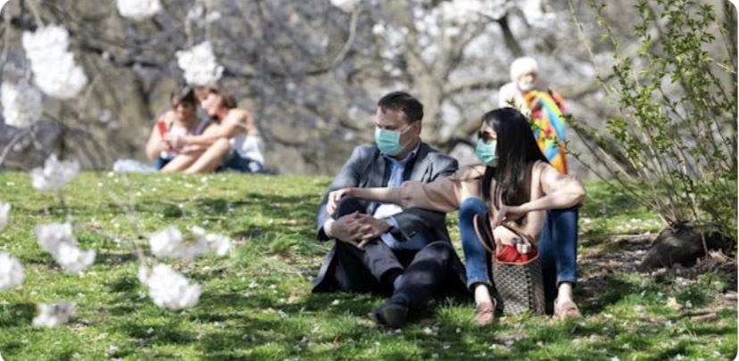
It’s been clear since the beginning of the pandemic that your chance of getting infected with COVID outside is close to zero. (Also see here). Yet I still see a few masked people on the beach, in the park, on balconies, and walking in the neighborhood. Given the negligible risk of contracting COVID outdoors, the marginal benefit of masking outdoors is infinitesimal. Likewise, the benefit of a mask to the sole occupant of a vehicle is about zilch. Okay, some individuals might forget to remove their masks after leaving a “high-risk” environment. Sure, maybe, but cloth masks really don’t stop the dispersion of fine aerosols anywhere, indoors or outdoors. Of course, the immune-compromised have a reasonable excuse to apply the precautionary principle, but generally not outside with good air quality.

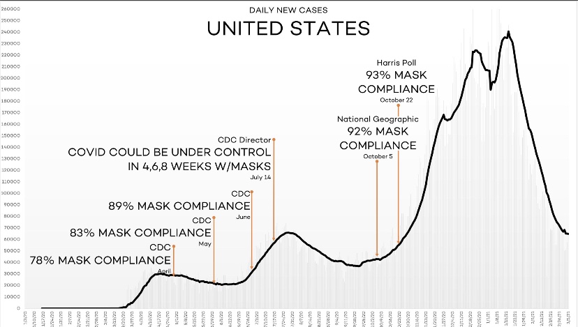
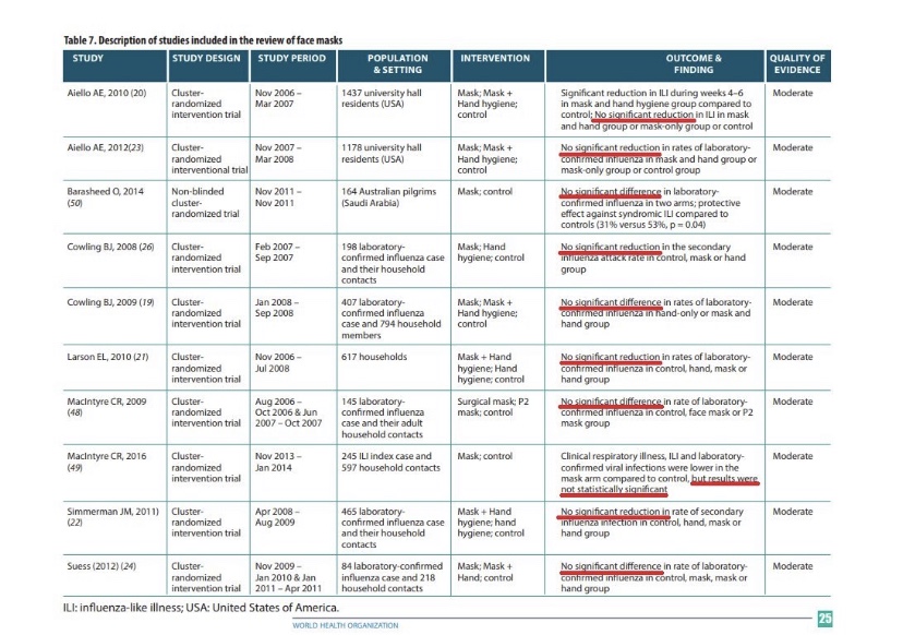
The following link provides a list of mask studies, and meta-studies. Several describe randomized control trials (RCTs). They vary in context, but all of them reject the hypothesis that masks are protective. Positive evidence on mask efficacy is lacking in health care settings, in community settings, and in school settings, and the evidence shows that masks create “pronounced difficulties” for young children and “emotional interference” for school children of all ages. Here’s another article containing links to more studies demonstrating the inefficacy of masks. Also see here. And this article is not only an excellent summary of the research, but it also highlights the hypocrisy of the “follow the science” public health establishment with respect to RCTs. Compliance is not even at issue in many of these studies, though if you think masks matter, it is always an issue in practice. Even studies claiming that cloth masks of the type normally worn by the public are “effective” usually concede that a large percentage of fine aerosols get through the masks… containing millions of tiny particles. In indoor environments with poor ventilation, those aerosols remain suspended in the air for periods long enough to be inhaled by others. That, in fact, is why masks are ineffective at preventing transmission.

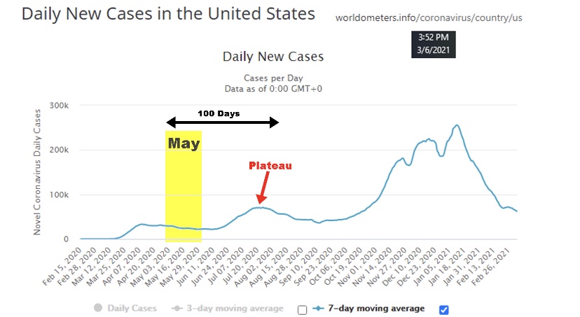
Another dubious claim is that masks are responsible for virtually eliminating cases of influenza in 2020 and 2021. Again, to be charitable, masks are of very limited effectiveness in stopping viral transmission. Moreover, compliance has been weak at best, and areas without mask mandates have experienced the same plunge in flu cases as areas with mandates. A far more compelling explanation is that viral interference caused the steep reduction in flu incidence. The chance of being infected with more than one virus at a time is almost nil. Simply put, COVID outcompeted the flu.

Again, I grant that there are studies (though only a single randomized control trial out of India of which I’m aware) that have demonstrated significant protective effects. Even then, however, the mixed nature of this body of research does not support intrusive masking requirements.

Nevertheless, masks are still mandated in some jurisdictions. Those mandates usually don’t apply outdoors, however, and not in your own damn car! Mask mandates contribute to the general climate of fear surrounding COVID, which is wholly unjustified for most children and healthy working-age people. Public health messaging should focus on high-risk individuals: the elderly, the obese, and those having so-called comorbidities and compromised immune systems. Those groups have obvious reasons to be concerned about the virus. They have excuses to be germaphobic! Still, they are at little risk outdoors, the value of masks is doubtful, and breathing deep of fresh air is good for you in any case!

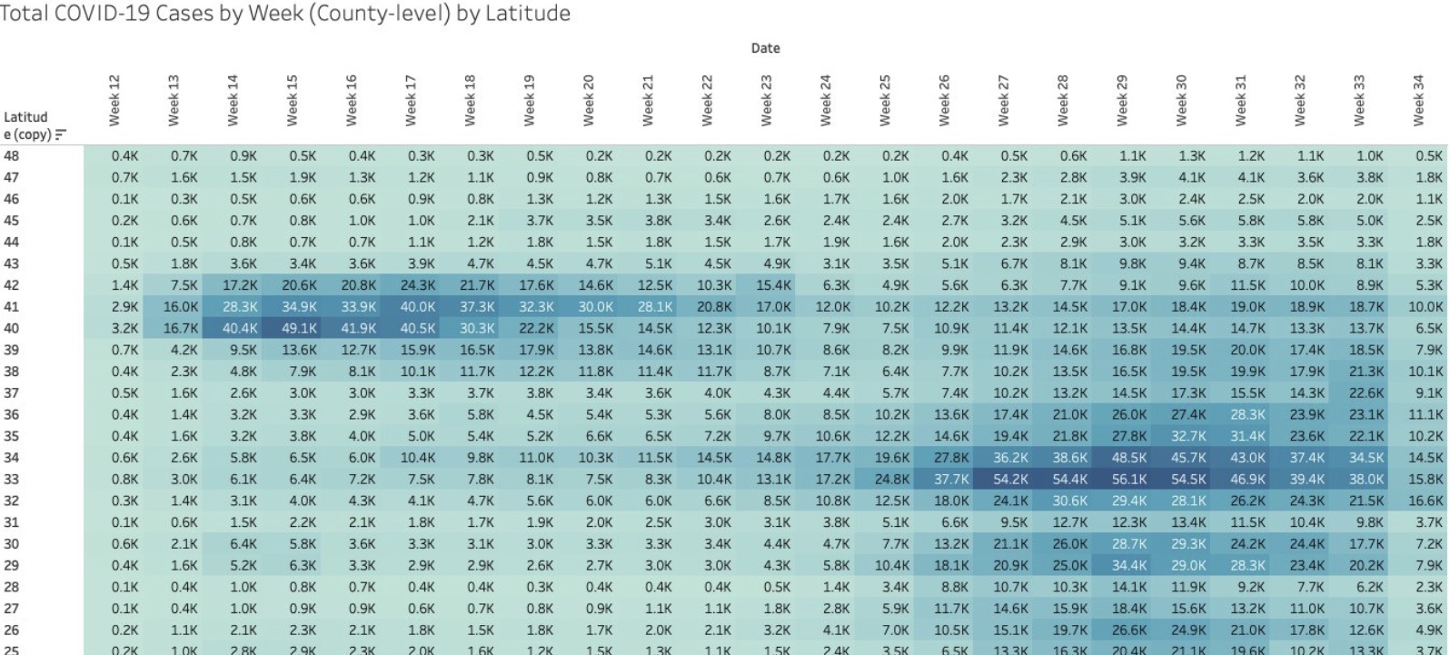
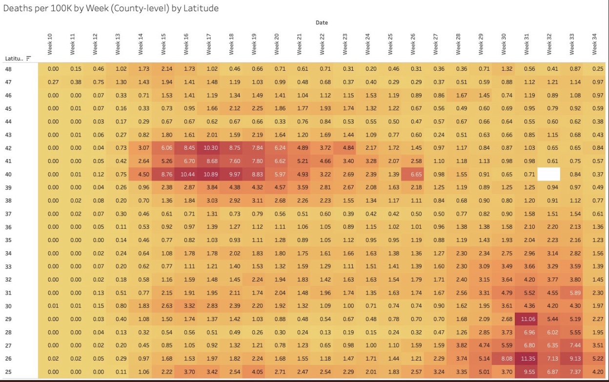
The incidence of COVID has declined substantially in many areas since early September, but the virus is now almost certainly endemic and is likely to return in seasonal waves. However, the Delta wave was far less deadly than earlier variants, a favorable trend many believe will continue. These charts from the UK posted by Michael Levitt demonstrate the improvement vividly. Perhaps the mask craze will fade away as the evidence accumulates.

The pandemic has been a moment of redemption for germaphobes, but no reasonable assessment of risk mitigation relative to the cost, inconvenience, discomfort, and psychological debasement of face jackets can prove their worth outdoors. Their value indoors is nearly as questionable. Yet there remains a stubborn reluctance by public health authorities to lift mask mandates. There are far too many individuals masking outdoors, and to be nice, perhaps it’s mere ignorance. But there are still a few would-be tyrants on Twitter presuming to shame others into joining this pathetic bit of theatre. I believe Anne Wheeler nailed it with this recent tweet:

“This is one of the first things you learn in OCD therapy – you don’t get to make people participate in your compulsions in order to lesson your own anxiety. It’s bizarre that it’s been turned into a virtue.”

There’s also no question that masks are still in vogue as a virtue signal in some circles, but a mask outdoors, especially, is increasingly viewed as a stupid-signal, and for good reason. I’ll continue to marvel at the irrationality of these masked alarmists, who just don’t understand how foolish they look. Give yourself permission to get some fresh air!

CDC Wags Finger; Diners Should Wag One Back

09 Tuesday Mar 2021

Posted by Nuetzel in Coronavirus, Public Health

≈ Leave a comment

Tags

Biden Administration, Causality, CDC, COVID Relief Bill, Covid-19, Dining Restrictions, Hope-Simpson, Karl Dierenbach, Lockdowns, Mask Mandates, Masks, Non-Pharmaceutical interventions, NPIs, Seasonality, Spurious Correlation, Vaccinations, Zero COVID

The CDC’s new study on dining out and mask mandates is a sham. On its face, the effects reported are small. And while it’s true most of the reported effects are statistically significant, the CDC acknowledges a number of factors that might well have confounded the results. This study should remind us of the infinite number of spurious and “significant” correlations in the world. Here, the timing of the mandates (or their removal) relative to purported effects and seasonal waves is highly suspicious, and as always, attributing causality on the basis of correlation is problematic.

On one hand, the CDC’s results are contrary to plentiful evidence that mandates are ineffective; on the other hand, the results are contrary to earlier CDC “guidance” that masks and limits on indoor dining are “highly effective”. Nevertheless, the latest report has massive propaganda value to the CDC. The media lapped up the story and provided cover for Democrats eager to pass the COVID (C19) relief package. Likewise, the Biden Administration is apparently committed to the narrative of an ongoing crisis as cover for continued attempts to shame political opponents in states that have elected to “reopen” or remain open.

Right off the bat, the study’s authors assert that the primary mode of transmission of C19 is from respiratory droplets. This is false. We know that aerosols are the main culprit in transmission, against which cloth masks are largely ineffective.

Be that as it may, let’s first consider the findings on dining. There was no statistically significant effect on the growth rate of cases or deaths up to 40 days after restrictions were lifted, according to the report. In fact, case growth declined slightly. There was, however, a small but statistically significant increase after 40 days. The fact that deaths seemed to “respond” faster and with greater magnitude than cases makes no sense and suggests that the results might be spurious.

The CDC offers possible explanations the long delay in the purported impact, such as the time required by restaurants to resume operations and early caution on the part of diners. These are speculative, of course. More pertinent is the fact that the data did not distinguish between indoor and outdoor dining, nor did it account for other differences in regulation such as rules on physical distancing, intra-county variation in local government mandates, and compliance levels.

Finally, the measurement of effects covered 100 days after the policy change, but this window spans different stages of the pandemic. There were three waves of infections during 2020, which correspond to the classic Hope-Simpson pattern of virus seasonality. One was near year-end, but as each of the first two waves tapered (April-May, August-September), it should be no surprise that many restrictions were lifted. Within two months, however, new waves had begun. Karl Dierenbach notes that most of the reopenings occurred in May. Here’s how he explains the pattern:

“The map on the left shows counties where there was no on-premises dining (pink) in restaurants as of the beginning of May (4/30). … The map on the right shows that by the end of May, almost the entire country moved to allow some on-premises dining (green).”

“In the 100 days after May 1, cases nationwide fell slightly, then began to rise, and then plateaued.”

“And what did the CDC find happened after restaurants were allowed (changing mostly in May) to have on-premises dining? … Surprise! The CDC found that cases fell slightly, then began to rise, and then plateaued.”

The summer “mini-wave” is typical of mid- and tropical-latitude seasonality. Thus, the CDC’s findings with respect to dining restrictions are likely an artifact of the strong seasonality of the virus, rather than having anything to do with the lifting of restrictions between waves.

What about the imposition of mask mandates? The CDC’s findings show a much faster response in this case, with statistically significant changes in growth during the first 20 days. Another indicator of spurious correlation is that the growth response of deaths did not lag that of cases, but in fact deaths have reliably lagged cases by over 18 days during the pandemic. Again, the CDC’s caveats apply equally to its findings on masks. A large share of individuals adopted mask use voluntarily before mandates were imposed, so it’s not even clear that the mandates contributed much to the practice.

It’s a stretch to believe that mask mandates would have had an immediate, incremental effect on the growth of cases and deaths, given probable lags in compliance, exposure, and onset of symptoms. Moreover, a number of mask mandates in 2020 were imposed near the very peak of the seasonal waves. Little wonder that the growth rates of cases and deaths declined shortly thereafter.

We’ve known for a long time that masks do little to stop the spread of viral particles. They become airborne as aerosols which easily penetrate the kind of cloth masks worn by most members of the public, to say nothing of making contact with their eyes. The table below contains citations to research over the past 10 years uniformly rejecting the hypothesis of a significant protective effect against influenza from masks. There is no reason to believe that they would be more effective in preventing C19 infections.

The CDC’s report on dining restrictions and mask mandates is a weak analysis. They wish to emphasize their faith in non-pharmaceutical interventions (NPIs) to minimize risks. They do so at a time when the vaccinated share of the most vulnerable population, the elderly, has climbed above 50% and is increasing steadily. Thus, risks are falling dramatically, so it’s past time to weigh the costs and benefits of NPIs more realistically. The timing of the report also seemed suspicious, coming as it did in the heat of the battle over the $1.9 trillion COVID relief bill, which subsequently passed.

It’s also a good time to note that zero risk, including “Zero COVID”, is not a realistic or worthwhile goal under any reasonable comparison of costs and benefits. Furthermore, NPIs have proven weak generally (also see here); claims to the contrary should always make us wary.

Auspicious COVID News for Thanksgiving

25 Wednesday Nov 2020

Posted by Nuetzel in Coronavirus, Herd Immunity

≈ 1 Comment

Tags

Covid-19, COVID-LIke-Illness, Deaths by Date-of-Death, Flu Season, Herd Immunity, Herd Immunity Threshold, Influenza-Like Illness, Latitude, New Cases, Reproduction Rate, Seasonality, Seroprevalence

There are some hints of good news on the spread of the coronavirus in a few of the “hot spots“ that developed this fall. This could be very good news, but it’s a bit too early to draw definitive conclusions.

The number of new cases plateaued in Europe a few weeks ago. Of course, Europe’s average latitude is higher than in most of the U.S., and the seasonal spread began there a little earlier. It makes sense that it might ebb there a bit sooner than in the U.S. as well.

In the U.S., cases shot up in the upper Midwest four to six weeks ago, depending on the state. Now, however, new cases have turned down in Iowa, Nebraska, North Dakota, South Dakota, and Wisconsin (first chart below), and they appear to have plateaued in Illinois, Kansas, Minnesota, and Missouri (second chart below, but ending a few days earlier). These are the hottest of the recent hot states.

These plateaus and declines were preceded by a decline in the growth rates of new cases around 10 days ago, shown below.

The timing of these patterns roughly correspond to the timing of the spread in other regions earlier in the year. It’s been suggested that after seroprevalence reaches levels of around 15% – 25% that individuals with new antibodies, together with individuals having an existing pre-immunity from other coronaviruses, is enough to bring the virus reproduction rate (R) to a value of one or less. That means a breach of the effective herd immunity threshold. It’s possible that many of these states are reaching those levels. Of course, this is very uncertain, but the patterns are certainly encouraging.

Deaths lag behind new infections, and it generally takes several weeks before actual deaths by date-of-death are known with any precision. However, we might expect deaths to turn down within two to three weeks.

Deaths by date-of-death are strongly associated with emergency room patients from three weeks prior who presented symptoms of COVID-like illness (CLI) or influenza-like illness ((ILI). The following chart shows CLI and ILI separately for the entire U.S. (ILI is the lowest dashed line), but the last few observations of both series, after a peak on November 15th, suggest a downturn in CLI + ILI. If the relationship holds up, actual U.S. deaths by date-of-death should peak around December 7th, though we won’t know precisely until early in the new year.

As a side note, it continues to look like the flu season will be exceptionally mild this year. See the next chart. That’s tremendous because it should take some of the normal seasonable pressure off health care resources.

So Happy Thanksgiving!

-————————————————

Note: I saved all those charts over the last few days but lost track of the individual sources on Twitter. I’m too lazy and busy to go back and search through Twitter posts, so instead I’ll just list a few of my frequent sources here with links to recent posts, which are not necessarily apropos of the above: Don Wolt, Justin Hart, AlexL, The Ethical Skeptic, Aaron Ginn, and HOLD2.

COVID and Hospital Capacity

15 Sunday Nov 2020

Posted by Nuetzel in Health Care, Pandemic

≈ 1 Comment

Tags

Bed Capacity, Capacity Management, CDC, Covid-19, HealthData.gov, Herd Immunity, Hospital Utilization, ICU Capacity, ICU Utilization, Influenza, Justin Hart, Lockdown Illnesses, Missouri, PCR Tests, Prevalence, Seasonality, St. Louis MO, Staffed Beds, Staffed Utilization, Statista

The fall wave of the coronavirus has brought with it an increase in COVID hospitalizations. It’s a serious situation for the infected and for those who care for them. But while hospital utilization is rising and is reaching tight conditions in some areas, claims that it is already a widespread national problem are without merit.

National and State Hospital Utilization

The table below shows national and state statistics comparing beds used during November 1-9 to the three-year average from 2017 – 19, from Justin Hart. There are some real flaws in the comparison: one is that full-year averages are not readily comparable to particular times of the year, with or without COVID. Nevertheless, the comparison does serve to show that current overall bed usage is not “crazy high” in most states, as it were. The increase in utilization shown in the table is highest in IA, MT, NV, PA, VT, and WI, and there are a few other states with sizable increases.

Another limitation is that the utilization rates in the far right column do not appear to be calculated on the basis of “staffed” beds, but total beds. The U.S. bed utilization rate would be 74% in terms of staffed beds.

Average historical hospital occupancy rates from Statista look like this:

Again, these don’t seem to be calculated on the basis of staffed beds, but current occupancies are probably higher now based on either staffed beds or total beds.

As of November 11th, a table available at HealthData.gov indicates that staffed bed utilization in the U.S. is at nearly 74%, with ICU utilization also at 74%. As the table above shows, states vary tremendously in their hospital bed utilization, a point to which I’ll return below.

COVID patients were using just over 9% of of all staffed beds and just over 19% of ICU beds as of November 11th. One caveat on the reported COVID shares you’ll see for dates going forward: the CDC changed its guidelines on counting COVID hospitalizations as of November 12th. It is now a COVID patient’s entire hospital stay, rather than only when a patient is in isolation with COVID. That might be a better metric if we can trust the accuracy of COVID tests (and I don’t), but either way, the change will cause a jump in the COVID share of occupied beds.

Interpreting Hospital Utilization

Many issues impinge on the interpretation of hospital utilization rates:

First, cases and utilization rates are increasing, which is worrisome, but the question is whether they have already reached crisis levels or will very soon. The data doesn’t suggest that is the case in the aggregate, but there certainly there are hospitals bumping up against capacity constraints in some parts of the country.

Second, occupancies are increasing due to COVID patients as well as patients suffering from lockdown-related problems such as self-harm, psychiatric problems, drug abuse, and conditions worsened by earlier deferrals of care. We can expect more of that in coming weeks.

Third, lockdowns create other hospital capacity issues related to staffing. Health care workers with school-aged children face the daunting task of caring for their kids and maintaining hours on jobs for which they are critically needed.

Fourth, there are capacity issues related to PPE and medical equipment that are not addressed by the statistics above. Different uses must compete for these resources within any hospital, so the share of COVID admissions has a strong bearing on how the care of other kinds of patients must be managed.

Fifth, some of the alarm is purely case-driven: all admissions are tested for COVID, and non-COVID admissions often become COVID admissions after false-positive PCR tests, or simply due to the presence of mild COVID with a more serious condition or injury. However, severe COVID cases have an outsized impact on utilization of staff because their care is relatively labor-intensive.

Sixth, there are reports that the average length of COVID patient stays has decreased markedly since the spring (it is hard to find nationwide figures), but it is also increasingly difficult to find facilities for post-acute care required for some patients on discharge. Nevertheless, if improved treatment reduces average length of stay, it helps hospitals deal with the surge.

Finally, thus far, the influenza season has been remarkably light, as the following chart from the CDC shows. It is still early in the season, but the near-complete absence of flu patients is helping hospitals manage their resources.

St. Louis Hotspot

The St. Louis metro area has been proclaimed a COVID “hotspot” by the local media and government officials, which certainly doesn’t make St. Louis unique in terms of conditions or alarmism. I’m curious about the data there, however, since it’s my hometown. Here is hospital occupancy on the Missouri side of the St. Louis region:

It seems this chart is based on total beds, not staffed beds, However, one of the interesting aspects of this chart is the variation in capacity over time, with several significant jumps in the series. This has to do with data coverage and some variation in daily reporting. Almost all of these data dashboards are relatively new, so their coverage has been increasing, but generally in fits and starts. Reporting is spotty on a day-to-day basis, so there are jagged patterns. And of course, capacity can vary from day-to-day and week-to-week — there is some flexibility in the number of beds that can be made available.

The share of St. Louis area beds in use was 61% as of November 11th (preliminary). COVID patients accounted for 12% of hospital beds. ICU utilization in the St. Louis region was a preliminary 67% as of Nov. 11, with COVID patients using 29% of ICU capacity (which is quite high). Again, these figures probably aren’t calculated on the basis of “staffed” beds, so actual hospital-bed and ICU-bed utilization rates could be several percentage points higher. More importantly, it does not appear that utilization in the St. Louis area has trended up over the past month.

At the moment, the St. Louis region appears to have more spare hospital capacity than the nation, but COVID patients are using a larger share of all beds and ICU beds in St. Louis than nationwide. So this is a mixed bag. And again, capacity is not spread evenly across hospitals, and it’s clear that hospitals are under pressure to manage capacity more actively. In fact, hospitals only have so many options as the share of COVID admissions increases: divert or discharge COVID and non-COVID patients, defer elective procedures, discharge COVID and non-COVID patients earlier, allow beds to be more thinly staffed and/or add temporary beds wherever possible.

Closing Thoughts

Anyone with severe symptoms of COVID-19 probably should be hospitalized. The beds must be available, or else at-home care will become more commonplace, as it was for non-COVID maladies earlier in the pandemic. A continued escalation in severe COVID cases would require more drastic steps to make hospital resources available. That said, we do not yet have a widespread capacity crisis, although that’s small consolation to areas now under stress. And a few of the states with the highest utilization rates now have been rather stable in terms of hospitalizations — they already had high average utilization rates, which is potentially dangerous.

COVID is a seasonal disease, and it’s no surprise that it’s raging now in areas that did not experience large outbreaks in the spring and summer. And those areas that had earlier outbreaks have not had a serious surge this fall, at least not yet. My expectation and hope is that the midwestern and northern states now seeing high case counts will soon reach a level of prevalence at which new infections will begin to subside. And we’re likely to see a far lower infection fatality rate than experienced in the Northeast last spring.

Fall Coronavirus Season

16 Friday Oct 2020

Posted by Nuetzel in Coronavirus, Pandemic, Uncategorized

≈ Leave a comment

Tags

Antigenic Drift, CARES Act, Coronavirus, Covid-19, Death Laundering, Europe, False Positives, Hospital Reimbursement, IFR, Immunity, Infection Fatality Rate, Kyle Lamb, Medicare, Seasonality, Second Wave, Twitter, Vitamin D, WHO

We’ve known for some times that COVID-19 (C19) follows seasonal patterns typical of the flu, though without the flu’s frequent antigenic drift. Now that we’re moving well into autumn, we’ve seen a surge in new C19 case counts in Europe and in a number of U.S. states, especially along the northern tier of the country.

The new case surge began in early to mid-September, depending on the state, and it’s been coincident with another surge in tests. From late July through early October, we had a near doubling in the number of tests per positive in the U.S. An increase in tests also accompanied the previous surge during the summer, which claimed far fewer lives than the initial wave in the early spring. In the summer, infections were much more prevalent among younger people than in the spring. Vitamin D levels were almost certainly higher during the summer months, our ability to treat the virus had also improved, and immunities imparted by prior infections left fewer susceptible individuals in the population. We have many of those advantages now, but D levels will fade as the fall progresses.

As for the new surge in cases, another qualification is that false positives are still a major testing problem; they inflate both case counts and C19-attributed deaths. In the absence of any improvement in test specificity, of which there is no evidence, the exaggeration caused by false positives grows larger as testing increases and positivity rates fall. So take all the numbers with that as a caveat.

How deadly will the virus be this fall? So far in Europe, the trends look very promising. Kyle Lamb provided the following charts from WHO on Twitter yesterday. (We should all be grateful that Twitter hasn’t censored Kyle yet, because he’s been a force in exposing alarmism in the mainstream media and among the public health establishment.) Take a look at these charts, and note particularly the lag between the first wave of infections and deaths, as well as the low counts of deaths now:

If the lag between diagnosis and death is similar now to the spring, Europe should have seen a strong upward trend in deaths by now, yet it’s hardly discernible in most of those countries. The fatality rates are low as well:

As Lamb notes, the IFRs in the last column look about like the flu, though again, the reporting of deaths and their causes are often subject to lags.

What about the U.S.? Nationwide, C19 cases and attributed death reports declined after July. See the chart below. More recently, reported deaths have stabilized at under 700 per day. Note again the relatively short lags between turns in cases and deaths in both the spring and summer waves.

Clearly, there has been no acceleration in C19 deaths corresponding to the recent trend in new cases. Northeastern states that had elevated death rates in the spring saw no resurgence in the summer; southern states that experienced a surge in the summer have now enjoyed taperings of both cases and deaths. But with each season, the virus seems to roll to regions that have been relatively unscathed to that point. Now, cases are surging in the upper Midwest and upper mountain states, though some of these states are lightly populated and their data are thin.

A few state charts are shown below, but trends in deaths are very difficult to tease out in some cases. First, here are new cases and reported deaths in Michigan, Wisconsin, and Minnesota. There is a clear uptrend in cases in these states along with a very slight rise in deaths, but reported deaths are very low.

Next are Idaho, Montana, North Dakota, and South Dakota. A slight uptrend in cases began as early as August. Idaho and Montana have had few deaths, so they are not plotted in the second chart. The Dakotas have had days with higher reported deaths, and while the data are thin and volatile, the visual impression is definitely of an uptrend in deaths.

The following states are somewhat more central in latitude: Colorado, Illinois, and Ohio. There is a slight upward trend in new cases, but not deaths. Illinois is experiencing its own second wave in cases.

Out of curiosity, I also plotted Massachusetts, Pennsylvania, and New Jersey, all of which suffered in the first wave during the spring. They are now experiencing uptrends in cases, especially Massachusetts, but deaths have been restrained thus far.

The upshot is that states having little previous exposure to the virus are seeing an uptrend in deaths this fall. The same does not seem to be happening in states with significant prior exposure, at least not yet.

There are major questions about the reasons for the lingering death counts in the U.S.. But consider the following: first, the infection fatality rate (IFR) keeps falling, despite the stubborn level of daily reported deaths. Second, deaths reported have increasingly been pulled forward from deaths that actually occurred in the more distant past. This sort of “laundering” lends the appearance of greater persistence in deaths than is real. Third, again, false positives exaggerate not just cases, but also C19 deaths. Hospitals test everyone admitted, and patients who test positive for C19 are reimbursed at higher rates under the CARES Act; Medicare reimburses at a higher rates for C19 patients as well.

We’re definitely seeing a seasonal upswing in C19 infections in the US., now going on five weeks. In Europe, the surge in cases began slightly earlier. However, in both Europe and the U.S., these new cases have not yet been associated with a meaningful surge in deaths. The exceptions in the U.S. are the low-density upper mountain states, which have had little prior exposure to the virus. The lag between cases and deaths in the spring and summer was just two to three weeks, and while it’s too early to draw conclusions, the absence of a surge in deaths thus far bodes well for the IFR going forward. If we’re so fortunate, we can thank a combination of factors: a younger set of infecteds, earlier detection, better treatment and therapeutics, lower viral loads, and a subset of individuals who have already gained immunity.

COVID, Trump, and Tyrants

11 Sunday Oct 2020

Posted by Nuetzel in Pandemic, Public Health, Trump Administration

≈ Leave a comment

Tags

15 Days to Slow the Spread, Andrew Cuomo, Asian Flu 1557-58, CCP, Centers for Disease Controls, Covid-19, Donald Trump, Dr. Anthony Fauci, Dr. Deborah Birx, Dr. Robert Redfield, Federalism, Mike Pence, Opening Up America Again, Pandemic, SARS Virus, Seasonality, World Health Organization

I’ve said this before, but it bears repeating: allegations of the White House’s “poor leadership” and preparedness for COVID-19 (C19) are a matter of selective memory. At the link above, I “graded” Trump’s pandemic job performance through May. Among other things, I said:

“Many have criticized the Trump Administration for not being ‘ready’ for a pandemic. I assign no grade on that basis because absolutely no one was ready, at least not in the West, so there is no sound premise for judgement. I also view the very general charge that Trump did not provide “leadership” as code for either ‘I don’t like him’, or ‘he refused to impose more authoritarian measures’, like a full-scale nationwide lockdown. Such is the over-prescriptive instinct of the Left.”

The President of the United States does not have the constitutional authority to impose a national lockdown, though Trump himself seemed confused at times as to whether he had that power. However, on this basis at least, the ad nauseam denigration of his “leadership” is vapid. At this point, the course of the pandemic in the U.S. is less severe than in several other industrialized countries who didn’t even have Andrew Cuomo around to exacerbate the toll, and it’s still not as deadly in per capita terms as the Asian Flu of 1957-58.

Who exactly was “ready” for C19? Perhaps critics are thinking of South Korea, or parts of South Asia. Those countries might have been “ready” to the extent that they had significant prior exposure to SARS viruses. There was already some degree of immunological protection. Those countries also were exposed to an earlier genetic variant of C19 that was much less severe than the strain that hit most of the western world. These are hardly reasons to blame Trump for a lack of “readiness”.

A related charge I hear all the time is that Trump “ignored the advice of medical experts“, or that he “ignored the science“. Presumably, those “experts” include the darling of the Prescriptive Class, Dr. Anthony Fauci. On February 28, Dr Fauci said:

“Right now, at this moment, there’s no need to change anything you’re doing on a day by day basis.“

All-righty then! So this was the advice Trump “should” have followed. Oh, wait… he did! And Fauci, on March 9, said there was no reason for young, healthy people to avoid cruise ships.

Likewise, Dr. Robert Redfield, Director of the Centers for Disease Control, said the following on February 27:

“The risk to the American public is low. We have an aggressive containment strategy that really has worked up to this time, 15 cases in the United States. Until the last case that we just had in Sacramento we hadn’t had a new case in two weeks.”

Then there is the World Health Organization, which downplayed the virus in January and February, and giving a convincing impression that it servied as a mouthpiece for the CCP.

In fact, the American people were badly harmed by wrongheaded decisions made by the “experts” at the CDC in January and February, when the agency insisted that testing could not proceed until a test of their own design was ready. Then, the first version it approved was discovered to be flawed! This set the testing effort back by well over a month, a delay that proved critical. It’s no exaggeration to say this bureaucratic overreach denied the whole country, and Trump, the information needed to properly assess the spread of the virus.

But let’s think about actual policy once it became clear that the virus was getting to be a serious matter in parts of the U.S. Here’s another excerpt from my post in May:

“Trump cannot be accused of ignoring expert advice through the episode. He was obviously on-board with Fauci, Dr. Deborah Birx, Dr. Robert Redfield, and other health care advisors on the ‘15 Days to Slow the Spread‘ guidelines issued on March 16. His messaging wavered during those 15 days, expressing a desire to fully reopen the nation by Easter, which Vice President Michael Pence later described as “aspirational”. Before the end of March, however, Trump went along with a 30-day extension of the guidelines. Finally, by mid-April, the White House released guidelines for ‘Opening Up America Again‘, which was a collaboration between Trump’s health care experts and the economic team. Trump agreed that the timeline for reopening should be governed by ‘the data’.” 

We should give Trump credit for shutting down flights into the U.S. from China, where the virus originated, late in January. That was an undeniably prescient move. Let’s also not forget that the original intent of the “15 Days” was to prevent hospitals and other medical resources from being overwhelmed. Today, the data show a strong seasonal tendency to the spread of the virus, but medical resources are not close to being overwhelmed, our ability to treat the virus has vastly improved, and its consequences are much less deadly than in the spring. That’s good progress, whatever the President’s detractors may say.

More than anything else, what Trump’s COVID critics fail to understand is that the executive leader of a republic is not possessed of monarchical powers. And in the U.S., the Constitution provides an additional layer of sovereignty for member states of the Union, a manifestation of the federalist principals without which the Union would not have been possible. The 15-day guidelines produced by the White House, and the guidelines for reopening, were consistent with this framework. The states have adapted their own policies to actual conditions and, if their leaders haven’t worn out their goodwill among voters, internal political realities. Those adaptations were often bad from my perspective, or even tyrannical, but sometimes good. That is exactly how our federalist system was designed to work.

COVID Seasonality and Latitudes

23 Sunday Aug 2020

Posted by Nuetzel in Pandemic

≈ 2 Comments

Tags

Air Conditioning, Antibodies, Antigenic Drift, Bimodal, Coronavirus, Covid-19, Ethical Skeptic, Heidi J Zapata, Herd Immunity, Herd Immunity Threshold, Humidity, Immune Response, Justin Hart, Latitude and Seasonality, Proofreading enzymes, Robert Edgar Hope-Simpson, SARS, SARS-CoV-2, Seasonality, Sunlight, T-Cell Immunity, Temperature, Tropical Latitudes, Viral Load, Viral Mutation, Vitamin D Deficiency

The coronavirus (C19), or SARS-CoV-2, has a strong seasonal component that appears to closely match that of earlier SARS viruses as well as seasonal influenza. This includes the two distinct caseloads we’ve experienced in the U.S. 1) in the late winter/early spring; and 2) the smaller bump we witnessed this summer in some southern states and tropics. 

COVID Seasonal Patterns and Latitude

The Ethical Skeptic on Twitter recently featured the chart below. It shows the new case count of C19 in the U.S. in the upper panel, and the 2003 SARS virus in the lower panel. Both viruses had an initial phase at higher latitudes and a summer rebound at lower latitudes.


I particularly like the following visualizations from Justin Hart demonstrating the pandemic’s pattern at different latitudes (shown in the leftmost column). The first table shows total cases by week of 2020. The second shows deaths per 100,000 of population by week. Again, notice that lower latitudes have had a crest in the contagion this summer, while higher latitudes suffered the worst of their contagion in the spring. Based on deaths in the second table, the infections at lower latitudes have been less severe.

Viral Patterns in the South

Many expected the pandemic to abate this summer, including me, as it is well known that viruses don’t thrive in higher temperatures and humidity levels, and in more direct sunlight. So it is a puzzle that southern latitudes experienced a surge in the virus during the warmest months of the year. True, the cases were less severe on average, and sunlight and humidity likely played a role in that, along with the marked reduction in the age distribution of cases. However, the SARS pandemic of 2003 followed the same pattern, and the summer surge of C19 at southern latitudes was quite typical of viruses historically.

A classic study of the seasonality of viruses was published in 1981 by Robert Edgar Hope-Simpson. The next chart summarized his findings on influenza, seasonality, and latitude based on four groups of latitudes. Northern and southern latitudes above 30° are shown in the top and bottom panels, respectively. Both show wintertime contagions with few infections during the summer months. Tropical regions are different, however. The second and third panels of the chart show flu infections at latitudes less than 30°. Influenza seems to lurk at relatively low levels through most of the year in the tropics, but the respective patterns above and below the equator look almost like very muted versions of activity further to the north and south. However, some researchers describe the tropical pattern as bimodal, meaning that there are two peaks over the course of a year.   

So the “puzzle” of the summer surge at low latitudes appears to be more of an empirical regularity. But what gives rise to this pattern in the tropics, given that direct sunlight, temperature, and humidity subdue viral activity?

There are several possible explanations. One is that the summer rainy season in the tropics leads to less sunlight as well as changes in behavior: more time spent indoors and even less exposure to sunlight. In fact, today, in tropical areas where air conditioning is more widespread, it doesn’t have to be rainy to bring people indoors, just hot. Unfortunately, air conditioning dries the air and creates a more hospitable environment for viruses. Moreover, low latitudes are populated by a larger share of dark-skinned peoples, who generally are more deficient in vitamin D. That might magnify the virulence associated with the flight indoors brought on by hot and or rainy weather.   

Mutations and Seasonal Patterns

What makes the seasonal patterns noted above so reliable in the face of successful immune responses by recovered individuals? And shouldn’t herd immunity end these seasonal repetitions? The problem is the flu is highly prone to viral mutation, having segments of genes that are highly interchangeable (prompting so-called “antigenic drift“). That’s why flu vaccines are usually different each year: they are customized to prompt an immune response to the latest strains of the virus. Still, the power of these new viral strains are sufficient to propagate the kinds of annual flu cycles documented by Hope-Simpson.

With C19, we know there have been up to 100 mutations, mostly quite minor. Two major strains have been dominant. The first was more common in Southeast Asia near the beginning of the pandemic. It was less virulent and deadly than the strain that hit much of Europe and the U.S. Of course, in July the media misrepresented this strain as “new”, when in fact it had become the most dominant strain back in March and April.

What Lies Ahead

By now, it’s possible that the herd immunity threshold has been surpassed in many areas, which means that a surge this coming fall or winter would be limited to a smaller subset of still-susceptible individuals. The key question is whether C19 will be prone to mutations that pose new danger. If so, it’s possible that the fall and winter will bring an upsurge in cases in northern latitudes both among those still susceptible to existing strains, and to the larger population without immune defenses against new strains.

Fortunately, less dangerous variants are more more likely to be in the interest of the virus’ survival. And thus far, despite the number of minor mutations, it appears that C19 is relatively stable as viruses go. This article quotes Dr. Heidi J. Zapata, an infectious disease specialist and immunologist at Yale, who says that C19:

“… has shown to be a bit slow when it comes to accumulating mutations … Coronaviruses are interesting in that they carry a protein that ‘proofreads’ [their] genetic code, thus making mutations less likely compared to viruses that do not carry these proofreading proteins.”

The flu, however, does not have such a proofreading enzyme, so there is little to check its prodigious tendency to mutate. Ironically, C19’s greater reliability in producing faithful copies of itself should help ensure more durable immunity among those already having acquired defenses against C19.

This means that C19 might not have a strong seasonal resurgence in the fall and winter. Exceptions could include: 1) the remaining susceptible population, should they be exposed to a sufficient viral load; 2) regions that have not yet reached the herd immunity threshold; and 3) the advent of a dangerous new mutation, though existing T-cell immunity may effectively cross-react to defend against such a mutation in many individuals.


Follow Sacred Cow Chips on WordPress.com

Recent Posts

  • The Dreaded Social Security Salvage Job
  • Tariffs, Content Quotas, and What Passes for Patriotism
  • Carbon Credits and Green Bonds Are Largely Fake
  • The Wasteful Nature of Recycling Mandates
  • Broken Windows: Destroying Wealth To Create Green Jobs

Archives

  • March 2023
  • February 2023
  • January 2023
  • December 2022
  • November 2022
  • October 2022
  • September 2022
  • August 2022
  • July 2022
  • June 2022
  • May 2022
  • April 2022
  • March 2022
  • February 2022
  • January 2022
  • December 2021
  • November 2021
  • October 2021
  • September 2021
  • August 2021
  • July 2021
  • June 2021
  • May 2021
  • April 2021
  • March 2021
  • February 2021
  • January 2021
  • December 2020
  • November 2020
  • October 2020
  • September 2020
  • August 2020
  • July 2020
  • June 2020
  • May 2020
  • April 2020
  • March 2020
  • February 2020
  • January 2020
  • December 2019
  • November 2019
  • October 2019
  • September 2019
  • August 2019
  • July 2019
  • June 2019
  • May 2019
  • April 2019
  • March 2019
  • February 2019
  • January 2019
  • December 2018
  • November 2018
  • October 2018
  • September 2018
  • August 2018
  • July 2018
  • June 2018
  • May 2018
  • April 2018
  • March 2018
  • February 2018
  • January 2018
  • December 2017
  • November 2017
  • October 2017
  • September 2017
  • August 2017
  • July 2017
  • June 2017
  • May 2017
  • April 2017
  • March 2017
  • February 2017
  • January 2017
  • December 2016
  • November 2016
  • October 2016
  • September 2016
  • August 2016
  • July 2016
  • June 2016
  • May 2016
  • April 2016
  • March 2016
  • February 2016
  • January 2016
  • December 2015
  • November 2015
  • October 2015
  • September 2015
  • August 2015
  • July 2015
  • June 2015
  • May 2015
  • April 2015
  • March 2015
  • February 2015
  • January 2015
  • December 2014
  • November 2014
  • October 2014
  • September 2014
  • August 2014
  • July 2014
  • June 2014
  • May 2014
  • April 2014
  • March 2014

Blogs I Follow

  • Ominous The Spirit
  • Passive Income Kickstart
  • OnlyFinance.net
  • TLC Cholesterol
  • Nintil
  • kendunning.net
  • DCWhispers.com
  • Hoong-Wai in the UK
  • Marginal REVOLUTION
  • Stlouis
  • Watts Up With That?
  • Aussie Nationalist Blog
  • American Elephants
  • The View from Alexandria
  • The Gymnasium
  • A Force for Good
  • Notes On Liberty
  • troymo
  • SUNDAY BLOG Stephanie Sievers
  • Miss Lou Acquiring Lore
  • Your Well Wisher Program
  • Objectivism In Depth
  • RobotEnomics
  • Orderstatistic
  • Paradigm Library

Blog at WordPress.com.

Ominous The Spirit

Ominous The Spirit is an artist that makes music, paints, and creates photography. He donates 100% of profits to charity.

Passive Income Kickstart

OnlyFinance.net

TLC Cholesterol

Nintil

To estimate, compare, distinguish, discuss, and trace to its principal sources everything

kendunning.net

The future is ours to create.

DCWhispers.com

Hoong-Wai in the UK

A Commonwealth immigrant's perspective on the UK's public arena.

Marginal REVOLUTION

Small Steps Toward A Much Better World

Stlouis

Watts Up With That?

The world's most viewed site on global warming and climate change

Aussie Nationalist Blog

Commentary from a Paleoconservative and Nationalist perspective

American Elephants

Defending Life, Liberty and the Pursuit of Happiness

The View from Alexandria

In advanced civilizations the period loosely called Alexandrian is usually associated with flexible morals, perfunctory religion, populist standards and cosmopolitan tastes, feminism, exotic cults, and the rapid turnover of high and low fads---in short, a falling away (which is all that decadence means) from the strictness of traditional rules, embodied in character and inforced from within. -- Jacques Barzun

The Gymnasium

A place for reason, politics, economics, and faith steeped in the classical liberal tradition

A Force for Good

How economics, morality, and markets combine

Notes On Liberty

Spontaneous thoughts on a humble creed

troymo

SUNDAY BLOG Stephanie Sievers

Escaping the everyday life with photographs from my travels

Miss Lou Acquiring Lore

Gallery of Life...

Your Well Wisher Program

Attempt to solve commonly known problems…

Objectivism In Depth

Exploring Ayn Rand's revolutionary philosophy.

RobotEnomics

(A)n (I)ntelligent Future

Orderstatistic

Economics, chess and anything else on my mind.

Paradigm Library

OODA Looping

  • Follow Following
    • Sacred Cow Chips
    • Join 121 other followers
    • Already have a WordPress.com account? Log in now.
    • Sacred Cow Chips
    • Customize
    • Follow Following
    • Sign up
    • Log in
    • Report this content
    • View site in Reader
    • Manage subscriptions
    • Collapse this bar
 

Loading Comments...