• About

Sacred Cow Chips

Sacred Cow Chips

Tag Archives: PCR Tests

Herd Immunity To Public Health Bullshitters and To COVID

16 Monday Aug 2021

Posted by Nuetzel in Coronavirus, Herd Immunity, Uncategorized

≈ Leave a comment

Tags

Acquired Immunity, Aerosols, AstraZeneca, Border Control, Breakthrough Infections, Case Counts, Covid-19, Delta Variant, Endemicity, Herd Immunity, Hospitalizations, Immunity, Lockdowns, Mask Mandates, Oxford University, Paul Hunter, PCR Tests, School Closings, ScienceAlert, Sir Andrew Pollard, T-Cell Immunity, Transmissability, University of East Anglia, Vaccinations, Vaccine Hesitancy

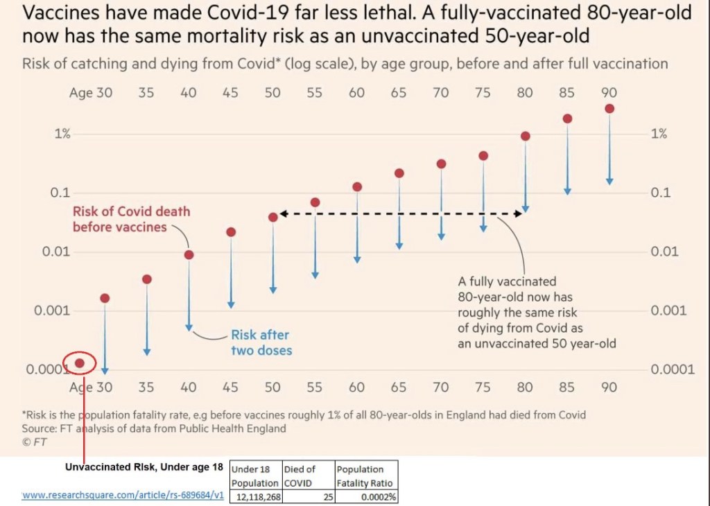
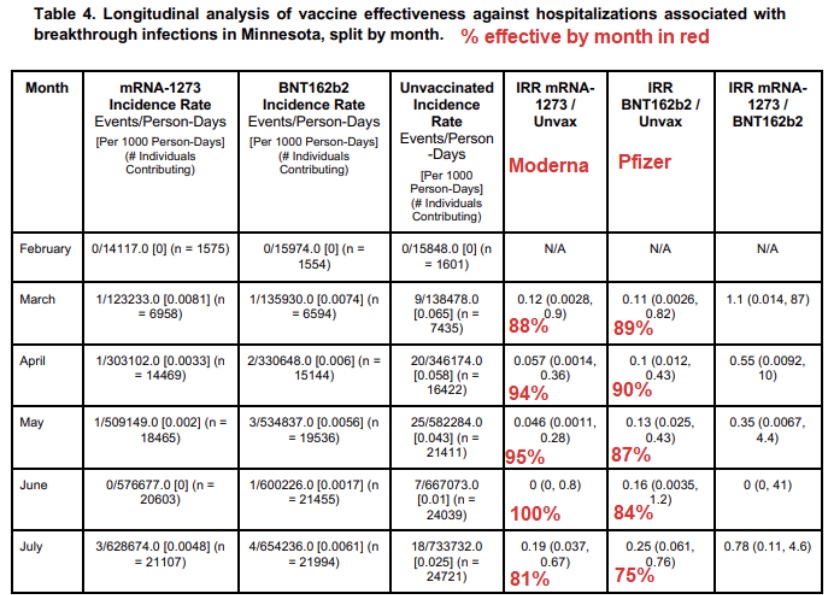
My last post had a simple message about the meaning of immunity: you won’t get very sick or die from an infection to which you are immune, including COVID-19. Like any other airborne virus, that does NOT mean you won’t get it lodged in your eyeballs, sinuses, throat, or lungs. If you do, you are likely to test positive, though your immunity means the “case” is likely to be inconsequential.

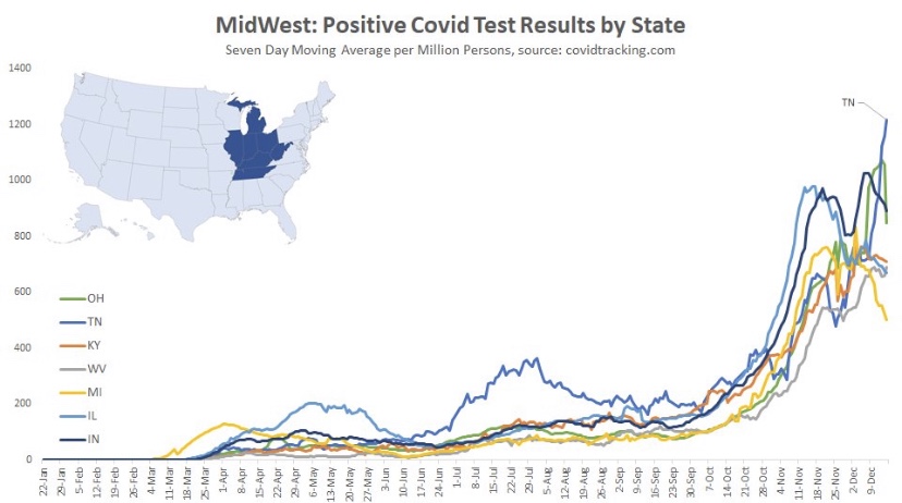
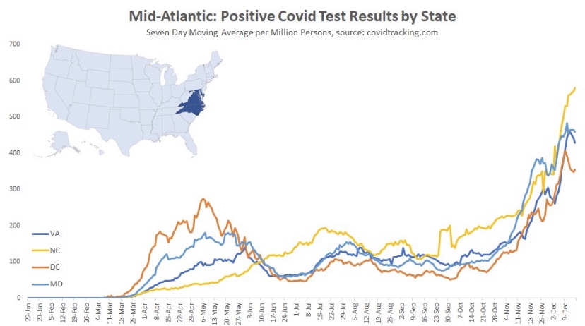
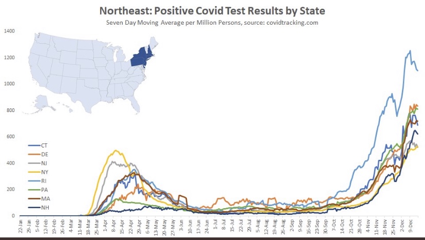
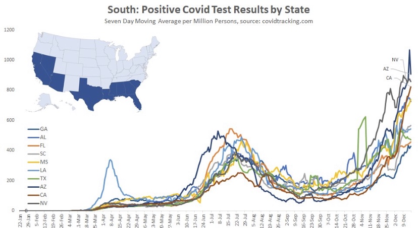
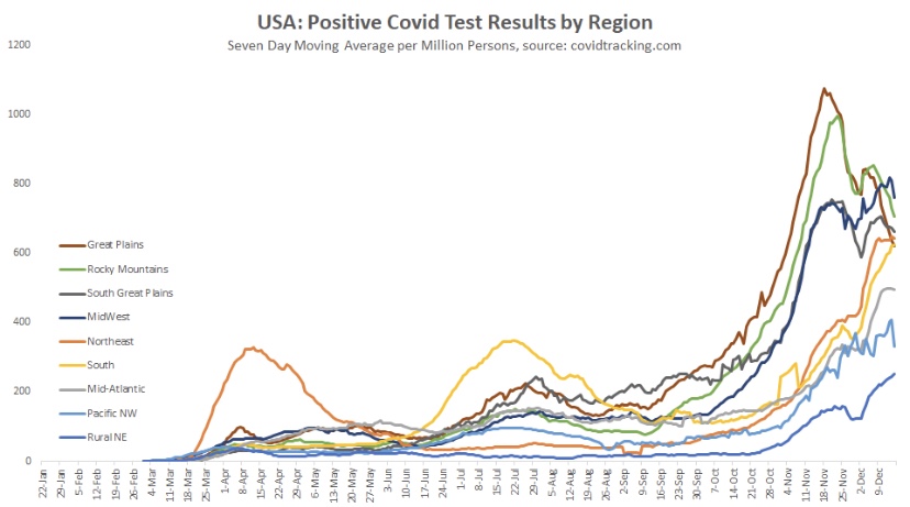
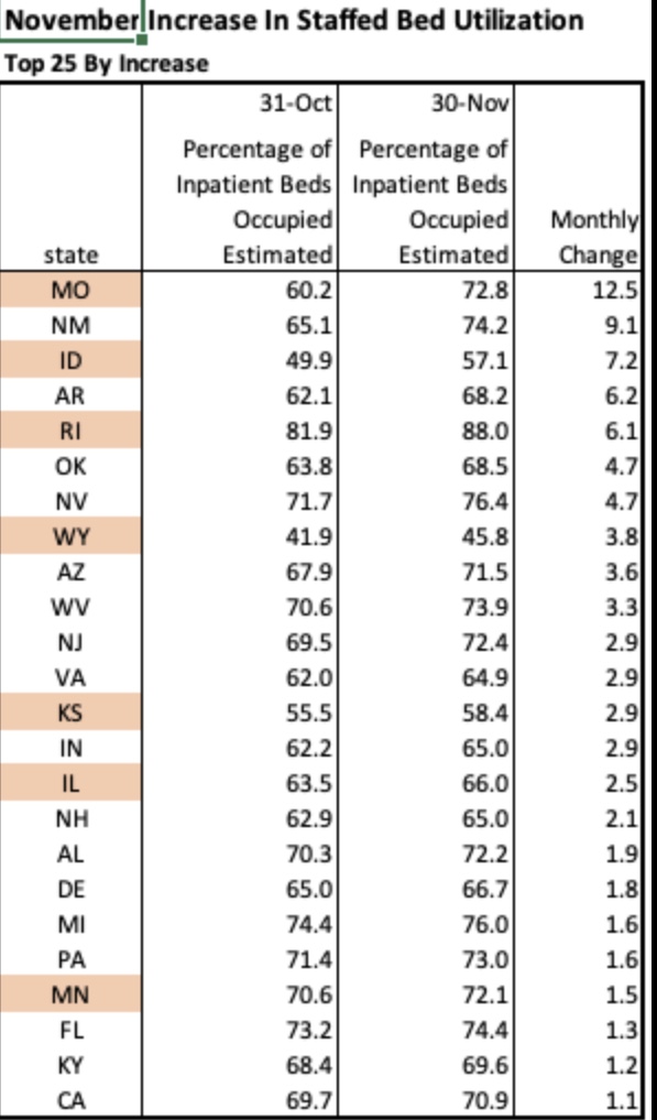
As noted in that last post, we’ve seen increasing COVID case counts with the so-called Delta variant, which is more highly transmissible than earlier variants. (This has been abetted by an uncontrolled southern border as well.) However, as we’d expect with a higher level of immunity in the population, the average severity of these cases is low relative to last year’s COVID waves. But then I saw this article in ScienceAlert quoting Sir Andrew Pollard, a scientist affiliated AstraZeneca and the University of Oxford. He says with Delta, herd immunity “is not a possibility” — everyone will get it.

Maybe everyone will, but that doesn’t mean everyone will get sick. His statement raises an obvious question about the meaning of herd immunity. If our working definition of the term is that the virus simply disappears, then Pollard is correct: we know that COVID is endemic. But the only virus that we’ve ever completely eradicated is polio. Would Pollard say we’ve failed to achieve herd immunity against all other viruses? I doubt it. Endemicity and herd immunity are not mutually exclusive. The key to herd immunity is whether a virus does or does not remain a threat to the health of the population generally.

Active COVID infections will be relatively short-lived in individuals with “immunity”. Moreover, viral loads tend to be lower in immune individuals who happen to get infected. Therefore, the “infected immune” have less time and less virus with which to infect others. That creates resistance to further contagion and contributes to what we know as herd immunity. While immune individuals can “catch” the virus, they won’t get sick. Likewise, a large proportion of the herd can be immune and still catch the virus without getting sick. That is herd immunity.

One open and controversial question is whether uninfected individuals will require frequent revaccination to maintain their immunity. A further qualification has to do with asymptomatic breakthrough infections. Those individuals won’t see any reason to quarantine, and they may unwittingly transmit the virus.

I also acknowledge that the concept of herd immunity is often discussed strictly in terms of transmission, or rather its failure. The more contagious a new virus, like the Delta variant, the more difficult it is to achieve herd immunity. Models predicting low herd immunity thresholds due to heterogeneity in the population are predicated on a given level of transmissibility. Those thresholds would be correspondingly higher given greater transmissibility.

A prominent scientist quoted in this article is Paul Hunter of the University of East Anglia. After backing-up Pollard’s dubious take on herd immunity, Hunter drops this bit of real wisdom:

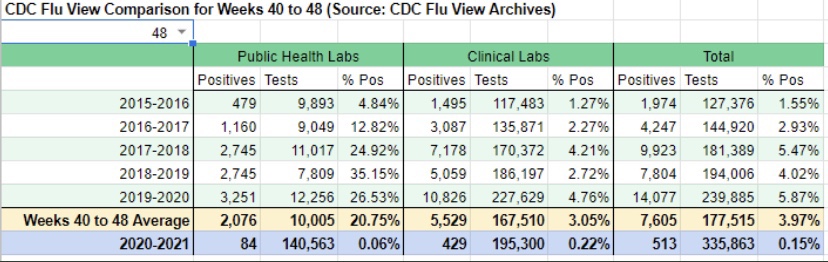
“We need to move away from reporting infections to actually reporting the number of people who are ill. Otherwise we are going to be frightening ourselves with very high numbers that don’t translate into disease burden.”

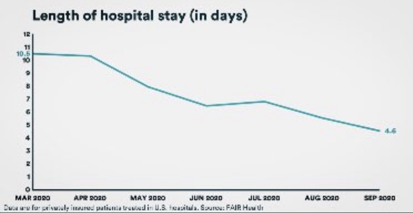
Here, here! Ultimately, immunity has to do with the ability of our immune systems to fight infections. Vaccinations, acquired immunity from infections, and pre-existing immunity all reduce the severity of later infections. They are associated with reductions in transmission, but those immune responses are more basic to herd immunity than transmissability alone. Herd immunity does not mean that severe cases will never occur. In fact, more muted seasonal waves will come and go, inflicting illness on a limited number of vulnerables, but most people can live their lives normally while viral reproduction is contained. Herd immunity!

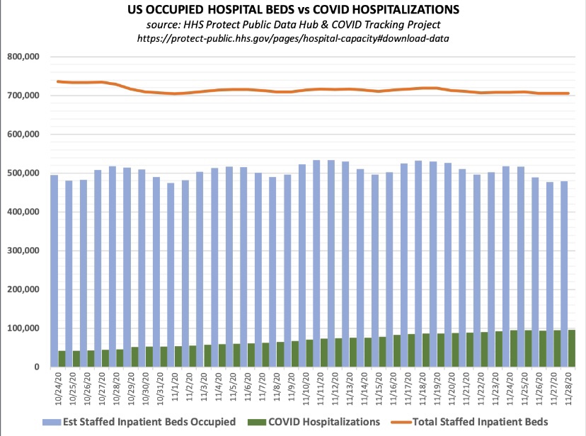
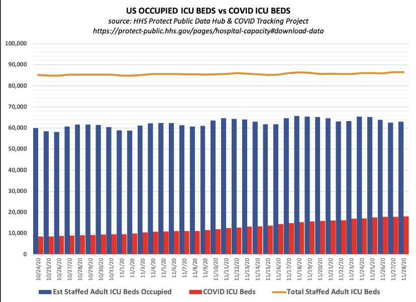
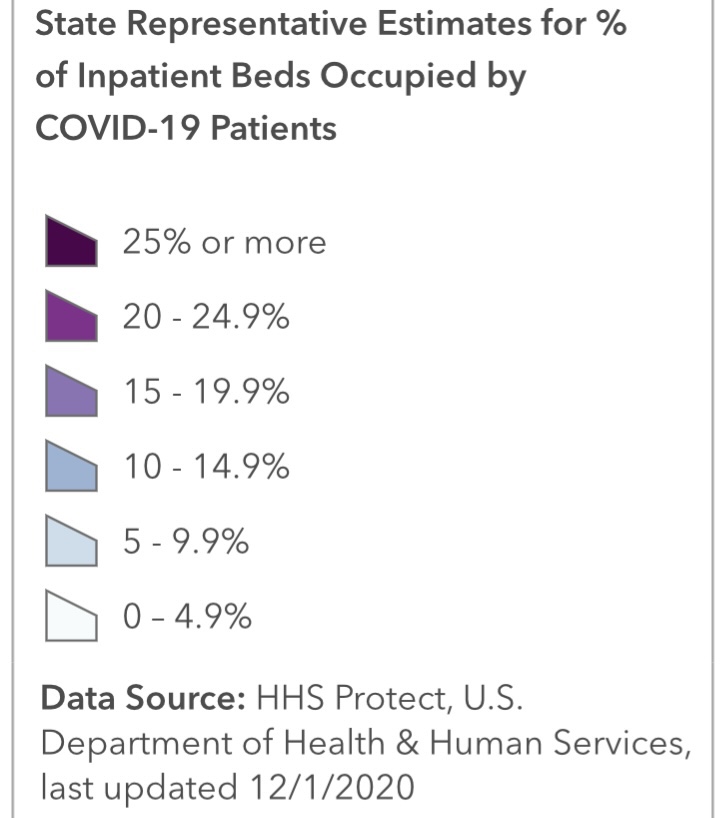
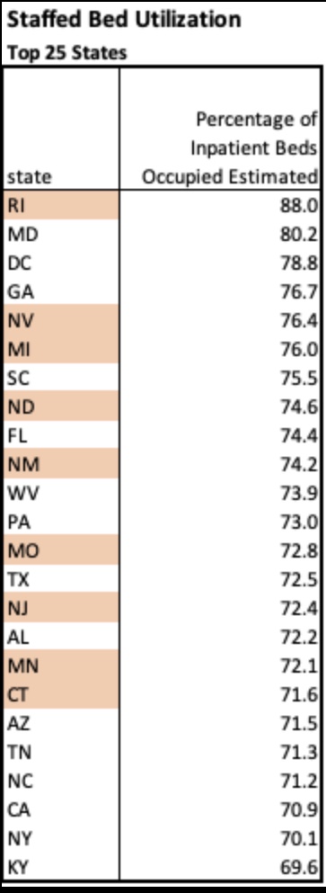
Sadly, we’re getting accustomed to hearing misstatements and bad information from public health officials on everything from mask mandates, lockdowns, and school closings to hospital capacity and vaccine hesitancy. Dr. Pollard’s latest musing is not unique in that respect. It’s almost as if these “experts” have become victims of their own flawed risk assessments insofar as their waning appeal to “the herd” is concerned. Professor Hunter’s follow-up is refreshing, however. Public health agencies should quit reporting case counts and instead report only patients who present serious symptoms, COVID ER visits, or hospitalizations.

Effective Immunity Means IF YOU CATCH IT, You Won’t Get Sick

12 Thursday Aug 2021

Posted by Nuetzel in Coronavirus, Uncategorized, Vaccinations

≈ 5 Comments

Tags

Acquired Immunity, Aerosols, Alpha Variant, Antibodies, Base Rate Bias, Breakthrough Infections, Covid-19, Delta Variant, Immunity, Issues & Insights, Kappa Variant, Kelly Brown, Lambda Variant, Larry Brilliant, Mayo Clinic, Our World In Data, PCR Tests, Phil Kerpen, T-Cell Immunity, Vaccinations, WHO

Listen very carefully: immunity does NOT mean you won’t get COVID, though an infection is less likely. Immunity simply means your immune system will be capable of dealing with an infection successfully. This is true whether the immunity is a product of vaccination or a prior infection. Immunity means you are unlikely to have worse than mild symptoms, and you are very unlikely to be hospitalized. (My disclaimer: I am opposed to vaccine mandates, but vaccination is a good idea if you’ve never been infected.)

I emphasize this because the recent growth in case numbers has prompted all sorts of nonsensical reactions. People say, “See? The vaccines don’t work!” That is a brazenly stupid response to the facts. Even more dimwitted are claims that the vaccines are killing everyone! Yes, there are usually side effects, and the jabs carry a risk of serious complications, but it is minuscule.

Vaccine Efficacy

Right out of the gate, we must recognize that our PCR testing protocol is far too sensitive to viral remnants, so the current surge in cases is probably exaggerated by false positives, as was true last year. Second, if a large share of the population is vaccinated, then vaccinated individuals will almost certainly account for a large share of infected individuals even if they have a lower likelihood of being infected. It’s simple math, as this explanation of base rate bias shows. In fact, according to the article at the link:

“… vaccination confers an eightfold reduction in the risk of getting infected in the first place; a 25-fold reduction in risk of getting hospitalized; and a 25-fold reduction in the risk for death.”

The upshot is that if you are vaccinated, or if you have acquired immunity from previous exposure, or if you have pre-existing immunity from contact with an earlier COVID strain, you can still “catch” the virus AND you can still spread it. Both are less likely, and you don’t have as much to worry about for your own health as those having no immunity.

As for overall vaccine efficacy in preventing death, here are numbers from the UK, courtesy of Phil Kerpen:

The vertical axis is a log scale, so each successive gridline is a fatality rate 100x as large as the one below it. Obviously, as the chart title asserts, the “vaccines have made COVID-19 far less lethal.” Also, at the bottom, see the information on fatality among children under age 18: it is almost zero! This reveals the absurdity of claims that children must be masked for schools to reopen! In any case, masks offer little protection to anyone against a virus that spreads via fine aerosols. Nevertheless, many school officials are pushing unnecessary but politically expedient masking policies

Delta

Ah, but we have the so-called Delta variant, which is now dominant and said to be far more transmissible than earlier variants. Yet the Delta variant is not as dangerous as earlier strains, as this UK report demonstrates. Delta had a case fatality rate among unvaccinated individuals that was at least 40% less than the so-called Alpha variant. This is a typical pattern of virus mutation: the virus becomes less dangerous because it wants to survive, and it can only survive in the long run by NOT killing its hosts! The decline in lethality is roughly demonstrated by Kelly Brown with data on in-hospital fatality rates from Toronto, Canada:

The case numbers in the U.S. have been climbing over the past few weeks, but as epidemiologist Larry Brilliant of WHO said recently, Delta spreads so fast it essentially “runs out of candidates.” In other words, the current surge is likely to end quickly. This article in Issues & Insights shows the more benign nature of recent infections. I think a few of their charts contain biases, but the one below on all-cause mortality by age group is convincing:

The next chart from Our World In Data shows the infection fatality rate continuing its decline in the U.S. The great majority of recent infections have been of the Delta variant, which also was much less virulent in the UK than earlier variants.

Furthermore, it turns out that the vaccines are roughly as effective against Delta and other new variants as against earlier strains. And the newest “scary” variants, Kappa and Lambda, do not appear to be making strong inroads in the U.S. 

Fading Efficacy?

There have been questions about whether the effectiveness of the vaccines is waning, which is behind much of the hand-wringing about booster shots. For example, Israeli health officials are insisting that the effectiveness of vaccines is “fading”, though I’ll be surprised if there isn’t some sort of confounding influence on the data they’ve cited, such as age and co-morbidities. 

Here is a new Mayo Clinic study of so-called “breakthrough” cases in the vaccinated population in Minnesota. It essentially shows that the rate of case diagnosis among the vaccinated rose between February and July of this year (first table below, courtesy of Phil Kerpen). However, the vaccines appear only marginally less effective against hospitalization than in March (second table below).

The bulk of the vaccinated population in the U.S. received their jabs three to six months ago, and according to this report, evidence of antibodies remains strong after seven months. In addition, T-cell immunity may continue for years, as it does for those having acquired immunity from an earlier infection. 

Breakthroughs

It’s common to hear misleading reports of high numbers of “breakthrough” cases. Not only will these cases be less menacing, but the reports often exaggerate their prevalence by taking the numbers out of context. Relative to the size of the vaccinated population, breakthrough cases are about where we’d expect based on the original estimates of vaccine efficacy. This report on Massachusetts breakthrough hospitalizations and deaths confirms that the most vulnerable among the vaxed population are the same as those most vulnerable in the unvaxed population: elderly individuals with comorbidities. But even that subset is at lower risk post-vaccination. It just so happens that the elderly are more likely to have been vaccinated in the first place, which implies that the vaccinated should be over-represented in the case population.

Conclusion

The COVID-19 vaccines do what they are supposed to do: reduce the dangers associated with infection. The vaccines remain very effective in reducing the severity of infection. However, they cannot and were not engineered to prevent infection. They also pose risks, but individuals should be able to rationally assess the tradeoffs without coercion. Poor messaging from public health authorities and the crazy distortions promoted in some circles does nothing to promote public health. Furthermore, there is every reason to believe that the current case surge in Delta infections will be short-lived and have less deadly consequences than earlier variants.

Harbingers of COVID Fade, But Not the Pretense for Hysteria

17 Thursday Dec 2020

Posted by Nuetzel in Coronavirus, Pandemic, Vaccinations

≈ Leave a comment

Tags

@Humble_Analysis (PLC), CLI, COVID Vaccines, Covid-19, COVID-Like Illness, Date of Death, False Positives, Herd Immunity, ILI, Influenza-Like Illness, Justin Hart, PCR Tests, Reported Deaths

My pre-Thanksgiving optimism about a crest in the fall wave of the coronavirus has been borne out for the Midwest and Mountain states in the U.S. These regions were the epicenter of the fall wave through October and most of November, but new cases in those states have continued to decline. Cases in a number of other states began to climb in November, however, contributing to a continuing rise in total new cases nationally. Some of these states are still in the throes of this wave, with the virus impacting subsets of the population that were relatively unscathed up till now.

My disclaimer: COVID is obviously a nasty virus. I don’t want to get it. However, on the whole, it is not a cataclysm on the order of many pandemics of the past. In fact, excess deaths this year will add just over 10% to projections of total deaths based on a five-year average. That level puts us in line with average annual deaths of about twenty years ago. And many of those excess deaths have been caused by our overreaction to the pandemic, not by the virus itself. As my endocrinologist has said, this is the greatest overreaction in all medical history. Unfortunately, a fading pandemic does not mean we can expect an end to the undue panic, or pretense for panic, on the part of interventionists.

This post will focus largely on trends in newly diagnosed COVID cases. I have been highly critical of our testing regime and COVID case counts because the most prominent diagnostic test (PCR) falsely identifies a large number of uninfected individuals as COVID-positive. However, case numbers are widely tracked and it’s fairly easy to find information across geographies for comparison. Deflate all the numbers by 30% if you want, or by any other factor, but please indulge me because I think the trends are meaningful, even if the absolute level of cases is inflated.

I’ll start with the good news and work my way down to states in which cases are still climbing (all of the following charts are from @Humble_Analysis (PLC)). The first chart is for the Great Plains, where cases peaked a little before Thanksgiving and have continued to fall since then. That peak came about six weeks after it began in earnest and cases have faded over the last four weeks.

Next we have the Mountain states, where again, cases peaked around Thanksgiving, though Idaho saw a rebound after the holiday. You’ll see below that a number of states had a distinct drop in new cases during the week of Thanksgiving. There was somewhat of a pause in testing during that week, so the subsequent rebounds are largely due to a “catch-up” at testing sites, rather than some kind of Thanksgiving-induced spike in infections.

Back to the Mountain region, the peak came an average of about six or seven weeks into the wave, but the duration of the wave appears to have been longer in Montana and Wyoming.

Here are the Southern Plain states, where cases plateaued around Thanksgiving (though cases in Missouri have clearly declined from their peak). In this region, case counts accelerated in October after a slow climb over the summer.

The situation is somewhat similar in the Midwest. where cases have generally plateaued. There were some post-Thanksgiving rebounds in several states, especially Tennessee. The wave began a little later in this region, in mid- to late October, and it is now seven to eight weeks into the wave, on average.

Here are the Mid-Atlantic states, which may be showing signs of a peak, though North Carolina has had the greatest caseload and is still climbing. These states are about seven weeks into the wave, on average.

The Northeast also shows signs of a possible peak and is about seven weeks into the wave, except for Rhode Island, which saw an earlier onset and the most severe wave among these states.

And finally we have the South, which is defined quite broadly in PLC’s construction. It’s a mixed bag, with a few states showing signs of a peak after about seven weeks. However, cases are still climbing in several states, notably California and Florida, among a few others.

Oregon and Washington were skipped, but they appear as the Pacific NW in the following chart, along with aggregations for all the other regions. Maine is Part of the “Rural NE”, which was also skipped. The fall wave can be grouped roughly into two sets of regions: those in which waves began in late September or early October, and those where waves began in early to mid-November. The first group has moved beyond a peak or at least has plateaued. The latter group may be reaching peaks now or one hopes very soon. It seems to take about seven weeks to reach the peak of these regional waves, so a late December peak for the latter group would be consistent.

Justin Hart has a take on the duration of these waves, but he does so in terms of the share of emergency room (ER) visits in which symptoms of COVID-like illness (CLI) are presented. CLI tends to precede case counts slightly. Hart puts the duration of these waves at eight to ten weeks, but that’s a judgement call, and I might put it a bit longer using caseloads as a guide. Still, this color-coded chart from Hart is interesting.

If this sort of cyclical duration holds up, it’s consistent with the view that cases in many of the still “hot” states should be peaking this month.

Aggregate cases for the U.S. appear below. The growth rate of new cases has slowed, and the peak is likely to occur soon. However, because it combines all of the regional waves, the duration of the wave nationwide will appear to be greater than for the individual regions. COVID-attributed deaths are also plotted, but they are reported deaths, not by date of death (DOD) or actual deaths, as I sometimes call them. Deaths by DOD are available only with a lag. As always, some of the reported deaths shown below occurred weeks before their reported date. Actual deaths were still rising as of late November, and are likely still rising. However, another indicator suggests they should be close to a peak.

A leading indicator of actual deaths I’ve discussed in the past now shows a more definitive improvement than it did just after Thanksgiving, as the next chart shows. This is the CLI share discussed above. An even better predictor of COVID deaths by actual DOD is the sum of CLI and the share of ER patients presenting symptoms of influenza-like illness (ILI), but ILI has been fairly low and stable, so it isn’t contributing much to changes in trend at the moment. There has been about a three-week lead between movements in CLI+ILI and COVID deaths by DOD.

(The reason the sum, CLI+ILI, has been a better predictor than CLI alone is because for some individuals, there are similarities in the symptoms of COVID and the flu.)

The chart shows that CLI peaked right around the Thanksgiving holiday (and so did CLI+ILI), but it remained on something of a plateau through the first week of December before declining. Some of the last few days on this chart are subject to revision, but the recent trend is encouraging. Allowing for a three-week lead, this indicates that peak deaths by DOD should occur around mid-December, but we won’t know exactly until early to mid-January. To be conservative, we might say the latter half of December will mark the peak in actual deaths.

The regional COVID waves this summer and fall seem to have run their course within 10 – 12 weeks. Several former hot spots have seen cases drop since Thanksgiving after surges of six to seven weeks. However, there are several other regions with populous states where the fall wave is still close to “mid-cycle”, as it were, showing signs of possible peaks after roughly seven weeks of rising cases. The national CLI share peaked around Thanksgiving, but it did not give up much ground until early December. That suggests that actual deaths (as opposed to reported deaths), at least in some regions, will peak around the time of the winter solstice. Let’s hope it’s sooner.

Successive waves within a region seem to reach particular subsets of the population with relatively few reinfections. The 10 – 12 week cycle discussed above is sufficient to achieve an effective herd immunity within these subsets. But once again, a large share of the vulnerable, and a large share of COVID deaths, are still concentrated in the elderly, high-risk population and in care homes. The vaccine(s) currently being administered to residents of those homes are likely to hasten the decline in COVID deaths beginning sometime in January, perhaps as early as mid-month. By then, however, we should already see a decline underway as this wave of the virus finally burns itself out. As vaccines reach a larger share of the population through the winter and spring, the likelihood of additional severe waves of the virus will diminish.

Lest there be any misunderstanding, the reasons for the contagion’s fade to come have mostly to do with reaching the effective herd immunity threshold within afflicted subsets of the population (sub-herds). Social distancing certainly plays a role as well. Nearly all of that is voluntary, though it has been encouraged by panicked pronouncement by certain public officials and the media. Direct interventions or lockdown measures are in general counter-productive, however, and they create a death toll of their own. Unfortunately, the fading pandemic might not rein-in the curtailment of basic liberties we’ve witnessed this year.

Post-Script: Let’s hope the side effects of the vaccines are not particularly severe in the elderly. That’s a little uncertain, because that sub-population was not tested in very high numbers.

Most Hospitals Have Ample Capacity

05 Saturday Dec 2020

Posted by Nuetzel in Coronavirus, Health Care

≈ 1 Comment

Tags

AJ Kay, CARES Act, CDC, CLI, COVID, COVID-Like Illness, Don Wolt, Emergency Use Authorization, FAIR Health, False Positives, FDA, HealthData.gov, Hospital Utiluzation, Houston Methodist Hospital, ICU Utilization, ILI, Influenza-Like Illness, Intensive Care, Length of Stay, Marc Boom, Observation Beds, PCR Tests, Phil Kerpen, Remdesivir, Staffed Beds, Statista

Let’s get one thing straight: when you read that “hospitalizations have hit record highs”, as the Wall Street Journal headline blared Friday morning, they aren’t talking about total hospitalizations. They reference a far more limited set of patients: those admitted either “for” or “with” COVID. And yes, COVID admissions have increased this fall nationwide, and especially in certain hot spots (though some of those are now coming down). Admissions for respiratory illness tend to be highest in the winter months. However, overall hospital capacity utilization has been stable this fall. The same contrast holds for ICU utilization: more COVID patients, but overall occupancy rates have been fairly stable. Several factors account for these differing trends.

Admissions and Utilization

First, take a look at total staffed beds, beds occupied, and beds occupied by COVID patients (admitted “for” or “with” COVID), courtesy of Don Wolt. Notice that COVID patients occupied about 14% of all staffed beds over the past week or so, and total beds occupied are at about 70% of all staffed beds.

Is this unusual? Utilization is a little high based on the following annual averages of staffed-bed occupancy from Statista (which end in 2017, unfortunately). I don’t have a comparable utilization average for the November 30 date in recent years. However, the medical director interviewed at this link believes there is a consensus that the “optimal” capacity utilization rate for hospitals is as high as 85%! On that basis, we’re fine in the aggregate!

The chart below shows that about 21% of staffed Intensive Care Unit (ICU) beds are occupied by patients having COVID infections, and 74% of all ICU beds are occupied.

Here’s some information on the regional variation in ICU occupancy rates by COVID patients, which pretty much mirror the intensity of total beds occupied by COVID patients. Fortunately, new cases have declined recently in most of the states with high ICU occupancies.

Resolving an Apparent Contradiction

There are several factors that account for the upward trend in COVID admissions with stable total occupancy. Several links below are courtesy of AJ Kay:

  • The flu season has been remarkably light, though outpatients with symptoms of influenza-like illness (ILI) have ticked-up a bit in the past couple of weeks. Still, thus far, the light flu season has freed up hospital resources for COVID patients. Take a look at the low CDC numbers through the first nine weeks of the current flu season (from Phil Kerpen):
  • There is always flexibility in the number of staffed beds both in ICUs and otherwise. Hospitals adjust staffing levels, and beds are sometimes reassigned to ICUs or from outpatient use to inpatient use. More extreme adjustments are possible as well, as when hallways or tents are deployed for temporary beds. This tends to stabilize total bed utilization.
  • The panic about the fall wave of the virus sowed by media and public officials has no doubt “spooked” individuals into deferring care and elective procedures that might require hospitalization. This has been an unfortunate hallmark of the pandemic with terrible medical implications, but it has almost surely freed-up capacity.
  • COVID beds occupied are inflated by a failure to distinguish between patients admitted “for” COVID-like illness (CLI) and patients admitted for other reasons but who happen to test positive for COVID — patients “with” COVID (and all admissions are tested).
  • Case inflation from other kinds of admissions is amplified by false positives, which are rife. This leads to a direct reallocation of patients from “beds occupied” to “COVID beds occupied”.
  • In early October, the CDC changed its guidelines for bed counts. Out-patients presenting CLI symptoms or a positive test, and who are assigned to a bed for observation for more than eight hours, were henceforth to be included in COVID-occupied beds.
  • Also in October, the FDA approve an Emergency Use Authorization for Remdesivir as a first line treatment for COVID. That requires hospitalization, so it probably inflated COVID admissions.
  • The CDC also announced severe penalties in October for facilities which fail to meet its rather inclusive COVID reporting requirements, creating another incentive to capture any suspected COVID case in its reports.

In addition to the above, let’s not forget: early on, hospitals were given an incentive to diagnose patients with COVID, whether tested or merely “suspected”. The CARES Act authorized $175 billion dollars for hospitals for the care of COVID patients. In the spring and even now, hospitals have lost revenue due to the cancellation of many elective procedures, so the law helped replace those losses (though the distribution was highly uneven). The point is that incentives were and still are in place to diagnose COVID to the extent possible under the law (with a major assist from false-positive PCR tests).

Improved Treatment and Treatment

While more COVID patients are using beds, they are surviving their infections at a much higher rate than in the spring, according to data from FAIR Health. Moreover, the average length of their hospital stay has fallen by more than half, from 10.5 to 4.6 days. That means beds turn over more quickly, so more patients can be admitted over a week or month while maintaining a given level of hospital occupancy.

The CDC just published a report on “under-reported” hospitalization, but as AJ Kay notes, it can only be described as terrible research. Okay, propaganda is probably a better word! Biased research would be okay as well. The basic idea is to say that all non-hospitalized, symptomatic COVID patients should be counted as “under-counted” hospitalizations. We’ve entered the theater of the absurd! It’s certainly true that maxed-out hospitals must prioritize admissions based on the severity of cases. Some patients might be diverted to other facilities or sent home. Those decisions depend on professional judgement and sometimes on the basis of patient preference. But let’s not confuse beds that are unoccupied with beds that “should be occupied” if only every symptomatic COVID patient were admitted.

Regional Differences

Finally, here’s a little more information on regional variation in bed utilization from the HealthData.gov web site. The table below lists the top 25 states by staffed bed utilization at the end of November. A few states are highlighted based on my loose awareness of their status as “COVID “hot spots” this fall (and I’m sure I have overlooked a couple. Only two states were above 80% occupancy, however.

The next table shows the 25 states with the largest increase in staffed bed utilization during November. Only a handful would appear to be at all alarming based on these increases, but Missouri, for example, at the top of the list, still had 27% of beds unoccupied on November 30. Also, 21 states had decreases in bed utilization during November. Importantly, it is not unusual for hospitals to operate with this much headroom or less, which many administrators would actually prefer.

Of course, certain local markets and individual hospitals face greater capacity pressures at this point. Often, the most crimped situations are in small hospitals in underserved communities. This is exacerbated by more limited availability of staff members with school-age children at home due to school closures. Nevertheless, overall needs for beds look quite manageable, especially in view of some of the factors inflating COVID occupancy.

Conclusion

Marc Boom, President and CEO of Houston Methodist Hospital, had some enlightening comments in this article:

“Hospital capacity is incredibly fluid, as Boom explained on the call, with shifting beds and staffing adjustments an ongoing affair. He also noted that as a rule, hospitals actually try to operate as near to capacity as possible in order to maximize resources and minimize cost burdens. Boom said numbers from one year ago, June 25, 2019, show that capacity was at 95%.”

So there are ample beds available at most hospitals. A few are pinched, but resources can and should be devoted to diverting serious COVID cases to other facilities. But on the whole, the panic over hospital capacity for COVID patients is unwarranted.

The Pernicious COVID PCR Test: Ditch It or Fix It

02 Wednesday Dec 2020

Posted by Nuetzel in Coronavirus, Public Health

≈ 2 Comments

Tags

Active Infections, Amplification Cycles, Andrew Bostom, Anthony Fauci, Antigen Tests, Asymptomatic. Minimally Infectious, Brown University, CDC, Coronavirus, Covid-19, Cycle Threshold, DNA, Elon Musk, Eurosurveillence, False Positives, Molecular Tests, New York Times, PCR Tests, Portugal, Replication Cycles, RNA, SARS-CoV-2

We have a false-positive problem and even the New York Times noticed! The number of active COVID cases has been vastly exaggerated and still is, but there is more than one fix.

COVID PCR tests, which are designed to detect coronavirus RNA from a nasal swab, have a “specificity” of about 97%, and perhaps much less in the field. That means at least 3% of tests on uninfected subjects are falsely positive. But the total number of false positive tests can be as large or larger than the total number of true positives identified. Let’s say 3% of the tested population is truly infected. Then out of every 100 individuals tested, three individuals are actively infected and 97 are not. Yet about 3 of those 97 will test positive anyway! So in this example, for every true infection identified, the test also falsely flags an uninfected individual. The number of active infections is exaggerated by 100%.

But again, it’s suspected to be much worse than that. The specificity of PCR tests depends on the number of DNA replications, or amplification cycles, to which a test sample is subjected. That process is illustrated through three cycles in the graphic above. It’s generally thought that 20 – 30 cycles is sufficient to pick-up DNA from a live virus infection. If a sample is subjected to more than 30 cycles, the likelihood that the test will detect insignificant dead fragments of the virus is increased. More than 35 cycles prompts real concern about the test’s reliability. But in the U.S., PCR tests are regularly subjected to upwards of 35 and even 40-plus cycles of amplification. This means the number of active cases is exaggerated, perhaps by several times. If you don’t believe me, just ask the great Dr. Anthony Fauci:

“It’s very frustrating for the patients as well as for the physicians … somebody comes in, and they repeat their PCR, and it’s like [a] 37 cycle threshold, but you almost never can culture virus from a 37 threshold cycle. So, I think if somebody does come in with 37, 38, even 36, you got to say, you know, it’s just dead nucleotides, period.“

Remember, the purpose of the test is to find active infections, but the window during which most COVID infections are active is fairly narrow, only for 10 – 15 days after the onset of symptoms, and often less; those individuals are infectious to others only up to about 10 days, and most tests lag behind the onset of symptoms. In fact, infected but asymptomatic individuals — a third or more of all those truly infected at any given time — are minimally infectious, if at all. So the window over which the test should be sensitive is fairly narrow, and many active infections are not infectious at all.

PCR tests are subject to a variety of other criticisms. Many of those are discussed in this external peer-review report on an early 2020 publication favorable to the tests. In addition to the many practical shortfalls of the test, the authors of the original paper are cited for conflicts of interest. And the original paper was accepted within 24 hours of submission to the journal Eurosurveillance (what a name!), which should raise eyebrows to anyone familiar with a typical journal review process.

The most obvious implication of all the false positives is that the COVID case numbers are exaggerated. The media and even public health officials have been very slow to catch onto this fact. As a result, their reaction has sown a panic among the public that active case numbers are spiraling out of control. In addition, false positives lead directly to mis-attribution of death: the CDC changed it’s guidelines in early April for attributing death to COVID (and only for COVID, not other causes of death). This, along with the vast increase in testing, means that false positives have led to an exaggeration of COVID as a cause of death. Even worse, false positives absorb scarce medical resources, as patients diagnosed with COVID require a high level of staffing and precaution, and the staff often requires isolation themselves.

Many have heard that Elon Musk tested positive twice in one day, and tested negative twice in the same day! The uncomfortable reality of a faulty test was recently recognized by an Appeals Court in Portugal, and we may see more litigation of this kind. The Court ruled in favor of four German tourists who were quarantined all summer after one of them tested positive. The Court said:

“In view of current scientific evidence, this test shows itself to be unable to determine beyond reasonable doubt that such positivity corresponds, in fact, to the infection of a person by the SARS-CoV-2 virus.” 

I don’t believe testing is a bad thing. The existence of diagnostic tests cannot be a bad thing. In fact, I have advocated for fast, cheap tests, even at the sacrifice of accuracy, so that individuals can test themselves at home repeatedly, if necessary. And fast, cheap tests exist, if only they would be approved by the FDA. Positive tests should always be followed-up immediately by additional testing, whether those are additional PCR tests, other molecular tests, or antigen tests. And as Brown University epidemiologist Andrew Bostom says, you should always ask for the cycle threshold used when you receive a positive result on a PCR test. If it’s above 30 and you feel okay, the test is probably not meaningful.

PCR tests are not ideal because repeat testing is time consuming and expensive, but PCR tests could be much better if the number of replication cycles was reduced to somewhere between 20 and 30. Like most flu and SARS viruses, COVID-19 is very dangerous to the aged and sick, so our resources should be focused on their safety. However, exaggerated case counts are a cause of unnecessary hysteria and cost, especially for a virus that is rather benign to most people.

November Pandemic Perspective

18 Wednesday Nov 2020

Posted by Nuetzel in Coronavirus, Pandemic, Uncategorized

≈ Leave a comment

Tags

@tlowdon, Actual Date of Death, COVID, COVID Testing, COVID-Like Illness, Don Wolt, Excess Deaths, False Positives, Hospitalizations, ILI, Influenza-Like Illness, PCR Tests, Reported Deaths

I hope readers share my compulsion to see updated COVID numbers. It’s become a regular feature on this blog and will probably remain one until infections subside, vaccine or otherwise. Or maybe when people get used to the idea of living normally again in the presence of an endemic pathogen, as they have with many other pathogens and myriad risks of greater proportions, and as they should. That might require more court challenges, political changes, and plain old civil disobedience.

So here, then, is an update on the U.S. COVID numbers released over the past few days. The charts below are attributable to Don Wolt (@tlowdon on Twitter).

First, reported deaths began to creep up again in the latter half of October and have escalated in November. They’ve now reached the highs of the mid-summer wave in the south, but this time the outbreak is concentrated in the midwest and especially the upper midwest.

Reported deaths are the basis of claims that we are seeing 1,500 people dying every day, which is an obvious exaggeration. There have been recent days when reported deaths exceeded that level, but the weekly average of reported deaths is now between 1,100 and 1,200 a day.

It’s important to understand that deaths reported in a given week actually occurred earlier, sometimes eight or more weeks before the week in which they are reported. Most occur within three weeks of reporting, but sometimes the numbers added from four-plus weeks earlier are significant.

The following chart reproduces weekly reported deaths from above using blue bars, ending with the week of November 14th. Deaths by actual date-of-death (DOD) are shown by the orange bars. The most recent three-plus weeks always show less than complete counts of deaths by DOD. But going back to mid-October, actual weekly deaths were running below reported deaths. If the pattern were to follow the upswings of the first two waves of infections, then actual weekly deaths would exceed reported deaths by perhaps the end of October. However, it’s doubtful that will occur, in part because we’ve made substantial progress since the spring and summer in treating the disease.

To reinforce the last point, it’s helpful to view deaths relative to COVID case counts. Deaths by DOD are plotted below by the orange line using the scale on the right-hand vertical axis. New positive tests are represented by the solid blue line, using the left-hand axis, along with COVID hospitalizations. There is no question that the relationship between cases, hospitalizations, and deaths has weakened over time. My suspicions were aroused somewhat by the noticeable compression of the right axis for deaths relative to the two charts above, but on reviewing the actual patterns (peak relative to troughs) in those charts, I’m satisfied that the relationships have indeed “decoupled”, as Wolt puts it.

Cases are going through the roof, but there is strong evidence that a large share of these cases are false positives. COVID hospitalizations are up as well, but their apparent co-movement with new cases appears to be dampening with successive waves of the virus. That’s at least partly a consequence of the low number of tests early in the pandemic.

So where is this going? The next chart again shows COVID deaths by DOD using orange bars. Wolt has concluded, and I have reported here, that the single-best short-term predictor of COVID deaths by DOD is the percentage of emergency room visits at which patients presented symptoms of either COVID-like illness (CLI) or influenza-like illness (ILI). The sum of these percentages, CLI + ILI, is shown below by the dark blue line, but the values are shifted forward by three weeks to better align with deaths. This suggests that actual COVID deaths by DOD will be somewhere around 7,000 a week by the end of November, or about 1,000 a day. Beyond that time, the path will depend on a number of factors, including the weather, prevalence and immunity levels, and changes in mobility.

I am highly skeptical that lockdowns have any independent effect in knocking down the virus, though interventionists will try to take credit if the wave happens to subside soon for any other reason. They won’t take credit for the grim lockdown deaths reaped by their policies.

Despite the bleak prospect of 1,000 or more COVID-attributed deaths a day by the end of November, the way in which these deaths are counted is suspect. Early in the pandemic, the CDC significantly altered guidelines for the completion of death certificates for COVID such that deaths are often improperly attributed to the virus. Some COVID deaths stem from false-positive PCR tests, and again, almost since the beginning of the pandemic, hospitals were given a financial incentive to classify inpatients as COVID-infected.

It’s also important to remember that while any true COVID fatality is premature, they are generally not even close to the prematurity of lockdown deaths. That’s a simple consequence of the age profile of COVID deaths, which indicate relatively few life-years lost, and the preponderance of co-morbidities among COVID fatalities.

Again, COVId deaths are bad enough, but we are seeing an unacceptable and ongoing level of lockdown deaths. This is now to the point where they may account for almost all of the continuing excess deaths, even with the fall COVID wave. It’s probable that public health would be better served with reduced emphasis on COVID-mitigation for the general population and more intense focus on protecting the vulnerable, including the distribution of vaccines.

COVID and Hospital Capacity

15 Sunday Nov 2020

Posted by Nuetzel in Health Care, Pandemic

≈ 1 Comment

Tags

Bed Capacity, Capacity Management, CDC, Covid-19, HealthData.gov, Herd Immunity, Hospital Utilization, ICU Capacity, ICU Utilization, Influenza, Justin Hart, Lockdown Illnesses, Missouri, PCR Tests, Prevalence, Seasonality, St. Louis MO, Staffed Beds, Staffed Utilization, Statista

The fall wave of the coronavirus has brought with it an increase in COVID hospitalizations. It’s a serious situation for the infected and for those who care for them. But while hospital utilization is rising and is reaching tight conditions in some areas, claims that it is already a widespread national problem are without merit.

National and State Hospital Utilization

The table below shows national and state statistics comparing beds used during November 1-9 to the three-year average from 2017 – 19, from Justin Hart. There are some real flaws in the comparison: one is that full-year averages are not readily comparable to particular times of the year, with or without COVID. Nevertheless, the comparison does serve to show that current overall bed usage is not “crazy high” in most states, as it were. The increase in utilization shown in the table is highest in IA, MT, NV, PA, VT, and WI, and there are a few other states with sizable increases.

Another limitation is that the utilization rates in the far right column do not appear to be calculated on the basis of “staffed” beds, but total beds. The U.S. bed utilization rate would be 74% in terms of staffed beds.

Average historical hospital occupancy rates from Statista look like this:

Again, these don’t seem to be calculated on the basis of staffed beds, but current occupancies are probably higher now based on either staffed beds or total beds.

As of November 11th, a table available at HealthData.gov indicates that staffed bed utilization in the U.S. is at nearly 74%, with ICU utilization also at 74%. As the table above shows, states vary tremendously in their hospital bed utilization, a point to which I’ll return below.

COVID patients were using just over 9% of of all staffed beds and just over 19% of ICU beds as of November 11th. One caveat on the reported COVID shares you’ll see for dates going forward: the CDC changed its guidelines on counting COVID hospitalizations as of November 12th. It is now a COVID patient’s entire hospital stay, rather than only when a patient is in isolation with COVID. That might be a better metric if we can trust the accuracy of COVID tests (and I don’t), but either way, the change will cause a jump in the COVID share of occupied beds.

Interpreting Hospital Utilization

Many issues impinge on the interpretation of hospital utilization rates:

First, cases and utilization rates are increasing, which is worrisome, but the question is whether they have already reached crisis levels or will very soon. The data doesn’t suggest that is the case in the aggregate, but there certainly there are hospitals bumping up against capacity constraints in some parts of the country.

Second, occupancies are increasing due to COVID patients as well as patients suffering from lockdown-related problems such as self-harm, psychiatric problems, drug abuse, and conditions worsened by earlier deferrals of care. We can expect more of that in coming weeks.

Third, lockdowns create other hospital capacity issues related to staffing. Health care workers with school-aged children face the daunting task of caring for their kids and maintaining hours on jobs for which they are critically needed.

Fourth, there are capacity issues related to PPE and medical equipment that are not addressed by the statistics above. Different uses must compete for these resources within any hospital, so the share of COVID admissions has a strong bearing on how the care of other kinds of patients must be managed.

Fifth, some of the alarm is purely case-driven: all admissions are tested for COVID, and non-COVID admissions often become COVID admissions after false-positive PCR tests, or simply due to the presence of mild COVID with a more serious condition or injury. However, severe COVID cases have an outsized impact on utilization of staff because their care is relatively labor-intensive.

Sixth, there are reports that the average length of COVID patient stays has decreased markedly since the spring (it is hard to find nationwide figures), but it is also increasingly difficult to find facilities for post-acute care required for some patients on discharge. Nevertheless, if improved treatment reduces average length of stay, it helps hospitals deal with the surge.

Finally, thus far, the influenza season has been remarkably light, as the following chart from the CDC shows. It is still early in the season, but the near-complete absence of flu patients is helping hospitals manage their resources.

St. Louis Hotspot

The St. Louis metro area has been proclaimed a COVID “hotspot” by the local media and government officials, which certainly doesn’t make St. Louis unique in terms of conditions or alarmism. I’m curious about the data there, however, since it’s my hometown. Here is hospital occupancy on the Missouri side of the St. Louis region:

It seems this chart is based on total beds, not staffed beds, However, one of the interesting aspects of this chart is the variation in capacity over time, with several significant jumps in the series. This has to do with data coverage and some variation in daily reporting. Almost all of these data dashboards are relatively new, so their coverage has been increasing, but generally in fits and starts. Reporting is spotty on a day-to-day basis, so there are jagged patterns. And of course, capacity can vary from day-to-day and week-to-week — there is some flexibility in the number of beds that can be made available.

The share of St. Louis area beds in use was 61% as of November 11th (preliminary). COVID patients accounted for 12% of hospital beds. ICU utilization in the St. Louis region was a preliminary 67% as of Nov. 11, with COVID patients using 29% of ICU capacity (which is quite high). Again, these figures probably aren’t calculated on the basis of “staffed” beds, so actual hospital-bed and ICU-bed utilization rates could be several percentage points higher. More importantly, it does not appear that utilization in the St. Louis area has trended up over the past month.

At the moment, the St. Louis region appears to have more spare hospital capacity than the nation, but COVID patients are using a larger share of all beds and ICU beds in St. Louis than nationwide. So this is a mixed bag. And again, capacity is not spread evenly across hospitals, and it’s clear that hospitals are under pressure to manage capacity more actively. In fact, hospitals only have so many options as the share of COVID admissions increases: divert or discharge COVID and non-COVID patients, defer elective procedures, discharge COVID and non-COVID patients earlier, allow beds to be more thinly staffed and/or add temporary beds wherever possible.

Closing Thoughts

Anyone with severe symptoms of COVID-19 probably should be hospitalized. The beds must be available, or else at-home care will become more commonplace, as it was for non-COVID maladies earlier in the pandemic. A continued escalation in severe COVID cases would require more drastic steps to make hospital resources available. That said, we do not yet have a widespread capacity crisis, although that’s small consolation to areas now under stress. And a few of the states with the highest utilization rates now have been rather stable in terms of hospitalizations — they already had high average utilization rates, which is potentially dangerous.

COVID is a seasonal disease, and it’s no surprise that it’s raging now in areas that did not experience large outbreaks in the spring and summer. And those areas that had earlier outbreaks have not had a serious surge this fall, at least not yet. My expectation and hope is that the midwestern and northern states now seeing high case counts will soon reach a level of prevalence at which new infections will begin to subside. And we’re likely to see a far lower infection fatality rate than experienced in the Northeast last spring.

The Favored Cause of Death

19 Monday Oct 2020

Posted by Nuetzel in Coronavirus, Public Health

≈ 3 Comments

Tags

All-Cause Mortality, Andrew Bostom, Andrew Cuomo, Cause of Death, Centers for Disease Control, Clinical Events, Coronavirus, Death Certificate, False Positives, Florida House of Representatives, Hospice Deaths, Justin Hart, Lockdown Deaths, Non-COVID Deaths. Co-Morbidities, PCR Tests, Specificity, Testing

The CDC changed its guidelines on completion of death certificates on April 5th of this year, and only for COVID-19 (C19), just as infections and presumed C19 deaths were ramping up. The substance of the change was to broaden the definition under which death should be attributed to C19. This ran counter to CDC guidelines followed over the previous 17 years, and the change not only makes the C19 death counts suspect: it also makes comparisons of C19 deaths to other causes of death unreliable, since only C19 is subject to the new CDC guidance. That’s true for concurrent and historical comparisons. The distortions are especially bad relative to other respiratory diseases, but also relative to other conditions that are common in mortality data.

The change in the CDC guidelines was noted in a recent report prepared for the Florida House of Representatives. It was brought to my attention by a retweet by Justin Hart linked to this piece on Andrew Bostom’s site. Death certificates are divided into two parts: Part 1 provides four lines in which causes of death are listed in reverse clinical order of events leading to death. Thus, the first line is the final clinical condition precipitating death. Prior clinical events are to be listed below that. The example shown above indicates that an auto accident, listed on the fourth line, initiated the sequence of events. Part 2 of the certificate is available for physicians or examiners to list contributing factors that might have played a role in the death that were not part of the sequence of clinical events leading to death.

The CDC’s change in guidelines for C19, and C19 only, made the criteria for inclusion in Part 1 less specific, and it essentially eliminated the distinction between Parts 1 and 2. The following appears under “Vital Records Criteria”:

“A death certificate that lists COVID-19 disease or SARS-CoV-2 as a cause of death or a significant condition contributing to death.”

How much difference does this make? For one thing, it opens the door to C19-attributed deaths in cases of false-positive PCR tests. When large cohorts are subject to testing — for example, all patients admitted to hospitals — there will always be a significant number of false positives even when test specificity is as high as 98 – 99%.

The elimination of any distinction between Parts 1 and 2 causes other distortions. A review of the Florida report is illustrative. The House staff reviewed almost 14,000 certificates for C19-19 attributed deaths. Over 9% of those did not list C19 among the clinical conditions leading to death. Instead, in those cases, C19 was listed as a contributing factor. Under the CDC’s previous guidelines, those would not have been counted as C19 deaths. The Florida House report is conservative in concluding that the new CDC guidelines inflated C19 deaths by only those 9% of the records examined.

There are reasons to think that the exaggeration was much greater, however. First, the Florida House report noted that nearly 60% of the certificates contained information “recorded in a manner inconsistent with state and national guidance”. In addition, almost another 10% of the fatalities were among patients already in hospice! Do we really believe the deaths of all those patients whose diseases had reached such an advanced stage should be classified as C19 fatalities? And another 1-2% listed non-C19 conditions as the immediate and underlying causes.

Finally, more than 20% of the certificates listed C19 alone as a cause of death despite a range of other contributing conditions or co-morbidities. This in itself may have been prompted by the change in the CDC’s guidelines, as the normal standards often involve a “comorbidity” as the initial reason for hospitalization — in that case a clinical event ordinarily listed in Part 1. The high rate of errors and the fact that roughly two-thirds of the deaths reviewed occurred in the hospital, where patients are all tested and often multiple times, raises the specter that up to 20% more of the C19 deaths were either erroneous and/or misclassified due to false positives.

(An exception may have occurred in New York, where an order issued in March by Governor Andrew Cuomo to return C19-positive residents of nursing homes (including suspected C19 cases) back to those homes, The order was made before the change in CDC guidelines and wasn’t rescinded until later in April. There is reason to believe that some of the C19 deaths among nursing home residents in New York were undercounted.)

All told, in the Florida data we have potential misclassification of deaths of 9% + 9% + 2% + 20% = 40%, or inflation relative to actual C19 deaths of up to 40%/60% = 67%! I strongly doubt it’s that high, but I would not consider a range of 25% – 50% exaggeration to be unreasonable.

We know that reports of C19 deaths lag actual dates of death by anywhere from 1 to 8 weeks, sometimes even more. This is misleading when no effort is made to explain that difference, which I’ve never heard out of a single journalist. We also know that false positive tests inflate C19 deaths. The Florida report gives us a sense of how large that exaggeration might be. In addition, the Florida data show that the CDC guidelines inflate C19 deaths in other ways: as a mere contributing factor, it can now be listed as the cause of death, unlike the treatment of pneumonia as a contributing factor, for instance. The same kind of distortion occurs when patients contract C19 (or have a false positive test) while in hospice.

There is no doubt that C19 led to “excess deaths” relative to all-cause mortality. However, many of these fatalities are misclassified, and it’s likely that a large share were and are lockdown deaths as opposed to C19 deaths. That’s tragic. The CDC has done the country a massive disservice by creating “special rules” for attributing cause-of-death to C19. If reported C19 fatality rates reflected the same rules applied to other conditions, our approach to managing the pandemic surely would have inflicted far less damage to health and economic well being.

False Positives, False Cases, False Deaths

14 Monday Sep 2020

Posted by Nuetzel in Coronavirus, Pandemic

≈ Leave a comment

Tags

Andrew N. Cohen, Antibodies, Bruce Kessel, Coronavirus, COVID Deaths, Covid-19, False Negatives, False Positives, Infectious vs Infected, Michael G. Milgroom, NFL, PCR Tests, Positivity Rate, Rapid Tests, Seroprevalence, T-Cells, University of Arizona

The tremendous increase in testing for COVID-19 (C19) this summer was associated with an increase in cases. Most of these tests were so-called PCR tests with samples collected via deep nasal swabs. More testing did not fully explain the increased case load, but false positives (FPs) still accounted for a substantial share. That’s especially true in light of the decline in positivity rates, which reflected a decline in the actual prevalence of active infections. FPs also account for a substantial share of the deaths attributed to COVID, which are obviously cases of false attribution. If a test for C19 is positive, it will be listed on the death certificate.  

COVID Case Inflation

The exaggeration of confirmed cases due to FPs is more substantial as the prevalence of active infection declines. That’s because the share of true positives in the tested population declines, while the share of false positives must rise due to the greater share of uninfected individuals in the population.

Now, as the contagion is waning in former hot spots, there is a danger that FPs create the impression of persistence in the case counts. That’s costly not just for those incorrectly diagnosed, but also in terms of medical resources, for communities subject to excessive public intervention, such as inappropriate lockdowns, and in terms of the fear promoted by these inaccuracies.

FPs are extremely disruptive when testing is relied upon in critical situations such as health care staffing, or even among sports teams. For example, at the University of Arizona, out of 25 positive tests on September 3, only 10 were confirmed as positives in later tests. The NFL has also had its share of false positives. 

Lax Testing Standards

There is evidence that testing standards under CDC guidance are so broad that a large number of inactive, non-infectious cases are being flagged as positives (see the chart above for the intuition, as well as the graphic at the bottom of this post). The tests sometimes amount to a coin flip when it comes to evaluating positives; some of the positives might even come from non-novel coronaviruses such as the common cold! This paper by Andrew N. Cohen, Bruce Kessel, & Michael G. Milgroom – CKM) questions the guidance of public health authorities on testing more generally. From the abstract (my emphasis):

“Unlike previous epidemics, in addressing COVID-19 nearly all international health organizations and national health ministries have treated a single positive result from a PCR-based test as confirmation of infection, even in asymptomatic persons without any history of exposure. …  positive results in asymptomatic individuals that haven’t been confirmed by a second test should be considered suspect.”

False Positive Math

When I wrote about “The Scourge of False Positives” in July. I noted that a test specificity of 95% implies that 5% of uninfected individuals will falsely test positive. Unfortunately, that still produces a huge number of FPs when testing is broad. That’s NOT a good reason to avoid broad testing; it just means that positive tests should be confirmed by another test. (In this case, two tests with the same specificity reduce a 5% false positive rate to 0.25%. That’s why fast, cheap tests are necessary for confirmation.

Again, exaggerated case counts due to FP’s become more severe as a contagion wanes. That’s because FPs become an increasingly large share of positive test results and overstate the persistence of the virus. If active infections fall to 1% of 750,000 daily tests, or 7,500 true cases, the 5% specificity implies 37,125 FPs: true positives would be only 17% of positive cases. Much worse than a coin flip! And again, which cases are infectious?

How Bad Are FPs, Really?

This recent research, also authored by CKM, explains the reasons why FPs are usually an issue in the real world, despite the tests’ reportedly perfect reactivity to anything other than the virus’ genetic fragments. CKM find that the median FP rate in their sample of “tests of tests” was 2.3%. That means 23 out of every 1,000 uninfected people tested will test positive.

If that seems small to you, suppose the true prevalence of active infection in a population is 4%. If 1,000,000 people are tested and there are no false negatives (unlikely), then 40,000 infected people will be identified by the test. However, another 22,000 uninfected people will also test positive ((1,000,000 – 40,000 infected) x 0.023). That means the number of positive tests will be inflated by 55%. They’ll all receive some form of treatment or ordered into quarantine. Expanded Testing and FPs This summer, the volume of daily tests increased from about 150,000 a day in early April to more than 750,000 a day in July. That’s a 400% increase, but the true prevalence of active infection in the expanded test population during the summer was almost certainly lower than in the spring. Suppose active infections fell from 10% of the test population in the spring to 5% in the summer. That means the daily number of “true positives” would have risen from 15,000 to 35,000 in the expanded test population (and again I assume no false negatives for simplicity). The number of FPs, however, would have risen from 3,105 to 16,445. Therefore, FPs would have accounted for 40% of the increase in “confirmed” cases between spring and summer.

False COVID Deaths

FPs are also inflating COVID death counts. PCR tests are routinely given at hospital admission for any cause, and even after sudden death, especially as the availability of tests increased late in the spring. This subset of the tested population will certainly have its share of FPs. If such a patient dies, regardless of underlying cause, it might well be attributed to COVID-19 as it will still appear on the death certificate. The same has occurred in the case of traffic fatalities, suicides, and other sudden deaths.

Antibody Tests

The FP problem also plagues tests of seroprevalence, which determine whether an individual has had the virus or is cross-protected against the virus by antibodies acquired via non-novel coronavirus infections. The consequences of these antibody FPs can be serious as well, because it means a positive test might not ensure immunity. As the exposed share of the population increases, however, the FP share of antibody tests is diminished.

Conclusion

As long as testing is required, dealing with FPs (and false negatives, of course) requires repeated testing, as CKM state unequivocally. And the tests must be fast to be of any use. The current testing regime must be overhauled to prevent false positives from costly impositions on the lives of uninfected patients, consuming unnecessary medical resources, making unrealistic assessments of cases and deaths, and unnecessary suspensions of normal human social activity and liberty.

Follow Sacred Cow Chips on WordPress.com

Recent Posts

  • Conformity and Suppression: How Science Is Not “Done”
  • Grow Or Collapse: Stasis Is Not a Long-Term Option
  • Cassandras Feel An Urgent Need To Crush Your Lifestyle
  • Containing An Online Viper Pit of Antisemites
  • My Christmas With Stagger Lee and Billy DeLyon

Archives

  • January 2023
  • December 2022
  • November 2022
  • October 2022
  • September 2022
  • August 2022
  • July 2022
  • June 2022
  • May 2022
  • April 2022
  • March 2022
  • February 2022
  • January 2022
  • December 2021
  • November 2021
  • October 2021
  • September 2021
  • August 2021
  • July 2021
  • June 2021
  • May 2021
  • April 2021
  • March 2021
  • February 2021
  • January 2021
  • December 2020
  • November 2020
  • October 2020
  • September 2020
  • August 2020
  • July 2020
  • June 2020
  • May 2020
  • April 2020
  • March 2020
  • February 2020
  • January 2020
  • December 2019
  • November 2019
  • October 2019
  • September 2019
  • August 2019
  • July 2019
  • June 2019
  • May 2019
  • April 2019
  • March 2019
  • February 2019
  • January 2019
  • December 2018
  • November 2018
  • October 2018
  • September 2018
  • August 2018
  • July 2018
  • June 2018
  • May 2018
  • April 2018
  • March 2018
  • February 2018
  • January 2018
  • December 2017
  • November 2017
  • October 2017
  • September 2017
  • August 2017
  • July 2017
  • June 2017
  • May 2017
  • April 2017
  • March 2017
  • February 2017
  • January 2017
  • December 2016
  • November 2016
  • October 2016
  • September 2016
  • August 2016
  • July 2016
  • June 2016
  • May 2016
  • April 2016
  • March 2016
  • February 2016
  • January 2016
  • December 2015
  • November 2015
  • October 2015
  • September 2015
  • August 2015
  • July 2015
  • June 2015
  • May 2015
  • April 2015
  • March 2015
  • February 2015
  • January 2015
  • December 2014
  • November 2014
  • October 2014
  • September 2014
  • August 2014
  • July 2014
  • June 2014
  • May 2014
  • April 2014
  • March 2014

Blogs I Follow

  • Ominous The Spirit
  • Passive Income Kickstart
  • OnlyFinance.net
  • TLC Cholesterol
  • Nintil
  • kendunning.net
  • DCWhispers.com
  • Hoong-Wai in the UK
  • Marginal REVOLUTION
  • Stlouis
  • Watts Up With That?
  • Aussie Nationalist Blog
  • American Elephants
  • The View from Alexandria
  • The Gymnasium
  • A Force for Good
  • Notes On Liberty
  • troymo
  • SUNDAY BLOG Stephanie Sievers
  • Miss Lou Acquiring Lore
  • Your Well Wisher Program
  • Objectivism In Depth
  • RobotEnomics
  • Orderstatistic
  • Paradigm Library

Blog at WordPress.com.

Ominous The Spirit

Ominous The Spirit is an artist that makes music, paints, and creates photography. He donates 100% of profits to charity.

Passive Income Kickstart

OnlyFinance.net

Financial Matters!

TLC Cholesterol

Nintil

To estimate, compare, distinguish, discuss, and trace to its principal sources everything

kendunning.net

The future is ours to create.

DCWhispers.com

Hoong-Wai in the UK

A Commonwealth immigrant's perspective on the UK's public arena.

Marginal REVOLUTION

Small Steps Toward A Much Better World

Stlouis

Watts Up With That?

The world's most viewed site on global warming and climate change

Aussie Nationalist Blog

Commentary from a Paleoconservative and Nationalist perspective

American Elephants

Defending Life, Liberty and the Pursuit of Happiness

The View from Alexandria

In advanced civilizations the period loosely called Alexandrian is usually associated with flexible morals, perfunctory religion, populist standards and cosmopolitan tastes, feminism, exotic cults, and the rapid turnover of high and low fads---in short, a falling away (which is all that decadence means) from the strictness of traditional rules, embodied in character and inforced from within. -- Jacques Barzun

The Gymnasium

A place for reason, politics, economics, and faith steeped in the classical liberal tradition

A Force for Good

How economics, morality, and markets combine

Notes On Liberty

Spontaneous thoughts on a humble creed

troymo

SUNDAY BLOG Stephanie Sievers

Escaping the everyday life with photographs from my travels

Miss Lou Acquiring Lore

Gallery of Life...

Your Well Wisher Program

Attempt to solve commonly known problems…

Objectivism In Depth

Exploring Ayn Rand's revolutionary philosophy.

RobotEnomics

(A)n (I)ntelligent Future

Orderstatistic

Economics, chess and anything else on my mind.

Paradigm Library

OODA Looping

  • Follow Following
    • Sacred Cow Chips
    • Join 121 other followers
    • Already have a WordPress.com account? Log in now.
    • Sacred Cow Chips
    • Customize
    • Follow Following
    • Sign up
    • Log in
    • Report this content
    • View site in Reader
    • Manage subscriptions
    • Collapse this bar
 

Loading Comments...