Tags
Antibodies, aparachick, B-Cells, Breakthrough Infections, Conditional Probability, Covid-19, Great Barrington Declaration, Hospitalizations, Immune Escape, Immune Response, Infections, Jay Bhattacharya, Mutations, Natural Immunity, Omicron Variant, Public Health, Seroprevalence, T-Cells, Transmissability, Vaccine Efficacy, Vaccine Mandate, Virulence, Wuhan
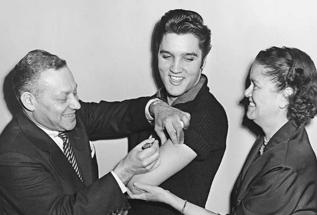
There should never have been any doubt that vaccines would not stop you from “catching” the coronavirus. Vaccines cannot stop virus particles from lodging in your nose or your eyeballs. The vaccines act to prime the immune system against the virus, but no immune response is instantaneous. In other words, if you aren’t first “infected”, antibodies don’t do anything! A virus may replicate for at least a brief time, and it is therefore possible for a vaccinated individual to carry the virus and even pass it along to others. The Omicron variant has proven that beyond a shadow of a doubt, though the wave appears to be peaking in most of the U.S. and has peaked already in a few states, mostly in the northeast.
I grant that the confusion over “catching” the virus stems from an imprecision in our way of speaking about contracting “bugs”. Usually we don’t say we “caught” one unless it actually makes us feel a bit off. We come into intimate contact with many more bugs than that. The effects are often so mild that we either don’t notice or brush it off without mention. But when it comes to pathogens like Covid and discussions of vaccine efficacy (VE), it’s obviously useful to remember the distinction between infections, on the one hand, and symptomatic infections on the other.
Cases Are the Wrong Focus
Unless calibrated by seroprevalence data, these studies are not based on proper estimates of infections in the population. Asymptomatic people are much less likely to get tested, and vaccinated individuals who are infected are either much more likely to be asymptomatic or the test might not detect the weak presence of a virus at all. VE based on detected infections is essentially meaningless unless testing is universal.
We are bombarded by studies (and analyses like the one here) alleging that VE should be judged on the reduction in infections among the vaccinated. The likelihood of a detected infection by vaccination status is simply the wrong way to measure of VE. It’s not so much the direction of bias in measured VE, however. The mere presence of cases among the vaccinated has been sufficient to inflame anti-vax sentiment, especially cases detected in mandatory tests at hospitals, where the infections are often incidental to the primary cause of admission.
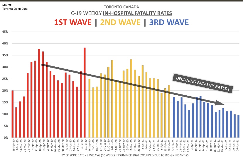
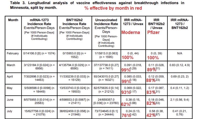
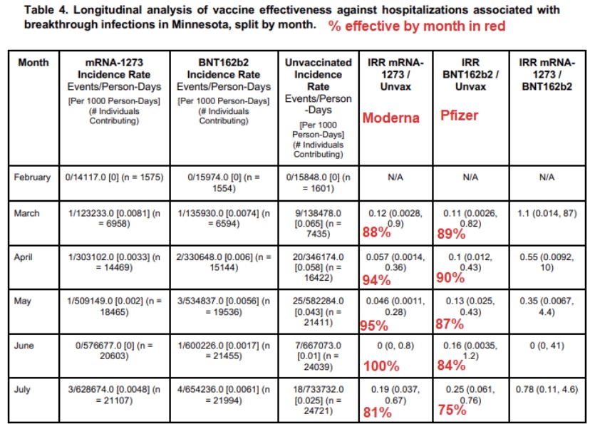
The typical evolution of a novel virus is further reason to dismiss case numbers as a basis for measuring VE. Mutations create new variants in ways that usually promote the continuing survival of the lineage. Subsequent variants tend to be more transmissible and less deadly to their hosts. Thus, given a certain “true” degree of VE, so-called breakthrough infections among the vaccinated are even more likely to be asymptomatic and less likely to be tested and/or detected.
There is the matter of immune escape or evasion, however, which means that sometimes a virus mutates in ways that get around natural or vaccine-induced immune responses. While such a variant is likely to be less dangerous to unvaccinated hosts, more cases among the vaccinated will turn up. That should not be interpreted as a deterioration in VE, however, because detected infections are still the wrong measure. Instead, the fundamental meaning of VE is a lower virulence or severity of a variant in vaccinated individuals than in unvaccinated individuals.
Interestingly, to digress briefly, while immune escape has been discussed in connection with Omicron, that variant’s viral ancestors may have predated even the original Covid strain released from the Wuhan lab! It is a fascinating mystery.
Virulence
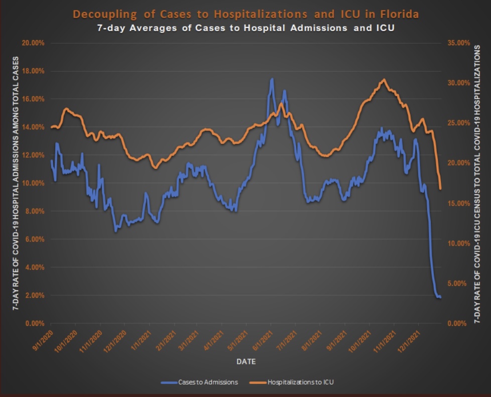
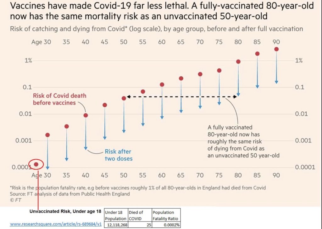
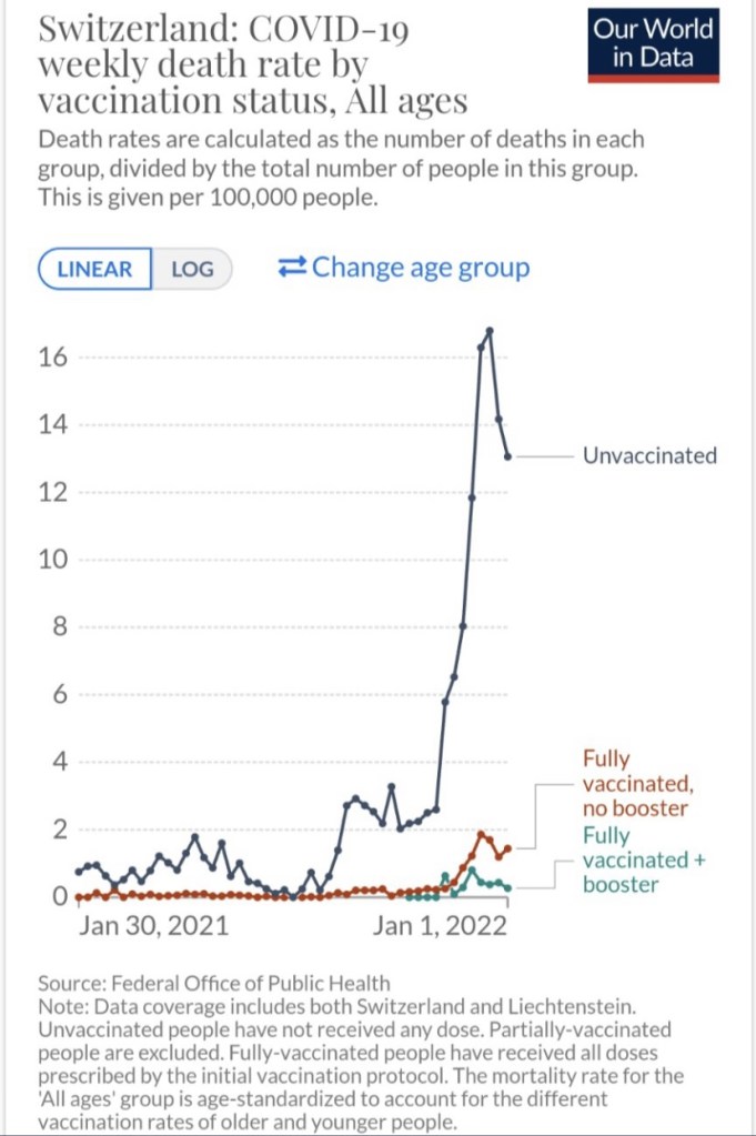
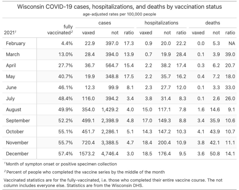
In fact, vaccines have reduced the virulence of Covid infections, and the evidence is overwhelming. See here for a CDC report. The chart below is Swiss data, followed by a “handy” report from Wisconsin:
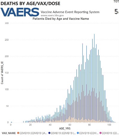
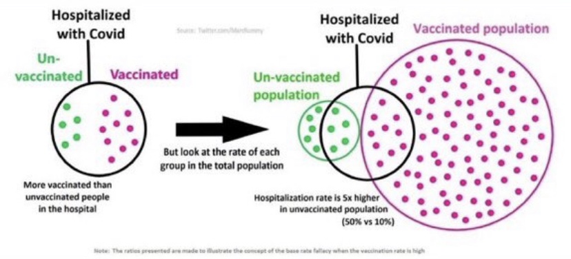
From the standpoint of virulence, there are other kinds of misguided comparisons to watch out for: these involve vaxed and unvaxed patients with specific outcomes, like the left side of the graphic at the top of this post (credit to Twitter poster aparachick). This thread has an excellent discussion of the misconception inherent in the claim that vaccines haven’t reduced severity: the focus is on the wrong conditional probability (again, like the left side of the graphic). Getting that wrong can lead to highly inaccurate conclusions when the sizes of the two key groups, hospitalizations and vaccinated individuals in this case, are greatly different.
Bumbled Messaging
The misunderstandings about VE are just one of many terrible failures of public health authorities over the course of the pandemic. There seems to have been fundamental miscommunication by the vaccine manufacturers and many others in the epidemiological community about what vaccines can and cannot do.
Another example is the apparent effort to downplay the importance of natural immunity, which is far more protective than vaccines. This looks suspiciously like a willful effort to push the narrative that universal vaccination as the only valid course for ending the pandemic. Even worse, the omission was helpful to those attempting to justify the tyranny of vaccine mandates.
Waning Efficacy
It should be noted that the efficacy of vaccines will wane over time. This phenomenon has been measured by the presence of antibodies, which is a valid measure of one aspect of VE over time. However, immune responses are more deeply embedded in the human body: so-called T-cells carry messages alerting so-called B-cells to the presence of viral “invaders”. The B-cells then produce new antibodies specific to characteristics of the interloping pathogen. Thus, these cells can function as a kind of “memory” allowing the immune system to mount a fresh antibody defense to a repeat or similar infection. The reports on waning antibodies primarily in vaccinated but uninfected individuals do not and cannot account for this deeper process.
Conclusion
Vaccines don’t necessarily reduce the likelihood of infection or even the spread of the virus, but they absolutely limit virulence. That’s why Jay Bhattacharya, one of the authors of The Great Barrington Declaration, says the vaccines provide a private benefit, but only a limited public benefit. Yet too often we see VE measured by the number of infections detected, and vaccine mandates are still motivated in part by the idea that vaccines offer protection to others. They might do that only to the extent that infections are less severe and clear-up more quickly.