Tags
Cost of Lost Output, Covid-19, Cytokine Storm, Economic Costs, Excess Mortality, Herd Immunity, Life-Years, Lockdown, Non-Prescription Measures, Novel Coronavirus, Pandemic, Quarantines, Reason.com, Serological Testing, Skilled Care, Social Distancing, South Korea, Spanish Flu, World War I
The coronavirus pandemic differs in a few important ways from the much deadlier Spanish flu pandemic of 1918-19. Estimates are that as much as 1/3rd of the world’s population was infected during that contagion, and the case fatality rate is estimated to have been 10-20%. The current pandemic, while very serious, will not approach that level of lethality.
Another important difference: the Spanish Flu was very deadly among young adults, whereas the Coronavirus is taking its greatest toll on the elderly and those with significant co-morbidities. Of course, the Spanish Flu infected a large number of soldiers and sailors, many returning from World War I in confined conditions aboard transport vessels. A major reason for its deadliness among young adults, however, is thought to be the “cytokine storm“, or severe inflammatory response, it induced in those with strong immune systems.
It’s difficult to make a perfect comparison between the pandemics, but the charts below roughly illustrate the contrast between the age distribution of case mortality for the Spanish Flu in 1918, shown in the first chart, and Covid-19 in the second. The first shows a measure of “excess mortality” for each age cohort as the vertical gap between the solid line (Spanish flu) and the dashed line (the average of the seven previous seasons for respiratory diseases). Excess mortality was especially high among those between the ages of 15 and 44.
The second chart is for South Korea, where the Covid-19 pandemic has “matured” and was reasonably well controlled. We don’t yet have a good measure of excess case mortality for Covid-19, but it’s clear that it is most deadly among the elderly population. Not to say that infected individuals in younger cohorts never suffer: they are a higher proportion of diagnosed cases, severe cases are of extended duration, and some of the infected might have to deal with lasting consequences.


One implication of these contrasting age distributions is that Covid-19 will inflict a loss of fewer “life years” per fatality. If the Spanish flu’s median victim was 25 years old, then perhaps about 49 life years were lost per fatality, based on life expectancies at that time. At today’s life expectancies, it might be more like 54 years. if Covid-19’s median victim is 70 years old, then perhaps 15 life-years are lost per fatality, or about 73% less. And that assumes the the median Covid victim is of average health, so the loss of life years is probably less. But what a grisly comparison! Any loss is tragic, but it is worth noting that the current pandemic will be far less severe in terms of fatalities, excess mortality (because the elderly always die at much higher rates), and in life-years lost.
Is that relevant to the policy discussion? It doesn’t mean we should throw all caution to the wind. Ideally, policy would save lives and conserve life-years. We’d always put children on the lifeboats first, after all! But in this case, younger cohorts are the least vulnerable.
The flu pandemic of 1918-19 is often held to support the logic of non-prescription public health measures such as school closures, bans on public gatherings, and quarantines. Does the difference in vulnerabilities noted above have any bearing on the “optimal” level of those measures in the present crisis? Some argue that while a so-called lockdown confers health benefits for a Spanish flu-type pandemic in which younger cohorts are highly vulnerable, that is not true of the coronavirus. The young are already on lifeboats having few leaks, as it were.
My view is that society should expend resources on protecting the most vulnerable, in this case the aged and those with significant co-morbidities. Health care workers and “first responders” should be on the list as well. If well-targeted and executed, a Covid-19 lockdown targeted at those groups can save lives, but it means supporting the aged and afflicted in a state of relative isolation, at least until effective treatments or a vaccine prove out. A lockdown might not change living conditions greatly for those confined to skilled care facilities, but much can be done to reduce exposure among those individuals, including a prohibition on staff working at multiple facilities.
Conversely, the benefits of a lockdown for younger cohorts at low risk of death are much less compelling for Covid-19 than might be suggested by the Spanish flu experience. In fact, it can be argued that a complete lockdown denies society of the lowest-hanging fruit of earlier herd immunity to Covid-19. Younger individuals who have more social and economic contacts can be exposed with relative safety, and thus self-immunized, as their true mortality rate (including undiagnosed cases in the denominator) is almost zero to begin with.
Then we have the economic costs of a lockdown. Idle producers are inherently costly due to lost output, but idle non-producers don’t impose that cost. For Covid-19, prohibiting the labor of healthy, working age adults has scant health benefits, and it carries the high economic costs of lost output. That cost is magnified by the mounting difficulty of bringing moribund activities back to life, many of which will be unsalvageable due to insolvency.
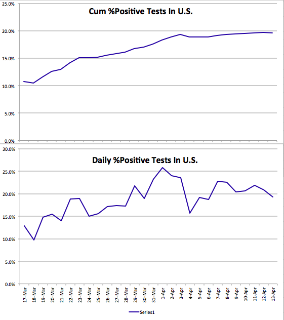
The lockdown question is not binary. There are ways to maintain at least modest levels of production in many industries while observing guidelines on safety and social distancing. In fact, producers are finding inventive ways of maximizing both production and safety. They should be relied upon to create these solutions. The excess mortality rates associated with this pandemic will continue to come into focus at lower levels with more widespread serological testing. That will reinforce the need for individual autonomy in weighing risks and benefits. Hazards are always out there: reckless or drunk drivers, innumerable occupational hazards, and the flu and other communicable diseases. Protect yourself in any way you see fit, but if you are healthy, please do so without agitating for public support from the rest of us, and without imposing arbitrary judgments on which activities carry acceptable risk for others.