• About

Sacred Cow Chips

Sacred Cow Chips

Tag Archives: Coronavirus

CDC Sows Covid Case-Fatality Confusion

15 Wednesday Apr 2020

Posted by Nuetzel in Data Integrity, Pandemic

≈ Leave a comment

Tags

Case Fatality Rate, Centers for Disease Control, Co-Morbidities, Coronavirus, Covid "Hot Spots", Covid-119, Crisis Management, Data Integrity, Death Toll, Excess Deaths, Government Accounting, Influenza, New York Deaths, Probable Deaths, Respiratory Disease, Testing Guidelines

The Centers for Disease Control has formally decided to inflate statistics on coronavirus deaths by adding so-called “probable” cases to the toll. This news follows the announcement yesterday that New York decided to add, in one day, about 4,000 deaths from over the past month to its now “probable” Covid-19 death toll. So much for clean accounting! We have a confirmed death toll up to April 14th. We have a probable death toll after. The error in timing alone introduced by this abrupt adjustment impairs efforts to track patterns of change. Case fatality rates are rendered meaningless. Data integrity, which was already weak, has been thrown out the window by our public heath authorities.

It’s no longer necessary for a deceased patient to have tested positive for Covid-19:

“A probable case or death is defined as one that meets clinical criteria such as symptoms and evidence of the disease with no lab test confirming Covid-19. It can also be classified as a probable case if there are death or other vital records listing coronavirus as a cause. A third way to classify it is through presumptive laboratory evidence and either clinical criteria or evidence of the disease.”

Consider the following:

  • to date, more than 80% of patients presenting symptoms sufficient to meet testing guidelines have tested negative for Covid-19;
  • the most severe cases of Covid-19 and other respiratory diseases are coincident with significant co-morbidities;
  • “probable” cases appear to be concentrated among the elderly and infirm, whose regular mortality rate is high.

Deaths involving mere symptoms, or mere symptoms and co-morbidities, and even deaths of undetermined cause, are now more likely to be over-counted as Covid-19 deaths. This is certain to distort, and I believe overcount, Covid-19 deaths. Of course, this was already happening in some states, as I mentioned last week in “Coronavirus Controversies“.

One of the charts I’ve presented in my Continue%20reading Coronavirus “Framing” posts tracks Covid-19 deaths. The change in these cause-of-death guidelines will make continued tracking into something of a farce. I’d be tempted to deduct the one-day distortion caused by the New York decision, but then the count will still be distorted going forward by the broader definition of Covid-19 death.

The only possible rationale for these decisions by New York and the CDC is that testing is still subject to severe rationing. I have my doubts, as the number of daily tests has stabilized. On the other hand, I have heard anecdotes about hospitals with large numbers of respiratory patients who have not been tested! And they are intermingling all of these patients?? I’m not sure I can reconcile these reports. Surely the patients meet the guidelines for testing. Perhaps the CDC’s decision is associated with an effort to spread testing capacity by allowing only new patients to be tested, counting those already hospitalized as presumptively Covid-infected. And if they aren’t already, they will be! A decision to count deaths within that group as “probable” Covid deaths  would fit conveniently into that approach, but that would be wildly misguided and perverse.

I’m obviously cynical about the motives here. I don’t trust government accounting when it bears on the credit or blame for crisis management. Who stands to gain from a higher Covid death toll? The CDC? State health authorities? “Hot spots” vying for federal resources?

A consistent approach to attributing cause of death would have been more useful for gauging the direction of the pandemic, but as I’ve said, there will always be uncertainty about the true Covid-19 death toll. Ultimately, the best estimates will have to rely on calculations of “excess deaths” in 2020 compared to a “normal” level from a larger set of causes. In fact, even that comparison will be suspect because the flu season leading up to the Covid outbreak was harsh. Was it really the flu later in the season?

Coronavirus “Framing” Update #4

13 Monday Apr 2020

Posted by Nuetzel in economic growth, Pandemic

≈ 2 Comments

Tags

Centre for Translational Data Science, Confirmed Cases, Coronavirus, Covid-19, Death Toll, Epidemiological Models, Herd Immunity, IMHE, Murray Model, Pandemic, Pending Tests, Test Demand, The University of Sydney

It’s beginning to look like we’ve turned a corner in mitigating the spread of the coronavirus. I hope I’m not speaking too soon.

It’s time to update some of the charts and thoughts about where the epidemic is trending in the U.S. Here’s the first of these “framing” posts I published on March 18th. The last update from about a week ago is here. The demand for tests seems to be tapering a little, and the percentage of tests that are positive has leveled and even dropped a bit. The number of confirmed cases continues to mount, but the daily increases are slowing, as is the growth rate of the cumulative count. Finally, the daily increase in the number of deaths is also slowing, and total deaths have risen more slowly than one prominent model predicted on the date at which I chose to “freeze” it for my own expositional purposes: April 2. The charts appear further below.

The epidemiological modelers have taken a real beating from many observers as their estimated virus growth curves have shifted downward. Their initial projections were way too high, and they have continued to overshoot in subsequent model revisions. In fairness, however, they didn’t have a lot to go on during the early stages of the pandemic, and conservatism was probably seen as a must. The variety and extent of mitigation measures was also an unknown, of course.

I build “event” models for a living, though the events I study are economic and are obviously much different kinds of risks than coronavirus infection. I seldom face situations in which so little historical data is available, so I can appreciate the modeling challenge presented by Covid-19: it was pretty close to an unwinnable situation. Nevertheless, until recently the projections were outrageously high. There comes a time when accurate, rather than conservative, projections are demanded. The confidence intervals produced by the modelers are really not worthy of the name. Partly on that basis, a very recent paper gave the model produced by the Institute for Health Metrics and Evaluation very poor marks (IMHE, which I called the Murray Model last week):

“In excess of 70% of US states had actual death rates falling outside the 95% prediction interval for that state…”

That’s nothing short of pathetic.

That brings me to the “framing” exercise I’ve been performing for nearly four weeks. It is not a modeling exercise. The “very good” and “pretty bad” scenarios I charted for the confirmed Covid-19 case count in the U.S. were not intended as confidence intervals except perhaps in spirit. The intent was to provide perspective on developments as they unfolded. Where to place those bounds? They were based on multiples of the Italian experience (pretty bad) and the South Korean experience (very good) as of March 18, normalized for U.S. population. Here’s the latest version of that chart, where Day 1 was March 4th:

The curve may be just starting to bend to the right. Let’s hope so. The daily growth rate of new cases has dropped below 5%. Below, it’s clear that the daily count of new confirmed cases plateaued in early April, and the last few days show an encouraging reduction.

I also think it’s telling that after a few weeks of “excess demand” for tests, demand seems to be falling. The chart below showed the sharp reduction in the “pending test” count about a week ago. It corresponded with the spike in daily tests, which have stabilized since then and may be trending down (lower panel).

The next chart shows that the cumulative share of tests with a positive diagnosis has flattened. The lower panel hints at a taper in the daily share of positive tests, which would be welcome. However, I do not necessarily expect that percentage to decline too much if the number of tests continues to fall. In fact, more testing will almost certainly be required in order to “restart” the economy. Then, we should see a reduction in the percentage of positive tests if all goes well.

The last chart highlights the IMHE model discussed above. The chart extends from March through June, though the unlabeled date axis is not cooperating with me. The mean model prediction of U.S. cumulative deaths attributed to Covid-19 is shown in red. The upper and lower bounds of the confidence interval are the blue and green lines. Again, I “froze” this forecast as of April 2 to serve as another “framing” device. Actual deaths are traced by the black line, which goes through April 13th. It is trending below the mean forecast, and IMHE has reduced their mean forecast of the death toll by about a third since April 2nd (to 60,000). Actual deaths may well come in below that level.

I hope my optimism based on these nascent developments is not unwarranted. But they are consistent with state-by-state reports of more positive trends in the data. It is time to start planning for a return to more normal times, but with a new eye toward mitigating risk that will probably involve isolating vulnerable groups when appropriate, more work at home, widespread testing, and a few other significant changes in social and business practices. It remains to be seen how easily certain industries can return to previous levels, such as hospitality, or how soon crowds can return to sporting events, concerts, and theaters. That might have to await greater levels of “herd immunity”, an effective vaccine, and fast testing.

Coronavirus Controversies

11 Saturday Apr 2020

Posted by Nuetzel in Health Care, Leftism, Pandemic

≈ 1 Comment

Tags

American Society of  Thoracic Surgeons, Anecdotal Evidence, Co-Morbidities, Coronavirus, Covid-19, Donald Trump, Dr. Anthony Fauci, Dr. Jeffrey Singer, Excess Deaths, FDA, Hydroxychloraquin, Plasma Therapy, Randomized Control Trial, Reason Magazine, Remdeivir, Replication Problem, Right-To-Try Laws, Trump Derangement Syndrome, Victoria Taft, Z-Pac, Zinc

The coronavirus and the tragedy it has wrought has prompted so many provocative discussions that it’s hard to pick just one of those topics for scarce blogging time. So I’ll try to cover two here: first, the question of whether coronavirus deaths are being miscounted; second, the politically-motivated controversy over the use of hydroxychloraquin to treat severe cases of Covid-19.

Counting Deaths

I’ve been suspicious that Covid deaths are being over-counted, but I’m no longer as sure of that. Of course, there are reasons to doubt the accuracy of the death counts. For example, there is a strong possibility that some Covid deaths are simply not being counted due to lack of diagnoses. But there are widespread suspicions that too many deaths with positive diagnoses are being counted as Covid deaths when decedents have severe co-morbidities. Members of that cohort die on an ongoing basis, but now many or all of those deaths are being attributed to Covid-19. A more perverse counting problem might occur when public health authorities instruct physicians to attribute various respiratory deaths to Covid even without a positive diagnosis! That is happening in some parts of the country.

To avoid any bias in the count, I’ve advocated tracking mortality from all co-morbidities and comparing the total to historical or “normal” levels to calculate “excess deaths”. One could also look at all-cause mortality and do the same, though I don’t think that would be quite on point. For example, traffic deaths are certainly way down, which would distort the excess deaths calculation.

Despite the vagaries in counting, there is no question that the coronavirus has been especially deadly in its brief assault on humans. New York has experienced a sharp increase in deaths, as the chart below illustrates (the chart is a corrected version of what appeared in the Reason article at the prior link). The spike is way out of line with normal seasonal patterns, and it obviously corresponds closely with deaths attributable to Covid-19. It is expected to be short-lived, but it might taper over the course of several weeks or months, Once it does, I suspect that the cumulative deaths under all those other curves in the chart will exceed Covid deaths substantially. Also note that the yellow line for the flu just stops when Covid deaths begin, suggesting that the red line probably incorporates at least some “normal” flu deaths.

Once the virus abates, we’ll be able to tell with a bit more certainty just how deadly the pandemic has been. It will be revealed through analyses of excess deaths. For now, we have the statistics we have, and they should be interpreted cautiously.

Hydrochloraquin

A more boneheaded debate centers on the use of the anti-malarial drug hydroxychloraquin (HCQ) to treat coronavirus patients. There have been many successes, particularly in combination with a Z-Pak, or zinc. Guidelines issued by the American Society of  Thoracic Surgeons last week call for HCQ’s use in advanced cases of coronavirus infection. These and other therapies are being tested formally, but many are prescribed outside any formal testing framework. Remdesivir has been prominent among these. Plasma therapy has been as well, and several other possible treatments are under study.

With respect to HCQ, it’s almost as if the Left, much of the media, and a subset of overly “prescriptive” medical experts were goaded into an irrational position via pure Trump Derangement. Just Google or Bing “Hydroxychloraquine Coronavirus” for a bizarre list of alarmist articles about Trump’s mention of HCQ. To take just two of the claims, the idea that Trump stands to earn substantial personal profits from HCQ because he holds a few equity shares in a manufacturer of generic drugs is patently absurd. And claims that shortages for arthritis, lupus, and malaria patients are imminent are unconvincing, given the massive stockpiles now accumulated and the efforts to ramp-up production.

So much lefty hair is on fire over a potential therapy that is both promising and safe that the media message lacks credulity. But more ominously, the Democrat governors of Michigan and Nevada were so petulant that they banned HCQ’s use in their states, though at least Nevada’a governor rescinded his order. It’s almost as if they don’t want it to work, and don’t want to give it a chance to work. Or do I go too far? No, I don’t think so.

Victoria Taft has a good summary of the media backlash against President Trump’s hopeful statements about HCQ. Not only was the FDA’s authority over the use of HCQ misrepresented, there was also a good bit of smearing of various researchers who’d found preliminary evidence of HCQ’s effectiveness. Let’s be honest: the quality of medical research is often inflated by the research establishment. And the media eat up any study with findings that are noteworthy in any way. Over the years, a great deal of medical research has been based on small samples from which statistical hypothesis tests are shaky at best. That’s one reason for the legendary replication problem in medical research. In the case of HCQ, there has been widespread misuse of the term “anecdotal” in the media, prompted by experts like Dr. Anthony Fauci, who should know better. The term was used to describe clinical tests on moderately large groups of patients, at least one of which was a randomized control trial.

Every day we hear stories from individual patients that they were saved by HCQ. These are properly called anecdotal accounts. But we also hear from various physicians around the country and world who claim to be astonished at HCQ’s therapeutic efficacy on groups of patients. This link gives another strong indication of how physicians feel about HCQ at this point. These are not from RCTs, but they constitute clinical evidence, not mere “anecdotes”.

By virtue of state and federal right-to-try laws, terminally ill patients can choose to take medications that are unapproved by regulators. Beyond that, FDA approval of HCQ specifically for treating coronavirus was unnecessary because the drug was already legal to prescribe to cover patients as an “off-label” use. That’s true of all drugs approved by the FDA: they can be prescribed legally for off-label uses. When regulators like Dr. Fauci, and even practicing physicians like Dr. Jeffrey Singer (linked below) claim that the FDA hasn’t approved HCQ specifically for treating Covid, it is a technicality: the FDA can certainly “approve” it for that specific use, but it’s already legal to prescribe!

While it won’t end the silly argument, which is obviously grounded in other motives, Dr. Singer brings us to the only reasonable position: treatment of Covid with HCQ is between the patient and their doctor.


Coronavirus: Framing the Next Few Weeks #3

05 Sunday Apr 2020

Posted by Nuetzel in Pandemic, Risk Management

≈ 1 Comment

Tags

80000 Hours, Chris Murray Model, Christopher Monkton, Christopher Murray, Co-morbidity, Confidence Interval, Coronavirus, Covid Tracking Project, Covid-19, Economic Restart, Indur M. Goklany, Institute for Health Metrics and Evaluation, Lockdowns, Pending Tests, Positive Test Ratio, Social Distancing, Stay-at-Home Orders, White House Coronavirus Task Force

There were a few encouraging signs of change over the past few days in the course of the coronavirus pandemic in the U.S. This is the third of my quaint efforts to provide perspective on the coronavirus pandemic with “tracking” or “framing” posts. The first two were: Coronavirus: Framing the Next Few Weeks, on March 22, and Framing Update on March 28. In both of those posts, I charted confirmed cases of Covid-19 in the U.S. along with optimistic and pessimistic scenarios. I speculated that over the course of a few weeks, social distancing would lead to a reduction in the daily number of new confirmed cases. Unfortunately, it’s not clear whether that curve has started to “bend” rightward, but new confirmed cases on Sunday, April 5 — the number of those testing positive — was down almost 30% from Saturday.

An updated version of the earlier chart appears below, accompanied by a table. The number of confirmed cases (red line) has mounted over the past week, as has the daily increase in confirmed cases, though yesterday’s number was better. The table below the chart shows that the growth rate of confirmed cases (the far right-hand column) has decelerated, but it had leveled off at about 14% over the few days before Sunday. If Sunday’s drop persists it would be encouraging. Unfortunately, even moderate growth rates are destructive when the base of confirmed cases is large. The faster the growth rate declines, the faster the curve will bend.

I did not make any changes to the original “Very Good” and “Pretty Bad” scenarios, deciding that it was better to keep them as a consistent benchmark. As of Sunday, the top of the “Very Good” curve would still be about 2.3x the North Korean experience as of Sunday night, normalized for population. The top of the “Pretty Bad” scenario (which is not visible in this “zoomed-in” version) would be about 1.4x the Italian experience thus far. South Korea’s curve flattened substantially several weeks ago, and now even Italy’s curve is showing a rightward bend. Let’s hope that continues.

The case count obviously depends on the volume of daily testing, which has been increasing rapidly. As I’ve noted before, there has been a backlog of test requests. In addition, every day there is an overhang of “pending” test results. Interestingly, the number of tests stabilized on Saturday and the number of pending test results plunged (see the next chart, which uses data from the Covid Tracking Project). We’ll see if those developments persist. It would represent a milestone because daily case counts will advance as long as tests do, and the effort to work through the backlog has been inflating the speed of the advance in confirmed cases.

Another interesting development coincident with the drop in pending tests has to do with the cumulative percentage of positive test results: it has stabilized after growing for several weeks. This might mean we’ve reached a point at which the most severe incoming cases are fewer, but we’ll have to see if the flattening persists or even declines, which would be wonderful.

I’ve been grappling with potential weaknesses of the data on confirmed cases: first, the U.S. got a late start on testing, so there was the backlog of patients requiring tests just discussed above. That was presumed to have exaggerated the acceleration in the daily totals for new cases. Second, it’s possible that a continuing transition to more rapid test results would exaggerate the daily counts of new cases. Third, It’s possible that testing criteria are being relaxed, which, despite reducing the positive test rate, would increase growth in the “official” confirmed case count. Suspected cases should be tested, of course, but the change in standards is another factor that distorts the shape of the curve.

Any published statistic has its shortcomings. All test results are subject to false positives and negatives. Hospitalizations of patients with a positive coronavirus diagnosis are subject to the measurement issues as well, though they might be driven more by the severity of symptoms and co-morbidities than a positive Covid diagnosis per se. And hospitalizations of Covid patients might be subject to inconsistencies in reporting, and so might ICU admittances. Coronavirus deaths are subject to vagaries: reporting a cause of death is dictated by various criteria when co-morbidities are involved, and those criteria differ from country to country, or perhaps even hospital to hospital and doctor to doctor! In fact, some go so far as to say that all deaths should be tracked for coronavirus plus its co-morbidities and then compared to an average of the past five to ten years to obtain an estimate of “excess deaths”, which could conceivably be negative or positive. Finally, recoveries are even more impacted by inconsistent reporting, especially because many recoveries occur at home.

I’ll be highlighting coronavirus deaths going forward, and I’ll continue to focus mainly on the U.S. and only lightly on other countries. After all, death is obviously the most negative outcome. Again, however, the count of coronavirus deaths does not account for deaths that would have occurred over the same time frame due to co-morbidities or the effect of deaths that would not have occurred absent co-morbidities.

The predictions in the chart below are from the Chris Murray Model, upon which the White House Coronavirus Task Force has focused more recently. This model was developed by Dr. Christopher Murray at the Institute for Health Metrics and Evaluation at the University of Washington. I’ll be using the forecast starting from April 2 as the basis for my “framing” of actual deaths over the next few weeks, keeping it “frozen” at that level as a new benchmark. My apologies for the absence of dates on the horizontal axis, but the origin is at March 14 and there is only a single line up through April 1. That line represents actual cumulative Covid deaths recorded in the U.S. The red line is the mean model prediction. Deaths are expected to ramp up over the next week or so, much as we’ve seen in the confirmed case count, as deaths lag behind diagnoses by anywhere from a few days up to 17 days. This model predicts an ultimate death toll of about 94,000 at the top of the mean curve (not visible on the zoomed-in chart). Above and below that line are upper (blue) and lower (green) bounds, respectively, of a “confidence interval”. It’s unlikely we’ll see cumulative deaths breach either of those bounds. The lower bound would place the ultimate death toll at about 40,000; the upper bound would place it at just under 180,000. At this point, as of Sunday, April 5, actual deaths (black) are slightly below the mean or central tendency, but that’s difficult to see in the current chart.

The ongoing lockdowns in the U.S. and around the world are exceedingly controversial. There is a very real tradeoff between the benefits of extending the length of these lockdowns and the benefits of allowing economic activity to “restart”. But do lockdowns work? Christopher Monkton offers aggregate evidence that they truly do reduce the spread of the virus in “Are Lockdowns Working?” That they would work is intuitive, and decisions to scale them back should be made cautiously for certain “high exposure” activities, and in conjunction with isolating and trace-tracking contacts of all infected individuals, as they have done successfully in countries such as Taiwan and Singapore.

There may be signs that a bend in the U.S. case curve is in the offing, perhaps over the next week or two. That timing would roughly comport with the notion that over the past three weeks, efforts at social distancing and stay-at-home orders have allowed the U.S. to limit the spread of coronavirus through the first major “round” of infections and a much more limited second round. Perhaps these efforts will largely stanch a third and subsequent rounds of infection. Ultimately, if the number of coronavirus deaths is in the neighborhood of the mean value predicted by the Murray Model, about 94,000, that would place the severity of the toll at less than two times the severity of a bad flu season, though limiting the Covid death toll will have been achieved at much higher economic cost.

There are signs elsewhere around the globe that the pandemic may be turning a corner toward more favorable trends. See “Good News About COVID-19” at 80,000hours.org for a good review.

The Opportunity of Skewed Coronavirus Transmission

30 Monday Mar 2020

Posted by Nuetzel in economic growth, Pandemic

≈ 1 Comment

Tags

Contagion, Coronavirus, Covid-19, Fat-Tailed Distribution, Heart Disease, Herd Immunity, John Cochrane, President Trump, Prophylaxis, Public Park Closures, Reproduction Rate, Restart Economy, Right Skew, Shelter In Place, Stay-at-Home, Suicide, Super-Spreaders, The Federalist, Transmission Rate

People talk about the transmission rate or reproduction rate (R0) of Covid-19 as if it’s a single number that applies to the entire population. John Cochrane emphasizes the huge implications of this misperception for how best to prevent the spread of the virus, and at lower cost, and for how best to “restart” the economy.

First, however, lets dispense with the absolutist position that there can be no compromise on virus mitigation in favor of economic activity. I am not opposed to the “lockdown” we are now living, but it will have significant and unnecessary costs if it goes on too long: the lost output is a huge blow not only to our current lifestyles but to our ability to grow in the future, or even to afford better health care in the future. Beyond that, the lockdown has immediate negative impacts of its own on public health: economic stress leads to all kinds of terrible health outcomes like heart disease and even suicide. About the latter, the President is absolutely correct: if you need research to prove it, see here, here, here, and here, all respected journals (the links all courtesy of The Federalist.) Economic stress and isolation is quite likely to promote poor dietary habits, lethargy, and possibly family dysfunction as well. Don’t pretend there aren’t real tradeoffs between the economy, virus interventions, and public health. The trick is to improve those tradeoffs. A balance can and must be struck, and depending on policy actions, the tradeoff can be made better or worse.

Back to the virus reproduction rate: the R0 values we see quoted are estimates of the average number of other people infected by each infected person. A value of three means that each person infected with the virus passes it on to three others, on average. If R0 is greater than one, an epidemic grows. If R0 is less than one, a contagion recedes. It becomes a “non-epidemic” if R0 remains less than one. It does not have to be zero (and probably cannot be zero).

But not everyone is the same: my R0 is different from your R0 if only because we have different occupational exposure to others and different levels of social engagement. We also differ physiologically, which probably leads to differences in our “personal” R0 values. And an individual’s R0 will differ by time and place, depending on random circumstances like which way the wind is blowing. But here is where it gets interesting. Cochrane describes an extreme version of the skewed distribution shown at the top of this post:

“Suppose there are 100 people with a 0.5 reproduction rate, and 1 super-spreader with a 100 replication rate. The average reproduction rate is 1.5. Clearly, locking everyone down is wildly inefficient. It’s much more important to find the 1 super-spreader and lock him or her down, or change the business or behavior that’s causing the super-spreading.

This is exaggerated, but not far off the mark. I have not seen numbers on the distribution of reproduction rates across people, but it is a fair bet that it has an extremely fat tail. Most of us are washing our hands, social distancing, work in businesses that are shut down or are taking great steps to limit contact. And a few people and activities contribute to most of the spread.

This wide and fat-tailed dispersion is ignored in a lot of simulations I’ve seen. They take the average reproduction rate as the same for everyone. That’s a big mistake.

The danger: we waste a huge amount of time and money moving you and me from a 0.5 reproduction rate to an 0.4 reproduction rate. …  The opportunity: focus on the super-spreaders, and the super-spreading activities, and you bring down the reproduction rate at much lower cost. “

There are many ways to reduce R0. Cochrane gets a little more specific about this and the policy implications of the skewed R0 distribution across individuals:

“All we need is to get the transmission rate under one. Activities with possible but very low transmission rates, and high economic benefits should go on. Don’t separate to ‘essential’ and ‘non-essential.’ Separate into ‘high likelihood of transmission’ and ‘low likelihood of transmission.’

Why are we not using masks everywhere? Sure, they’re not perfect. Sure, an old hankerchief might only cut the chance of transmission by half. We’re not all surgeons. Cutting by half is enough to stop the virus. 

Conversely, why did they close the state parks? Really? Just how dangerous is it to drive the dog to a hiking trail and stay 6 feet away from other people? Parks, ski areas, golf courses, all sorts of businesses that surely can be run with a reproduction rate far less than one are just shut down. I met a realtor on our dog walk yesterday. They’re totally shut down. Just how hard is it to run a realty business with a 0.5 reproduction rate? One family in the house at a time, don’t touch anything, an hour between showings, stay 6 feet from the realtor… But instead the whole business is just shut down.”

The beginning of that last paragraph echoes a point I made in my last post about public park closures and the health benefits of getting outside generally.

Cochrane goes on to discuss several other policy options, including the potential benefits of simple kinds of testing and the overemphasis on false negatives and positives in policy discussions. Imperfect tests should not be discouraged by these concerns. If you’re worried about that, you shouldn’t use a thermometer either!

“Stay-at-home” or “shelter-in-place” orders will increasingly be tested by private parties if they remain in effect too long. That will be encouraged by the seemingly arbitrary distinctions some orders make between “essential” and “non-essential” activities. If workers or small businessmen judge themselves to be at low risk, they will take matters into their own hands to the extent they can. I believe that’s already happening where the specifics of “lockdown” orders have gone too far.  Workers at the low end of the income spectrum are especially hard hit by these orders. One can hardly blame them for trying to earn what they can if they believe, and their customers believe, their activities and interactions are of low risk.

Ultimately, the entire distribution of R0s will slide to the left. That will occur even at low levels of “herd immunity” and anything that offers at least weak prophylaxis. Broadly speaking, the latter includes maintaining distance, refusing admittance to venues with a fever, avoiding handshakes, wearing masks, and potentially chloroquine, which is already in widespread use by physicians treating coronavirus patients. Ultimately, a vaccine will slide the distribution far to the left, but the economy need not be held hostage until that time. To paraphrase Cochrane, we can get the transmission rate below one and keep it there without stopping the world permanently. There are many options, and now is the time for business and government to start planning for that.

Don’t Be Cowed: Shelter, But Get Outside

29 Sunday Mar 2020

Posted by Nuetzel in Pandemic, Uncategorized

≈ 5 Comments

Tags

Absolute Humidity, Air Conditioning, Civil Liberties, Coronavirus, Forced Air Heating, Park Closures, Public Health, Shelter In Place, Unauthorized Walking, Vitamin D

As the coronavirus ordeal continues, it’s astonishing to hear the refrain from government officials, celebrities, talking heads, and social media scolds to “stay inside“. President Trump did it again today at his press conference. WTF? In northern England a man was arrested for “unauthorized walking”. Orders to “shelter in place” are often interpreted to mean “don’t go outside your home” except when necessary, as if active shooters are marauding through neighborhoods. In fairness, I don’t think anyone in the U.S. has yet been arrested for taking a walk, except for this incident, which is bad enough. Still, the misplaced emphasis of such rhetoric is confusing to people. The threat to civil liberties is one thing, but the suggestion that we should all stay inside is itself a threat to public health.

If you can get out of your home without coming face-to-face with others, you SHOULD get outside whenever you can! Get out in the sun and out of the forced-air, dehumidified environment that is your dwelling unit. Get some vitamin D and breath some fresh, humid air.

Here’s a personal anecdote: My yard backs-up to an extensive wooded area of a huge corporate campus. It was built years ago, and ever since, the company has welcomed residents of our neighborhood to walk the grounds. The company even maintains an access road that connects our street to a route that is often more convenient than our main entrance. A very good neighbor. I was out walking along one of the roads through the campus yesterday. Employees have not reported to work there for three weeks due to an employee’s diagnosis with the virus, so it was very quiet. A security guard drove by and stopped to tell me that I could no longer walk the campus due to the coronavirus. “That’s corporate policy now with this thing…”, he trailed off. As if my solitary stroll through the campus would contribute to the spread of the virus! Again, WTF? Of course, it is private property and they are entitled to make their own rules. I’m okay with that, but the virus is nonsensical as a rationale.

Public parks are closed in many areas. I understand the wisdom of discouraging people from mingling and preventing the virus’s spread via surfaces like park benches and playground equipment. Nevertheless, I believe parks should remain open to individuals or families for walking, running or resting. Just keep your distance.

You are highly unlikely to catch the virus outside unless you are in close proximity to an individual with the virus. Even then it’s unlikely. Yes, it can survive in air for about three hours, carried along in fine, exhaled aerosols. That is of much greater concern indoors, where the air is still and its volume limited. It is quickly dispersed outdoors into the vast atmosphere. And again, the virus is likely to degrade quickly in warm temperatures (> 54 degrees), direct sunlight, and high absolute humidity. All three are covered in this report. So enjoy your yard, your porch, your street, or at least open your windows when you can.

Supply-Gouging Laws Keep Goods Off Shelf

23 Monday Mar 2020

Posted by Nuetzel in Markets, Pandemic, Price Controls

≈ 2 Comments

Tags

Arbitrage, Conservation, Coronavirus, Hoarding, incentives, J.D. Tucille, Michael Munger, Price Gouging, Scarcity, Shortage, Speculation

“Low prices say, ‘Take all you want, there’s plenty more.‘”

— Duke economist Michael Munger

See the prices marked on those shelves above? They say infinity!

Nothing drives economists crazy like anti-price “gouging” sentiment, and especially politicians who play on it. Hoarders hoard under such laws precisely because prices are too low given demand and supply conditions. Scarcity is defined by demand relative to supply, and freely adjusting prices register the degree of scarcity quite well. To what purpose? First, to ration available supplies; second, to encourage conservation; third, to incentivize producers to bring more product to market.

But when hoarders hoard, does that not create artificial scarcity? Not really, because the scarcity itself was already a condition, or else the hoarder would not have acted. And the hoarder would not have acted if developing conditions of scarcity had not been contradicted by the low price.

But what if the hoarders are mere speculators? Doesn’t that prove their actions create artificial scarcity? No, again, scarce conditions existed. Speculators don’t speculate to lose money, and they would certainly lose money if they buy when a product is not truly in short supply relative to demand. Speculators operate on the principle of arbitrage: transacting in response to profit opportunities created by gaps between prices and real value. Markets tend to eliminate such opportunities. Anti-“gouging” laws create them in times of crisis.

Should we demand that respiratory therapists not accept higher offers to practice in areas hit hard by the coronavirus? That bears a certain equivalence to laws preventing retailers from raising prices sufficiently to discourage hoarding. After all, retailers know that their dwindling inventory has gained value in a crisis situation, just as the respiratory therapist knows that her services have gained value in a world ravaged by a lung-damaging viral disease. Should we arrest her?

In a functioning market, the respiratory therapist, the retailer, and producers who supply the retailer would all earn more based on the true value of their skills, inventories, or ability to produce. These parties get to keep any premium they earn when conditions create more scarcity. Speculators however, generally don’t share their gains with the producer, which some find regrettable. (In fact, commodity speculators often provide valuable hedging opportunities for suppliers, so my last statement is not quite true.) Nevertheless, speculators serve a valuable function because they often provide the first source of information about changes in scarcity. That information, the price signal, has social value because it embeds incentives for conservation and added production.

Yes, retailers should be able to restock with some time. But it can fairly be said they did not react quickly enough to the “demand shock” caused by the range of precautions taken in response to the coronavirus pandemic. Perhaps retailers placed additional orders with suppliers in an effort to deal with the crisis, and some might have hiked certain prices marginally. I don’t know. However, it’s certain they were chastened in their price response by fears of damaging their public image, and even cowed by short-sighted laws and regulations in some cases. It doesn’t take much imagination, however, to think of ways they might have be able to deal with crisis conditions via pricing policy, such as charging quantity premiums: first package of TP at regular price, second at 2x regular price, three-plus at 10x regular price.

As J.D. Tucille says, people think of price “gouging” as a matter of degree. But at what threshold does price flexibility become inappropriate as conditions of scarcity change? No price controller can tell you exactly. That’s a good reason to eschew shortage-inducing pricing laws. Is it fair when prices rise drastically? Well, the price is infinite when the shelf is empty. Is that fair? Better let markets do their job.

Coronavirus: Framing the Next Few Weeks

19 Thursday Mar 2020

Posted by Nuetzel in Pandemic

≈ 4 Comments

Tags

Aaron Ginn, Co-morbidity, Coronavirus, Covid-19, Diamond Process, Endless Metrics, Envelope Membrane, Gompertz curves, Insights and Outliers, Medium.com, Mortality, Pandemic, S-Curve, Scott Alexander, Seasonal Flu, Sigmoid Function, SlateStarCodex, Transmissibility, Willis Eschenbach

See my March 28 update here.

What follows is an exercise intended to put the coronavirus in perspective as we move through a crucial phase in the U.S. I believe it’s more informative than speculative. However, I’m relying on several pieces of information in establishing bounds on how the caseload and mortality rate will play out over the next few months: the experience abroad; domestic developments thus far; risk mitigation; prospective treatments; and some mathematics.

Pandemic Progressions

Despite all the warnings we’ve heard about exponential growth in the number of infections, that is something characterizing only the earliest stages of epidemics. These episodes invariably follow a growth curve that accelerates for a time before tapering. The total number of individuals infected eventually flattens, like the top of the dashed red line in the chart below. Think of the blue line’s height as showing the number of new positive diagnoses each day. New cases (blue) peak as the slope of the red line, total positive diagnoses, begins to decrease. The blue line is the one we’d like to flatten. That’s because once the number of new cases exceeds a certain threshold, medical resources can no longer handle the load. Nevertheless, I’ll focus on the red line and how it’s growth accelerates and then decelerates. Where are various countries on that curve? 

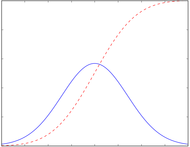
I’ve been using the interactive tool at the Insights and Outliers web site to view curves like the red line above, by country. China and South Korea are at the top, where the line is flat, though I discount the Chinese numbers as quite likely manipulated. Italy is somewhere in the middle of the red curve — one hopes it will enter the deceleration phase soon, but it’s not clear from the numbers.

Setting Context

The U.S. caseload is accelerating; it will continue to accelerate until the availability of tests catches up with demand from individuals meeting the qualifications for testing. The delay in the availability of tests, which I mentioned in an earlier post, will exaggerate the acceleration in the number of diagnosed cases for another week, or perhaps a bit more. Some of those cases already existed, and we should have known about them before now. However, after starting high, the U.S. death rate from the virus is already well below the global death rate, suggesting that either 1) our testing is actually well ahead of the rest of the world; 2) our Covid-19 mortality is, and will be, lower than the rest of the world; or 3) deaths in the U.S. will increase much faster than new diagnoses over the next few weeks. I seriously doubt the latter given the high quality of U.S. health care, the time of year, and the promising treatments that have recently been approved for use.

I expect the daily number of new cases in the U.S. to fall after the “catch-up” in testing. That’s based on a combination of things: first, the time from infection to first symptoms can be up to about 14 days, but the mean is just five days. Second, in the U.S., we began to practice “social distancing” and “self-quarantine” in earnest just this past week. Among those infected before this week, those who develop symptoms serious enough to notice will know before the end of March. But people are still out trying to take care of business. Some of those people will catch the virus, and there will be secondary infections of family members or others in close proximity to individuals diagnosed earlier. It will take an additional week, accounting for overlap, for infections among that cohort to mature. Nevertheless, over the next three weeks, the number of infections transmitted to new “hosts” will fall drastically with social distancing, as each of us comes into contact with fewer people. 

Third, the transmissibility of the virus will decrease with rising temperatures, more direct sunlight, and higher absolute humidity. See my post on the topic here. I know, I know, skeptics wag their fingers and say, “Covid-19 is not the same as the flu virus”, and they’re right! It has some similarities, however: a so-called “envelope” lipid membrane, transmissability via fine aerosols or larger droplets expelled into the air by infected individuals, and symptoms that are similar, except for shortness of breath with Covid-19. And like the flu, the new virus seems to be more virulent in cold, dry environments. If you cannot avoid contact with other individuals during your workday, if you have a large family at home, or if you live in quarters with a number of other individuals, it might be a good idea to keep your humidifier on or don’t air-condition aggressively. That’s an implication of this study and this study:

“The current spread suggests a degree of climate determination with Coronavirus displaying preference for cool and dry conditions. The predecessor SARS-CoV was linked to similar climate conditions.”

Bounding Expectations

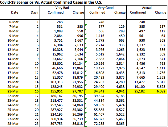
How high will the numbers go? I’ll start by establishing some “very good” and “very bad” scenarios for total confirmed cases. South Korea (where masks were used widely) has had an excellent experience thus far. The county’s cumulative confirmed cases flattened out at less than 0.017% (0.00017) of the total population. Assuming that 90% of cases are asymptomatic and undiagnosed, that would mean 0.17% (0.0017) of the South Korean population has been infected. If the U.S. experience is the same, we’d have a total of about 60,000 confirmed infections when our curve flattens. But I won’t be that optimistic — we’re at about 25,000 cases already and I think we’ll be at 60,000 cases within a week. Instead, I’ll define the “very good” scenario as 2.5x the South Korean outcome, or 150,000 confirmed cases. 

For a “very bad” scenario one might look to Italy. Unfortunately, it’s impossible to say how much higher Italy’s case load will go before flattening. If it had flattened today (it didn’t), the rate of confirmed cases for the country would be 0.077% (0.00077). That yields 0.77% of the population including the undiagnosed at 90% of cases. Applying the same percentage to the U.S. would mean just over 250,000 confirmed cases. But again, for a really bad scenario, and because we don’t yet know how Italy’s experience will play out, let’s suppose Italy’s confirmed cases quadruple: For the U.S., using the same percentage of the population would imply just over 1 million confirmed cases, or about 1.6% of the population. That yields a total infected population of 10 million.  

I’ve illustrated these “very good” and “very bad” scenarios in the chart below as Gompertz curves, a form of sigmoid function or s-curve. First, a couple of caveats: Please note that this represents a “first wave” of the virus, as it were. I do not dismiss the possibility of a second wave should we relax our nonprescription safeguards prematurely, and obviously the chart does not speak to a return of the virus in the fall. Also, these are just two examples that allow us to examine the implications of extreme outcomes. I could have varied the timing, growth, and end-outcome in other ways, but I think the following is instructive.

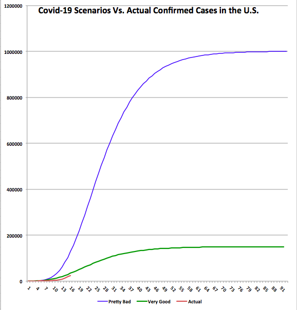
The chart shows cumulative confirmed cases for each scenario. It also shows the actual confirmed case total through March 21st, which is the shorter red line at the bottom. The data plotted begins on March 6, when there were 248 cases confirmed. The horizontal axis shows days elapsed since then. The accompanying table shows the same information through March 28th, a week from today. 

There are a few things to note about the chart and table:

  1. The actual curve is still below the “very good” curve. If our experience proves to be marginally worse than the “very good” scenario, then we’ve already “caught-up” in terms of testing for Covid-19: the actual increase today is larger than the highest daily increases under that scenario. If our experience approaches the “very bad” scenario, then we are eight days behind in our testing. That is, today’s actual increase is about what that scenario would have predicted eight days ago.
  2. Under the “very good” scenario, the daily increase in cases would peak by Friday, March 27. We’ve already exceeded that level of daily increase, but it will be encouraging if the daily increase doesn’t accelerate much more over the next few days. Under the “very bad” scenario, and given a full “catch-up”, the daily increase would peak about a week from now at approximately 37,000. That would be delayed if the catch-up process is more protracted.
  3. New cases flatten out within a couple of months under both scenarios. Under the “very good” scenario, new cases fall below 1,000 per day by April 21. Under the “very bad’ scenario, they don’t reach that level until Mid-May.
  4. In the next week (by March 28th), we will know a lot more about where we’re trending relative to these scenarios. I plan to provide an update later in the week or next weekend. 

While it can’t be seen from the chart or the table, once the “catch-up” ends, if there really is a catch-up involved, the daily increase in cases might fall abruptly. That would be encouraging.

Other Thoughts

It’s also important to note that the experience within the U.S. might be as varied as what we see around the globe. For example, New York and Washington state seem to be hot spots. Cities with large international ports and flights are more likely to suffer relatively high infection rates. In contrast, St. Louis probably won’t have a comparable incidence of infection, as there are so few international flights terminating there. 

The global death rate from Covid-19 has been widely quoted as somewhere around 4%, but that came into question with the revelation of low mortality aboard the Diamond Princess, despite the many seniors aboard. And it appears that the death rate from coronavirus is declining in the U.S. This was noted here at Endless Metrics several days ago. It’s also discussed in some detail by Aaron Ginn in this excellent this Medium article. Again, the death rate will decline as our testing “catches-up”, if indeed it must, and it will decline with spring weather as well as treatments if they are effective. Ultimately, I’ll be surprised if it comes in at more than 1% of confirmed cases in the U.S., and I won’t be surprised if it’s much less. At 1% under the “very bad” scenario, the U.S. would have about 10,000 deaths associated with coronavirus, the large majority of which would be individuals older than 70 years of age with significant co-morbidities.  

Conclusion

I hope this exercise proves useful to others in establishing a framing for what will ensue over the next few weeks. However, even the “very bad” scenario discussed above involves an infected share of the population of much less than we’ve heard we’re in for. Yet that scenario is far worse than Italy’s experience thus far, which most people consider pretty bad. For this reason, I am increasingly convinced that this pandemic will not prove to be the widespread calamity we’re still being told to expect. Those warning us might be alarmists, or perhaps they simply lack a sufficient level of numeracy.

This post was partly inspired by The Math of Epidemics by Willis Eschenbach, as well as Scott Alexander’s March 2nd post at Slate Star Codex. Also, see the Medium article by Aaron Ginn. It is a thorough examination of many aspects of the pandemic and very much aligned with my views. (Something is wrong with the link … I’ll try to fix it later.)


at WUWT 

Left’s Pandemic Response: Politics As Usual

17 Tuesday Mar 2020

Posted by Nuetzel in Health Care, Pandemic, Regulation

≈ 2 Comments

Tags

Biodefense, Breitbart.com, CDC, Centers for Disease Control, Coronavirus, ebola, FDA, Glenn Reynolds, Infectious Diseases, John Bolton, Legal Insurrection, Leslie Eastman, Nancy Pelosi, National Biodefense Strategy, National Security Council, NSC, Pandemic Response Team, Richard Goldberg, Ronald Bailey, Ronna McDaniel, Tim Morrison

The Left asserts that President Trump dismissed and dismantled the nation’s Pandemic Response Team. That’s bullshit. So is the claim that the CDC was defunded. The news media and certain pundits have helped to feed this narrative. Or, as Glenn Reynolds calls those pundits, “Democrat operatives with bylines”.

First of all, the team in question was not at the CDC, a fact that hasn’t always been clear from the commentary on this issue. It was a team of White House overseers at the National Security Council’s “Directorate for Global Health Security and Biodefense”. What happened was this: the senior director of that team resigned after John Bolton was appointed to head the NSC. Bolton might have wanted him out, but what we know is the director resigned. Subsequently, that team was folded into another directorate as part of an long-overdue consolidation. Health experts from the team remain on the NSC staff today. Yet Sen. Sherrod Brown (D-OH)—and many others since—had the temerity to charge that Trump had fired “the entire Whilte House pandemic team”. Well, at least he didn’t imply that it was the CDC.

Tim Morrison wrote the following in the Washington Post yesterday:

“Because I led the very directorate assigned that mission, the counterproliferation and biodefense office, for a year and then handed it off to another official who still holds the post, I know the charge is specious. …

When I joined the National Security Council staff in 2018, I inherited a strong and skilled staff in the counterproliferation and biodefense directorate. This team of national experts together drafted the National Biodefense Strategy of 2018 and an accompanying national security presidential memorandum to implement it; an executive order to modernize influenza vaccines; and coordinated the United States’ response to the Ebola epidemic in Congo, which was ultimately defeated in 2020.”

This assessment at Brietbart.com quotes former senior NSC official Richard Goldberg:

“Weird. A year later I was inside the NSC working with talented global health/biodefense professionals who coordinated an incredibly effective response to Ebola. They’re still there. Working hard. On #Covid_19.”

It’s true that Bolton sought to eliminate red tape, duplication, and bureaucracy within the NSC, and that was wholly justified. According to Morrison, the NSC staff quadrupled from the 1990s through the second Obama term. Pandemics are supposed to be the CDC’s purview, but the proliferation of administrative layers is what happens as government grows uncontrollably. Leslie Eastman at Legal Insurrection questions whether the U.S. needs a permanent “Pandemic Response Team” in the White House. She quotes GOP Chairwoman Ronna McDaniel:

“JAN 7: CDC established a coronavirus incident management system, two days before China announced the outbreak. … Pelosi began Week 3 of withholding her sham impeachment articles. 

JAN 21: The CDC activated its emergency operations center to provide ongoing support to confront coronavirus. …What were Congressional Democrats focused on? Writing their opening arguments for their bogus impeachment trial.”

Well, bully for the CDC. As for “defunding the CDC”, the facts are this: the proposed budget submitted to Congress by the Trump Administration in February, but never passed, did indeed include cuts to the CDC’s budget, which has grown over the years as it expanded its mission from fighting infectious diseases to matters like obesity, racism, and questions of social justice. The cuts proposed by Trump, however, were primarily to state grants. Actually, the proposal called for increased CDC staffing, and it funded all programs related to infectious diseases. But no matter, because that proposal is unlikely to become part of any appropriations bill that would pass Congress.

True to form, the Left plays politics in the middle of a national crisis. When the Trump Administration told airlines that it was considering banning flights from China in late January, it was called racist. Now, of course, he hasn’t done enough. A huge irony, however, is that Trump’s biggest mistake was in trusting the FDA and the CDC’s authority to develop and regulate testing for the coronavirus. They botched it. In a classic case of over-regulation, they prohibited hospitals and labs from conducting tests developed privately or by academic researchers, insisting that everyone wait for the “approved” test to be distributed. Then, the test they released in early February was flawed, costing additional weeks before testing was available.


Covid-19: Killing It With Sunshine, Fresh Air

14 Saturday Mar 2020

Posted by Nuetzel in Health Care, Pandemic

≈ 2 Comments

Tags

1918-19 Pandemic, Coronavirus, Covid-19, Fresh Air, Influenza, Medium.com, Open Air Factor, Ozone, Richard Hobday, Spanish Flu, UV Light, Vitamin D

Update: also see “Don’t Be Cowed: Shelter, But Get Outside”

Patients with viral and bacterial infections seem to respond better if exposed to sunshine and fresh air. In fact, anyone hoping to keep infections at bay would do well to get outside in the sun for a while every day. A friend’s post alerted me to this fascinating article in Medium.com: “Coronavirus and the Sun: a Lesson from the 1918 Influenza Pandemic“, by Richard Hobday. It is well-sourced, though the references aren’t hyperlinked. Here’s the main point:

“... records from the 1918 pandemic suggest one technique for dealing with influenza — little-known today — was effective. … Put simply, medics found that severely ill flu patients nursed outdoors recovered better than those treated indoors. A combination of fresh air and sunlight seems to have prevented deaths among patients; and infections among medical staff. There is scientific support for this. Research shows that outdoor air is a natural disinfectant. Fresh air can kill the flu virus and other harmful germs. Equally, sunlight is germicidal and there is now evidence it can kill the flu virus.

On the last assertion, see here. Viruses always ebb as the weather warms in the spring. Light conditions improve, which might be more important than temperature: UV light is thought to kill germs of many kinds. Moreover, Vitamin D is generally protective against infections, and a deficiency is thought to increase Covid-19 risk.

Hobday goes on to describe the Open Air Factor, which probably is related to the presence of ozone, but maybe other curatives:

“Doctors who had first-hand experience of open-air therapy at the hospital in Boston were convinced the regimen was effective. It was adopted elsewhere. If one report is correct, it reduced deaths among hospital patients from 40 per cent to about 13 per cent. …

Patients treated outdoors were less likely to be exposed to the infectious germs that are often present in conventional hospital wards. They were breathing clean air in what must have been a largely sterile environment. We know this because, in the 1960s, Ministry of Defence scientists proved that fresh air is a natural disinfectant. Something in it, which they called the Open Air Factor, is far more harmful to airborne bacteria — and the influenza virus — than indoor air. They couldn’t identify exactly what the Open Air Factor is. But they found it was effective both at night and during the daytime. 

I’m not sure they were able to control for the relative absence of germs in fresh air, as opposed to the presence of something beneficial, but it’s certainly intriguing.

So whether you’re still on the “office team” or otherwise on the job, try to get outside! Whether you’re in a Covid-19 self-quarantine or worried about catching it, get outside if you can. Get some sun and fresh air, especially after a thunderstorm, when the air is rich with ozone. But drink plenty of fluids and don’t get burned! I’ll be hanging out in my back yard.

Newer posts →
Follow Sacred Cow Chips on WordPress.com

Recent Posts

  • Immigration and Merit As Fiscal Propositions
  • Tariff “Dividend” From An Indigent State
  • Almost Looks Like the Fed Has a 3% Inflation Target
  • Government Malpractice Breeds Health Care Havoc
  • A Tax On Imports Takes a Toll on Exports

Archives

  • December 2025
  • November 2025
  • October 2025
  • September 2025
  • August 2025
  • July 2025
  • June 2025
  • May 2025
  • April 2025
  • March 2025
  • February 2025
  • January 2025
  • December 2024
  • November 2024
  • October 2024
  • September 2024
  • August 2024
  • July 2024
  • June 2024
  • May 2024
  • April 2024
  • March 2024
  • February 2024
  • January 2024
  • December 2023
  • November 2023
  • August 2023
  • July 2023
  • June 2023
  • May 2023
  • April 2023
  • March 2023
  • February 2023
  • January 2023
  • December 2022
  • November 2022
  • October 2022
  • September 2022
  • August 2022
  • July 2022
  • June 2022
  • May 2022
  • April 2022
  • March 2022
  • February 2022
  • January 2022
  • December 2021
  • November 2021
  • October 2021
  • September 2021
  • August 2021
  • July 2021
  • June 2021
  • May 2021
  • April 2021
  • March 2021
  • February 2021
  • January 2021
  • December 2020
  • November 2020
  • October 2020
  • September 2020
  • August 2020
  • July 2020
  • June 2020
  • May 2020
  • April 2020
  • March 2020
  • February 2020
  • January 2020
  • December 2019
  • November 2019
  • October 2019
  • September 2019
  • August 2019
  • July 2019
  • June 2019
  • May 2019
  • April 2019
  • March 2019
  • February 2019
  • January 2019
  • December 2018
  • November 2018
  • October 2018
  • September 2018
  • August 2018
  • July 2018
  • June 2018
  • May 2018
  • April 2018
  • March 2018
  • February 2018
  • January 2018
  • December 2017
  • November 2017
  • October 2017
  • September 2017
  • August 2017
  • July 2017
  • June 2017
  • May 2017
  • April 2017
  • March 2017
  • February 2017
  • January 2017
  • December 2016
  • November 2016
  • October 2016
  • September 2016
  • August 2016
  • July 2016
  • June 2016
  • May 2016
  • April 2016
  • March 2016
  • February 2016
  • January 2016
  • December 2015
  • November 2015
  • October 2015
  • September 2015
  • August 2015
  • July 2015
  • June 2015
  • May 2015
  • April 2015
  • March 2015
  • February 2015
  • January 2015
  • December 2014
  • November 2014
  • October 2014
  • September 2014
  • August 2014
  • July 2014
  • June 2014
  • May 2014
  • April 2014
  • March 2014

Blogs I Follow

  • Passive Income Kickstart
  • OnlyFinance.net
  • TLC Cholesterol
  • Nintil
  • kendunning.net
  • DCWhispers.com
  • Hoong-Wai in the UK
  • Marginal REVOLUTION
  • Stlouis
  • Watts Up With That?
  • Aussie Nationalist Blog
  • American Elephants
  • The View from Alexandria
  • The Gymnasium
  • A Force for Good
  • Notes On Liberty
  • troymo
  • SUNDAY BLOG Stephanie Sievers
  • Miss Lou Acquiring Lore
  • Your Well Wisher Program
  • Objectivism In Depth
  • RobotEnomics
  • Orderstatistic
  • Paradigm Library
  • Scattered Showers and Quicksand

Blog at WordPress.com.

Passive Income Kickstart

OnlyFinance.net

TLC Cholesterol

Nintil

To estimate, compare, distinguish, discuss, and trace to its principal sources everything

kendunning.net

The Future is Ours to Create

DCWhispers.com

Hoong-Wai in the UK

A Commonwealth immigrant's perspective on the UK's public arena.

Marginal REVOLUTION

Small Steps Toward A Much Better World

Stlouis

Watts Up With That?

The world's most viewed site on global warming and climate change

Aussie Nationalist Blog

Commentary from a Paleoconservative and Nationalist perspective

American Elephants

Defending Life, Liberty and the Pursuit of Happiness

The View from Alexandria

In advanced civilizations the period loosely called Alexandrian is usually associated with flexible morals, perfunctory religion, populist standards and cosmopolitan tastes, feminism, exotic cults, and the rapid turnover of high and low fads---in short, a falling away (which is all that decadence means) from the strictness of traditional rules, embodied in character and inforced from within. -- Jacques Barzun

The Gymnasium

A place for reason, politics, economics, and faith steeped in the classical liberal tradition

A Force for Good

How economics, morality, and markets combine

Notes On Liberty

Spontaneous thoughts on a humble creed

troymo

SUNDAY BLOG Stephanie Sievers

Escaping the everyday life with photographs from my travels

Miss Lou Acquiring Lore

Gallery of Life...

Your Well Wisher Program

Attempt to solve commonly known problems…

Objectivism In Depth

Exploring Ayn Rand's revolutionary philosophy.

RobotEnomics

(A)n (I)ntelligent Future

Orderstatistic

Economics, chess and anything else on my mind.

Paradigm Library

OODA Looping

Scattered Showers and Quicksand

Musings on science, investing, finance, economics, politics, and probably fly fishing.

  • Subscribe Subscribed
    • Sacred Cow Chips
    • Join 128 other subscribers
    • Already have a WordPress.com account? Log in now.
    • Sacred Cow Chips
    • Subscribe Subscribed
    • Sign up
    • Log in
    • Report this content
    • View site in Reader
    • Manage subscriptions
    • Collapse this bar
 

Loading Comments...