• About

Sacred Cow Chips

Sacred Cow Chips

Tag Archives: Covid-19

On the Meaning of Herd Immunity

09 Saturday May 2020

Posted by Nuetzel in Pandemic, Public Health, Risk

≈ 2 Comments

Tags

Antibody, Antigen, Carl T. Bergstrom, Christopher Moore, Covid-19, Herd Immunity, Heterogeneity, Household Infection, Immunity, Infection Mortality Risk, Initial Viral Load, John Cochrane, Lockdowns, Marc Lipsitch, Muge Cevik, Natalie Dean, Natural Immunity, Philippe Lemoine, R0, Santa Fe Institute, SARS-CoV-2, Social Distancing, Super-Spreaders, Zvi Mowshowitz

Immunity doesn’t mean you won’t catch the virus. It means you aren’t terribly susceptible to its effects if you do catch it. There is great variation in the population with respect to susceptibility. This simple point may help to sweep away confusion over the meaning of “herd immunity” and what share of the population must be infected to achieve it.

Philippe Lemoine discusses this point in his call for an “honest debate about herd immunity“. He reproduces the following chart, which appeared in this NY Times piece by Carl T. Bergstrom and Natalie Dean:

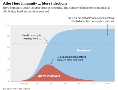
Herd immunity, as defined by Bergstrom and Dean, occurs when there are sufficiently few susceptible individuals remaining in the population to whom the actively-infected can pass the virus. The number of susceptible individuals shrinks over time as more individuals are infected. The chart indicates that new infections will continue after herd immunity is achieved, but the contagion recedes because fewer additional infections are possible.

We tend to think of the immune population as those having already been exposed to the virus, and who have recovered. Those individuals have antibodies specifically targeted at the antigens produced by the virus. But many others have a natural immunity. That is, their immune systems have a natural ability to adapt to the virus.

Heterogeneity

At any point in a pandemic, the uninfected population covers a spectrum of individuals ranging from the highly susceptible to the hardly and non-susceptible. Immunity, in that sense, is a matter of degree. The point is that the number of susceptible individuals doesn’t start at 100%, as most discussions of herd immunity imply, but something much smaller. If a relatively high share of the population has low susceptibility, the virus won’t have to infect such a large share of the population to achieve effective herd immunity.

The apparent differences in susceptibility across segments of the population may be the key to early herd immunity. We’ve known for a while that the elderly and those with pre-existing conditions are highly vulnerable. Otherwise, youth and good health are associated with low vulnerability.

Lemoine references a paper written by several epidemiologists showing that “variation in susceptibility” to Covid-19 “lowers the herd immunity threshold”:

“Although estimates vary, it is currently believed that herd immunity to SARS-CoV-2 requires 60-70% of the population to be immune. Here we show that variation in susceptibility or exposure to infection can reduce these estimates. Achieving accurate estimates of heterogeneity for SARS-CoV-2 is therefore of paramount importance in controlling the COVID-19 pandemic.”

The chart below is from that paper. It shows a measure of this variation on the horizontal axis. The colored, vertical lines show estimates of historical variation in susceptibility to historical viral episodes. The dashed line shows the required exposure for herd immunity as a function of this measure of heterogeneity.

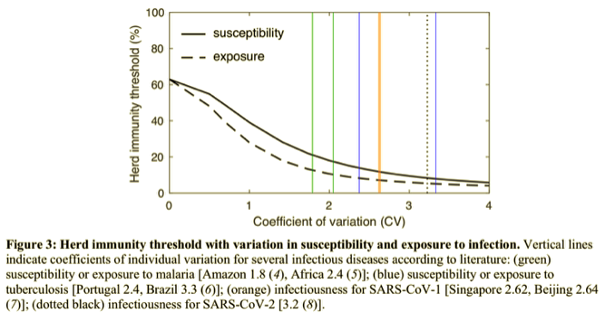
Their models show that under reasonable assumptions about heterogeneity, the reduction in the herd immunity threshold (in terms of the percent infected) may be dramatic, to perhaps less than 20%.

Then there are these tweets from Marc Lipsitch, who links to this study:

“As an illustration we show that if R0=2.5 in an age-structured community with mixing rates fitted to social activity studies, and also categorizing individuals into three categories: low active, average active and high active, and where preventive measures affect all mixing rates proportionally, then the disease-induced herd immunity level is hD=43% rather than hC=1−1/2.5=60%.”

Even the celebrated Dr. Bergstrom now admits, somewhat grudgingly, that hereogeniety reduces the herd immunity threshold, though he doesn’t think the difference is large enough to change the policy conversation. Lipsitch also is cautious about the implications.

Augmented Heterogeneity

Theoretically, social distancing reduces the herd immunity threshold. That’s because infected but “distanced” people are less likely to come into close contact with the susceptible. However, that holds only so long as distancing lasts. John Cochrane discusses this at length here. Social distancing compounds the mitigating effect of heterogeneity, reducing the infected share of the population required for herd immunity.

Another compounding effect on heterogeneity arises from the variability of initial viral load on infection (IVL), basically the amount of the virus transmitted to a new host. Zvi Mowshowitz discusses its potential importance and what it might imply about distancing, lockdowns, and the course of the pandemic. In any particular case, a weak IVL can turn into a severe infection and vice versa. In large numbers, however, IVL is likely to bear a positive relationship to severity. Mowshowitz explains that a low IVL can give one’s immune system a head start on the virus. Nursing home infections, taking place in enclosed, relatively cold and dry environments, are likely to involve heavy IVLs. In fact, so-called household infections tend to involve heavier IVLs than infections contracted outside of households. And, of course, you are very unlikely to catch Covid outdoors at all.

Further Discussion

How close are we to herd immunity? Perhaps much closer than we thought, but maybe not close enough to let down our guard. Almost 80% of the population is less than 60 years of age. However, according to this analysis, about 45% of the adult population (excluding nursing home residents) have any of six conditions indicating elevated risk of susceptibility to Covid-19 relative to young individuals with no co-morbidities. The absolute level of risk might not be “high” in many of those cases, but it is elevated. Again, children have extremely low susceptibility based on what we’ve seen so far.

This is supported by the transmission dynamics discussed in this Twitter thread by Dr. Muge Cevik. She concludes:

“In summary: While the infectious inoculum required for infection is unknown, these studies indicate that close & prolonged contact is required for #COVID19 transmission. The risk is highest in enclosed environments; household, long-term care facilities and public transport. …

Although limited, these studies so far indicate that susceptibility to infection increases with age (highest >60y) and growing evidence suggests children are less susceptible, are infrequently responsible for household transmission, are not the main drivers of this epidemic.”

Targeted isolation of the highly susceptible in nursing homes, as well as various forms of public “distancing aid” to the independent elderly or those with co-morbidities, is likely to achieve large reductions in the effective herd immunity ratio at low cost relative to general lockdowns.

The existence of so-called super-spreaders is another source of heterogeneity, and one that lends itself to targeting with limitations or cancellations of public events and large gatherings. What’s amazing about this is how the super-spreader phenomenon can lead to the combustion of large “hot spots” in infections even when the average reproduction rate of the virus is low (R0 < 1). This is nicely illustrated by Christopher Moore of the Santa Fe Institute. Super-spreading also implies, however, that while herd immunity signals a reduction in new infections and declines in the actively infected population, “hot spots” may continue to flare up in a seemingly random fashion. The consequences will depend on how susceptible individuals are protected, or on how they choose to mitigate risks themselves.

Conclusion

I’ve heard too many casual references to herd immunity requiring something like 70% of the population to be infected. It’s not that high. Many individuals already have a sort of natural immunity. Recognition of this heterogeneity has driven a shift in the emphasis of policy discussions to the idea of targeted lockdowns, rather than the kind of indiscriminate “dumb” lockdowns we’ve seen. The economic consequences of shifting from broad to targeted lockdowns would be massive. And why not? The health care system has loads of excess capacity, and Covid infection fatality risk (IFR) is turning out to be much lower than the early, naive estimates we were told to expect, which were based on confirmed case fatality rates (CFRs).

The Vagaries of Excess Deaths

02 Saturday May 2020

Posted by Nuetzel in Liberty, Pandemic, Tyranny

≈ 2 Comments

Tags

Cause of Death, CDC, Civid-Only Deaths, Co-Morbidities, Coronavirus, Covid-19, Denmark Covid, Eastern Europe Covid, Euromomo, Excess Mortality, Germany Covid, Jacob Sullum, John Burn-Murdoch, New York Covid, New York Times, Probable Covid Deaths

The New York Times ran a piece this week suggesting that excess mortality from Covid-19 in the U.S. is, or will be, quite high. The analysis was based on seven “hard hit” states, including three of the top four states in Covid death rate and five of the top ten. Two states in the analysis, New York and New Jersey, together account for over half of all U.S. active cases. This was thinly-veiled cherry picking by the Times, as Jacob Sullum notes in his discussion of what excess mortality does and doesn’t mean. Local and regional impacts of the virus have varied widely, depending on population density, international travel connections, cultural practices, the quality of medical care, and private and public reaction to news of the virus. To suggest that the experience in the rest of the country is likely to bear any similarity to these seven states is complete nonsense. Make no mistake: there have been excess deaths in the U.S. over the past few weeks of available data, but again, not of the magnitude the Times seems to intimate will be coming.

Beyond all that, the Times asserts that the CDC’s all-cause death count as of April 11 is a significant undercount, though the vast majority of deaths are counted within a three week time frame. In fact, CDC data at this link show that U.S. all-cause mortality was at a multi-year low during the first week of April. The author admits, however, that the most recent data is incomplete. The count will rise as reporting catches up, but even an allowance for the likely additions to come would leave the count for the U.S. well below the kinds of levels suggested by the Times‘s fear-mongering article, based as it was on the seven cherry-picked states.

The author of this Twitter thread, John Burn-Murdoch, seems to engage in the same practice with respect to Europe. He shows charts with excess deaths in 12 countries, almost all of which show significant, recent bumps in excess deaths (the sole exception being Denmark). Inexplicably, he excludes Germany and a number of other countries with low excess deaths or even “valleys” of negative excess deaths. His most recent update is a bit more inclusive, however. (It was the source of the chart at the top of this post.) Euromomo is a site that tracks excess mortality in 24 European countries or major regions (non-overlapping), and by my count, 13 of have no or very little excess mortality. And by the way, even this fails to account for a number of other Eastern European nations having low Covid deaths.

Excess mortality is a tricky metric: it cannot be measured with certainty, and almost any measure has conceptual shortcomings. In the case of Covid-19, excess mortality seeks to measure the number of deaths attributable to the virus net of deaths that would have occurred anyway in the absence of the virus. For example, abstracting from some of the details, suppose there are 360 deaths per hundred-thousand of population during the average month of a pandemic. If the “normal” mortality rate is 60 per hundred-thousand, then excess mortality is 300 per month. It can also be expressed as a percentage of the population (0.3% in the example). But that’s just one way to measure it.

In the spirit of Sullum’s article, it’s important to ask what we’re trying to learn from statistics on excess mortality. It’s easy to draw general conclusions if the number of Covid-19 deaths is far in excess of the normal death rate, but that depends on the quality of the data, and any conclusion is subject to limits on its applicability. Covid deaths are not that high in many places. By the same token, if the number of Covid deaths (defined narrowly) is below the normal death rate (measured by an average of prior years), it really conveys little information about whether excess mortality is positive of negative: that depends on the nature of the question. For each of the following I offer admittedly preliminary answers:

  • Are people dying from Covid-19? Of course, virtually everywhere. There is no “normal” death rate here. And while this is the most direct question, it might not be the “best” question.
  • Is Covid-19 causing an increase in respiratory deaths? Yes, in many places, but perhaps not everywhere. Here and below, the answer might depend on the time frame as well.
  • Is Covid-19 increasing deaths from infectious diseases (biological and viral)? Yes, but perhaps not everywhere.
  • Is Covid-19 increasing total deaths from natural causes? Yes, but not everywhere.
  • Is all-cause mortality increasing due to Covid-19? In some places, not others. Accurate global and national numbers are still a long way off.

All-cause mortality is the most “rough and ready” comparison we have, but it includes deaths that have no direct relationship to the disease. For example, traffic fatalities might be down significantly due to social distancing or regulation during a pandemic. Thus, if our purpose is purely epidemiological, traffic fatalities might bias excess mortality downward. On the other hand, delayed medical treatments or personal malaise during a pandemic might lead to higher deaths, creating an upward bias in excess deaths via comparisons based on all-cause mortality.

Do narrow comparisons give a more accurate picture? If we focus only on respiratory deaths then we exclude deaths from other causes and co-morbidities that would have occurred in the absence of the virus. That may create a bias in excess mortality. So narrow comparisons have their drawbacks, depending on our purpose.

That also goes for the length of time over which excess mortality is measured. It can make a big difference. Again, much has been made of the fact that so many victims of Covid-19 have been elderly or already ailing severely before the pandemic. There is no question that some of these deaths would have occurred anyway, which goes to the very point of calculating excess mortality. If the pandemic accelerates death by a matter of weeks or months for a certain percentage of victims, it is reasonable to measure excess mortality over a lengthier period of time, despite the (perhaps) highly valuable time lost by those victims (that being dependent on the decedent’s likely quality of life during the interval).

Conversely, too narrow a window in time can lead to biases that might run in either direction. Yet a cottage industry is busy calculating excess mortality even as we speak with the pandemic still underway. There are many fatalities to come that are excluded by premature calculations of excess mortality. On the other hand, if the peak in deaths is behind us, a narrow window and premature calculation may sharply exaggerate excess mortality.

Narrow measures of excess mortality are affected by the accuracy of cause-of-death statistics. There are always inaccuracies in this data because so many deaths involve multiple co-morbidities, so there is often an arbitrary element in these decisions. For Covid-19, cause-of-death attribution has been extremely problematic. Some cases are easy: those testing positive for the virus, or even its presence immediately after death, and having no other respiratory infections, can fairly be counted as Covid-19 deaths. But apparently just over half of Covid-19 deaths counted by the CDC are “Covid-Only” deaths. A significant share of deaths involve both Covid and the flu, pneumonia, or all three. There are also “probable” Covid-19 deaths now counted without testing. In fact, hospitals and nursing homes are being encouraged to code deaths that way, and there are often strong financial incentives to do so. Many deaths at home, sans autopsy, are now routinely classified as Covid-19 deaths. While I have no doubt there are many Covid deaths of untested individuals both inside or outside of hospitals, there is no question this practice will overcount Covid deaths. Whether you believe that or not, doubts about cause-of-death accuracy is another reason why narrow comparisons can be problematic.

More trustworthy estimates of the coronavirus’ excess mortality will be possible with the passage of time. It’s natural, in the heat of the pandemic, to ask about excess mortality, but such early estimates are subject to tremendous uncertainty. Unfortunately, those calculations are being leveraged and often mis-applied for political purposes. Don’t trust anyone who would use these statistics as a cudgel to deny your Constitutional rights, or otherwise to shame or threaten you.

New York’s Covid experience is not applicable to the country as a whole. Urban mortality statistics are not applicable to areas with lower population densities. Excess mortality for the elderly cannot be used to make broad generalizations about excess mortality for other age groups. And excess mortality at the peak of a pandemic cannot be used to make generalizations about the full course of the pandemic. In the end, I expect Covid-19 excess mortality to be positive, whether calculated by all-cause mortality or more narrow measures. However, it will not be uniform in its impact. Nor will it be of the magnitude we were warned to expect by the early epidemiological models.

Covid “Framing” #5: Crested Wave

28 Tuesday Apr 2020

Posted by Nuetzel in Pandemic

≈ Leave a comment

Tags

Coronavirus, Covid Tracking Project, Covid-19, IHME Model, Institute for Health Metrics and Evaluation, Italy Covid, Johns Hopkins Dashboard, Missouri Covid, New York Covid, Private Testing, South Korea Covid, Testing and Tracing

One big change in recent national Covid trends has to do with testing. In the past week, the number of daily tests has increased by an average of over 50%. That’s shown in the first chart below. Regardless of whether the individuals being tested meet the earlier testing criteria, there are still plenty of people who either want to get tested or are being tested for occupational reasons. Nonetheless, there are reports of unused testing capacity at private labs and universities. Further increases in testing are in the offing, especially if those desiring tests are made aware of their availability.

Increased testing has been accompanied by further declines in the percentage of positive tests. That’s certainly a good thing, but it’s not clear how much of the decline can be attributed to declining transmissions, as opposed to broadened testing criteria.

Coronavirus deaths in the U.S. have also begun to taper. The black line below plots cumulative Covid-attributed deaths the U.S. up through April 28. The red line is the IHME model projection from April 2nd, with upper and lower confidence bounds shown by the blue and green lines, respectively. Despite the notorious broadening of the definition of a Covid death a few weeks ago, the cumulative death toll has remained below the mean IMHE projection. 

More bad news is that the number of confirmed coronavirus cases continues to mount. Of course, that is a consequence of broader testing and possibly some arbitrary classifications as well. My previous coronavirus “framing” posts (#1 from March 18th is here, #4 is here ) usually featured a chart like the one below, which shows the number of cumulative confirmed cases of Covid-19 in the U.S. Day 1 in the chart was March 4th, so tonight, April 28th, we’re 55 days in. The blue and green lines are what I originally called “pretty bad” and “very good” outcomes, based on multiples of Italy and South Korea as of March 18th, as a share of their respective populations. Italy’s case count kept climbing after that, but its growth has now slowed considerably.

The U.S. case count has increased dramatically, now exceeding the original “very bad” case curve I plotted in mid-March. Has the U.S. fared as poorly as that seems to suggest? As of April 28, the U.S. has performed about three times as many tests as Italy, and it has identified about 10% fewer cases per capita. If we excluded the state of New York, which accounts for 5.7% of U.S. population but fully 30% of U.S. Covid cases through April 28th, U.S. Covid incidence would be well below Italy’s. However, Italy is still perhaps two weeks ahead of us.

The next chart examines New York’s experience relative to all other states. The blue line is the number of daily confirmed cases in the U.S., and the red line is the U.S. excluding New York state. The vertical gap between the two lines is the daily case count for New York. The fluctuating, slight downward trend in the U.S since about April 10th is largely attributable to improvement in New York. The rest of the country, while not as serious as New York in terms of incidence, is still on a plateau.

The next chart shows daily Covid-attributed deaths for the U.S. (blue), the U.S excluding New York state (red), and New York state (green). The source of this data is the Covid Tracking Project, which reports numbers as of 4 p.m. each day, so it differs from the daily numbers reported by the Johns Hopkins Dashboard. There are a few interesting things to note here. First, New York has accounted for a major share of daily deaths, though its share is diminishing. The decline in New York Covid deaths has been a major positive development over the past few weeks. The pattern of deaths for the U.S. is kind of fascinating: It shows a distinct weekly frequency, with declines over weekends and spikes early in each week. I suspect this is based on the data elements used by the Tracking Project, perhaps based on reporting dates rather than actual times of death. New York does not show that kind of pattern, but I’ve heard that the reporting system there is highly efficient. We might have seen a favorable turn in U.S. daily fatalities over the past week. After the peak early this week, the daily count is likely to decline again over the next few days. We can hope the weekly spikes and valleys reach lower levels as we get into May.

Finally, a couple of charts updating the status of the pandemic in Missouri, my home state. Despite some volatility, new cases continue to taper.

Missouri Covid fatalities are extremely volatile. It’s hard to see the kind of “weekend” phenomenon so apparent in the U.S. aggregate shown earlier. With a couple of recent spikes, it’s difficult to say anything conclusive about the course of daily fatalities based on the chart below. However, as fewer new cases are diagnosed in Missouri, the number of fatalities will follow.

So, what’s the new “framing”? I expect U.S. case counts to continue to climb with more extensive testing. If the most vulnerable individuals remain quarantined or at least carefully distanced, then individuals presenting symptoms will continue to fall, so the rate of new positive will decline. Additions to the case count will come increasingly from the asymptomatic who happen to be tested for occupational reasons, for travel abroad, and ultimately for testing and tracing efforts. Improved light and humidity is likely to cut into the rising case count as June approaches. With any luck it will become negligible along with fatalities. We’ll continue to learn as well. The hope is that a few treatments or even a vaccine will prove out. Test results for a few of the latter might be available as early as September.

Spanish Flu: No Guide for Covid Lockdowns

25 Saturday Apr 2020

Posted by Nuetzel in Pandemic

≈ Leave a comment

Tags

Cost of Lost Output, Covid-19, Cytokine Storm, Economic Costs, Excess Mortality, Herd Immunity, Life-Years, Lockdown, Non-Prescription Measures, Novel Coronavirus, Pandemic, Quarantines, Reason.com, Serological Testing, Skilled Care, Social Distancing, South Korea, Spanish Flu, World War I

The coronavirus pandemic differs in a few important ways from the much deadlier Spanish flu pandemic of 1918-19. Estimates are that as much as 1/3rd of the world’s population was infected during that contagion, and the case fatality rate is estimated to have been 10-20%. The current pandemic, while very serious, will not approach that level of lethality.

Another important difference: the Spanish Flu was very deadly among young adults, whereas the Coronavirus is taking its greatest toll on the elderly and those with significant co-morbidities. Of course, the Spanish Flu infected a large number of soldiers and sailors, many returning from World War I in confined conditions aboard transport vessels. A major reason for its deadliness among young adults, however, is thought to be the “cytokine storm“, or severe inflammatory response, it induced in those with strong immune systems.

It’s difficult to make a perfect comparison between the pandemics, but the charts below roughly illustrate the contrast between the age distribution of case mortality for the Spanish Flu in 1918, shown in the first chart, and Covid-19 in the second. The first shows a measure of “excess mortality” for each age cohort as the vertical gap between the solid line (Spanish flu) and the dashed line (the average of the seven previous seasons for respiratory diseases). Excess mortality was especially high among those between the ages of 15 and 44.

The second chart is for South Korea, where the Covid-19 pandemic has “matured” and was reasonably well controlled. We don’t yet have a good measure of excess case mortality for Covid-19, but it’s clear that it is most deadly among the elderly population. Not to say that infected individuals in younger cohorts never suffer: they are a higher proportion of diagnosed cases, severe cases are of extended duration, and some of the infected might have to deal with lasting consequences.

One implication of these contrasting age distributions is that Covid-19 will inflict a loss of fewer “life years” per fatality. If the Spanish flu’s median victim was 25 years old, then perhaps about 49 life years were lost per fatality, based on life expectancies at that time. At today’s life expectancies, it might be more like 54 years. if Covid-19’s median victim is 70 years old, then perhaps 15 life-years are lost per fatality, or about 73% less. And that assumes the the median Covid victim is of average health, so the loss of life years is probably less. But what a grisly comparison! Any loss is tragic, but it is worth noting that the current pandemic will be far less severe in terms of fatalities, excess mortality (because the elderly always die at much higher rates), and in life-years lost.

Is that relevant to the policy discussion? It doesn’t mean we should throw all caution to the wind. Ideally, policy would save lives and conserve life-years. We’d always put children on the lifeboats first, after all! But in this case, younger cohorts are the least vulnerable.

The flu pandemic of 1918-19 is often held to support the logic of non-prescription public health measures such as school closures, bans on public gatherings, and quarantines. Does the difference in vulnerabilities noted above have any bearing on the “optimal” level of those measures in the present crisis? Some argue that while a so-called lockdown confers health benefits for a Spanish flu-type pandemic in which younger cohorts are highly vulnerable, that is not true of the coronavirus. The young are already on lifeboats having few leaks, as it were.

My view is that society should expend resources on protecting the most vulnerable, in this case the aged and those with significant co-morbidities. Health care workers and “first responders” should be on the list as well. If well-targeted and executed, a Covid-19 lockdown targeted at those groups can save lives, but it means supporting the aged and afflicted in a state of relative isolation, at least until effective treatments or a vaccine prove out. A lockdown might not change living conditions greatly for those confined to skilled care facilities, but much can be done to reduce exposure among those individuals, including a prohibition on staff working at multiple facilities.

Conversely, the benefits of a lockdown for younger cohorts at low risk of death are much less compelling for Covid-19 than might be suggested by the Spanish flu experience. In fact, it can be argued that a complete lockdown denies society of the lowest-hanging fruit of earlier herd immunity to Covid-19. Younger individuals who have more social and economic contacts can be exposed with relative safety, and thus self-immunized, as their true mortality rate (including undiagnosed cases in the denominator) is almost zero to begin with.

Then we have the economic costs of a lockdown. Idle producers are inherently costly due to lost output, but idle non-producers don’t impose that cost. For Covid-19, prohibiting the labor of healthy, working age adults has scant health benefits, and it carries the high economic costs of lost output. That cost is magnified by the mounting difficulty of bringing moribund activities back to life, many of which will be unsalvageable due to insolvency.

The lockdown question is not binary. There are ways to maintain at least modest levels of production in many industries while observing guidelines on safety and social distancing. In fact, producers are finding inventive ways of maximizing both production and safety. They should be relied upon to create these solutions. The excess mortality rates associated with this pandemic will continue to come into focus at lower levels with more widespread serological testing. That will reinforce the need for individual autonomy in weighing risks and benefits. Hazards are always out there: reckless or drunk drivers, innumerable occupational hazards, and the flu and other communicable diseases. Protect yourself in any way you see fit, but if you are healthy, please do so without agitating for public support from the rest of us, and without imposing arbitrary judgments on which activities carry acceptable risk for others.


A Look at Covid-19 Cases in Missouri

21 Tuesday Apr 2020

Posted by Nuetzel in Pandemic

≈ 2 Comments

Tags

Bing, Confirmed Cases, Coronavirus, Covid Tracker, Covid-19, Fatalities, Log Scale, Microsoft, Missouri, Pandemic, St. Louis MO/IL Metro

This is a quick post for Missouri readers. It’s well known that the coronavirus pandemic has differed in its severity across the world and across the country. I’ve been focusing on nationwide statistics, but I thought it would be interesting to look at my home state’s progress in getting ahead of the virus. The charts below are taken from the Covid Tracker from Microsoft/Bing.

The peak of new cases in Missouri appears to be behind us. The state reached a rough plateau around the beginning of April. There was some volatility in the daily numbers of conformed cases, but the a downward trend seemed to begin around the 10th.

Cumulative confirmed cases in Missouri are shown in the next chart (Oops… spelling!), but in log scale. The slope of the line can be interpreted as the growth rate. It’s still positive and will be as long as there are new confirmed cases, but it is getting small.

Daily Covid-19 fatalities in Missouri are shown next. They are obviously quite volatile from day-to-day, as might be expected. They seemed to reach a high about a week after new cases reached their plateau, which demonstrates the lag between diagnosis and death in the most severe cases. The trend has become more favorable over the past week, though another jump in deaths was reported today.

The following chart shows cumulative Missouri fatalities in log scale. The curve is flattening (growth rate slowing), but it might take a few weeks for fatalities to stay in the very low single digits day after day.

The St. Louis metro area has had the largest concentration of cases and fatalities in Missouri. St. Louis County, St. Louis City, and St. Charles County are ranked #1 – #3 in the state, respectively. Here are the top ten counties in terms of this grim statistic (I’m sorry for the poor alignment).

County                 Cases       Deaths

St. Louis               2,333       91 (3.90%)
St. Louis City           877       21 (2.39%)
St. Charles              458       15 (3.28%)
Jackson                   438       13 (2.97%)
Jefferson.                230         3 (1.30%)
Franklin.                  102         5 (4.90%)
Boone                       96         1 (1.04%)
Greene.                    84          7 (8.33%)
Clay                          61         1 (1.64%)
Cass                         54          6  (11.1%)

I wanted to take a closer look at the pattern of cases in the metro area over time. Last night I found daily county-level case data on my phone. I thought I’d be able to download it tonight, but the site has been uncooperative. Maybe later.

Missouri looks like it’s on the back end of the curve, at least for this wave of the pandemic. We can hope there won’t be a second wave, or if there is, that it will be more manageable.


Lockdown-Righteous Morons Condemn Beachgoers

19 Sunday Apr 2020

Posted by Nuetzel in Liberty, Pandemic, Public Health

≈ Leave a comment

Tags

Aerosols, Close Talkers, Confined Space, Coronavirus, Covid-19, Dr. Christopher Gill, Droplets, Huggers, Humidity, HVAC, Indoor Transmission, Jacksonville, Outdoor Transmission, Public Health, SARS-CoV-2, Social Media, Time Magazine, Ultraviolet Light

I’m often inspired by social media because that’s where the sacred cows graze. Today I saw a juicy one… but actually, the linked article was not surprising: the headline claimed that Jacksonville, Florida residents were flocking to local beaches after they’d been reopened. What grabbed me were the half-witted condemnations made by the poster and his friends. One individual, a Jacksonville resident, claimed that the article was incorrect, that this was “not happening in Jax”. But many of the commenters were horrified by the accompanying photo, a view down the beach showing a number of walkers. If you’ve ever been to a beach, you probably know that such a visual perspective can exaggerate crowd conditions. They looked adequately distanced to me, and I’d bet most of the people or small groups in the photo were a good 20+ feet apart.

The comments on the post were a display of unbridled anger: those people on the beach would be sorry when they caused a second spike in coronavirus cases. How monstrous were these Jaxers to chance infecting others! A few expressed hope that the beachgoers would get sick, as if they’d learn their lesson. And in a delicious case of projection by the uninformed, the hashtag #FloridaMorons was trending on social media. These ugly, nitwitted nannies just can’t get over their need to control their fellow man, while lacking the knowledge to do so sensibly.

Not only did the people on the beach look adequately distanced to the rational eye, but unless you’re an unreformed hugger or “close talker”, the chance of contracting coronavirus outdoors is slim to none! That’s especially true on a beach, where there is typically a decent breeze.

A recent study conducted by Chinese researchers on the environments in which clusters of Covid infections were originally contracted showed that outdoor transmission is very unlikely:

“…among our 7,324 identified cases in China with sufficient descriptions, only one outdoor outbreak involving two cases occurred.”

The authors conclude that coronavirus transmission is an indoor phenomenon.

A Q&A from Time includes the question: Is there any difference between being indoors and outdoors when it comes to transmission? Here is part of the response:

“We all occupy an area in three dimensional space, and as we move away from one another, the volume of air space on which we have an impact expands enormously. ‘If you go from a 10-ft. sphere to a 20-ft. sphere you dilute the concentration [of contaminated air] eight-fold,’ says Dr. Christopher Gill, associate professor of global health at Boston University School of Public Health.”

“‘Within seconds [a virus] can be blown away,’ […] Sunlight may also act as a sterilizer, Gill says. Ultraviolet wavelengths can be murder—literally—on bacteria and viruses, though there hasn’t yet been enough research to establish what exactly the impact of sun exposure is on SARS-CoV-2, the virus responsible for COVID-19.”

There is evidence, however, that high temperatures and humidity reduce the spread of the virus (and see here). That sounds like the beach to me! Whether by droplets or aerosols, confined spaces are where transmission happens. It is almost exclusively an indoors phenomenon, aggravated by HVAC air flows that create dry conditions.

Social distancing is still important at the moment, but keeping people indoors is not conducive to public health. Most of the country (well, outside of downstate New York)  is on a path to stanching the contagion. Under these circumstances, you can expect people to push back against unreasonable demands to stay off the beach, stay off an outdoor job, or even stay off their indoor job where there is good ventilation with fresh air, and where distance can be maintained. These little social-media tyrants should pry off their jack-boots and get some sand between their toes!


Lockdown Illusions

16 Thursday Apr 2020

Posted by Nuetzel in Federalism, Liberty, Pandemic

≈ Leave a comment

Tags

CityLab, Coastal States, Coronavirus, Covid-19, Fixed Effects, International Travelers, Mood Affiliation, Pandemic, Population Density, Stay-at-Home Orders, Viral Transmission, Worldometers

Analytical sins have occurred with great regularity in popular discussions of the Covid-19 pandemic and even in more scholarly quarters. Among my pet peeves are cavalier statements about the number of cases or deaths in one country or state versus another without adjusting for population. Some of this week’s foibles also deal comparisons of the pandemic and public policy across jurisdictions, but they ignore important distinctions.

No matter how you weigh the benefits and costs of lockdowns or stay-at-home orders, there is no question that maximizing social distance can reduce the spread of the virus. But stories like this one from Kansas dispute even that straightforward conclusion. As evidence, the author presents the following table:

Now, I fully support the authority of states or local areas to make their own decisions, but this table does not constitute valid evidence that stay-at-home orders don’t reduce transmission. There are at least three reasons why the comparisons made in the table are invalid:

  1. The onset of coronavirus in these states lagged the coastal states, primarily because…
  2. These are all interior states with few direct arrivals of international travelers;
  3. These states are all more or less rural with relatively low population densities, ranking 40, 41, 42, 46, 48, 49, 52, 53, and 55 in density among all states and territories.

All of these factors lead to lower concentrations of confirmed cases and Covid deaths (though the first applies only on the front-end of the epidemic). The last two points provide strong rationale for less restrictive measures to control the spread of the virus. In fact, population density bears a close association with the incidence of Covid-19, as the table at the top of this post shows. Even within low-density states, residents of urban areas are at greater risk. That also weighs heavily against one-size-fits-all approaches to enforced distancing. But instead, the authors fall over themselves in a clumsy attempt to prove a falsehood.

Even highly-educated researchers can race to wholly unjustified conclusions, sometimes fooled by their own clever devices and personal mood affiliation. This recent study directly controls for the timing of stay-at-home orders at the county level. The researchers attempt to control for inherent differences in county transmission and other factors via “fixed effects” on case growth (which are not reported). This is an excuse for “assuming away” important marginal effects that local features and conditions might play in driving the contagion. The authors conclude that stay-at-home orders are effective in reducing the spread of coronavirus, which is fine as far as it goes. But they also leap to the conclusion that a uniform, mandatory, nationwide lockdown is the wisest course. Not only does this neglect to measure the differential impact of lockdowns by easily measured differences across counties, it also assumes that the benefits of lockdowns always exceed costs, regardless of density, demographics, and industrial composition; and that a central authority is always the best judge as to the timing and severity of a mandate.

The national crisis engendered by the coronavirus pandemic required action at all levels of government and by private institutions, not a uniform set of rules enforced by federal police power. State and local police power is dangerous enough, but better to have decisions made by local authorities who are more immediately accountable to citizens. Government certainly has a legitimate role to play in mitigating behaviors that might impose external costs on others. Providing good information about the risks of a virus might be a pivotal role for government, though governments have not acquitted themselves well in this regard during the Covid crisis.

It’s also important for federal, state and local authorities to remember that private governance is often more powerful in achieving social goals than public rule-making. People make innumerable decisions every day that weigh benefits against risks, but public authorities are prone to nudging or pushing private agents into over-precautionary states of being. It’s about time to start easing up.


Coronavirus “Framing” Update #4

13 Monday Apr 2020

Posted by Nuetzel in economic growth, Pandemic

≈ 2 Comments

Tags

Centre for Translational Data Science, Confirmed Cases, Coronavirus, Covid-19, Death Toll, Epidemiological Models, Herd Immunity, IMHE, Murray Model, Pandemic, Pending Tests, Test Demand, The University of Sydney

It’s beginning to look like we’ve turned a corner in mitigating the spread of the coronavirus. I hope I’m not speaking too soon.

It’s time to update some of the charts and thoughts about where the epidemic is trending in the U.S. Here’s the first of these “framing” posts I published on March 18th. The last update from about a week ago is here. The demand for tests seems to be tapering a little, and the percentage of tests that are positive has leveled and even dropped a bit. The number of confirmed cases continues to mount, but the daily increases are slowing, as is the growth rate of the cumulative count. Finally, the daily increase in the number of deaths is also slowing, and total deaths have risen more slowly than one prominent model predicted on the date at which I chose to “freeze” it for my own expositional purposes: April 2. The charts appear further below.

The epidemiological modelers have taken a real beating from many observers as their estimated virus growth curves have shifted downward. Their initial projections were way too high, and they have continued to overshoot in subsequent model revisions. In fairness, however, they didn’t have a lot to go on during the early stages of the pandemic, and conservatism was probably seen as a must. The variety and extent of mitigation measures was also an unknown, of course.

I build “event” models for a living, though the events I study are economic and are obviously much different kinds of risks than coronavirus infection. I seldom face situations in which so little historical data is available, so I can appreciate the modeling challenge presented by Covid-19: it was pretty close to an unwinnable situation. Nevertheless, until recently the projections were outrageously high. There comes a time when accurate, rather than conservative, projections are demanded. The confidence intervals produced by the modelers are really not worthy of the name. Partly on that basis, a very recent paper gave the model produced by the Institute for Health Metrics and Evaluation very poor marks (IMHE, which I called the Murray Model last week):

“In excess of 70% of US states had actual death rates falling outside the 95% prediction interval for that state…”

That’s nothing short of pathetic.

That brings me to the “framing” exercise I’ve been performing for nearly four weeks. It is not a modeling exercise. The “very good” and “pretty bad” scenarios I charted for the confirmed Covid-19 case count in the U.S. were not intended as confidence intervals except perhaps in spirit. The intent was to provide perspective on developments as they unfolded. Where to place those bounds? They were based on multiples of the Italian experience (pretty bad) and the South Korean experience (very good) as of March 18, normalized for U.S. population. Here’s the latest version of that chart, where Day 1 was March 4th:

The curve may be just starting to bend to the right. Let’s hope so. The daily growth rate of new cases has dropped below 5%. Below, it’s clear that the daily count of new confirmed cases plateaued in early April, and the last few days show an encouraging reduction.

I also think it’s telling that after a few weeks of “excess demand” for tests, demand seems to be falling. The chart below showed the sharp reduction in the “pending test” count about a week ago. It corresponded with the spike in daily tests, which have stabilized since then and may be trending down (lower panel).

The next chart shows that the cumulative share of tests with a positive diagnosis has flattened. The lower panel hints at a taper in the daily share of positive tests, which would be welcome. However, I do not necessarily expect that percentage to decline too much if the number of tests continues to fall. In fact, more testing will almost certainly be required in order to “restart” the economy. Then, we should see a reduction in the percentage of positive tests if all goes well.

The last chart highlights the IMHE model discussed above. The chart extends from March through June, though the unlabeled date axis is not cooperating with me. The mean model prediction of U.S. cumulative deaths attributed to Covid-19 is shown in red. The upper and lower bounds of the confidence interval are the blue and green lines. Again, I “froze” this forecast as of April 2 to serve as another “framing” device. Actual deaths are traced by the black line, which goes through April 13th. It is trending below the mean forecast, and IMHE has reduced their mean forecast of the death toll by about a third since April 2nd (to 60,000). Actual deaths may well come in below that level.

I hope my optimism based on these nascent developments is not unwarranted. But they are consistent with state-by-state reports of more positive trends in the data. It is time to start planning for a return to more normal times, but with a new eye toward mitigating risk that will probably involve isolating vulnerable groups when appropriate, more work at home, widespread testing, and a few other significant changes in social and business practices. It remains to be seen how easily certain industries can return to previous levels, such as hospitality, or how soon crowds can return to sporting events, concerts, and theaters. That might have to await greater levels of “herd immunity”, an effective vaccine, and fast testing.

Coronavirus Controversies

11 Saturday Apr 2020

Posted by Nuetzel in Health Care, Leftism, Pandemic

≈ 1 Comment

Tags

American Society of  Thoracic Surgeons, Anecdotal Evidence, Co-Morbidities, Coronavirus, Covid-19, Donald Trump, Dr. Anthony Fauci, Dr. Jeffrey Singer, Excess Deaths, FDA, Hydroxychloraquin, Plasma Therapy, Randomized Control Trial, Reason Magazine, Remdeivir, Replication Problem, Right-To-Try Laws, Trump Derangement Syndrome, Victoria Taft, Z-Pac, Zinc

The coronavirus and the tragedy it has wrought has prompted so many provocative discussions that it’s hard to pick just one of those topics for scarce blogging time. So I’ll try to cover two here: first, the question of whether coronavirus deaths are being miscounted; second, the politically-motivated controversy over the use of hydroxychloraquin to treat severe cases of Covid-19.

Counting Deaths

I’ve been suspicious that Covid deaths are being over-counted, but I’m no longer as sure of that. Of course, there are reasons to doubt the accuracy of the death counts. For example, there is a strong possibility that some Covid deaths are simply not being counted due to lack of diagnoses. But there are widespread suspicions that too many deaths with positive diagnoses are being counted as Covid deaths when decedents have severe co-morbidities. Members of that cohort die on an ongoing basis, but now many or all of those deaths are being attributed to Covid-19. A more perverse counting problem might occur when public health authorities instruct physicians to attribute various respiratory deaths to Covid even without a positive diagnosis! That is happening in some parts of the country.

To avoid any bias in the count, I’ve advocated tracking mortality from all co-morbidities and comparing the total to historical or “normal” levels to calculate “excess deaths”. One could also look at all-cause mortality and do the same, though I don’t think that would be quite on point. For example, traffic deaths are certainly way down, which would distort the excess deaths calculation.

Despite the vagaries in counting, there is no question that the coronavirus has been especially deadly in its brief assault on humans. New York has experienced a sharp increase in deaths, as the chart below illustrates (the chart is a corrected version of what appeared in the Reason article at the prior link). The spike is way out of line with normal seasonal patterns, and it obviously corresponds closely with deaths attributable to Covid-19. It is expected to be short-lived, but it might taper over the course of several weeks or months, Once it does, I suspect that the cumulative deaths under all those other curves in the chart will exceed Covid deaths substantially. Also note that the yellow line for the flu just stops when Covid deaths begin, suggesting that the red line probably incorporates at least some “normal” flu deaths.

Once the virus abates, we’ll be able to tell with a bit more certainty just how deadly the pandemic has been. It will be revealed through analyses of excess deaths. For now, we have the statistics we have, and they should be interpreted cautiously.

Hydrochloraquin

A more boneheaded debate centers on the use of the anti-malarial drug hydroxychloraquin (HCQ) to treat coronavirus patients. There have been many successes, particularly in combination with a Z-Pak, or zinc. Guidelines issued by the American Society of  Thoracic Surgeons last week call for HCQ’s use in advanced cases of coronavirus infection. These and other therapies are being tested formally, but many are prescribed outside any formal testing framework. Remdesivir has been prominent among these. Plasma therapy has been as well, and several other possible treatments are under study.

With respect to HCQ, it’s almost as if the Left, much of the media, and a subset of overly “prescriptive” medical experts were goaded into an irrational position via pure Trump Derangement. Just Google or Bing “Hydroxychloraquine Coronavirus” for a bizarre list of alarmist articles about Trump’s mention of HCQ. To take just two of the claims, the idea that Trump stands to earn substantial personal profits from HCQ because he holds a few equity shares in a manufacturer of generic drugs is patently absurd. And claims that shortages for arthritis, lupus, and malaria patients are imminent are unconvincing, given the massive stockpiles now accumulated and the efforts to ramp-up production.

So much lefty hair is on fire over a potential therapy that is both promising and safe that the media message lacks credulity. But more ominously, the Democrat governors of Michigan and Nevada were so petulant that they banned HCQ’s use in their states, though at least Nevada’a governor rescinded his order. It’s almost as if they don’t want it to work, and don’t want to give it a chance to work. Or do I go too far? No, I don’t think so.

Victoria Taft has a good summary of the media backlash against President Trump’s hopeful statements about HCQ. Not only was the FDA’s authority over the use of HCQ misrepresented, there was also a good bit of smearing of various researchers who’d found preliminary evidence of HCQ’s effectiveness. Let’s be honest: the quality of medical research is often inflated by the research establishment. And the media eat up any study with findings that are noteworthy in any way. Over the years, a great deal of medical research has been based on small samples from which statistical hypothesis tests are shaky at best. That’s one reason for the legendary replication problem in medical research. In the case of HCQ, there has been widespread misuse of the term “anecdotal” in the media, prompted by experts like Dr. Anthony Fauci, who should know better. The term was used to describe clinical tests on moderately large groups of patients, at least one of which was a randomized control trial.

Every day we hear stories from individual patients that they were saved by HCQ. These are properly called anecdotal accounts. But we also hear from various physicians around the country and world who claim to be astonished at HCQ’s therapeutic efficacy on groups of patients. This link gives another strong indication of how physicians feel about HCQ at this point. These are not from RCTs, but they constitute clinical evidence, not mere “anecdotes”.

By virtue of state and federal right-to-try laws, terminally ill patients can choose to take medications that are unapproved by regulators. Beyond that, FDA approval of HCQ specifically for treating coronavirus was unnecessary because the drug was already legal to prescribe to cover patients as an “off-label” use. That’s true of all drugs approved by the FDA: they can be prescribed legally for off-label uses. When regulators like Dr. Fauci, and even practicing physicians like Dr. Jeffrey Singer (linked below) claim that the FDA hasn’t approved HCQ specifically for treating Covid, it is a technicality: the FDA can certainly “approve” it for that specific use, but it’s already legal to prescribe!

While it won’t end the silly argument, which is obviously grounded in other motives, Dr. Singer brings us to the only reasonable position: treatment of Covid with HCQ is between the patient and their doctor.


Coronavirus: Framing the Next Few Weeks #3

05 Sunday Apr 2020

Posted by Nuetzel in Pandemic, Risk Management

≈ 1 Comment

Tags

80000 Hours, Chris Murray Model, Christopher Monkton, Christopher Murray, Co-morbidity, Confidence Interval, Coronavirus, Covid Tracking Project, Covid-19, Economic Restart, Indur M. Goklany, Institute for Health Metrics and Evaluation, Lockdowns, Pending Tests, Positive Test Ratio, Social Distancing, Stay-at-Home Orders, White House Coronavirus Task Force

There were a few encouraging signs of change over the past few days in the course of the coronavirus pandemic in the U.S. This is the third of my quaint efforts to provide perspective on the coronavirus pandemic with “tracking” or “framing” posts. The first two were: Coronavirus: Framing the Next Few Weeks, on March 22, and Framing Update on March 28. In both of those posts, I charted confirmed cases of Covid-19 in the U.S. along with optimistic and pessimistic scenarios. I speculated that over the course of a few weeks, social distancing would lead to a reduction in the daily number of new confirmed cases. Unfortunately, it’s not clear whether that curve has started to “bend” rightward, but new confirmed cases on Sunday, April 5 — the number of those testing positive — was down almost 30% from Saturday.

An updated version of the earlier chart appears below, accompanied by a table. The number of confirmed cases (red line) has mounted over the past week, as has the daily increase in confirmed cases, though yesterday’s number was better. The table below the chart shows that the growth rate of confirmed cases (the far right-hand column) has decelerated, but it had leveled off at about 14% over the few days before Sunday. If Sunday’s drop persists it would be encouraging. Unfortunately, even moderate growth rates are destructive when the base of confirmed cases is large. The faster the growth rate declines, the faster the curve will bend.

I did not make any changes to the original “Very Good” and “Pretty Bad” scenarios, deciding that it was better to keep them as a consistent benchmark. As of Sunday, the top of the “Very Good” curve would still be about 2.3x the North Korean experience as of Sunday night, normalized for population. The top of the “Pretty Bad” scenario (which is not visible in this “zoomed-in” version) would be about 1.4x the Italian experience thus far. South Korea’s curve flattened substantially several weeks ago, and now even Italy’s curve is showing a rightward bend. Let’s hope that continues.

The case count obviously depends on the volume of daily testing, which has been increasing rapidly. As I’ve noted before, there has been a backlog of test requests. In addition, every day there is an overhang of “pending” test results. Interestingly, the number of tests stabilized on Saturday and the number of pending test results plunged (see the next chart, which uses data from the Covid Tracking Project). We’ll see if those developments persist. It would represent a milestone because daily case counts will advance as long as tests do, and the effort to work through the backlog has been inflating the speed of the advance in confirmed cases.

Another interesting development coincident with the drop in pending tests has to do with the cumulative percentage of positive test results: it has stabilized after growing for several weeks. This might mean we’ve reached a point at which the most severe incoming cases are fewer, but we’ll have to see if the flattening persists or even declines, which would be wonderful.

I’ve been grappling with potential weaknesses of the data on confirmed cases: first, the U.S. got a late start on testing, so there was the backlog of patients requiring tests just discussed above. That was presumed to have exaggerated the acceleration in the daily totals for new cases. Second, it’s possible that a continuing transition to more rapid test results would exaggerate the daily counts of new cases. Third, It’s possible that testing criteria are being relaxed, which, despite reducing the positive test rate, would increase growth in the “official” confirmed case count. Suspected cases should be tested, of course, but the change in standards is another factor that distorts the shape of the curve.

Any published statistic has its shortcomings. All test results are subject to false positives and negatives. Hospitalizations of patients with a positive coronavirus diagnosis are subject to the measurement issues as well, though they might be driven more by the severity of symptoms and co-morbidities than a positive Covid diagnosis per se. And hospitalizations of Covid patients might be subject to inconsistencies in reporting, and so might ICU admittances. Coronavirus deaths are subject to vagaries: reporting a cause of death is dictated by various criteria when co-morbidities are involved, and those criteria differ from country to country, or perhaps even hospital to hospital and doctor to doctor! In fact, some go so far as to say that all deaths should be tracked for coronavirus plus its co-morbidities and then compared to an average of the past five to ten years to obtain an estimate of “excess deaths”, which could conceivably be negative or positive. Finally, recoveries are even more impacted by inconsistent reporting, especially because many recoveries occur at home.

I’ll be highlighting coronavirus deaths going forward, and I’ll continue to focus mainly on the U.S. and only lightly on other countries. After all, death is obviously the most negative outcome. Again, however, the count of coronavirus deaths does not account for deaths that would have occurred over the same time frame due to co-morbidities or the effect of deaths that would not have occurred absent co-morbidities.

The predictions in the chart below are from the Chris Murray Model, upon which the White House Coronavirus Task Force has focused more recently. This model was developed by Dr. Christopher Murray at the Institute for Health Metrics and Evaluation at the University of Washington. I’ll be using the forecast starting from April 2 as the basis for my “framing” of actual deaths over the next few weeks, keeping it “frozen” at that level as a new benchmark. My apologies for the absence of dates on the horizontal axis, but the origin is at March 14 and there is only a single line up through April 1. That line represents actual cumulative Covid deaths recorded in the U.S. The red line is the mean model prediction. Deaths are expected to ramp up over the next week or so, much as we’ve seen in the confirmed case count, as deaths lag behind diagnoses by anywhere from a few days up to 17 days. This model predicts an ultimate death toll of about 94,000 at the top of the mean curve (not visible on the zoomed-in chart). Above and below that line are upper (blue) and lower (green) bounds, respectively, of a “confidence interval”. It’s unlikely we’ll see cumulative deaths breach either of those bounds. The lower bound would place the ultimate death toll at about 40,000; the upper bound would place it at just under 180,000. At this point, as of Sunday, April 5, actual deaths (black) are slightly below the mean or central tendency, but that’s difficult to see in the current chart.

The ongoing lockdowns in the U.S. and around the world are exceedingly controversial. There is a very real tradeoff between the benefits of extending the length of these lockdowns and the benefits of allowing economic activity to “restart”. But do lockdowns work? Christopher Monkton offers aggregate evidence that they truly do reduce the spread of the virus in “Are Lockdowns Working?” That they would work is intuitive, and decisions to scale them back should be made cautiously for certain “high exposure” activities, and in conjunction with isolating and trace-tracking contacts of all infected individuals, as they have done successfully in countries such as Taiwan and Singapore.

There may be signs that a bend in the U.S. case curve is in the offing, perhaps over the next week or two. That timing would roughly comport with the notion that over the past three weeks, efforts at social distancing and stay-at-home orders have allowed the U.S. to limit the spread of coronavirus through the first major “round” of infections and a much more limited second round. Perhaps these efforts will largely stanch a third and subsequent rounds of infection. Ultimately, if the number of coronavirus deaths is in the neighborhood of the mean value predicted by the Murray Model, about 94,000, that would place the severity of the toll at less than two times the severity of a bad flu season, though limiting the Covid death toll will have been achieved at much higher economic cost.

There are signs elsewhere around the globe that the pandemic may be turning a corner toward more favorable trends. See “Good News About COVID-19” at 80,000hours.org for a good review.

← Older posts
Newer posts →
Follow Sacred Cow Chips on WordPress.com

Recent Posts

  • Grading Trump II, So Far
  • A Warsh Policy Scenario At the Federal Reserve
  • The Coexistence of Labor and AI-Augmented Capital
  • The Case Against Interest On Reserves
  • Immigration and Merit As Fiscal Propositions

Archives

  • March 2026
  • February 2026
  • January 2026
  • December 2025
  • November 2025
  • October 2025
  • September 2025
  • August 2025
  • July 2025
  • June 2025
  • May 2025
  • April 2025
  • March 2025
  • February 2025
  • January 2025
  • December 2024
  • November 2024
  • October 2024
  • September 2024
  • August 2024
  • July 2024
  • June 2024
  • May 2024
  • April 2024
  • March 2024
  • February 2024
  • January 2024
  • December 2023
  • November 2023
  • August 2023
  • July 2023
  • June 2023
  • May 2023
  • April 2023
  • March 2023
  • February 2023
  • January 2023
  • December 2022
  • November 2022
  • October 2022
  • September 2022
  • August 2022
  • July 2022
  • June 2022
  • May 2022
  • April 2022
  • March 2022
  • February 2022
  • January 2022
  • December 2021
  • November 2021
  • October 2021
  • September 2021
  • August 2021
  • July 2021
  • June 2021
  • May 2021
  • April 2021
  • March 2021
  • February 2021
  • January 2021
  • December 2020
  • November 2020
  • October 2020
  • September 2020
  • August 2020
  • July 2020
  • June 2020
  • May 2020
  • April 2020
  • March 2020
  • February 2020
  • January 2020
  • December 2019
  • November 2019
  • October 2019
  • September 2019
  • August 2019
  • July 2019
  • June 2019
  • May 2019
  • April 2019
  • March 2019
  • February 2019
  • January 2019
  • December 2018
  • November 2018
  • October 2018
  • September 2018
  • August 2018
  • July 2018
  • June 2018
  • May 2018
  • April 2018
  • March 2018
  • February 2018
  • January 2018
  • December 2017
  • November 2017
  • October 2017
  • September 2017
  • August 2017
  • July 2017
  • June 2017
  • May 2017
  • April 2017
  • March 2017
  • February 2017
  • January 2017
  • December 2016
  • November 2016
  • October 2016
  • September 2016
  • August 2016
  • July 2016
  • June 2016
  • May 2016
  • April 2016
  • March 2016
  • February 2016
  • January 2016
  • December 2015
  • November 2015
  • October 2015
  • September 2015
  • August 2015
  • July 2015
  • June 2015
  • May 2015
  • April 2015
  • March 2015
  • February 2015
  • January 2015
  • December 2014
  • November 2014
  • October 2014
  • September 2014
  • August 2014
  • July 2014
  • June 2014
  • May 2014
  • April 2014
  • March 2014

Blogs I Follow

  • Passive Income Kickstart
  • OnlyFinance.net
  • TLC Cholesterol
  • Nintil
  • kendunning.net
  • DCWhispers.com
  • Hoong-Wai in the UK
  • Marginal REVOLUTION
  • Stlouis
  • Watts Up With That?
  • American Elephants
  • The View from Alexandria
  • The Gymnasium
  • A Force for Good
  • Notes On Liberty
  • troymo
  • SUNDAY BLOG Stephanie Sievers
  • Miss Lou Acquiring Lore
  • Your Well Wisher Program
  • Objectivism In Depth
  • RobotEnomics
  • Orderstatistic
  • Paradigm Library
  • Scattered Showers and Quicksand
  • Jam Review

Blog at WordPress.com.

Passive Income Kickstart

OnlyFinance.net

TLC Cholesterol

Nintil

To estimate, compare, distinguish, discuss, and trace to its principal sources everything

kendunning.net

The Future is Ours to Create

DCWhispers.com

Hoong-Wai in the UK

A Commonwealth immigrant's perspective on the UK's public arena.

Marginal REVOLUTION

Small Steps Toward A Much Better World

Stlouis

Watts Up With That?

The world's most viewed site on global warming and climate change

American Elephants

Defending Life, Liberty and the Pursuit of Happiness

The View from Alexandria

In advanced civilizations the period loosely called Alexandrian is usually associated with flexible morals, perfunctory religion, populist standards and cosmopolitan tastes, feminism, exotic cults, and the rapid turnover of high and low fads---in short, a falling away (which is all that decadence means) from the strictness of traditional rules, embodied in character and inforced from within. -- Jacques Barzun

The Gymnasium

A place for reason, politics, economics, and faith steeped in the classical liberal tradition

A Force for Good

How economics, morality, and markets combine

Notes On Liberty

Spontaneous thoughts on a humble creed

troymo

SUNDAY BLOG Stephanie Sievers

Escaping the everyday life with photographs from my travels

Miss Lou Acquiring Lore

Gallery of Life...

Your Well Wisher Program

Attempt to solve commonly known problems…

Objectivism In Depth

Exploring Ayn Rand's revolutionary philosophy.

RobotEnomics

(A)n (I)ntelligent Future

Orderstatistic

Economics, chess and anything else on my mind.

Paradigm Library

OODA Looping

Scattered Showers and Quicksand

Musings on science, investing, finance, economics, politics, and probably fly fishing.

Jam Review

"If you get confused, listen to the music play."

  • Subscribe Subscribed
    • Sacred Cow Chips
    • Join 128 other subscribers
    • Already have a WordPress.com account? Log in now.
    • Sacred Cow Chips
    • Subscribe Subscribed
    • Sign up
    • Log in
    • Report this content
    • View site in Reader
    • Manage subscriptions
    • Collapse this bar
 

Loading Comments...