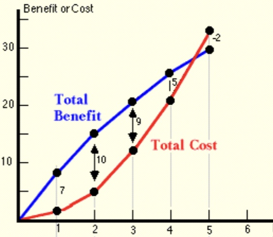
This post offers a simple representation of the argument against public non-pharmaceutical interventions (NPIs) to subdue the COVID-19 pandemic. The chart below features two lines, one representing the presumed life-saving benefits of lockdown measures or NPI stringency, and another representing the costs inflicted by those measures. The values on the axes here are not critical, though measures of stringency exist (e.g., the University of Oxford Stringency Index) and take values from zero to 100.
The benefits of lives saved due to NPI stringency are assigned a value on the vertical axis, as are the costs of lives lost due to deferred health care, isolation, and other stressors caused by stringency. In addition, there are the more straightforward losses caused by suspending economic activity, which should be included in costs.
One can think of the benefits curve as representing gains from forcing individuals, via lockdown measures, to internalize the external costs of risk inflicted on others. However, this curve captures only benefits incremental to those achieved through voluntary action. Thus, NPI benefits include only extra gains from coercing individuals to internalize risks, while losses from NPI stringency are captured by the cost curve.
My contention is that the benefits of stringency diminish and may in fact turn down at some point, and that costs always increase in the level of stringency. In the chart, for what it’s worth, the “optimal” level of stringency would be at a value of 2, where the difference between total benefits and total costs is maximized (and where the benefits of incremental stringency are equal to the marginal costs or losses). However, I am not convinced that the benefits of lockdown measures ever exceed costs, as they do in the chart above. That is, voluntary action may be sufficient. But if the benefits of NPIs do exceed costs, it’s likely to be only at low levels of stringency.
To the extent that people are aware of the pandemic and recognize risk, the external costs of possible infectiousness are already internalized to some degree. Moreover, there is mutual risk in most interactions, and all individuals face risks that are proportional to those to which they expose others: if your contacts are more varied and your interactions are more frequent and intimate, you face correspondingly higher risks yourself. After all, in a pandemic, an individual’s failure to exercise caution may lead to a very hard internalization of costs if an infection strikes them. This mutuality is an element absent from most situations involving externalities. And to the extent that you take voluntary precautions, you and your contacts both benefit. Nevertheless, I concede that there are individuals who face less risk themselves (the young or healthy) but who might behave recklessly, and they might not internalize all risk for which they are responsible. Yes, stringency may have benefits, but that does not mean it has net benefits.
Even if there is some meaningful point at which NPIs are “optimized”, government does not possess the knowledge required to find that point. It lacks detailed knowledge of both costs and benefits of NPIs. This is a manifestation of the “knowledge problem” articulated by Friedrich Hayek, which hampers all efforts at central planning. In contrast, individual actors know their own tolerance for risk, and they surely have some sense of the risks they create in their normal course of affairs. And again, there is a strong degree of proportionality and voluntary internalization of mutual risks.
While relying on voluntary action is economically inefficient relative to an ideal, full-information and perfectly altruistic solution, it is at least based on information that individuals possess: their own risk profile and risk preferences. In contrast, government does not possess information necessary to impose rules in an optimal way, and those rules are rife with unintended consequences and costs inflicted on individuals.
My next post will present empirical evidence of the weakness of lockdown measures in curbing the coronavirus as well as the high costs of those measures. The coronavirus is a serious infection, but it is not terribly deadly or damaging to the longer-term health of the vast majority of people. This, in and of itself, should be sufficient to demonstrate that the array of non-pharmaceutical interventions imposed in the U.S. and abroad were and are not worthwhile. People are capable of assessing risks for themselves. The externality argument, that NPIs are necessary because people do not adequately assess the risk they pose to others, relies on an authority’s ability to assess that risk, and they invariably go overboard on interventions for which they underestimate costs. COVID is not serious enough to justify a surrender of our constitutional rights, and like every concession to government authority, those rights will be difficult to recover.
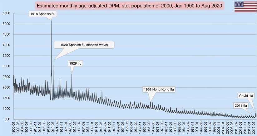
In this short post I’m trying to do my part to put our pandemic experience in perspective. Lord knows, I was on the low side in my U.S. case-load “guesstimate” last March, as well as the number of deaths induced by COVID. (A number of others, using highly sophisticated models, erred more severely in the opposite direction.) I also failed to anticipate the strength of the later seasonal waves we’ve experienced — I was excessively optimistic as the first wave ebbed. But now, as the fall wave is showing some signs of topping out, what can we say about the pandemic in historical perspective? I came across an interesting chart that sheds some light on the question.
In terms of all-cause mortality, we’ve clearly seen a bump upward this year. Take a look at the chart below. It shows deaths per million (DPM) of population (from all causes). Try clicking on it if it’s hard to read, or turn your phone sideways. See the little blip on the lower right? That’s our pandemic year through August. The blip made 2020, at least through August, look something like a normal year of the early 2000s.
The visible spike early in 2020 was the spring wave, which was concentrated on the east coast. Of course, the fall wave will yield another spike, probably a bit higher than the first. Nevertheless, against the historical backdrop, this chart shows that the magnitude of our current public health crisis is relatively minor.
If you scan to the left from 2020, you can see that DPM this year would have appeared normal around 2005. Remember how bad it was back in aught-five…. all the death? Yeah, me neither. That’s perspective.
The chart also reflects several mild flu seasons over the past few years. Because the flu, like COVID-19, tends to hit the elderly and infirm the hardest, the “soft” DPM numbers over the past few years support the theory that the population included a fair amount of so-called “dry tinder” for COVID as we entered the year.
One other note on the chart: the DPMs are “age-adjusted”, meaning that age groups are weighted for comparisons across countries with differing age distributions (not what we’re doing here). In this case, the DPM values are weighted based on the population in the year 2000.
It’s amazing how so many have bought into the narrative that the current pandemic is historically bad. Yes, our DPMs are high relative to the last decade, but a significant number of those deaths were caused not by COVID, but by our own overreaction to the virus. That’s something else I failed to anticipate in the spring. It’s something we can put behind us now, however, if only we’re willing to put our experience in perspective. Unfortunately, many public officials, along with their public health advisors, continue to promote the deluded view that the virus can only be stopped by stopping our lives, our educations, our earnings, our health, and our sanity.
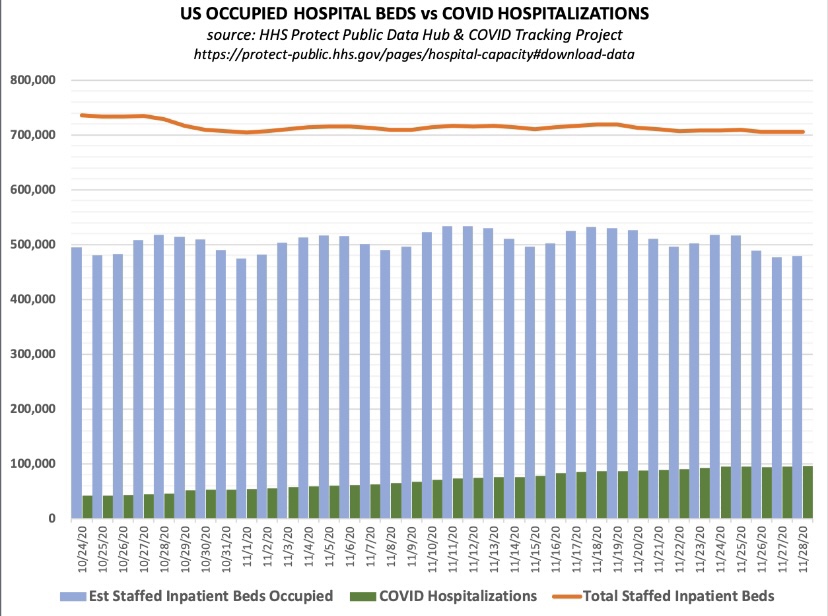
Let’s get one thing straight: when you read that “hospitalizations have hit record highs”, as the Wall Street Journal headline blared Friday morning, they aren’t talking about total hospitalizations. They reference a far more limited set of patients: those admitted either “for” or “with” COVID. And yes, COVID admissions have increased this fall nationwide, and especially in certain hot spots (though some of those are now coming down). Admissions for respiratory illness tend to be highest in the winter months. However, overall hospital capacity utilization has been stable this fall. The same contrast holds for ICU utilization: more COVID patients, but overall occupancy rates have been fairly stable. Several factors account for these differing trends.
Admissions and Utilization
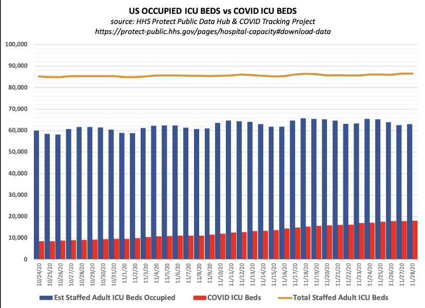
First, take a look at total staffed beds, beds occupied, and beds occupied by COVID patients (admitted “for” or “with” COVID), courtesy of Don Wolt. Notice that COVID patients occupied about 14% of all staffed beds over the past week or so, and total beds occupied are at about 70% of all staffed beds.
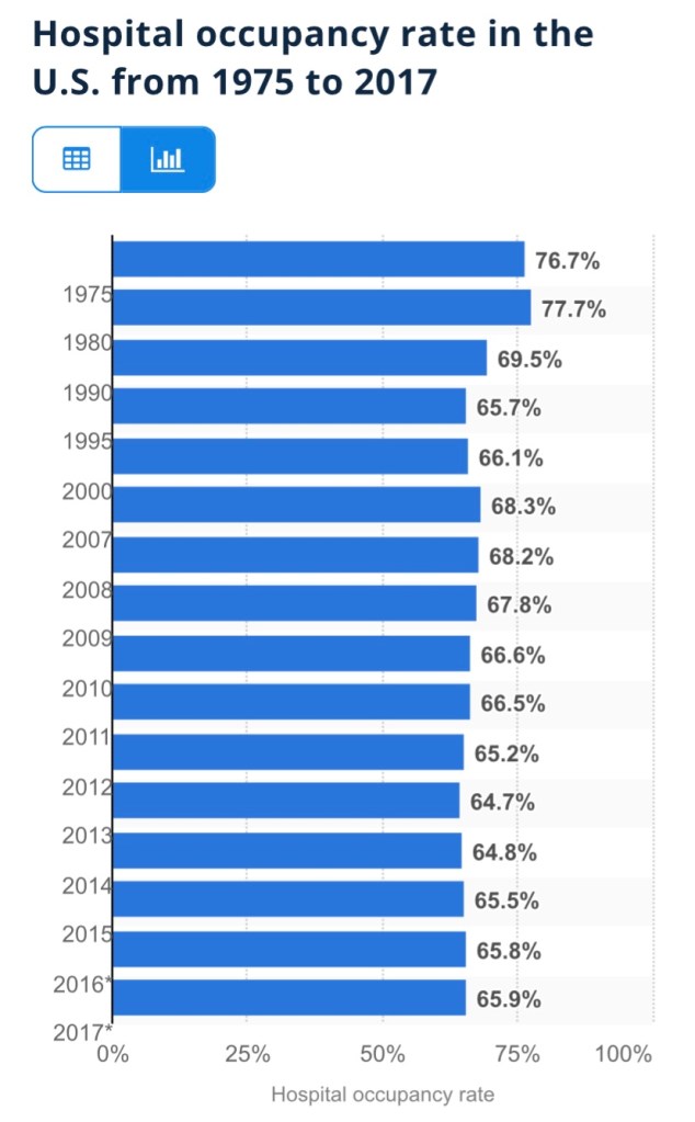
Is this unusual? Utilization is a little high based on the following annual averages of staffed-bed occupancy from Statista (which end in 2017, unfortunately). I don’t have a comparable utilization average for the November 30 date in recent years. However, the medical director interviewed at this link believes there is a consensus that the “optimal” capacity utilization rate for hospitals is as high as 85%! On that basis, we’re fine in the aggregate!
The chart below shows that about 21% of staffed Intensive Care Unit (ICU) beds are occupied by patients having COVID infections, and 74% of all ICU beds are occupied.
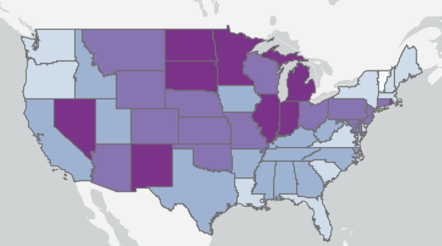
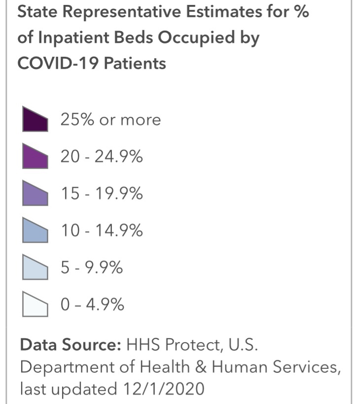
Here’s some information on the regional variation in ICU occupancy rates by COVID patients, which pretty much mirror the intensity of total beds occupied by COVID patients. Fortunately, new cases have declined recently in most of the states with high ICU occupancies.
Resolving an Apparent Contradiction
There are several factors that account for the upward trend in COVID admissions with stable total occupancy. Several links below are courtesy of AJ Kay:
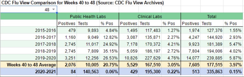
The flu season has been remarkably light, though outpatients with symptoms of influenza-like illness (ILI) have ticked-up a bit in the past couple of weeks. Still, thus far, the light flu season has freed up hospital resources for COVID patients. Take a look at the low CDC numbers through the first nine weeks of the current flu season (from Phil Kerpen):
There is always flexibility in the number of staffed beds both in ICUs and otherwise. Hospitals adjust staffing levels, and beds are sometimes reassigned to ICUs or from outpatient use to inpatient use. More extreme adjustments are possible as well, as when hallways or tents are deployed for temporary beds. This tends to stabilize total bed utilization.
The panic about the fall wave of the virus sowed by media and public officials has no doubt “spooked” individuals into deferring care and elective procedures that might require hospitalization. This has been an unfortunate hallmark of the pandemic with terrible medical implications, but it has almost surely freed-up capacity.
COVID beds occupied are inflated by a failure to distinguish between patients admitted “for” COVID-like illness (CLI) and patients admitted for other reasons but who happen to test positive for COVID — patients “with” COVID (and all admissions are tested).
Case inflation from other kinds of admissions is amplified by false positives, which are rife. This leads to a direct reallocation of patients from “beds occupied” to “COVID beds occupied”.
In early October, the CDC changed its guidelines for bed counts. Out-patients presenting CLI symptoms or a positive test, and who are assigned to a bed for observation for more than eight hours, were henceforth to be included in COVID-occupied beds.
Also in October, the FDA approve an Emergency Use Authorization for Remdesivir as a first line treatment for COVID. That requires hospitalization, so it probably inflated COVID admissions.
The CDC also announced severe penalties in October for facilities which fail to meet its rather inclusive COVID reporting requirements, creating another incentive to capture any suspected COVID case in its reports.
In addition to the above, let’s not forget: early on, hospitals were given an incentive to diagnose patients with COVID, whether tested or merely “suspected”. The CARES Act authorized $175 billion dollars for hospitals for the care of COVID patients. In the spring and even now, hospitals have lost revenue due to the cancellation of many elective procedures, so the law helped replace those losses (though the distribution was highly uneven). The point is that incentives were and still are in place to diagnose COVID to the extent possible under the law (with a major assist from false-positive PCR tests).
Improved Treatment and Treatment
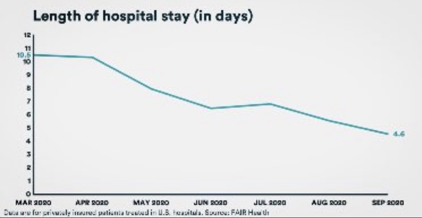
While more COVID patients are using beds, they are surviving their infections at a much higher rate than in the spring, according to data from FAIR Health. Moreover, the average length of their hospital stay has fallen by more than half, from 10.5 to 4.6 days. That means beds turn over more quickly, so more patients can be admitted over a week or month while maintaining a given level of hospital occupancy.
The CDC just published a report on “under-reported” hospitalization, but as AJ Kay notes, it can only be described as terrible research. Okay, propaganda is probably a better word! Biased research would be okay as well. The basic idea is to say that all non-hospitalized, symptomatic COVID patients should be counted as “under-counted” hospitalizations. We’ve entered the theater of the absurd! It’s certainly true that maxed-out hospitals must prioritize admissions based on the severity of cases. Some patients might be diverted to other facilities or sent home. Those decisions depend on professional judgement and sometimes on the basis of patient preference. But let’s not confuse beds that are unoccupied with beds that “should be occupied” if only every symptomatic COVID patient were admitted.
Regional Differences
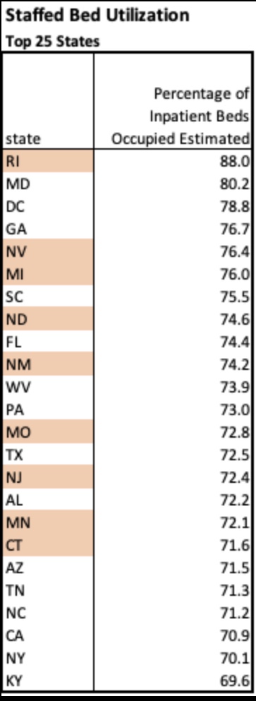
Finally, here’s a little more information on regional variation in bed utilization from the HealthData.govweb site. The table below lists the top 25 states by staffed bed utilization at the end of November. A few states are highlighted based on my loose awareness of their status as “COVID “hot spots” this fall (and I’m sure I have overlooked a couple. Only two states were above 80% occupancy, however.
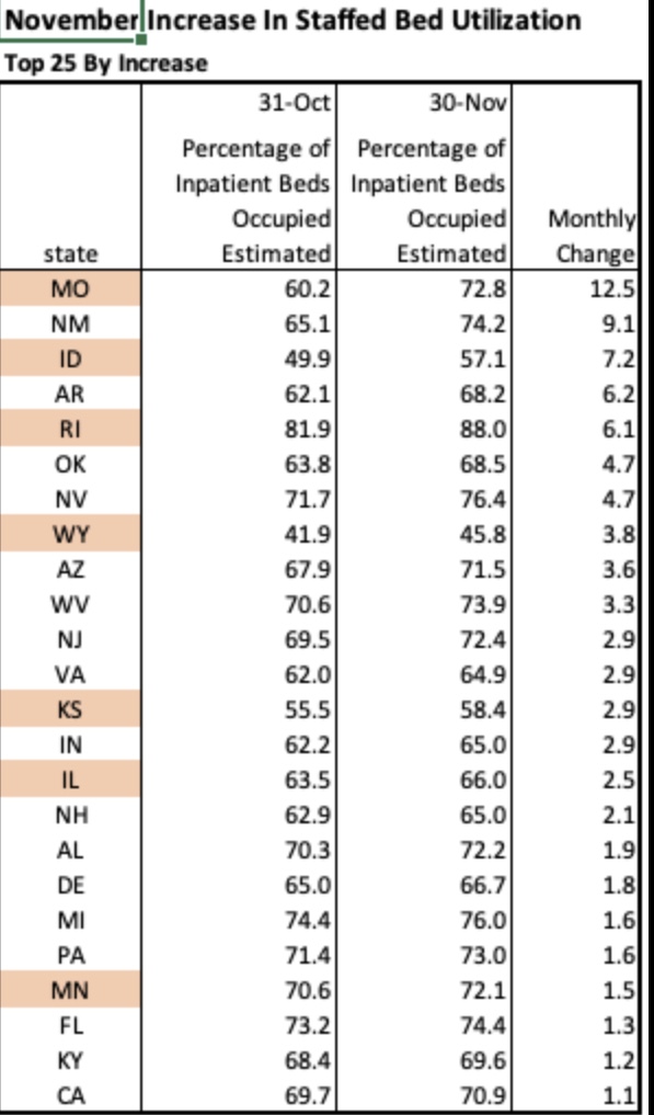
The next table shows the 25 states with the largest increase in staffed bed utilization during November. Only a handful would appear to be at all alarming based on these increases, but Missouri, for example, at the top of the list, still had 27% of beds unoccupied on November 30. Also, 21 states had decreases in bed utilization during November. Importantly, it is not unusual for hospitals to operate with this much headroom or less, which many administrators would actually prefer.
Of course, certain local markets and individual hospitals face greater capacity pressures at this point. Often, the most crimped situations are in small hospitals in underserved communities. This is exacerbated by more limited availability of staff members with school-age children at home due to school closures. Nevertheless, overall needs for beds look quite manageable, especially in view of some of the factors inflating COVID occupancy.
Conclusion
Marc Boom, President and CEO of Houston Methodist Hospital, had some enlightening comments in this article:
“Hospital capacity is incredibly fluid, as Boom explained on the call, with shifting beds and staffing adjustments an ongoing affair. He also noted that as a rule, hospitals actually try to operate as near to capacity as possible in order to maximize resources and minimize cost burdens. Boom said numbers from one year ago, June 25, 2019, show that capacity was at 95%.”
So there are ample beds available at most hospitals. A few are pinched, but resources can and should be devoted to diverting serious COVID cases to other facilities. But on the whole, the panic over hospital capacity for COVID patients is unwarranted.
We have a false-positive problem and even the New York Times noticed! The number of active COVID cases has been vastly exaggerated and still is, but there is more than one fix.
COVID PCR tests, which are designed to detect coronavirus RNA from a nasal swab, have a “specificity” of about 97%, and perhaps much less in the field. That means at least 3% of tests on uninfected subjects are falsely positive. But the total number of false positive tests can be as large or larger than the total number of true positives identified. Let’s say 3% of the tested population is truly infected. Then out of every 100 individuals tested, three individuals are actively infected and 97 are not. Yet about 3 of those 97 will test positive anyway! So in this example, for every true infection identified, the test also falsely flags an uninfected individual. The number of active infections is exaggerated by 100%.
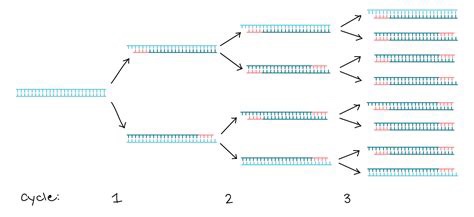
But again, it’s suspected to be much worse than that. The specificity of PCR tests depends on the number of DNA replications, or amplification cycles, to which a test sample is subjected. That process is illustrated through three cycles in the graphic above. It’s generally thought that 20 – 30 cycles is sufficient to pick-up DNA from a live virus infection. If a sample is subjected to more than 30 cycles, the likelihood that the test will detect insignificant dead fragments of the virus is increased. More than 35 cycles prompts real concern about the test’s reliability. But in the U.S., PCR tests are regularly subjected to upwards of 35 and even 40-plus cycles of amplification. This means the number of active cases is exaggerated, perhaps by several times. If you don’t believe me, just ask the great Dr. Anthony Fauci:
“It’s very frustrating for the patients as well as for the physicians … somebody comes in, and they repeat their PCR, and it’s like [a] 37 cycle threshold, but you almost never can culture virus from a 37 threshold cycle. So, I think if somebody does come in with 37, 38, even 36, you got to say, you know, it’s just dead nucleotides, period.“
Remember, the purpose of the test is to find active infections, but the window during which most COVID infections are active is fairly narrow, only for 10 – 15 days after the onset of symptoms, and often less; those individuals are infectious to others only up to about 10 days, and most tests lag behind the onset of symptoms. In fact, infected but asymptomatic individuals — a third or more of all those truly infected at any given time — are minimally infectious, if at all. So the window over which the test should be sensitive is fairly narrow, and many active infections are not infectious at all.
PCR tests are subject to a variety of other criticisms. Many of those are discussed in this external peer-review report on an early 2020 publication favorable to the tests. In addition to the many practical shortfalls of the test, the authors of the original paper are cited for conflicts of interest. And the original paper was accepted within 24 hours of submission to the journal Eurosurveillance (what a name!), which should raise eyebrows to anyone familiar with a typical journal review process.
The most obvious implication of all the false positives is that the COVID case numbers are exaggerated. The media and even public health officials have been very slow to catch onto this fact. As a result, their reaction has sown a panic among the public that active case numbers are spiraling out of control. In addition, false positives lead directly to mis-attribution of death: the CDC changed it’s guidelines in early April for attributing death to COVID (and only for COVID, not other causes of death). This, along with the vast increase in testing, means that false positives have led to an exaggeration of COVID as a cause of death. Even worse, false positives absorb scarce medical resources, as patients diagnosed with COVID require a high level of staffing and precaution, and the staff often requires isolation themselves.
Many have heard that Elon Musk tested positive twice in one day, and tested negative twice in the same day! The uncomfortable reality of a faulty test was recently recognized by an Appeals Court in Portugal, and we may see more litigation of this kind. The Court ruled in favor of four German tourists who were quarantined all summer after one of them tested positive. The Court said:
“In view of current scientific evidence, this test shows itself to be unable to determine beyond reasonable doubt that such positivity corresponds, in fact, to the infection of a person by the SARS-CoV-2 virus.”
I don’t believe testing is a bad thing. The existence of diagnostic tests cannot be a bad thing. In fact, I have advocated for fast, cheap tests, even at the sacrifice of accuracy, so that individuals can test themselves at home repeatedly, if necessary. And fast, cheap tests exist, if only they would be approved by the FDA. Positive tests should always be followed-up immediately by additional testing, whether those are additional PCR tests, other molecular tests, or antigen tests. And as Brown University epidemiologist Andrew Bostom says, you should always ask for the cycle threshold used when you receive a positive result on a PCR test. If it’s above 30 and you feel okay, the test is probably not meaningful.
PCR tests are not ideal because repeat testing is time consuming and expensive, but PCR tests could be much better if the number of replication cycles was reduced to somewhere between 20 and 30. Like most flu and SARS viruses, COVID-19 is very dangerous to the aged and sick, so our resources should be focused on their safety. However, exaggerated case counts are a cause of unnecessary hysteria and cost, especially for a virus that is rather benign to most people.
There are some hints of good news on the spread of the coronavirus in a few of the “hot spots“ that developed this fall. This could be very good news, but it’s a bit too early to draw definitive conclusions.
The number of new cases plateaued in Europe a few weeks ago. Of course, Europe’s average latitude is higher than in most of the U.S., and the seasonal spread began there a little earlier. It makes sense that it might ebb there a bit sooner than in the U.S. as well.
In the U.S., cases shot up in the upper Midwest four to six weeks ago, depending on the state. Now, however, new cases have turned down in Iowa, Nebraska, North Dakota, South Dakota, and Wisconsin (first chart below), and they appear to have plateaued in Illinois, Kansas, Minnesota, and Missouri (second chart below, but ending a few days earlier). These are the hottest of the recent hot states.
These plateaus and declines were preceded by a decline in the growth rates of new cases around 10 days ago, shown below.
The timing of these patterns roughly correspond to the timing of the spread in other regions earlier in the year. It’s been suggested that after seroprevalence reaches levels of around 15% – 25% that individuals with new antibodies, together with individuals having an existing pre-immunity from other coronaviruses, is enough to bring the virus reproduction rate (R) to a value of one or less. That means a breach of the effective herd immunity threshold. It’s possible that many of these states are reaching those levels. Of course, this is very uncertain, but the patterns are certainly encouraging.
Deaths lag behind new infections, and it generally takes several weeks before actual deaths by date-of-death are known with any precision. However, we might expect deaths to turn down within two to three weeks.
Deaths by date-of-death are strongly associated with emergency room patients from three weeks prior who presented symptoms of COVID-like illness (CLI) or influenza-like illness ((ILI). The following chart shows CLI and ILI separately for the entire U.S. (ILI is the lowest dashed line), but the last few observations of both series, after a peak on November 15th, suggest a downturn in CLI + ILI. If the relationship holds up, actual U.S. deaths by date-of-death should peak around December 7th, though we won’t know precisely until early in the new year.
As a side note, it continues to look like the flu season will be exceptionally mild this year. See the next chart. That’s tremendous because it should take some of the normal seasonable pressure off health care resources.
So Happy Thanksgiving!
-————————————————
Note: I saved all those charts over the last few days but lost track of the individual sources on Twitter. I’m too lazy and busy to go back and search through Twitter posts, so instead I’ll just list a few of my frequent sources here with links to recent posts, which are not necessarily apropos of the above: Don Wolt, Justin Hart, AlexL, The Ethical Skeptic, Aaron Ginn, and HOLD2.
The other day a friend told me “your data points always seem to miss the people points.” He imagines a failure on my part to appreciate the human cost of the coronavirus. Evidently, he feels that I treat data on cases, hospitalizations, and deaths as mere accounting issues, all while emphasizing the negative aspects of government interventions.
This fellow reads my posts very selectively, hampered in part by his own mood affiliation. Indeed, he seems to lack an appreciation for the nuance and zeitgeist of my body of blogging on the topic… my oeuvre! This despite his past comments on the very things he claims I haven’t mentioned. His responses usually rely on anecdotes relayed to him by nurses or doctors he knows. Anecdotes can be important, of course. But I know nurses and doctors too, and they are not of the same mind as his nurses and doctors. Anecdotes! We’re talking about the determination of optimal policy here, and you know what Dr. Fauci says about relying on anecdotes!
Incremental Costs and Benefits
My friend must first understand that my views are based on an economic argument, one emphasizing the benefits and costs of particular actions, including human costs. COVID is dangerous, but primarily to the elderly, and no approach to managing the virus is free. Here are two rather disparate choices:
Mandated minimization of economic and social interactions throughout society over some time interval in the hope of reducing the spread of the virus;
Laissez faire for the general population while minimizing dangers to high-risk individuals, subject to free choice for mentally competent, high-risk individuals.
To be clear, #2 entails all voluntary actions taken by individuals to mitigate risks. Therefore, #1 implies a set of incremental binding restrictions on behavior beyond those voluntary actions. However, I also include in #1 the behavioral effects of scare mongering by public officials, who regularly issue pronouncements having no empirical basis.
The first option above entails so-called non-pharmaceutical interventions (NPIs) by government. These are the elements of so-called lockdowns, such as quarantines and other restrictions on mobility, business and consumer activity, social activities, health care activities, school closures, and mask mandates. NPIs carry costs that are increasing in the severity of constraints they impose on society.
And before I proceed, remember this: tallying all fatal COVID cases is really irrelevant to the policy exercise. Nothing we do, or could have done, would save all those lives. We should compare what lives can be saved from COVID via lockdowns, if any, with the cost of those lockdowns in terms of human life and human misery, including economic costs.
Economic Losses
NPIs involve a loss of economic output that can never be recovered… it is gone forever, and a loss is likely to continue for some time to come. That sounds so very anodyne, despite the tremendous magnitude of the loss involved. But let’s stay with it for just a second. The loss of U.S. output in 2020 due to COVID has been estimated at $2.5 trillion. As Don Boudreaux and Tyler Cowen have noted, what we normally spend on safety and precautionary measures (willingness-to-pay), together with the probabilities of losses, implies that we value our lives at less than $4 million on average. Let’s say the COVID death toll reaches 300,000 by year-end (that’s incremental in this case— but it might be a bit high). That equates to a total loss of $1.2 trillion in life-value if we ignore distinctions in life-years lost. Now ask this: if our $2.5 trillion output loss could have saved every one of those 300,000 lives, would it have been worth it? Not even close, and the truth is that the sacrifice will not have saved even a small fraction of those lives. I grant, however, that the economic losses are partly attributable to voluntary decisions, but goaded to a great extent by the alarmist commentary of public health officials.
The full depth of losses is far worse than the dollars and cents comparison above might sound. Output losses are always matched by (and, in value, are exactly the same as) income losses. That involves lost jobs, lost hours, failed businesses, and destroyed careers. Ah, now we’re getting a bit more “human”, aren’t we! It’s nothing short of callous to discount these costs. Unfortunately, the burden falls disproportionately on low-income workers. Our elites can mostly stay home and do their jobs remotely, and earn handsome incomes. The working poor spend their time in line at food banks.
Yes, government checks can help those with a loss of income compete with elites for the available supply of goods, but of course that doesn’t replace the lost supply of goods! Government aid of this kind is a palliative measure; it doesn’t offset the real losses during a suspension of economic activity.
Decimated Public Health
The strain of the losses has been massive in the U.S. and nearly everywhere in the world. People are struggling financially, making do with less on the table, depleting their savings, and seeking forbearance on debts. The emotional strains are no less real. Anxiety is rampant, drug overdoses have increased, calls to suicide hotlines have exploded, and the permanence of the economic losses may add to suicide rates for some time to come. Dr. Robert Redfield of the CDC says more teenagers will commit suicide this year than will die from COVID (also see here). There’s also been a terrifying escalation in domestic abuse during the pandemic, including domestic homicide. The despair caused by economic losses is all too real and should be viewed as a multiplier on the total cost of severe NPIs.
More on human costs: a health care disaster has befallen locked-down populations, including avoidance of care on account of panic fomented by so-called public health experts, the media, and government. Some of the consequences are listed here. But to name just a few, we have huge numbers of delayed cancer diagnoses, which sharply decrease survival time; mass avoidance of emergency room visits, including undiagnosed heart attacks and strokes; and unacceptable delays in cardiac treatments. Moreover, lockdowns worldwide have severely damaged efforts to deal with scourges like HIV, tuberculosis, and malaria.
The CDC reports that excess mortality among 25-44 year-olds this year was up more than 26%, and the vast bulk of these were non-COVID deaths. A Lancet study indicates that a measles outbreak is likely in 2021 due to skipped vaccinations caused by lockdowns. The WHO estimates that 130,000,000 people are starving worldwide due to lockdowns. That is roughly the population of the U.S. east coast. Again, the callousness with which people willfully ignore these repercussions is stunning, selfish and inhumane, or just stupid.
Excess Deaths
Can we quantify all this? Yes we can, as a matter of fact. I’ve offered estimates in the past, and I already mentioned that excess deaths, COVID and non-COVID, are reported on the CDC’s web site. The Ethical Skeptic (TES) does a good job of summarizing these statistics, though the last full set of estimates was from October 31. Here is the graphic from the TES Twitter feed:
Note particularly the huge number of excess deaths attributable to SAAAD (Suicide, Addiction Abandonment, Abuse and Despair): over 50,000! The estimate of life-years lost due to non-COVID excess deaths is almost double that of COVID deaths because of the difference in the age distributions of those deaths.
Here are a few supporting charts on selected categories of excess deaths, though they are a week behind the counts from above. The first is all non-COVID, natural-cause excess deaths (the vertical gap between the two lines), followed by excess deaths from Alzheimer’s and dementia, other respiratory diseases, and malignant neoplasms (cancer):
The clearest visual gap in these charts is the excess Alzheimer’s and dementia deaths. Note the increase corresponding to the start of the pandemic, when these patients were suddenly shut off from loved ones and the company of other patients. I also believe some of these deaths were (and are) due to overwhelmed staff at care homes struck by COVID, but even discounting this category of excess deaths leaves us with a huge number of non-COVD deaths that could have been avoided without lockdowns. This represents a human cost over and above those tied to the economic losses discussed earlier.
Degraded Education and Health
Lockdowns have also been destructive to the education of children. The United Nations has estimated that 24 million children may drop out of school permanently as a result of lockdowns and school closures. This a burden that falls disproportionately on impoverished children. This article in the Journal of the American Medical Association Network notes the destructive impact of primary school closures on educational attainment. Its conclusions should make advocates of school closures reconsider their position, but it won’t:
“… missed instruction during 2020 could be associated with an estimated 5.53 million years of life lost. This loss in life expectancy was likely to be greater than would have been observed if leaving primary schools open had led to an expansion of the first wave of the pandemic.“
Lockdown Inefficacy
Lockdowns just don’t work. There was never any scientific evidence that they did. For one thing, they are difficult to enforce and compliance is not a given. Of course, Sweden offers a prime example that draconian lockdowns are unnecessary, and deaths remain low there. This Lancet study, published in July, found no association between lockdowns and country mortality, though early border closures were associated with lower COVID caseloads. A French research paper concludes that public decisions had no impact on COVID mortality across 188 countries, U.S. states, and Chinese states. A paper by a group of Irish physicians and scientists stated the following:
“Lockdown has not previously been employed as a strategy in pandemic management, in fact it was ruled out in 2019 WHO and Irish pandemic guidelines, and as expected, it has proven a poor mitigator of morbidity and mortality.”
One of the chief arguments in favor of lockdowns is the fear that asymptomatic individuals circulating in the community (and there are many) would spread the virus. However, there is no evidence that they do. In part, that’s because the window during which an individual with the virus is infectious is narrow, but tests may detect tiny fragments of the virus over a much longer span of time. And there is even some evidence that lockdown measures may increase the spread of the virus!
Lockdown decisions are invariably arbitrary in their impact as well. The crackdown on gyms is one noteworthy example, but gyms are safe. Restaurants don’t turn up in many contact traces either, and yet restaurants have been repeatedly implicated as danger zones. And think of the many small retailers shut down by government, while giant competitors like Wal-Mart continue to operate with little restriction. This is manifest corporatism!
Then there is the matter of mask mandates. As readers of this blog know, I think masks probably help reduce transmission from droplets issued by a carrier, that is, at close range. However, this recent Danish study in the Annals of Internal Medicine found that cloth masks are ineffective in protecting the wearer. They do not stop aerosols, which seem to be the primary source of transmission. They might reduce viral loads, at least if worn properly and either cleaned often or replaced. Those are big “ifs”.
To the extent that masks offer any protection, I’m happy to wear them within indoor public accommodations, at least for the time being. To the extent that people are “scared”, I’m happy to observe the courtesy of wearing a mask, but not outside in uncrowded conditions. To the extent that masks are required under private “house rules”, of course I comply. Public mask mandates outside of government buildings are over the line, however. The evidence that those mandates work is too tenuous and our liberties are too precious too allow that kind of coercion. And private facilities should be subject to private rules only.
QED
So my poor friend is quite correct that COVID is especially deadly to certain cohorts and challenging for the health care community. But he must come to grips with a few realities:
The virus won’t be defeated with NPIs; they don’t work!
NPIs inflict massive harm to human well-being.
Lockdowns or NPIs are little or no gain, high-pain propositions.
The rejection of NPI’s, or lockdowns, is based on compelling “human” data points. As Don Boudreaux says:
“The lockdowns and other restrictions on economic and social activities are astronomically costly – in a direct economic sense, in an emotional and spiritual sense, and in a ‘what-the-hell-do-these-arbitrary-diktats-portend-for-our-freedom?’ sense.”
This doctor has a message for the those denizens of social media with an honest wish to dispense helpful public health advice:
“Americans have admitted that they will meet for Thanksgiving. Scolding and shaming them for wanting this is unlikely to slow the spread of SARS-CoV-2, though it may earn you likes and retweets. Starting with compassion, and thinking of ways they can meet, but as safely as possible, is the task of real public health. Now is the time to save public health from social media.”
I hope readers share my compulsion to see updated COVID numbers. It’s become a regular feature on this blog and will probably remain one until infections subside, vaccine or otherwise. Or maybe when people get used to the idea of living normally again in the presence of an endemic pathogen, as they have with many other pathogens and myriad risks of greater proportions, and as they should. That might require more court challenges, political changes, and plain old civil disobedience.
So here, then, is an update on the U.S. COVID numbers released over the past few days. The charts below are attributable to Don Wolt (@tlowdon on Twitter).
First, reported deaths began to creep up again in the latter half of October and have escalated in November. They’ve now reached the highs of the mid-summer wave in the south, but this time the outbreak is concentrated in the midwest and especially the upper midwest.
Reported deaths are the basis of claims that we are seeing 1,500 people dying every day, which is an obvious exaggeration. There have been recent days when reported deaths exceeded that level, but the weekly average of reported deaths is now between 1,100 and 1,200 a day.
It’s important to understand that deaths reported in a given week actually occurred earlier, sometimes eight or more weeks before the week in which they are reported. Most occur within three weeks of reporting, but sometimes the numbers added from four-plus weeks earlier are significant.
The following chart reproduces weekly reported deaths from above using blue bars, ending with the week of November 14th. Deaths by actual date-of-death (DOD) are shown by the orange bars. The most recent three-plus weeks always show less than complete counts of deaths by DOD. But going back to mid-October, actual weekly deaths were running below reported deaths. If the pattern were to follow the upswings of the first two waves of infections, then actual weekly deaths would exceed reported deaths by perhaps the end of October. However, it’s doubtful that will occur, in part because we’ve made substantial progress since the spring and summer in treating the disease.
To reinforce the last point, it’s helpful to view deaths relative to COVID case counts. Deaths by DOD are plotted below by the orange line using the scale on the right-hand vertical axis. New positive tests are represented by the solid blue line, using the left-hand axis, along with COVID hospitalizations. There is no question that the relationship between cases, hospitalizations, and deaths has weakened over time. My suspicions were aroused somewhat by the noticeable compression of the right axis for deaths relative to the two charts above, but on reviewing the actual patterns (peak relative to troughs) in those charts, I’m satisfied that the relationships have indeed “decoupled”, as Wolt puts it.
Cases are going through the roof, but there is strong evidence that a large share of these cases are false positives. COVID hospitalizations are up as well, but their apparent co-movement with new cases appears to be dampening with successive waves of the virus. That’s at least partly a consequence of the low number of tests early in the pandemic.
So where is this going? The next chart again shows COVID deaths by DOD using orange bars. Wolt has concluded, and I have reported here, that the single-best short-term predictor of COVID deaths by DOD is the percentage of emergency room visits at which patients presented symptoms of either COVID-like illness (CLI) or influenza-like illness (ILI). The sum of these percentages, CLI + ILI, is shown below by the dark blue line, but the values are shifted forward by three weeks to better align with deaths. This suggests that actual COVID deaths by DOD will be somewhere around 7,000 a week by the end of November, or about 1,000 a day. Beyond that time, the path will depend on a number of factors, including the weather, prevalence and immunity levels, and changes in mobility.
I am highly skeptical that lockdowns have any independent effect in knocking down the virus, though interventionists will try to take credit if the wave happens to subside soon for any other reason. They won’t take credit for the grim lockdown deaths reaped by their policies.
Despite the bleak prospect of 1,000 or more COVID-attributed deaths a day by the end of November, the way in which these deaths are counted is suspect. Early in the pandemic, the CDC significantly altered guidelines for the completion of death certificates for COVID such that deaths are often improperly attributed to the virus. Some COVID deaths stem from false-positive PCR tests, and again, almost since the beginning of the pandemic, hospitals were given a financial incentive to classify inpatients as COVID-infected.
It’s also important to remember that while any true COVID fatality is premature, they are generally not even close to the prematurity of lockdown deaths. That’s a simple consequence of the age profile of COVID deaths, which indicate relatively few life-years lost, and the preponderance of co-morbidities among COVID fatalities.
Again, COVId deaths are bad enough, but we are seeing an unacceptable and ongoing level of lockdown deaths. This is now to the point where they may account for almost all of the continuing excess deaths, even with the fall COVID wave. It’s probable that public health would be better served with reduced emphasis on COVID-mitigation for the general population and more intense focus on protecting the vulnerable, including the distribution of vaccines.
The fall wave of the coronavirus has brought with it an increase in COVID hospitalizations. It’s a serious situation for the infected and for those who care for them. But while hospital utilization is rising and is reaching tight conditions in some areas, claims that it is already a widespread national problem are without merit.
National and State Hospital Utilization
The table below shows national and state statistics comparing beds used during November 1-9 to the three-year average from 2017 – 19, from Justin Hart. There are some real flaws in the comparison: one is that full-year averages are not readily comparable to particular times of the year, with or without COVID. Nevertheless, the comparison does serve to show that current overall bed usage is not “crazy high” in most states, as it were. The increase in utilization shown in the table is highest in IA, MT, NV, PA, VT, and WI, and there are a few other states with sizable increases.
Another limitation is that the utilization rates in the far right column do not appear to be calculated on the basis of “staffed” beds, but total beds. The U.S. bed utilization rate would be 74% in terms of staffed beds.
Average historical hospital occupancy rates from Statista look like this:
Again, these don’t seem to be calculated on the basis of staffed beds, but current occupancies are probably higher now based on either staffed beds or total beds.
As of November 11th, a table available at HealthData.gov indicates that staffed bed utilization in the U.S. is at nearly 74%, with ICU utilization also at 74%. As the table above shows, states vary tremendously in their hospital bed utilization, a point to which I’ll return below.
COVID patients were using just over 9% of of all staffed beds and just over 19% of ICU beds as of November 11th. One caveat on the reported COVID shares you’ll see for dates going forward: the CDC changed its guidelines on counting COVID hospitalizations as of November 12th. It is now a COVID patient’s entire hospital stay, rather than only when a patient is in isolation with COVID. That might be a better metric if we can trust the accuracy of COVID tests (and I don’t), but either way, the change will cause a jump in the COVID share of occupied beds.
Interpreting Hospital Utilization
Many issues impinge on the interpretation of hospital utilization rates:
First, cases and utilization rates are increasing, which is worrisome, but the question is whether they have already reached crisis levels or will very soon. The data doesn’t suggest that is the case in the aggregate, but there certainly there are hospitals bumping up against capacity constraints in some parts of the country.
Second, occupancies are increasing due to COVID patients as well as patients suffering from lockdown-related problems such as self-harm, psychiatric problems, drug abuse, and conditions worsened by earlier deferrals of care. We can expect more of that in coming weeks.
Third, lockdowns create other hospital capacity issues related to staffing. Health care workers with school-aged children face the daunting task of caring for their kids and maintaining hours on jobs for which they are critically needed.
Fourth, there are capacity issues related to PPE and medical equipment that are not addressed by the statistics above. Different uses must compete for these resources within any hospital, so the share of COVID admissions has a strong bearing on how the care of other kinds of patients must be managed.
Fifth, some of the alarm is purely case-driven: all admissions are tested for COVID, and non-COVID admissions often become COVID admissions after false-positive PCR tests, or simply due to the presence of mild COVID with a more serious condition or injury. However, severe COVID cases have an outsized impact on utilization of staff because their care is relatively labor-intensive.
Sixth, there are reports that the average length of COVID patient stays has decreased markedly since the spring (it is hard to find nationwide figures), but it is also increasingly difficult to find facilities for post-acute care required for some patients on discharge. Nevertheless, if improved treatment reduces average length of stay, it helps hospitals deal with the surge.
Finally, thus far, the influenza season has been remarkably light, as the following chart from the CDC shows. It is still early in the season, but the near-complete absence of flu patients is helping hospitals manage their resources.
St. Louis Hotspot
The St. Louis metro area has been proclaimed a COVID “hotspot” by the local media and government officials, which certainly doesn’t make St. Louis unique in terms of conditions or alarmism. I’m curious about the data there, however, since it’s my hometown. Here is hospital occupancy on the Missouri side of the St. Louis region:
It seems this chart is based on total beds, not staffed beds, However, one of the interesting aspects of this chart is the variation in capacity over time, with several significant jumps in the series. This has to do with data coverage and some variation in daily reporting. Almost all of these data dashboards are relatively new, so their coverage has been increasing, but generally in fits and starts. Reporting is spotty on a day-to-day basis, so there are jagged patterns. And of course, capacity can vary from day-to-day and week-to-week — there is some flexibility in the number of beds that can be made available.
The share of St. Louis area beds in use was 61% as of November 11th (preliminary). COVID patients accounted for 12% of hospital beds. ICU utilization in the St. Louis region was a preliminary 67% as of Nov. 11, with COVID patients using 29% of ICU capacity (which is quite high). Again, these figures probably aren’t calculated on the basis of “staffed” beds, so actual hospital-bed and ICU-bed utilization rates could be several percentage points higher. More importantly, it does not appear that utilization in the St. Louis area has trended up over the past month.
At the moment, the St. Louis region appears to have more spare hospital capacity than the nation, but COVID patients are using a larger share of all beds and ICU beds in St. Louis than nationwide. So this is a mixed bag. And again, capacity is not spread evenly across hospitals, and it’s clear that hospitals are under pressure to manage capacity more actively. In fact, hospitals only have so many options as the share of COVID admissions increases: divert or discharge COVID and non-COVID patients, defer elective procedures, discharge COVID and non-COVID patients earlier, allow beds to be more thinly staffed and/or add temporary beds wherever possible.
Closing Thoughts
Anyone with severe symptoms of COVID-19 probably should be hospitalized. The beds must be available, or else at-home care will become more commonplace, as it was for non-COVID maladies earlier in the pandemic. A continued escalation in severe COVID cases would require more drastic steps to make hospital resources available. That said, we do not yet have a widespread capacity crisis, although that’s small consolation to areas now under stress. And a few of the states with the highest utilization rates now have been rather stable in terms of hospitalizations — they already had high average utilization rates, which is potentially dangerous.
COVID is a seasonal disease, and it’s no surprise that it’s raging now in areas that did not experience large outbreaks in the spring and summer. And those areas that had earlier outbreaks have not had a serious surge this fall, at least not yet. My expectation and hope is that the midwestern and northern states now seeing high case counts will soon reach a level of prevalence at which new infections will begin to subside. And we’re likely to see a far lower infection fatality rate than experienced in the Northeast last spring.
Like many others, I strongly suspect widespread ballot fraud in the presidential election, as well as miscounting due to software problems in certain jurisdictions. I therefore fully support the legal challenges and recounts now getting underway. However, there is one indicator of fraud, now widely cited by Republicans, in which I have no confidence as applied. It’s a statistical tool based on Benford’s Law, which can serve as a signal of voter fraud. I mentioned it briefly in my last post. At the risk of getting ahead of myself, here’s what I said then:
“… Benford’s Law … is a “forensic” test of fraud based on statistical theory, but I do not trust the form in which it’s been invoked thus far. Violations have been cited in several counties over the past few days. However, a violation of this law obviously doesn’t constitute direct evidence of fraud, and the test is a reliable indicator only when the number of voters in different precincts vary by orders of magnitude (there must be a mix of [numbers in the] 10s, 100s, 1,000s, 10,000s). With precinct sizes, that is often not the case. There is a more reliable form of Bedford’s law, but I have not seen its application to any results in this election.“
The last link above is to a paper by Walter Mebane of the University of Michigan. I’ll refer to his work below, including some post-election tests he’s conducted.
First Digits
Benford’s Law holds that many collections of numbers encountered in nature or human affairs (populations of ant colonies, accounting data) will have a large proportion of leading digits that are low numbers. For example, the number 1 will tend to appear as the leading digit about 30% of the time; the number 2 will be the leading digit about 18% of the time, while the number 9 will be the leading digit less than 5% of the time. The broader the range of the numbers, the more accurately they will conform to Benford’s Law. As I stated above, a range of numbers covering several orders of magnitude will approximate Benford’s Law fairly well, while a range confined to a single order of magnitude generally won’t conform unless its distribution is extremely skewed toward the low end of the range.
What does that have to do with election fraud? If the number of votes across different voting precincts cover several orders of magnitude (for example, single digits, 10s, 100s, and 1,000s), they should conform to Benford’s Law. The distribution of first digits across precincts should look a lot like the chart above. If they don’t conform, it’s an indication that votes may have been altered or added. That’s because Benford’s Law tends to break down when an independent process leads to additive changes to the original numbers (rather than multiplicative changes, such as population growth).
So again, there have been claims that several cities had presidential voting patterns suggesting violations of Benford’s Law for Joe Biden, but not for Donald Trump and other candidates. These were Milwaukee, WI, Chicago, IL, and Allegheny County, PA. Subsequently I saw similar claims about other cities and counties, such as Fulton County, GA.
The chart below shows the results for Milwaukee. I show only three of the candidates’ distributions of first digits, but the other candidates, who garnered relatively few votes, look much like the one on the far right. The chart shows that Joe Biden’s distribution looks nothing like Benford’s Law would suggest, while Trump’s does. The assertion is that Biden’s pattern is a sign of fraudulent voting.
The problem with these claims is that the size of the precincts and variations in votes across wards might not support the validity of Benford’s Law. I looked at the 327 election wards in the City of Milwaukee, which range in size from just a few voters to several thousand, but most have less than 1,000 voters. The average turnout of registered voters across wards was over 78%, and the average number of ballots cast per ward was 757. Biden received almost 80% of the votes in Milwaukee, or about 595 per ward; Trump received an average of 148.
(I should note that in seven wards there were controversial, post-election upward adjustments in the number of registered voters, where voter turnout had originally been calculated as greater than 100%. Needless to say, that is rather suspicious. However, I disclose now that the data were collected after these adjustments were made.)
What’s important in the application of Benford’s Law is the distribution of votes across wards. Biden’s distribution of votes across wards in Milwaukee was concentrated between 186 and 1,196 (the middle 90% of his distribution of ward votes), and again, centered at 595. For Trump, 90% of his ward vote totals were between 14 and 412. It should be no surprise that a large share of Biden’s vote totals would have leading digits of 4, 5, and 6, while Trump had lower leading digits. So the charts of leading digits for Milwaukee are really artifacts of the narrow distributions of ward votes for these candidates. Broader distributions covering several orders of magnitude would provide first-digit analysis more capable of indicating fraud, if it occurred.
Second Digits
The other Benford-type test of fraud mentioned above is based on the second digit of vote totals, and it is not sensitive to the width of the vote distributions. The typical pattern of second digits is much less pronounced than first digits, but there is still a smooth decline from smaller to larger second digits. I found the two charts below on the Golden Age of Gaia site, of all places. They contrast the frequency of second digits from the Biden and Trump vote totals by precinct for ballots in Allegheny County, PA. The usual pattern of second digits is plotted along the orange line, but whoever prepared these charts mislabelled the horizontal axes (they should run from zero to nine).
Joe Biden’s frequencies are irregular, with significant differences for some values of the second digit. Trump’s pattern is more typical. However, I learned today that Walter Mebane had performed a few second-digit tests on Allegheny County and Milwaukee. He calculates an overall test statistic for the full set of second-digit values and finds the statistics for those counties to be within a certain reasonable range, or at least he felt they could be explained by other factors.
Visually, however, there is a sharp contrast between the Biden and Trump charts. And the data has been in flux, so it’s not clear that the charts correspond to exactly the same data tested by Mebane.
In the end, these tests offer no real guidance in this case. All tests of this kind offer circumstantial evidence, at best, and they are invalid under some circumstances. As Mebane said in his 2006 paper:
“… to prevent election fraud, appropriate practices need to be used while the election is being conducted. Insecure or opaque voting technology or election administration procedures should not be used. The election environment should not foment chaos and confusion. Not only should elections be secure and fair, but everyone should know they are secure and fair.“
Chaos and confusion…. yes, that sounds about like the 2020 election environment. Mebane is obviously aware of the limitations of the statistics in which he specializes. Nevertheless, these tests are broadly used in a variety of applications. Crazy results raise suspicions, but sometimes they are not the best leads in pursuing claims of election fraud. There are plenty of other red flags in the present case. The states now in dispute are close, and most of those votes will be subject to recount anyway.
Since Saturday I’ve heard people in the media refer to “President-Elect Biden”, and I heard “President Biden” in one instance. He is neither, at least not yet. If and when the results of the election are certified in enough states to give Biden 270+ electoral votes, my attitude will be “Que Sera, Sera“. We can then move on to other challenges. But we aren’t there yet. Much remains to be settled in several states, and whether there is a change in the outcome of the presidential election might not be as important as cleaning up the mess that’s become of our election system.
Here’s a little primer on the signs of election fraud from the BBC. Several of those signs appear very much like what we see now. The list of red flags arising from the results of this election is long, and the denials from authorities in charge of the process in various jurisdictions look increasingly suspicious. We have turnout greater than the number of registered voters in several areas, dead voters, out-of-state voters, poll observers who were refused entry or held at impractical distances, late-night suspension of counts resuming after observers departed, ballot arrivals with no chain of custody, a huge number of Biden ballots with no votes for down-ballot candidates and few cases of the same for Trump. If you hadn’t guessed, the down-ballot discrepancy smacks of vote manufacturing. The sheer volume of last day “provisional” ballots is suggestive of ballot harvesting activity. And there are a number of other irregularities. A retired auditor/blogger compiled a nice list of red flags several days ago. This update is even better.)
As Jonathan Turley notes, as Americans we should welcome reviews of close elections. It would be a travesty to ignore these strong indications of fraud. Doing so would disenfranchise millions of voters, destroy confidence in our democratic system, and reward aberrant behavior. And for readers of this blog who might be aghast that we’re unwilling to simply absolve election authorities and other helpers who managed to produce or allow these red flags, the simple fact of the matter is we don’t trust them, and we don’t trust you either!
No, we do not trust authorities who tell us to ignore the kinds of obvious red flags that have arisen in this election. Election fraud has a long history in many of the jurisdictions now in dispute. This is just one form of the corruption endemic to one-party rule in many of these localities. No one is accountable and rules can be broken with the support of the local party machine. These are mini-swamps, and they should be drained.
The media is of course a giant swamp of its own, refusing to acknowledge or report on the very real warning signs of fraud. This is not journalism, and sadly, those who would contemplate violating the code are victims of intimidation. The very act of pronouncing Joe Biden the “President-Elect” at this stage is bad enough as an assertion of power. In addition, we have social media platforms censoring those who would call attention to obvious signs of fraud. This is an authoritarian play. It goes without saying that we do not trust the media, who are doing their best to game these challenges out of existence. Not gonna happen.
And neither do we trust those who would burn our cities, or forgive those who do; who would keep lists of those with whom they disagree and suggest reeducation; who would engage in eliminationist rhetoric; who would unfairly accuse opponents of racism, despite the racism and anti-semitism in their own ranks; who for years years would parrot false claims of Russian collusion, attempting to invalidate the last election; who would ignore the Biden family history of influence peddling and lies! And who would insist that the media’s proclamation of a winner in this election is beyond question. If that’s who you are, you are in the swamp. You’re either naive or evil. No, we don’t trust you.
The recent changes in election rules, ostensibly due to COVID, produced a chaotic situation many foresaw. I view the overwhelming support for these changes on the Left as wholly opportunistic. It created ample opportunities for fraud, and not only in the mini-swamps. Now, the presumed outcome, no matter how likely or how much you might like it, is no excuse for failing to adjudicate very real disputes, investigate or audit irregularities, and recount votes where state law or the courts demand it.
One reservation I have about the claims of fraud has to do with so-called violations of Benford’s Law. It is a “forensic” test of fraud based on statistical theory, but I do not trust the form in which it’s been invoked thus far. Violations have been cited in several counties over the past few days. However, a violation of this law obviously doesn’t constitute direct evidence of fraud, and the test is a reliable indicator only when the number of voters in different precincts vary by order of magnitude (there must be a mix of 10s, 100s, 1,000s, 10,000s). With precinct sizes, that is often not the case. There is a more reliable form of Bedford’s law, but I have not seen its application to any results in this election.
One last point that might be of interest: a reasonable scenario would leave the electoral college tied at 269. This would involve Trump taking NC and AK, while AZ, GA, and WI flip to Trump with MI and PA remaining in Biden’s column. The election would then be decided in the House of Representatives. However, the outcome there is not based on a straight vote. Instead, there is a single vote for each state delegation. As it turns out, Republicans hold the advantage there, despite their minority membership in the House.
In advanced civilizations the period loosely called Alexandrian is usually associated with flexible morals, perfunctory religion, populist standards and cosmopolitan tastes, feminism, exotic cults, and the rapid turnover of high and low fads---in short, a falling away (which is all that decadence means) from the strictness of traditional rules, embodied in character and inforced from within. -- Jacques Barzun