• About

Sacred Cow Chips

Sacred Cow Chips

Category Archives: Pandemic

Virus Visuals and Non-Pharmaceutical Interventions

19 Saturday Sep 2020

Posted by Nuetzel in Government Failure, Pandemic

≈ Leave a comment

Tags

Bill Blain. Donald Luskin, Coronavirus, Covid-19, Death Laundering, False Positives, Federalism, Flatten the Curve, Jacob Sullum, Kyle Lamb, National Bureau of Economic Research, Non-Pharmaceutical interventions, NPIs, Oxford Stringency Index, The Ethical Skeptic

There are a bunch of nice graphs below summarizing the course of the coronavirus (C19) pandemic in different countries, as well as their policy responses. The charts are courtesy of Kyle Lamb, who has been an unlikely (in my mind…) but forceful voice regarding the pandemic over the past few months. I’m sorry if the resolution in some of the charts is poor, but I hope you can click on them for a better view.

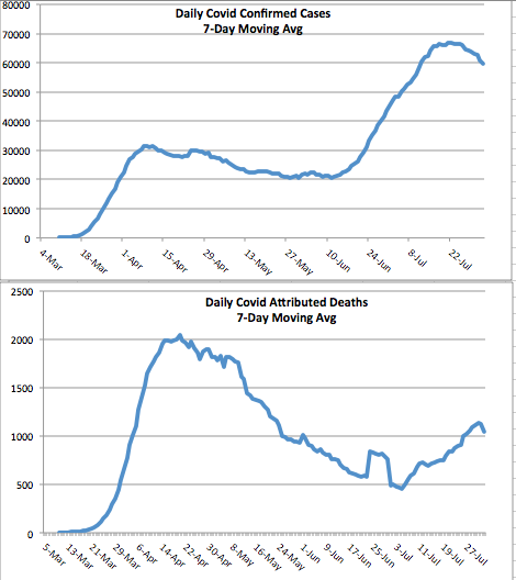
The data reported in the charts goes through September 12. The first few charts below are “mirror charts”: they show newly diagnosed C19 cases by day on top, right-side up; on the bottom of each chart are C19-attributed deaths, but the vertical axis is inverted to create the “mirror effect”. The scales on the bottom are heavily stretched compared to the top (deaths are much smaller than cases), and the scales for different countries aren’t comparable. The patterns are informative nevertheless, and I’ll provide per capita deaths separately.

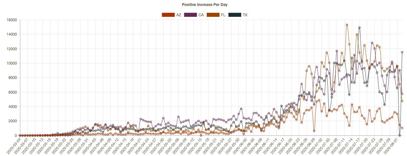
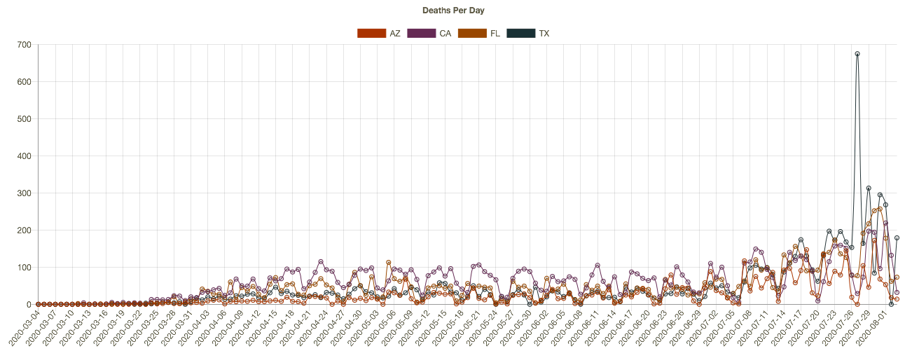
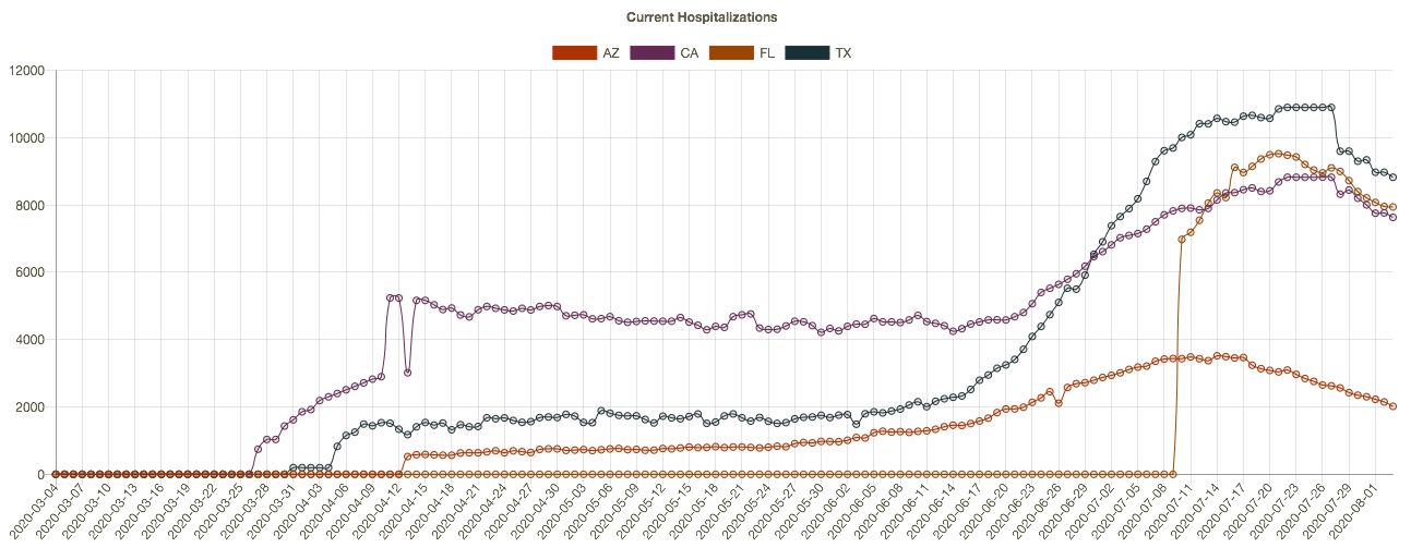
Let’s start with the U.S., where the early part of the pandemic in the spring was quite deadly, while the second, geographically distinct “wave” of the pandemic was less deadly. It looks bad, but the high number of deaths in the spring was partly a consequence of mismanagement by a few prominent government officials in the Northeast, most glaringly Governor Andrew Cuomo of New York. The full pattern for the U.S. combines different waves in different regions. The overall outcome to-date is 622 deaths per million of population.

Then we have charts for (deaths/mil in parens): the UK (628), Italy (591), Spain (653), France (467), Germany (114), the Netherlands (364), and Switzerland (240), which all have had second waves in cases, of but hardly any noticeable second wave in deaths, at least not yet:

And finally, we have Sweden (576), which had many deaths during the first wave, but very few now. Overall, to-date, Sweden has faired better than the U.S., Spain, the UK, and Italy — not to mention Belgium (870), for which I don’t have mirror charts.

There are several points to make about the charts:

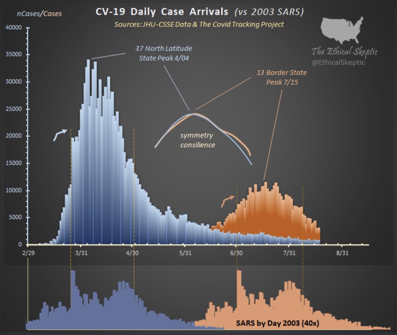
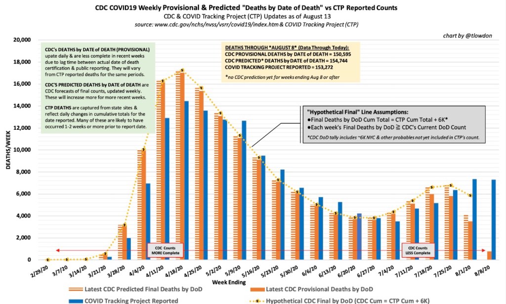
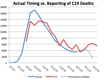
First, the so-called second wave this summer has not been as deadly as the virus was in the spring. The U.S. is not an exception in that regard, though it did have more C19 deaths than the other countries. The count of U.S. deaths in the summer was partly due to C19 false positives under a much heavier testing regime, as well as “death laundering” by public health authorities that looks suspiciously like a politicization of the attribution process: C19 deaths over the summer have been well in excess of what would be expected from C19 hospitalizations and ICU admissions. It’s also evident that deaths are being reallocated to C19 from other natural causes, as this chart from The Ethical Skeptic shows (compare the bright line for 2020 to the (very) dim but tightly clustered baselines from prior years):

Second, most of the charts for Europe (not Sweden) show a late summer escalation in cases, though cases in Spain and Germany appear to have crested already. If an uptrend in deaths is to follow, it should become noticeable soon. Thus far, the wave certainly looks less threatening. 

Finally, it’s noteworthy that Sweden’s early experience, which was plagued by mismanagement of the virus’ threat to the nursing home population, later transitioned to a dramatic fading of cases and deaths. There has been no late summer wave in Sweden as we’ve seen elsewhere. This despite Sweden’s far less stringent non-pharmaceutical interventions (NPIs). Sweden’s deaths per million of population are now less than in the US, the UK, Italy, Spain, and Belgium, and most of those differences are growing.

All of the other countries discussed above have had far more stringent lockdown policies than Sweden, and at far greater economic cost. The following charts show some cross-country comparisons of an Oxford University index of NPI stringency over time. It combines a number of different dimensions of NPIs, such as mask mandates, restrictions on public gatherings, and school closures. The first chart below shows the U.S. and the UK contrasted with Sweden. The other countries discussed above are shown in separate charts that follow. 

In the U.S., there has been tremendous variation across states in terms of stringency due to the federalist approach required by the U.S. Constitution, but overall, the Oxford measure for the U.S. has been broadly similar to the UK over time, with the largest departures from one another at the start of the pandemic.   


The stringency of NPIs over the full pandemic depends on their day-by-day strength as well as their duration at various levels. One could measure stringency indices and deaths at various points in time and produce all kinds of conflicting results as to the efficacy of NPIs. On the whole, however, these charts suggest that stringent NPIs hold no particular advantage except perhaps as a way to temporarily avoid overwhelming the health care system. Even the original “flatten the curve” argument acknowledged that the virus could not be avoided indefinitely at a reasonable cost via NPIs, especially in an otherwise free society.

Note that most of these countries eased their NPIs after the initial wave in the spring, but several remained far more stringent than Sweden’s policies. That did not prevent the second wave of cases, though again, those were far less deadly.

As Jacob Sullum writes, and what is increasingly clear to honest observers: lockdowns tend to be ineffective and even destructive over lengthy periods.

A working paper from the National Bureau of Economic Research finds that four different “stylized facts” about the growth in C19 deaths are consistent across countries and states having different policy responses to the virus. The authors say:

“… failing to account for these four stylized facts may result in overstating the importance of policy mandated [non-pharmaceutical interventions] for shaping the progression of this deadly pandemic.“

Here’s Bill Blain’s discussion of the inefficacy of lockdowns. And here is Donald Luskin’s summary of his firm’s research that appeared in the WSJ, which likewise casts extreme doubt on the wisdom of stringent NPIs.

The virus is far from gone, but this summer’s wave has been much more docile in both Europe and the U.S. There are reasons to think that subsequent waves will be dampened in many areas via the cumulative immunity gained from exposure thus far, not to mention improvements in treatment and knowledge regarding prophylaxis such as Vitamin D supplements. Government authorities and their public health advisors should dispense with the pretense that stringent NPIs can mitigate the impact of the virus at a reasonable cost. These measures are constitutionally flawed, impinge on basic freedoms, and look increasingly like government failure. Risk mitigation should be practiced by those who are either vulnerable or fearful, but for most people, particularly children and people of working age, those risks no longer appear to be much worse than a bad year for influenza.  

False Positives, False Cases, False Deaths

14 Monday Sep 2020

Posted by Nuetzel in Coronavirus, Pandemic

≈ Leave a comment

Tags

Andrew N. Cohen, Antibodies, Bruce Kessel, Coronavirus, COVID Deaths, Covid-19, False Negatives, False Positives, Infectious vs Infected, Michael G. Milgroom, NFL, PCR Tests, Positivity Rate, Rapid Tests, Seroprevalence, T-Cells, University of Arizona

The tremendous increase in testing for COVID-19 (C19) this summer was associated with an increase in cases. Most of these tests were so-called PCR tests with samples collected via deep nasal swabs. More testing did not fully explain the increased case load, but false positives (FPs) still accounted for a substantial share. That’s especially true in light of the decline in positivity rates, which reflected a decline in the actual prevalence of active infections. FPs also account for a substantial share of the deaths attributed to COVID, which are obviously cases of false attribution. If a test for C19 is positive, it will be listed on the death certificate.  

COVID Case Inflation

The exaggeration of confirmed cases due to FPs is more substantial as the prevalence of active infection declines. That’s because the share of true positives in the tested population declines, while the share of false positives must rise due to the greater share of uninfected individuals in the population.

Now, as the contagion is waning in former hot spots, there is a danger that FPs create the impression of persistence in the case counts. That’s costly not just for those incorrectly diagnosed, but also in terms of medical resources, for communities subject to excessive public intervention, such as inappropriate lockdowns, and in terms of the fear promoted by these inaccuracies.

FPs are extremely disruptive when testing is relied upon in critical situations such as health care staffing, or even among sports teams. For example, at the University of Arizona, out of 25 positive tests on September 3, only 10 were confirmed as positives in later tests. The NFL has also had its share of false positives. 

Lax Testing Standards

There is evidence that testing standards under CDC guidance are so broad that a large number of inactive, non-infectious cases are being flagged as positives (see the chart above for the intuition, as well as the graphic at the bottom of this post). The tests sometimes amount to a coin flip when it comes to evaluating positives; some of the positives might even come from non-novel coronaviruses such as the common cold! This paper by Andrew N. Cohen, Bruce Kessel, & Michael G. Milgroom – CKM) questions the guidance of public health authorities on testing more generally. From the abstract (my emphasis):

“Unlike previous epidemics, in addressing COVID-19 nearly all international health organizations and national health ministries have treated a single positive result from a PCR-based test as confirmation of infection, even in asymptomatic persons without any history of exposure. …  positive results in asymptomatic individuals that haven’t been confirmed by a second test should be considered suspect.”

False Positive Math

When I wrote about “The Scourge of False Positives” in July. I noted that a test specificity of 95% implies that 5% of uninfected individuals will falsely test positive. Unfortunately, that still produces a huge number of FPs when testing is broad. That’s NOT a good reason to avoid broad testing; it just means that positive tests should be confirmed by another test. (In this case, two tests with the same specificity reduce a 5% false positive rate to 0.25%. That’s why fast, cheap tests are necessary for confirmation.

Again, exaggerated case counts due to FP’s become more severe as a contagion wanes. That’s because FPs become an increasingly large share of positive test results and overstate the persistence of the virus. If active infections fall to 1% of 750,000 daily tests, or 7,500 true cases, the 5% specificity implies 37,125 FPs: true positives would be only 17% of positive cases. Much worse than a coin flip! And again, which cases are infectious?

How Bad Are FPs, Really?

This recent research, also authored by CKM, explains the reasons why FPs are usually an issue in the real world, despite the tests’ reportedly perfect reactivity to anything other than the virus’ genetic fragments. CKM find that the median FP rate in their sample of “tests of tests” was 2.3%. That means 23 out of every 1,000 uninfected people tested will test positive.

If that seems small to you, suppose the true prevalence of active infection in a population is 4%. If 1,000,000 people are tested and there are no false negatives (unlikely), then 40,000 infected people will be identified by the test. However, another 22,000 uninfected people will also test positive ((1,000,000 – 40,000 infected) x 0.023). That means the number of positive tests will be inflated by 55%. They’ll all receive some form of treatment or ordered into quarantine. Expanded Testing and FPs This summer, the volume of daily tests increased from about 150,000 a day in early April to more than 750,000 a day in July. That’s a 400% increase, but the true prevalence of active infection in the expanded test population during the summer was almost certainly lower than in the spring. Suppose active infections fell from 10% of the test population in the spring to 5% in the summer. That means the daily number of “true positives” would have risen from 15,000 to 35,000 in the expanded test population (and again I assume no false negatives for simplicity). The number of FPs, however, would have risen from 3,105 to 16,445. Therefore, FPs would have accounted for 40% of the increase in “confirmed” cases between spring and summer.

False COVID Deaths

FPs are also inflating COVID death counts. PCR tests are routinely given at hospital admission for any cause, and even after sudden death, especially as the availability of tests increased late in the spring. This subset of the tested population will certainly have its share of FPs. If such a patient dies, regardless of underlying cause, it might well be attributed to COVID-19 as it will still appear on the death certificate. The same has occurred in the case of traffic fatalities, suicides, and other sudden deaths.

Antibody Tests

The FP problem also plagues tests of seroprevalence, which determine whether an individual has had the virus or is cross-protected against the virus by antibodies acquired via non-novel coronavirus infections. The consequences of these antibody FPs can be serious as well, because it means a positive test might not ensure immunity. As the exposed share of the population increases, however, the FP share of antibody tests is diminished.

Conclusion

As long as testing is required, dealing with FPs (and false negatives, of course) requires repeated testing, as CKM state unequivocally. And the tests must be fast to be of any use. The current testing regime must be overhauled to prevent false positives from costly impositions on the lives of uninfected patients, consuming unnecessary medical resources, making unrealistic assessments of cases and deaths, and unnecessary suspensions of normal human social activity and liberty.

Teachers Face Low-to-Moderate COVID Risk

29 Saturday Aug 2020

Posted by Nuetzel in Education, Pandemic, School Choice, Uncategorized

≈ Leave a comment

Tags

Coronavirus, Covid-19, Digital Divide, Gymnasium Teachers, Occupational Risk, Online Learning, School Choice, School Closures, School Reform, Sweden, Teachers Unions

A quick follow-up to my recent post “COVID Hysteria and School Reform“: the graphic above is from an occupational risk study recently conducted by Swedish health authorities. The horizontal axis is obscured by the lower banner from Twitter (my fault), but the average risk of infection across all occupations was slightly less than 1%, and the highest-risk occupations were in the 4 – 5% range. Keep in mind, the data was collected while the virus was still raging in Sweden, while schools remained open. The virus hasn’t completely vanished in Sweden since then, but it has largely abated.

The study found that teachers had roughly average or below average risk, especially for pre-school and upper secondary (so-called “gymnasium”) teachers. The results demonstrate the lack of merit to claims by teachers unions that their members are somehow at greater risk of contracting coronavirus than other “essential” workers. We already know that children have extremely low susceptibility to COVID-19 and that they do not readily transmit the virus.

The health benefits of closing schools or taking them on-line do not compensate for the loss of educational effectiveness and detrimental health effects of preventing children from attending schools. The digital divide between children from disadvantaged households and their peers is likely to grow more severe if online learning is their only option. They should have choices, including functioning public schools.

To the last point, however, read this link for the sort of thing one teachers union supports. If the members are okay with that insanity then they shouldn’t be teaching your kids.

COVID Hysteria and School Reform

24 Monday Aug 2020

Posted by Nuetzel in Education, Pandemic, School Choice

≈ 1 Comment

Tags

Andrew Cuomo, Coronavirus, Donald Trump, Dr. Anthony Fauci, Glenn Reynolds, K-12 education, National Public Radio, NPR, Teachers Unions

Many haven’t quite gathered it in, but our public education system is an ongoing disaster for many low-income and minority students and families. The pandemic, however, is creating a major upheaval in K-12 education that might well benefit those students in the end. But before I get into that, a quick word about National Public Radio (NPR): it doesn’t make its political leanings a secret, which is why it should not be supported by taxpayers. Yes, like many other mainstream media outlets, NPR serves as a political front organization for Democrats (and worse).

Last week, NPR did a segment on “learning pods”, which I’d describe as private adaptations to the failure of many public schools (and teachers’ unions) to do their job during the pandemic. Glenn Reynolds passed along an interpretation of that NPR segment from a friend on Facebook, which I quote in its entirety below (bold emphasis mine). It was either this segment or else NPR has taken it down … but that link more or less matches the description. The post is somewhat satiric, but it captures much of what was actually said:

“Hilarious NPR, last week’s edition. They had an hour-long segment on learning pods. Participants: Host (white woman), Black Woman Activist, Asian Woman Parent, School-System Man.

Slightly editorialized (but true!) recollections below.

Host: In wealthy areas, parents get together and organize learning pods. What do we make of it?

School-System Man: Inequitable! Inappropriate! Bad! We do not support it!

Asian Woman Parent: Equity requires that we form these pods to educate our own children! Otherwise, only the rich can get education! Rich bad!

Host: Rich bad.

School-System Man: Rich horrible! They withdraw kids from public schools during the pandemic, so schools have less money!

Asian Woman Parent: We have no choice. You are not teaching.

Host: But what are you doing for the equity?

Asian Woman Parent: Why are the parents supposed to be doing something for the equity? That’s why we pay taxes, so professionals do something!

School-System Man: We cannot fix equity if you are clandestinely educating your own children, but not everyone else’s children!

Asian Woman Parent: The proper solution would have been to end the pandemic. But Trump did not end the pandemic. So, we must do learning pods. As soon as the pandemic is over, we’ll get back to normal, and everyone will catch up.

Everyone [with great relief]: Trump bad. Bad.

Black Woman Activist: No, wait a minute. This sounds as though in a regular school year, black children get good education. And they are getting terrible education! Unacceptable!

Host: Bad Trump!

Black Woman Activist: Foggeraboutit! It’s not Trump! It’s always been terrible! Black children are dumped into horrible public schools, where nobody is teaching them! So, my organization is now helping organize these learning pods for minority kids everywhere.

School-System Man [cautiously]: This is only helping Trump…

Black Woman Activist: Forget Trump! Don’t tell me black kids get no education because things are not normal now. When things were normal, their education was just as bad!

School-System Man: Whut??? How dare you! Our public schools are the best thing that ever happened to black children.

Asian Woman Parent: I’ll second that. Public schools in my neighborhood are just svelte.

Black Woman Activist: That’s the point! You live in a rich suburb, and your kids get a great public school! Black kids don’t!

Asian Woman Parent: If Trump managed the pandemic properly, we would not be having this conversation.

Host: Bad Trump!

Everyone: Bad Trump!

The end.”

Ah yes, so we’re back to blaming Donald Trump for following the advice of his medical experts, most prominently Dr. Anthony Fauci. And, while we’re at it, let’s blame Mr. Trump for following federalist principles by deferring to state and local governments to deal flexibly with the varying regional conditions of the pandemic, rather than ruling by federal executive edict. Of course, some of those state and local officials botched it, such as Andrew Cuomo. That’s tragic, but had Trump followed a more prescriptive tack, the howling from the Left would have been even more deafening.

We know that children are at little risk from the coronavirus. Nor do they seem to transmit the virus like older individuals, but teachers unions are adamant that the risks their members face at school would far exceed those shouldered by other “essential” workers. And the unions, not shy about partisanship even while representing public employees, want nothing more than to see Trump lose the election. So the unions and the schools districts they seem to control hold parents hostage. They collect their tax revenue and salaries while delivering virtual service at lower standards than usual, or no service at all. (Of course, public schools in some parts of the country are in session.) 

The teachers’ unions and public schools might get their comeuppance. The situation represents a tremendous opportunity for private schools, home schooling, and innovative schooling paradigms. Many private schools are holding classes in-person, more parents are homeschooling, and alternative arrangements like learning pods have formed, many of which are quite cost-effective.

Pressure is building to allow education dollars to follow individual students, not simply to flow to specific government schools. You can buy a decent K-12 education for $12,000 a year or so, and it’s likely to be a better education than you’ll get in many public schools. (One of the panelists on the NPR segment smugly called this an “insidious temptation”). At long last, parents would be allowed real choice in educating their children, and at long last schools would be incentivized to compete for those students. That might be one of the best things to come out of the pandemic.

COVID Seasonality and Latitudes

23 Sunday Aug 2020

Posted by Nuetzel in Pandemic

≈ 2 Comments

Tags

Air Conditioning, Antibodies, Antigenic Drift, Bimodal, Coronavirus, Covid-19, Ethical Skeptic, Heidi J Zapata, Herd Immunity, Herd Immunity Threshold, Humidity, Immune Response, Justin Hart, Latitude and Seasonality, Proofreading enzymes, Robert Edgar Hope-Simpson, SARS, SARS-CoV-2, Seasonality, Sunlight, T-Cell Immunity, Temperature, Tropical Latitudes, Viral Load, Viral Mutation, Vitamin D Deficiency

The coronavirus (C19), or SARS-CoV-2, has a strong seasonal component that appears to closely match that of earlier SARS viruses as well as seasonal influenza. This includes the two distinct caseloads we’ve experienced in the U.S. 1) in the late winter/early spring; and 2) the smaller bump we witnessed this summer in some southern states and tropics. 

COVID Seasonal Patterns and Latitude

The Ethical Skeptic on Twitter recently featured the chart below. It shows the new case count of C19 in the U.S. in the upper panel, and the 2003 SARS virus in the lower panel. Both viruses had an initial phase at higher latitudes and a summer rebound at lower latitudes.


I particularly like the following visualizations from Justin Hart demonstrating the pandemic’s pattern at different latitudes (shown in the leftmost column). The first table shows total cases by week of 2020. The second shows deaths per 100,000 of population by week. Again, notice that lower latitudes have had a crest in the contagion this summer, while higher latitudes suffered the worst of their contagion in the spring. Based on deaths in the second table, the infections at lower latitudes have been less severe.

Viral Patterns in the South

Many expected the pandemic to abate this summer, including me, as it is well known that viruses don’t thrive in higher temperatures and humidity levels, and in more direct sunlight. So it is a puzzle that southern latitudes experienced a surge in the virus during the warmest months of the year. True, the cases were less severe on average, and sunlight and humidity likely played a role in that, along with the marked reduction in the age distribution of cases. However, the SARS pandemic of 2003 followed the same pattern, and the summer surge of C19 at southern latitudes was quite typical of viruses historically.

A classic study of the seasonality of viruses was published in 1981 by Robert Edgar Hope-Simpson. The next chart summarized his findings on influenza, seasonality, and latitude based on four groups of latitudes. Northern and southern latitudes above 30° are shown in the top and bottom panels, respectively. Both show wintertime contagions with few infections during the summer months. Tropical regions are different, however. The second and third panels of the chart show flu infections at latitudes less than 30°. Influenza seems to lurk at relatively low levels through most of the year in the tropics, but the respective patterns above and below the equator look almost like very muted versions of activity further to the north and south. However, some researchers describe the tropical pattern as bimodal, meaning that there are two peaks over the course of a year.   

So the “puzzle” of the summer surge at low latitudes appears to be more of an empirical regularity. But what gives rise to this pattern in the tropics, given that direct sunlight, temperature, and humidity subdue viral activity?

There are several possible explanations. One is that the summer rainy season in the tropics leads to less sunlight as well as changes in behavior: more time spent indoors and even less exposure to sunlight. In fact, today, in tropical areas where air conditioning is more widespread, it doesn’t have to be rainy to bring people indoors, just hot. Unfortunately, air conditioning dries the air and creates a more hospitable environment for viruses. Moreover, low latitudes are populated by a larger share of dark-skinned peoples, who generally are more deficient in vitamin D. That might magnify the virulence associated with the flight indoors brought on by hot and or rainy weather.   

Mutations and Seasonal Patterns

What makes the seasonal patterns noted above so reliable in the face of successful immune responses by recovered individuals? And shouldn’t herd immunity end these seasonal repetitions? The problem is the flu is highly prone to viral mutation, having segments of genes that are highly interchangeable (prompting so-called “antigenic drift“). That’s why flu vaccines are usually different each year: they are customized to prompt an immune response to the latest strains of the virus. Still, the power of these new viral strains are sufficient to propagate the kinds of annual flu cycles documented by Hope-Simpson.

With C19, we know there have been up to 100 mutations, mostly quite minor. Two major strains have been dominant. The first was more common in Southeast Asia near the beginning of the pandemic. It was less virulent and deadly than the strain that hit much of Europe and the U.S. Of course, in July the media misrepresented this strain as “new”, when in fact it had become the most dominant strain back in March and April.

What Lies Ahead

By now, it’s possible that the herd immunity threshold has been surpassed in many areas, which means that a surge this coming fall or winter would be limited to a smaller subset of still-susceptible individuals. The key question is whether C19 will be prone to mutations that pose new danger. If so, it’s possible that the fall and winter will bring an upsurge in cases in northern latitudes both among those still susceptible to existing strains, and to the larger population without immune defenses against new strains.

Fortunately, less dangerous variants are more more likely to be in the interest of the virus’ survival. And thus far, despite the number of minor mutations, it appears that C19 is relatively stable as viruses go. This article quotes Dr. Heidi J. Zapata, an infectious disease specialist and immunologist at Yale, who says that C19:

“… has shown to be a bit slow when it comes to accumulating mutations … Coronaviruses are interesting in that they carry a protein that ‘proofreads’ [their] genetic code, thus making mutations less likely compared to viruses that do not carry these proofreading proteins.”

The flu, however, does not have such a proofreading enzyme, so there is little to check its prodigious tendency to mutate. Ironically, C19’s greater reliability in producing faithful copies of itself should help ensure more durable immunity among those already having acquired defenses against C19.

This means that C19 might not have a strong seasonal resurgence in the fall and winter. Exceptions could include: 1) the remaining susceptible population, should they be exposed to a sufficient viral load; 2) regions that have not yet reached the herd immunity threshold; and 3) the advent of a dangerous new mutation, though existing T-cell immunity may effectively cross-react to defend against such a mutation in many individuals.


The FDA Can Put Virus Behind Us, Sans Vaccine

19 Wednesday Aug 2020

Posted by Nuetzel in Liberty, Pandemic, Vaccinations

≈ 1 Comment

Tags

Alex Tabarrok, Anti-Vaxers, Coronavirus, COVID Screening, Covid-19, E25Bio, Emergency Use Authorization, False Positive, Falze Negative, FDA, Harvard, Infectious vs Infected, John Cochrane, National Basketball Players Association, NBA, Paper Tests, Rapid Tests, Regulatory Failure, SalivaDirect, Self-Quarantine, Test Accuracy, Tracing, Transmission Chain, Vaccine Development, Vaccine Supply Chain, Wyss Institute for Biologically Inspired Engineering, Yale, Zach Lowe

Most of the news about COVID vaccine development is positive, but there are still huge doubts about 1) whether an effective vaccine(s) will ever be available; 2) when it will be available; 3) in what quantities (supply chains for vaccines present issues that most lay persons would never imagine) ; 4) the best approaches to allocation across young/healthy vs. old/vulnerable; 5) how long it will provide protection (the news is good on lasting immunity as well); and 6) whether people will actually take it. Given all these uncertainties, it’s worth considering an approach to stanching the coronavirus that won’t require a vaccine while still allowing a return to normalcy: cheap, rapid tests available to consumers on a daily basis in their homes or in businesses.

The full benefits of cheap, rapid tests can take people a while to wrap their heads around. In fact, there are skeptics who’s views on any and all testing are colored by suspicions that increased testing is some sort of conspiracy to spread fear and keep the economy hobbled. It’s true that increased testing drove much of the increase in COVID cases this summer, which caused the mainstream media to delight in spinning alarmist narratives. Fair enough, but that misses the point, which I’ll try to elucidate below. I credit a John Cochrane post for bringing this to my attention.

A successful vaccine breaks the so-called “transmission chain”, but so does frequent testing to identify infectious individuals on an ongoing basis so they can self-quarantine. As Alex Tabarrok has emphasized, we should worry about identifying infectious individuals, as opposed to infected individuals. They are not the same. Cheap, rapid, and easy-to-administer tests have already proven to be fairly accurate during the infectious stage. The idea is for individuals to self-test every day and stay home if they are positive. Or, employers can test workers every day and send them home if they are positive. Frequent testing also makes it simpler to trace the source of an infection and may reduce the importance of tracing.

To those who say this represents an affront to personal liberty, and I’m very touchy on that subject myself, recall that even now people are being screened in their workplaces using thermometers, questionnaires, or on the basis of any frogginess perceived by supervisors and co-workers. Those “tests” are far less accurate in identifying COVID-19 contagiousness than the kinds of cheap tests at issue here, and they are certainly no less intrusive. Then there are the many businesses facing restrictions on their operations: how “accurate” is it to keep everyone at home by locking down places of business? How intrusive is that? Those restrictions are indefensible, and especially with the advent and diffusion of cheap, rapid tests.

Of course, people might cheat and not report positives. Tests could be administered at workplaces to avoid that possibility, or at points of admission to businesses and facilities, but a few minutes of delay would be necessary. I would not support a centralized database of daily test results. If nothing else, relying on the good faith of individuals in reporting their results would be a giant leap forward in breaking the transmission chain now, rather than counting on the possibility of a successful virus in the indefinite future. And we might then avoid the whole pro-vax/anti-vax imbroglio that already foments, which raises major questions bearing on individual liberty.

Then there is the question of positive tests within multi-person households. Should the entire family or household self-quarantine? I say no, not if the others are negative, but then the others should test twice before going out, which dramatically reduces the probability of a false negative, and they should probably test more frequently, perhaps several times a day.

There are other important details to address: Who will pay for the tests? Will workers be paid to stay home if they test positive? How long will they be required to stay home? How will repeated tests be treated? I don’t want to get into detail on all of these points, but cheap, fast tests can help overcome many of these difficulties, and I believe many of the details can and should be worked out privately.

Unfortunately, the FDA has approved only two rapid tests, and they are not very rapid and not cheap enough. Only one had been approved up until last weekend because the FDA found the accuracy to be lacking … compared to PCR tests! But the FDA finally issued an Emergency Use Authorization for a saliva-based test (SalivaDirect) developed at Yale, partly funded by the NBA and the Players Association. The test still requires processing at a lab, so it’s really not convenient enough and not fast enough. Here is Zach Lowe on the cost:

“The cost per sample could be as low as about $4, though the cost to consumers will likely be higher than that — perhaps around $15 or $20 in some cases, according to expert sources.”

Not bad, but it’s much higher than more rapid, paper tests developed by Harvard’s Wyss Institute for Biologically Inspired Engineering and a company called E25Bio. Both of those are expected to cost about $1 per sample and can be completed anywhere. That’s a price that can work. And there are other promising candidates.

The benefits of tests that are rough, ready, and cheap will be huge. Such tests will also enable retesting, which helps to overcome the dilemmas of false positives and negatives. False negatives might be of greater concern to the FDA, but again, false negatives are less likely during the contagious stage of an infection, and the tests will be accurate enough that transmission risk will be drastically reduced.

The FDA needs to move beyond its stodgy insistence on achieving laboratory levels of accuracy. It’s unlikely that a single test source will be adequate to stanch the transmission chain, so the agency should rush to approve as many cheap, rapid tests as possible, with as many advisories and patient warnings regarding test results and follow-up instructions as it deems necessary. Remember, these tests are much better than thermometers!

Evidence of Fading COVID Summer Surge

16 Sunday Aug 2020

Posted by Nuetzel in Pandemic

≈ Leave a comment

Tags

CDC, CLI, Covid Tracking Project, Covid-19, COVID-Like Illness, Date of Death, FEMA, FEMA Regions, Herd Immunity Threshold, Hospitalizations, Kyle Lamb, PCR Test, Percent Positive, Provisional Deaths

Lately I’ve talked a lot about reported deaths each week versus deaths by actual date of death (DOD). Much of that information came from Kyle Lamb’s Twitter account, and he’s the source of the charts below as well. The first one provides a convenient summary of the data reported through last week. The blue bars are reported deaths each week from the COVID Tracking Project (CTP), which are an aggregation of deaths that actually occurred over previous weeks. Again, the blue bars do NOT represent deaths that occurred in the reporting week. The solid orange bars are “provisional” actual deaths by DOD. “Provisional” means that recent weeks are not complete, though most deaths by DOD are captured within three to four weeks. The CDC also produces a “forecast” of final death counts by DOD, shown by the hatched orange bars.   

Note that the recent surge in deaths has been much smaller than the one in the spring, which was driven by deaths in the northeast. The CDC “expects” actual deaths by DOD to have declined starting after the week of July 23rd. However, CTP was still reporting deaths of over 1,000 per day last week. The actual timing of those deaths in prior weeks, and the ultimate extent of the summer surge in COVID deaths, remains to be seen.

Certain leading indicators of deaths are signaling declines in actual deaths in August. Two of those indicators are 1) the positivity rate on standard PCR tests for infections; and 2) the share of emergency room visits made for symptoms of “COVID Like Illness” (CLI). The charts below show those indicators for FEMA regions that had the largest uptrends in cases in June and July. Florida is part of Region 4, shown in the next chart:

Here is the Region 6, which includes Texas:

Finally, Region 8 includes Arizona and California:

Out of personal interest, I’m also throwing in Region 7 with a few midwestern states, where cases have risen but not to the levels reached in Regions 4, 6, and 8:

With the exception of the last chart, the clear pattern is a peak or plateau in the positivity rate in late June through late July, followed by declines in subsequent weeks. The share or ER visits for CLI was not quite coincident with the positivity rate, but close. The decline in the CLI share is evident in Regions 4, 6 and 8. Again, these three regions include states that drove the nationwide increase in cases this summer (AZ, CA, FL, and TX), and the surge appears to have maxed out.     

Here is a chart showing the share of CLI visits to ERs for all ten FEMA region from mid-June through last week. Clearly, this measure is improving across the U.S.

Nationwide, the CLI percentage at ERs has decreased by about 47% over the past four weeks, and the positivity rate has decreased by about 28% in that time. In addition to these favorable trends, COVID hospitalizations have decreased by about 40% over the past three weeks. All of these trends bode well for a downturn in COVID-attributed deaths.

The summertime surge in the virus was not nearly as ravaging as in the spring, and it appears to be fading. We’ll await developments in the fall, but we’ve come a long way in terms of protecting the vulnerable, treating the infected, approaching herd immunity thresholds (which means reduced rates of transmission to susceptible individuals), and the real possibility that we can put the pandemic behind us. 

Joe’s Moronic Outdoor Mask Mandate

15 Saturday Aug 2020

Posted by Nuetzel in Pandemic, Public Health

≈ 1 Comment

Tags

Absolute Humidity, Aerosol Transmission, Covid-19, Dr. Anthony Fauci, Droplet Transmission, Federalism, Indoor Transmission, Joe Biden, Kansas Department of Health and Environment, Kansas Policy Institute, KDHE, Mask Mandate, Outdoor Transmission, Randomized Control Trial, The Sentinel, UV Rays

Do you wear a mask whenever you step outside? In your yard? At the beach? In the park? On an empty sidewalk? Then congratulations! You are a colossal imbecile, like all the others in the mandatory mask crowd. Now, Joe Biden, in an attempt to prove either dementia or a full-fledged alliance with irredeemably lefty Karens, is demanding a three-month nationwide mandate for masks to be worn by everyone … OUTDOORS!

Really, what kind of moron believes there is any real danger of contracting coronavirus outside short of close and prolonged exposure to an infected individual? We know outdoor transmission is extremely rare. Nearly 100% of cases are contracted indoors, almost always in tight, poorly ventilated spaces.

It’s not hard to fathom why outdoor environments are of such low risk. Outdoors, air is of such enormous volume that virus particles are quickly diluted, dramatically reducing any viral load one might encounter. Air circulation is much better outdoors as well, driven by differences in temperatures across lateral and vertical space. Any breeze effectively disperses the particles. And those small loads drifting through open air won’t survive long: the ultraviolet waves in direct sunlight tend to kill it very quickly. Humidity is also associated with more rapid deactivation of the virus. Air tends to be more humid outdoors whenever forced air heating or air conditioning are used without sufficient humidification.

Cloth masks, in any case, may be effective against transmission by droplets expelled from coughs or sneezes, but they are of questionable value against transmission by aerosols from exhaled air. Outside, if you are distanced, you really have only aerosols to worry about. Under those circumstances, cloth masks are more for show than anything else.

And on what pretext do officials, or your nitwitted neighbors, get the idea that mandatory masks OUTSIDE is in the interest of public health? I mean, besides buying-in to a ridiculous nanny-state narrative promoted by the media? Well, there is also some crap “research” to consider. Here is a good example: a study on masks from the Kansas Department of Health and Environment (KDHE). Take a look at what these guys tried to pull off…  Here’s what KDHE hoped would serve as “proof” of the dramatic efficacy of masks:

Wow! Notice two things in this chart: 1) the two lines are plotted with respect to different vertical axes; and 2) the chart begins on July 12th. Now take a look at a longer history in which the lines are plotted against the same axis.

It certainly doesn’t appear that the mandate beginning on July 3 had a favorable impact on new cases. What KDHE did here was incredibly dishonest, and I applaud the Kansas Policy Institute and it’s publication The Sentinel (linked above) for calling out KDHE for their dishonest piece of crap.

Other studies have exaggerated the general efficacy of masks as well. It’s also noteworthy that Europe’s medical establishment is unimpressed with masks. And after all, to my knowledge there have been no randomized control trials supporting the efficacy of masks — the only acceptable form of test according to Anthony Fauci! Now, none of that means masks don’t reduce COVID transmission. I happily wear a mask when I enter public buildings. What’s at issue here is whether masks should be required outdoors. Furthermore, I dispute the notion that a nationwide mask mandate is needed, because not all localities are at equal risk. I’m an advocate of the federalist principle that the best state and local solutions are crafted at the state and local levels. And at a personal level, I say ignore the intrusive bastards. Get outside in the fresh air, and forget the mask if you have some space.

Election Snafus, Fraud: Invite and They Will Come

12 Wednesday Aug 2020

Posted by Nuetzel in Democracy, Pandemic, Voter Fraud

≈ 2 Comments

Tags

19th Amendment, Absentee Ballots, Amy Klobuchar, Atlantic County NJ, Ballot Harvesting, CalTech, CBS, Charles Stewart III, Eric Boehm, European Union, Fraud Risk, J Christian Adams, Logan Churchwell, Mail-In Voting, Mark Harris, Massachusetts Institute of Technology, New York Times, PILF, Postal Voting, Public Interest Legal Foundation, Reason.com, Ron Wyden

There is understandable controversy over the prospect of more mail-in voting, but it’s reasonable to believe that some additional mail-in or postal voting may be necessary in light of the pandemic. Social distancing reduces the volume of activity that polling places can handle in a single day, and administrative decisions about the voting process can’t be deferred until late October in order to observe the state of the pandemic and make last-minute changes. Most states already permit voters to request a mail-in ballot for a variety of reasons: travel, illness, or other exigencies are usually sufficient, if a reason is even required. In the context of the pandemic, such a request should certainly be granted to those most concerned about contracting the coronavirus. So the option to vote by mail seems reasonable, at least in the abstract, as long as those who prefer to cast their ballots in person can do so.

“Universal” mail-in voting is another story, but the term first requires some qualification. I construe “universal” in this case to mean voting by citizens of the United States, a right protected and reserved to citizens by the 19th Amendment to the Constitution. That also means voters must be registered and must comply with state requirements for identification, if any, before receiving a ballot. In other words, under current state laws, a voter might be required to appear before an election authority to obtain a ballot for return by mail. The proponents of universal postal mail, however, seem to think states should simply mail ballots to the addresses of all registered voters. Many proponents go further, suggesting that all individuals of voting age should be mailed ballots.

The first major problem with a large expansion of postal voting is administrative complexity. It would represent a significant challenge for many jurisdictions to arrange in short order. It’s bound to create major delays in counting and reporting results, and it is likely to create doubt as to the reliability of the official election results. Here are some administrative issues and examples worth considering:

This recent experiment by CBS revealed delays in the official receipt of mailed ballots, a problem that will be more acute given plans in some jurisdictions to send ballots to postal voters only a week prior to the November election. The study also revealed some mis-sorting and misplacement of returned ballots. It concluded that a percentage of voters is likely to be “disenfranchised” by mail-in voting.

In early August, primary balloting by mail in Atlantic County, NJ was said to be especially problematic. Signatures on ballots were difficult to match to DMV records signed on “screen”; there was an extra step in delivering ballots to a central post office location and then on to election officials, causing delays; the voter registration system was plagued by technical glitches related to heavy demand for updated records; and there was insufficient time between sending ballots to voters and the deadline.

New York City’s primary election in June was similarly afflicted with a high rate of invalid mailed ballots. “The city BOE received 403,103 mail-in ballots for the June 23 Democratic presidential primary. … But the certified results released Wednesday revealed that only 318,995 mail-in ballots were counted. … That means 84,108 ballots were not counted or invalidated — 21 percent of the total. … One out of four mail-in ballots were disqualified for arriving late, lacking a postmark or failing to include a voter’s signature, or other defects. The Post reported Tuesday that roughly 30,000 mail-in ballots were invalidated in Brooklyn alone. … The high invalidation rate provides more proof that election officials and the Postal Service were woefully underprepared to handle and process the avalanche of mail-in ballots that voters were encouraged to fill out to avoid having to go to the polls during the coronavirus pandemic, critics said.”

From the New York Times, “In the last presidential election, 35.5 million voters requested absentee ballots, but only 27.9 million absentee votes were counted, according to a study [NYT link is bad] by Charles Stewart III, a political scientist at the Massachusetts Institute of Technology. He calculated that 3.9 million ballots requested by voters never reached them; that another 2.9 million ballots received by voters did not make it back to election officials; and that election officials rejected 800,000 ballots. That suggests an overall failure rate of as much as 21 percent.”

The problem of rejected mail-in ballots is all too common throughout the country. For example, redistricting can cause mail-in voters to cast their votes in the wrong precinct at a higher rate; people move frequently, especially low-income voters, so updating voter rolls is a tremendous challenge; and voters often fail to follow instructions carefully, and there is no one at hand to offer assistance.

Again, these are just the administrative problems. The upshot is that mail-in voting is likely to introduce uncertainties and delays in determining election outcomes, and is likely to result in numerous legal challenges as well.

This piece by Eric Boehm in Reason is skeptical of our ability to vote by mail without major complications of that kind. Boehm then turns to the question of mail-in ballots and fraud, however, quoting a variety of experts who claim that election fraud is a miniscule problem and that fraud has not had a partisan bias in the past. But partisan bias is not really the critical issue… fraud is, party by party, district by district, and state by state.

Despite Boehm’s protestations and widespread denial in the news media, election fraud is a “thing”. More importantly, the risk of election fraud is a thing. It’s instructive that two U.S. Senators (Ron Wyden (OR) and Amy Klobuchar (MN)) have introduced legislation that not only would authorize more widespread voting by mail, but “ballot harvesting” as well. The latter is the practice of visiting homes and “offering” to collect residents’ postal ballots for delivery to collection points. It has been a flagrant form of vote fraud in the past.

So what is our experience with fraud? Here is a “sampling” of 1,290 cases of election fraud, many of which involved absentee ballots and ballot harvesting. Detail on most of these cases can be found here.

The following testimonial reinforces the ease with which fraud can be perpetrated via mail-in voting:”I know because I did it“:

“Last year, a political operative working for North Carolina Republican congressional candidate Mark Harris was charged with fraud for directing a group of people to fill out as many as one thousand absentee ballot requests on behalf of voters — most of whom were unaware the ballots were being requested. … These people then collected the ballots and filled them out themselves. … 

Also in 2019, a Democratic city clerk in Southfield, Michigan, was arrested and charged with six felonies for falsifying absentee ballot records to say that 193 of the ballots in one election were missing signatures or a return date, when in fact they had both. The correct records were found in the trash can in her office.

… J. Christian Adams of the Public Interest Legal Foundation (PILF) says if states aren’t careful, they’ll be issuing ‘an open invitation to fraud. … There are two big problems with vote by mail,’ Adams told InsideSources. ‘Number one … people voting the ballot for other people through undue influence. … The second one — the voter rolls are a mess.’ … Adams’ organization has sued several states and counties for refusing to maintain accurate voter rolls, allowing the names of thousands of dead voters, felons and non-citizens to remain in the system.”

Fraud risk always exists even if detected and proven levels of fraud are low, and the level of risk scales with the extent to which ballots are cast by mail. The sudden, massive expansion in mail-in voting now contemplated by some would create unprecedented opportunities for fraud.

Consider the 28 million mail-in ballots that went missing between 2012 and 2018, roughly 20% of mail-in ballots issued during those years. According to Logan Churchwell of PILF:

“So what do people that really focus on the election process do about that? They go into ballot harvesting. If there’s so many ballots out there in the wind unaccounted for by election officials, surely some manpower could be dedicated to go bring them in. And that’s another part of the system where you have weaknesses and risk.”

It takes only a small percentage of the vote to swing many elections, so ballot harvesting, enabled by more widespread voting-by-mail, is a serious threat to the integrity of the democratic process. The last link cites a few reports that should give mail voting proponents some pause:

“There’s little doubt that as the number of mail-in ballots increases, so does fraud. A 2012 report in The New York Times noted that voter fraud involving mail-in ballots ‘is vastly more prevalent than the in-person voting fraud that has attracted far more attention, election administrators say. In Florida, absentee-ballot scandals seem to arrive like clockwork around election time.’ According to a Wall Street Journal report on voter exploitation in Hispanic communities in Texas, mail-in ballots have ‘spawned a mini-industry of consultants who get out the absentee vote, sometimes using questionable techniques.’ Poor, elderly, and minority communities are most likely to be preyed upon by so-called ballot ‘brokers.’

Concerns about fraud in mail-in ballots were serious enough that a 2008 report produced by the CalTech/MIT Voting Technology Project recommended that states ‘restrict or abolish on-demand absentee voting in favor of in-person early voting.'”

It’s no coincidence that most countries in the European Union restrict mail-in voting to those who are unable to vote in-person, such as those working or studying abroad, as well as the sick and elderly. There are exceptions, of course, but many of these developed countries reject the notion that mail-in voting is worth the risks.

It’s reasonable to expect many cautious voters to request ballots for return by mail. But at a minimum, any large-scale transition to postal voting should be done with care for the security and integrity of the voting process. It is not an exercise to be done in haste, as proponents now demand. The result of such a drastic change would be significant delays, legal challenges, and reduced confidence in the outcome of elections. And there will almost certainly be fraud. As in almost all things, a voluntary option subject to jurisdictional risk controls is far preferable to either mandatory or “universal” postal voting.

COVID at Midsummer

04 Tuesday Aug 2020

Posted by Nuetzel in Pandemic, Public Health

≈ 2 Comments

Tags

Arizona, California, CDC, Coronavirus, COVID Time Series, Covid Tracking Project, Covid-19, Fatality Rate, Florida, Hospitalizations, Illinois, Kyle Lamb, Missouri, New Cases, New York, Provisional Deaths, Regional Variation, South Carolina, Tennessee, Texas

It’s been several weeks since I last posted on the state of the coronavirus pandemic (also see here). The charts below show seven-day moving averages of new confirmed cases and reported C19 deaths from the COVID Tracking Project as of August 3. Daily new cases began to flatten about three weeks ago and then turned down (it can take a few days for such changes to show up in a moving average). Daily C19-attributed deaths began climbing again in early July, lagging new cases by a few weeks, and they slowed just a bit over the past several days. Obviously, both are good news if those changes are maintained. The other thing to note is that deaths have remained far below their levels of April and early May.

The daily death count is that reported on each date, not when the deaths actually occurred. Each day’s report consists of deaths that were spread across several previous weeks or even a month or more. That makes the slight downturn in deaths more tenuous from a data perspective. There are sometimes large numbers of deaths from preceding weeks reported together on a single day, so reporting can be ragged and the final pattern of actual deaths is not known for some time. More on that below.

States

The increase in cases and deaths during late June and July was concentrated in four states: Arizona, California, Florida, and Texas. Here’s how those states look now in terms of cases and deaths, from the interactive COVID Time Series site:


New cases began to flatten or drop in these states two to three weeks ago, driving the change in the national data. Daily deaths have not turned convincingly, but again, these are reported deaths, which actually occurred over previous weeks. One more chart that is suggestive: current hospitalizations in these four states. The recent declines should bode well for the trend in reported deaths, but it remains to be seen. 

Meanwhile, other parts of the country have seen an uptrend in cases and deaths, such as Illinois, Missouri, South Carolina, and Tennessee. Here are new cases in those states:

It’s worth emphasizing that the elevated level of new cases this summer has not been associated with the rates of fatality experienced in the Northeast during the spring. There are many reasons: better patient care, new treatments, more direct summer sunlight, higher humidity, and tighter controls in nursing homes.

More On the Timing of Deaths

Back to the discrepancies in the timing of reported deaths and actual deaths. This is important because the reported totals each day and each week can be highly misleading, even to the point of frightening the public and policy makers, with consequent psychological and economic impacts.

The latest summary of provisional vs. reported deaths is shown below, courtesy of Kyle Lamb, who posts updates on his Twitter feed. This report ends with the last complete week ending August 1. It’s a little hard to read, but you might get a better look if you click on it or turn your phone sideways. Some of the key series are also graphed below. 

The table shows the actual timing of deaths in the fourth column, with dates alongside. The pattern differs from the statistics reported by the Covid Tracking Project (CTP) in the top row (shaded orange), and from the totals of actual deaths by reporting day in the third row (shaded gray). The reporting dates are always later than the dates of death. This can be seen in the chart below. The most obvious illustration is how many of the deaths from around the peak in mid-April were reported in May. In March and April, the daily reports were short of the ultimate actual death counts because so few deaths with associated dates were known by then.


The right-hand end of the red line shows that many deaths reported by CTP have not yet been placed at an actual date of death by the CDC.  At this point, the actual date of death has not been placed for over 10,000 deaths! Again, those will be spread over earlier weeks.

The blue line is dashed over the last four weeks because those counts are most “highly” provisional. Small changes in the actual counts are likely for dates even before that, but the last four weeks are subject to fairly substantial upward revisions. Eventually, the right end of the blue line will more closely approximate the totals shown in red.

To get an indication of trends in the actual timing of deaths, I plotted the weekly actual deaths reported for the last four reporting weeks going back in time. In the table, those are the four lowest, color-coded diagonals. In the graph below, which should include the qualifier “by recency of report week”, actual deaths in the most recent report week are represented by the blue line, the prior weekly report is red, followed by green (three weeks prior), and purple (four weeks prior… sorry, the colors are not consistent with those in the table). The lines extend farther to the right for more recent report weeks.

The increase in actual deaths occurring in July has declined or flattened in each of the four most recent report weeks. Only the second-to-last week increased as of the August 1st report. On the whole, those changes seem favorable, but we shall see.

Closing

It’s getting trite to say, but the next few weeks will be interesting. The increase in deaths in July was a sad development, but at least the extent of it appears to have been limited. Even with a somewhat higher death count, the fatality rate continued to decline. Let’s hope any further waves of infections are even less deadly.

← Older posts
Newer posts →
Follow Sacred Cow Chips on WordPress.com

Recent Posts

  • The Case Against Interest On Reserves
  • Immigration and Merit As Fiscal Propositions
  • Tariff “Dividend” From An Indigent State
  • Almost Looks Like the Fed Has a 3% Inflation Target
  • Government Malpractice Breeds Health Care Havoc

Archives

  • January 2026
  • December 2025
  • November 2025
  • October 2025
  • September 2025
  • August 2025
  • July 2025
  • June 2025
  • May 2025
  • April 2025
  • March 2025
  • February 2025
  • January 2025
  • December 2024
  • November 2024
  • October 2024
  • September 2024
  • August 2024
  • July 2024
  • June 2024
  • May 2024
  • April 2024
  • March 2024
  • February 2024
  • January 2024
  • December 2023
  • November 2023
  • August 2023
  • July 2023
  • June 2023
  • May 2023
  • April 2023
  • March 2023
  • February 2023
  • January 2023
  • December 2022
  • November 2022
  • October 2022
  • September 2022
  • August 2022
  • July 2022
  • June 2022
  • May 2022
  • April 2022
  • March 2022
  • February 2022
  • January 2022
  • December 2021
  • November 2021
  • October 2021
  • September 2021
  • August 2021
  • July 2021
  • June 2021
  • May 2021
  • April 2021
  • March 2021
  • February 2021
  • January 2021
  • December 2020
  • November 2020
  • October 2020
  • September 2020
  • August 2020
  • July 2020
  • June 2020
  • May 2020
  • April 2020
  • March 2020
  • February 2020
  • January 2020
  • December 2019
  • November 2019
  • October 2019
  • September 2019
  • August 2019
  • July 2019
  • June 2019
  • May 2019
  • April 2019
  • March 2019
  • February 2019
  • January 2019
  • December 2018
  • November 2018
  • October 2018
  • September 2018
  • August 2018
  • July 2018
  • June 2018
  • May 2018
  • April 2018
  • March 2018
  • February 2018
  • January 2018
  • December 2017
  • November 2017
  • October 2017
  • September 2017
  • August 2017
  • July 2017
  • June 2017
  • May 2017
  • April 2017
  • March 2017
  • February 2017
  • January 2017
  • December 2016
  • November 2016
  • October 2016
  • September 2016
  • August 2016
  • July 2016
  • June 2016
  • May 2016
  • April 2016
  • March 2016
  • February 2016
  • January 2016
  • December 2015
  • November 2015
  • October 2015
  • September 2015
  • August 2015
  • July 2015
  • June 2015
  • May 2015
  • April 2015
  • March 2015
  • February 2015
  • January 2015
  • December 2014
  • November 2014
  • October 2014
  • September 2014
  • August 2014
  • July 2014
  • June 2014
  • May 2014
  • April 2014
  • March 2014

Blogs I Follow

  • Passive Income Kickstart
  • OnlyFinance.net
  • TLC Cholesterol
  • Nintil
  • kendunning.net
  • DCWhispers.com
  • Hoong-Wai in the UK
  • Marginal REVOLUTION
  • Stlouis
  • Watts Up With That?
  • Aussie Nationalist Blog
  • American Elephants
  • The View from Alexandria
  • The Gymnasium
  • A Force for Good
  • Notes On Liberty
  • troymo
  • SUNDAY BLOG Stephanie Sievers
  • Miss Lou Acquiring Lore
  • Your Well Wisher Program
  • Objectivism In Depth
  • RobotEnomics
  • Orderstatistic
  • Paradigm Library
  • Scattered Showers and Quicksand

Blog at WordPress.com.

Passive Income Kickstart

OnlyFinance.net

TLC Cholesterol

Nintil

To estimate, compare, distinguish, discuss, and trace to its principal sources everything

kendunning.net

The Future is Ours to Create

DCWhispers.com

Hoong-Wai in the UK

A Commonwealth immigrant's perspective on the UK's public arena.

Marginal REVOLUTION

Small Steps Toward A Much Better World

Stlouis

Watts Up With That?

The world's most viewed site on global warming and climate change

Aussie Nationalist Blog

Commentary from a Paleoconservative and Nationalist perspective

American Elephants

Defending Life, Liberty and the Pursuit of Happiness

The View from Alexandria

In advanced civilizations the period loosely called Alexandrian is usually associated with flexible morals, perfunctory religion, populist standards and cosmopolitan tastes, feminism, exotic cults, and the rapid turnover of high and low fads---in short, a falling away (which is all that decadence means) from the strictness of traditional rules, embodied in character and inforced from within. -- Jacques Barzun

The Gymnasium

A place for reason, politics, economics, and faith steeped in the classical liberal tradition

A Force for Good

How economics, morality, and markets combine

Notes On Liberty

Spontaneous thoughts on a humble creed

troymo

SUNDAY BLOG Stephanie Sievers

Escaping the everyday life with photographs from my travels

Miss Lou Acquiring Lore

Gallery of Life...

Your Well Wisher Program

Attempt to solve commonly known problems…

Objectivism In Depth

Exploring Ayn Rand's revolutionary philosophy.

RobotEnomics

(A)n (I)ntelligent Future

Orderstatistic

Economics, chess and anything else on my mind.

Paradigm Library

OODA Looping

Scattered Showers and Quicksand

Musings on science, investing, finance, economics, politics, and probably fly fishing.

  • Subscribe Subscribed
    • Sacred Cow Chips
    • Join 128 other subscribers
    • Already have a WordPress.com account? Log in now.
    • Sacred Cow Chips
    • Subscribe Subscribed
    • Sign up
    • Log in
    • Report this content
    • View site in Reader
    • Manage subscriptions
    • Collapse this bar
 

Loading Comments...