• About

Sacred Cow Chips

Sacred Cow Chips

Tag Archives: Coronavirus

COVID Hysteria and School Reform

24 Monday Aug 2020

Posted by Nuetzel in Education, Pandemic, School Choice

≈ 1 Comment

Tags

Andrew Cuomo, Coronavirus, Donald Trump, Dr. Anthony Fauci, Glenn Reynolds, K-12 education, National Public Radio, NPR, Teachers Unions

Many haven’t quite gathered it in, but our public education system is an ongoing disaster for many low-income and minority students and families. The pandemic, however, is creating a major upheaval in K-12 education that might well benefit those students in the end. But before I get into that, a quick word about National Public Radio (NPR): it doesn’t make its political leanings a secret, which is why it should not be supported by taxpayers. Yes, like many other mainstream media outlets, NPR serves as a political front organization for Democrats (and worse).

Last week, NPR did a segment on “learning pods”, which I’d describe as private adaptations to the failure of many public schools (and teachers’ unions) to do their job during the pandemic. Glenn Reynolds passed along an interpretation of that NPR segment from a friend on Facebook, which I quote in its entirety below (bold emphasis mine). It was either this segment or else NPR has taken it down … but that link more or less matches the description. The post is somewhat satiric, but it captures much of what was actually said:

“Hilarious NPR, last week’s edition. They had an hour-long segment on learning pods. Participants: Host (white woman), Black Woman Activist, Asian Woman Parent, School-System Man.

Slightly editorialized (but true!) recollections below.

Host: In wealthy areas, parents get together and organize learning pods. What do we make of it?

School-System Man: Inequitable! Inappropriate! Bad! We do not support it!

Asian Woman Parent: Equity requires that we form these pods to educate our own children! Otherwise, only the rich can get education! Rich bad!

Host: Rich bad.

School-System Man: Rich horrible! They withdraw kids from public schools during the pandemic, so schools have less money!

Asian Woman Parent: We have no choice. You are not teaching.

Host: But what are you doing for the equity?

Asian Woman Parent: Why are the parents supposed to be doing something for the equity? That’s why we pay taxes, so professionals do something!

School-System Man: We cannot fix equity if you are clandestinely educating your own children, but not everyone else’s children!

Asian Woman Parent: The proper solution would have been to end the pandemic. But Trump did not end the pandemic. So, we must do learning pods. As soon as the pandemic is over, we’ll get back to normal, and everyone will catch up.

Everyone [with great relief]: Trump bad. Bad.

Black Woman Activist: No, wait a minute. This sounds as though in a regular school year, black children get good education. And they are getting terrible education! Unacceptable!

Host: Bad Trump!

Black Woman Activist: Foggeraboutit! It’s not Trump! It’s always been terrible! Black children are dumped into horrible public schools, where nobody is teaching them! So, my organization is now helping organize these learning pods for minority kids everywhere.

School-System Man [cautiously]: This is only helping Trump…

Black Woman Activist: Forget Trump! Don’t tell me black kids get no education because things are not normal now. When things were normal, their education was just as bad!

School-System Man: Whut??? How dare you! Our public schools are the best thing that ever happened to black children.

Asian Woman Parent: I’ll second that. Public schools in my neighborhood are just svelte.

Black Woman Activist: That’s the point! You live in a rich suburb, and your kids get a great public school! Black kids don’t!

Asian Woman Parent: If Trump managed the pandemic properly, we would not be having this conversation.

Host: Bad Trump!

Everyone: Bad Trump!

The end.”

Ah yes, so we’re back to blaming Donald Trump for following the advice of his medical experts, most prominently Dr. Anthony Fauci. And, while we’re at it, let’s blame Mr. Trump for following federalist principles by deferring to state and local governments to deal flexibly with the varying regional conditions of the pandemic, rather than ruling by federal executive edict. Of course, some of those state and local officials botched it, such as Andrew Cuomo. That’s tragic, but had Trump followed a more prescriptive tack, the howling from the Left would have been even more deafening.

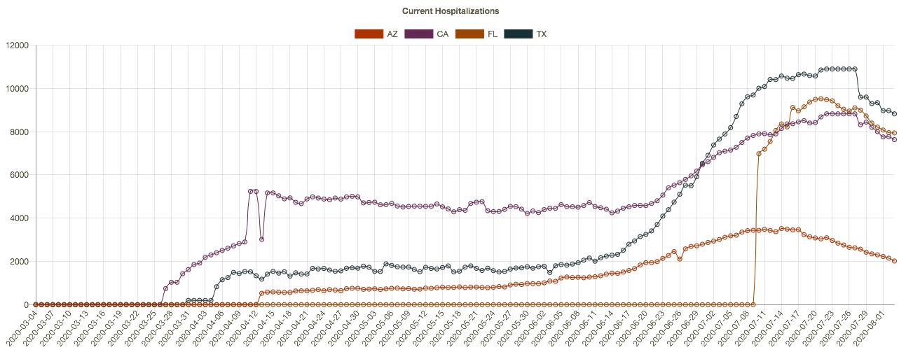
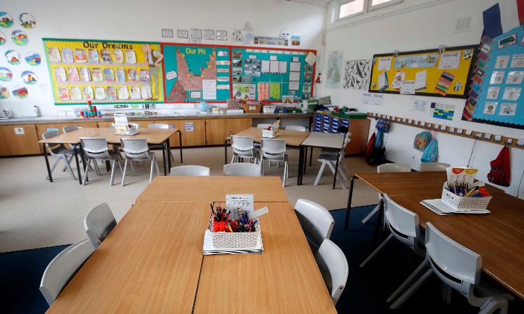
We know that children are at little risk from the coronavirus. Nor do they seem to transmit the virus like older individuals, but teachers unions are adamant that the risks their members face at school would far exceed those shouldered by other “essential” workers. And the unions, not shy about partisanship even while representing public employees, want nothing more than to see Trump lose the election. So the unions and the schools districts they seem to control hold parents hostage. They collect their tax revenue and salaries while delivering virtual service at lower standards than usual, or no service at all. (Of course, public schools in some parts of the country are in session.) 

The teachers’ unions and public schools might get their comeuppance. The situation represents a tremendous opportunity for private schools, home schooling, and innovative schooling paradigms. Many private schools are holding classes in-person, more parents are homeschooling, and alternative arrangements like learning pods have formed, many of which are quite cost-effective.

Pressure is building to allow education dollars to follow individual students, not simply to flow to specific government schools. You can buy a decent K-12 education for $12,000 a year or so, and it’s likely to be a better education than you’ll get in many public schools. (One of the panelists on the NPR segment smugly called this an “insidious temptation”). At long last, parents would be allowed real choice in educating their children, and at long last schools would be incentivized to compete for those students. That might be one of the best things to come out of the pandemic.

COVID Seasonality and Latitudes

23 Sunday Aug 2020

Posted by Nuetzel in Pandemic

≈ 2 Comments

Tags

Air Conditioning, Antibodies, Antigenic Drift, Bimodal, Coronavirus, Covid-19, Ethical Skeptic, Heidi J Zapata, Herd Immunity, Herd Immunity Threshold, Humidity, Immune Response, Justin Hart, Latitude and Seasonality, Proofreading enzymes, Robert Edgar Hope-Simpson, SARS, SARS-CoV-2, Seasonality, Sunlight, T-Cell Immunity, Temperature, Tropical Latitudes, Viral Load, Viral Mutation, Vitamin D Deficiency

The coronavirus (C19), or SARS-CoV-2, has a strong seasonal component that appears to closely match that of earlier SARS viruses as well as seasonal influenza. This includes the two distinct caseloads we’ve experienced in the U.S. 1) in the late winter/early spring; and 2) the smaller bump we witnessed this summer in some southern states and tropics. 

COVID Seasonal Patterns and Latitude

The Ethical Skeptic on Twitter recently featured the chart below. It shows the new case count of C19 in the U.S. in the upper panel, and the 2003 SARS virus in the lower panel. Both viruses had an initial phase at higher latitudes and a summer rebound at lower latitudes.


I particularly like the following visualizations from Justin Hart demonstrating the pandemic’s pattern at different latitudes (shown in the leftmost column). The first table shows total cases by week of 2020. The second shows deaths per 100,000 of population by week. Again, notice that lower latitudes have had a crest in the contagion this summer, while higher latitudes suffered the worst of their contagion in the spring. Based on deaths in the second table, the infections at lower latitudes have been less severe.

Viral Patterns in the South

Many expected the pandemic to abate this summer, including me, as it is well known that viruses don’t thrive in higher temperatures and humidity levels, and in more direct sunlight. So it is a puzzle that southern latitudes experienced a surge in the virus during the warmest months of the year. True, the cases were less severe on average, and sunlight and humidity likely played a role in that, along with the marked reduction in the age distribution of cases. However, the SARS pandemic of 2003 followed the same pattern, and the summer surge of C19 at southern latitudes was quite typical of viruses historically.

A classic study of the seasonality of viruses was published in 1981 by Robert Edgar Hope-Simpson. The next chart summarized his findings on influenza, seasonality, and latitude based on four groups of latitudes. Northern and southern latitudes above 30° are shown in the top and bottom panels, respectively. Both show wintertime contagions with few infections during the summer months. Tropical regions are different, however. The second and third panels of the chart show flu infections at latitudes less than 30°. Influenza seems to lurk at relatively low levels through most of the year in the tropics, but the respective patterns above and below the equator look almost like very muted versions of activity further to the north and south. However, some researchers describe the tropical pattern as bimodal, meaning that there are two peaks over the course of a year.   

So the “puzzle” of the summer surge at low latitudes appears to be more of an empirical regularity. But what gives rise to this pattern in the tropics, given that direct sunlight, temperature, and humidity subdue viral activity?

There are several possible explanations. One is that the summer rainy season in the tropics leads to less sunlight as well as changes in behavior: more time spent indoors and even less exposure to sunlight. In fact, today, in tropical areas where air conditioning is more widespread, it doesn’t have to be rainy to bring people indoors, just hot. Unfortunately, air conditioning dries the air and creates a more hospitable environment for viruses. Moreover, low latitudes are populated by a larger share of dark-skinned peoples, who generally are more deficient in vitamin D. That might magnify the virulence associated with the flight indoors brought on by hot and or rainy weather.   

Mutations and Seasonal Patterns

What makes the seasonal patterns noted above so reliable in the face of successful immune responses by recovered individuals? And shouldn’t herd immunity end these seasonal repetitions? The problem is the flu is highly prone to viral mutation, having segments of genes that are highly interchangeable (prompting so-called “antigenic drift“). That’s why flu vaccines are usually different each year: they are customized to prompt an immune response to the latest strains of the virus. Still, the power of these new viral strains are sufficient to propagate the kinds of annual flu cycles documented by Hope-Simpson.

With C19, we know there have been up to 100 mutations, mostly quite minor. Two major strains have been dominant. The first was more common in Southeast Asia near the beginning of the pandemic. It was less virulent and deadly than the strain that hit much of Europe and the U.S. Of course, in July the media misrepresented this strain as “new”, when in fact it had become the most dominant strain back in March and April.

What Lies Ahead

By now, it’s possible that the herd immunity threshold has been surpassed in many areas, which means that a surge this coming fall or winter would be limited to a smaller subset of still-susceptible individuals. The key question is whether C19 will be prone to mutations that pose new danger. If so, it’s possible that the fall and winter will bring an upsurge in cases in northern latitudes both among those still susceptible to existing strains, and to the larger population without immune defenses against new strains.

Fortunately, less dangerous variants are more more likely to be in the interest of the virus’ survival. And thus far, despite the number of minor mutations, it appears that C19 is relatively stable as viruses go. This article quotes Dr. Heidi J. Zapata, an infectious disease specialist and immunologist at Yale, who says that C19:

“… has shown to be a bit slow when it comes to accumulating mutations … Coronaviruses are interesting in that they carry a protein that ‘proofreads’ [their] genetic code, thus making mutations less likely compared to viruses that do not carry these proofreading proteins.”

The flu, however, does not have such a proofreading enzyme, so there is little to check its prodigious tendency to mutate. Ironically, C19’s greater reliability in producing faithful copies of itself should help ensure more durable immunity among those already having acquired defenses against C19.

This means that C19 might not have a strong seasonal resurgence in the fall and winter. Exceptions could include: 1) the remaining susceptible population, should they be exposed to a sufficient viral load; 2) regions that have not yet reached the herd immunity threshold; and 3) the advent of a dangerous new mutation, though existing T-cell immunity may effectively cross-react to defend against such a mutation in many individuals.


The FDA Can Put Virus Behind Us, Sans Vaccine

19 Wednesday Aug 2020

Posted by Nuetzel in Liberty, Pandemic, Vaccinations

≈ 1 Comment

Tags

Alex Tabarrok, Anti-Vaxers, Coronavirus, COVID Screening, Covid-19, E25Bio, Emergency Use Authorization, False Positive, Falze Negative, FDA, Harvard, Infectious vs Infected, John Cochrane, National Basketball Players Association, NBA, Paper Tests, Rapid Tests, Regulatory Failure, SalivaDirect, Self-Quarantine, Test Accuracy, Tracing, Transmission Chain, Vaccine Development, Vaccine Supply Chain, Wyss Institute for Biologically Inspired Engineering, Yale, Zach Lowe

Most of the news about COVID vaccine development is positive, but there are still huge doubts about 1) whether an effective vaccine(s) will ever be available; 2) when it will be available; 3) in what quantities (supply chains for vaccines present issues that most lay persons would never imagine) ; 4) the best approaches to allocation across young/healthy vs. old/vulnerable; 5) how long it will provide protection (the news is good on lasting immunity as well); and 6) whether people will actually take it. Given all these uncertainties, it’s worth considering an approach to stanching the coronavirus that won’t require a vaccine while still allowing a return to normalcy: cheap, rapid tests available to consumers on a daily basis in their homes or in businesses.

The full benefits of cheap, rapid tests can take people a while to wrap their heads around. In fact, there are skeptics who’s views on any and all testing are colored by suspicions that increased testing is some sort of conspiracy to spread fear and keep the economy hobbled. It’s true that increased testing drove much of the increase in COVID cases this summer, which caused the mainstream media to delight in spinning alarmist narratives. Fair enough, but that misses the point, which I’ll try to elucidate below. I credit a John Cochrane post for bringing this to my attention.

A successful vaccine breaks the so-called “transmission chain”, but so does frequent testing to identify infectious individuals on an ongoing basis so they can self-quarantine. As Alex Tabarrok has emphasized, we should worry about identifying infectious individuals, as opposed to infected individuals. They are not the same. Cheap, rapid, and easy-to-administer tests have already proven to be fairly accurate during the infectious stage. The idea is for individuals to self-test every day and stay home if they are positive. Or, employers can test workers every day and send them home if they are positive. Frequent testing also makes it simpler to trace the source of an infection and may reduce the importance of tracing.

To those who say this represents an affront to personal liberty, and I’m very touchy on that subject myself, recall that even now people are being screened in their workplaces using thermometers, questionnaires, or on the basis of any frogginess perceived by supervisors and co-workers. Those “tests” are far less accurate in identifying COVID-19 contagiousness than the kinds of cheap tests at issue here, and they are certainly no less intrusive. Then there are the many businesses facing restrictions on their operations: how “accurate” is it to keep everyone at home by locking down places of business? How intrusive is that? Those restrictions are indefensible, and especially with the advent and diffusion of cheap, rapid tests.

Of course, people might cheat and not report positives. Tests could be administered at workplaces to avoid that possibility, or at points of admission to businesses and facilities, but a few minutes of delay would be necessary. I would not support a centralized database of daily test results. If nothing else, relying on the good faith of individuals in reporting their results would be a giant leap forward in breaking the transmission chain now, rather than counting on the possibility of a successful virus in the indefinite future. And we might then avoid the whole pro-vax/anti-vax imbroglio that already foments, which raises major questions bearing on individual liberty.

Then there is the question of positive tests within multi-person households. Should the entire family or household self-quarantine? I say no, not if the others are negative, but then the others should test twice before going out, which dramatically reduces the probability of a false negative, and they should probably test more frequently, perhaps several times a day.

There are other important details to address: Who will pay for the tests? Will workers be paid to stay home if they test positive? How long will they be required to stay home? How will repeated tests be treated? I don’t want to get into detail on all of these points, but cheap, fast tests can help overcome many of these difficulties, and I believe many of the details can and should be worked out privately.

Unfortunately, the FDA has approved only two rapid tests, and they are not very rapid and not cheap enough. Only one had been approved up until last weekend because the FDA found the accuracy to be lacking … compared to PCR tests! But the FDA finally issued an Emergency Use Authorization for a saliva-based test (SalivaDirect) developed at Yale, partly funded by the NBA and the Players Association. The test still requires processing at a lab, so it’s really not convenient enough and not fast enough. Here is Zach Lowe on the cost:

“The cost per sample could be as low as about $4, though the cost to consumers will likely be higher than that — perhaps around $15 or $20 in some cases, according to expert sources.”

Not bad, but it’s much higher than more rapid, paper tests developed by Harvard’s Wyss Institute for Biologically Inspired Engineering and a company called E25Bio. Both of those are expected to cost about $1 per sample and can be completed anywhere. That’s a price that can work. And there are other promising candidates.

The benefits of tests that are rough, ready, and cheap will be huge. Such tests will also enable retesting, which helps to overcome the dilemmas of false positives and negatives. False negatives might be of greater concern to the FDA, but again, false negatives are less likely during the contagious stage of an infection, and the tests will be accurate enough that transmission risk will be drastically reduced.

The FDA needs to move beyond its stodgy insistence on achieving laboratory levels of accuracy. It’s unlikely that a single test source will be adequate to stanch the transmission chain, so the agency should rush to approve as many cheap, rapid tests as possible, with as many advisories and patient warnings regarding test results and follow-up instructions as it deems necessary. Remember, these tests are much better than thermometers!

COVID at Midsummer

04 Tuesday Aug 2020

Posted by Nuetzel in Pandemic, Public Health

≈ 2 Comments

Tags

Arizona, California, CDC, Coronavirus, COVID Time Series, Covid Tracking Project, Covid-19, Fatality Rate, Florida, Hospitalizations, Illinois, Kyle Lamb, Missouri, New Cases, New York, Provisional Deaths, Regional Variation, South Carolina, Tennessee, Texas

It’s been several weeks since I last posted on the state of the coronavirus pandemic (also see here). The charts below show seven-day moving averages of new confirmed cases and reported C19 deaths from the COVID Tracking Project as of August 3. Daily new cases began to flatten about three weeks ago and then turned down (it can take a few days for such changes to show up in a moving average). Daily C19-attributed deaths began climbing again in early July, lagging new cases by a few weeks, and they slowed just a bit over the past several days. Obviously, both are good news if those changes are maintained. The other thing to note is that deaths have remained far below their levels of April and early May.

The daily death count is that reported on each date, not when the deaths actually occurred. Each day’s report consists of deaths that were spread across several previous weeks or even a month or more. That makes the slight downturn in deaths more tenuous from a data perspective. There are sometimes large numbers of deaths from preceding weeks reported together on a single day, so reporting can be ragged and the final pattern of actual deaths is not known for some time. More on that below.

States

The increase in cases and deaths during late June and July was concentrated in four states: Arizona, California, Florida, and Texas. Here’s how those states look now in terms of cases and deaths, from the interactive COVID Time Series site:


New cases began to flatten or drop in these states two to three weeks ago, driving the change in the national data. Daily deaths have not turned convincingly, but again, these are reported deaths, which actually occurred over previous weeks. One more chart that is suggestive: current hospitalizations in these four states. The recent declines should bode well for the trend in reported deaths, but it remains to be seen. 

Meanwhile, other parts of the country have seen an uptrend in cases and deaths, such as Illinois, Missouri, South Carolina, and Tennessee. Here are new cases in those states:

It’s worth emphasizing that the elevated level of new cases this summer has not been associated with the rates of fatality experienced in the Northeast during the spring. There are many reasons: better patient care, new treatments, more direct summer sunlight, higher humidity, and tighter controls in nursing homes.

More On the Timing of Deaths

Back to the discrepancies in the timing of reported deaths and actual deaths. This is important because the reported totals each day and each week can be highly misleading, even to the point of frightening the public and policy makers, with consequent psychological and economic impacts.

The latest summary of provisional vs. reported deaths is shown below, courtesy of Kyle Lamb, who posts updates on his Twitter feed. This report ends with the last complete week ending August 1. It’s a little hard to read, but you might get a better look if you click on it or turn your phone sideways. Some of the key series are also graphed below. 

The table shows the actual timing of deaths in the fourth column, with dates alongside. The pattern differs from the statistics reported by the Covid Tracking Project (CTP) in the top row (shaded orange), and from the totals of actual deaths by reporting day in the third row (shaded gray). The reporting dates are always later than the dates of death. This can be seen in the chart below. The most obvious illustration is how many of the deaths from around the peak in mid-April were reported in May. In March and April, the daily reports were short of the ultimate actual death counts because so few deaths with associated dates were known by then.


The right-hand end of the red line shows that many deaths reported by CTP have not yet been placed at an actual date of death by the CDC.  At this point, the actual date of death has not been placed for over 10,000 deaths! Again, those will be spread over earlier weeks.

The blue line is dashed over the last four weeks because those counts are most “highly” provisional. Small changes in the actual counts are likely for dates even before that, but the last four weeks are subject to fairly substantial upward revisions. Eventually, the right end of the blue line will more closely approximate the totals shown in red.

To get an indication of trends in the actual timing of deaths, I plotted the weekly actual deaths reported for the last four reporting weeks going back in time. In the table, those are the four lowest, color-coded diagonals. In the graph below, which should include the qualifier “by recency of report week”, actual deaths in the most recent report week are represented by the blue line, the prior weekly report is red, followed by green (three weeks prior), and purple (four weeks prior… sorry, the colors are not consistent with those in the table). The lines extend farther to the right for more recent report weeks.

The increase in actual deaths occurring in July has declined or flattened in each of the four most recent report weeks. Only the second-to-last week increased as of the August 1st report. On the whole, those changes seem favorable, but we shall see.

Closing

It’s getting trite to say, but the next few weeks will be interesting. The increase in deaths in July was a sad development, but at least the extent of it appears to have been limited. Even with a somewhat higher death count, the fatality rate continued to decline. Let’s hope any further waves of infections are even less deadly.

Some Cheery COVID Research Tidbits

16 Thursday Jul 2020

Posted by Nuetzel in Pandemic, Public Health, Uncategorized

≈ 1 Comment

Tags

ACE Inhibitors, Angiotensin Drugs, ARBs, bacillus Calmette-Guerin, BCG Vaccine, Blood Plasma, Cholesterol, Coronavirus, Covid-19, Derek Lowe, Gilead Sciences, Herd Immunity, Hydroxychloroquine, Immune Globulin, Instapundit, Lancet, Marginal Revolution, National Academies of Science Engineering and Medicine, Off-Label Drugs, Oxford, R0, Remdesivir, SARS-CoV-2, Severe Acute Respiratory Syndrome, Statins, T-Cell Immunity, Transmissability, Tricor, Tuberculosis, Viral Load

Here’s a short list of new or newish research developments, some related to the quest to find COVID treatments. Most of it is good news; some of it is very exciting!

Long-lasting T-cell immunity: this paper in Nature shows that prior exposure to coronaviruses like severe acute respiratory syndrome (SARS) and even the common cold prompt an immune reaction via so-called T-cells that have long memories and are reactive to certain proteins in COVID-19 (SARS-CoV-2). The T-cells were detected in both C19-infected and uninfected patients. This comes after discouraging reports that anti-body responses to C19 are short-lived, but T-cells are a different form of acquired immunity. Derek Lowe says the following:

“This makes one think, as many have been wondering, that T-cell driven immunity is perhaps the way to reconcile the apparent paradox between (1) antibody responses that seem to be dropping week by week in convalescent patients but (2) few (if any) reliable reports of actual re-infection. That would be good news indeed.”

The herd immunity threshold (HIT) is much lower than you think: I’ve written about the effect of heterogeneity on the HIT before, here and here. This new paper, by three Oxford zoologists, shows that the existence of a cohort having some form of prior immunity, innate or acquired, reduces the number of infections required to achieve the HIT. For example, if initial transmissibility (R0) is 2.5 and 40% of the population has prior immunity (both reasonable assumptions for many areas), the HIT is as low as 20%, according to the authors’ calculations. That’s when the contagion begins to recede, though the final infected share of the population would be higher. This might explain why new cases and deaths have already plunged in places like Italy, Sweden, and New York, and why protests in NYC did not lead to a new wave of infections, while those in the south appear to have done so.

Seasonal effects: viral loads might be decreasing. From the abstract:

“Severity of COVID-19 in Europe decreased significantly between March and May and the seasonality of COVID-19 is the most likely explanation. Mucosal barrier and mucociliary clearance can significantly decrease viral load and disease progression, and their inactivation by low relative humidity of indoor air might significantly contribute to severity of the disease.”

The BCG vaccine appears to be protective: this is the bacillus Calmette-Guérin tuberculosis vaccine administered in some countries, This finding is not based on clinical trials, so more work is needed.

Is there no margin in plasma? No subsidy? This is the only “bad news” item on my list. It’s widely agreed that blood plasma from recovered C19 patients can be incorporated into an immune globulin drug to inoculate people against the virus. It’s proven safe, but for various reasons no one seems interested. Not the government. Not private companies. Did Trump happen to mention it or something?

C19 doesn’t spread in schools: this German study demonstrates that there is little risk in reopening schools. One of the researchers says:

“Children act more as a brake on infection. Not every infection that reaches them is passed on…. This means that the degree of immunization in the group of study participants is well below 1 per cent and much lower then we expected. This suggests schools have not developed into hotspots.”

Also worth emphasis is that remote learning leaves much to be desired, as acknowledged by the National Academies of Science, Engineering and Medicine, which has recommended that schools reopen for younger children and those with special needs.

Can angiotensin drugs (ACE Inhibitors/ARBs) reduce mortality? This meta-analysis of nine studies finds that these drugs reduce C19 mortality among patients with hypertension. The drugs were also associated with a reduction in severity but not with statistical significance. These results run contrary to initial suspicions, because ACEI/ARB drugs actually “up-regulate” ACE-2 receptors, to which C19 binds. Researchers say the drugs might be working through some other protective channel. This is not a treatment per se, but this should be reassuring if you already take one of these medications.

Tricor appears to clear lung tissue of C19: this research focused on C19’s preference for an environment rich in cholesterol and other fatty acids:

“What they found is that the novel coronavirus prevents the routine burning of carbohydrates, which results in large amounts of fat accumulating inside lung cells – a condition the virus needs to reproduce.”

Tricor reduces those fats, and the researchers claim it is capable of clearing lung tissue of C19 in a matter of days. This was not a clinical trial, however, so more work is needed. Tricor is an FDA approved drug, so it is safe and could be administered “off label” immediately. Tricor is a fibrate; the news with respect to statins and C19 severity is pretty good too! These are not treatments per se, but this should be reassuring if you already take one of these medications.

Hydroxychloroquine works: despite months of carping from media and leftist know-it-all’s dismissing the mere possibility of HCQ as a potential C19 treatment, evidence is accumulating that it is effective in treating early-stage infections after all. The large study conducted by the Henry Ford Health System found that treatment with HCQ early after hospitalization, and with careful monitoring of heart function, cut the death rate in half relative to a control group. Here’s another: an Indian study found that four-plus maintenance doses of HCQ acted as a prophylactic against C19 infection among health care workers, reducing the odds of infection by more than half. An additional piece of evidence is provided by this analysis of a 14-day Swiss ban on the use of HCQ in late May and early June. The ban was associated with a huge leap in the C19 deaths after a lag of less than two weeks. Resumption of HCQ treatment brought C19 deaths down sharply after a similar lag.

Meanwhile, a study in Lancet purporting to show that HCQ was ineffective and posed significant risks to heart health was retracted based on the poor quality of the data.

Remdesivir also cuts death rate: by 62% in a smaller controlled study by the drug maker Gilead Sciences.

Pet ownership might confer some immunity: this one is a little off-beat, and perhaps the research is under-developed, but it is interesting nonetheless!

I owe Instapundit and Marginal Revolution hat tips for several of these items.

Case Fatality, Stale Ratios and Exaggerated Loss

14 Tuesday Jul 2020

Posted by Nuetzel in Analytics, Pandemic

≈ Leave a comment

Tags

Antibodies, Case Fatality Rates, CDC, Coronavirus, COVID Time Series, Hospitalizations, Mortality Rate, Pandemic, Predictive Value, Serological tests

I hope someday I won’t feel compelled to write or worry about the coronavirus. However, as the pandemic wears on, it seems to take only a few days for issues to pile up, and I just can’t resist comment. Today I have a couple of beefs with uses of data and concomitant statements I’ve seen posted of late.

People are still quoting case fatality rates (CFRs) as if those cumulative numbers are relevant to the number of deaths we can expect going forward. They are not. Just as hair-brained are applications of cumulative hospitalization and ICU admittance rates to produce “rough and ready” estimates of what to expect going forward. Or, I’ve seen people express hospitalizations as ratios to CFR, as if those ratios will be the same going forward. Again, they are not. Let me try to explain.

The chart below shows the course of the U.S. CFR since the start of the pandemic. It’s taken from the interactive Covid Time Series site. My apologies if you have to click on the chart for decent viewing (or you can visit the site). The CFR at any date is the cumulative number of deaths to-date divided by the cumulative number of confirmed cases. It is a summary of past history, but it is not well-suited to making predictions about death rates in the future. The CFR began to taper a little before Memorial Day, and it is now at about 4% (as of July 13).

Out of curiosity, I also generated CFRs for AZ, CA, FL, GA, and TX, which now average about half of the national CFR. There’s an obvious lesson: if you must use CFRs, understand that they vary from place to place.

Again, CFRs are cumulative. Their changes over time can tell us something about recent trends, but even then they are flawed. For example, case counts have risen dramatically with more widespread testing. Those testing positive more recently are concentrated in younger age cohorts, for whom infections are much less severe. Treatment has improved dramatically as well, so there is little reason to expect the CFR’s of recently diagnosed cases to be as high as the latest CFRs shown above.

There is no easy way to calculate an unflawed “marginal” CFR for a recent period, though an effort to do so might improve the predictive value. Deaths lag behind case counts because the progression from early symptoms to death can take several weeks. Even more vexing for constructing a valid, recent fatality rate is that reporting of deaths is itself delayed, as I explained in my last post. Each day’s report of deaths captures deaths that may have occurred over a period of several weeks in the past, and sometimes many more.

Finally no CFR can capture the true mortality rate of the virus without ongoing, ubiquitous testing. As the state of testing stands, the true mortality rate must reflect undiagnosed cases in the denominator. The CDC’s latest “best” estimate of the true mortality rate is just 0.3%, and 0.05% for those aged 50 years or less. Those figures are based on serological tests for the presence of antibodies to C19 in more random samples of the population. Those findings reflect the extent of undiagnosed and/or asymptomatic cases.

The point is one shouldn’t be too blithe about throwing numbers around like 4% mortality based on the CFR, or even 1% mortality as a “nice, round number”, without heavy qualification. Those numbers are gross exaggerations of what we are likely to see going forward.

The same criticisms can be leveled at claims that hospitalizations will proceed at some fixed ratio relative to diagnosed cases, or some fixed ratio relative to deaths. Again, new cases tend to be less severe, so hospitalizations are likely to be a much lower ratio to cases than what is reflected in cumulative totals. Because of improved treatment, the ratio of deaths to hospitalizations will be much lower in the future as well.

CFRs are not a useful guide to future COVID deaths. The true mortality rate is a much better baseline, particularly for subsets of the population matching the current case load. Finally, and this is the only disclaimer I’ll bother to provide today, we all know that suffering is not confined to terminal cases, and it is not confined to the hospitalized subset. But don’t exaggerate the extent of your preferred interpretation of suffering by applying inappropriate cumulative calculations.


Reported and “Actual” COVID Deaths

13 Monday Jul 2020

Posted by Nuetzel in Pandemic, Political Bias

≈ 2 Comments

Tags

Cause of Death, CDC, Coronavirus, Covid Tracking Project, COVID-Phobic Deaths, Death Toll, Hospital Reimbursements, Kyle Lamb, Lockdown Deaths, Our World In Data, Reclassified Deaths

I was updating my post from twelve days ago on the upward trend in new coronavirus cases when I came across a great tabular summary of a phenomenon that’s been underway since early April: significant delays in reporting deaths from COVID-19 (C19). Before I get to that, a quick word on what’s happened over the past 12 days. New coronavirus cases keep climbing in a number of states, and it’s been a grisly waiting game to see whether the severity and lethality of infections will follow the case counts upward. The following chart provides a very preliminary answer. It’s taken from Our World In Data, and it shows the seven-day moving average of C19 deaths in the U.S.

There has indeed been an upturn in reported deaths over the past week. Just prior to that, a temporary plateau in late June was caused by a set of “reclassifications” of earlier deaths in New Jersey (the “plateau effect is caused by seven-day averaging). These kinds of changes in reporting make it rather difficult to interpret trends accurately. Unfortunately, the reporting of deaths has been subject to continuing distortions that are even more difficult to discern than New Jersey’s spike.

Kyle Lamb provides the interesting table below, which might be difficult to read without either clicking on it or going to the link at Twitter. Here is another link to an annotated version of the table. The top row labeled “CTP Total” is the C19 death toll reported each week by the COVID Tracking Project. This is generally what the public sees. These reports show that deaths reached their highest levels during the weeks of April 11th through May 9th. However, the second column shows C19 deaths by their actual week of occurrence. This series shows a more distinct peak on April 18th with steady declines thereafter.

The weekly totals in the second column are not final, however. Take a look at the last reporting week in the far right column (July 11th). The CTP reported 4,286 deaths, an increase over the prior week consistent with the upturn in the first chart above. But the table shows that over half of that week’s reported deaths actually occurred in late April and early May! So the upturn in deaths is something of a mirage.

We won’t have a reasonable approximation of the death totals for the past several weeks (or how they compare) for at least several more weeks. In fact, one can argue that it might be a matter of months before we have a reasonable approximation of those deaths, but it’s worth noting that the vast bulk of “actual” C19 deaths tend to be reported within four weeks of the initial reporting week, and the additions or revisions to the two weeks in late April and early May in the last column were exceptionally large. Chances are we won’t see many more that big…. Or will we?

Aspects of this process hint at the ease with which the C19 death totals could be manipulated. The reported totals for all-cause mortality in the first column are incomplete; more recent weeks, especially, are not fully settled as to causes of death. Some of those fatalities are certain to be attributed to C19. Others might be reclassified as C19. And here is the scary part: the all-cause totals are certain to include a significant number of lockdown-related or COVID-phobic deaths: individuals who were unable or unwilling to seek medical care for urgent needs due to lockdowns or fears of rampant spread of C19 infections within hospital environments. To anyone with an interest in manipulating the C19 death toll, whether hospital officials seeking higher reimbursements, local or state officials seeking federal funds, or public officials at any level seeking to promote pandemic fears and/or political discord, these “extra” deaths might be tempting marks for reclassification.

I’m fairly confident that the uptrend of new cases will be far less severe than early in the pandemic. I believe much of the alarm I see on social and mainstream media is misplaced. More on that in a subsequent post, but for now I’ll simply note that those testing positive are concentrated in much lower ranges of the age distribution, and treatment has improved in a variety of ways. The table above shows that the downtrend in actual weekly C19 deaths is intact as of the admittedly incomplete July 11th reporting week. We won’t know the “actual” pattern of early-July C19 fatalities for another month or more. Even then, one might harbor suspicions that the totals are manipulated for economic or political reasons, but we can hope the reporting authorities are exercising the utmost objectivity in assigning cause of death.

Unfortunate COVID Follies

08 Wednesday Jul 2020

Posted by Nuetzel in Government Failure, Pandemic

≈ Leave a comment

Tags

Arsenic and Old Lace, BAME, Black Asian and Minority Ethnics, BLM, CDC, Coronavirus, Covid-19, Dr. Einstein, Flattening the Curve, Hydroxychloraquine, Jonathan Brewster, Lockdowns, Masks, Operation Warp Speed, Vitamin D Deficiency, World Health Organization

This post is devoted to a few coronavirus policies and positions that trouble me. 

Counting Deaths: People have the general impression that counting COVID-19 cases and deaths is straightforward. The facts are more reminiscent of the following exchange in the film Arsenic and Old Lace, when Jonathan Brewster angrily insists he has offed more souls than his sweet little aunties have poisoned with elderberry wine:

Dr. Einstein: You cannot count the one in South Bend. He died of pneumonia!
Jonathan Brewster: He wouldn’t have died of pneumonia if I hadn’t shot him! 

Here, Dr. Einstein wears the shoes of public health authorities who claim that C19 deaths are undercounted. But lives counted as lost from C19, in many cases, are individuals who also had the flu, pneumonia, stroke, kidney failure, and a variety of other co-morbidities. Yes, other causes of death might be induced by the coronavirus, but like Johnny’s victim in South Bend, many would not have died from C19 if they hadn’t had a prior health event. In addition, otherwise unexplained deaths are often attributed to C19 with little justification.

In fact, the C19 death toll has been distorted by a perverse federal hospital reimbursement policy that rewards hospitals for COVID patients. Death certificates seem to list C19 as the cause for almost anyone who dies in or out of a hospital during the pandemic, whether they’ve been tested or not. In fact, deaths have been attributed to C19 despite negative test results when officials decided, for one reason or another, that the test must have been unreliable!

Lockdowns: almost all of the “curve flattening” in late March and April was accomplished by voluntary action, which I’ve covered before here. The lockdowns imposed by state and local governments were highly arbitrary and tragic for many workers and business owners who could have continued to operate as safely as many so-called “essential” businesses. Lockdowns in certain areas were also blatant violations of religious rights. There is little to no evidence that lockdowns themselves led to any actual abatement of the virus. And of course, people are fed up! 

The Beach: Right now I’m at a wonderful beach condo in Florida for a week. There are other people on the beach, mostly families and a few groups of friends, but there is plenty of open space. You will not catch the coronavirus on a beach like this. And there is almost zero chance you’ll catch it on any beach. In fact, the chance you’ll catch it anywhere outside is minuscule unless you’re jammed so tightly among hundreds of protesters that you can’t even turn around. Yet government officials have closed beaches in many parts of the country while allowing the protests to go on. Oh sure, they think people will CROWD onto beaches as if they’re at a BLM protest… except they’re not. Ah, then it must be banned! That takes a special kind of dumbass.     

Waiting for Results: How could we have spent trillions of dollars as a nation on economic stimulus, much of it skimmed off by grifters, but we can’t seem to get sufficient resources to make calls to those awaiting test results? This is a case of misplaced priorities. Even now, people are waiting more than a week for their results, and many are wandering around in the community without knowing their status. Wouldn’t you think we’d get that done? We can conduct well over a half million tests a day, but can’t we find a few bucks to deliver results via phone, email, or text within 24 hours of processing results. This is truly absurd. 

Vaccine Candidates: A similar point can be made about vaccine development: We are spending $5 billion on Operation Warp Speed to build capacity in advance for five promising vaccine candidates. These will be identified over the next few months, and it looks as if all five will come from established pharmaceutical majors. There are many more vaccine candidates, however, some being developed by smaller players using inventive new techniques. The OWS expenditure looks pretty meager when you compare it to the trillions in funds the federal government is spending on economic stimulus, especially when finding an effective vaccine would obviate much of the stimulus. 

Treatment: Hydroxycloroquine has been found to lower the death rate from COVID-19 in a large controlled trial. Congratulations, morons, for trashing HCQ as a potential treatment, solely because Trump mentioned it. Way to go, dumbasses, for banning the use of a potential treatment that could have saved many thousands of lives. 

Air Conditioning: I’m shocked that public health experts haven’t been more vocal about the potentially dangerous effects of running air conditioners at high levels in public buildings. The virus is known to thrive in cool, dry environments, which is exactly what AC creates, yet this seems to have been almost completely ignored.   

Vitamin D: Likewise, I think public health experts have been far too reticent about the connection between Vitamin D deficiencies and the severity of C19 (also see here and here). The accumulating evidence about this association offers an explanation for the disturbingly high severity of cases among Black, Asian and Minority Ethnics (BAME), not to mention a possible role in C19 deaths among the generally D-deficient nursing home population. For the love of God, get the word out to the community that Vitamin D supplements might help, and they won’t hurt, and otherwise, tell people to get some sun!

Masks: I’m not in favor of strict mask mandates, but I have trouble understanding the aversion to masks among certain friends. Of course, there’s been way too much mixed messaging on the benefits of masks, and it didn’t all come from politicians! Scientists, the CDC, and the World Health Organization seemingly did everything possible to squander their credibility on this and other issues. However, a consensus now seems to have developed that masks protect others from the wearer and seem to protect the wearer from others as well. It should be obvious that masks offer a middle ground on which the economy can be restarted while mitigating the risks of further contagion. But even if you don’t believe masks protect the wearer, but only protect others from an infected wearer, donning a mask inside buildings, and when social distancing is impossible, still qualifies as a mannerly thing to do.  


Coronavirus Framing #7: Second Wave Uncertainty

19 Friday Jun 2020

Posted by Nuetzel in Pandemic

≈ 1 Comment

Tags

Air Conditioning, Asian Flu, Case Fatality Rate, CDC, Coronavirus, COVID Time Series, Covid Tracking Project, Effective Herd Immunity, George Floyd, HHS, High Cholesterol, Hong Kong Flu, Johns Hopkins, Operation Warp Speed, Pooled Testing, Reverse Seasonal Effect, Rich Lowry, Social Distancing, Testing, Vitamin D Deficiency

We’re now said to be on the cusp of a “second wave” of coronavirus infections. It’s become a new focus of media attention in the past week or so. Increased infections have been reported across a number of states, especially in the south, but I’m not especially alarmed at this point for reasons explained below. Either way, the public policy response will certainly be different this time, at least in most areas. We’ve learned that a more targeted approach to managing coronavirus risk is far less costly, which means eschewing general lockdowns in favor of focusing resources on protecting the most vulnerable. That approach is supported by research weighing the costs and benefits of the alternatives (also see here and here).

The targeted approach I’ve advocated does not call for any less caution on the part of individuals. That means avoiding prolonged, close contact with others, especially indoors. I don’t mind wearing a mask when inside stores or public buildings, but I believe it should be voluntary. I do my best to stay out of close proximity to most others in public places anyway, masked or otherwise. This is voluntary social distancing. I also believe public health authorities should be more active in disseminating information on known correlates of coronavirus severity, such as Vitamin D deficiency, high LDL cholesterol, and the “reverse seasonal effect” caused by low humidity in air-conditioned spaces. I would also strongly agree that the effort to identify and mass produce vaccine candidates, known as Operation Warp Speed, should be ramped up considerably, with heavier funding and more than five vaccine candidates.

We’ve seen a continuing increase in coronavirus testing since my last “framing” post about a month ago. Testing has increased to a daily average of almost 500,000 over the past two weeks. At present we appear to have an excess supply of testing capacity in many areas, as Rich Lowry notes:

“The problem with testing nationally is becoming less a shortfall of availability of the tests and more a shortfall of people showing up to get tested. An insider in the diagnostics industry says that laboratories are reporting that they are ‘sample starved’ — i.e., they aren’t getting enough specimens. He notes, ‘We have all seen stories about sample-collection sites in some regions not seeing that many patients.’

An HHS official says that in May there was the capacity to do twice as many tests as were actually performed, calling it a function of ‘allocation and efficiency, but more just demand.’ Says Giroir, ‘We really see areas in the country now that there’s more tests available than people who want to get tested or the need for testing.'”

Before turning to some charts, a word about the data in the charts I’ve been using throughout the pandemic. Some of the nationwide information was directly from the CDC or the Johns Hopkins dashboard. In other cases, I’ve reported state level data and some nationwide data published by The COVID Tracking Project (CTP) and the COVID Time Series (CTS) dashboard, which uses state data from CTP. I first noticed a few discrepancies in the national totals in April, which have become larger with growth in the counts of cases and deaths. Here is a key part of CTP’s explanation:

“For many states, the CDC publishes higher testing numbers than the states themselves report, which raises questions about the structure and integrity of both state and federal data reporting. … Another point of contrast between the CDC’s new reporting and the official state data compiled by The COVID Tracking Project is that the CDC has not released historical, state-level testing data for the first three months of the outbreak.”

Thus, the CDC currently reports almost 120,000 U.S. deaths, while CTP reports about 112,000. Nevertheless, I will continue to report numbers from both sources for the sake of continuity, and I will try to remember to note the source in each case.

The first chart below shows the number of daily tests from CTP; the second chart shows the number of daily confirmed cases (CTP). Since mid-May, daily testing has increased by more than 50%, calculated on a moving average basis, and is now approaching half a million per day or more than 3 million per week. Pooled testing is coming, which will ultimately increase testing capacity several-fold. Daily confirmed cases have been hovered just above 20,000 since around Memorial Day, with a recent turn upward to around 24,000.

Early in the pandemic, I made the mistake of focusing too heavily on case numbers. Yes, I adjusted for population size and was aware that the initial shortage of tests was restraining diagnoses. Still, I did not foresee the great expansion in testing we’ve witnessed, the great transmissibility of the virus in some regions, nor the large number of asymptomatic cases that would ultimately be diagnosed.

The daily percentage of positive tests (CTP), which is smoothed in the chart below using a seven-day moving average to eliminate within-week variability, has declined gradually since early April to about 4% before the uptick in the last few days. Still, that’s a drop of about 75% from the peak when tests were in very short supply. Those were days when even heavily symptomatic individuals were having trouble getting tested.

We’d hope to see a resumption in the decline of the positive percentage as testing continues to grow, but even with a relatively constant positivity rate, the number of daily confirmed cases must grow as testing expands. There may be several reasons the positivity rate has remained stubbornly near 5% over the past few weeks. One is the obvious reversal in social distancing as states have opened up. People became less fearful about the virus in general, and protesters jammed the streets after the George Floyd murder in Minneapolis. Another reason is that there are new areas of focus for testing that might be picking up cases. For example, hospitals in some states are now testing all admissions for COVID-19. This will tend to pick up more infections to the extent that individuals with co-morbidities are hospitalized at higher rates in general and are also more susceptible to the coronavirus. Finally, testing more broadly is likely to pick up a larger share of asymptomatic cases even as the “true rate” of infection declines.

The daily death toll (CTP) attributed to coronavirus has continued to decline. See below. It is now running at about a third of the peak level it reached in mid-April. There are several reasons for the decline. One is the lower number of active cases, changes in which lead deaths by a few weeks. Awareness and testing capacity have undoubtedly led to earlier diagnosis of the most severe cases. There is also the strong possibility that the virus, having felled some of the most susceptible individuals, is now up against more hosts with effective immune responses. An ongoing degree of social distancing, more humid weather, and more direct sunlight have probably reduced initial viral loads from those experienced early-on, when the case load was escalating. Finally, treatment has improved in multiple ways, and there are now a few medications that have shown promise in shortening the duration and severity of infection.

The course of the pandemic has varied greatly across countries and across regions of the U.S. The New York City area was especially hard hit along with several other large cities, as well as Louisiana. CTS shows that states with the highest cumulative number of coronavirus deaths (New York (blue line), New Jersey (green), Massachusetts, Illinois, and Pennsylvania in the charts below) have experienced downward trends in positive cases per day (the first chart below), leading daily deaths downward in May and early June (the second chart — NY’s downtrend began earlier). I apologize if the charts below are difficult to read, but they have resisted my efforts at resizing. Note: I’m mainly focused on trends here, and I have not shown these series on a per capita basis.

More recently, almost two dozen states have begun to see higher daily case diagnoses. Several of these had more favorable outcomes in the early months of the pandemic and were in more advanced stages of reopening. The charts below (CTS) show results for Arizona, Florida, Georgia, and Texas. The new “hot spots” in these states are mostly urban centers. It’s not clear that the reopenings are to blame, however. The protests after George Floyd’s murder may have contributed in cities like Houston, though no increase in New York is apparent as yet. The states in the chart are all in the south or southwest, so the increases have occurred despite sunny, warm conditions. It’s possible that hot weather has prompted more intensive use of air conditioning, which dries indoor environments and can promote the spread of the virus. These southern states have not yet experienced a corresponding increase in deaths, though that would occur with a lag. 

Missouri has seen an slow upward trend in its daily positive test count over the past four weeks, even though the state’s positive rate has trended down slowly since early May. I show MO’s confirmed cases per day below (in green) together with Illinois’ (because my hometown is on the border and the two states are a nice contrast). IL is much larger and has had a much higher case load, but the downward trend in new cases in IL is impressive. Coronavirus deaths per day are shown in the second chart below, with seven-day averages superimposed. Deaths have also trended down in both states, though MO has experienced a few bad days very recently, and MO’s case fatality rate is slightly higher than in IL.

We’ll know fairly soon whether we’re really headed for a second major wave. However, the case count, in and of itself, is not too informative. Testing has increased markedly, so we would expect to see more cases diagnosed. The percent of tests that are positive is a better indicator, and it has flattened at a still uncomfortable 5% for about a month, with a slight uptick in the past few days. Even more telling will be the future path of coronavirus deaths. My expectation is that more recent infections are likely to be less deadly, if only because of the lessons learned about protecting the care-bound elderly. I also believe we’re not too far from what I have called effective herd immunity. 

The pandemic has taken a heavy toll, especially among the aged. In fact, total deaths in the U.S. have now exceeded both the Hong Kong flu of the late 1960s and the Asian flu of the late 1950s. Unfortunately, risks will remain elevated for some time. However, any reasonable estimate of the life-years lost is considerably less than in those earlier pandemics due to the differing age profiles of the victims. In any case, the coronavirus pandemic has not been the kind of apocalyptic event that was originally feared and erroneously predicted by several prominent epidemiological models. It can be tackled effectively and at much lower cost by focusing resources on protecting vulnerable segments of the population. 

.

Trump Hates/Loves Lockdowns, Dumps on Swedes

07 Sunday Jun 2020

Posted by Nuetzel in Health Care, Pandemic

≈ Leave a comment

Tags

Cholesterol, Coronavirus, Donald Trump, Herd Immunity, Institute for Health Metrics and Evaluation, Lockdowns, Nordic, Rose Garden Briefing, Somali Immigration, Sweden, Vitamin D

President Trump was in a festive mood last Friday, pleased with the May employment report, as he should be. But in his Rose Garden word jam, he made some questionable and unnecessary claims about coronavirus policies in the U.S. and the Swedish experience. I credit Trump for pushing to end the lockdowns as it became clear that they were both unhealthy and unsustainable. However, he’s now way too eager to cover his earlier tracks. That is, he is now defensive about the precautions he advocated on the advice of his medical experts in March and early April.

In the Rose Garden, Trump said that lockdowns were necessary to stop the spread of the virus. But to assert that lockdowns “stopped” or even slowed the spread of the virus is speculation at best, and they had deadly effects of their own. Most of the social distancing was achieved through voluntary action, as I have argued previously. Lockdown advocacy lacked any semblance of geographic nuance, as if uniform application makes sense regardless of population density.

Trump went on to say that Sweden was in “bad shape” because it did not impose a lockdown during the pandemic. This is not a new position for the president, but the facts are anything but clear-cut. Again, there is mixed evidence on whether mandatory lockdowns have a real impact on the spread or mortality of the coronavirus (also see here). That’s not to say that social distancing doesn’t work, but much of the benefit comes from private decisions to mitigate risk via distancing. Of course, that also depends on whether people have good information to act on. And to be fair, Sweden did take certain measures such as banning gatherings of more than 50 people, closing schools, and limiting incoming travel.

While the full tale has not been told, and Sweden’s death rate is high on a per capita basis, several other Western European countries that imposed lockdowns have had even higher death rates. The following chart is from the Institute for Health Metrics and Evaluation (IMHE). It is expressed in terms of coronavirus deaths per 100,000 of population. The orange line is Sweden, the purple line is Belgium, and the light blue line is the UK. Actuals are reported through June 4th. While Sweden’s death toll has a somewhat steeper gradient, the level remains well below both Belgium and the UK. It is also lower than the death rates for Italy and Spain, and it is about the same as France’s death rate. Yes, a number of other countries have lower death rates, including the U.S., but the evidence is hardly consistent with Trump’s characterization.

Sweden’s big mistake was not it’s decision to rely on voluntary social distancing, but in failing to adequately protect highly vulnerable populations. The country’s elderly skew older than most countries by several years. Residents of nursing homes have accounted for about half of Sweden’s coronavirus deaths, an international outlier. Inadequate preparedness in elder care has been a particular problem, including a lack of personal protective equipment for workers. There was also a poorly implemented volunteer program, intended to fill-out staffing needs, that appears to have aggravated transmission of the virus.

Sweden has also experienced a concentration of cases and deaths among its large immigrant population. It has the largest immigrant population among the Nordic countries, with large numbers of low income migrants from Syria, Iraq, Iran, Somalia and parts of Eastern Europe. Earlier in the pandemic, according to one estimate, 40% of coronavirus fatalities in Stockholm were in the Somali population. These immigrants tend to live in dense conditions, often in multigenerational households. Many residents with health problems tend to go untreated. Conditions like Vitamin D deficiency and high cholesterol, apparent risk factors for coronavirus severity, likely go untreated in these communities. In addition, language barriers and traditional trust relationships may diminish the effectiveness of communications from public health authorities. In fact, some say the style of Swedish public health messaging was too culturally idiosyncratic to be of much use to immigrants. And one more thing: immigrants are a disproportionately high 28% of nursing home staff in Sweden, implying an intimacy between two vulnerable populations that almost surely acts as a risk multiplier in both.

It might be too harsh to suggest that that Sweden could have prevented the outsized impact of the virus on immigrants. However, Sweden’s coronavirus testing has not been as intensive as other Nordic countries. More testing might have helped alleviate the spread of the virus in nursing homes and in immigrant communities. But the vulnerabilities of the immigrant population might be more a matter of inadequate health care than anything else, both on the demand and supply sides.

Contrary to Trump’s characterization, Sweden’s herd immunity strategy is not the reason for it’s relatively high death rate from the virus. Several countries that imposed lockdowns have had higher death rates. And Sweden’s death rate has been heavily concentrated among the aged in nursing homes and its large immigrant population. It’s possible that Sweden’s approach led to a cavalier attitude with respect identifying vulnerable groups and taking measures that could have protected them, including more intensive testing. Nevertheless, it’s inaccurate and unfair to scapegoat Sweden for not imposing a mandatory lockdown. The choice is not merely whether to impose lockdowns, but how to protect vulnerable populations at least cost. In that sense, general lockdowns are a poor choice.


← Older posts
Newer posts →
Follow Sacred Cow Chips on WordPress.com

Recent Posts

  • Immigration and Merit As Fiscal Propositions
  • Tariff “Dividend” From An Indigent State
  • Almost Looks Like the Fed Has a 3% Inflation Target
  • Government Malpractice Breeds Health Care Havoc
  • A Tax On Imports Takes a Toll on Exports

Archives

  • December 2025
  • November 2025
  • October 2025
  • September 2025
  • August 2025
  • July 2025
  • June 2025
  • May 2025
  • April 2025
  • March 2025
  • February 2025
  • January 2025
  • December 2024
  • November 2024
  • October 2024
  • September 2024
  • August 2024
  • July 2024
  • June 2024
  • May 2024
  • April 2024
  • March 2024
  • February 2024
  • January 2024
  • December 2023
  • November 2023
  • August 2023
  • July 2023
  • June 2023
  • May 2023
  • April 2023
  • March 2023
  • February 2023
  • January 2023
  • December 2022
  • November 2022
  • October 2022
  • September 2022
  • August 2022
  • July 2022
  • June 2022
  • May 2022
  • April 2022
  • March 2022
  • February 2022
  • January 2022
  • December 2021
  • November 2021
  • October 2021
  • September 2021
  • August 2021
  • July 2021
  • June 2021
  • May 2021
  • April 2021
  • March 2021
  • February 2021
  • January 2021
  • December 2020
  • November 2020
  • October 2020
  • September 2020
  • August 2020
  • July 2020
  • June 2020
  • May 2020
  • April 2020
  • March 2020
  • February 2020
  • January 2020
  • December 2019
  • November 2019
  • October 2019
  • September 2019
  • August 2019
  • July 2019
  • June 2019
  • May 2019
  • April 2019
  • March 2019
  • February 2019
  • January 2019
  • December 2018
  • November 2018
  • October 2018
  • September 2018
  • August 2018
  • July 2018
  • June 2018
  • May 2018
  • April 2018
  • March 2018
  • February 2018
  • January 2018
  • December 2017
  • November 2017
  • October 2017
  • September 2017
  • August 2017
  • July 2017
  • June 2017
  • May 2017
  • April 2017
  • March 2017
  • February 2017
  • January 2017
  • December 2016
  • November 2016
  • October 2016
  • September 2016
  • August 2016
  • July 2016
  • June 2016
  • May 2016
  • April 2016
  • March 2016
  • February 2016
  • January 2016
  • December 2015
  • November 2015
  • October 2015
  • September 2015
  • August 2015
  • July 2015
  • June 2015
  • May 2015
  • April 2015
  • March 2015
  • February 2015
  • January 2015
  • December 2014
  • November 2014
  • October 2014
  • September 2014
  • August 2014
  • July 2014
  • June 2014
  • May 2014
  • April 2014
  • March 2014

Blogs I Follow

  • Passive Income Kickstart
  • OnlyFinance.net
  • TLC Cholesterol
  • Nintil
  • kendunning.net
  • DCWhispers.com
  • Hoong-Wai in the UK
  • Marginal REVOLUTION
  • Stlouis
  • Watts Up With That?
  • Aussie Nationalist Blog
  • American Elephants
  • The View from Alexandria
  • The Gymnasium
  • A Force for Good
  • Notes On Liberty
  • troymo
  • SUNDAY BLOG Stephanie Sievers
  • Miss Lou Acquiring Lore
  • Your Well Wisher Program
  • Objectivism In Depth
  • RobotEnomics
  • Orderstatistic
  • Paradigm Library
  • Scattered Showers and Quicksand

Blog at WordPress.com.

Passive Income Kickstart

OnlyFinance.net

TLC Cholesterol

Nintil

To estimate, compare, distinguish, discuss, and trace to its principal sources everything

kendunning.net

The Future is Ours to Create

DCWhispers.com

Hoong-Wai in the UK

A Commonwealth immigrant's perspective on the UK's public arena.

Marginal REVOLUTION

Small Steps Toward A Much Better World

Stlouis

Watts Up With That?

The world's most viewed site on global warming and climate change

Aussie Nationalist Blog

Commentary from a Paleoconservative and Nationalist perspective

American Elephants

Defending Life, Liberty and the Pursuit of Happiness

The View from Alexandria

In advanced civilizations the period loosely called Alexandrian is usually associated with flexible morals, perfunctory religion, populist standards and cosmopolitan tastes, feminism, exotic cults, and the rapid turnover of high and low fads---in short, a falling away (which is all that decadence means) from the strictness of traditional rules, embodied in character and inforced from within. -- Jacques Barzun

The Gymnasium

A place for reason, politics, economics, and faith steeped in the classical liberal tradition

A Force for Good

How economics, morality, and markets combine

Notes On Liberty

Spontaneous thoughts on a humble creed

troymo

SUNDAY BLOG Stephanie Sievers

Escaping the everyday life with photographs from my travels

Miss Lou Acquiring Lore

Gallery of Life...

Your Well Wisher Program

Attempt to solve commonly known problems…

Objectivism In Depth

Exploring Ayn Rand's revolutionary philosophy.

RobotEnomics

(A)n (I)ntelligent Future

Orderstatistic

Economics, chess and anything else on my mind.

Paradigm Library

OODA Looping

Scattered Showers and Quicksand

Musings on science, investing, finance, economics, politics, and probably fly fishing.

  • Subscribe Subscribed
    • Sacred Cow Chips
    • Join 128 other subscribers
    • Already have a WordPress.com account? Log in now.
    • Sacred Cow Chips
    • Subscribe Subscribed
    • Sign up
    • Log in
    • Report this content
    • View site in Reader
    • Manage subscriptions
    • Collapse this bar
 

Loading Comments...